
Pantone’s annual announcement of “the color” of the coming year is always notable. Last week’s revelation of Radiant Orchid as the newest “it” color caught me a little by surprise. After emerald green’s reign over 2013, I just was not expecting such a dramatic turn on the color wheel. But, being a “pink” person, I think I can be persuaded to embrace this violet-y pink, although right now I have no fabric or project planned to do so. I am actually thinking that this color might suit me better in accessories rather than a full outfit in it. Handbags and shoes? Yes, I could get excited about that.
This choice of color made me start to think about predecessors to it, so back I went to my Vogue Pattern Magazines, two from the 1950s and one from the 1960s, to see what I could find. In December/January of 1953-54, an entire feature focused on The Pleasures of Pink.
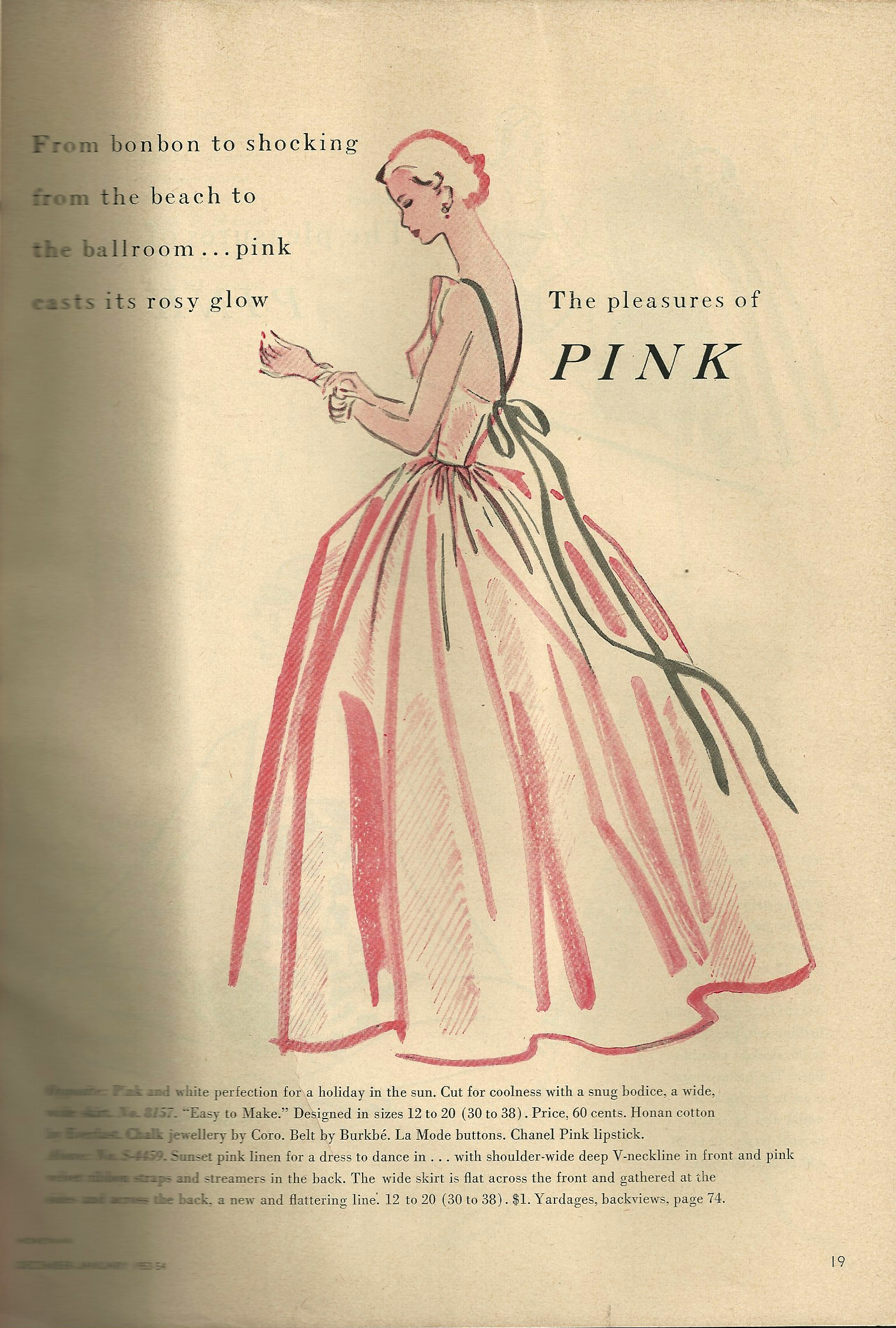
“From bon bon to shocking – from the beach to the ballroom … pink casts its rosy glow”
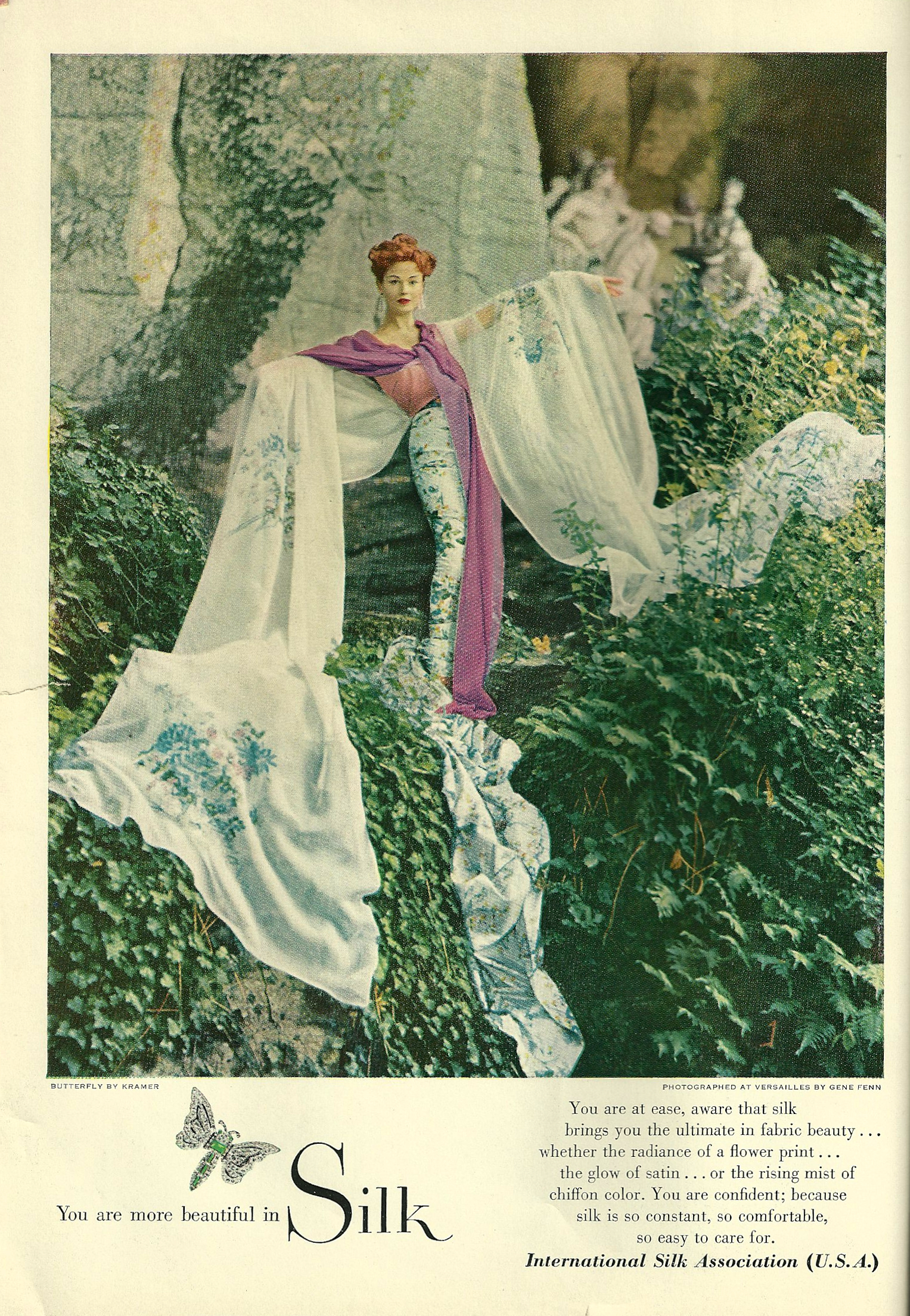
Two ads from the February/March 1957 VPM featured a pink, which is very close to 2014’s radiant orchid. Who could argue with the statement “You are more beautiful in Silk”?
Here is” Radiant Orchid”, mid-century style!
Lowenstein’s ad features “Signature” cottons designed by famous artists. If you read the caption fully, you will see that the price per yard is listed at “about $1.39”.
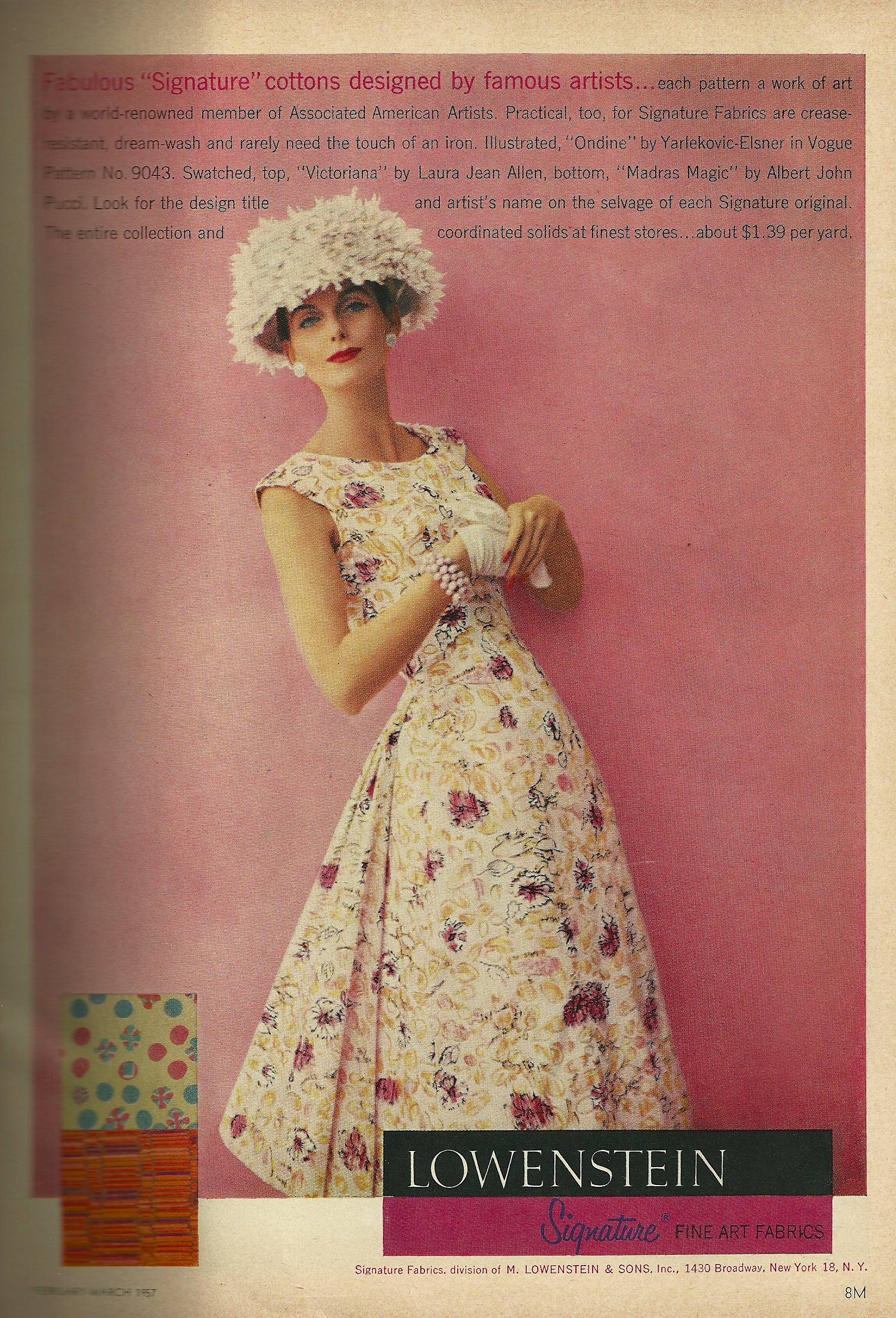
And don’t you love the hat??
December/January of 1960-61 shows two of the suit and blouse patterns in what could definitely be called Radiant Orchid.
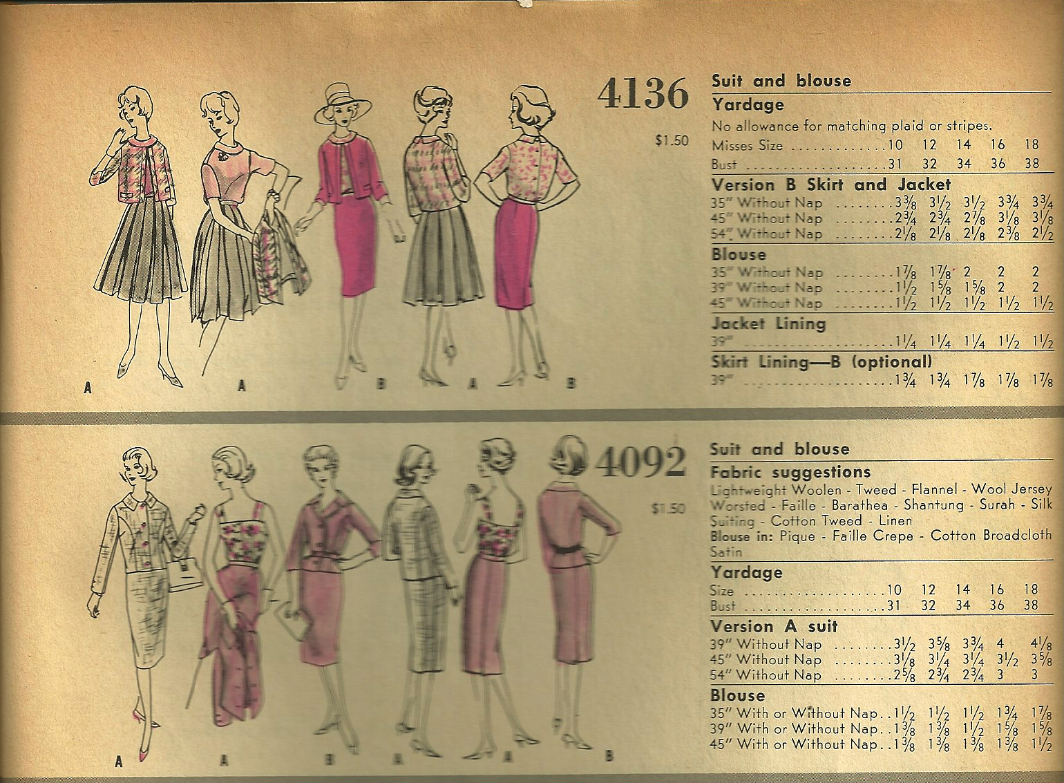
Look at that Chanel-type jacket in Pattern #4136.
While 2014 is set to be the year of “Radiant Orchid”, dear old 2013 is just not quite over yet. Busy December of every year finds me focusing on the colors of Christmas and the holiday season more than on the current fashionable colors.
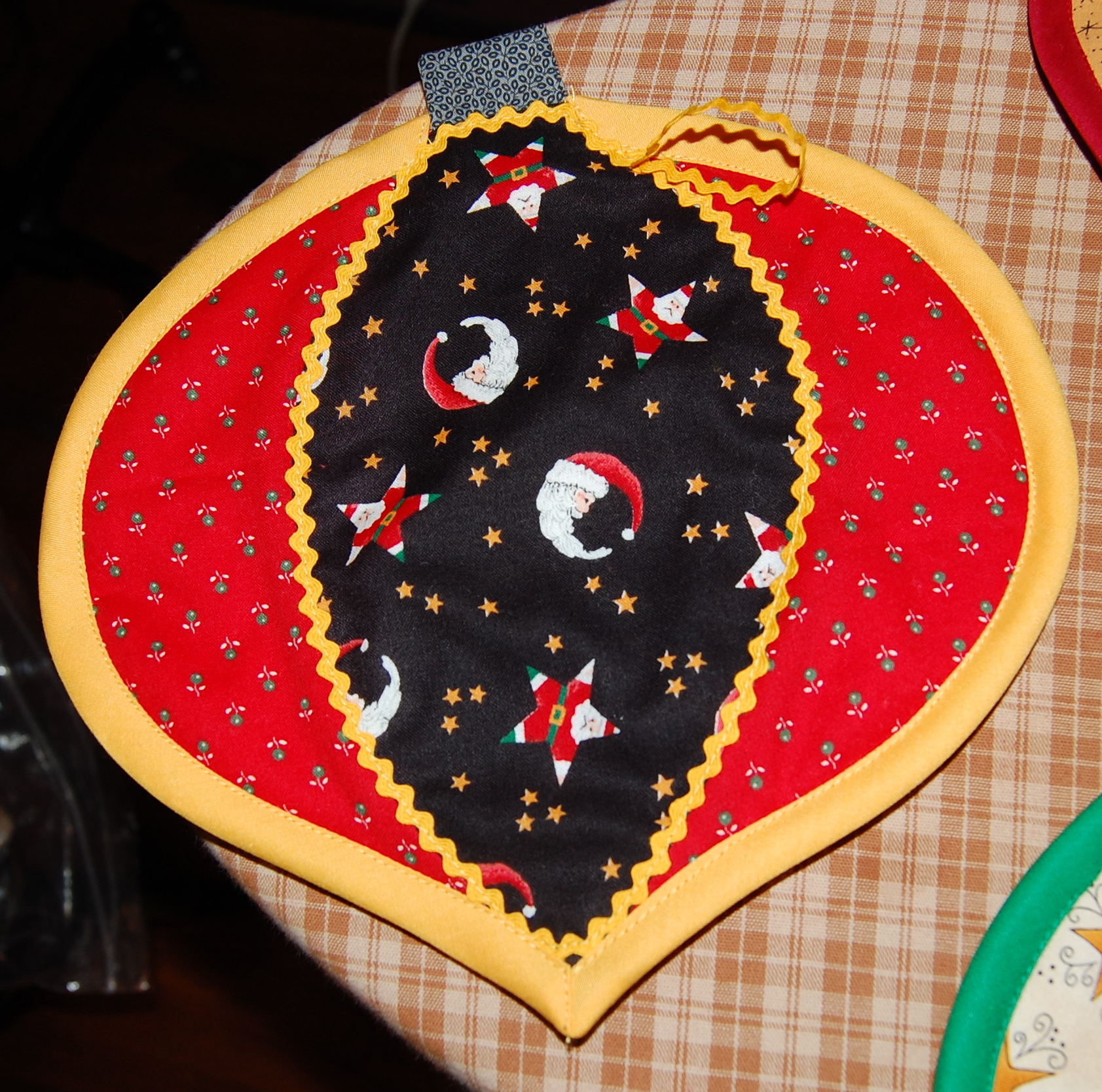
Somehow, Christmas just would not be Christmas if I were not scrambling to finish some handmade gifts. This year is no different, as I conjured up some crazy idea to design and make Christmas-themed potholders as a small addition to the presents I give to some very wonderful ladies who help me in my house (and vacuum many a thread off the floor of my sewing room!) I dug through my stash of “quilting” cottons and came up with some holiday themed fabric, which I used as my starting point. Then I paired each fabric with some complementary small prints, and concocted what I hope looks like fancy Christmas balls – except that they are large enough to use on a hot pan!
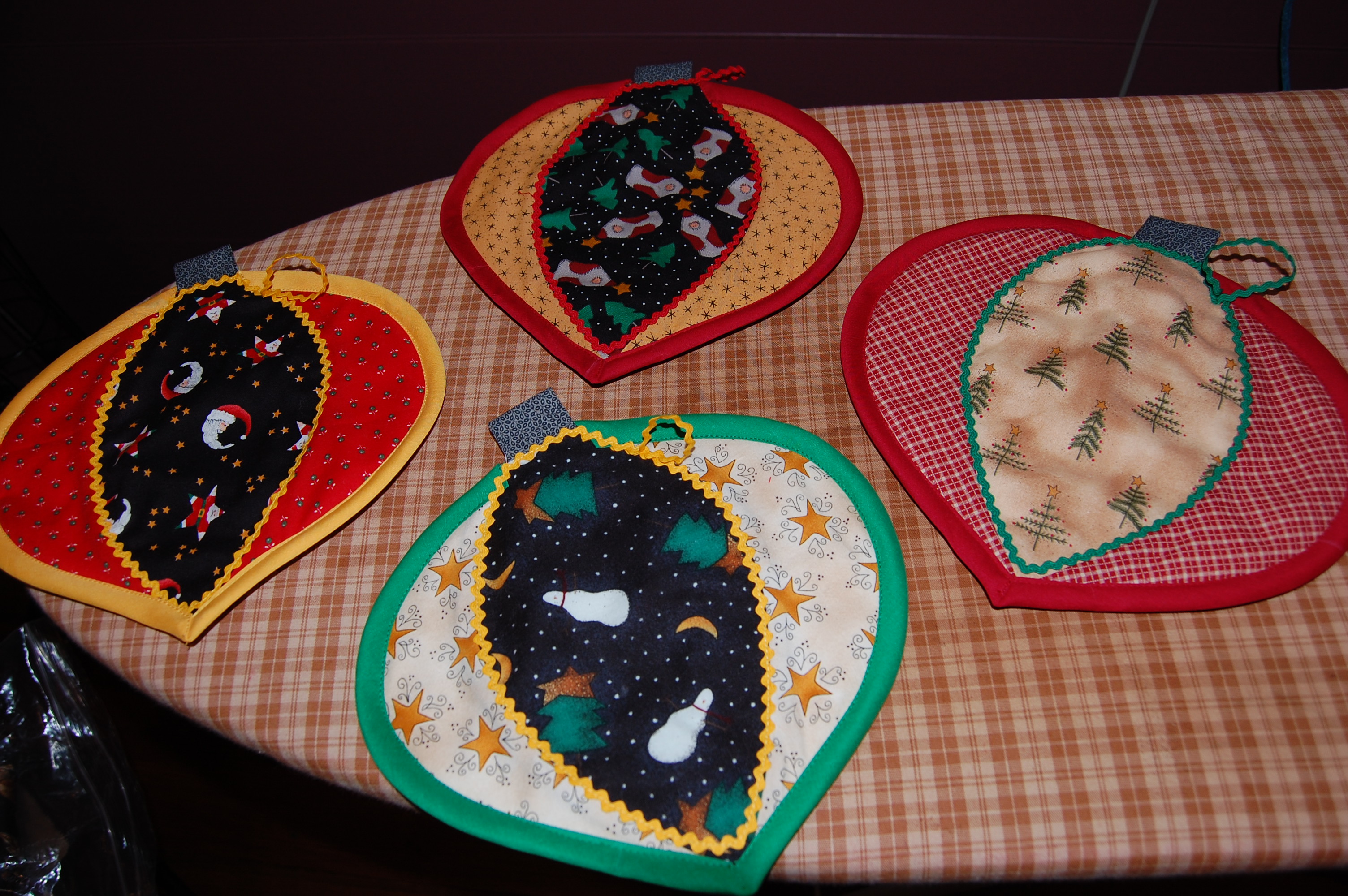 I indulged my love of rickrack, and the most fun part was deciding which color binding and which color rickrack to use to enhance the finished product.
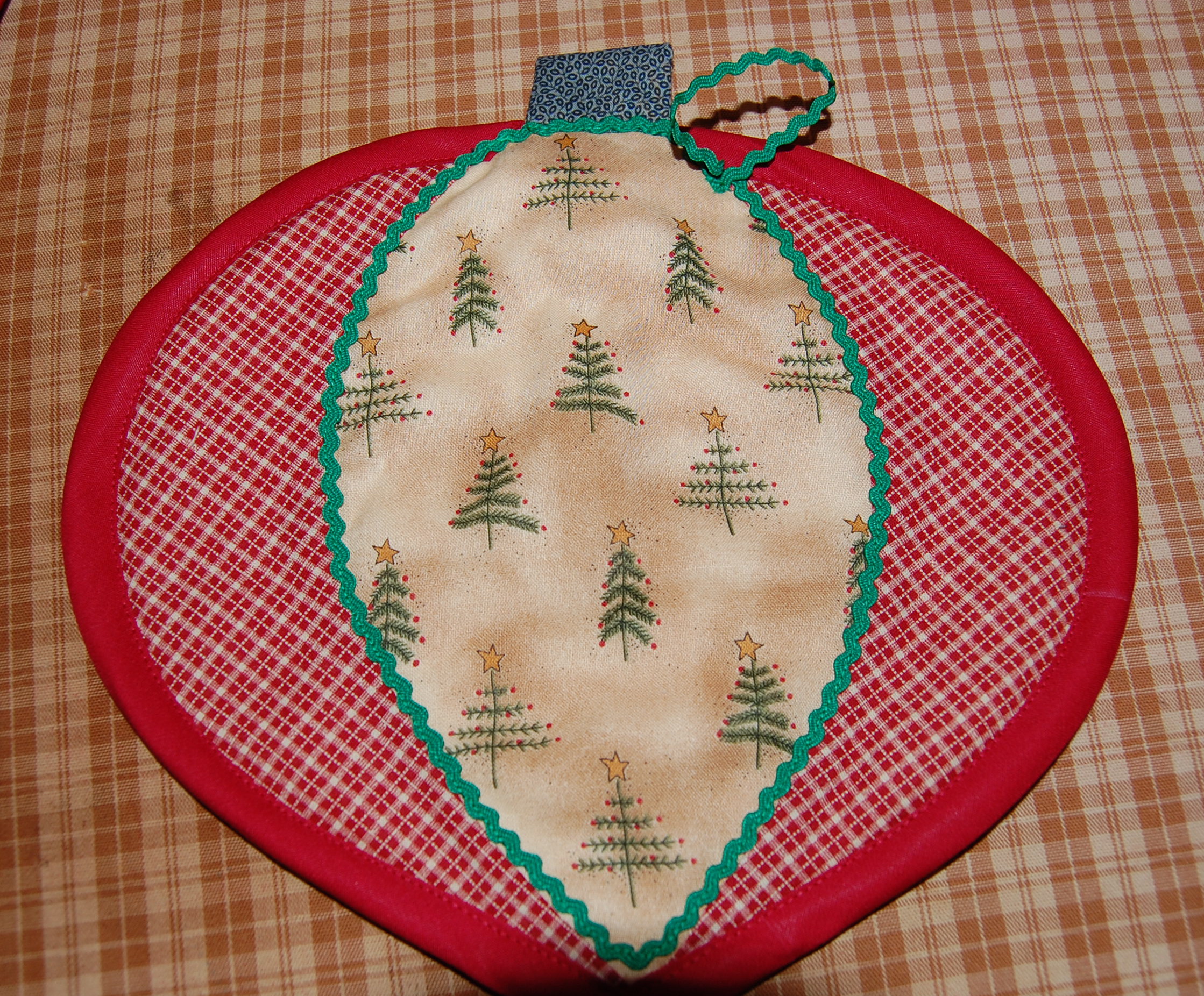
I added a small gray “cap” at the top to simulate a Christmas ball hook-holder, and a rick-rack loop for hanging.
This is my favorite one…
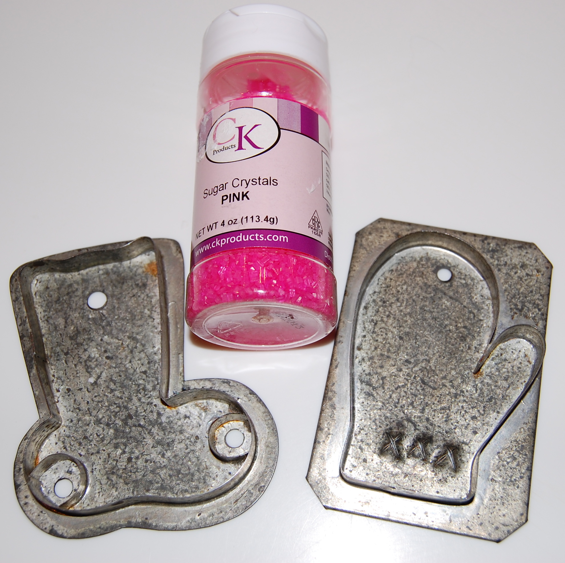
Coming full circle (pardon the pun) on the color wheel brings me back to radiant orchid – and whether our holiday celebrations will possibly see any pink hues peeking out between the Christmas reds and greens? Oh, yes! Once I get around to cookie-making, I’ll be certain to make fashionably forward stockings and mittens decorated with sparkly pink sugar!

I’m not sure Radiant Orchid will be my color either but it does stick with the trend of secondary colors they’ve been picking. I wonder if 2015 will take us back into the primaries.
I love the ornament potholders you are making for small Christmas gifts – so cute! I love rickrack too!
Good observation, Brooke, about the trend with secondary colors. I’d love to see a primary color in 2015.
Rickrack makes me happy for some reason!
I love those ornament pot holders too!
Thanks so much – they were fun to make!
The ornament holders are very cute.
I can’t see Radiant Orchid creeping into my wardrobe at all. I’m just not a pink or purple wearer. I do like it though, and enjoyed your historical pink tour.
“Think Pink!”
I think Radiant Orchid may grow on me over the course of the year (figuratively, not literally!!).
Hi! Just found your blog courtesy of WordPress’ “You May Like” side bar. Like you, I was born bang in the middle of the 20th century, in the middle of 1950. And, I share a great love for making stuff, especially clothing.
Love this post about Radiant Orchid. I am finding it quite refreshing right now.
So happy to “meet” you! Sounds like we are kindred spirits – please stay in touch! And thanks so much for your comment.
We do put pressure on ourselves during Christmas, don’t we? I finally gave up making all of our gift tags …… and somehow feel guilty about it. Crazy.
At any rate I’m excited about Radiant Orchid as the Pantone 2014 color, and I’m always ready for spring 🙂 Merry Christmas!
Yes, we do put pressure on ourselves this time of year – for sure! I try to sort out the “important” from the “oh, that would be nice…” – but sometimes the lines get blurred! I’ll bet your gift tags were spectacular!
Fab bauble potholders! So Christmassy and lovely.
Radiant Orchid is so not my colour, I think it’s very pretty but not quite for me. I’ll just stick with emerald green 🙂
I will always love emerald green, be it color of the year or not! Thanks so much for your comment!
I am in love with the Radiant Orchid colour. My favourite colour is purple, but it’s hard to wear many shades of it without looking like a) an easter egg or b) a little kid. But, I think this colour has just enough subtlety and greyness to it to make it very wearable.
I agree! I am liking it more and more!