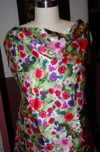
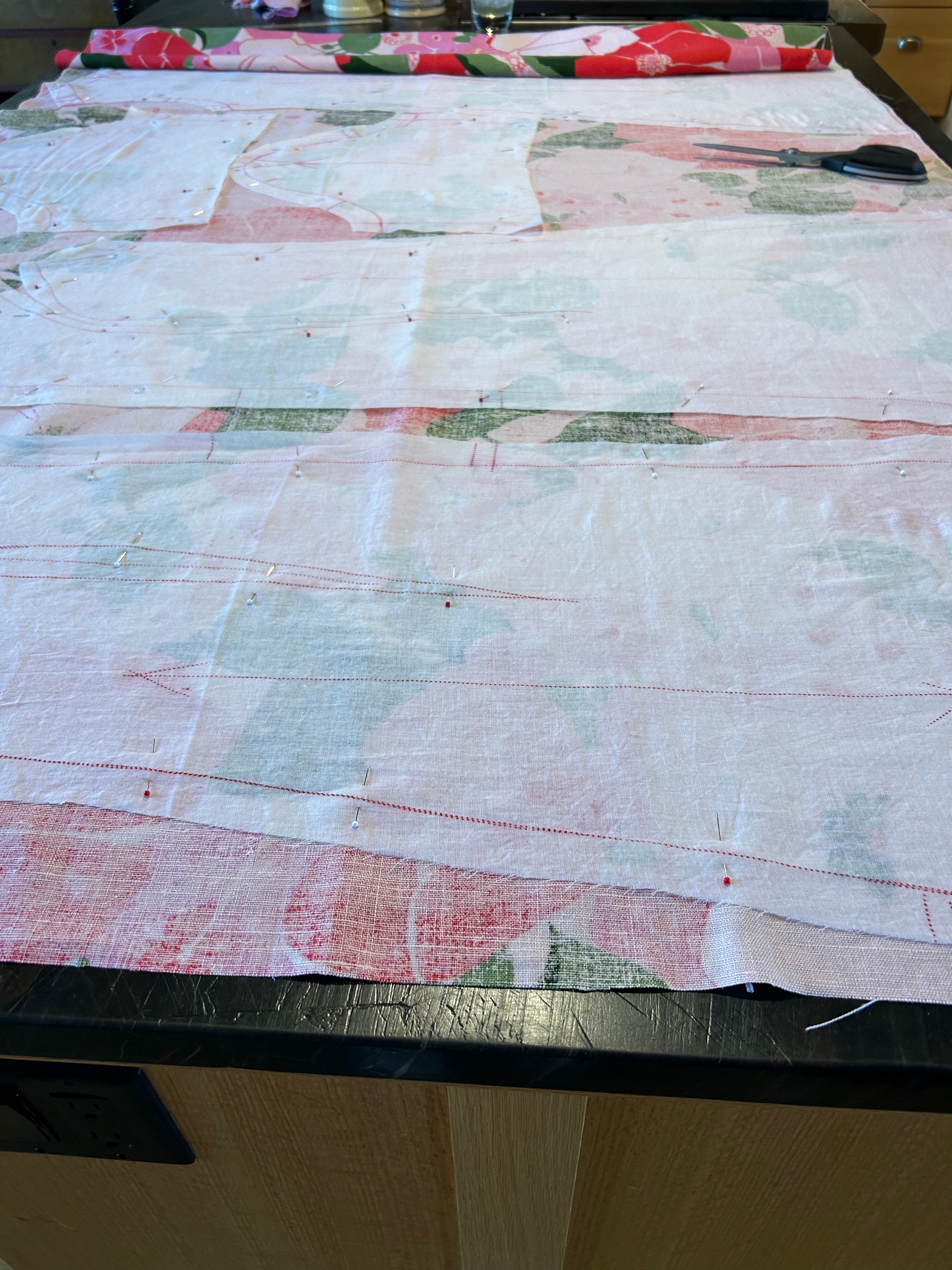
Whenever I am working with vintage fabric, it seems I either have more yardage than I need or, more frequently, less than I need. I have learned over the years there is usually a way to work around having less fabric than I really need. I just have to get creative. And that’s what I did when I made this dress.

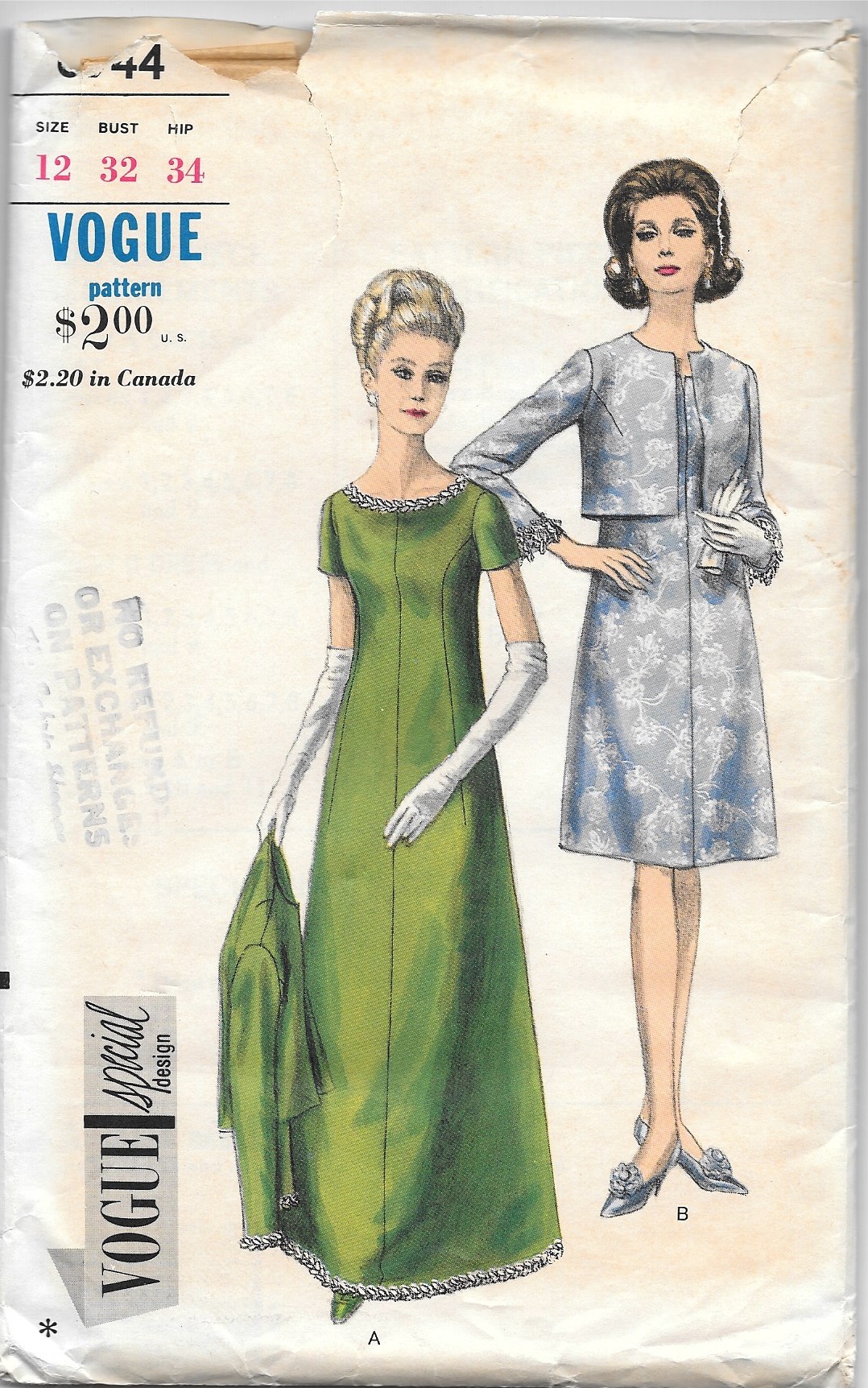
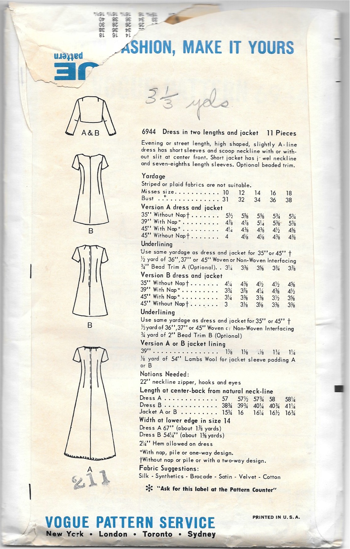
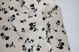
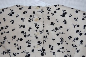
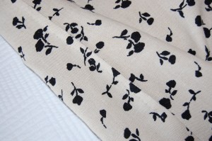
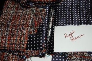
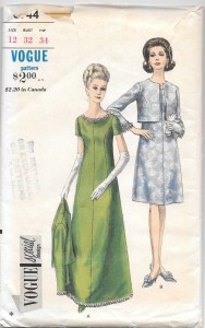
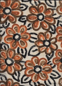
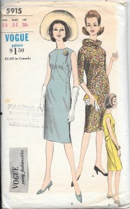
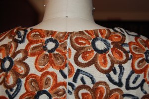
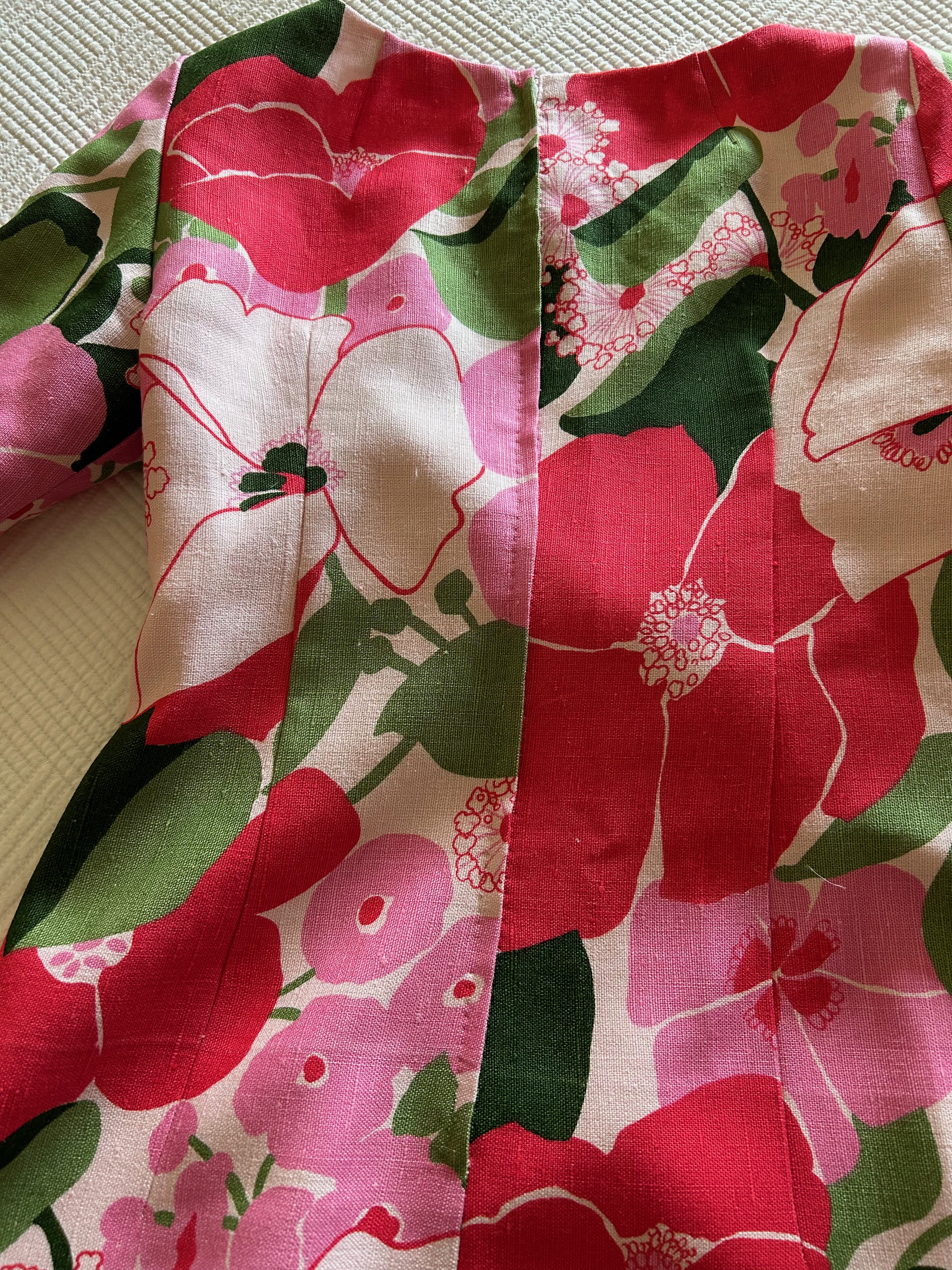
I quickly determined there was no way I could get the dress I wanted by placing the pattern on the lengthwise straight-of-grain. The flare of the skirt, which I wanted to be mid-calf, precluded any notion of such a layout. At 45” wide, I knew I could just get the dress length I wanted if I laid out the pattern on the cross-grain, from selvedge to selvedge. Linen is a very stable fabric, so I was confident the cross-grain would work. In addition, there were no directional limitations in the floral design of the fabric. Barely fitting my pattern – from shoulder to hem – on the fabric from selvedge to selvedge, however, would leave no extra fabric to turn up for the hem – or even to face the hem. I decided to worry about that later. First I wanted to determine how I could get the four pieces for the dress and the two lengthened sleeves placed on the fabric, keeping in mind three important things: 1) although this was not a fabric to be matched per se, the all-over design of the fabric needed to be on the same plane in contiguous seams; 2) I wanted to space out the larger floral motifs so the dress would be balanced as best as possible (looking critically at the dress I made when I was 23, I clearly could have given this more thought!); and 3) I wanted to avoid large demonstrative blooms at the bust. Then, and only then, would I worry about the hem.
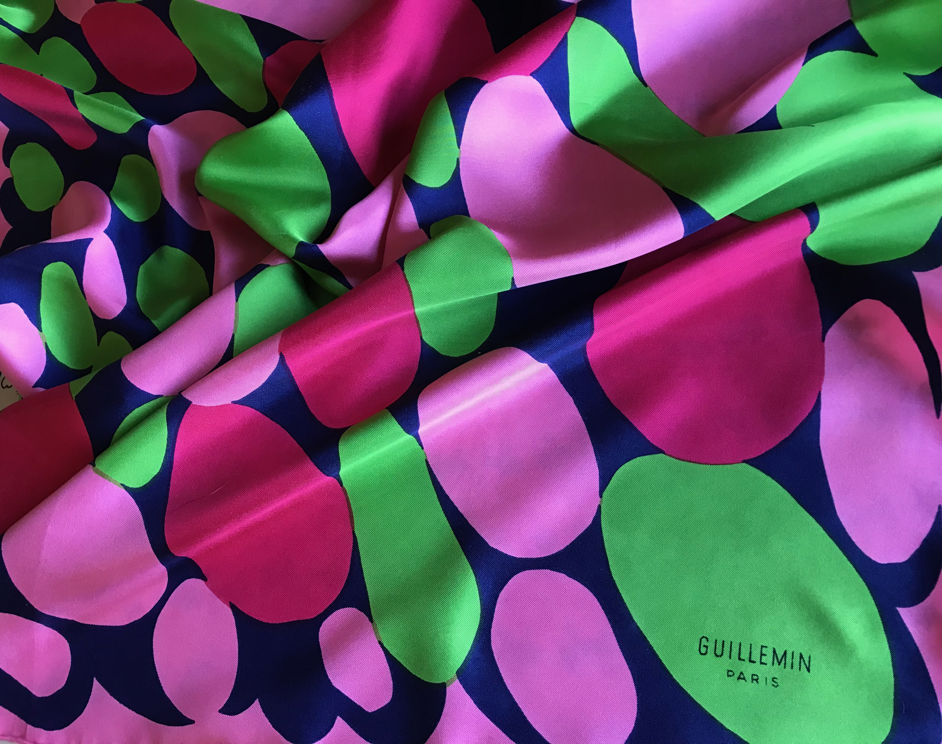
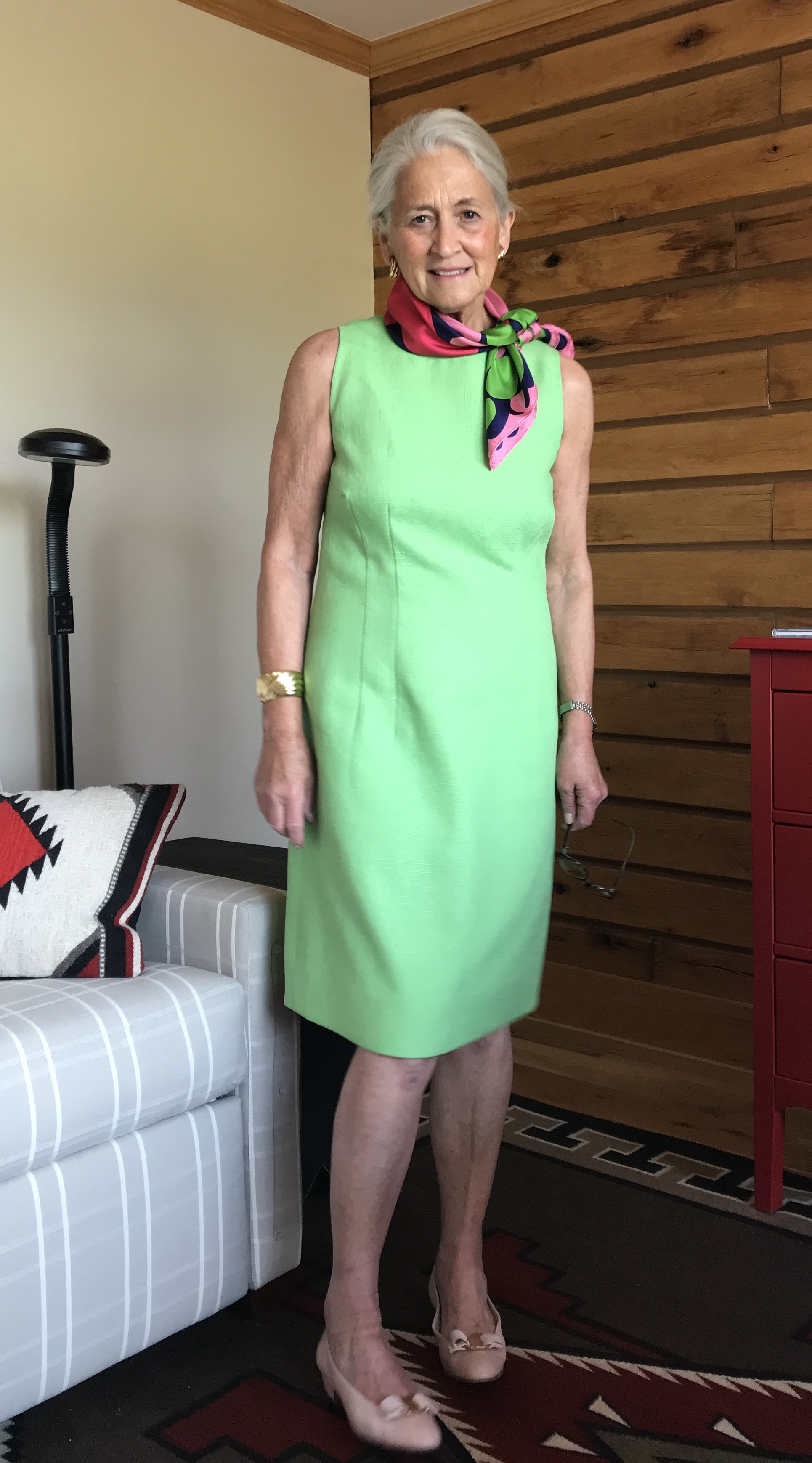
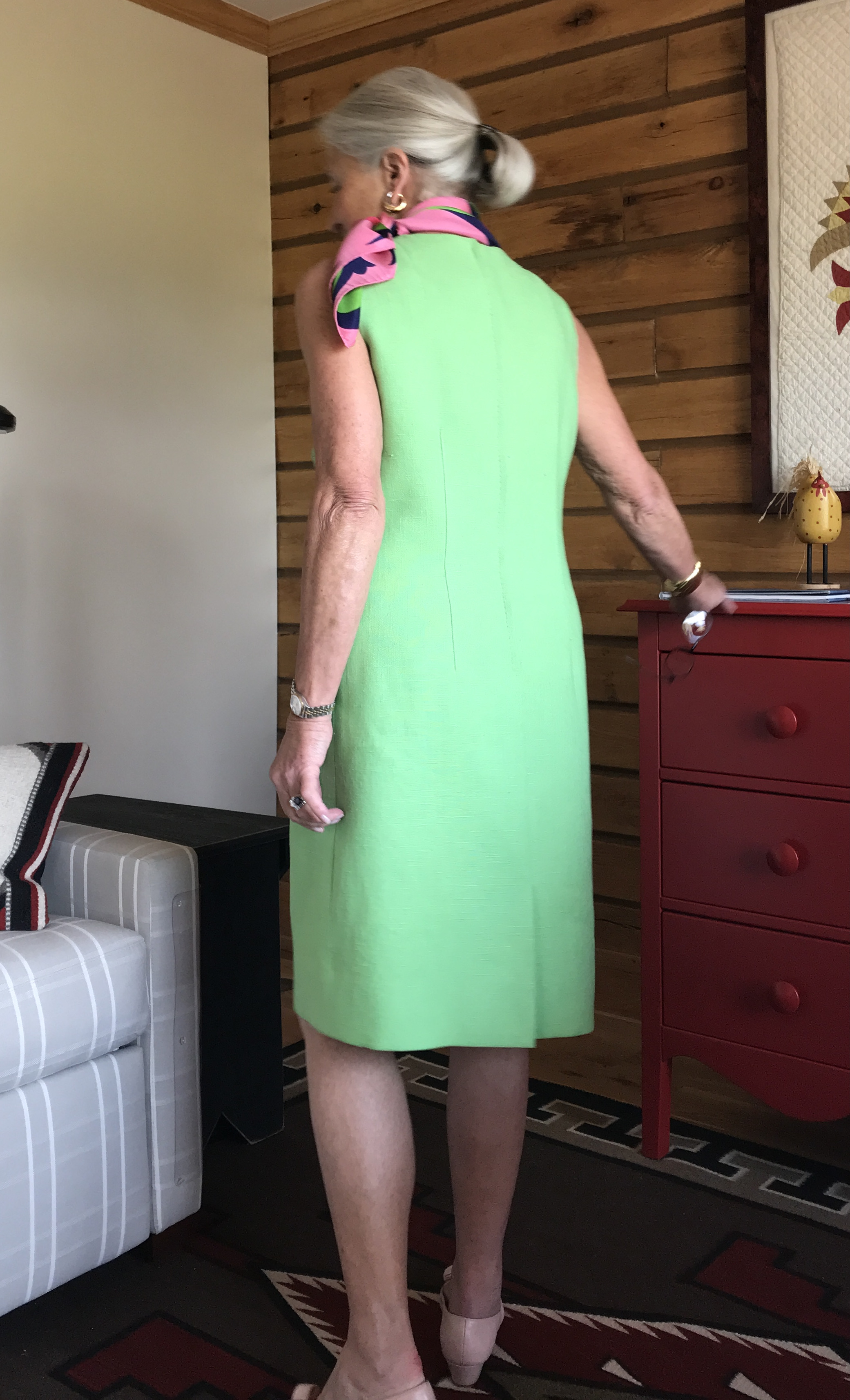
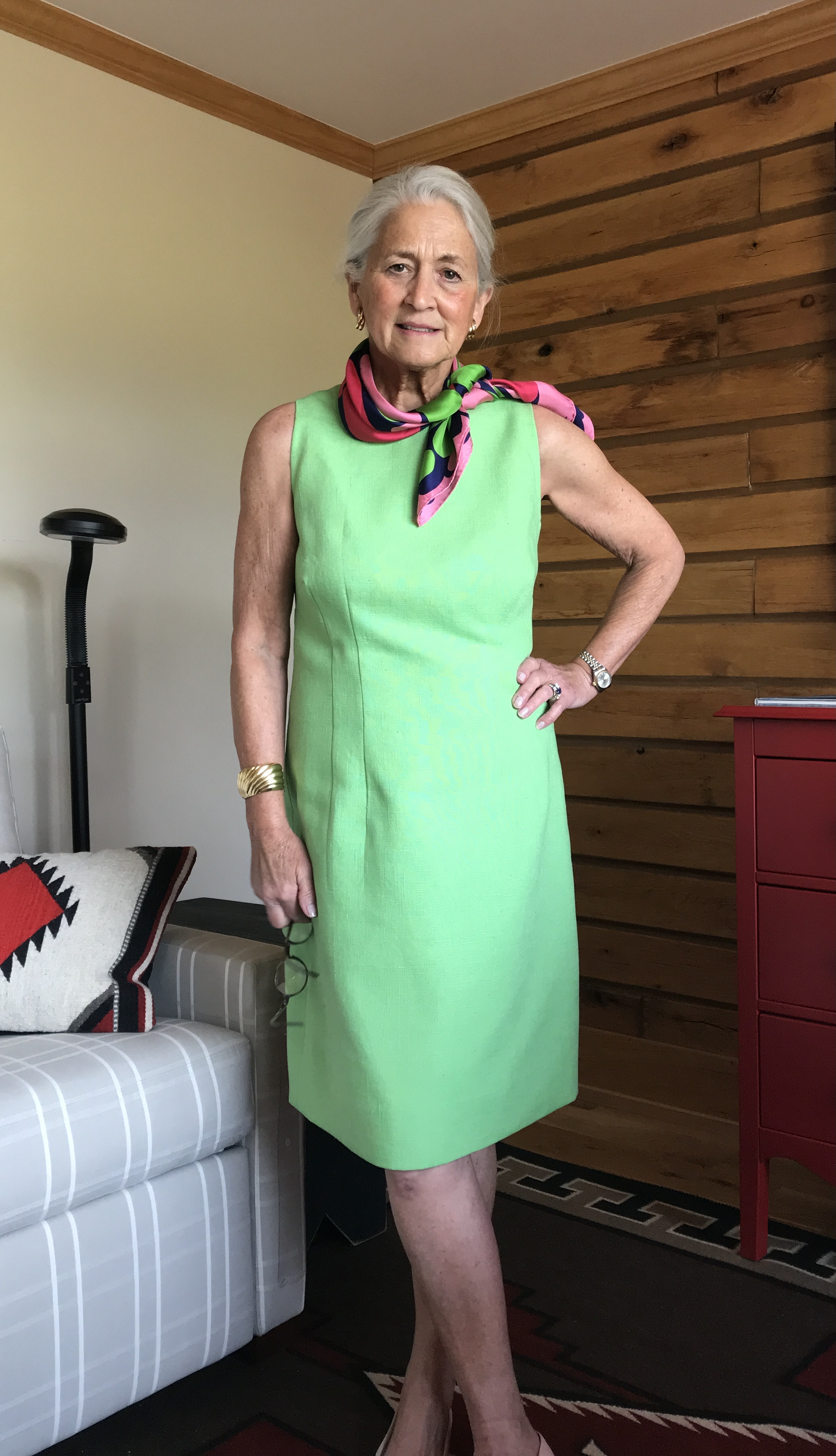
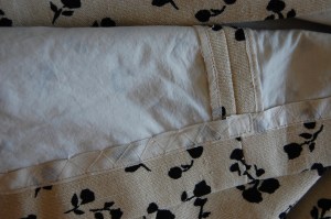
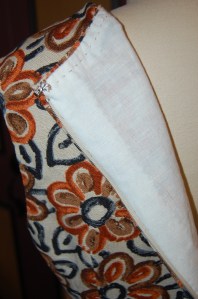
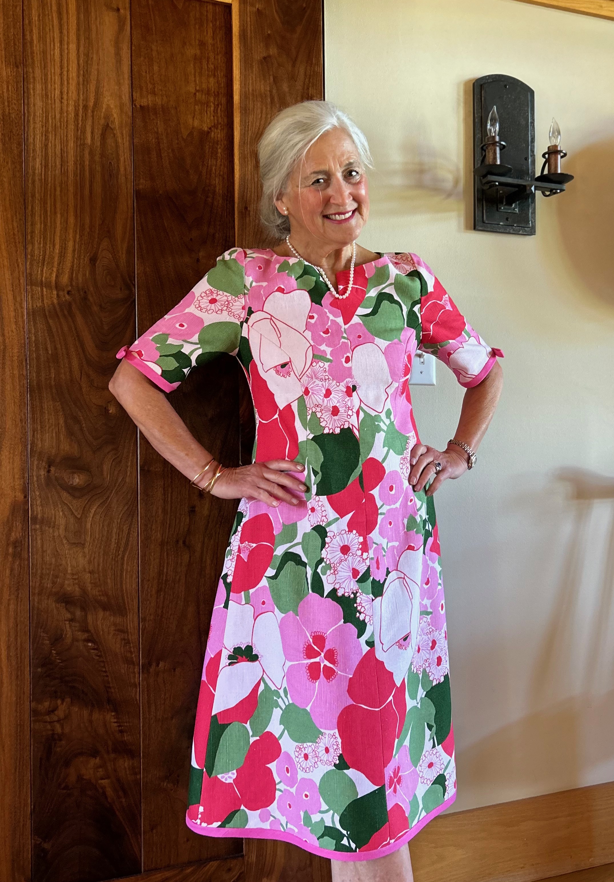
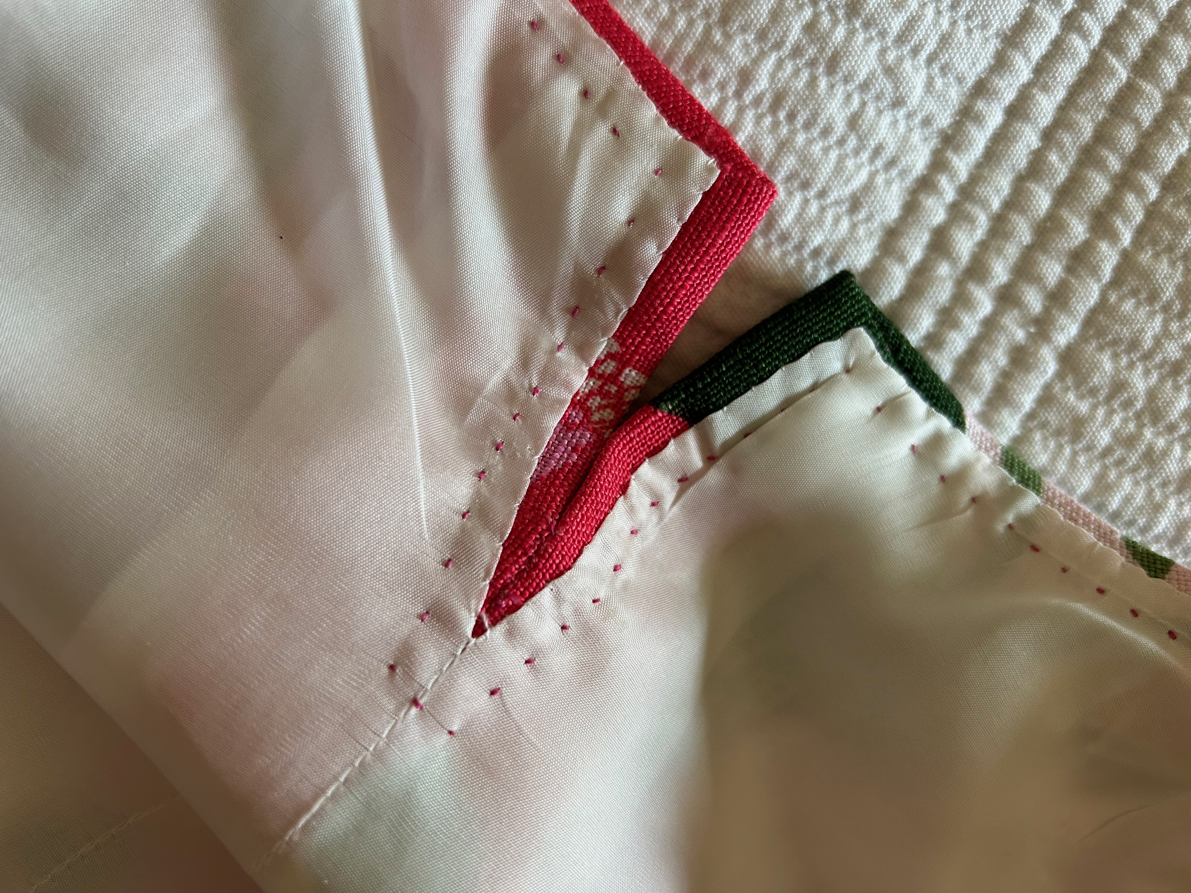
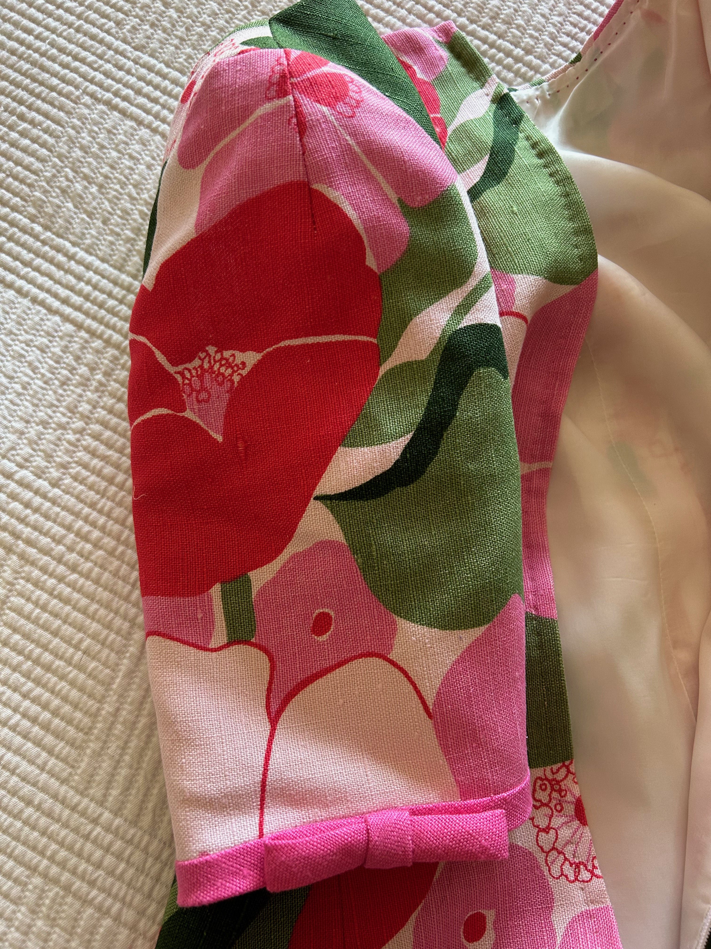
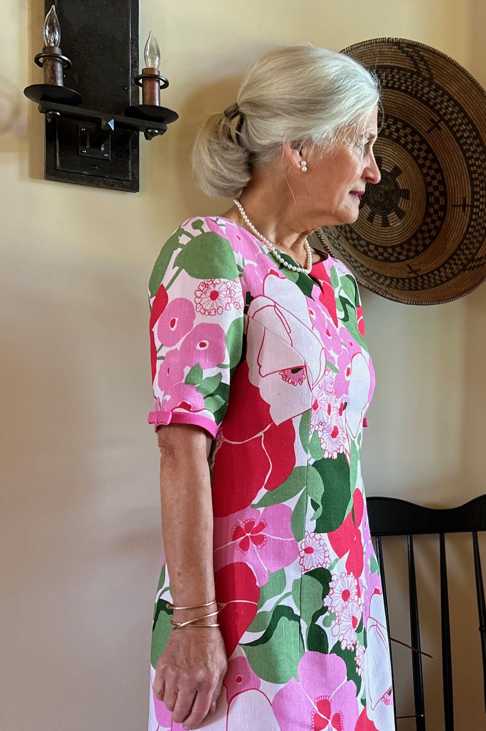
Once I was happy with this placement, I had a eureka moment when I knew I could accomplish two things with a simple bias trim made from the yardage of deep pink linen which coordinated nicely with the floral. 1) I could preserve the full 45” of cross-grain length by applying bias trim to the hem edge instead of turning it under, and I could do the same with the sleeves. And 2) the trim would add interest to the dress, just as I had vaguely imagined. (A quick aside here – I have ample yardage of the solid deep pink linen to make a coordinating coat at some point. Every dress needs a coat, right?)

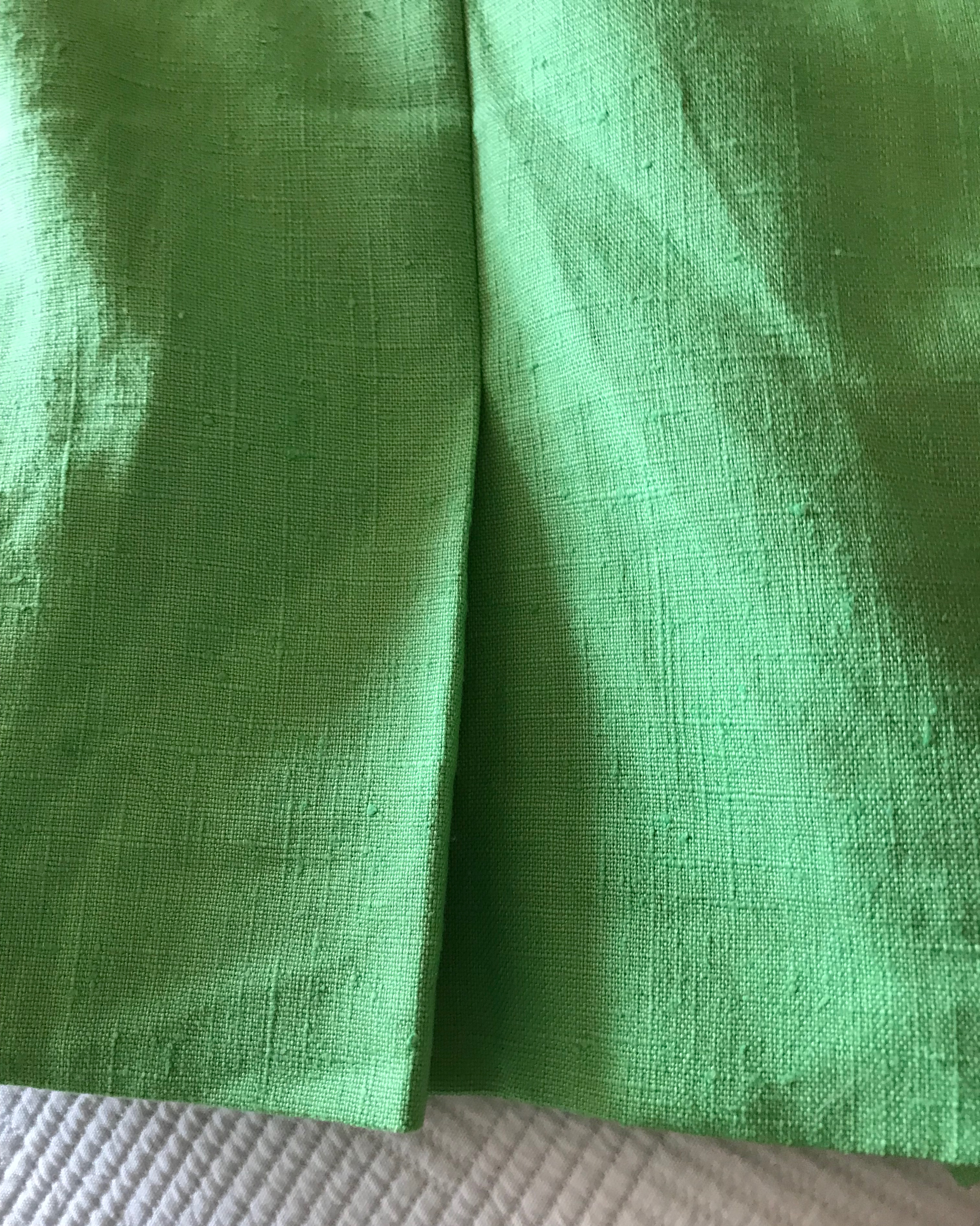
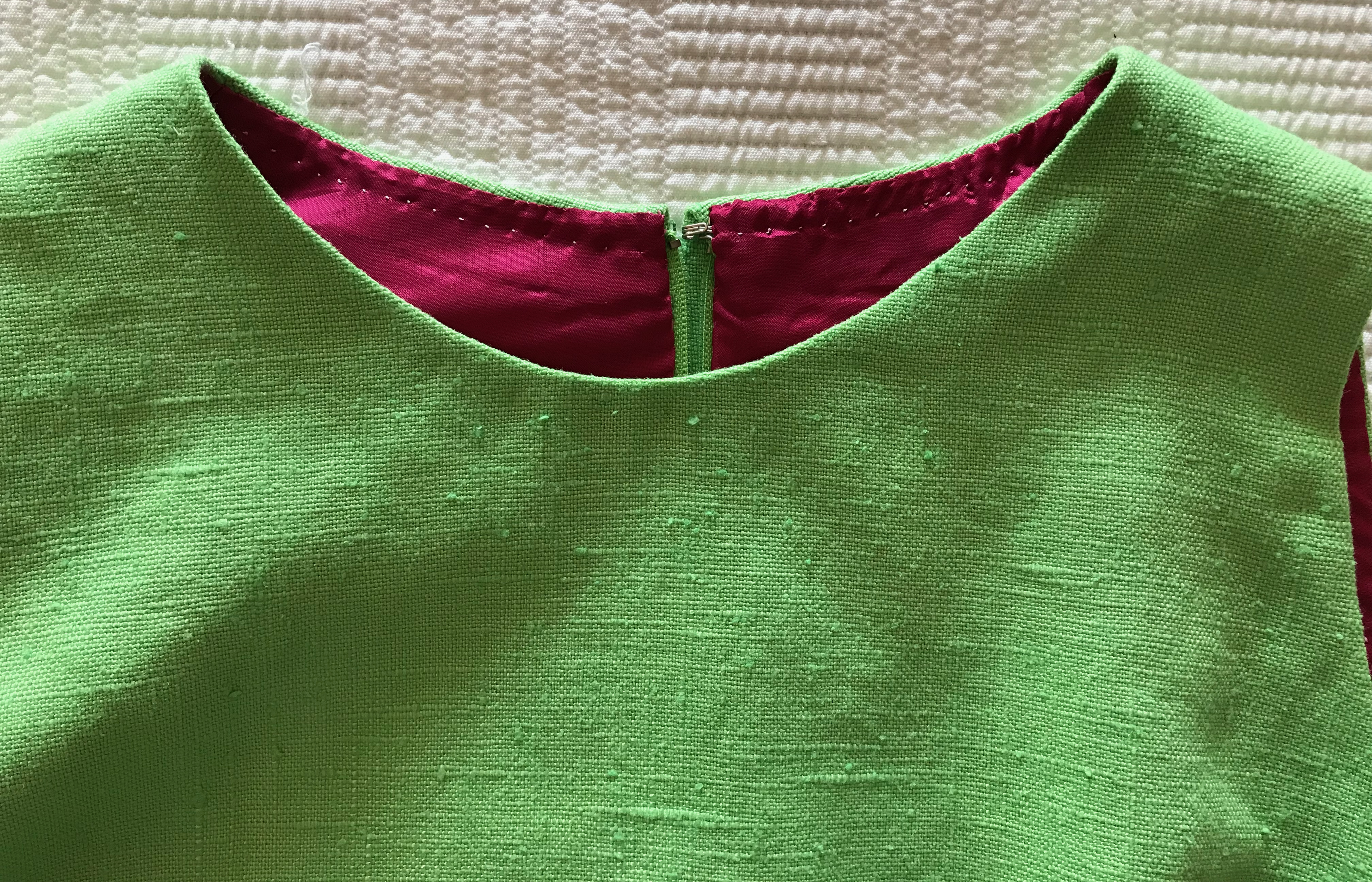
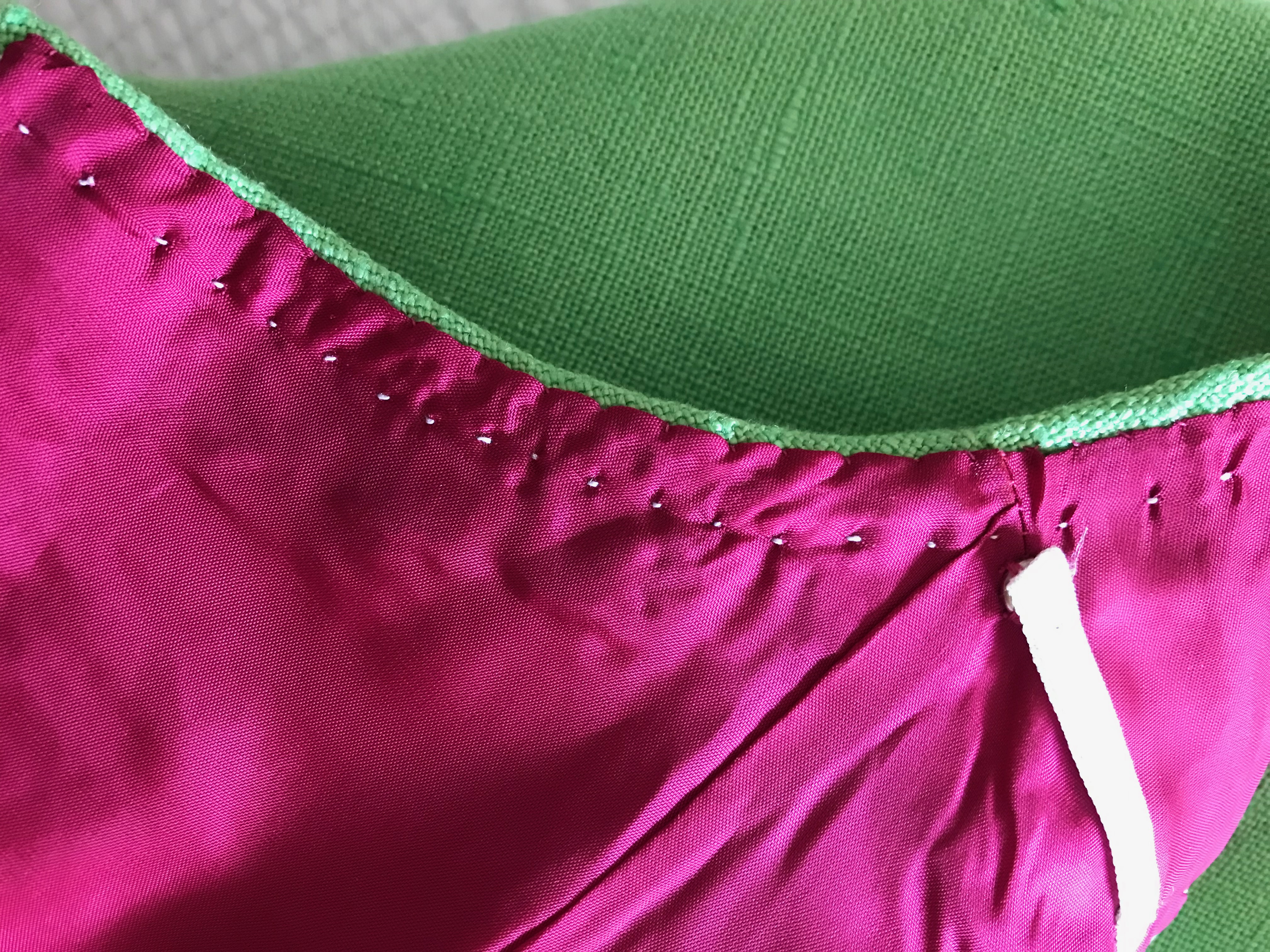
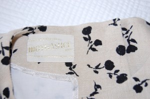
I underlined this dress in a very lightweight, pre-washed, cotton batiste, then I lined it in Bemberg rayon. Moygashel linen washes beautifully, as does Bemberg lining, which is why I chose Bemberg over silk for this dress. I eliminated the neckline facing, choosing instead to bring the lining up to the edge of the neckline seam, then under-stitching it to secure that edge in place.
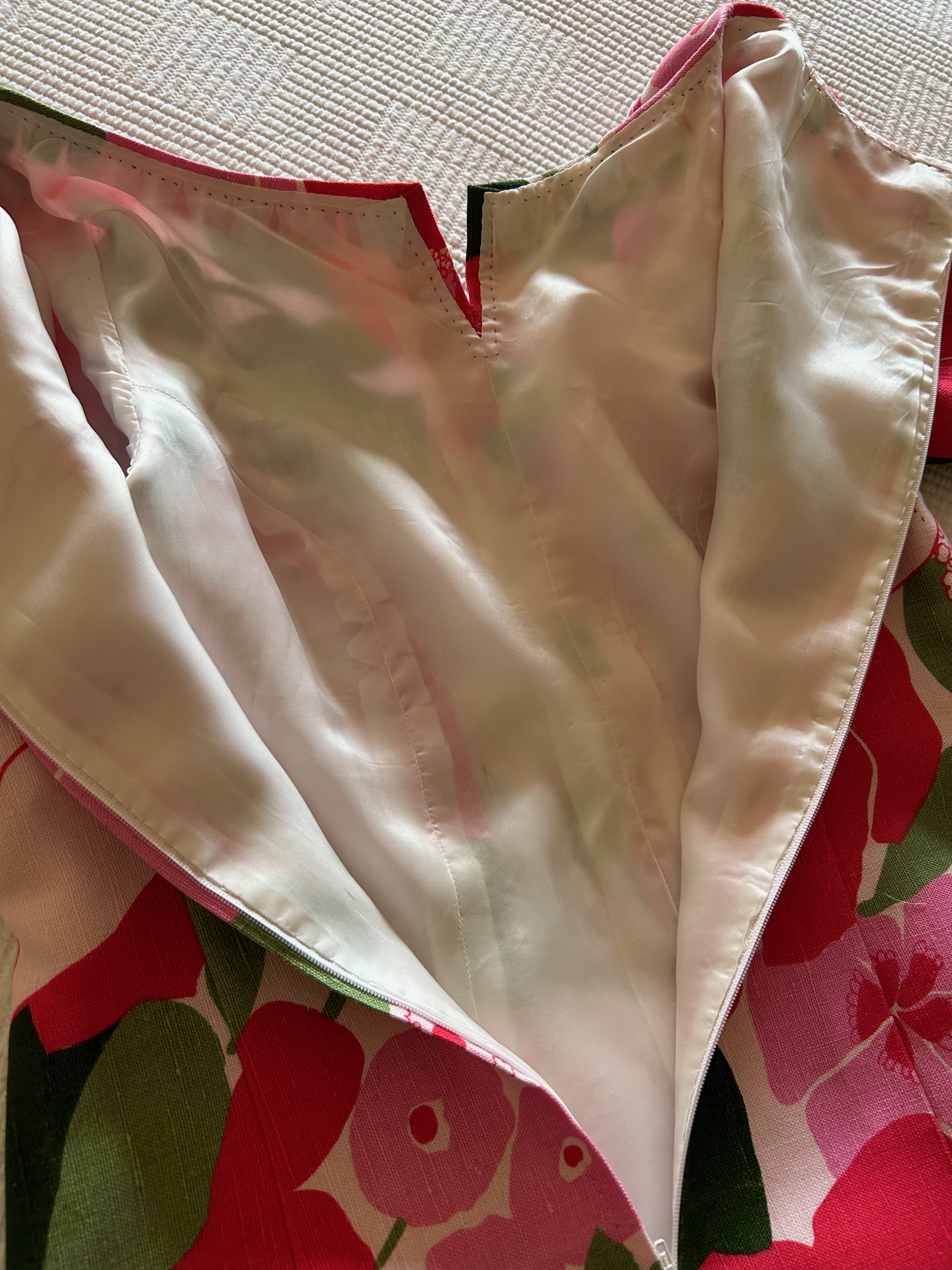
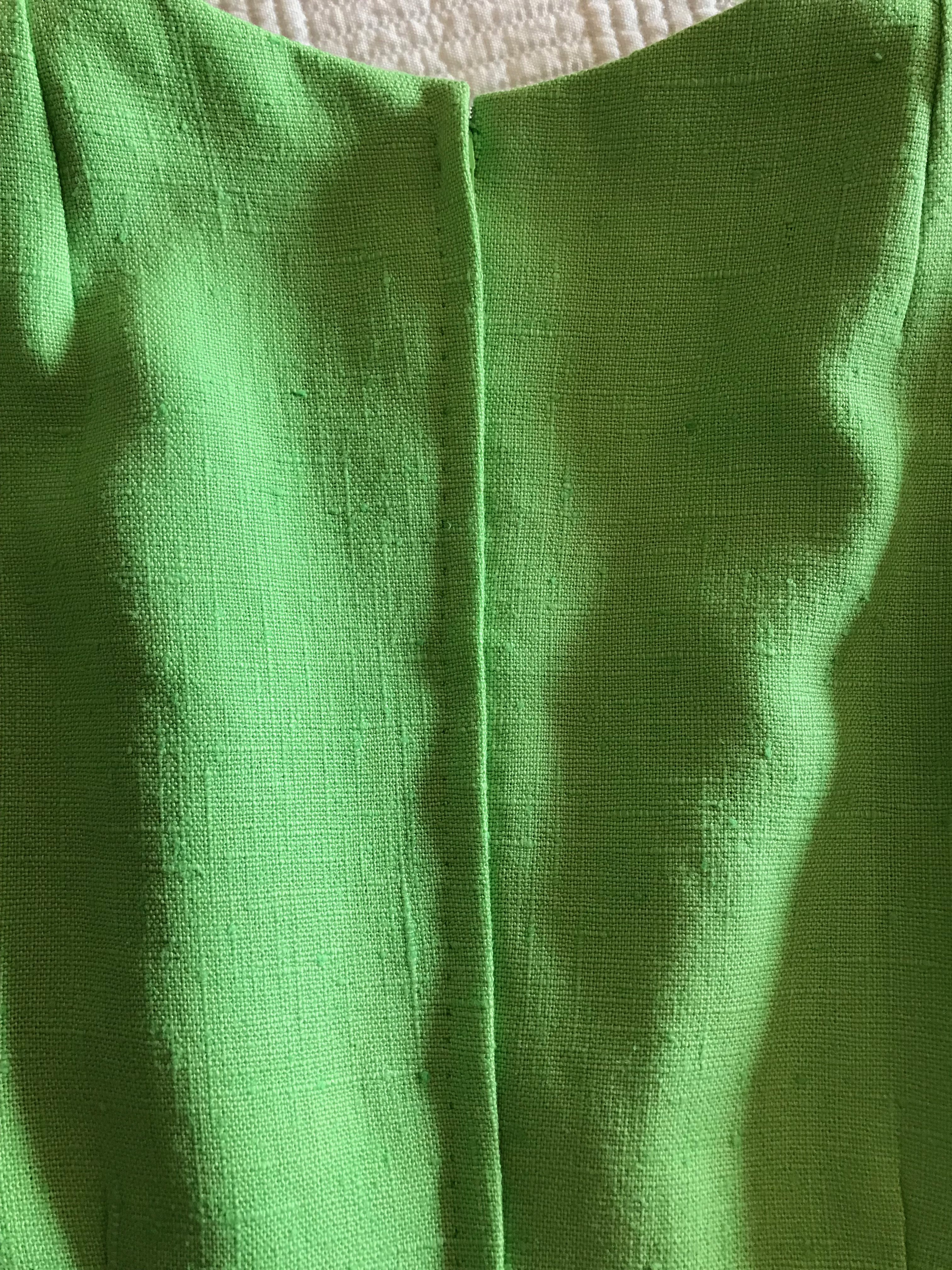
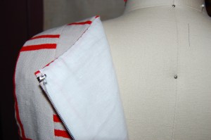
I chose to do a hand-picked, lapped zipper, an application which I think looks so lovely. Interestingly, I hand-picked the zipper in the dress I made in 1973, although it is a centered application.

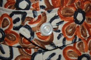
When it came time to apply the bias-cut trim to the hem and sleeves, I had to experiment around a bit. I didn’t want it too wide, but it needed to be substantial enough to look like it was meant to be and not an afterthought or decision made in desperation! I finally settled on an exposure of 1/2”.
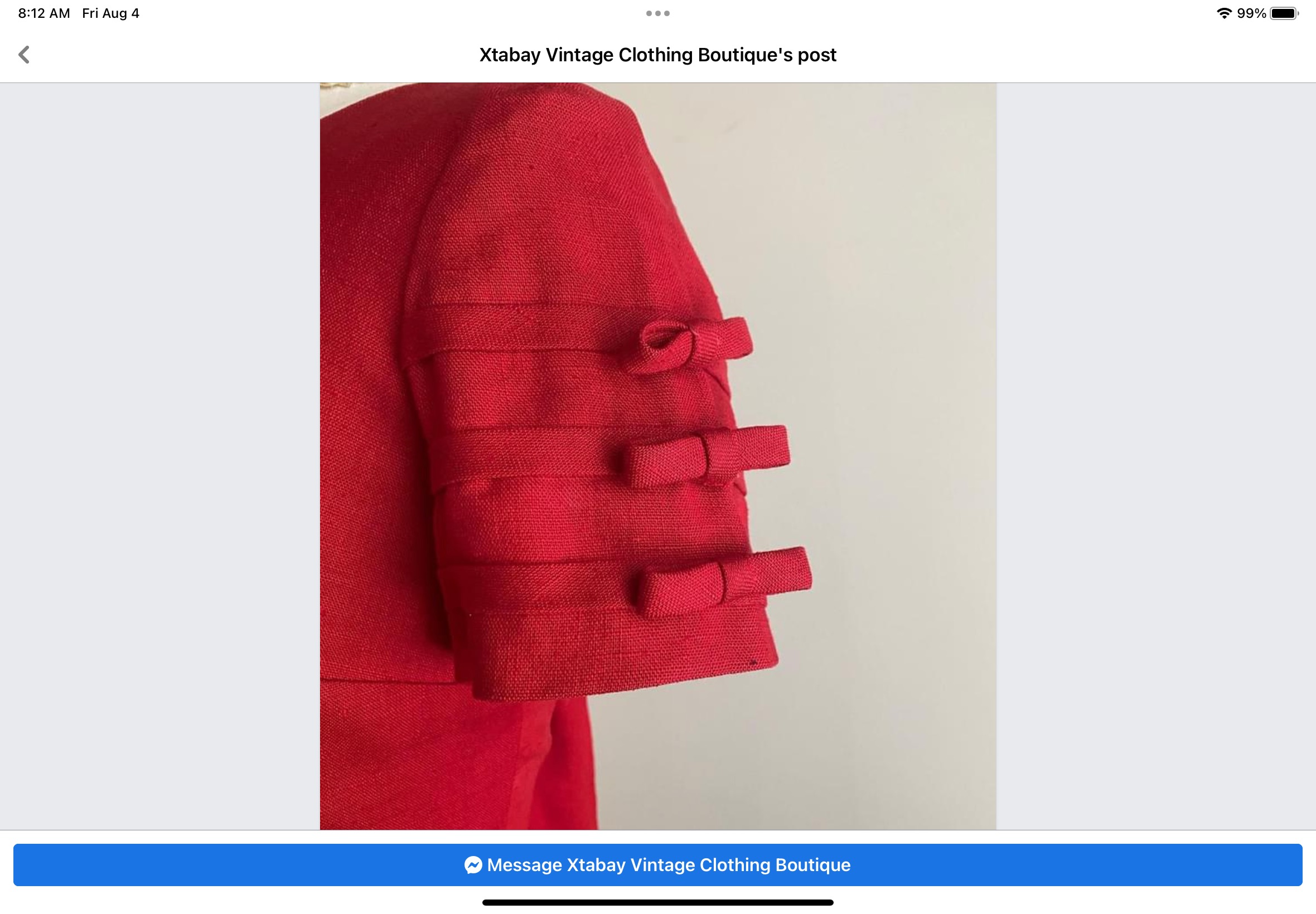
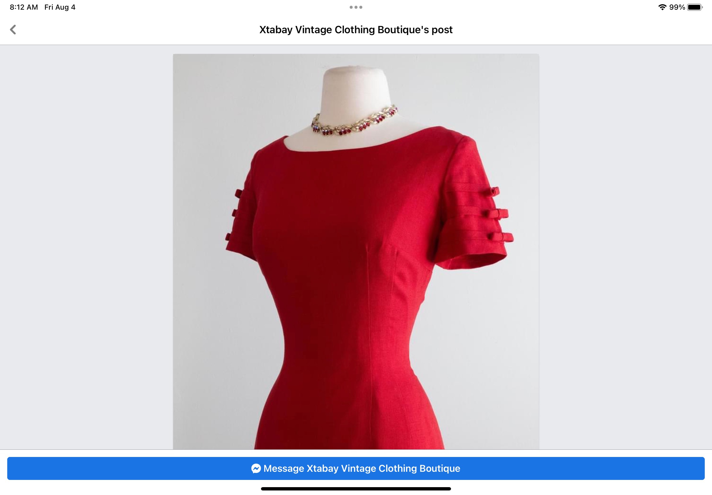
Now this is where it gets interesting. A few weeks ago I saw a vintage dress on a Facebook/Meta post by Xtabay Vintage Clothing Boutique. It is obviously Moygashel linen (I can tell by its weave and color), but what really caught my eye were the bias strips and low-profile bows adorning its sleeves. I tucked this idea in the back of my mind for future consideration. What I didn’t know was that the future was right around the corner! Yes – I “borrowed” this idea and added a single bias-cut bow to each sleeve. Somehow, it just seems to finish the dress.


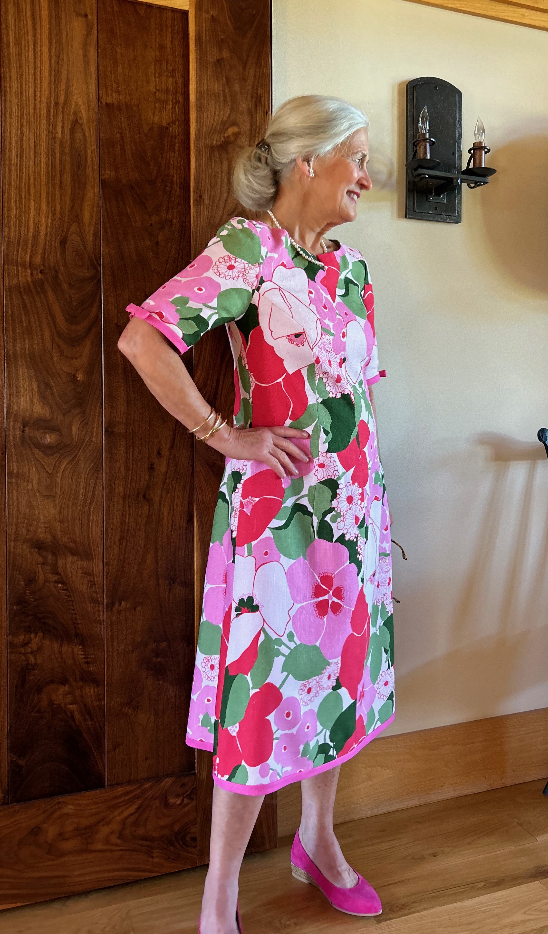
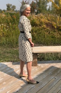
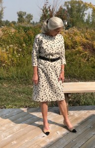
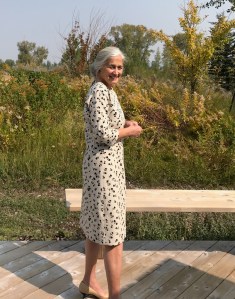
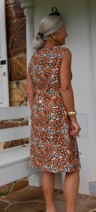
Well, you may have guessed by now the reason for making this dress this year. I will wear it next week when my husband and I celebrate our 50th Wedding Anniversary. I have changed a lot in those 50 years (and so has my husband!), but I still love pink in all its shades and I still love Moygashel linen (and I still love my husband, too!)