
Sounds super simple, doesn’t it? Well, yes, but simple does not necessarily equate with speedy. The skirt in question is this one which I fit into my sewing queue as part of a group project in Susan Khalje’s new subscription sewing club.

Susan provided the pattern to all the members, and the choice of which view to use (if one chose to participate; no pressure in this club, only support!) was entirely up to each individual.
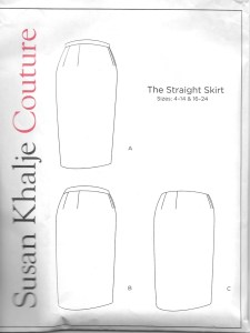
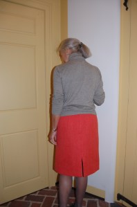
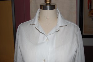
I used View A for my skirt. Although this looks like a simple straight skirt, there are subtle details which make it a step above ordinary. For example, the side seams are set slightly back from the front. There is slight fullness built in at the hip; not enough to be noticeable, but enough to make it more comfortable for wearing. This pattern is available on Susan’s website.
I chose the view with the waistband sitting right at the waist (View A), and decided to use a lovely, soft piece of vintage wool I found recently. As Susan provided video support for each step of the skirt, and answered questions online, I slowly worked through each component while working on my other projects at the same time.
Some of the members in the group have gotten very creative with their renderings of the skirt, but I chose just to keep it simple. I had already used this pattern once when I made my guipure lace skirt last year, but I tweaked the fit again and am now much happier with it. (And now I have a go-to skirt pattern.) One fitting tip that Susan shared was to make sure those side seams are exactly perpendicular to the floor. If they sway to the front or back, then adjustments need to be made.
The wool I used for my skirt was very lightweight, enough so that I determined the lining fabric should be as close in color as possible. Luckily I had a piece of silk crepe de chine in my “linings” box which matched perfectly. (I love it when things like this happen!)
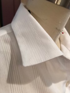
I hand-picked a lapped zipper into the center back seam, and this small detail adds just a touch of class, in my opinion.
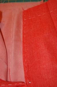
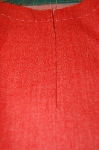
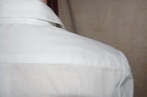
Here my center back seams are clearly marked, necessary for any zipper application, but especially so with a lapped zipper.
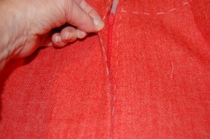
Here the zipper is in, and the center back lines match, showing the offset of the zipper on the left.
More of the same!
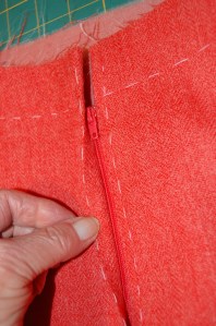
And here is what the zipper looks like when completed.
Even though my wool’s lightweight quality would have lent itself to a simple “all-in-one” waistband, I prefer not to have wool up against my bare middle, or my middle, clothed with just a layer of camisole silk between it and the waistband. So – I made a two-piece waistband with a facing out of the lining silk. Inserted into the band is a piece of Petersham ribbon, giving it support and shape.
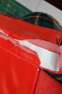
The lining has been attached (see how good the match is to the wool?), and the Petersham ribbon is ready to be encased inside the waistband.
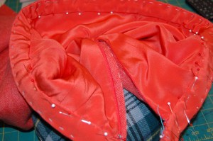
The waistband facing is ready to be attached to the lining/waistline seam.
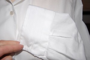
The back slit of the skirt is angled in about a quarter inch on both sides, so that it hangs and wears with less of a separation.
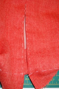
The white basting stitches show the center back. I angled the edges towards the center before finishing the hem.
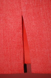
The finished slit and hem.
Not too much else to say about this simple skirt, except that it was a very satisfying little project.

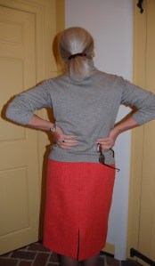
Notice how the back slit hangs together?


Actually there is one more thing to say – about straight skirts in general. They take very little fabric for most people – often a scant yard in a wide-width wool will suffice. Will there be more straight skirts in my future? Oh, yes. In fact, I already have a wool tartan remnant waiting for early 2019. But there is much to sew before then… not all of it so simple as this!


Fabulous Fashion at the Philadelphia Museum of Art
A recent Thursday found two of my friends and me gazing with stars in our eyes at some of the fashions currently on display at The Philadelphia Museum of Art.
Because I sew, I think I look at fashion exhibits differently from those who may not spend so many of their waking hours either thinking about dressmaking or actually engaged in the process. The opening storyboard immediately spoke to me with these words:
“Feminine fashion is a forum for great creativity and superb craftsmanship. A single garment can be appreciated as representing the aesthetics of its era, a designer’s vision, a workroom’s skills, or a wearer’s taste.”
I actually believe, at times, all four values can be inherent in one single garment. Actually, as a dressmaker using many vintage patterns, I know this to be true. But I digress! The fashions on exhibit neatly displayed one or more of these characteristics, even as they were divided into general categories, such as “Shape and Volume,” “Drape” and “Color,” etc. Included in the Exhibit were the famous designer names one would expect, such as Dior, Chanel, Balenciaga, and Saint Laurent; some of the more recent designers, such as de la Renta, Herrera, and Moschino; and some more obscure designers, such as Emilio Schuberth and Benjamin Green-Field.
As always, it is almost impossible to choose the designs about which to report, when so many deserve mention. Following is a slightly biased look at some of the fabulous fashions, in no particular order.
Ball gowns are always crowd pleasers, and this Exhibit had plenty to show. This gown by Jean Desses from the late ‘50s is typical of his ability to sculpt and drape lace, in this instance, to great effect:
One of Cristobal Balenciaga’s famous silhouettes, from the Spring of 1951, displays his Spanish heritage in its “flamenco dancer’s” interpretation. This $3,000 (a lot of money for 1951!) “haute couture creation, exquisitely … constructed, was purchased for a special showing at Wanamaker’s department store because it most dramatically illustrates the 1951 fashion trend of extravagant romanticism.’” (You can read about a very special fashion show I attended at Wanamaker’s in one of my early posts, here. Wanamaker’s was one of the country’s grand old department stores, and it was my distinct pleasure to shop there “back in the day.”)
I was delighted to see Jacqueline de Ribes included in the Exhibit. This dress (below) had to be one of the crowd favorites. From around 1990, the dress is described as “ streamlined, sculptural, timeless, and alluring.” Her designs are known for their elegant demeanor, described by her as “the art of being astonishing without creating astonishment.”
I was also happy to see Anne Fogarty represented. This romantic, youthful dress (below) from about 1953, was a gift of the designer to the Museum, where she had worn it to receive an award for her designs.
Having just seen the wonderful exhibit of Norman Norell last Spring at FIT in New York, this “mermaid” dress, circa 1967-70, caught my eye from across the room. I hope you can see the rhinestones encircling the cuffs of this dress. It was gorgeous!
And another American designer (from Philadelphia, no less), James Galanos, was represented with this “ready-to-wear” evening gown (below), each bead and sequin of it stitched on by hand. This is a great example of the relevance of vintage fashion; this dress would look right at home at some swanky party given this holiday season. Galanos graciously gifted this dress to the Museum in 1957.
Cocktail dresses were well represented, in splendid manner. This dress by Emilio Schuberth (below), dating to about 1961, was an astounding display of three-dimensional decoration. The simple silhouette of the dress is the perfect foil for the exquisite beading and fabric flowers. (Note the hem of the dress, a good example of a “couture” hem which is typically not pressed flat, adding some dimension to the lower edge.)
Who does not love Oscar de la Renta? And how could you not love this cocktail skirt and halter ensemble, from 1999? This happens to be a ready-to-wear example which is anything but ordinary. The skirt “sparkles with beads and sequins but is enlivened by three dimensional embroidered leaves and dangling strings of beads.” The green silk taffeta of the halter pairs perfectly with that luminescent skirt.
Palazzo pajamas, anyone? Yes, please, if they can be this example designed by Irene Galitzine in 1962. The boldly patterned silk taffeta of the top and pants of this ensemble is beaded, while the overskirt is not, creating an unusual and effective texture to the entirety. They were a gift to the Museum from Princess Irene Galitzine, herself.
And here is the dramatic back view of the Galitzine pajamas.
Of course, daywear was also represented. A classic example of a Chanel suit was this simple and elegant one, designed by Gaston Berthelet for Chanel, Fall/Winter 1972-73. As the caption said, “ Chanel’s suit became a staple for sophisticated modern women.” And it is still thus!
A very clever juxtaposition further showed the influence of vintage on current fashion. This dress, surviving only in a photograph, was the result of fabric panels left over from an art installation by Ellsworth Kelly in 1952:
Here is the modern interpretation of it, in collaboration with Francisco Costa, and produced by Calvin Klein in 2013:
Conspicuously absent from this Exhibit were coats (jackets, yes, but no outerwear.) As one who adores coats, this was a disappointment, but only a minor detraction. The closest thing to a coat, believe it or not, was this wedding gown, designed by Philadelphia native Gustave Tassell in 1968. There are no words to describe the luminosity of the silk/wool moiré in this “coat-dress.” Along with its feather-trimmed hood, rather than a veil, this dress could have seen a second life as an evening coat after the wedding. It was a remarkable look.
Adding to the enjoyment of the Exhibit were looping videos in the gallery viewing areas. In the entrance, the video showed clips from runways, from the 1950s up through the 1990s. The second video had a small seating area from which to watch it. On view were ateliers of various designers, from the 1950s up to the current day. The bustle of activity by the embroiderers and petit mains (dressmakers), as the designers directed affairs, gave a bit of a hint to the complexity and time-consuming process of haute couture.
This has been a whirlwind tour through Fabulous Fashion. See it if you can. For another review, go to the posts for October 30 and November 30, 2018 of The Vintage Traveler.
12 Comments
Filed under Fashion commentary, Fashion Exhibits, Fashion history, Uncategorized
Tagged as Fashion Exhibits, Philadelphia Museum of Art Costume Collection, vintage fashion