Category Archives: Pattern Art

A Very Pink Coat, Part 1

Some projects deserve more than one blog post and this pattern and coat fall into that category. 

I am making View A, although with the concealed (fly front) opening.
I purchased this cashmere and wool blend from Farmhouse Fabrics. It has a “brushed” surface, giving it a nap which provides a depth to the deep pink color. I have underlined all the components of the coat with silk organza. Basting holds the two fabrics together and also gives me my stitching lines and other pertinent information.

From the magical year of 1957 (I promise some time I will devote an entire post to the notable spot that the year 1957 occupies in the modern history of fashion), this coat pattern is in a class of its own.  Referred to as a “car coat” in two Vogue Pattern Book Magazine entries, it is a quintessential example of that genre.  Here’s why:

  1. It is a wonderful example of fashion following lifestyle.  The copyright date of 1957 puts it firmly in the early appearance of this form.  To wit, the entry for car coats in Fairchild’s Dictionary of Fashion reads:  “Sport or utility coat made hip-to-three-quarter length, which is comfortable for driving a car.  First became popular with the station-wagon set in suburbia in the 1950s and 1960s and has become a classic style since then.”  (ibid, p. 89)
  2. The flap pockets – three of them – are intentionally utilitarian, but also add a certain finesse to the coat.   Those flaps help protect the contents of the pocket – in the case of a car coat, obviously keys, perhaps gloves, or even a change purse. 
  3. The side slits give a bit of wiggle room to the area of the hips, for sliding in and out of car seats.  And the buttoned tabs at the wrists add to its aesthetic appeal.  No, they are not really necessary, but that is not what this coat was all about.  It was meant to be extremely functional, but smart looking.
  4. The concealed front in View B, commonly referred to as a fly front, steps the appearance of this coat up a notch.  Particularly notable is the arrowhead detail at the top of the topstitching on the front of the coat.  
  5. The busy mother and wife would have looked very “put-together” wearing this coat out and about.  Later versions of the car coat style included Benchwarmer, Duffel coat, Ranch coat, Mackinaw jacket, Stadium coat, and Toggle coat (according to Fairchild’s Dictionary of Fashion)  But this coat was a car coat, in its very pure early, but fashionable form.

This pattern is featured twice in the Vogue Pattern Book Magazine from August-September 1957.

Here is the longer version shown on page 22:

“The coat that goes over everything.” Here is an interesting observation which might not be readily apparent. When I was fitting my muslin (toile) for this coat, I initially thought the sleeves may be a bit too loose. You can see in this photo they are not slim on the model. But then I realized they have a bit more girth to them for a reason – to give the wearer comfort and unrestricted movement while driving. (And in 1957 there was a good chance she was driving a stick-shift car!) I kept them the way they are as I will appreciate being able to wear a heavy sweater under my coat.

And here on page 37 is a drawing (by illustrator Dilys Wall) of the coat in red with this description:  “A hounds-tooth-check car coat with three flap pockets, side-slit seams, and tab-button detail on the sleeves.  Designed in sizes 10 to 18.”  

Interestingly, also featured in this same magazine is this example of a child’s coat, also with a fly front.  This type of opening takes more skill – and time – to make.  I love the affirmation this item gives to the commitment and ability of the home-sewer in the 1950s.  

Because this coat has those extra details which put it a notch above ordinary, there is a lot of preparation work before seams can actually be sewn together.  The sleeve tabs, with their bound buttonholes must be complete before the sleeve seams can be sewn.  Additionally, the set-in pockets with their flaps present a considerable amount of prep work on the fronts of the coat.  Sounds like fun to me! More to come . . .

16 Comments

Filed under car coats, Coats, Fashion commentary, Fashion history, Mid-Century style, Pattern Art, pockets, Uncategorized, vintage Vogue patterns from the 1950s, woolens

A Dress That Was Meant to Be – in Vogue

Sometimes the sewing stars align to ensure success (and sometimes they don’t.)  But this story is a success story, although it played out differently than I originally planned.  

I wrote about this vintage Forstmann wool fabric in a previous post.

Having only 1.25 yards of this vintage wool restricted my options to either a simple sheath dress or a skirt.  I opted for the sheath, with all good intentions of using the princess-lined pattern I had recently used for a pink dress in vintage Linton wool.  In fact, one of the reasons I made the pink dress was to see if I would be able to successfully match plaids when I started on the red/green wool.  (The weave of the pink Linton has a plaid woven into it, which I knew would be helpful to me in determining the pattern’s useability for a multi-color plaid.)  Only one problem – when I laid out the pattern pieces on the Forstmann wool, I didn’t have enough fabric.  I should have realized that the 7-panel princess dress would take more fabric than I had – and this time there was no making it work.

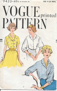
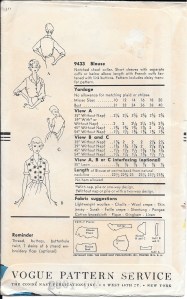
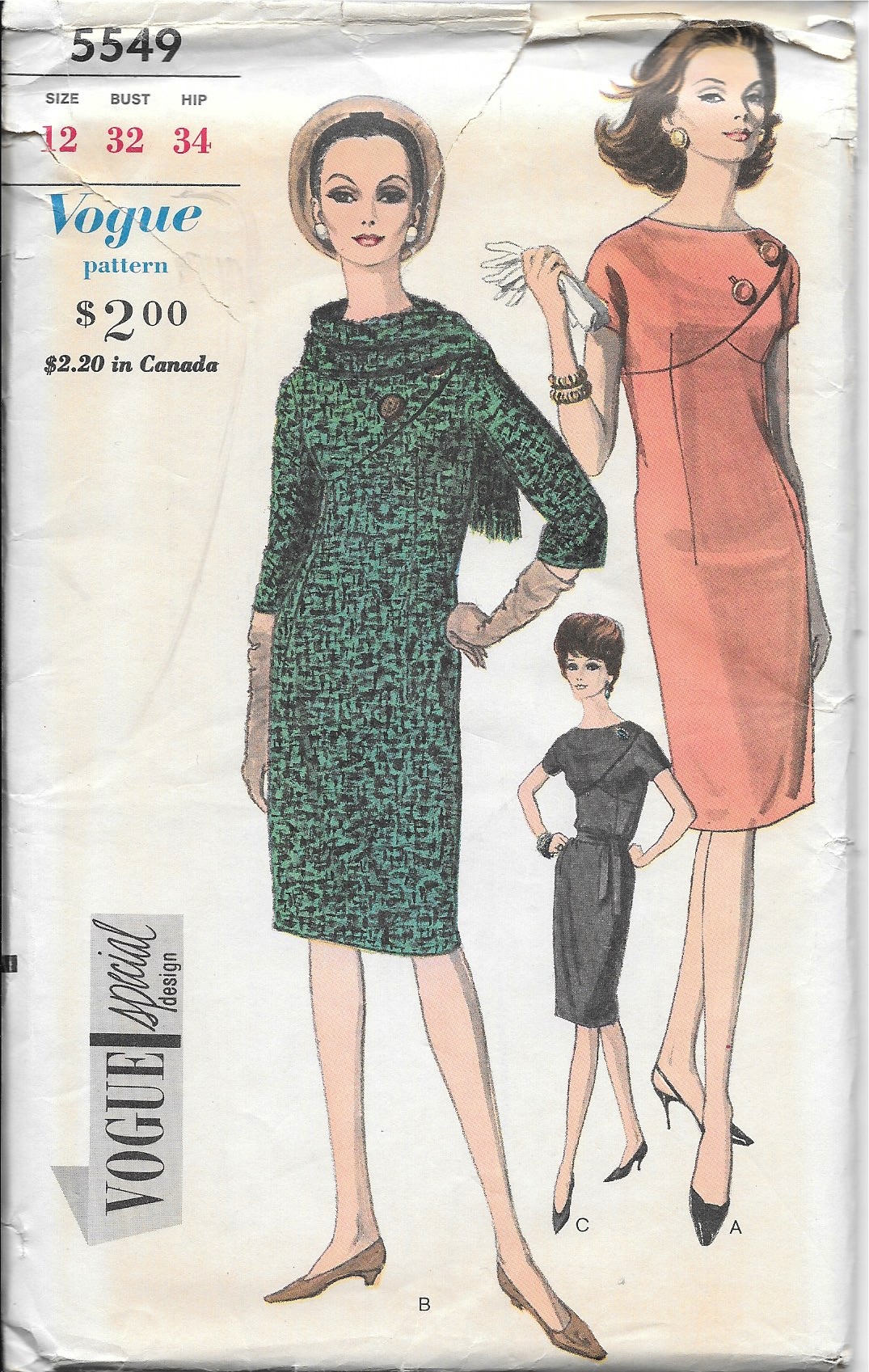
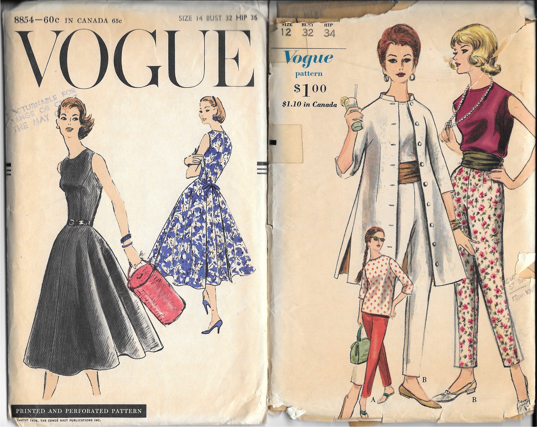
SO – I had to find another pattern.  I have, over the years, made several sheath dresses using a newer Butterick pattern, but I really wanted to use a vintage pattern for this wool.  Now, I have a lot of vintage patterns in my collection – and I went through every single one looking for the right sheath dress.  At first I didn’t realize this pattern had the look I wanted.  

I had originally purchased this pattern for that gorgeous shawl collared coat.  But – BINGO – when I took another look, there was the perfect sheath looking right at me.  

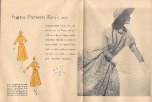
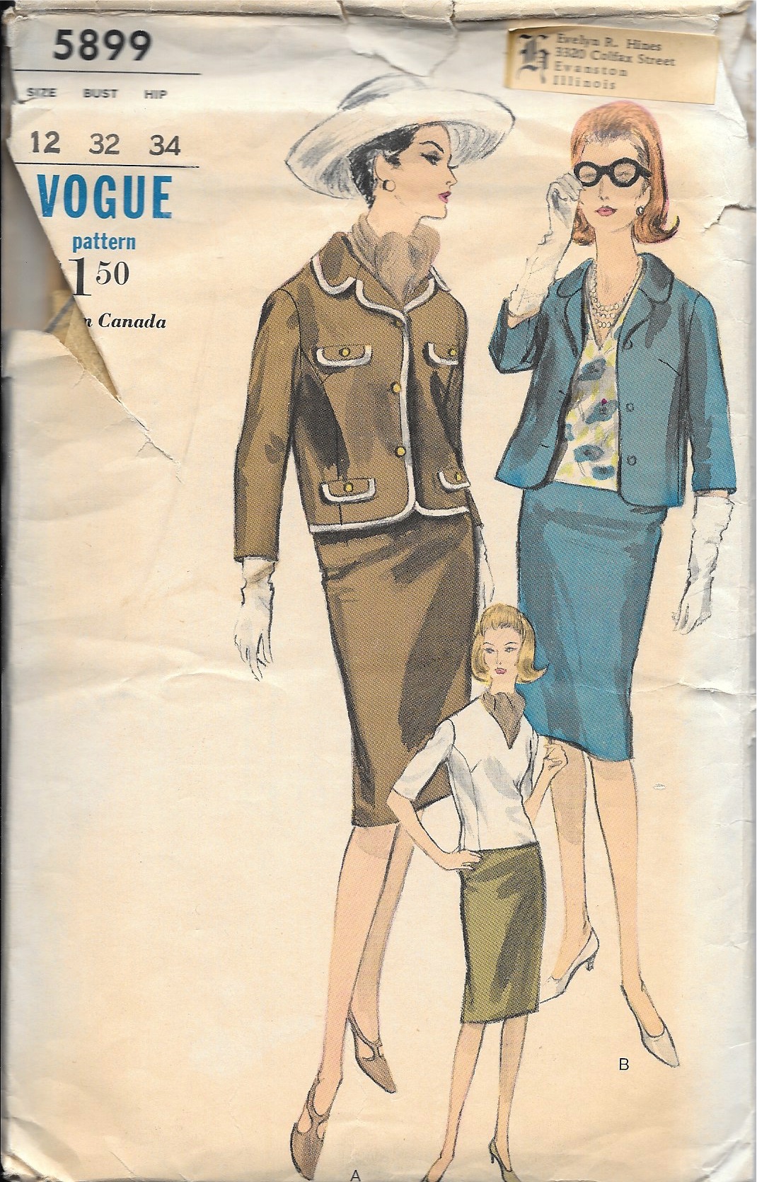
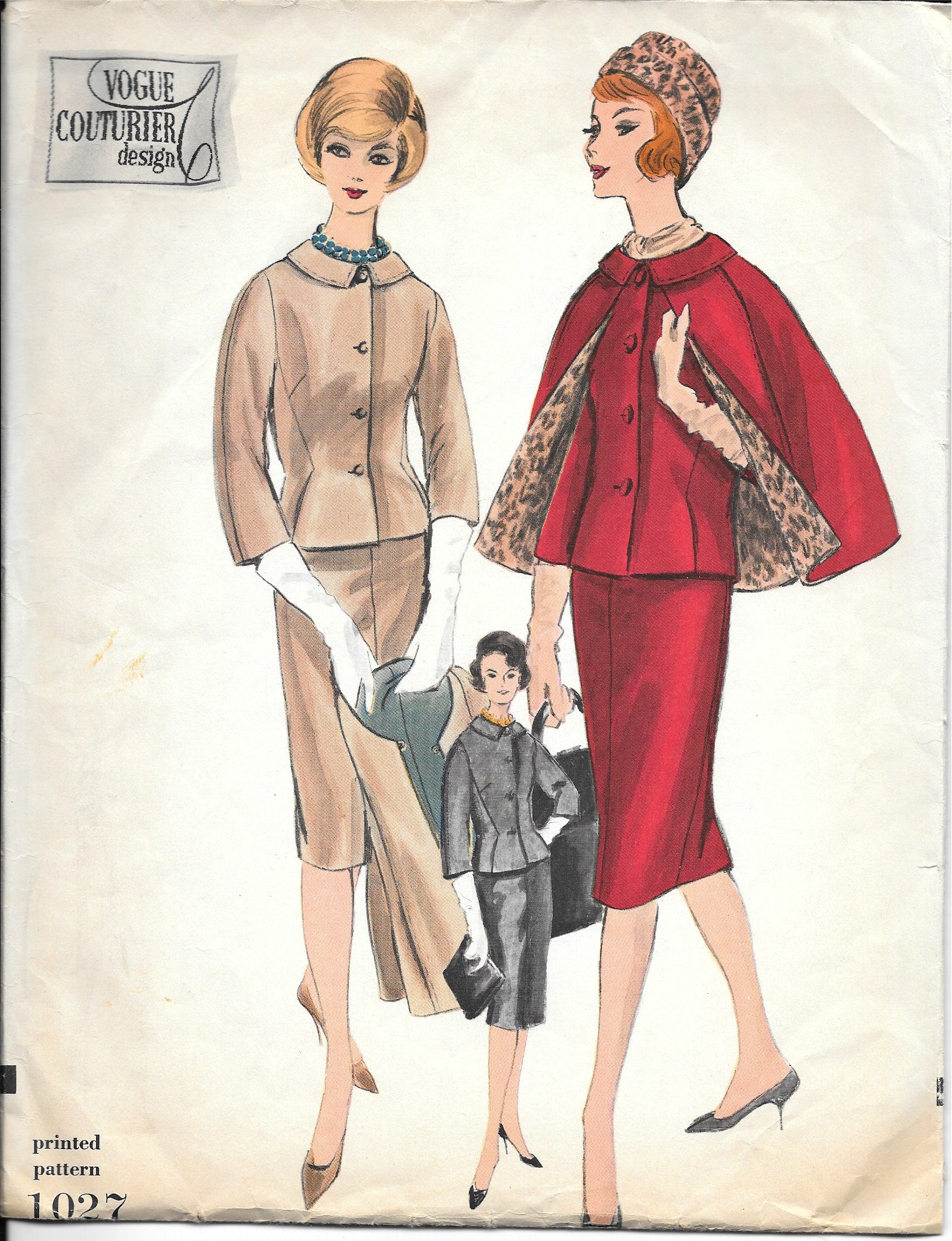
Although the pattern was not dated, I knew it was from the early 1960s.  But of course, I thought it would be wonderful to know the year it first appeared.  A lengthy search through old Vogue Pattern Magazines proved to be successful – not only successful, but timely.  This pattern was included in the December 1962/January 1963 issue, and was the featured pattern for a Special Capsule Catalog included in the issue.  Not only that, the caption read: “110 IDEAS TO START THE NEW YEAR IN VOGUE.”  Yes, I thought, that’s what I want to do!  

What a glamorous look!
And here is the entry for this pattern in the capsule catalog.

Of course, starting with a pattern I had not before used meant I had to make a muslin (toile)  and fit it.  That little effort took two days.  But then I got started in earnest, cutting out the silk organza underlining and positioning it right where it needed to be on the fabric.

You will notice that this fabric has a center front, woven to provide a mirror image of the plaid on each side. Really a brilliant way to handle an uneven plaid.

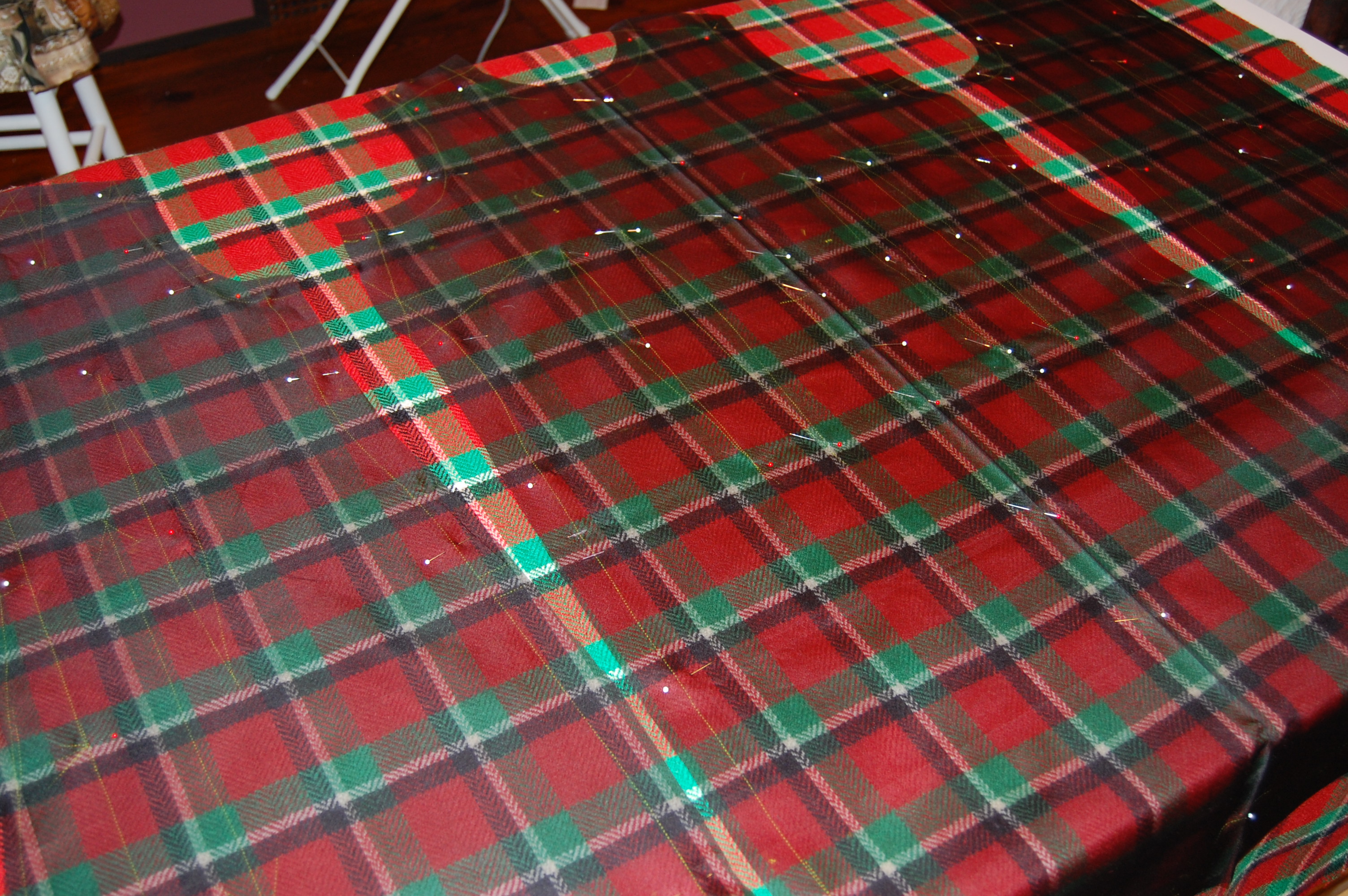
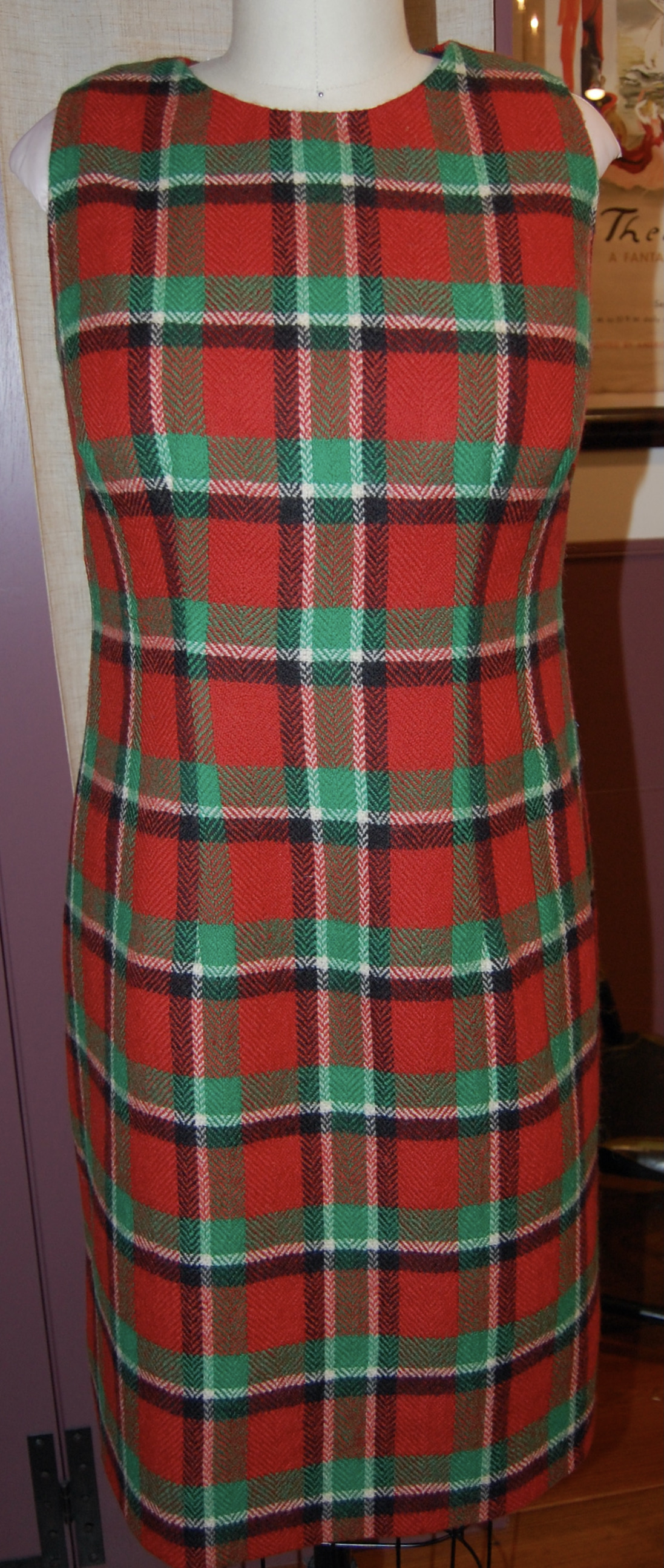
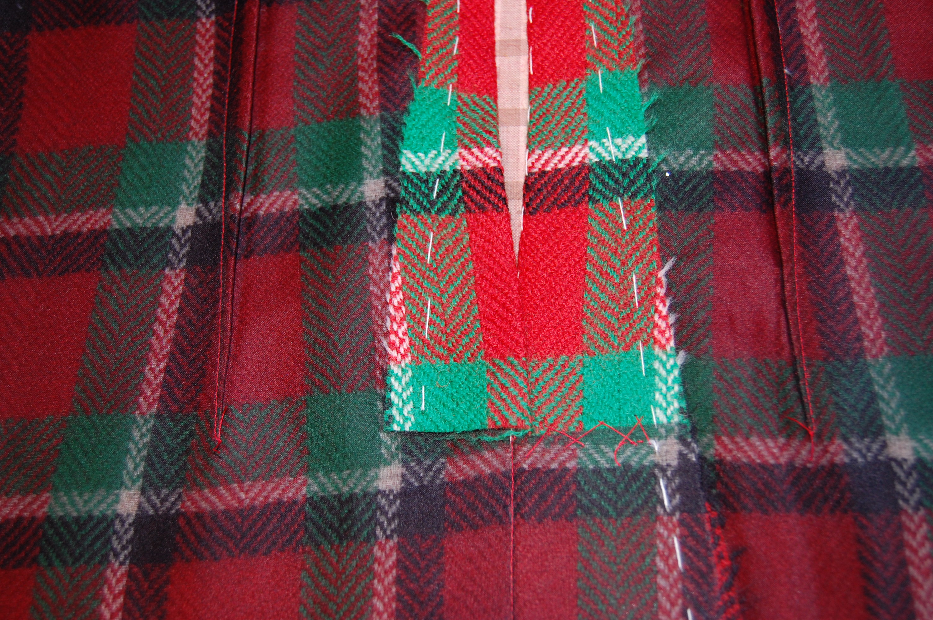
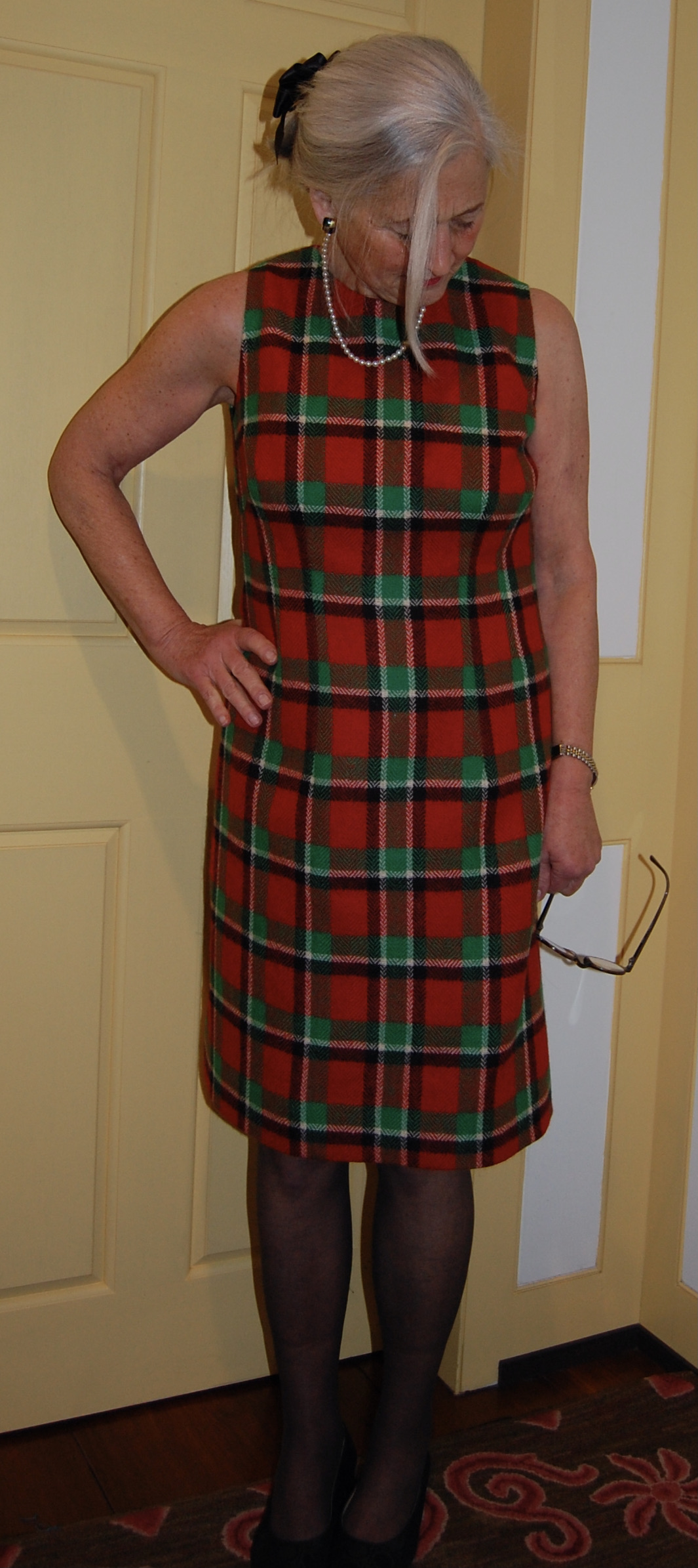
There were two important considerations for placing my silk organza underlining “templates” on the plaid:  1) the orientation of the plaid vertically and 2) the correct placement of the hemline on the grid of the plaid and making this placement work with the position of the waistline and neckline.  

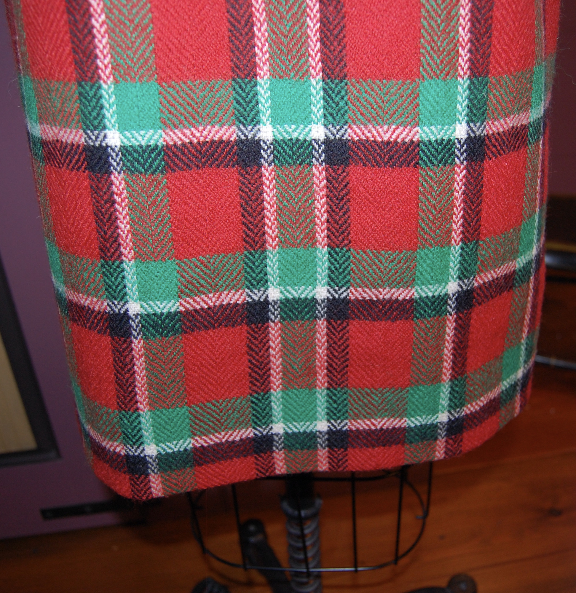
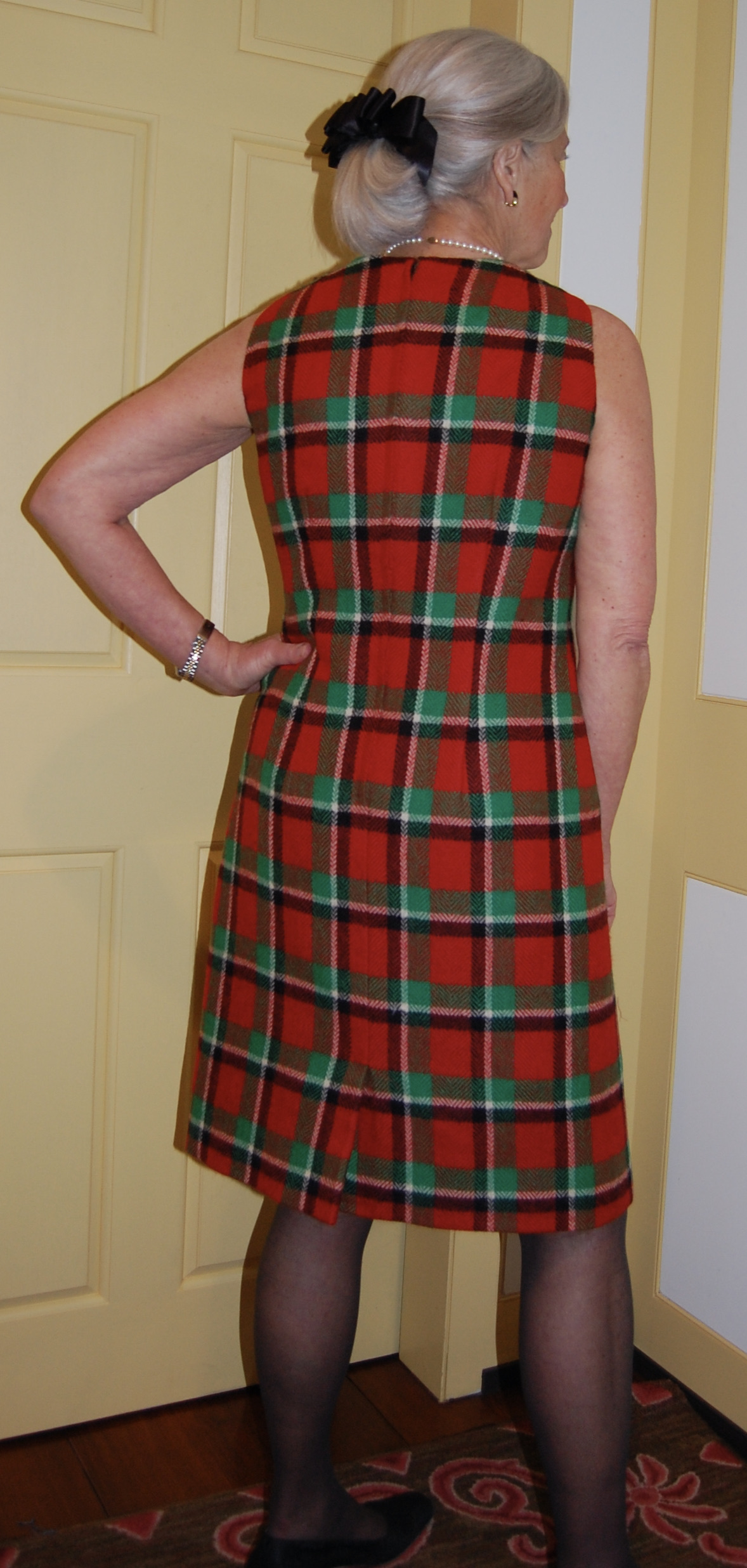
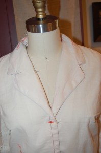
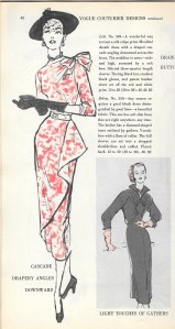
I thought the wider, darker part of each woven “block” on the plaid should be oriented to the bottom of the dress, which I believe is apparent above.  

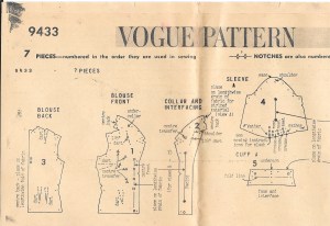
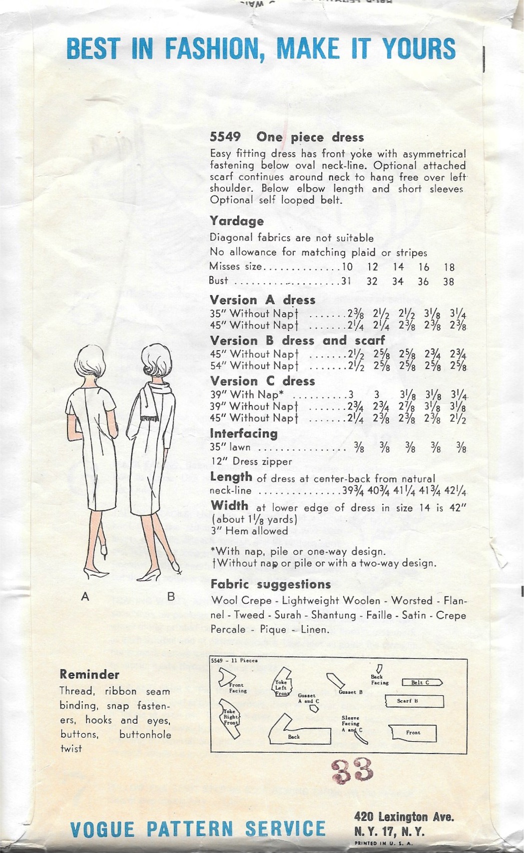
I find, when working with plaid, it is very important to have the hemline determined before you cut out your fabric.  Visually it is more appealing if the hem does not cut a block of the plaid directly in half or, especially with smaller plaids, end right at the edge of a block.  I think it looks better if there is a bit of a “float” around the bottom of the dress to anchor the bottommost blocks. (Larger plaids have their own considerations. Look at the art on the pattern envelope above to observe this.)

The red “band” at the hemline serves as this “float.”

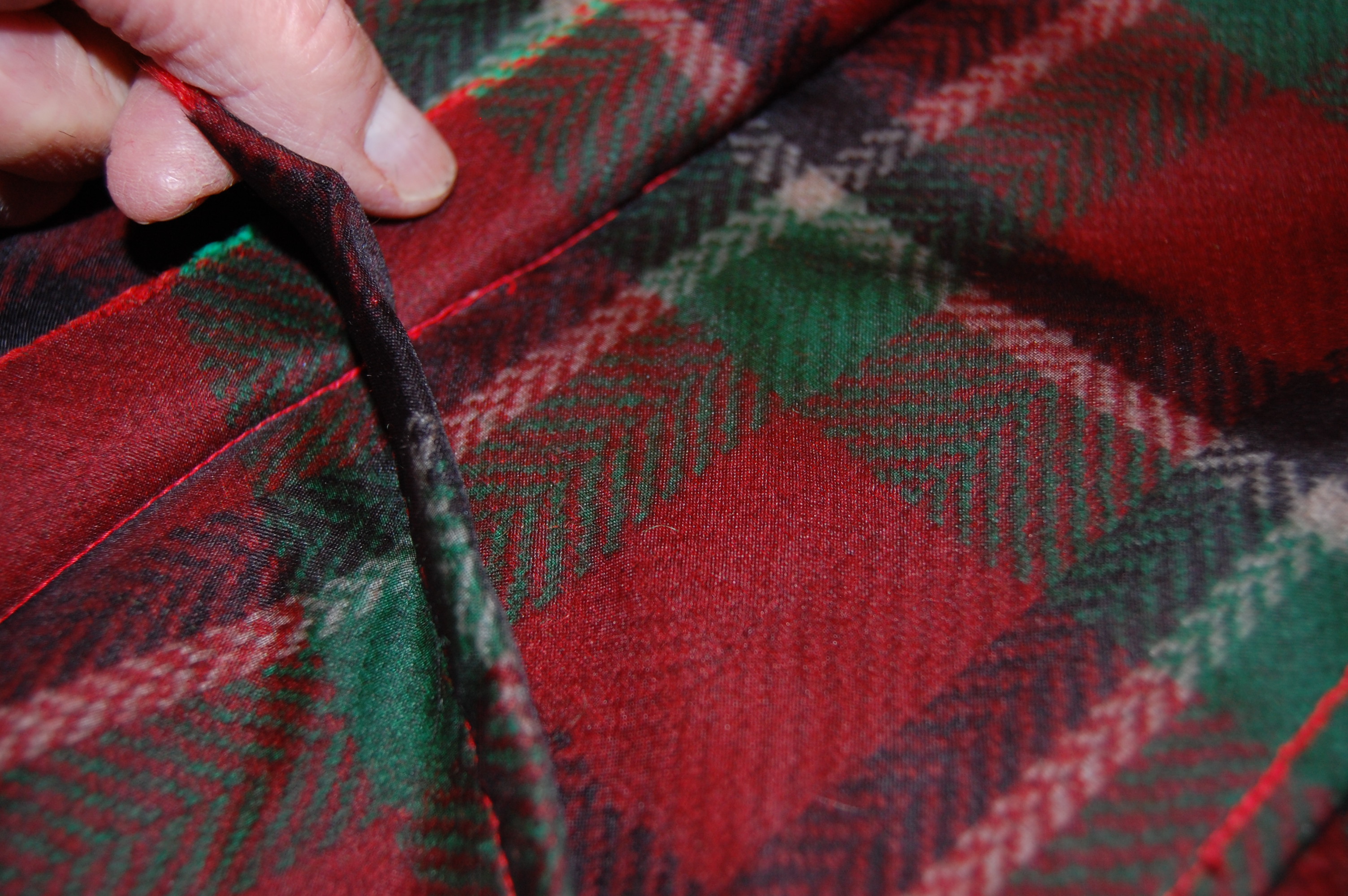
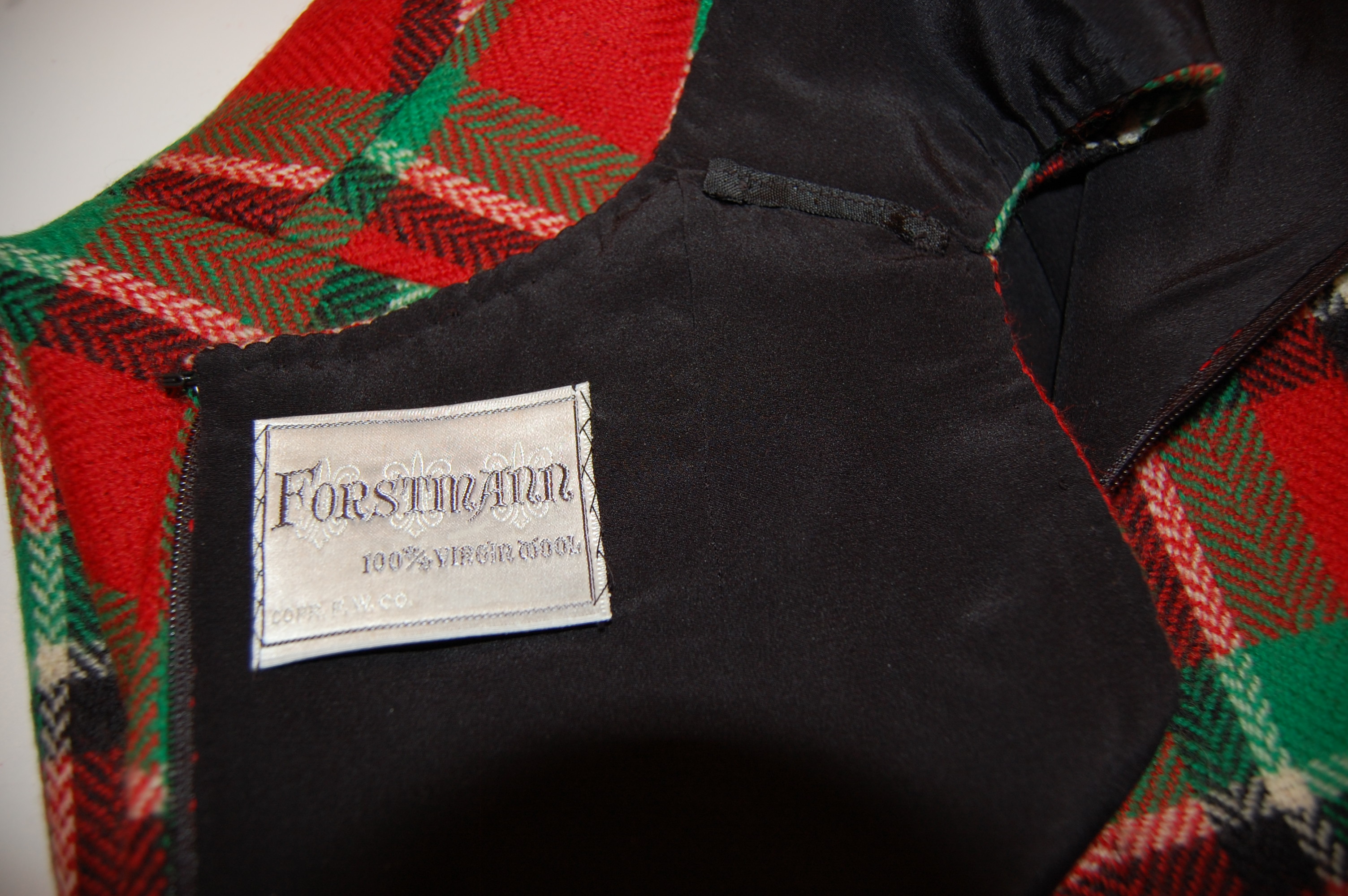
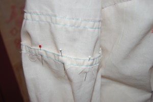
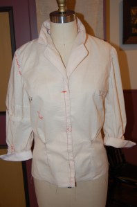
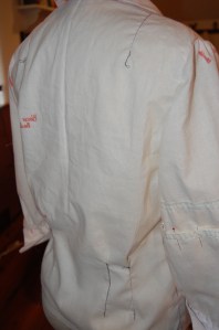
One of the design features of this dress is the kick pleat, which has its origin in the back seam starting at the bottom of the zipper.  I wasn’t sure how I was going to work the lining around this, but I also thought I could probably figure it out.

The instruction diagram shows the kick pleat quite well.
I angled the raw edges to finish the bottom edge of the seam.
Here is the finished kick pleat.

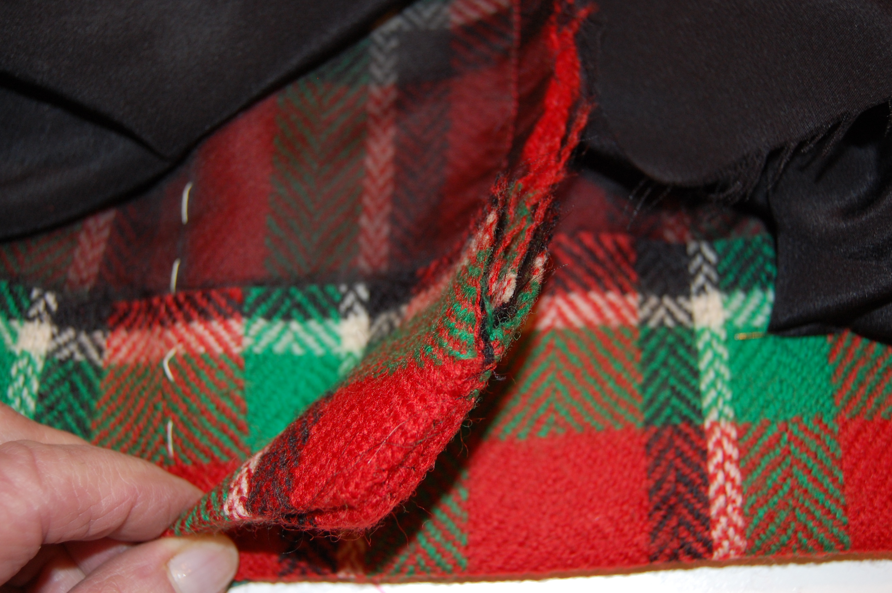
I loved that fact that this type of kick pleat made the perfect setting for a lapped zipper, shown below.  

The left side is pressed slightly to the middle to accommodate a lapped zipper.

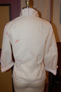
You will notice this dress has two shaping darts on either side of the front panel, in addition to the bust darts.  The back has one shoulder dart and one shaping dart on either side.  

All these darts make for such a lovely fit. In addition, I used a trick I have learned from Susan Khalje. Instead of sewing the bust dart into the side seam, I allowed it to float free, stitching the seam above and below the dart. I did this for both the fashion fabric and the lining. Using this method provides more ease to the bust.

This photo shows what I did with the side seam at the bust dart.

I did lower the neckline by about ½ inch, and I cut the shoulders in by about an inch on either side.  These changes just seemed to look better on me, as determined by my muslin (toile).  

I lined the dress in black silk crepe de chine. (I find almost all my lining silk at Emma One Sock.)  When it came to the kick pleat, I found that a slanted seam below the end of the zipper was necessary to divide the lining between the two sides of the kick pleat. 

Black is so difficult to photograph, but hopefully the angle is apparent.

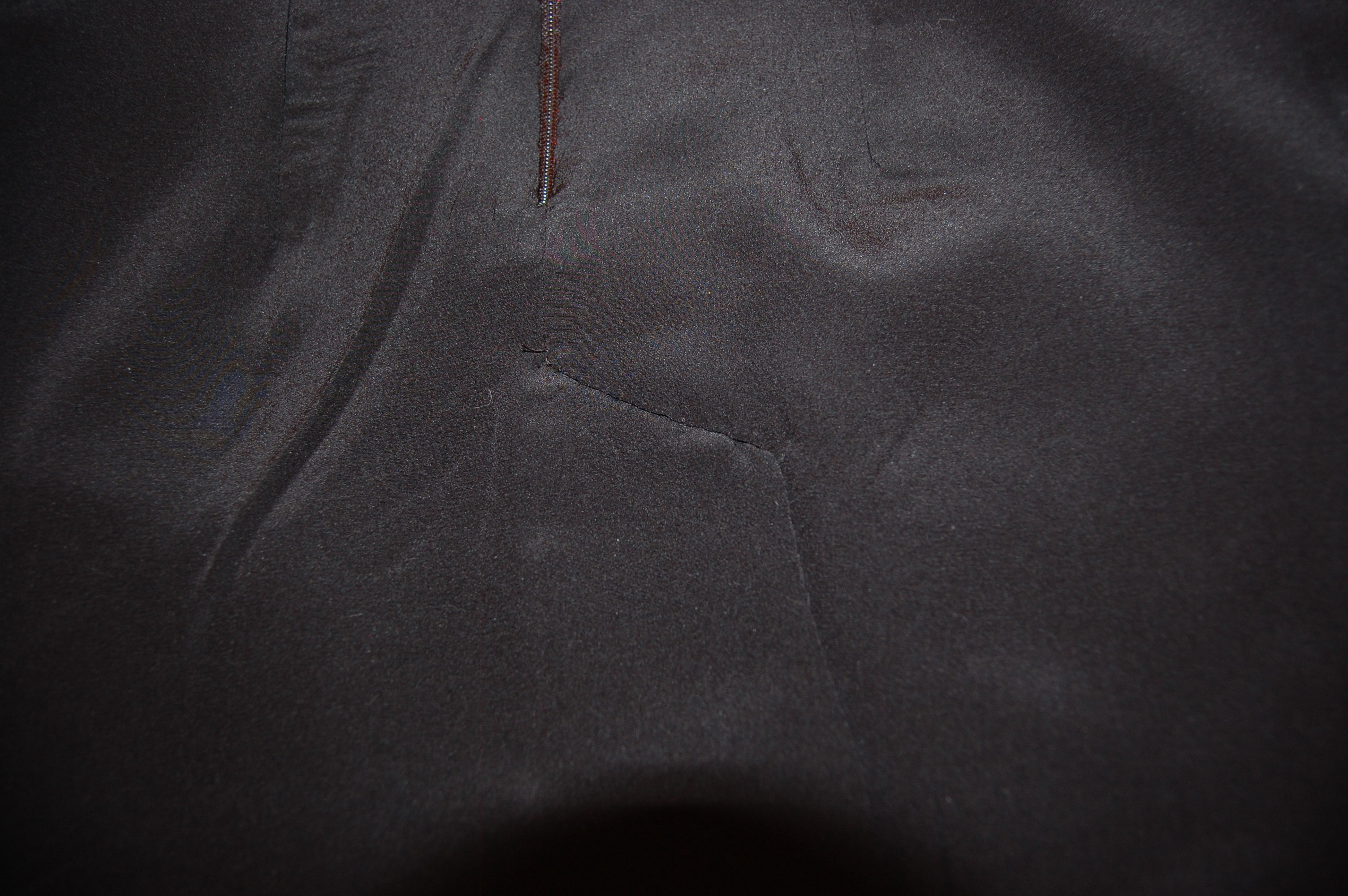
 I have no idea how to explain what I did to finish the lining in this area.  Just know that whatever I did – worked!  I ended up with no lumps and no restriction on the functionality of the pleat.  

How lovely to have a label for this vintage wool.

This dress was such a fun project.  I loved working with such a beautiful wool and such a beautiful pattern.  There will be more such sheath dresses in my future. 

I now would like to make a black jacket to wear with this dress; I do have a small amount of fabric remaining to use as trim in some way…

So now, how about you?  Have you started the new year in Vogue? I hope so!

52 Comments

Filed under couture construction, fabric labels, Hems, Linings, Mid-Century style, Pattern Art, Sheath dresses, Uncategorized, underlinings, Vintage fabric, vintage Vogue patterns from the 1960s, woolens

Prepping for the Next Project

Sewing is a little bit like house painting in that successful end results are often dependent upon good prep work. Well, I don’t know about you, but I’d much rather be making a muslin (toile), tedious as it sometimes is, than sanding, spackling, and cleaning walls or woodwork. And sometimes, a pattern reveals unknown charms as its toile comes to life.

Such has certainly been the case with my next project, a three-part ensemble, the first of which is a blouse, to be made out of lightweight and shimmery silk dupioni. This is to be a dressy blouse in which I want to emphasize the fabric and some amazing French buttons I found for it. Because I love a notched collar which can be raised up at the back of the neck and frame the neck and face in the front, I looked for a pattern which had that feature, but also some feminine sleeves. Among the possibilities in my pattern collection was this Vogue pattern from 1958.

Of course, View A is my version of choice.

After studying the pattern pieces, I determined it had just about everything I was looking for, even though the pattern art doesn’t make this look like a particularly fancy blouse.

The back of the pattern envelope often gives important information, such as placement of darts. This one also told me that the collar has a center back seam, which is a stylistic detail I like.

I was especially intrigued by the small diagonal darts you can see here on the “blouse front” and “collar and interfacing” diagrams. The instructions were to graduate the dart down from 1/8 of an inch at the center point to nothing at both ends. I discovered that little bit of shaping makes a huge difference in the way the collar turns, allowing it to emphasize the neckline.

Click on the image for enlargement.

I show the collar flat here, but I intend to wear it with the back of the neck standing up.

The sleeve pattern called for three tucks (also visible above on the pattern diagram) as well as gathering at the cuff, which I knew would add a gentle feminine silhouette, especially in dupioni. And the cuffs are French cuffs, but very petite ones, with a small angled turn-back, which is just such a lovely feature. The only thing I could not determine was if the sleeves were too short for my “vision.” Of course, that is what muslins/toiles are for, and indeed, the first sleeve was too short. I added a three-inch extension to the next sleeve, knowing I could always take it up. I finally settled on lengthening the pattern by 1.5 inches.

Here is the blouse with the original sleeve on the right (as you are looking at it, actually the left side of the blouse), and the sleeve with an extension of 1.5 inches opposite.

I believe the longer sleeve looks less like 1958 and more like 2017. I love using vintage patterns, but I don’t want to look vintage!

The toile also told me that the top button needed to be lowered, and I needed to add a bit of width around the hips. I originally thought I might not want to use the released darts at the waistline, but I love the effect they make.

It’s not often that I stand back and admire a muslin, with its loose threads, its uncut seam allowances and lumpy corners. I am usually anxious to tear it apart so I can quickly proceed to use its pieces for my working pattern. Of course, I will be doing that, but until then, I will marvel at all the design secrets it has revealed to me in its humble cloth.

19 Comments

Filed under Blouse patterns from the 1950's, Blouses, Pattern Art, Uncategorized, vintage Vogue patterns from the 1950s

“To the Most Imaginative Woman in the World”

“You see her leafing through pattern books – picking out a collar here, a cuff there, a new way of pleating a skirt . . . You see her fingering a tiny swatch of fabric, Yet she’s seeing it as a whole dress, or a blouse, or a jacket . . . Who is she – this lady with the limitless imagination? She’s the woman who sews. YOU . . .”

Most imaginative woman - Burlington-2

This is just one of many ads placed by manufacturers of fabric in the April-May 1950 Vogue Pattern Book Magazine. Ordinarily I would not have purchased this issue, as most Vogue patterns available before 1955 were not printed, and I rarely buy a vintage pattern which is not printed! My particular interest in these vintage magazines is the opportunity they provide to identify dates for patterns, fabrics and style trends, making the experience of sewing with vintage patterns (and fabrics) even more enjoyable.  However, when this issue was available in an Etsy store, I succumbed. I was born in May of 1950, and my curiosity just got the better of me.

I find the haughty expression on the cover model somewhat amusing.

An early haughty expression on a  model!

Looking at this issue made me realize how old I am… NO, NO, NO! Just kidding, I think. Actually, what really popped out at me was how exciting it must have been to be a home dressmaker at this point in time, with the home sewing business booming, post-war, and fine fashion – and the desire to look wonderful – such important aspects of a woman’s life.

And then, as I was leafing through the magazine, I found an unexpected surprise. Tucked in between two pages was Vogue Patterns April 15 Collection, an 8-page flyer, available at pattern counters and easily something that could be tossed away. I find it remarkable that this slim printed piece survived.

Most imaginative woman - flyer cover-5

The format is larger than what I am used to seeing in later Vogue pattern flyers from the 1960s and 1970s.  When one looks at the fashions and patterns detailed, it is easy to imagine the woman who picked this up, looking at it again and again.

This is one of the inside pages of the flyer.

This is one of the inside pages of the flyer.

Not only that, also tucked in with this flyer was this page from Harper’s Bazaar, March 1st, 1950.

Most imaginative woman - Harpers Bazaar

How many of you save pictures of dresses/blouses/coats you would like to copy? Pinterest, anyone? I certainly do!

Clearly she had in mind making the dress pictured on the back cover of the flyer:

"Consider them two by two - the pattern and the fabric, and you will always have a happy result." Timeless advice!

“Consider them two by two – the pattern and the fabric, and you will always have a happy result.” Timeless advice!

Some of my favorite pages in this, my “birthday” issue? I was delighted to find an ad for Moygashel linen, for which I have a particular passion:

Most imaginative woman - flyer cover-1

A lover of polka dots makes me partial to this gorgeous blouse:

Most imaginative woman - flyer cover-3

This blouse is very similar to one I made a few years ago.

And how can I resist this stunning “moulded sheath dress with a draped cascade”?

Most imaginative woman - cascade dress-4

I am so struck by the sophistication of the styling of the fashions and illustrations, the emphasis on Designer offerings, and the exciting abundance of piece goods being sold by manufacturer’s name to the home sewing population. Times and fashions change, but I believe we have much in common with these mid-century home dressmakers plotting their wardrobes with creativity and skill – pairing fabric and pattern. We are the women who sew – and are still the ones with the limitless imaginations!

21 Comments

Filed under Messages from past owners of vintage patterns, Mid-Century style, Moygashel linen, Pattern Art, Polka dots, The Conde Nast Publications, Uncategorized, vintage Vogue patterns from the 1950s

Oh, The Things We Can Learn!

When is a pattern envelope not just a place to keep a tissue pattern? When it is a mini lesson in sewing, style, history, elegance, and story-telling. Of course, I am thinking primarily of vintage pattern envelopes – and because I primarily sew from Vogue patterns, those are the focus of my thoughts.

I am also limiting my short exploration of these topics to the course of about ten years, from approximately 1956 until 1966. Most of the pattern art from this time period was in illustration form rather than photography. There were exceptions, such as this classic polka-dotted dress and coat ensemble from 1959:

The reverse of this envelope has very precise sketches of the fronts and backs of the dress and coat. This is one of the few envelopes from this period - 1958 - that I have seen that features photography rather than illustration art.

The reverse of this envelope has very precise sketches of the fronts and backs of the dress and coat. This is one of the few envelopes from this period – 1958 – that I have seen that features photography rather than illustration art.

It was up to the fashion illustrators and artists to represent the pattern accurately. Darts, seams, buttons, belts, pockets, etc. all had to be clearly indicated in the illustrations on the fronts of the envelopes and in the thumbnail sketches on the back of the envelopes. Home dressmakers wanted to know these things about a pattern before purchasing it – we still do! Here is a great example of the clarity of these pattern illustrations in regard to these items:

The darts, seams, and buttons are clearly delineated in this artwork.

The darts, seams, and buttons are clearly delineated in this artwork.

The back of this pattern also gives lots of additional sewing information. The thumbnail sketches clearly show that there is no back zipper. Among the details listed is a 12” zipper. That can only mean that a side zipper is used – which makes sense as it is paired with the front-buttoned bodice.

Oh the things we can learn, no 2

Further scrutiny of the pattern layout shows a gusset, obviously for use under the arm. If you, as a dressmaker, were uncomfortable with putting in a gusset, then maybe you would want to avoid this particular pattern!

It is such an advantage to be able to see the shapes of the pattern pieces in these layouts.

It is such an advantage to be able to see the shapes of the pattern pieces in these layouts.

It was also up to the fashion illustrator to make the pattern look relevant to one’s life. Different views were often shown in varying colors, widening the visual appeal. They were also shown in dressier or more casual renditions, making the pattern attractive to different lifestyles and age groups. These two patterns clearly show this endeavor:

Oh the things we can learn, no 4

The inclusion of accessories in the pattern illustration from this time period shows just how much Vogue and other pattern companies were selling a complete look. They were saying “Start with this pattern, add gloves, a bangle bracelet or two, sunglasses or a hat, maybe a scarf, earrings, high heels, and a handbag, and you, too, can walk out looking like a million dollars!” The great desire in looking well-dressed and chic during this time period is so beautifully reflected in these pattern envelopes.

Gloves, gloves and more gloves! And look at those glasses!

Gloves, gloves and hats and scarves…   And look at those glasses!

This has got to be one of my favorite examples of pattern art: the model in white holding the scarf so casually, the stylish shoes, and the large clutch handbag on the model on the left - lovely and evocative!

This has got to be one of my favorite examples of pattern art: the model in white holding the scarf so casually, the stylish shoes, and the large clutch handbag on the model on the left – lovely and evocative!

One way of dating pattern envelopes is by looking at the hairstyles of the illustrated “models.” After about 1960, Vogue stopped including the copyright date on their envelopes. But it’s fairly clear by the bouffant and flipped hairstyles on the pattern on the left that we are looking at one from the early to mid-‘60s.  The one on the right is a few years later, based on the hairstyles alone.

Note, too, how the Vogue masthead changed during this short time period.

Note, too, how the Vogue masthead changed during this short time period.

Finally, I am delightfully intrigued by the almost universal depiction of “elegance” on the pattern envelopes from this period. From the leopard print hat and lined cape on this suit from 1959:

Oh the things we can learn, no 8

to this reversible car coat from the early ‘60s:

The model in the red version of the coat strikes a chic and elegant pose with her hair tucked under a scarf, her arms casually folded, and with her stylish handbag...

The model in the red version of the coat strikes a chic and elegant pose with her hair tucked under a scarf, her arms casually folded, her stylish handbag looped over one arm …

to this cocktail dress and coat ensemble from the mid ‘60s:

Oh the things we can learn, no 10

the message seemed to be: “These beautiful clothes which you can create are ladylike and elegant (even the casual ones), and you will be, too, when you wear them!” Perhaps Virginia Woolf said it best: “There is much to support the view that it is clothes that wear us and not we them; we may make them take the mould of arm or breast, but they would mould our hearts, our brains, our tongues to their liking.”

And therein lies the intrigue of it all. The story, which begins on the outside of the pattern envelope by way of the artist’s hand, becomes our own to finish when we are creators of our own clothing. How much fun is that?

26 Comments

Filed under Mid-Century style, Pattern Art, The Conde Nast Publications, Uncategorized, vintage Vogue patterns from the 1950s, vintage Vogue patterns from the 1960s