Monthly Archives: March 2014

A Preoccupation with Emilio Pucci

In the world of designer fashion, there are certain names which are synonymous with specific looks.  Obvious examples are Coco Chanel with her little black dress and classic cardigan jacket, Christian Dior with his figure-enhancing full skirts and feminine décolleté necklines, and Emilio Pucci with his distinctive colorful prints,  smart sportswear and flowing at-home-wear.

Lately I’ve been thinking about Emilio Pucci (1914-1992) a lot.   It all started a couple of years ago on one of my West Coast visits to Britex Fabrics in San Francisco. I had already decided upon several lengths of fabric, when I saw a silk charmeuse, which clearly spoke to me of Pucci.  The design was so amazing, the colors so vibrant, and the silk so luscious, that, with a little encouragement from my husband, I added it to my pile.  At 60” wide, I thought 2 yards would suffice for a blouse, not really knowing what I would make.

Pucci

DSC_1183

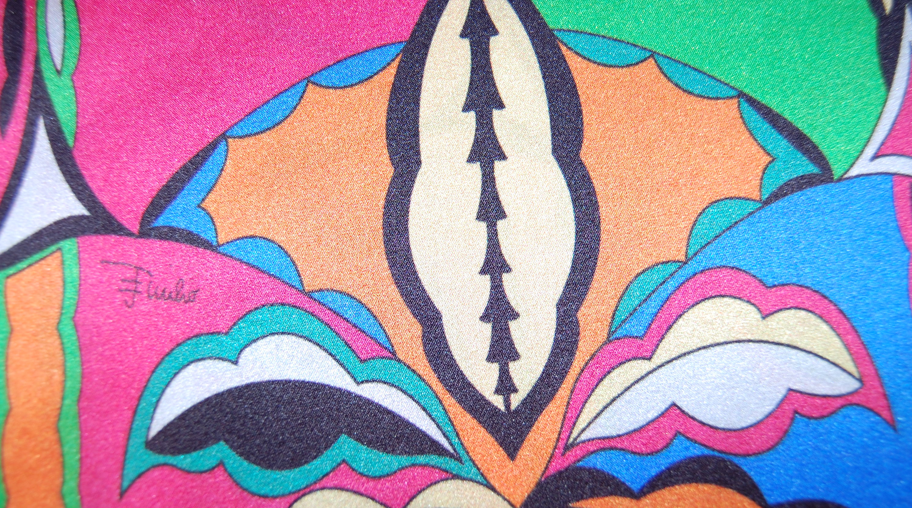
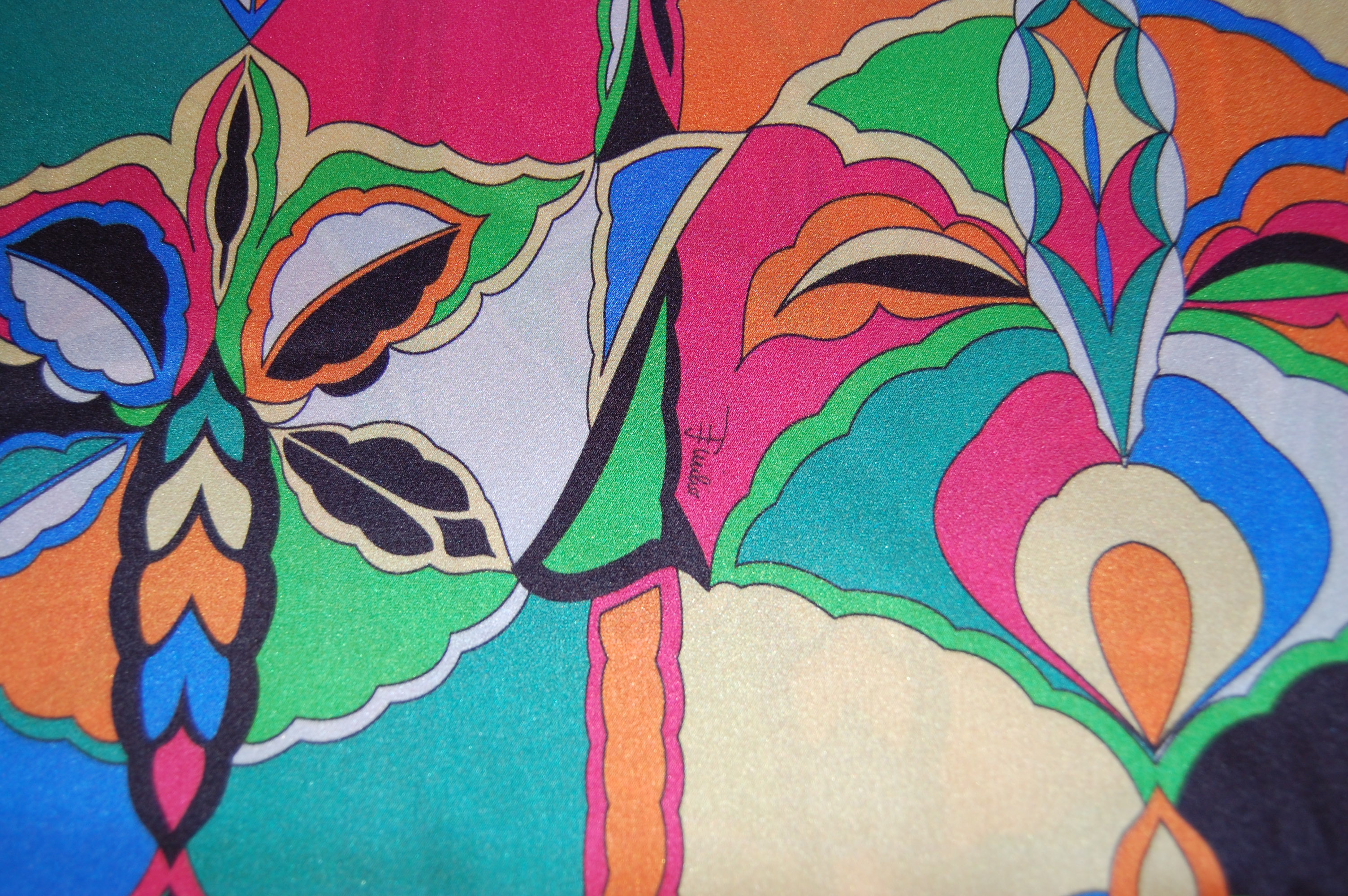
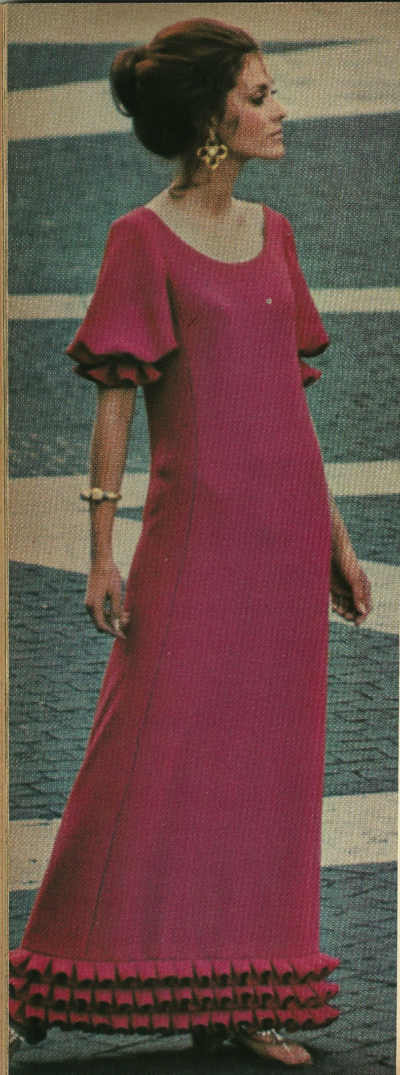
The silk I purchased seemed to have all the bells and whistles of a classic Pucci print.  (Pucci’s daughter, Laudomia took over the business after her father’s death, and has continued her father’s signature style.)  He only used the finest, luscious fabrics with a color palette “straight from the Aegean horizon” according to the entry on him in The St. James Fashion Encyclopedia  ( Visible Ink Press, Detroit, MI, 1997, pages 325-326):  “turquoise and ultramarine set against sea green and lime, or hot fuchsia and sunflower yellow”.  These colors are arranged in “optical fantasies of geometric shapes” which eschew repetitiveness. And, finally, every authentic Pucci fabric carries his discreet “Emilio” signature.  (The Vintage Traveler blog has an excellent post on Pucci and his sporty prints, which shows another example of his signature and his diverse designs.)

The small "Emilio" signature is at the lower part of the pink section.

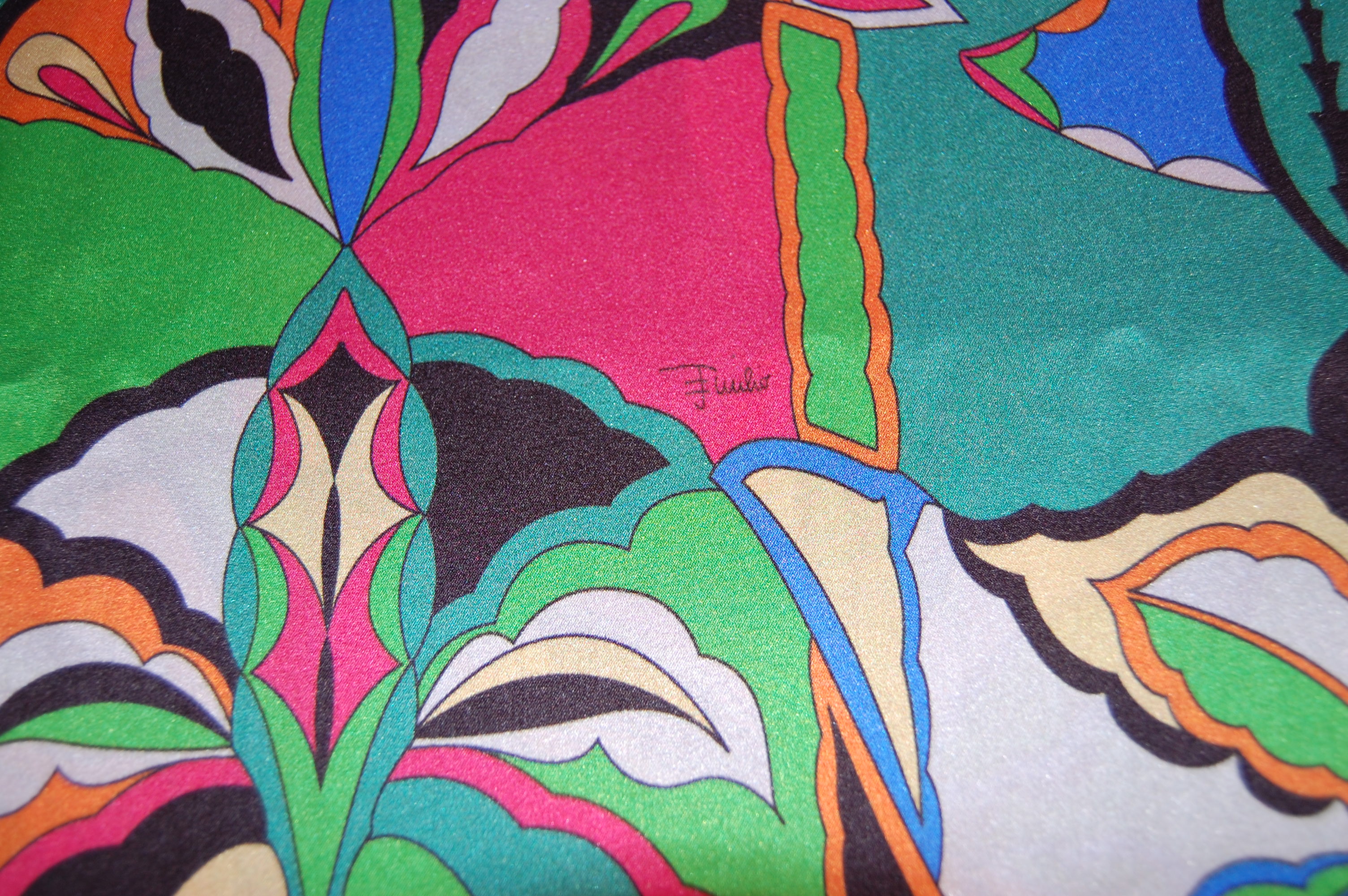
The small “Emilio” signature is at the lower part of the pink section.

The signature is spread thinly across the expanse of the fabric.

The signature is spread thinly across the expanse of the fabric.

And here is a signature printed vertically rather than horizontally.

And here is a signature printed vertically rather than horizontally.

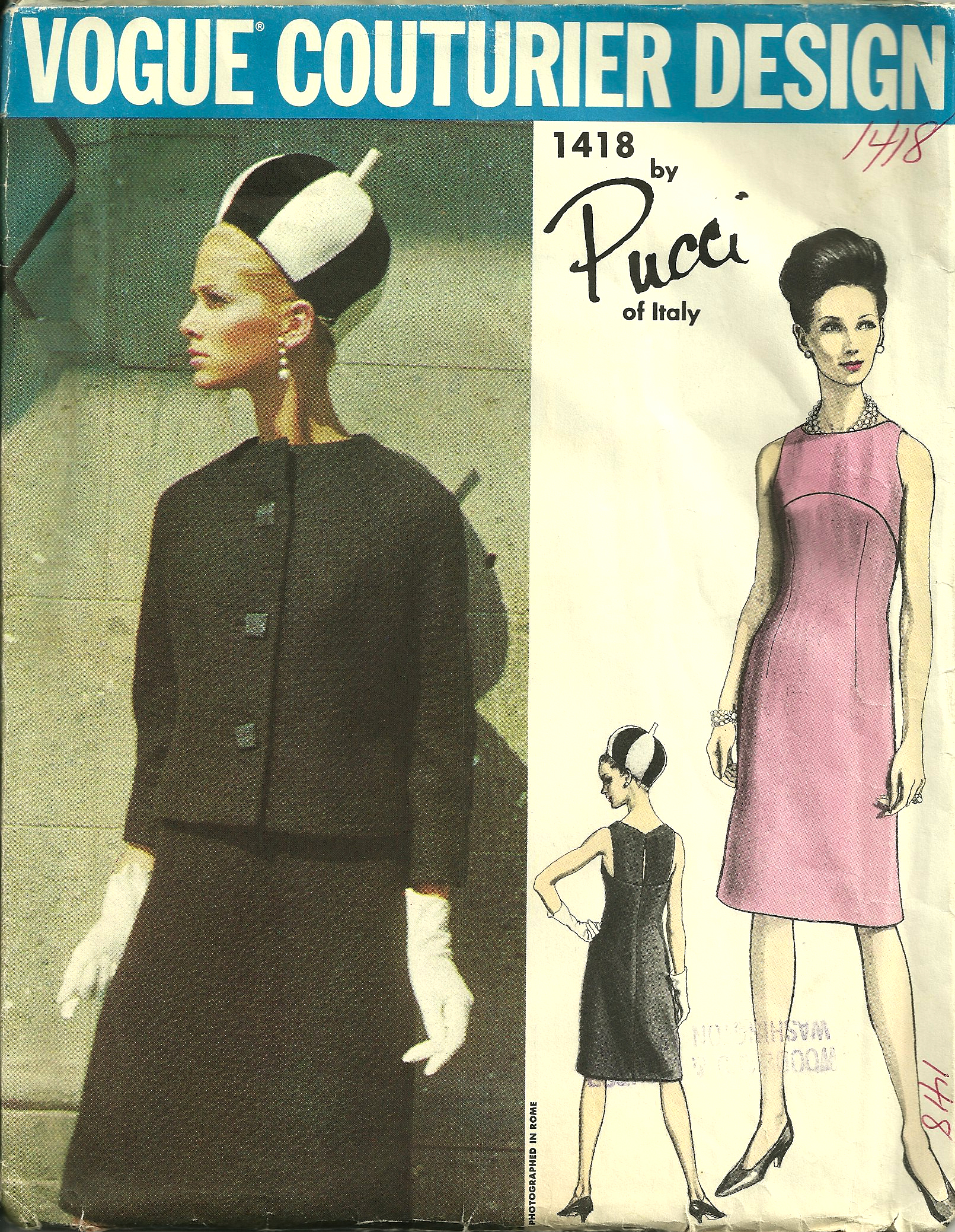
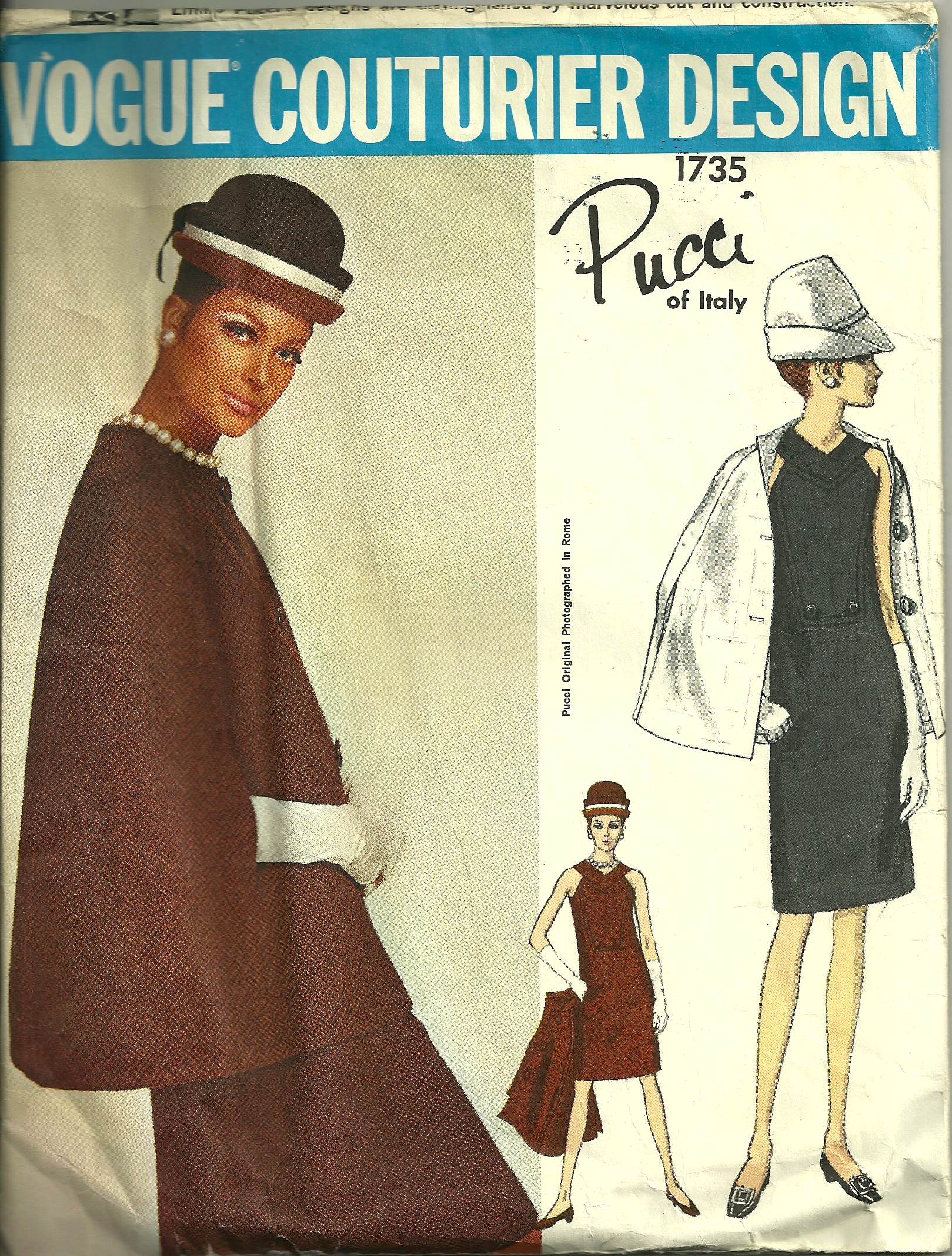
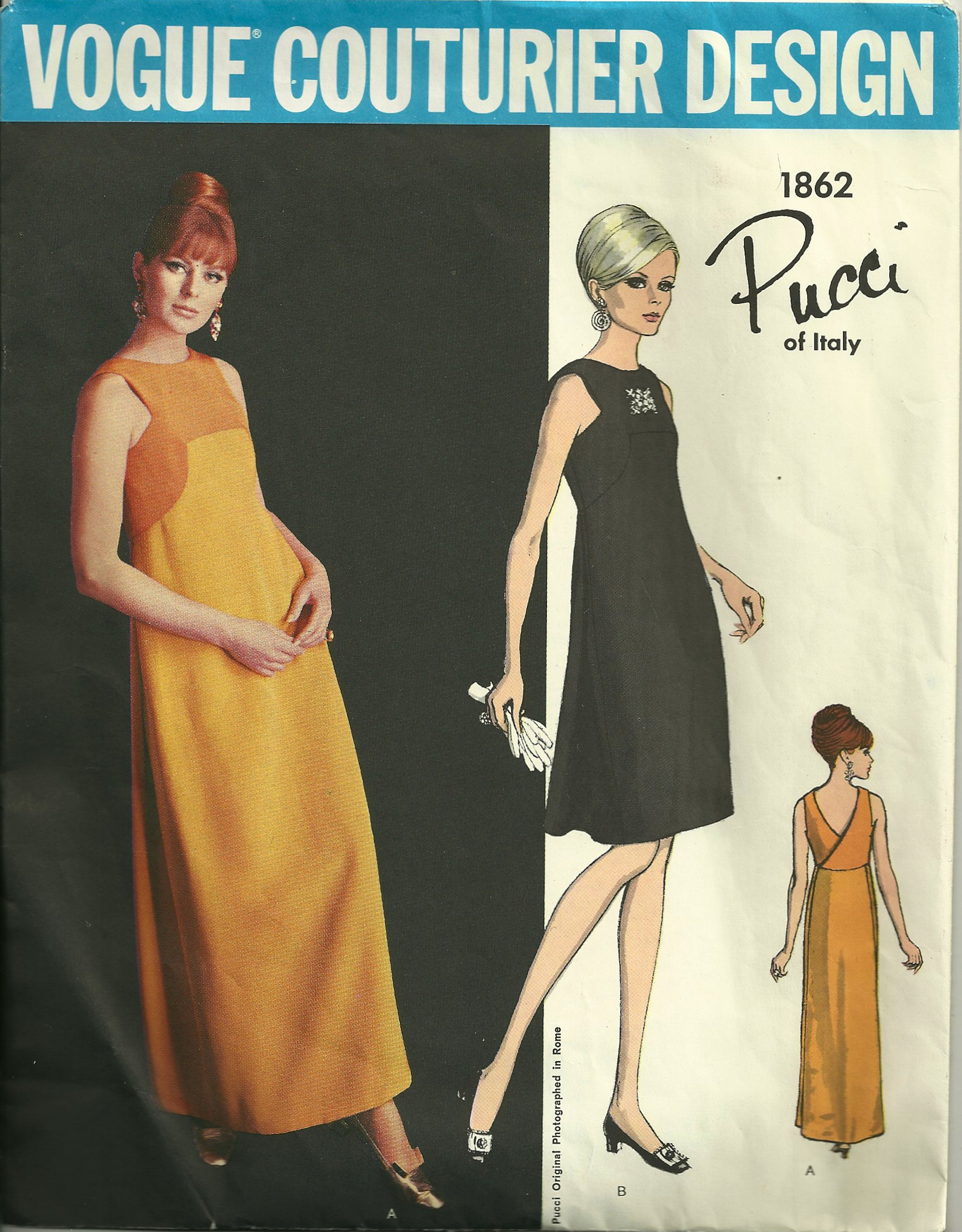
Shortly after this fabric purchase, I began to get a greater and new appreciation for Pucci’s diversity as a fashion designer as I acquired a few of his Vogue Designer patterns.  Instead of featuring styles dependent upon his bright and unusual fabric designs, they showed feminine dresses and jackets, with clean lines and a surprising touch of demureness.   Here are the three patterns I purchased:

Happy New Sewing Year - Pucci pattern

Pucci - pattern envelope

Wrap dress - 5 (Pucci)

Some other of his designs for Vogue patterns were featured in Vogue Pattern Book Magazine:

The caption in this June/July 1972 article says:  "Emilio Pucci adds glamour to your life with an off-white silk crepe pantsuit..." while the lower picture shows his "signature colors on a silk jersey  lounge gown."

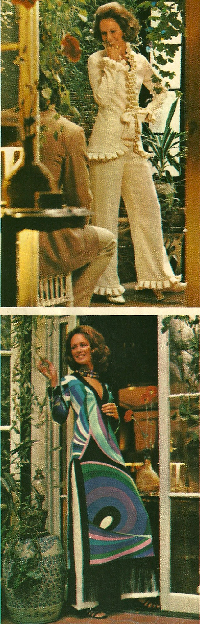
The caption in this June/July 1972 article says: “Emilio Pucci adds glamour to your life with an off-white silk crepe pantsuit…” while the lower picture shows his “signature colors on a silk jersey lounge gown.”

This lovely Pucci gown was shown in the April/May 1970 issue of VPB Magazine.

This lovely Pucci gown was shown in the April/May 1970 issue of VPB Magazine.

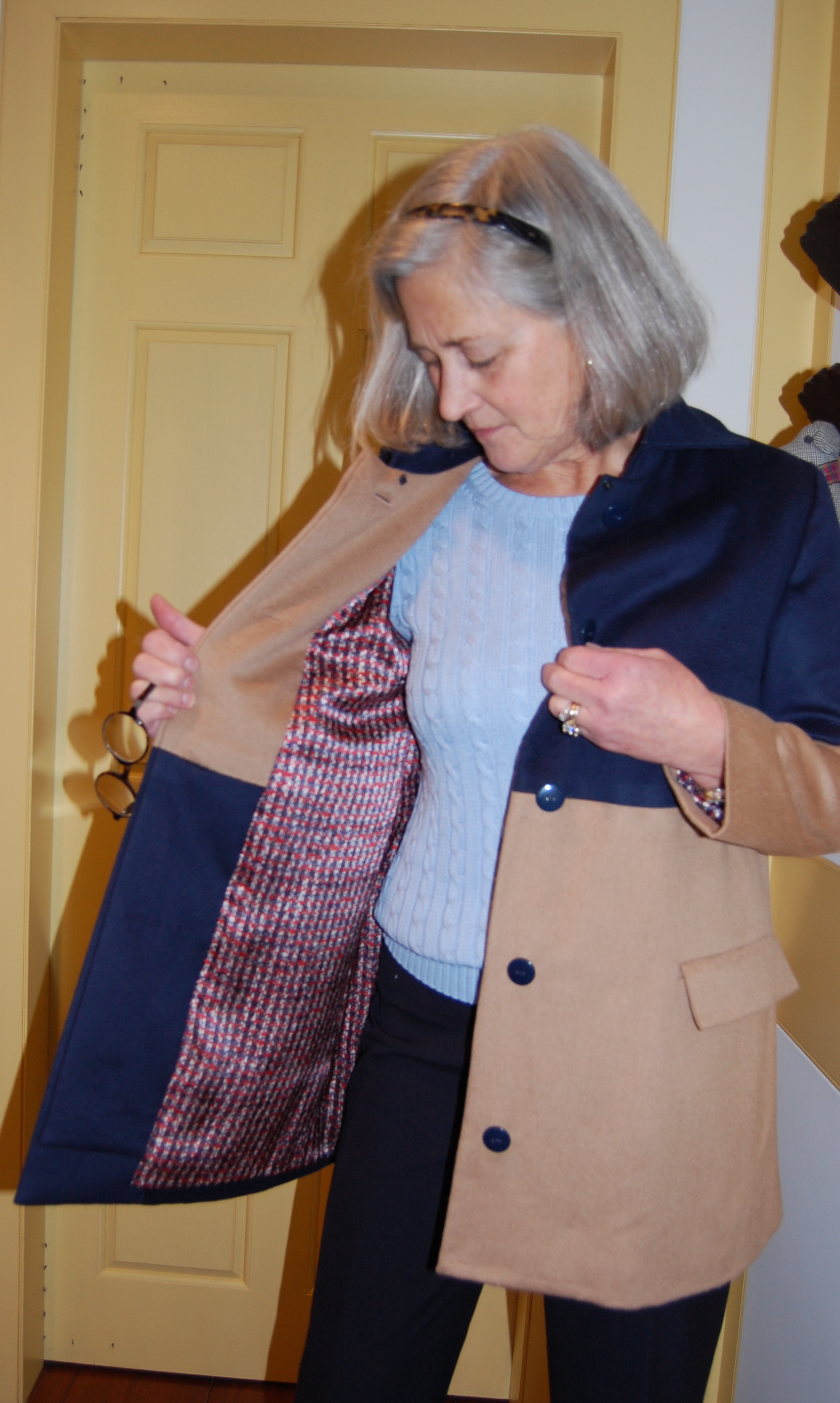
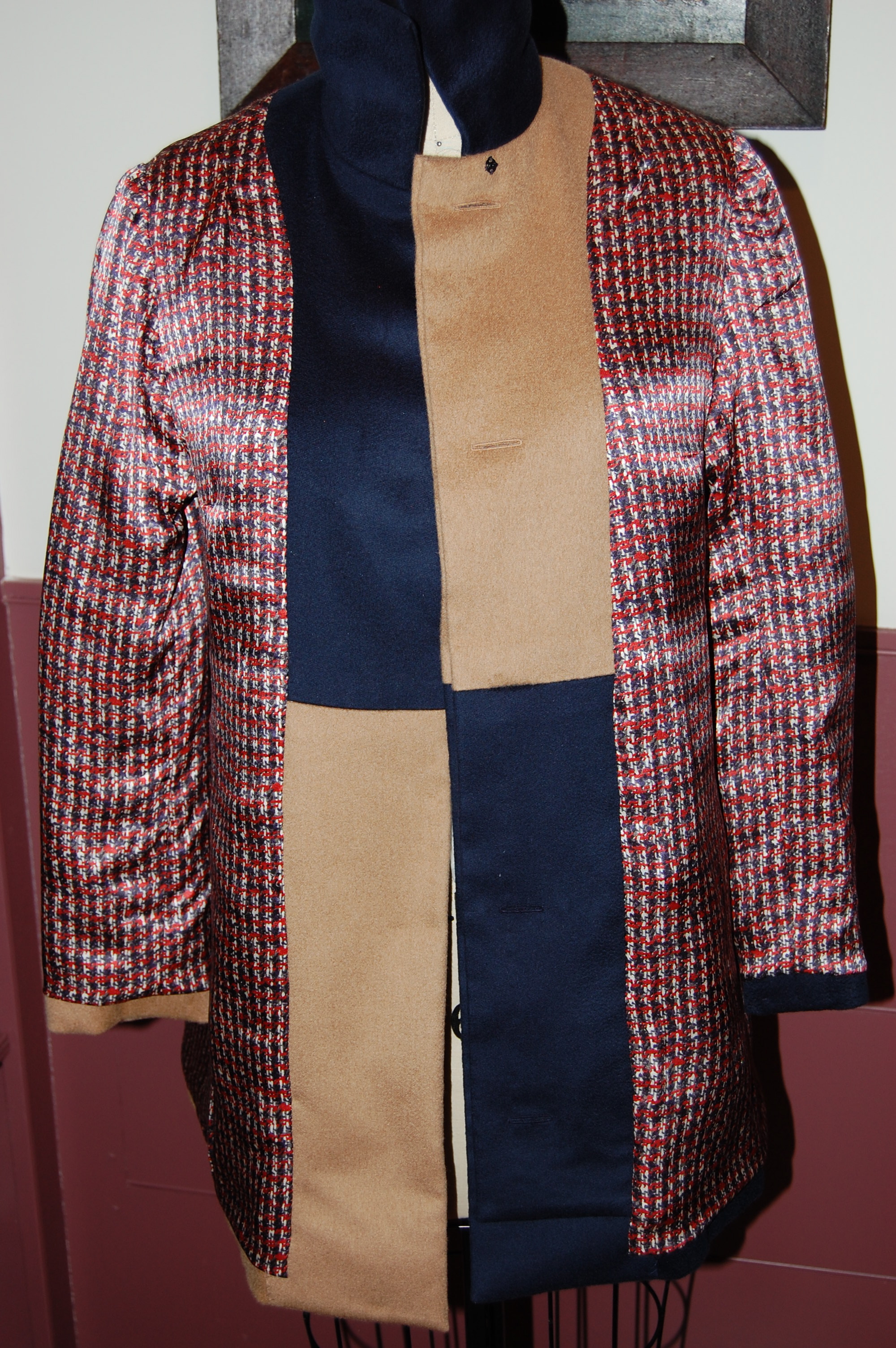
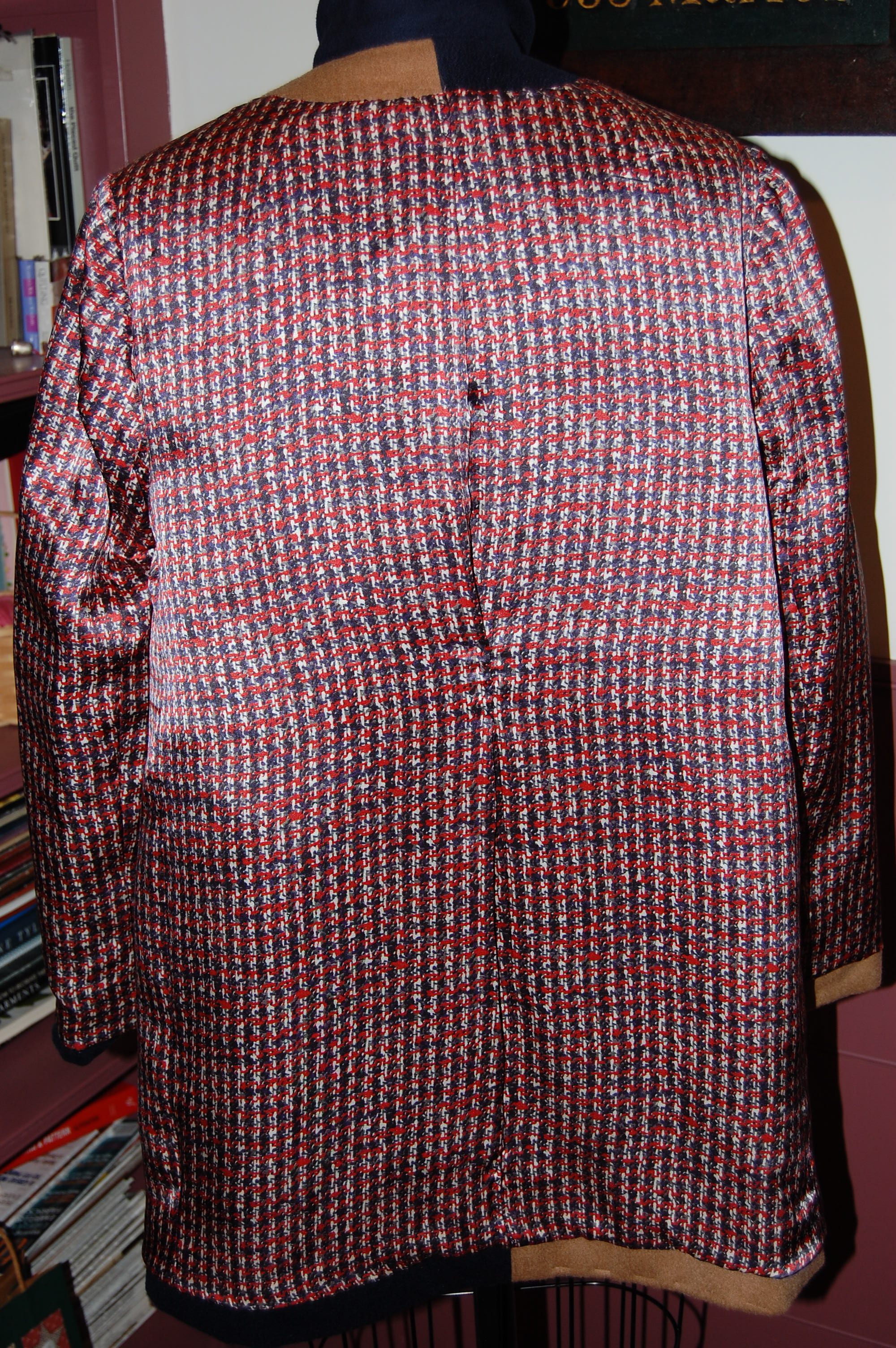
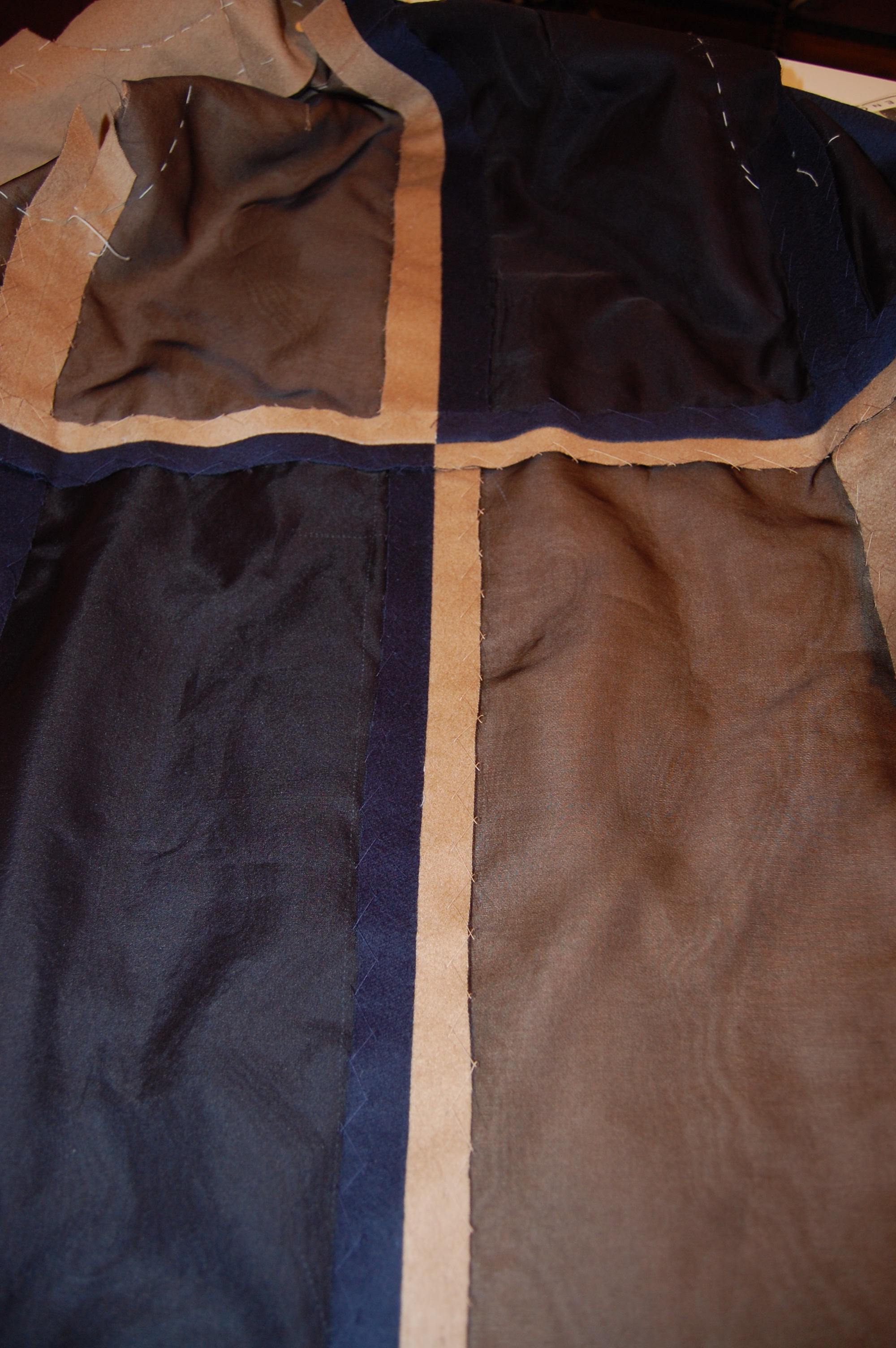
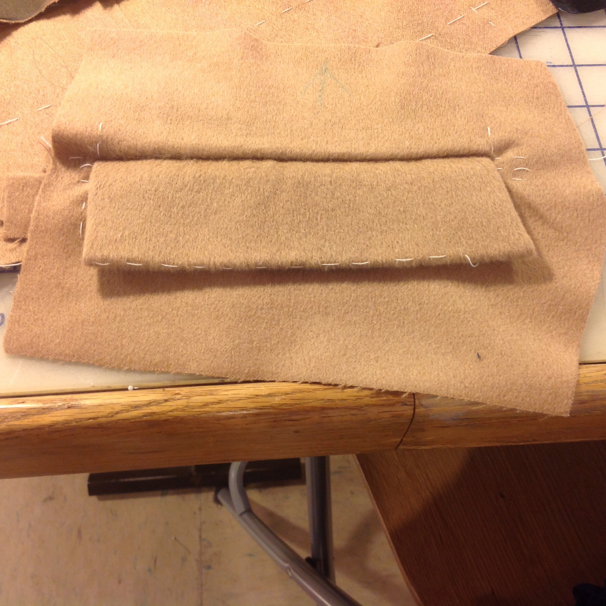
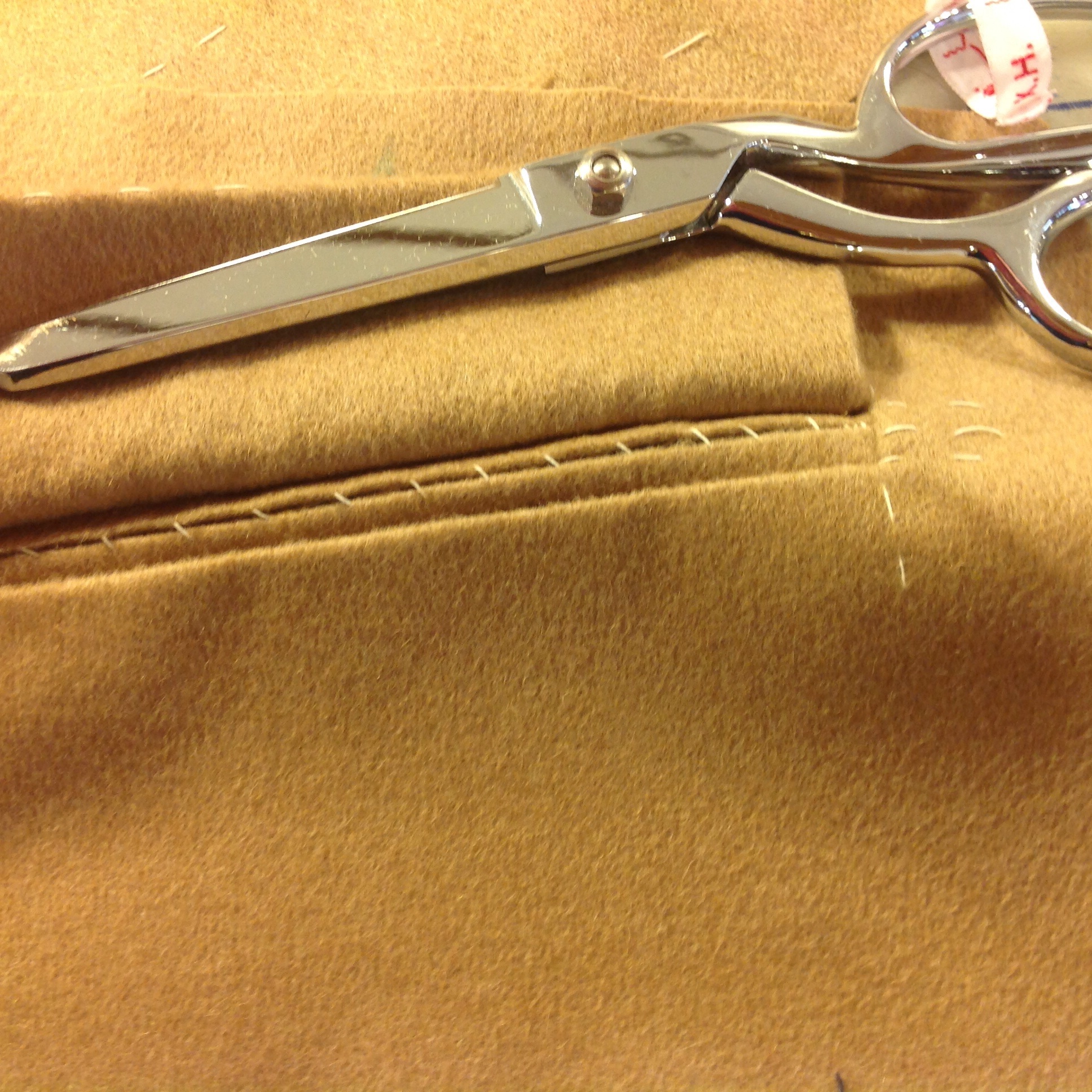
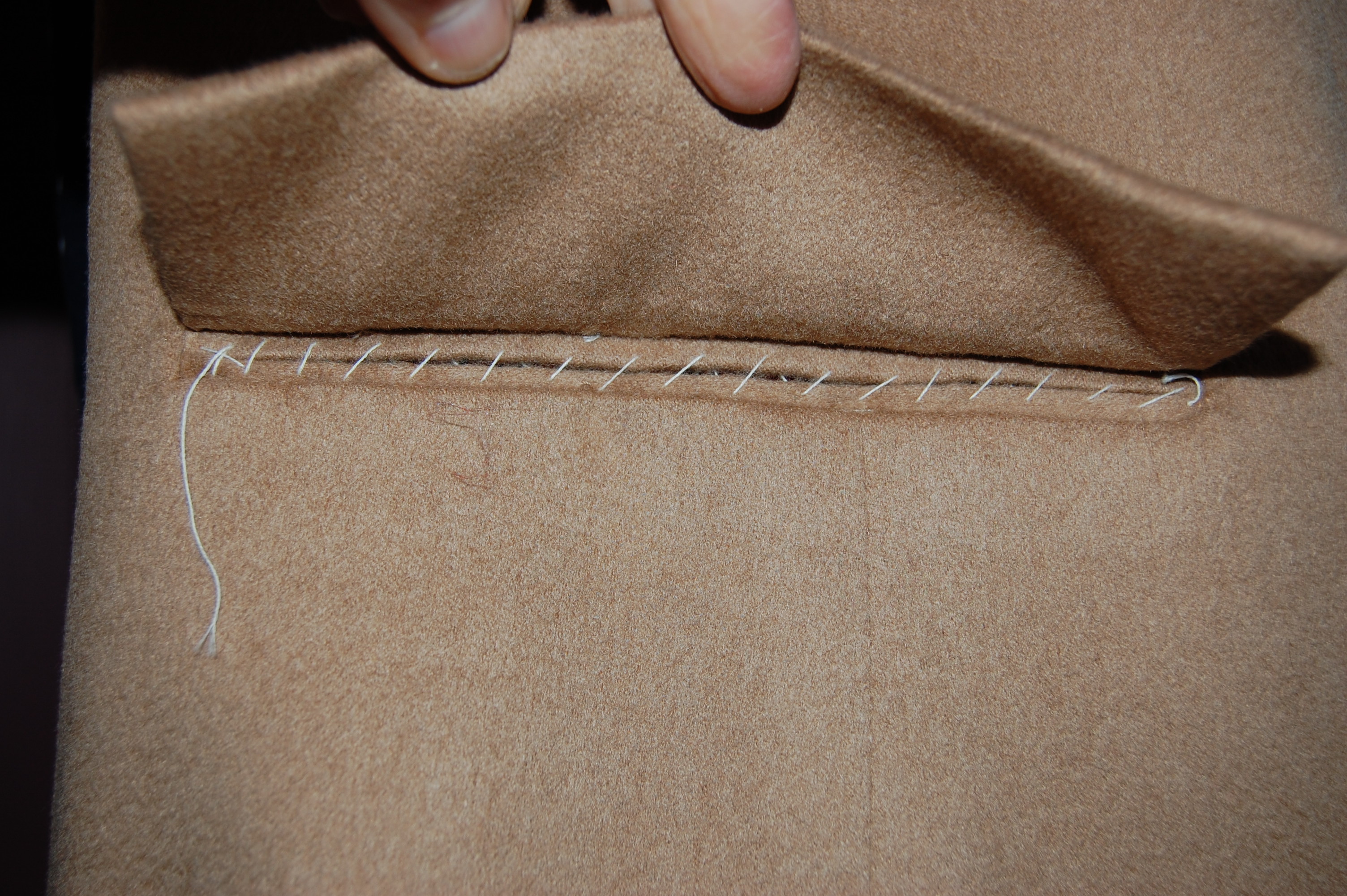
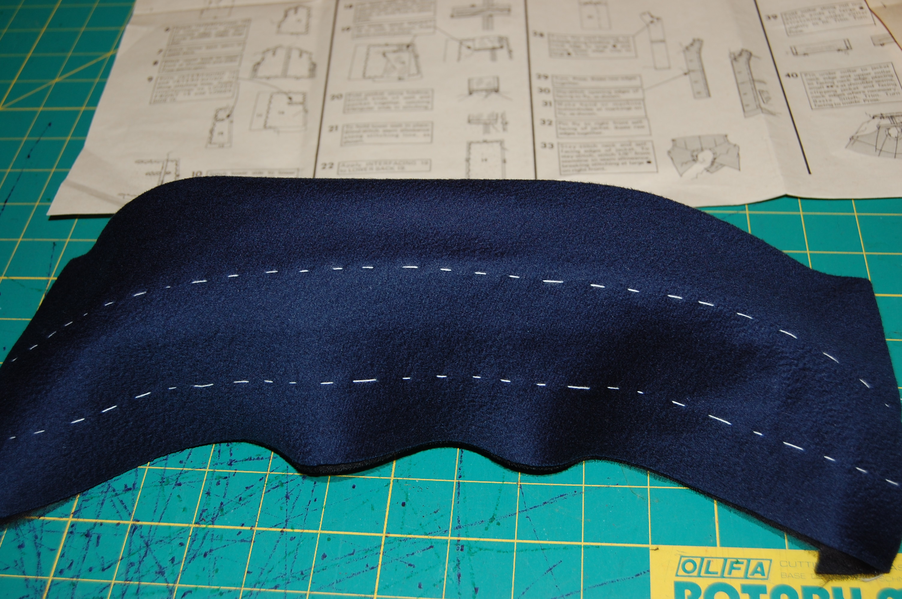
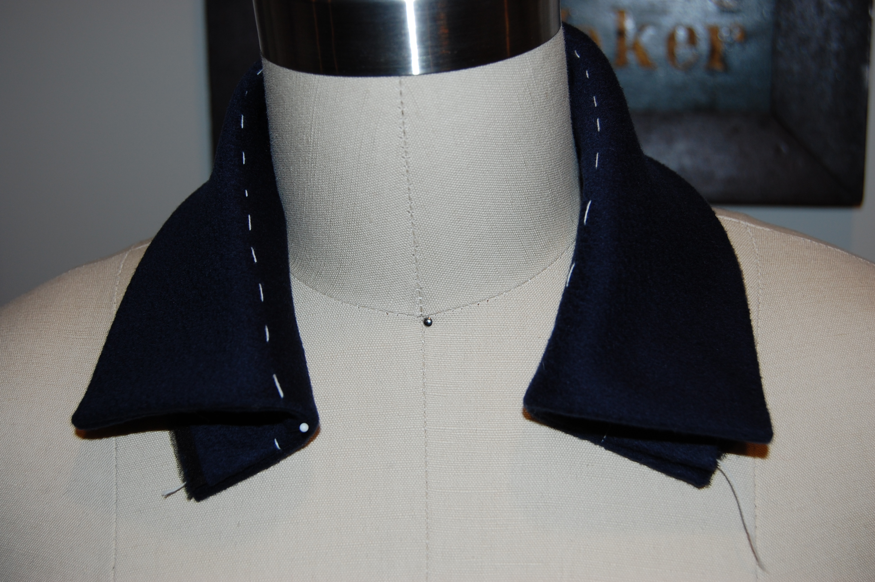
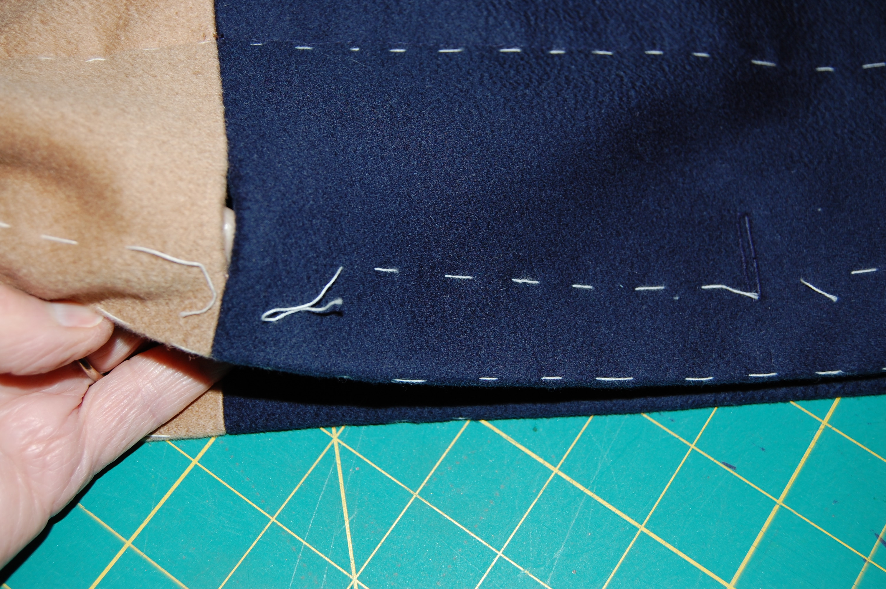
Both the fabric and the patterns sat in hibernation in one of the closets in my sewing room until an idea began to take hold in my mind.  I decided I’d like to use one of my Pucci patterns for my authentic Pucci fabric. It just seemed totally logical to me. I measured my fabric again and found I had closer to 2¼ yards.  I was envisioning pattern # 1418, with the dress in the silk print, paired with the jacket in black, lined in the same silk.  With this plan in mind, I found a lightweight, soft and silky wool/cotton waffle weave in black at Britex Fabrics in early February while I was on the West Coast for Susan Khalje’s Couture Sewing School Class – perfect for the jacket.

Hopefully the "waffle" weave shows up enough in this picture.

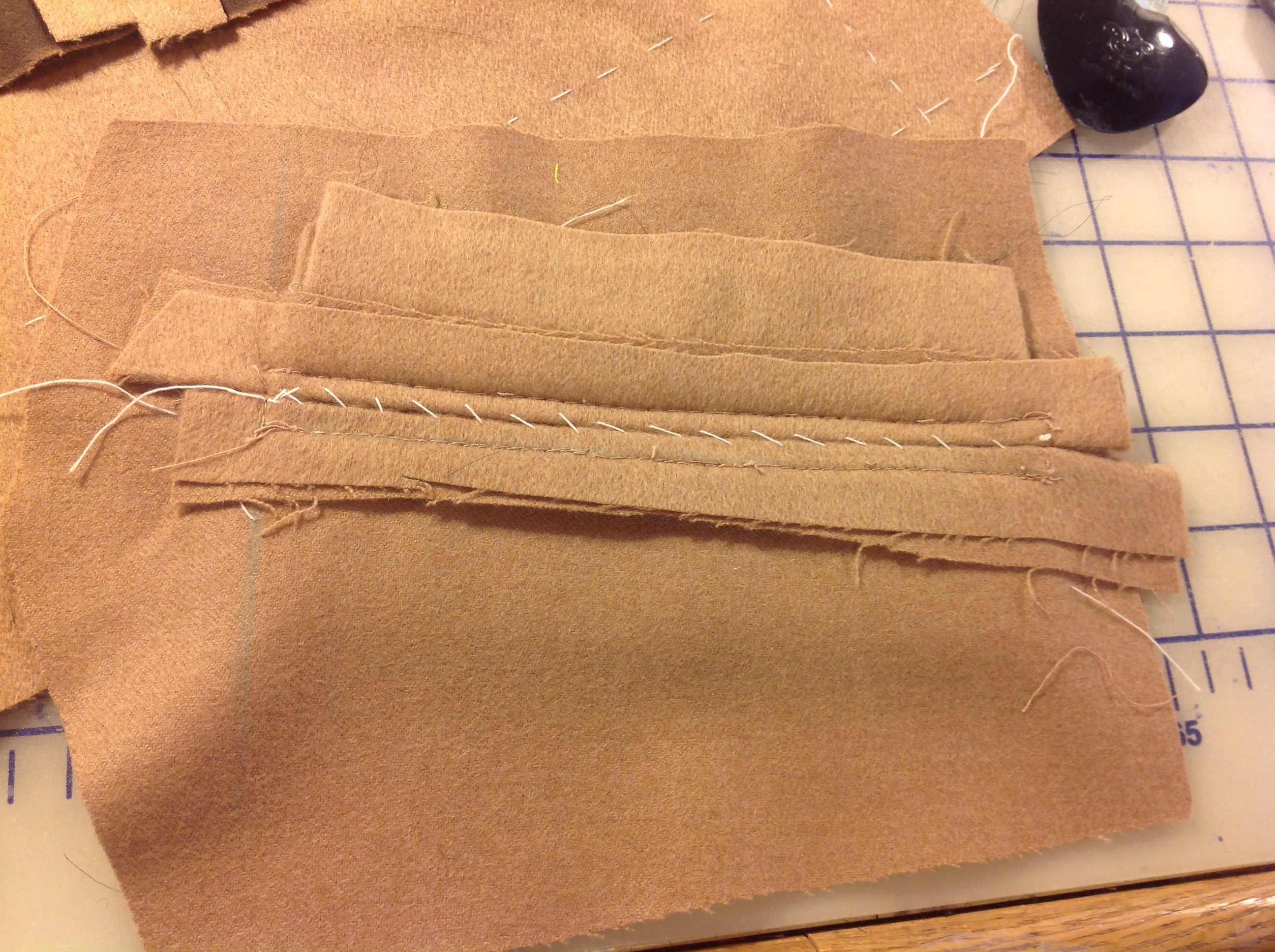
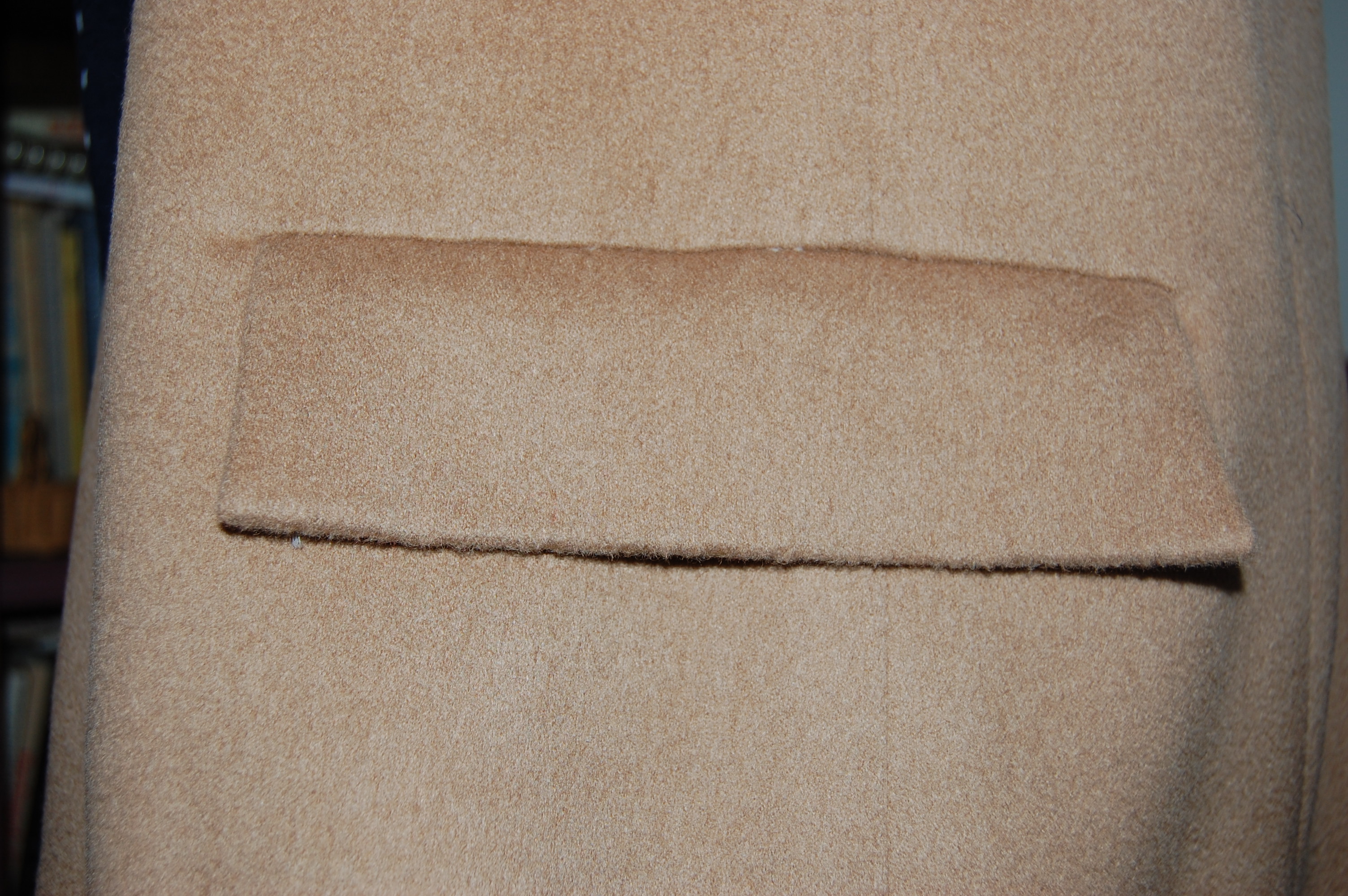
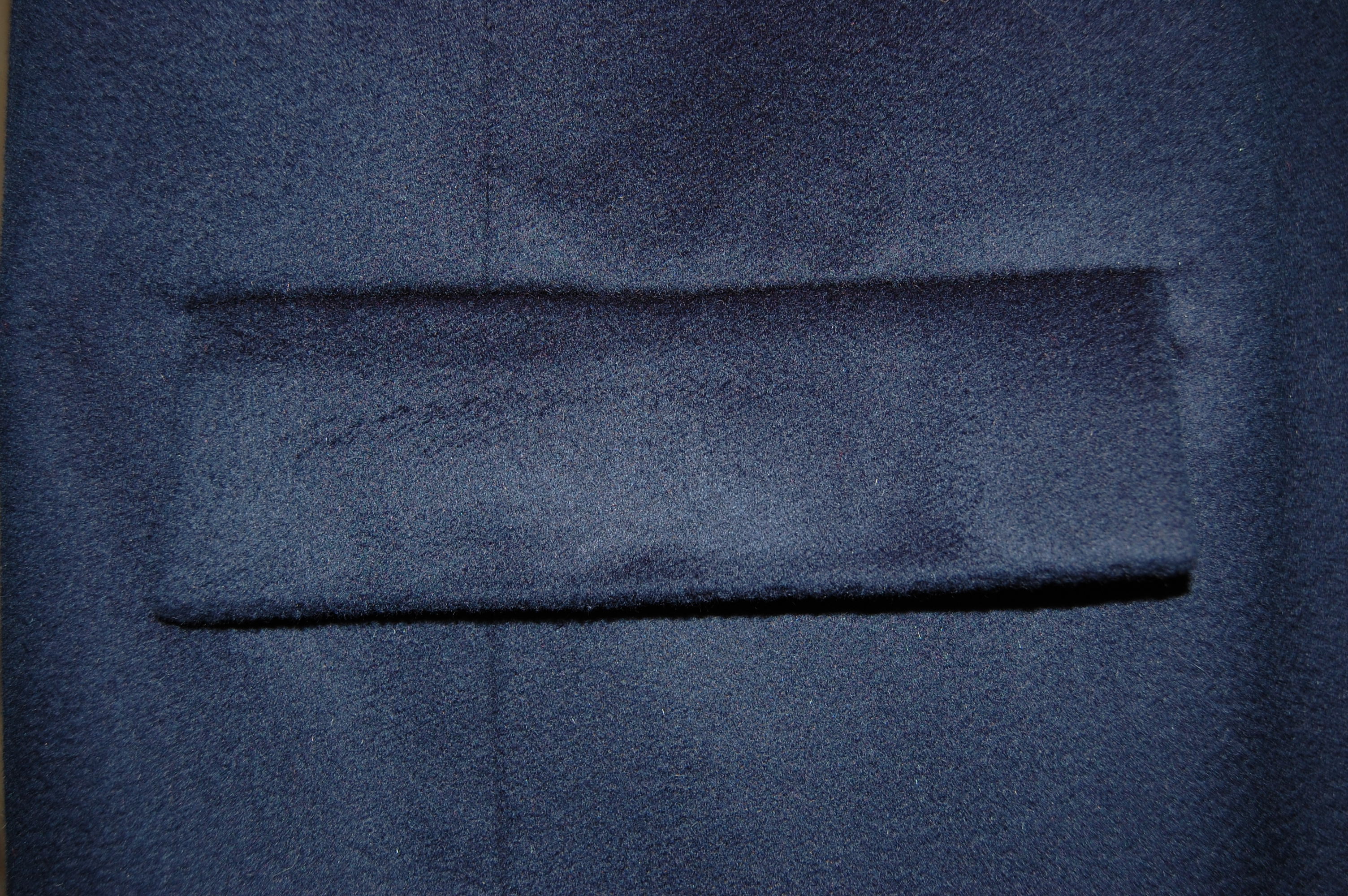
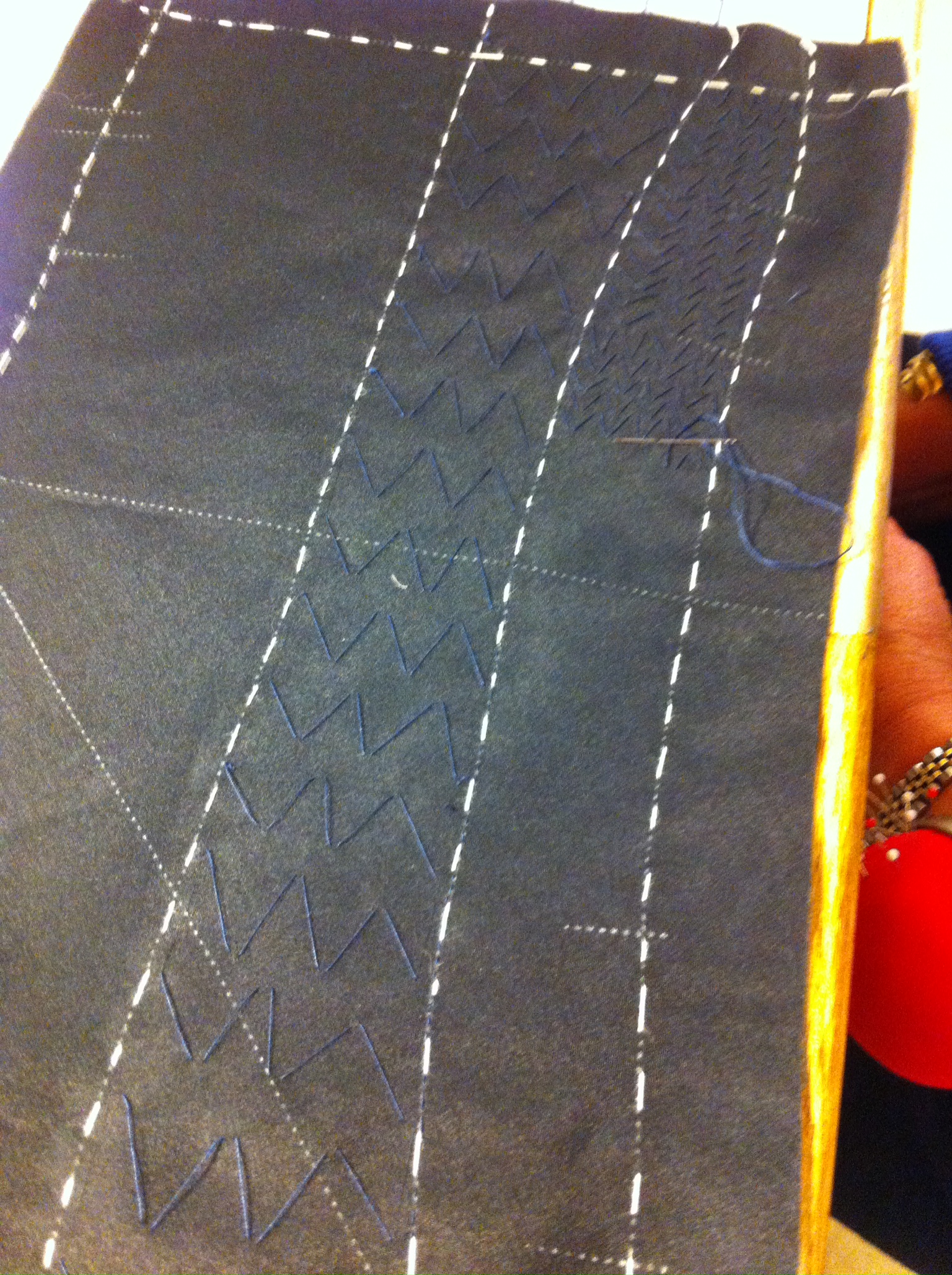
Hopefully the “waffle” weave shows up enough in this picture.

With pattern, fabrics, and a vision, I was ready to go on my next big project.  There was only one gnawing question – would I have enough yardage of the Pucci silk to make that sheath-style dress and line the jacket?

The answer to that question  – deserves its own Fifty Dresses post!

18 Comments

Filed under sewing in silk, Uncategorized, vintage Vogue patterns from the 1960s, vintage Vogue patterns from the 1970s

Magnificent Obsession

Sometimes the dreams and aspirations of our younger days take a long time to come to fruition.  Although I was doing a lot of fashion sewing for myself when I was in my twenties, there were many more Vogue pattern designs which I never had the opportunity to make.  One was Vogue Paris Original #2668 by Hubert de Givenchy (1927-).

Coats of certain length - 7 I never forgot the jacket, in particular, featured in this Designer Pattern.  Over the years I occasionally obssessed about this pattern, regretting that I had not purchased it.  I never imagined I would have a second chance to make it mine, but thanks to the marvels of the Internet, I did.  When I saw a listing for it in this Etsy store months ago, and it was in my size, I knew it was time to buy it.

The use of color blocking, as featured in View A, became stylish in the mid-1960s, when Yves Saint Laurent introduced his classic Mondrian dress.

This little sketch from The Fairchild Dictionary of Fashion, Fairchild Publications, Inc., New York, New , York, 2010, p. 329, shows the classic blocked design.

This little sketch from The Fairchild Dictionary of Fashion, Fairchild Publications, Inc., New York, New  York, 2010, p. 329, shows the classic blocked design.

The appeal of the use of large geometrical sections of contrasting colors was widespread then and has, for many of us, never lost its cachet.  The clean precise lines, and diverse use of fabrics in color blocking must have appealed to Hubert de Givenchy’s sense of design.  Known for simplicity and refinement, according to Arlene C. Cooper, writing in the St. James Fashion Encyclopedia, Givenchy emphasizes “line rather than decoration”.  Further, Givenchy is known for “coats that are marvels of line and volume…”  (St. James Fashion Encyclopedia, Visible Ink Press, Detroit, MI, 1997, p. 154).  Vogue Patterns must have been exceptionally pleased to have the rights to this design for its Designer Series in the early 1970’s.

I started my jacket in early February this year in Susan Khalje’s Couture Sewing School class in San Francisco.  I just finished it.

Magnificent Obsession

Magnificent Obsession

I like it worn open as well...

I like it worn open as well…

A look inside...

A look inside…

A back view.

A back view.

Making this was one of the most enjoyable sewing experiences I have ever had.  Being privileged to get Susan’s expert guidance on some parts of the jacket certainly was part of the equation.  In addition to that, however, were the preciseness and subtle design details of the pattern, which made it a pleasureable sew.  A few of those details are:

1)  the genius of the extra side panel, which enhances the “swing” line of the coat.

2) that side panel  also allows the use of a Dior dart which adds just enough to the bust to keep the line smooth, but ample.

Th instruction sheet gives a good diagram of the small Dior dart tucked into that front side seam.

The instruction sheet gives a good diagram of the small Dior dart tucked into that front side seam.

3) the concealed front allows the clean appearance of the coat to be unencumbered by buttons.

I chose these navy blue buttons for the concealed front.  They are flat, simple, and match the blue exactly.

I chose these navy blue buttons for the concealed front. They are flat, simple, and match the blue exactly.

4) the flap pockets, which conceal the openings, again with minimal interruption to the clean and “simple” look.

The concealed opening, with a flash of pretty pocket lining.

The concealed opening, with a flash of pretty pocket lining.

I did make a few changes/alterations to the jacket, ensuring a better fit for me in 2014.

First, with Susan’s assistance, I took some of the volume out of the back seam, as it was just too full for my frame.  Second, I added ½ “ to the diameter of each sleeve, as they were just a little too slim for comfort.  Doing this allowed me to enlarge the lower armscye, also adding comfort and more flexibility.  I felt like I was able to do these alterations without changing the look of the jacket.  I also made two “visible” changes, although still in keeping with the design.  The original flaps looked a little too “’70s” to me.  I reduced the “depth” of them by 7/8″, so that they are more in keeping with modern sensibility.

These muslin patterns are folded in half to show the depth of the original flap and the depth of the altered one below.

These muslin patterns are folded in half to show the depth of the original flap and the depth of the altered one below.

The pattern had separate pieces for the lining, and even the lining followed the blocked design.  I had chosen a printed silk charmeuse (at Britex , naturally!) for my lining, which did not need to be block sewn.  So, using the muslin I had made for the lining, I cut the “lengths” as one piece, eliminating 16 horizontal seams.  I also underlined the silk charmeuse with a very lightweight rayon voile, which made the lining fabric easy to control, and adds another layer of warmth to the overall coat.  This photo shows the underlining in the sleeve linings before I sewed them into the coat.

Magnificent Obsession

The jacket turned inside out, showing the lining.

The jacket turned inside out, showing the lining.

The inside back of the coat.

The inside back of the coat.

Finally, the pattern called for topstitching the exterior edges of the coat.  Due to the nature of my napped fabric, I thought machine topstitching would detract rather than add.  But – I wasn’t happy with the thought of no topstitching, either.  So I decided to do it by hand.  It wasn’t nearly as time-consuming as I thought it would be, and I am happy with the result.

The topstitching is very subtle, but you can see it here on the pocket flap.

The topstitching is very subtle, but you can see it here on the pocket flap.  Click on the photo for a close-up.

One more thing about this pattern.   When I received it, the pattern pieces for the pants and sleeveless tunic were cut and had obviously been used (although every piece is intact).  The tissue pieces for the coat were still in their factory folds.  On the outside of the pattern in the upper right hand corner is the name Georgia Sanders.  I guess I’ll always wonder if she had plans to make the jacket, too.  I’m so glad she bought this pattern and kept it in such good condition so that it could find its way eventually to me – to help me realize my magnificent obsession from my younger self.

20 Comments

Filed under Buttons - choosing the right ones, Coats, Color blocking, couture construction, Dior darts, underlinings, vintage Vogue Designer patterns, vintage Vogue patterns from the 1970s, Vogue patterns, woolens

The Inside Story

Silk organza must be the best fabric ever made.  The more I use it, the more I appreciate and value its unique properties.  Having first become aware of it as the building block of couture sewing in the Couture Dress Class by Susan Khalje on Craftsy, I quickly adapted my sewing to incorporate it whenever possible and feasible.  Although I fully expected to be using it for my color-blocked coat, I wasn’t sure if I would need to add more to the inside construction in the way of interfacings or other support techniques.

The pattern envelope and instruction sheets were somewhat mystifying, as they listed yardages for both interfacings and underlinings.  However, the diagrams on the instruction sheets clearly showed interfacings only.

The Inside Story - interfacing detail from instruction sheet It was just so lovely to have Susan Khalje’s input and expertise to help me with this during my Couture Sewing School class with her in February.  Silk organza was clearly going to be the only “support” mechanism I was going to need (with the exception of the collar, to be discussed below.)  With each jacket section underlined with black silk organza, I was able to control the inside seams by catch-stitching them to the silk organza.

Here is the inside of the back of the coat, with the seams catch-stitched to the organza.

Here is the inside of the back of the coat, with the seams catch-stitched to the organza.  Click on the photo to see  details.

A quick note here on pressing.  Because my fabrics each have a distinct nap to them, making them easily impressionable, and because they are heavier coat weight fabrics, pressing seams required some extra attention.  Susan had me insert sheets of paper under the two edges of each seam for its initial press (before trimming  them down for catch-stitching).  This prevented the impression of the seam allowances to show up on the right side.  With a really good steam iron, a wonderful finish can be achieved with this method.

The pockets were one of the first details to be tackled.  It had been a while (like years!) since I had made flap/buttonhole pockets.  Once again, Susan’s guidance gave me confidence.  She had me make a trial pocket first, and then I was ready for the real thing.

My sample flap before pressing.

My sample flap before pressing.

Showing the "buttonhole" type opening.

Showing the “buttonhole” type opening.

Showing the "inside" of my trial pocket.

Showing the “inside” of my trial pocket. 

With the flap concealing the opening of the pocket, there is no room for error (or else you will end up with puckers at the edges of the flaps).  I basted and basted and sewed with extreme caution.  I ended up with pockets with which I can, thankfully (whew!), be  happy.

One finished pocket . . .

One finished pocket . . .

. . . and the other one.

. . . and the other one.

And here is what it looks like under the flap, with the opening basted together temporarily.

And here is what it looks like under the flap, with the opening basted together temporarily.

So now on to the collar.  The collar was cut on the bias, and it had a clearly marked roll line.  With the organza basted on (the only “interfacing” I would need), Susan had me run an invisible line of tiny hand stitching along the roll line.

The curved line is the roll line.

The curved line is the roll line.

This anchors it for the subsequent pad-stitching.  Although the pattern instruction sheet shows only half of the collar interfaced, you will see the pad-stitching detail, which is required to get the collar to roll properly.

The Inside Story - collar detail

I am grateful to my classmate Sylvia for taking a photo of the pad-stitching which I did on the collar.  What this shows is the small pad-stitching below the roll line, with larger pad-stitching above it, extending to the fold line.

The inside story - collar pad-stitching

Click on the photo to see it in detail.

With the side seams sewn, my collar showed a clear roll where it was supposed to be.

The inside story

And here is the collar on my dress form.

And here is the collar on my dress form.

I had one more important question for Susan:  what about the buttonholes on that concealed fly front?  Normally, when sewing with wool, I would do bound buttonholes, but we both agreed that would add too much bulk to what should be a clean, sleek finish on this coat.  It seemed machine-made buttonholes would be the ones of choice.  I must admit, I had a bit of reluctance to do machine buttonholes in wool.  I even practiced making buttonholes by hand, but I wasn’t happy with my trial runs, and even they seemed too bulky.  So, I simulated the thickness of my layers at the fly front and made some machine buttonholes in a sample piece.  And – I thought they were great!  On to the real thing – and this was clearly the way to go:

The buttonholes show up better on the camel wool. Click on the photo for a close-up.

The buttonholes show up better on the camel wool. Click on the photo for a close-up.

The middle buttonhole is a slot-seam one.

The middle buttonhole is a slot-seam one.

The next step, before inserting the lining, is to finish the hems in the sleeves and the body of the coat.  Here I may add a bias strip of soft interfacing to insure that the hem has a soft edge to it.

The Vogue Sewing Book from 1963 includes this detail on The Soft Hemline, as part of its section on Haute Couture Techniques.

The Vogue Sewing Book from 1963 includes this detail on The Soft Hemline, as part of its section on Haute Couture Techniques.  I also asked Susan about sewing on a chain at the hem as well.  Because the two wools I have used are slightly different weights, she agreed this may be a good idea, to help ensure an even hang.

So – the miracle of silk organza, pressing techniques, and practice, practice, practice – are helping to make my long-awaited color-blocked coat a reality.  On to the finish line!

15 Comments

Filed under Coats, Color blocking, couture construction, Uncategorized, underlinings, vintage Vogue Designer patterns, vintage Vogue patterns from the 1970s, woolens