It is always in the early days of December when I start to speculate on what the Pantone Color of the Year will be for the year to come. I’m not sure why I am so intrigued with this annual selection, but obviously it must have something to do with sewing and fabric and day-dreaming. This year, on the 2nd of December, Pantone gave those of us, who have this particular obsession with color, the chance to vote for the family of color from which we thought 2025’s selection would come.
Well, I was WAY off! I voted for the Red Family, described by Pantone as “empowering and exciting.” This was the way I happened to be feeling on that particular day in early December. The other color families from which to choose were: Orange (radiant and hot), Yellow (energy and life), Green (deep forests and wide meadows), Blue (constancy and truth), Pink (soft and innocent), Purple (mystical and magical), Brown (rooted and earthy), Black (sleek and sophisticated), and White (pristine and peaceful).
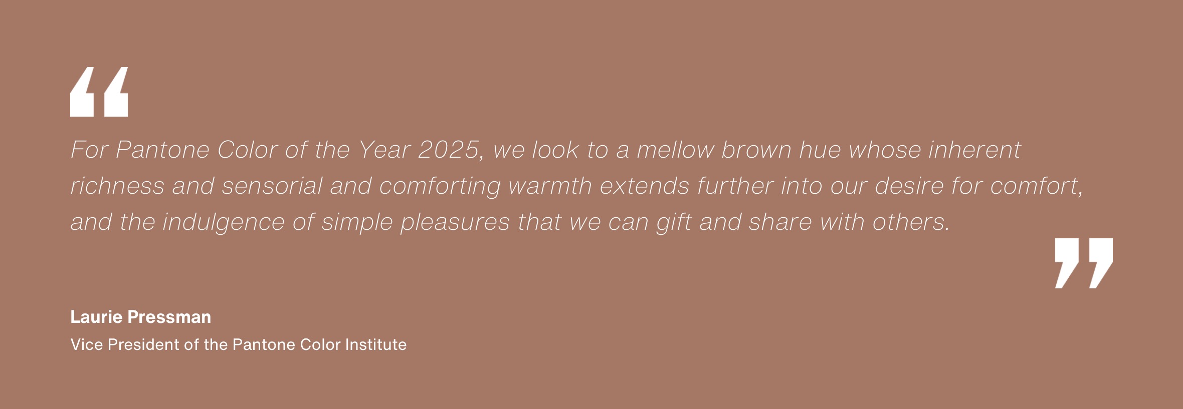
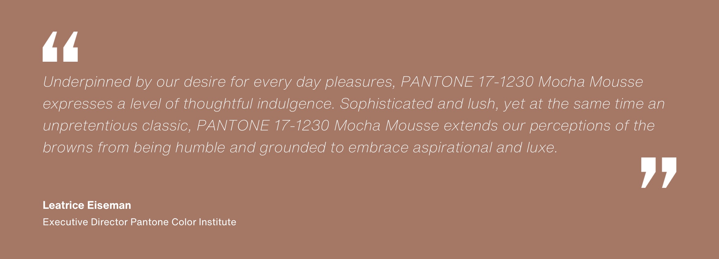
The Color Family most people taking the poll chose was Green. Those of you who care about such things now know the Pantone Color of the Year is Mocha Mousse, “a warming, brown hue imbued with richness.” (All quoted statements are directly from the Pantone website.)
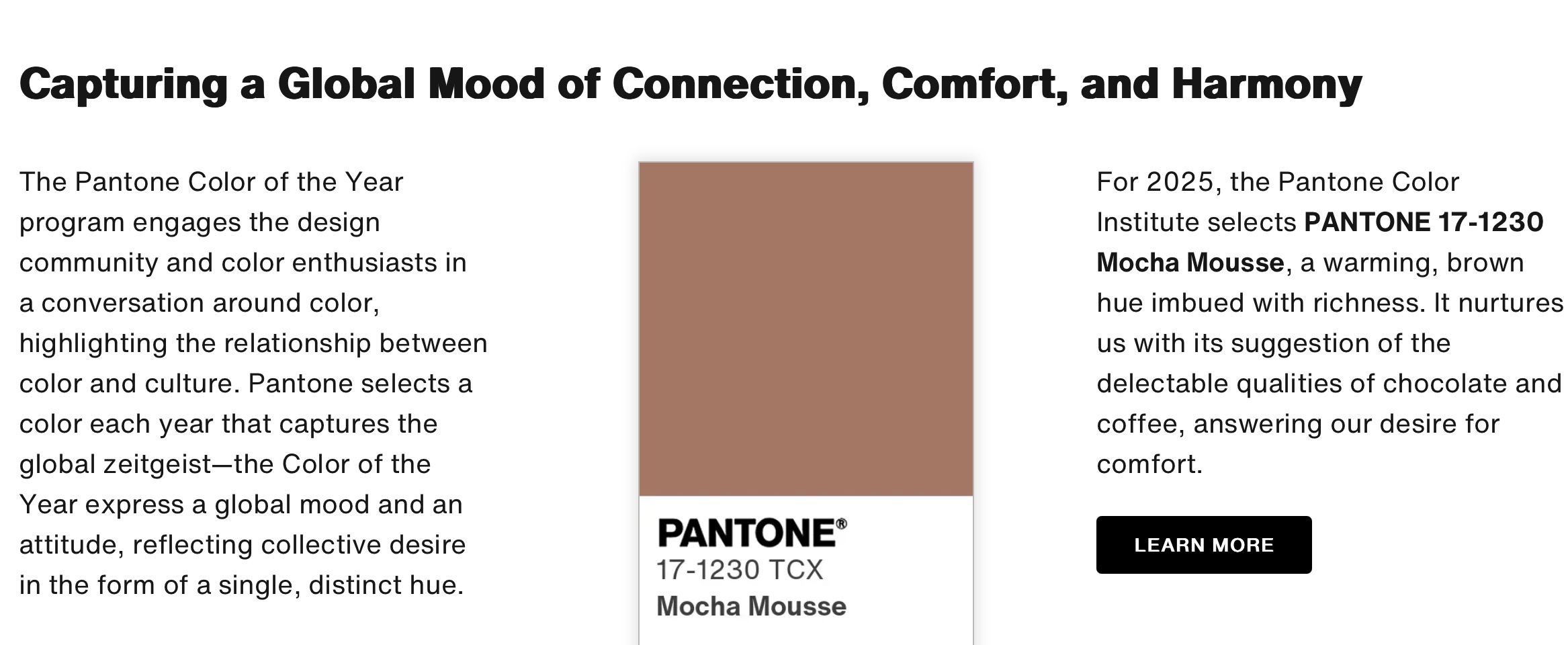
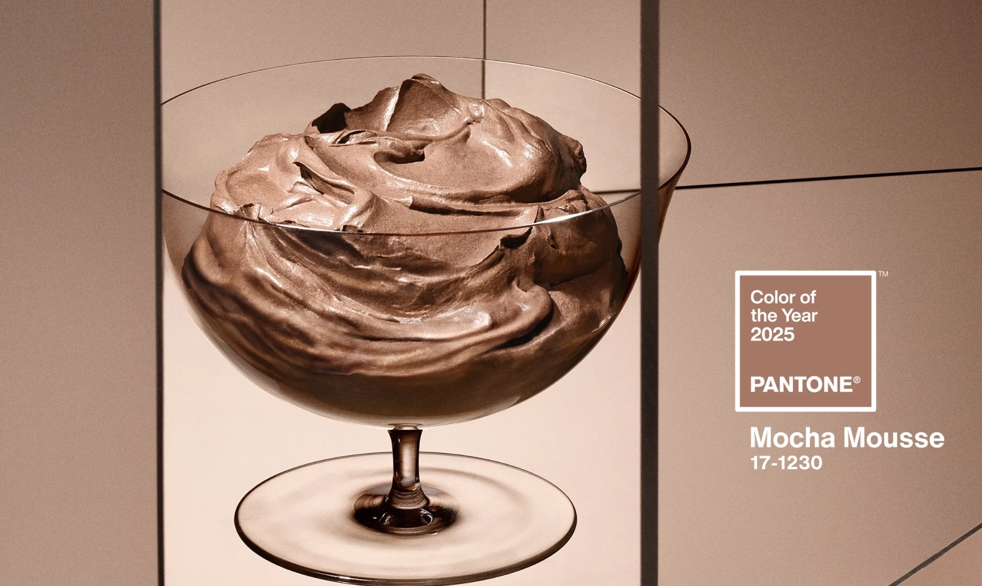
I certainly did not see that coming. Which made me really curious about this selection by people obviously much more in tune with the “global zeitgeist” than I! The more I read about the decision, the more I understood it – and, although it is not exciting as a red family hue would be, I do find it to be empowering in its own subtle way, “capturing a global mood of connection, comfort, and harmony.”
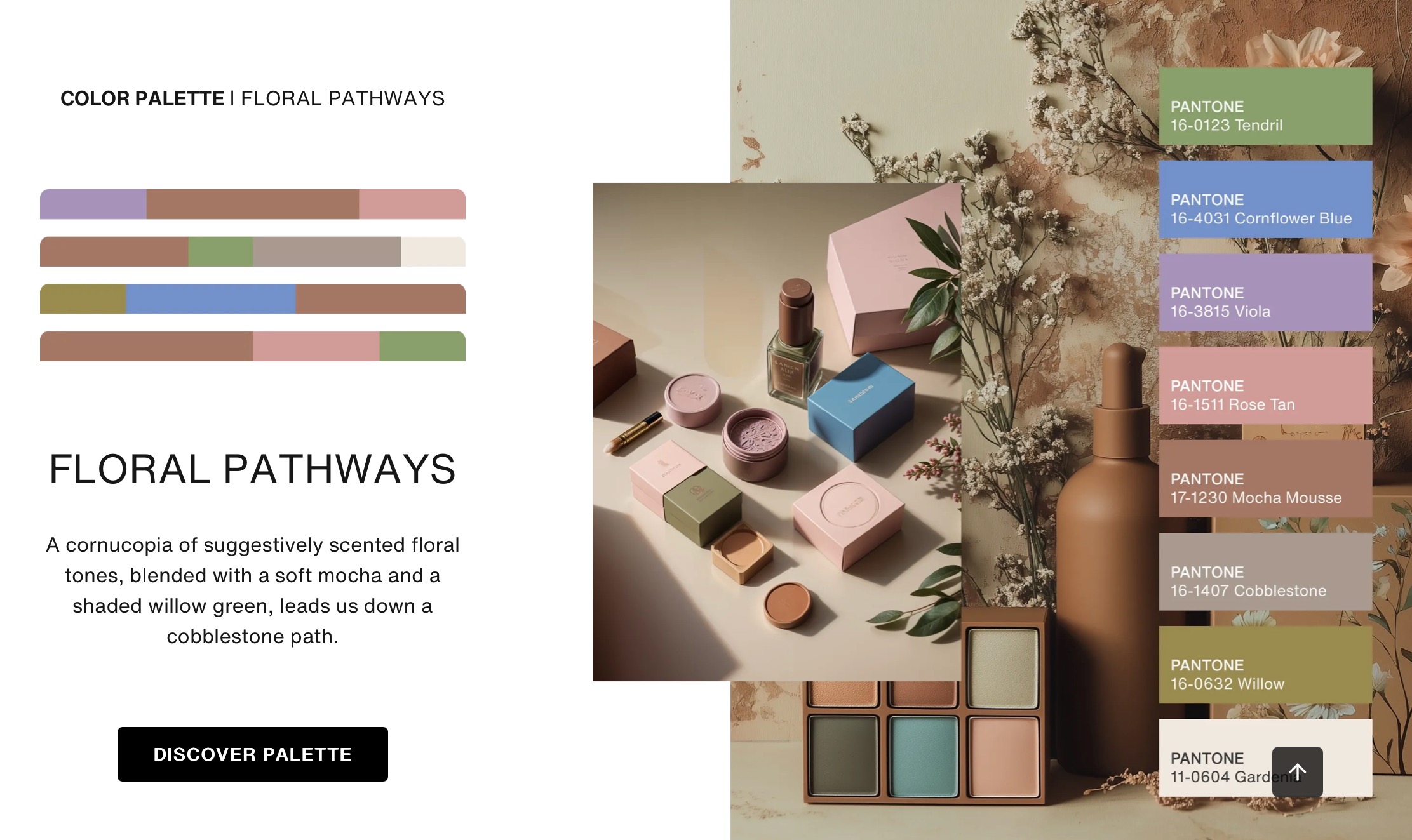
Pantone wisely suggests a “Color Palette” for their Color of the Year, a selection of hues to coordinate with the chosen color. For Mocha Mousse, the color palette is charmingly called “Floral Pathways.” Seven colors to lead us down a “cobblestone path:” a green called tendril, cornflower blue, a gentle lavender called viola, rose tan, a soft gray called cobblestone, another green called willow, and a soft white called gardenia. These are all lovely coordinates, which make me appreciate Mocha Mousse more.
Although I will not necessarily be purchasing fabric or planning sewing projects around Mocha Mousse this year, I will be thinking about it and focusing on the warm comfort and harmony it suggests.
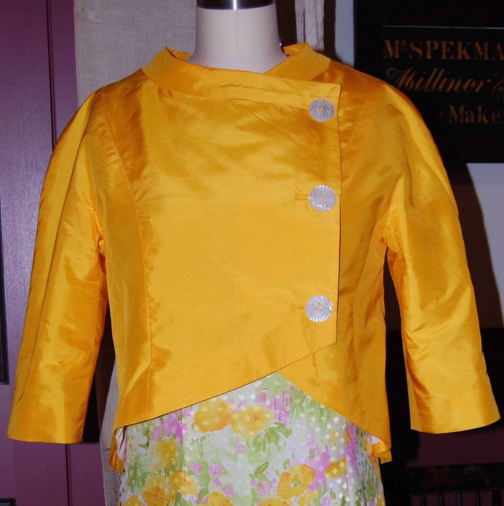
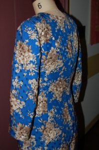
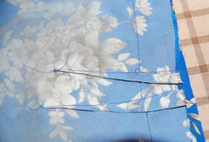
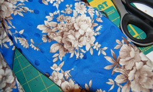
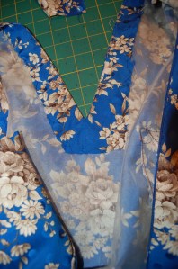
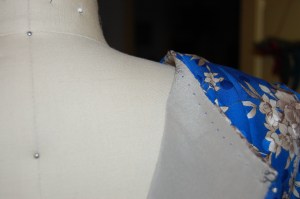
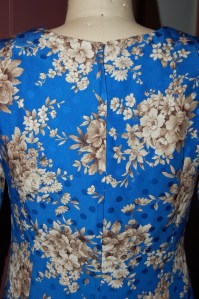
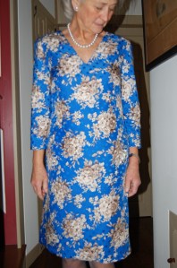
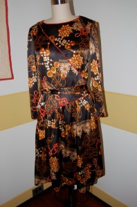
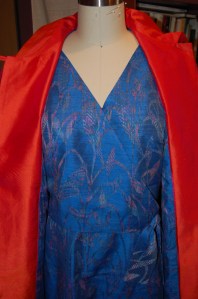
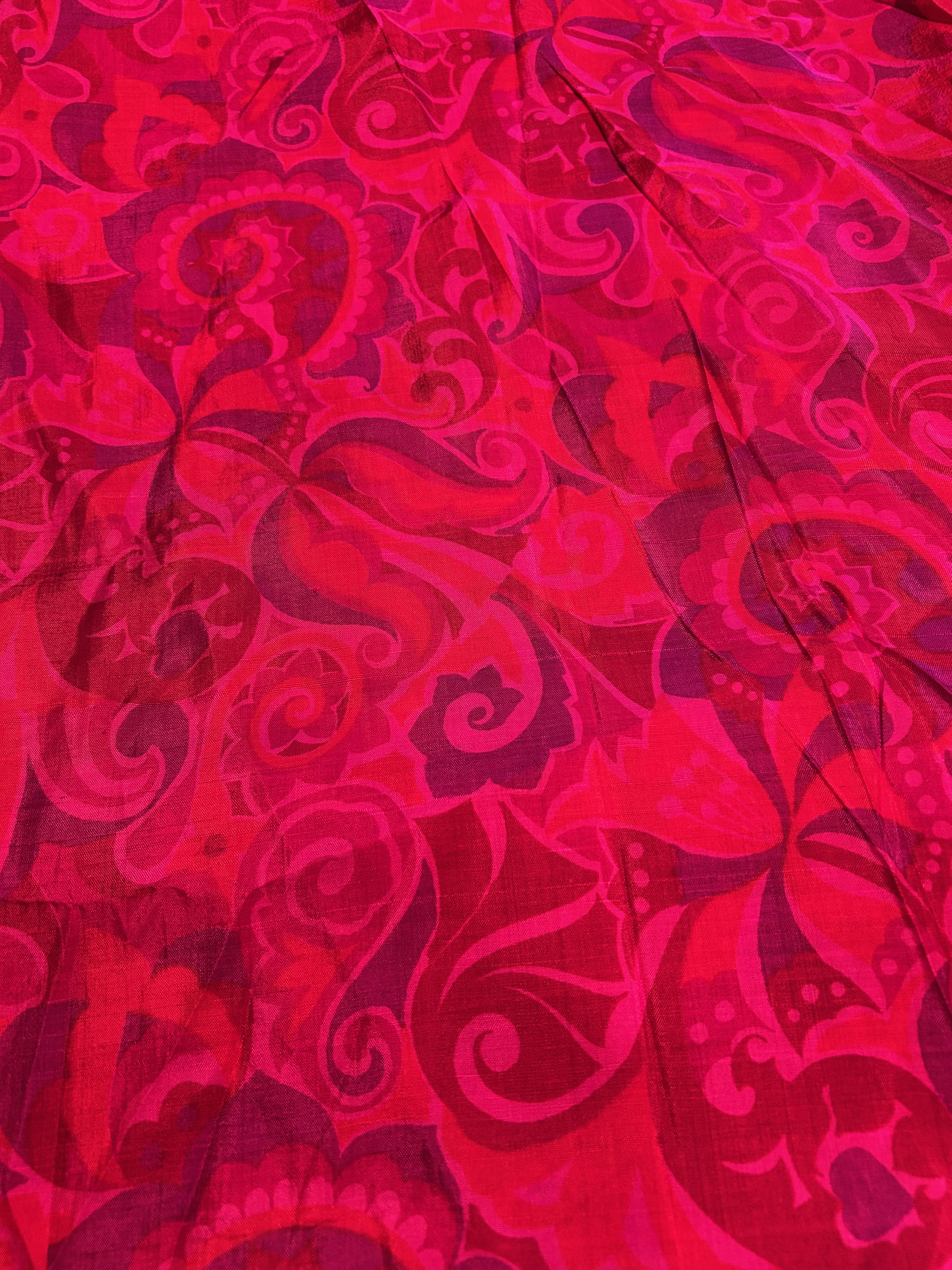
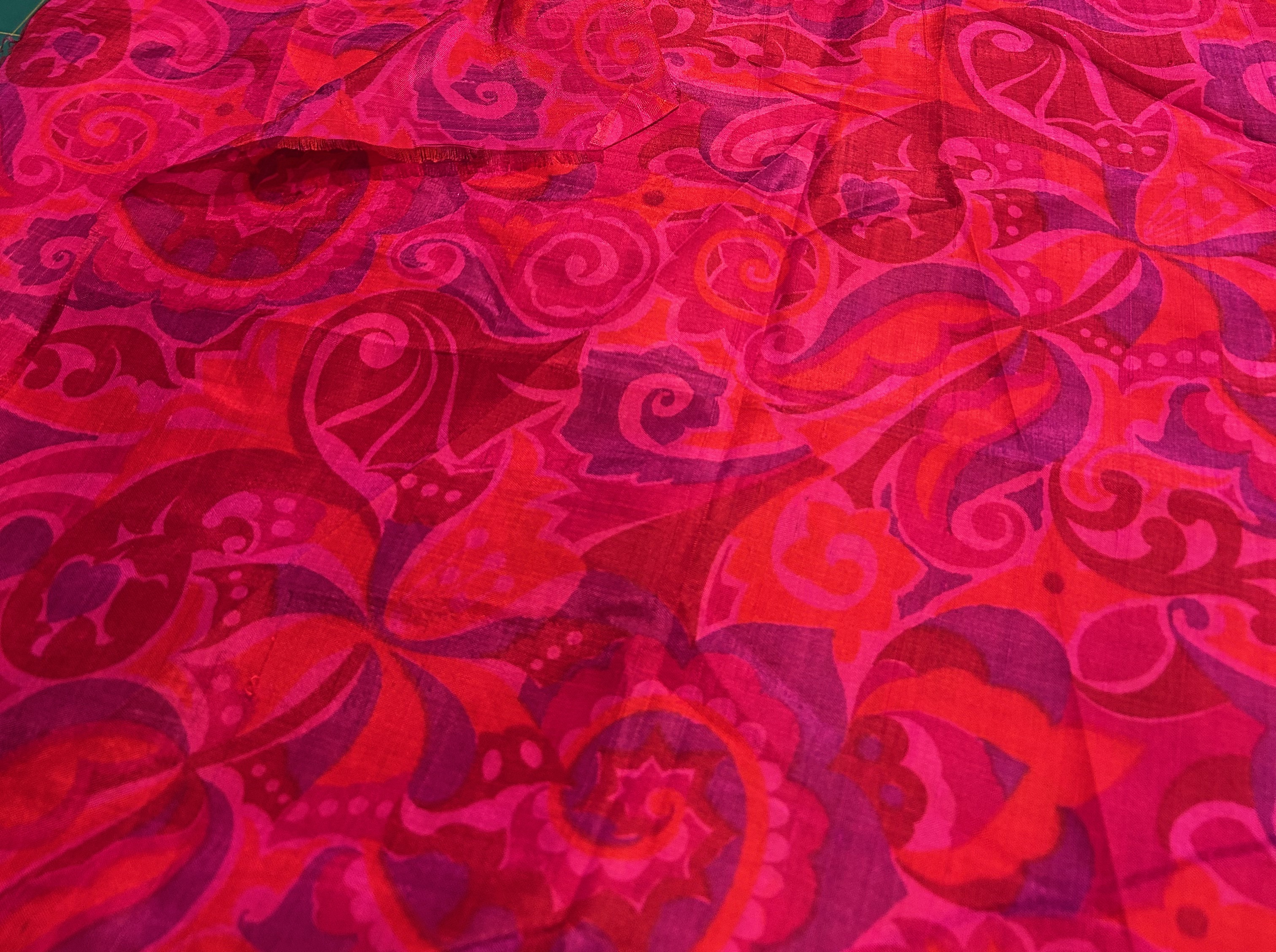
However, what really makes me not only think in color, but also dream in color, is a piece of Thai silk just given to me from a sweet and thoughtful friend. She told me it had been given it to her over forty years ago by a friend of hers, purchased while in that part of the world. My friend had finally decided she needed to part with it as she was certainly never going to use it. Lucky me! With over four yards and over 50” wide, I have plenty to work with. What should I make?
About my long absence from this blog… I did not expect to be away for 6 months. Thank you to those of you who did not abandon me over that time. A confluence of circumstances thwarted my sewing production – and motivation – during the summer months. Perhaps on that early December day when I instinctively voted for the Red Family in the Pantone quiz, I was feeling some small spark of vitality returning to my bones. Perhaps…
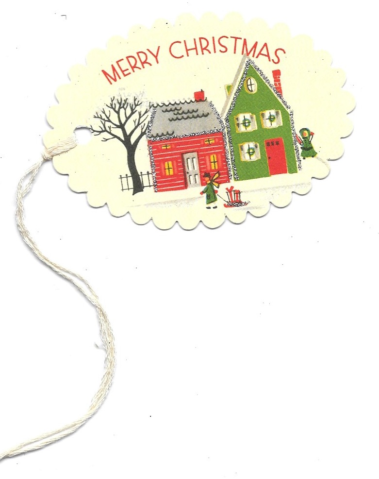
Certainly, I cannot close this short post without acknowledging the joy in this season of holidays and Christmas and extending best wishes far and wide to each of you. Merry Christmas!