Category Archives: fabric labels

And Now I Match my Chair, Part 2

Isn’t a good pattern worth its weight in gold?  When I purchased this jacket pattern several years ago, I just liked it, no plans in place, and thought the day might come when I could use it.  The more I studied it with my Pendleton blanket in mind, the more I thought it was perfect for my project.  First task, of course, was to make a muslin toile and check the fit and size. 

View B is the version I intended to use.

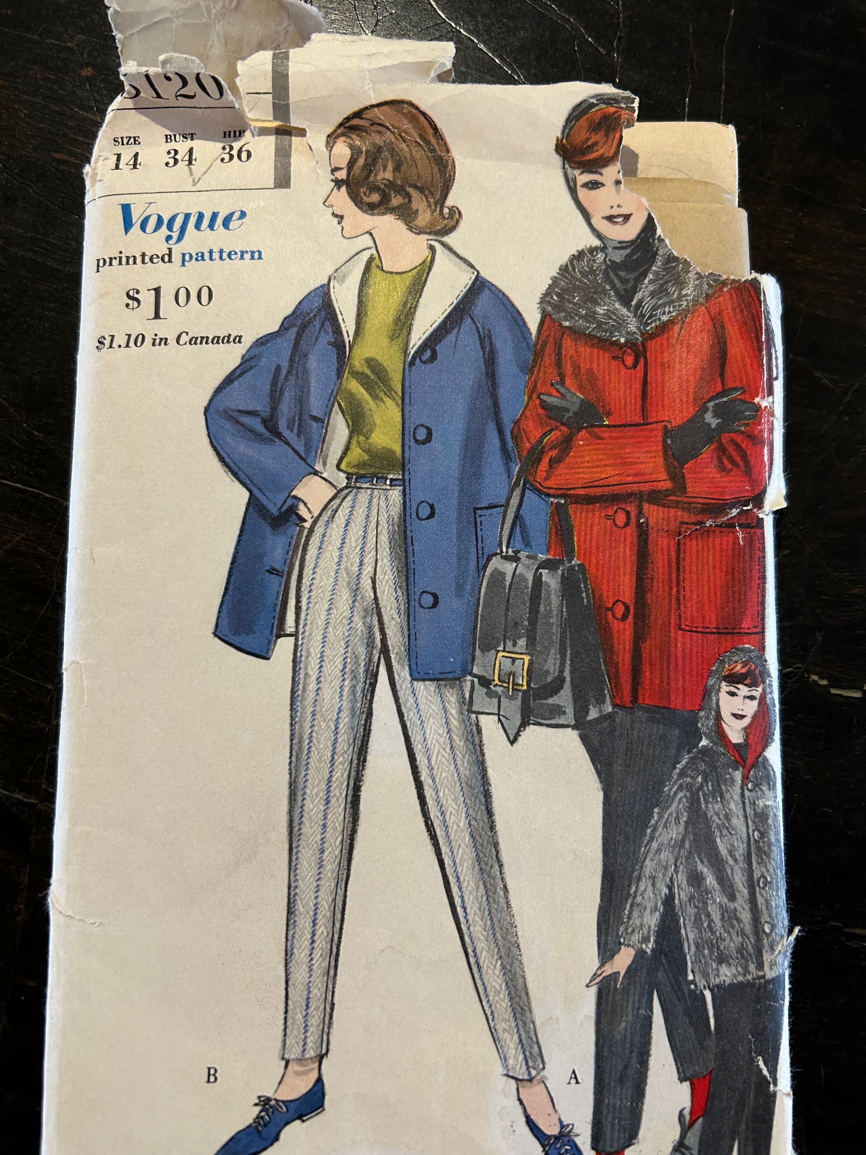
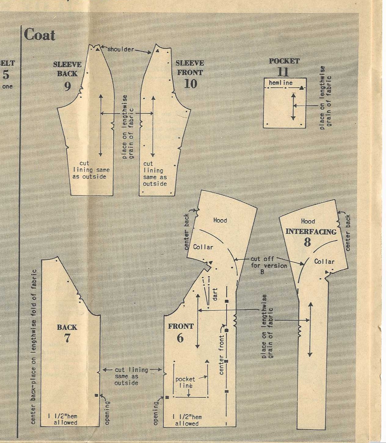
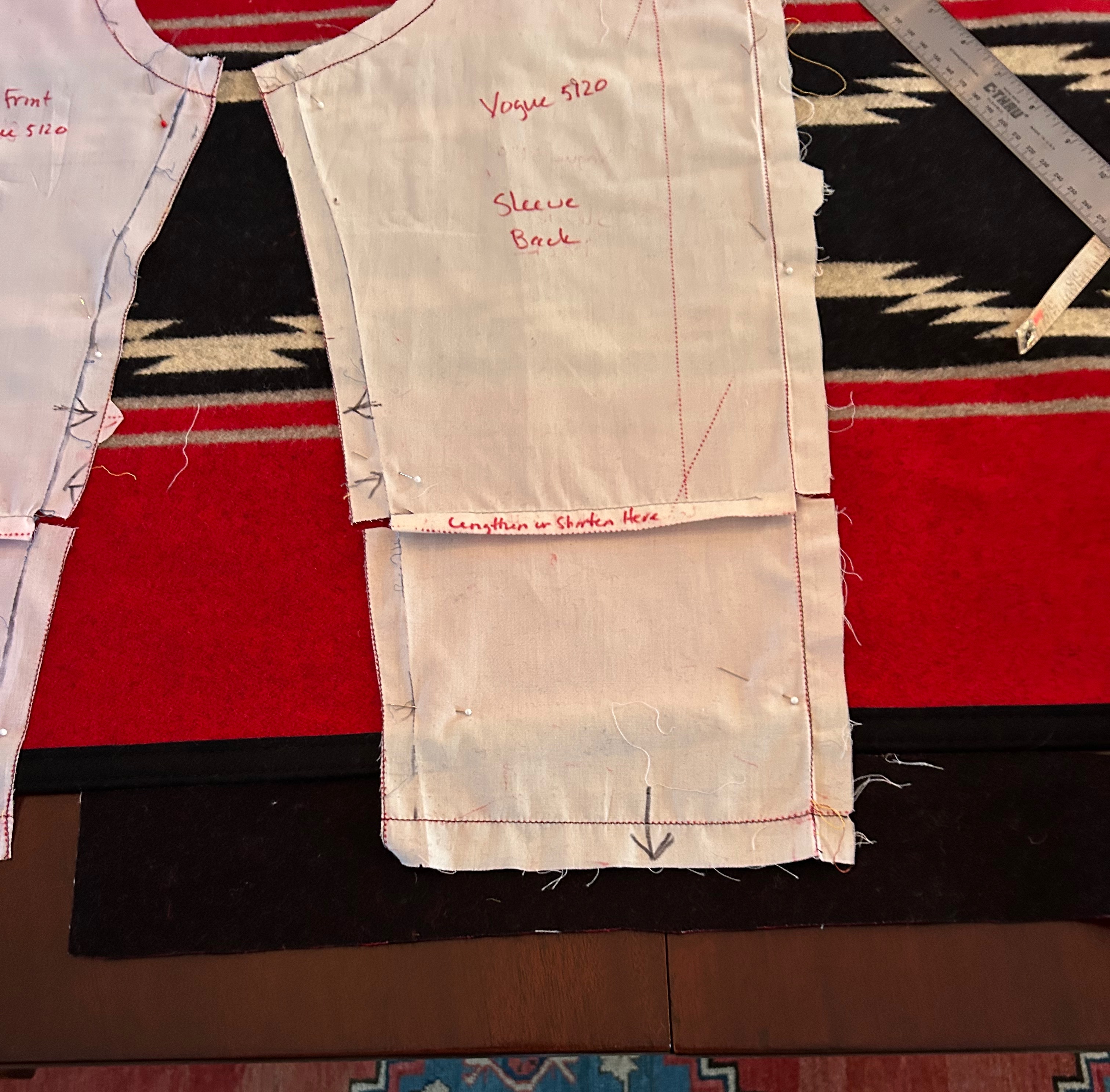
By now, November and early December had passed with my life taken over by bathroom renovations and holidays looming on the horizon. We headed back to Wyoming for Christmas, and then the new year of 2026 dawned, with all its promise and things unknown.  January was the perfect time to get back to my project. The jacket as designed was to be fully lined, either with fleece, contrasting fabric, or self-lined. I determined I would need to line the sleeves, while the rest of the jacket should remain unlined.  However, I needed a facing for the shawl collar and front edges. Because there was a pattern piece for interfacing the collar and front edges, I thought I could use that for my facing.  My toile confirmed that for me.  

I used the interfacing (minus the hood extension) in the lower right corner of the diagram for my coat facing.

The coat muslin seemed very large overall on me, requiring a lot of alteration.  It can be tricky with coats, as enough ease must be allowed for wearing a heavier sweater or layers underneath. Also, the thickness and relative non-fluidity of the blanket dictated a looser fit.  I spent a few days perfecting my toile.  Then the real test was upon me.

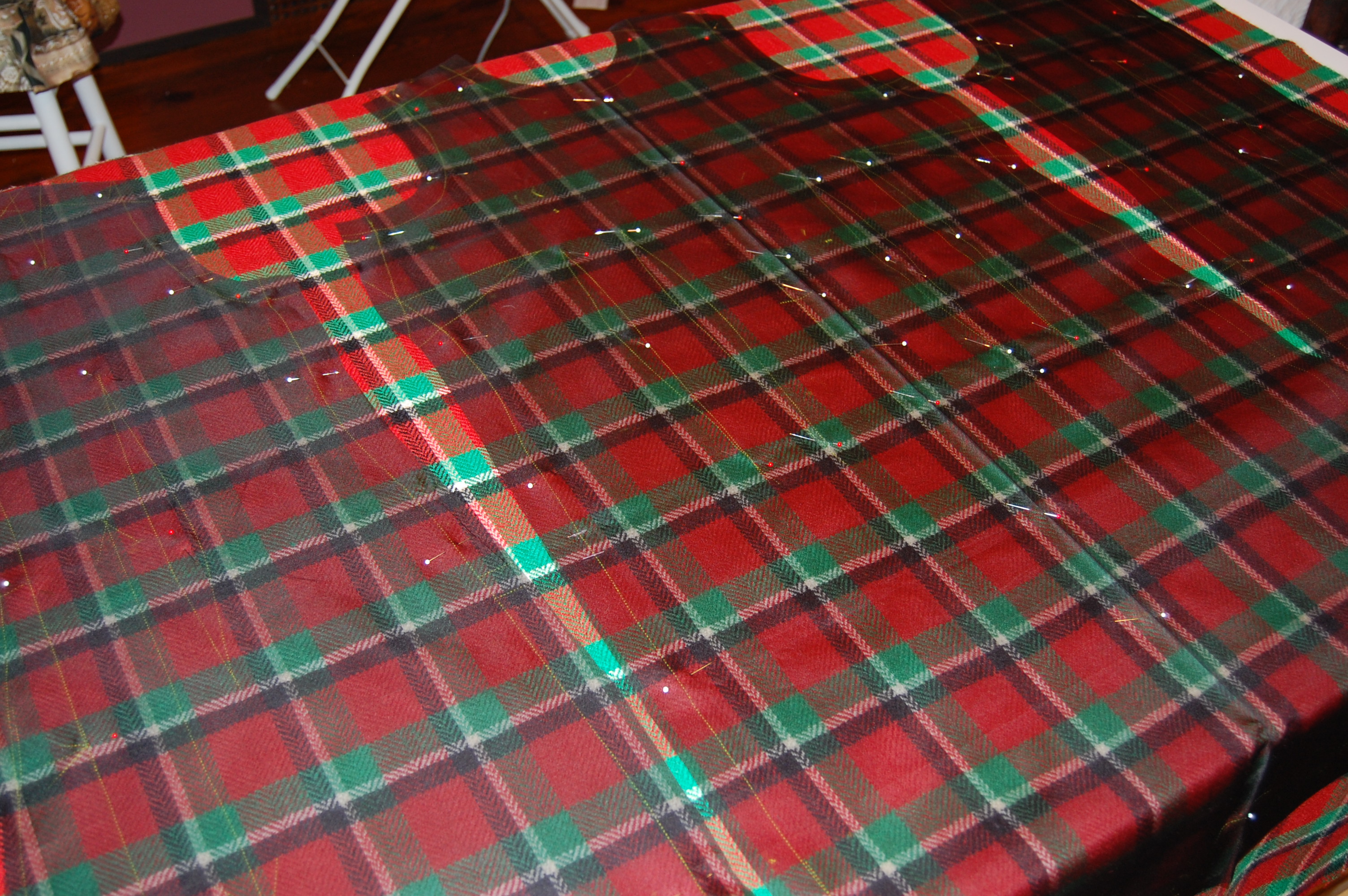
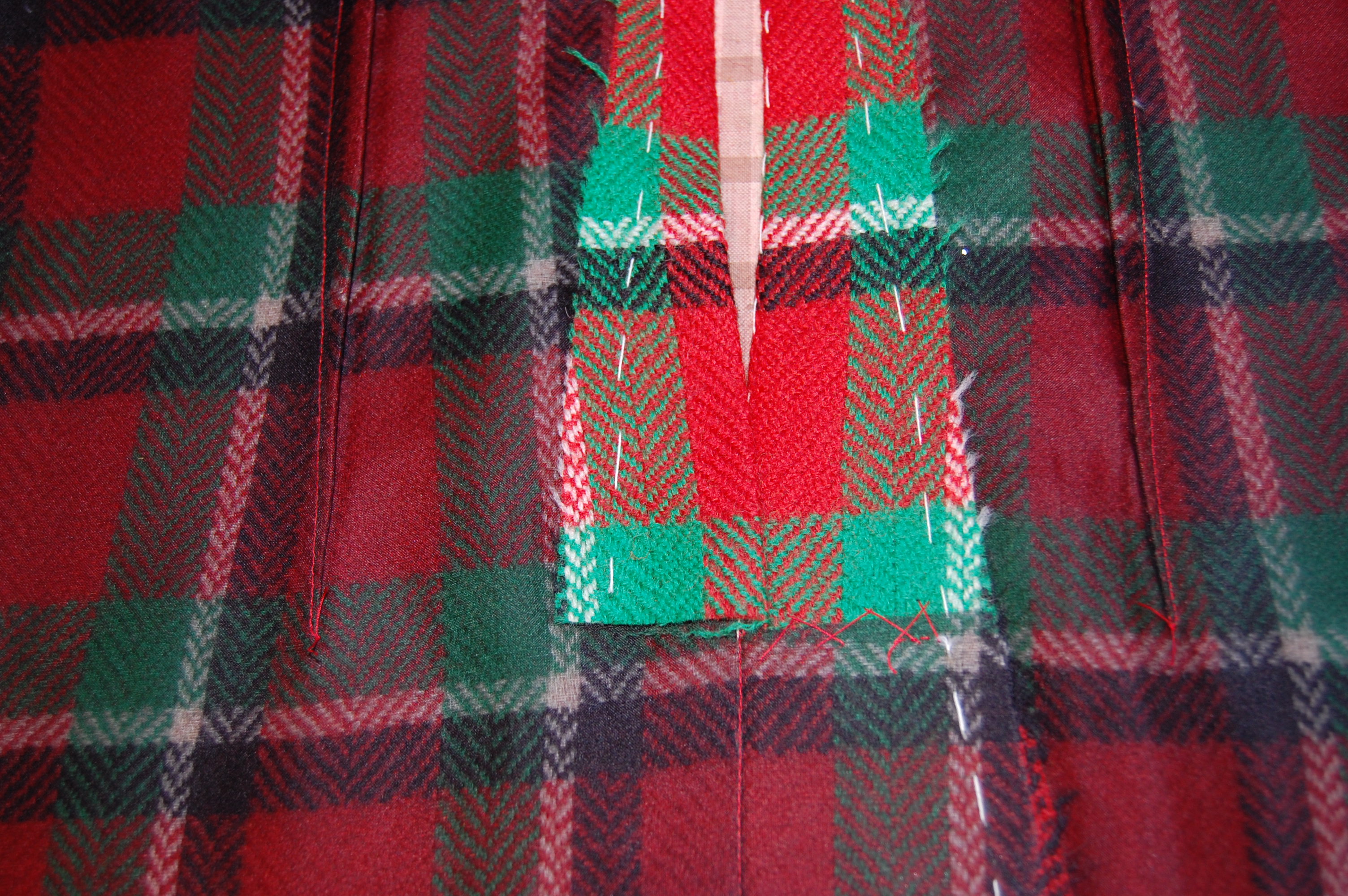
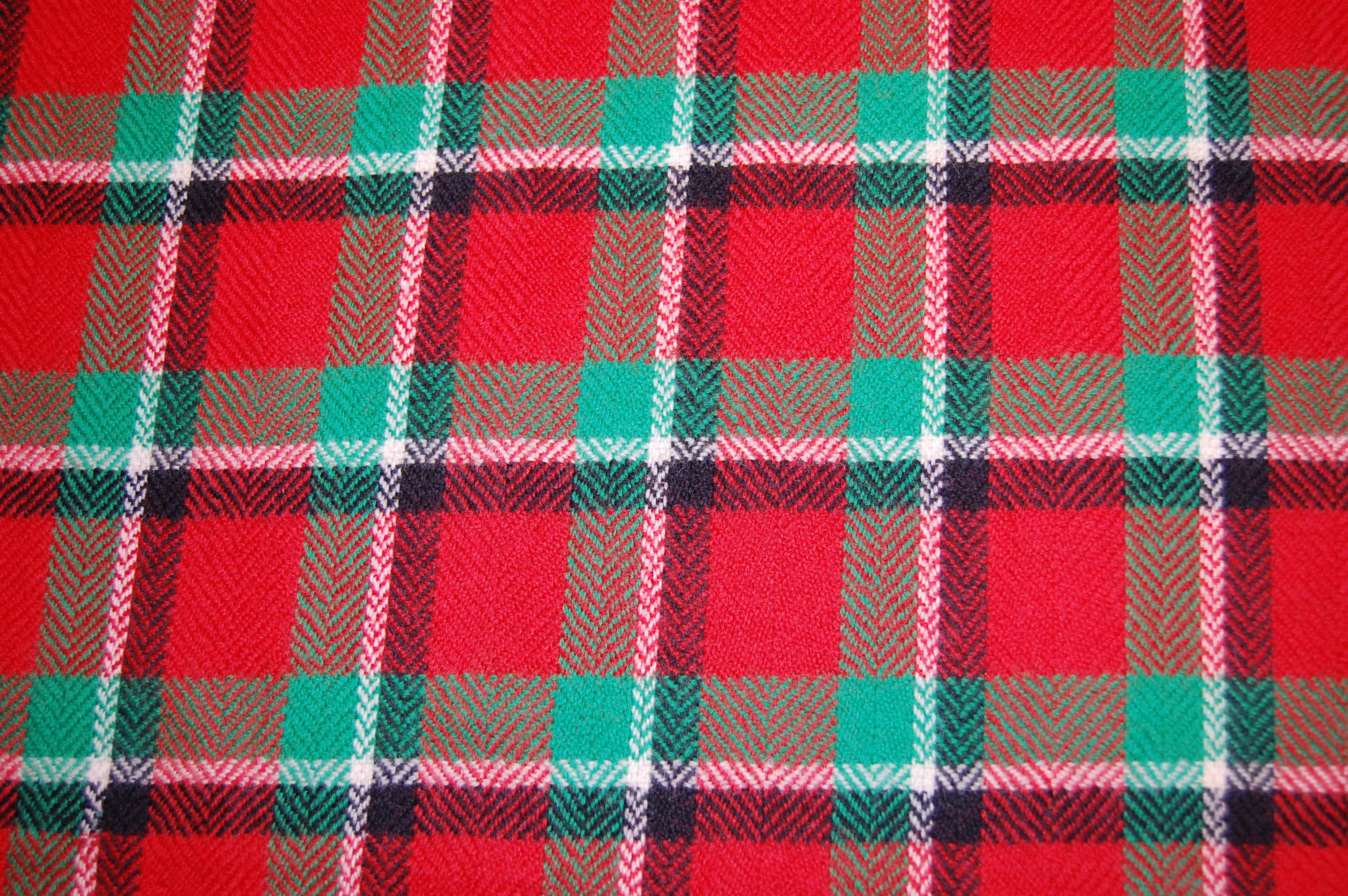
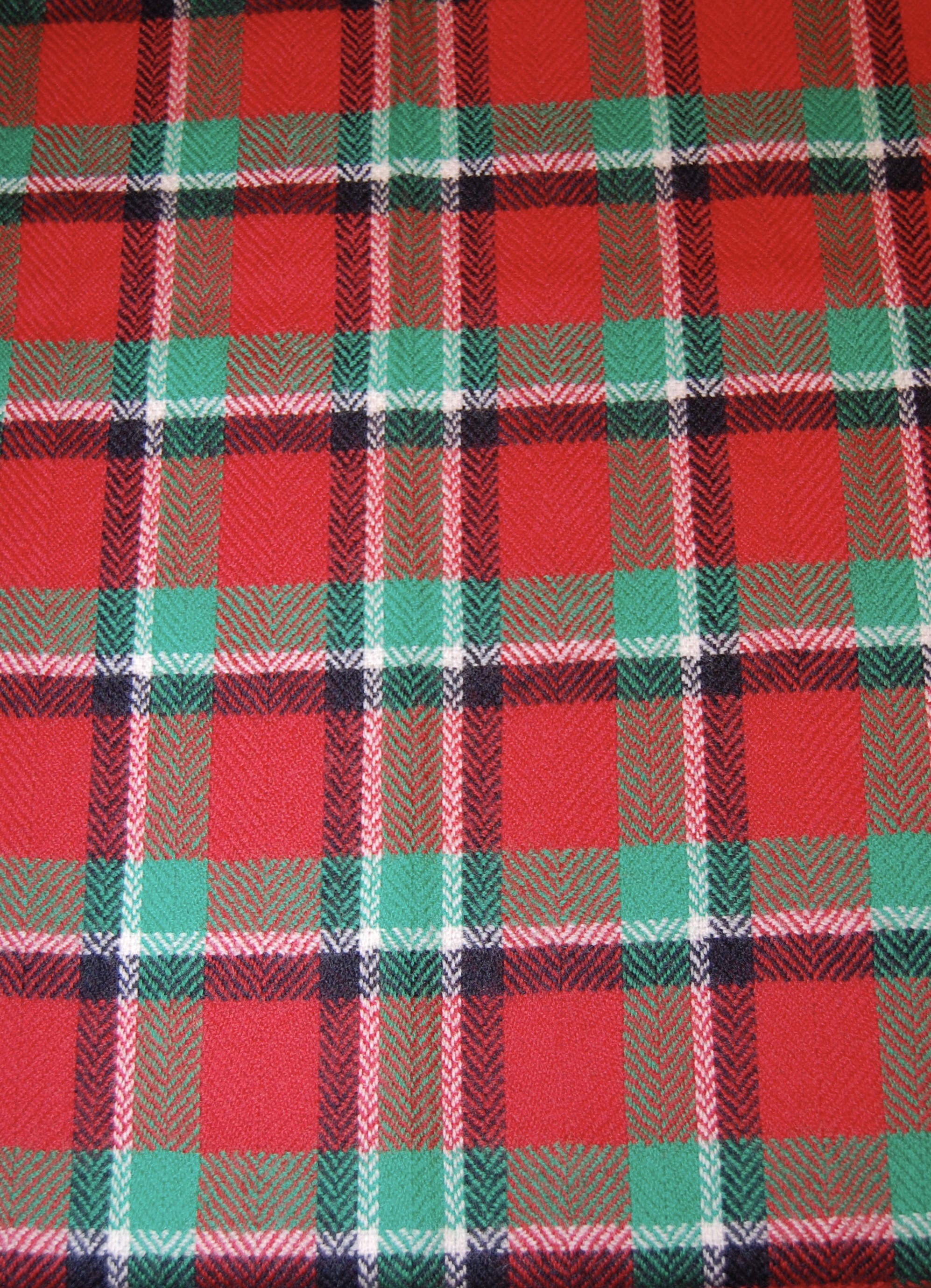
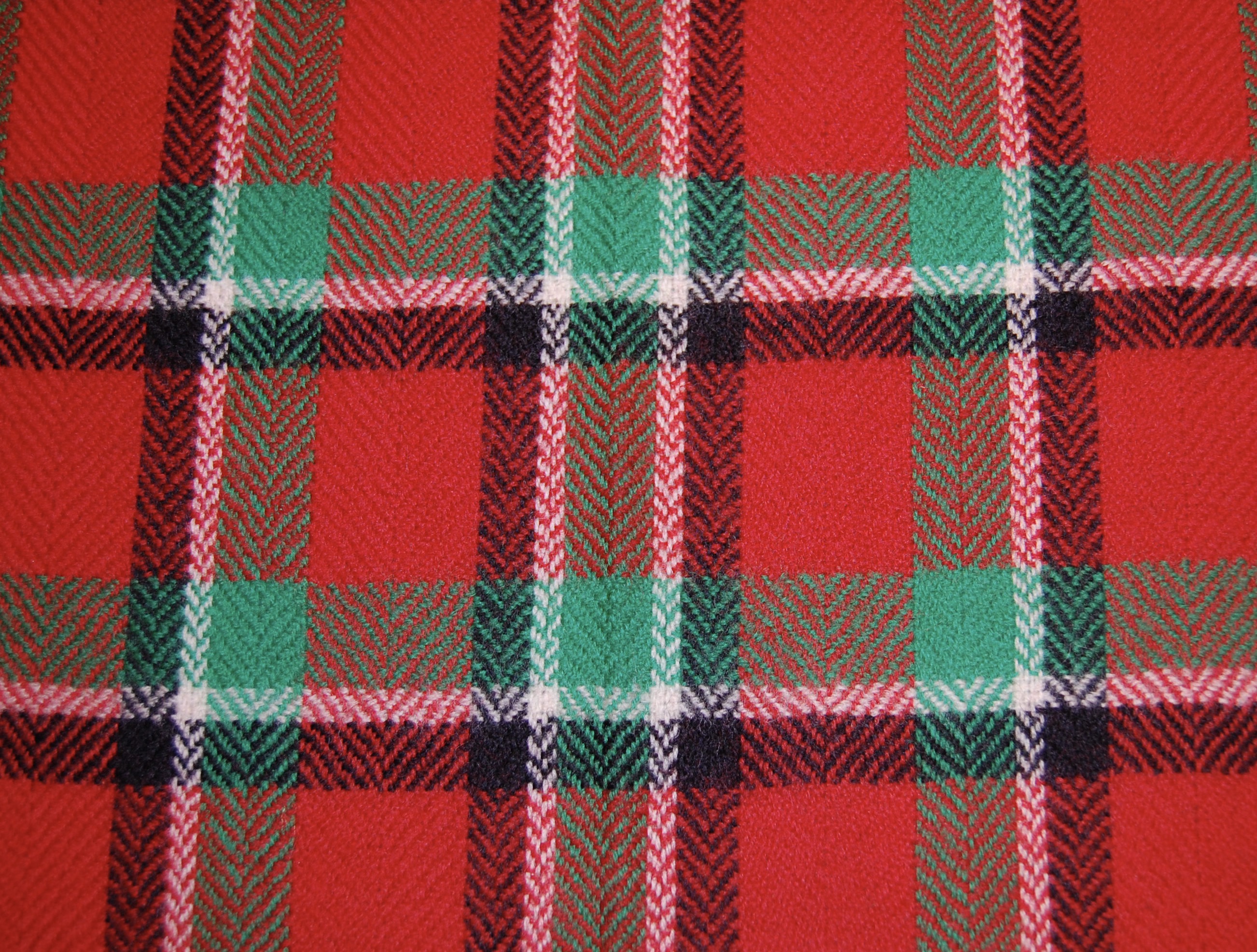
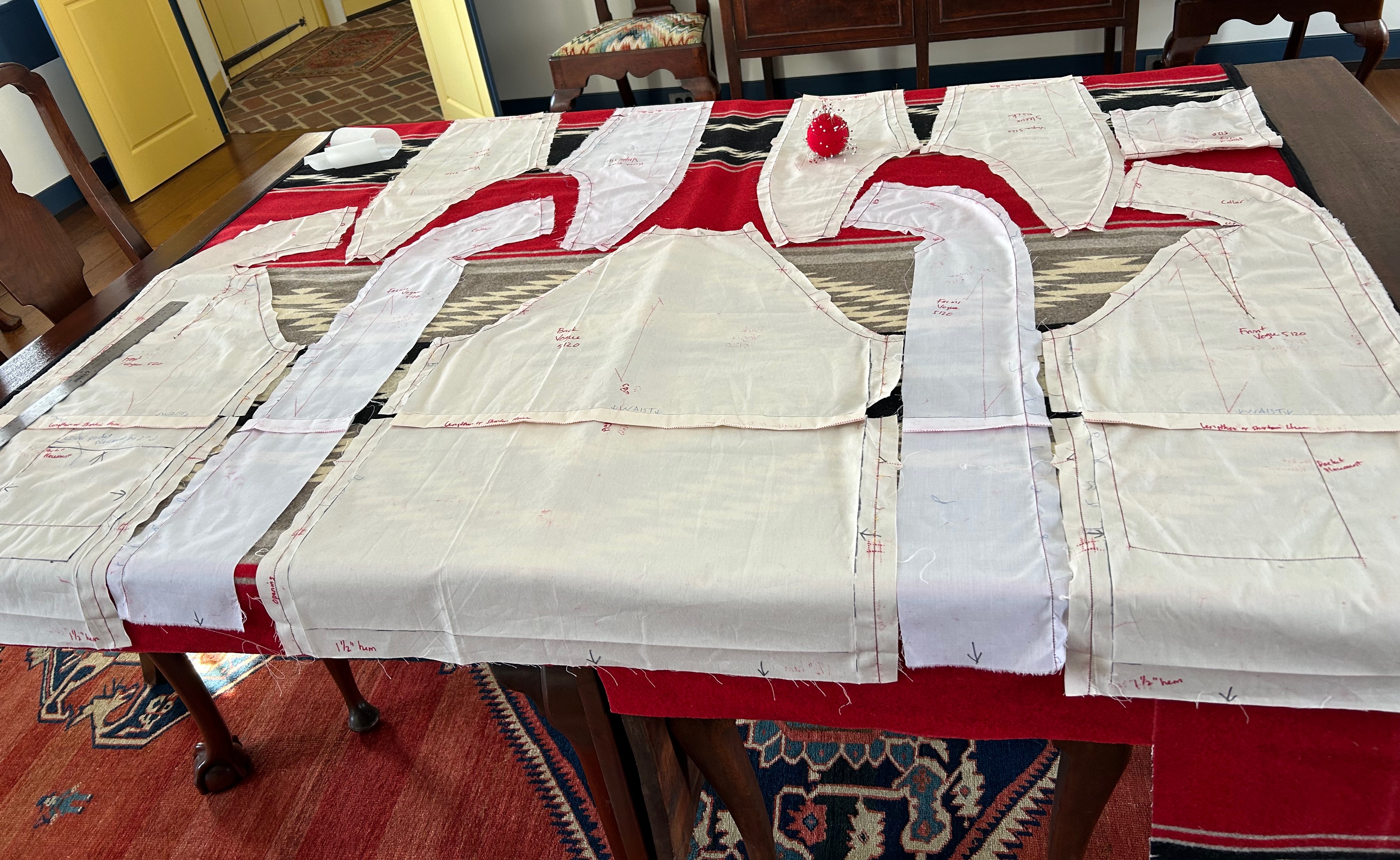
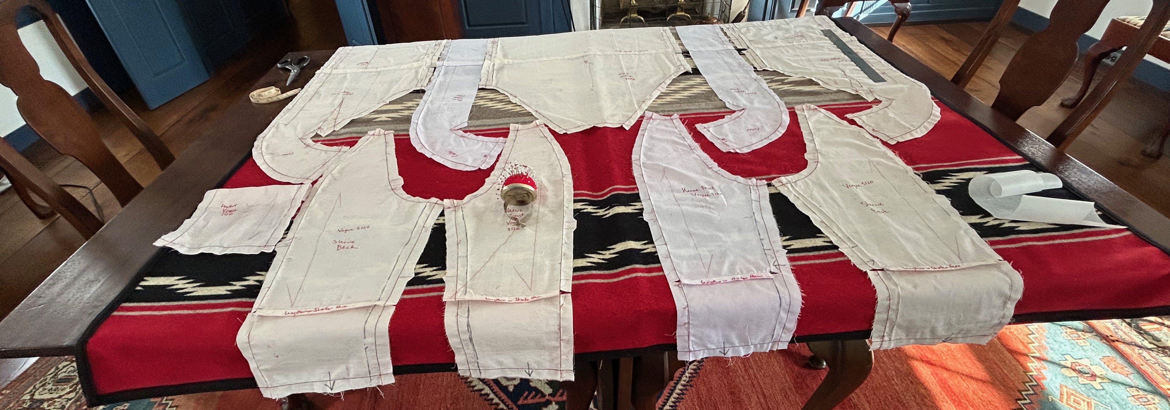
I took my muslin apart, producing pattern pieces to fit onto my fabric/blanket. Was making this jacket out of what I had left of the blanket even going to be possible? If so, how would the placement of the pattern pieces on the very graphic and large design work out? 

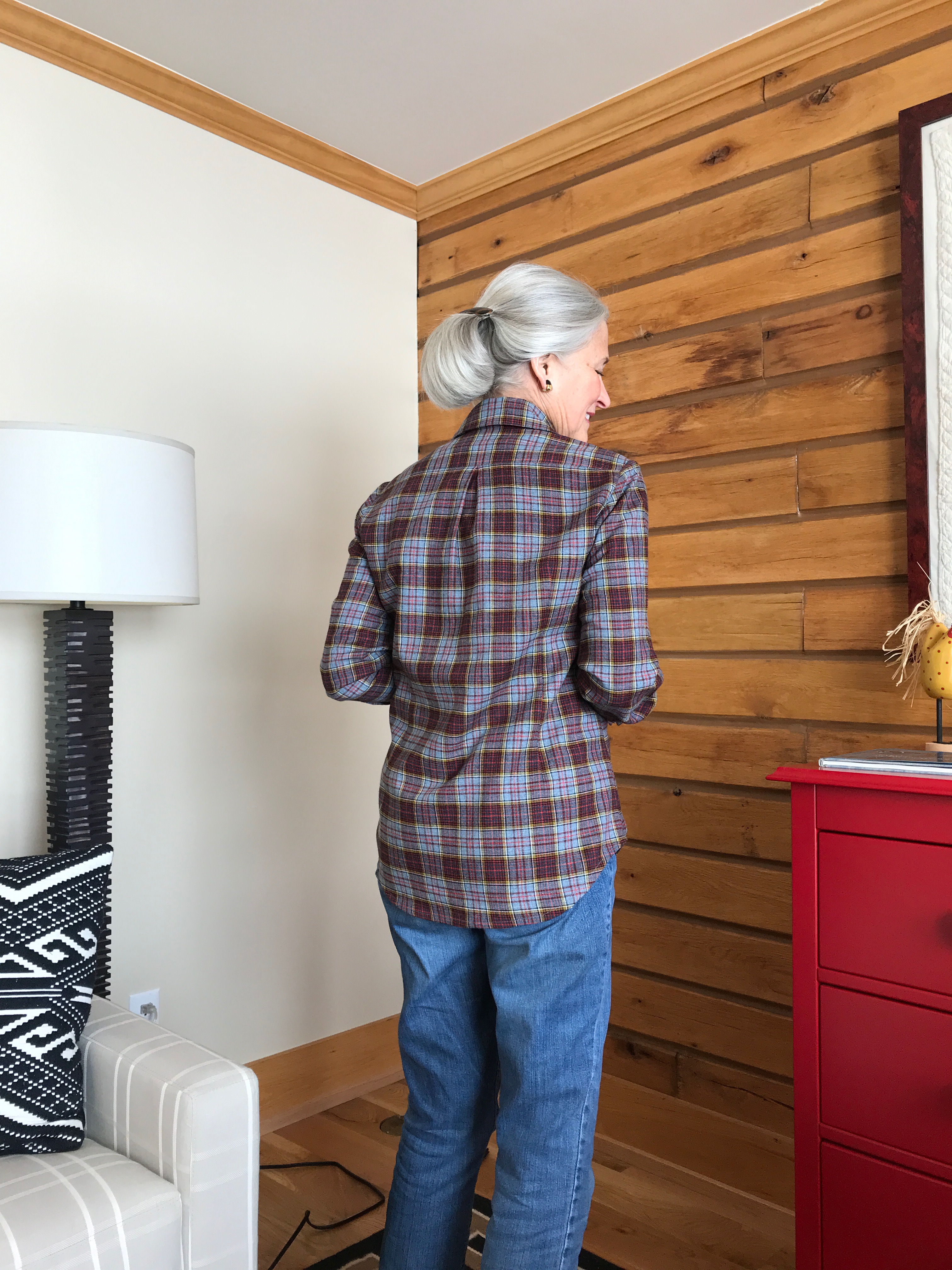
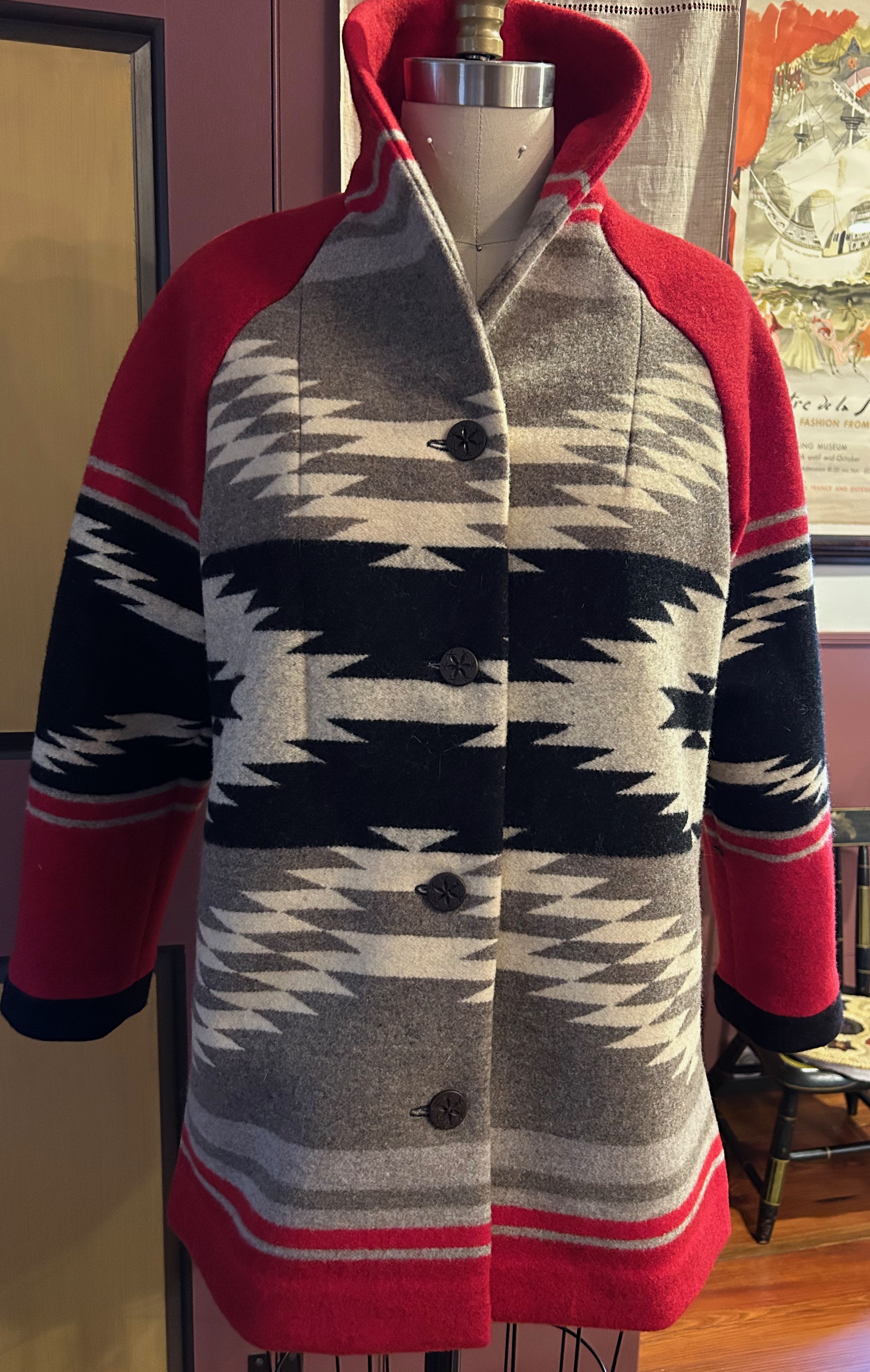
I got to work with everything spread out on my dining room table, starting with two main objectives: 1) The large “dragonfly” motif on the blanket would be centered on the back of the jacket, and 2) I wanted the “portrait” or neckline area of the shawl collar to feature the dominant color of red. 

I had to use the entire width of the blanket, without an inch to spare in the final layout, for the pieces of the main body of the coat. This layout gave me the the red collar I wanted and the center motif of the blanket centered on the coat back. Visible on the lower part of the picture is the where the upholsterer had cut the fabric.
This is the opposite end of the blanket, where I needed to position the sleeves and, potentially, patch pockets. This is where it got a little tricky. That black “sawtooth” panel, a dominate woven feature, was going to make or break the fluidity of the overall look of the coat.

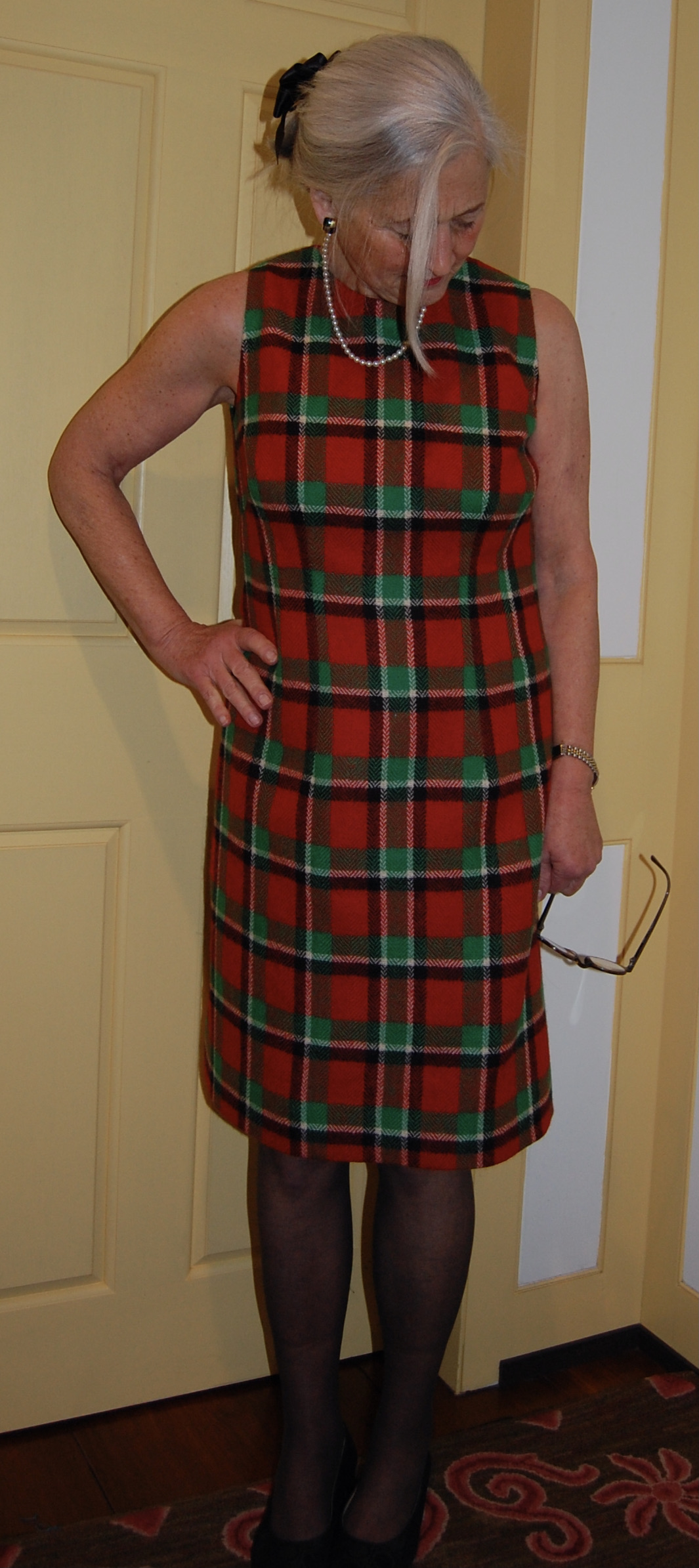
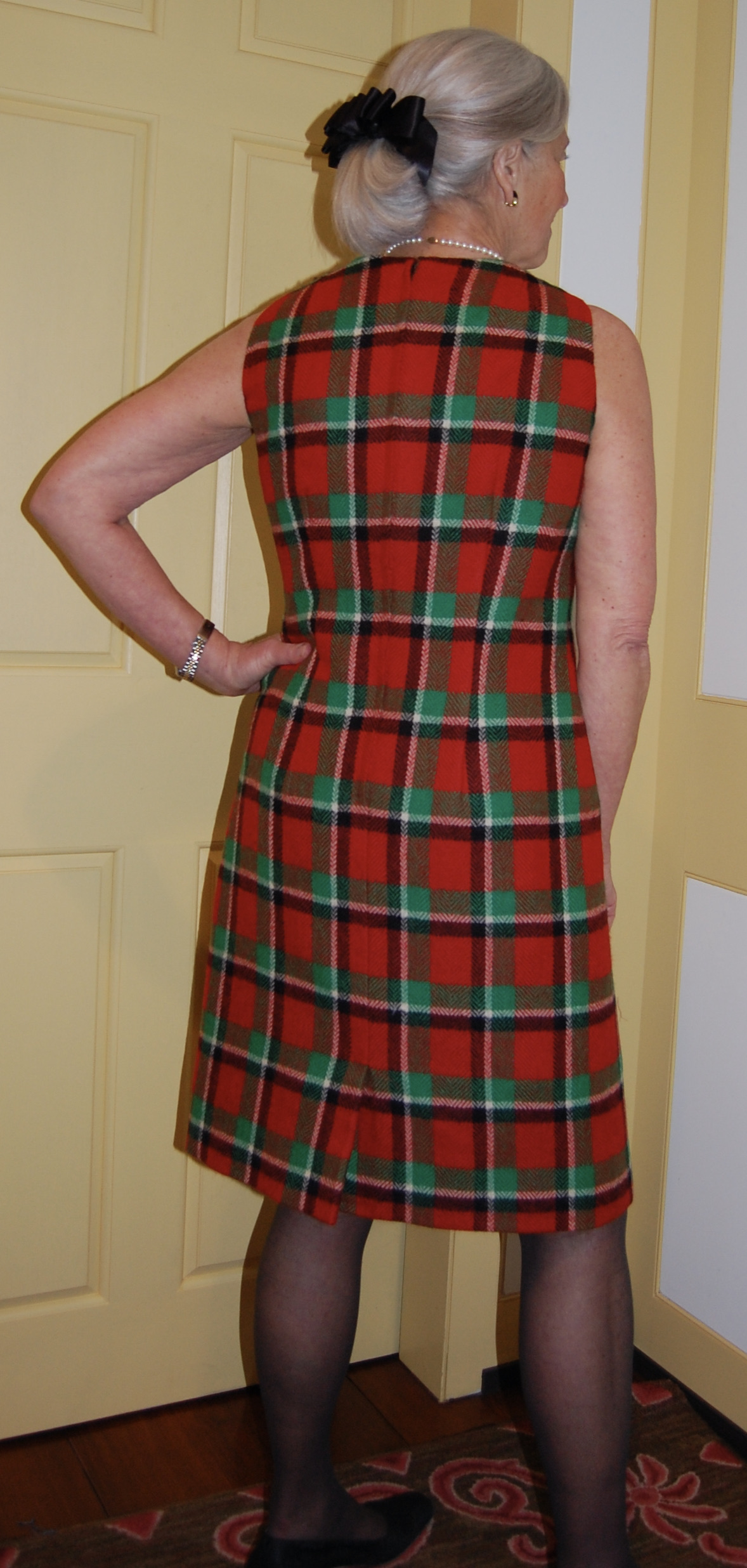
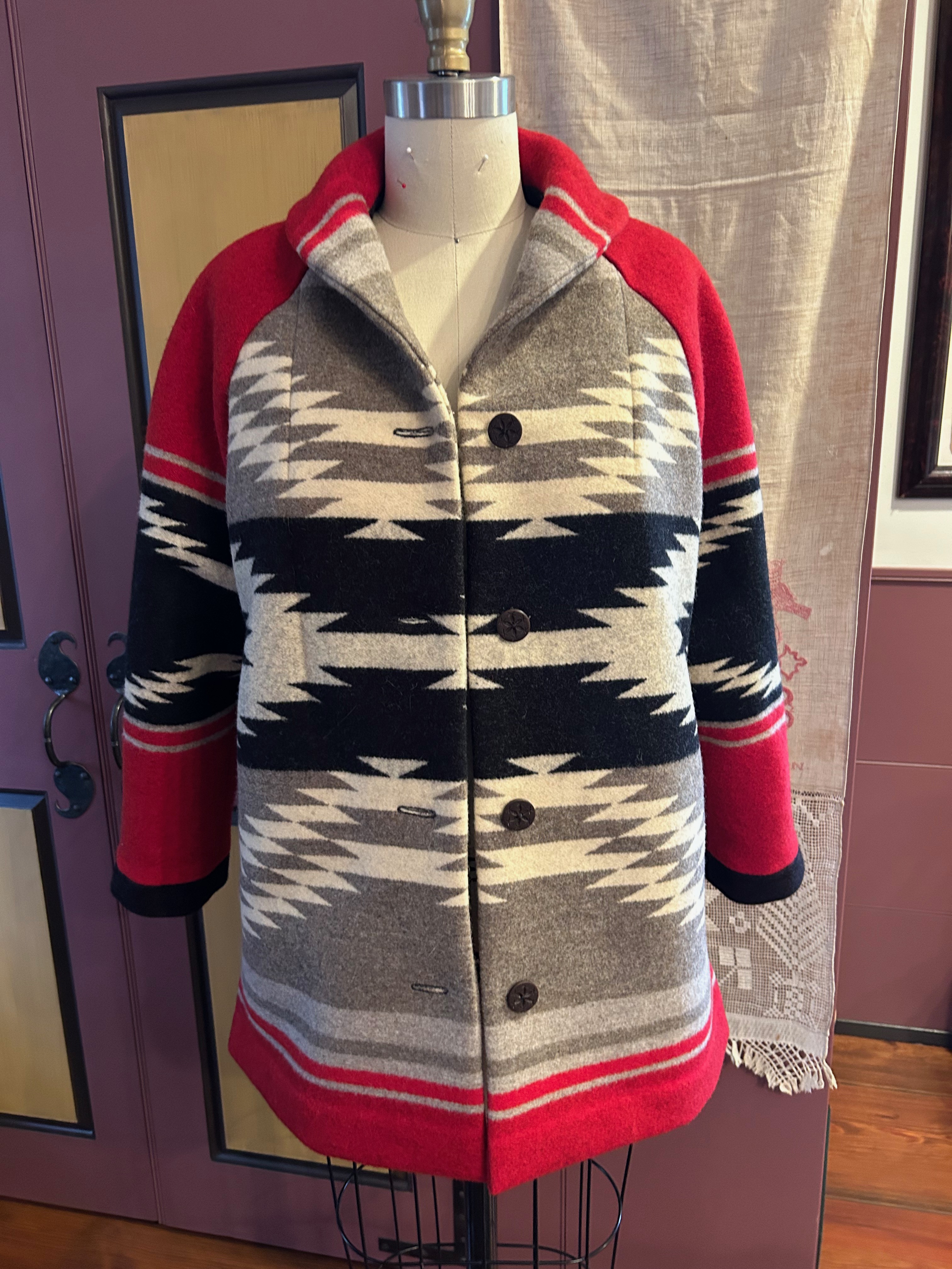
From there the fabric told me what I could do and what I could not do, and the best way to explain my decisions is to show you the finished coat.

1) I determined the dominate black stripe across the sleeves (see below) absolutely had to be centered on the black stripe across the front of the coat (and consequently centered on the main motif on the back.) However, the width of the two stripes were not the same. 2) The only way I could center them was to wiggle around the placement of the sleeves on the fabric. I had not originally intended to put black “cuffs” on the sleeves, but that turned out to be the only way I could center the black stripes on each other, by moving the sleeves off the edge of the fabric, and adding “cuffsto get the sleeve length I needed.
First, I cut out the main pieces of the coat. (I had Plan B in place already, knowing by now I would have to piece the lower edges/cuff on the sleeves.) That gave me more flexibility on determining exactly how those two black design features would lineup to best effect.
I was sweating bullets, even with Plan B, when I realized how much I had to wiggle the sleeves down off the edge of the fabric to get those black design features centered on each other. In this photo you can see the scraps of black fabric (reversible to red) I intended to use for the “cuffs.” Fortunately I found that I could successfully remove the binding on the blanket, gaining me another 3/4 inch in length – which meant the piecing I needed to do on the cuffs would be a pleasing width.
Here is the back of the jacket. I was very pleased with how well the sleeves lined up with it.

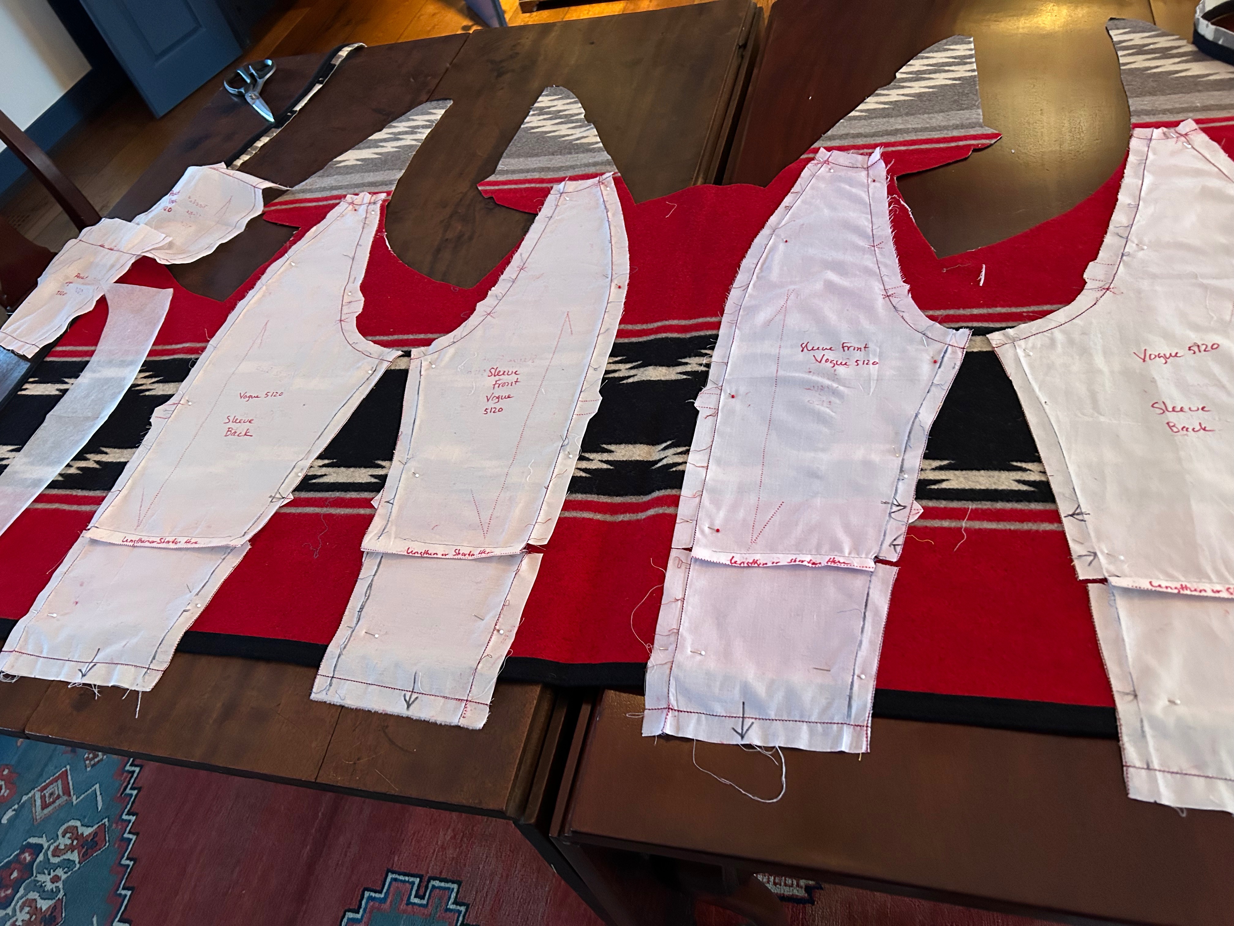
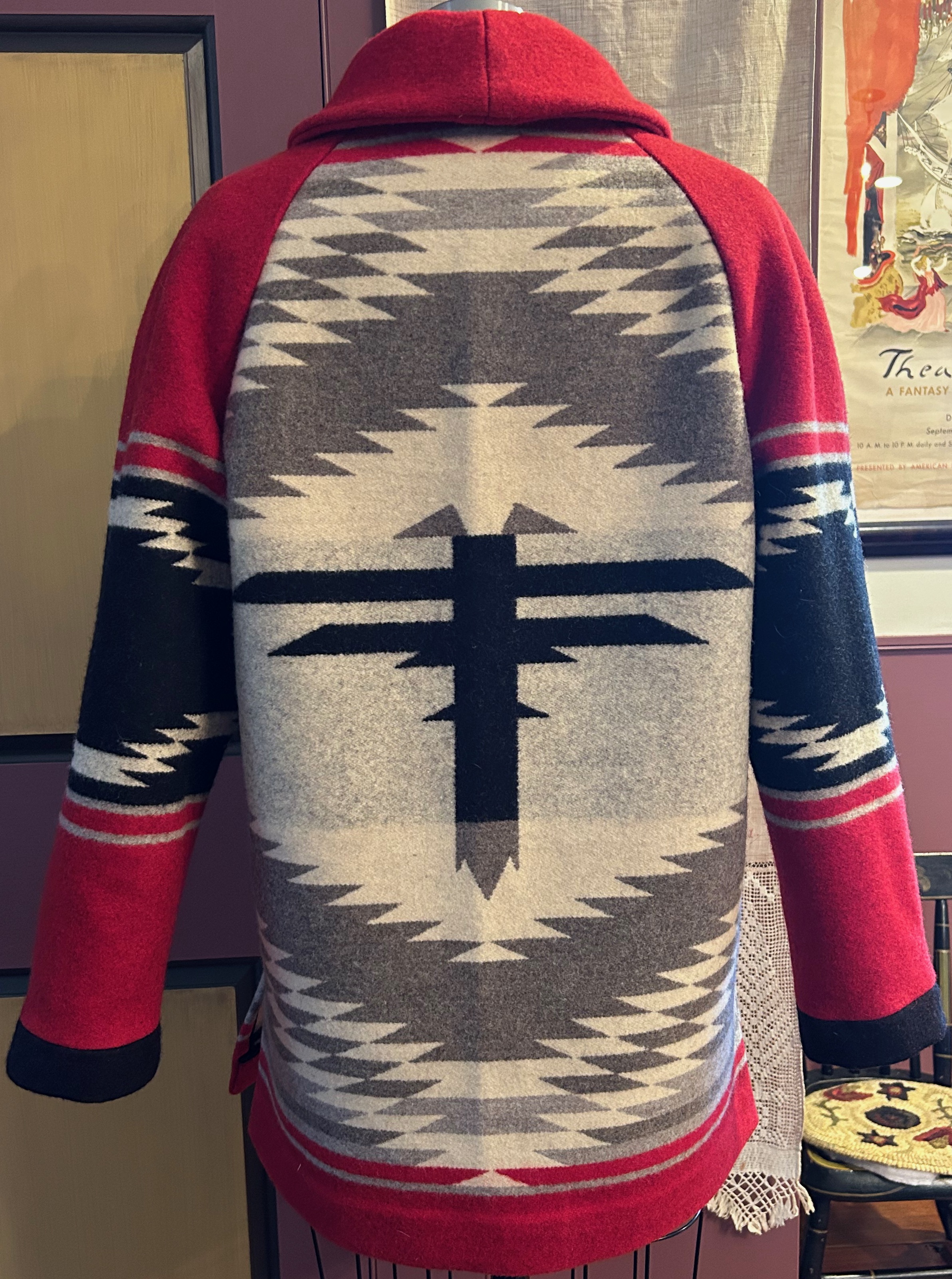
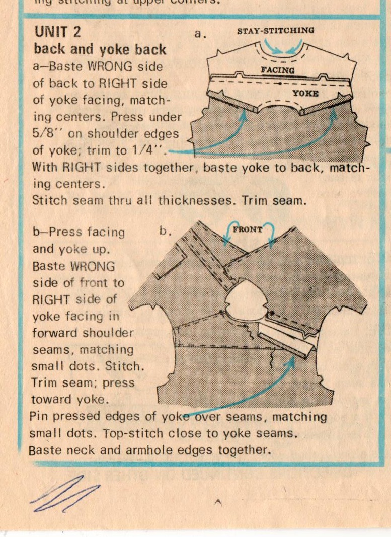
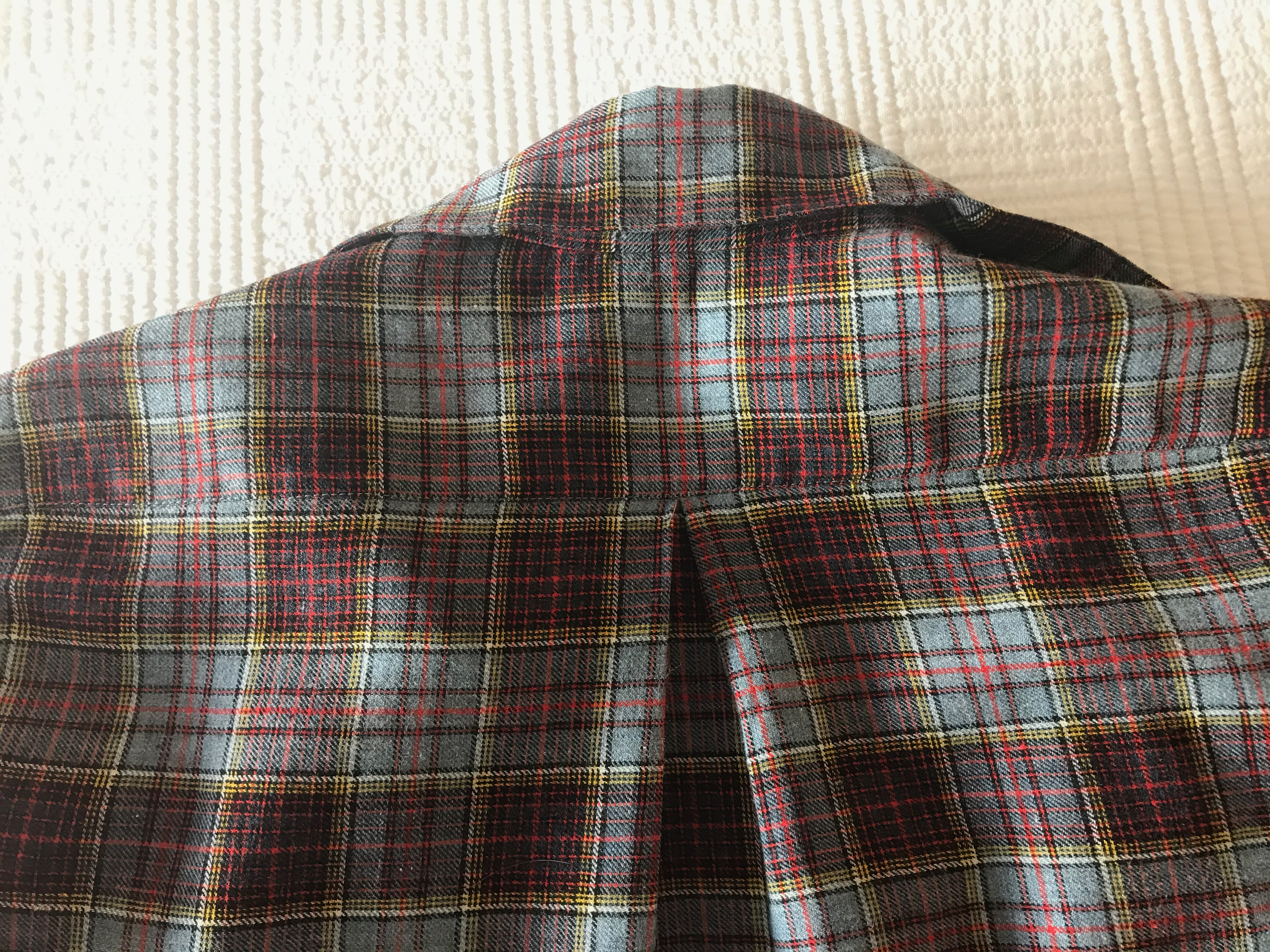
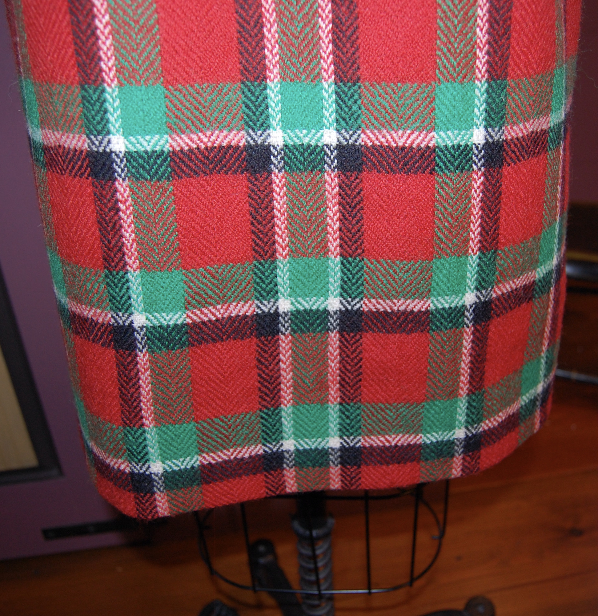
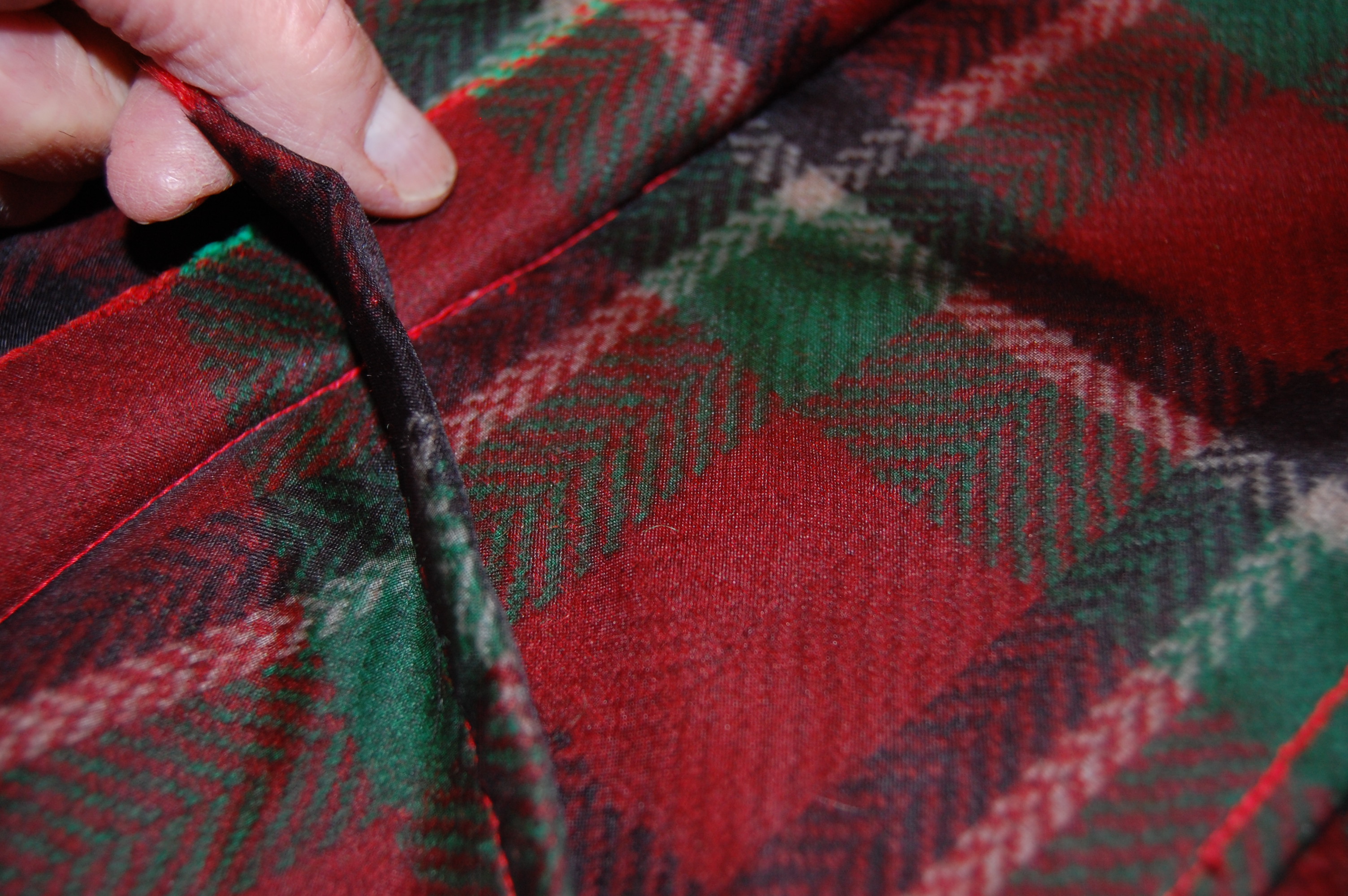
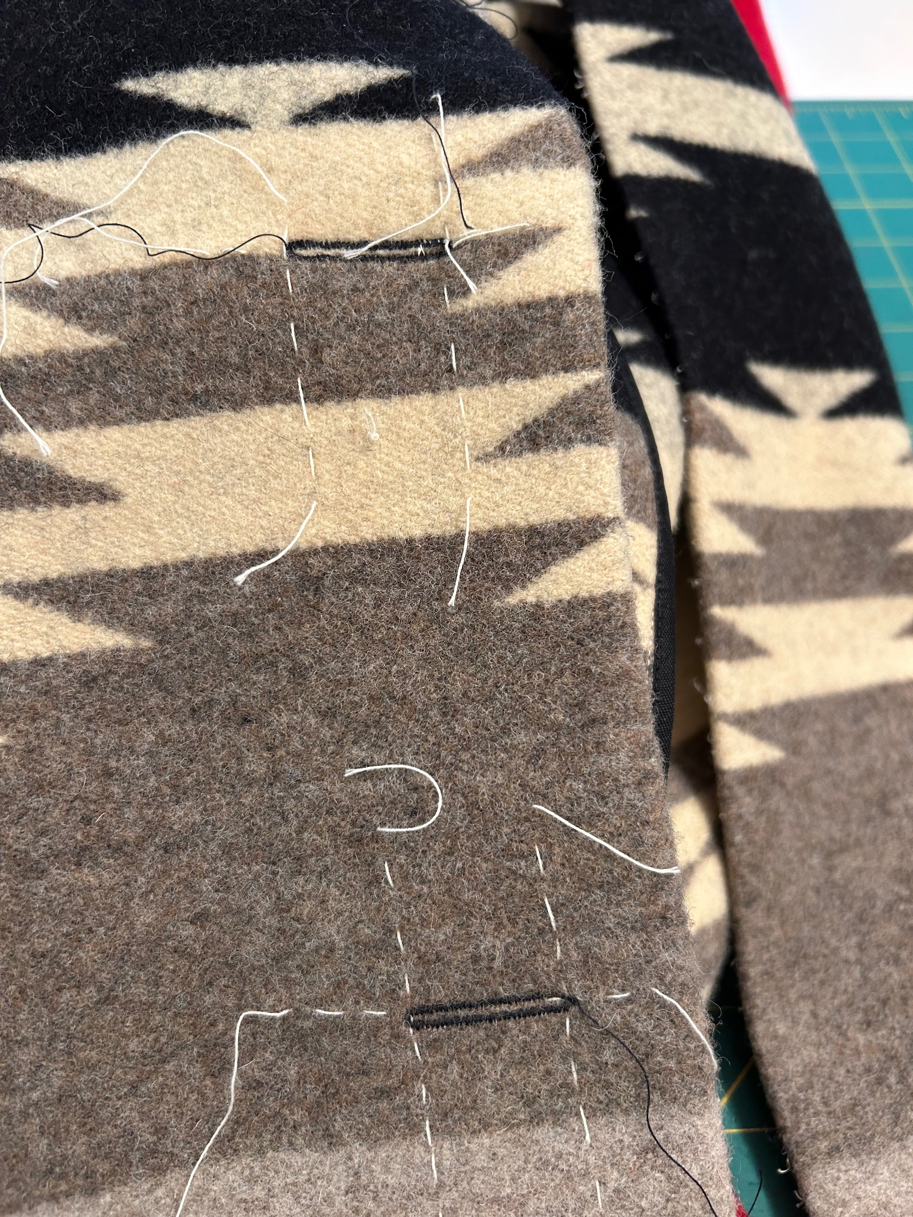
I thought it would be “easy” after getting to this point. Easy is not a word I should ever use while sewing. I should know that by now. Every seam had to pressed with loads of steam, followed by a clapper to help set it, usually more than once. Every exposed seam edge needed to be encased with rayon tape. I split the two vertical darts and needed to hand-stitch the raw edges to prevent fraying. Every seam needed to be basted together before machine sewing in order to keep the horizontal lines in the design matched.  

Here and below are looks at the interior seam binding I did on all the exposed edges – and the fabulous labels which I took from the blanket and attached on the coat front facing.

Here is the back interior of the jacket, showing the sleeve linings (I used lightweight cotton batiste that had a slight sheen) and how I finished the raw edges of the center back neckline.

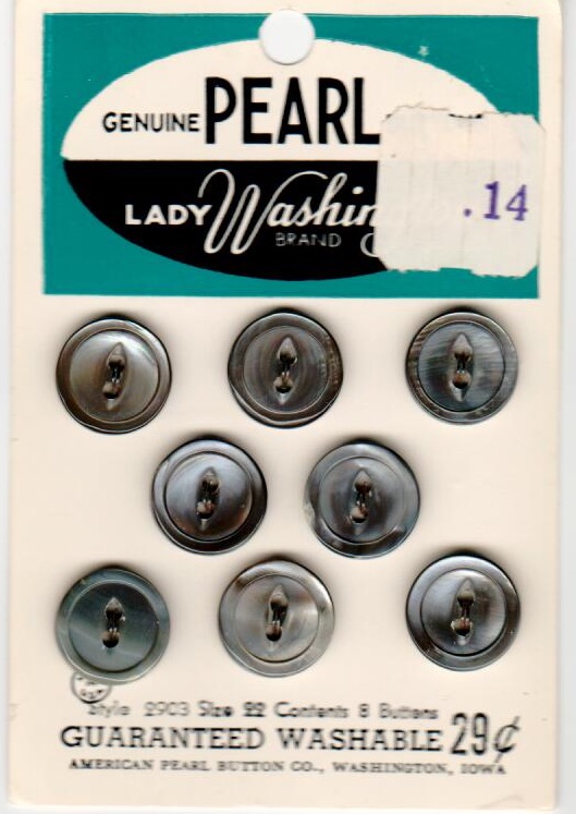
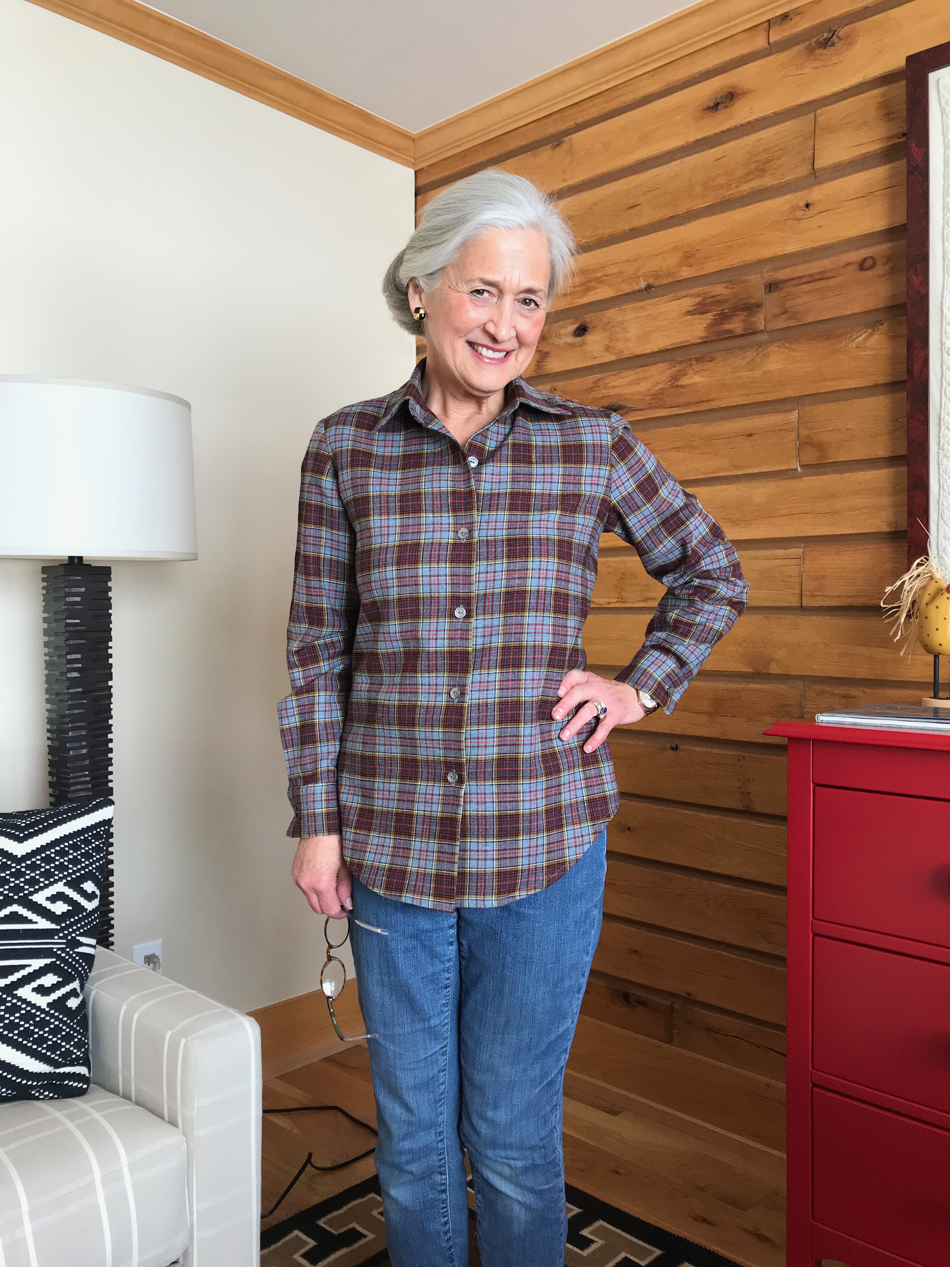
I had found a set of taupe-colored vintage buttons in my collection which, at first glance, did not look like they would work. But after auditioning black buttons and red buttons, I was convinced those taupe ones would be perfect.  However, I had no idea how I was going to do buttonholes in that thick fabric. I fiddled around with fabric scraps to make practice bound buttonholes, using a lightweight fabric for the “lips.” They looked awful.  I thought of using large snaps and just securing the buttons on the coat front for effect. That did not appeal to me at all.  So I went to my two failsafe sewing maxims:  1) I’ll figure it out later, and 2) Plan B – it BETTER work.

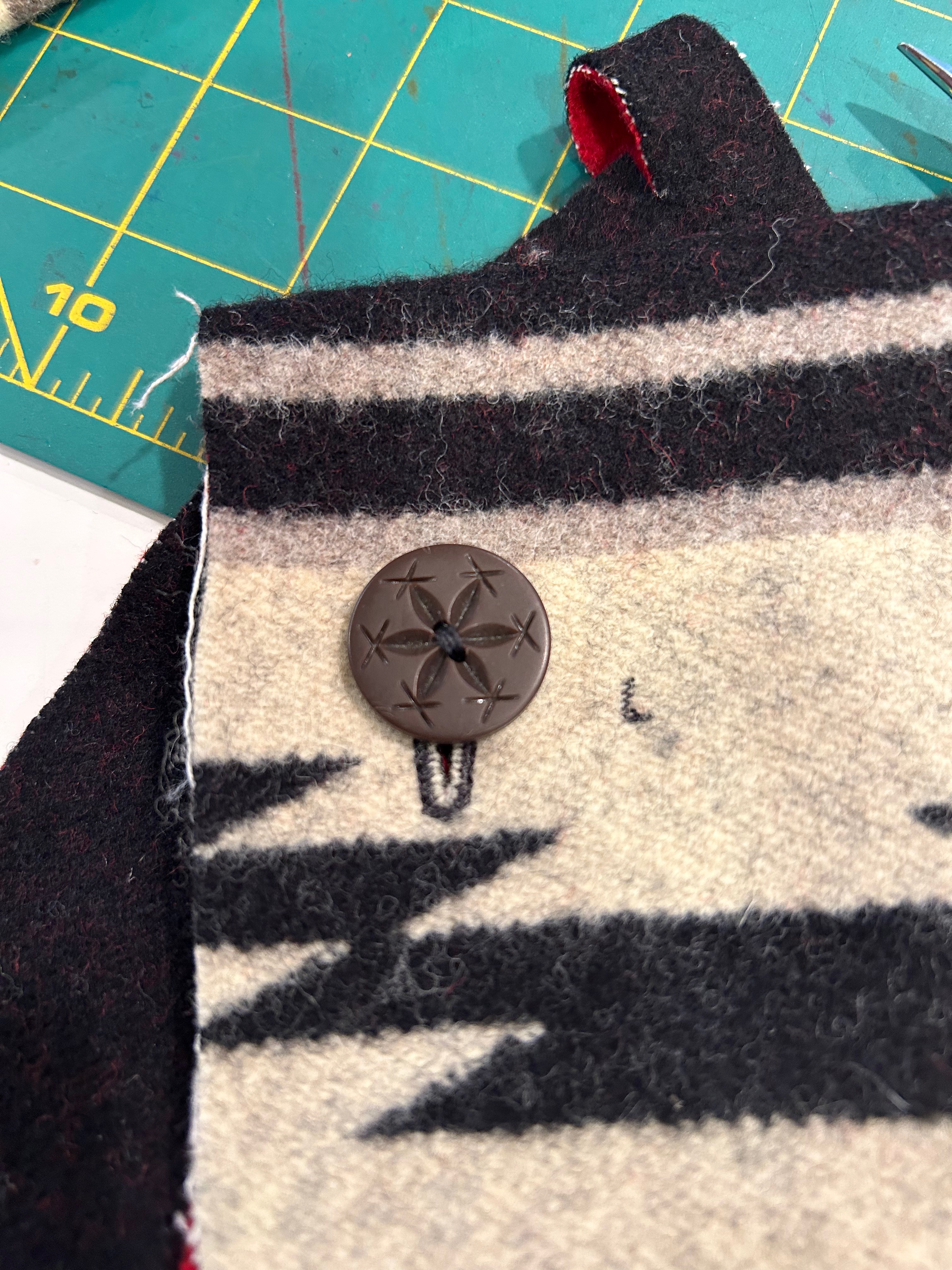
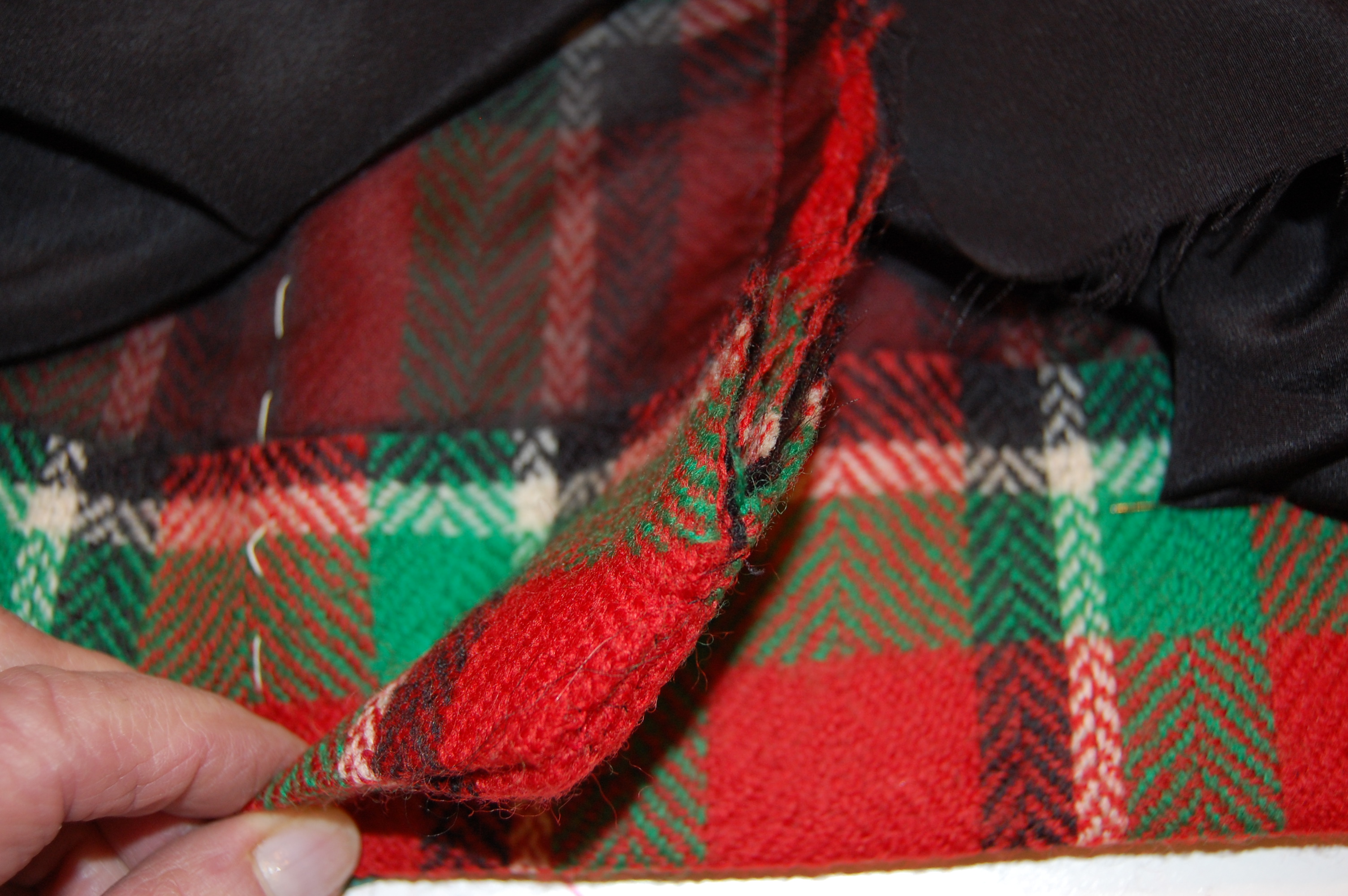
The jacket was practically finished before I found a method to make those buttonholes. Because the fabric was so thick, I could successfully only do a machine buttonhole on one layer of it. I experimented around and discovered if I made the buttonhole on the front of the coat, I could then line up the facing and use a straight machine stitch through both layers around the buttonhole. I used very small stitches to make it secure. Then I sliced them open. It worked!

I had to remove the facing to make the machine buttonholes and then stitch it back on before continuing. I could not have seen that coming since I really did not know early on how in the world I was going to make these buttonholes!
This picture shows the buttonholes all finished and completely functional! Also, this is an interesting view of the front of the coat. I was kind of wringing my hands over the center front of the coat. I did not have enough fabric to balance the design across the center front. And then I realized, even if I had had enough fabric to do that, it would not have worked. The reason? I would not have been able to balance those small dragonfly motifs on either side – or – they would have been pushed too much to either side to make sense for the design. To my eye, that balance was the more important one. One more thing… I did not have enough fabric to make patch pockets for the coat. I considered making inseam pockets out of the black batiste, but I was concerned they may cause distortion of the side seams due to the heavy nature of the fabric. I finally decided to forego pockets altogether. After wearing the coat next winter, I can always come back to the pocket conundrum if I decide pockets are a must. Right now in my mind, they are not.

Are you still reading at this point? Or did I lose you back at the dining room table?

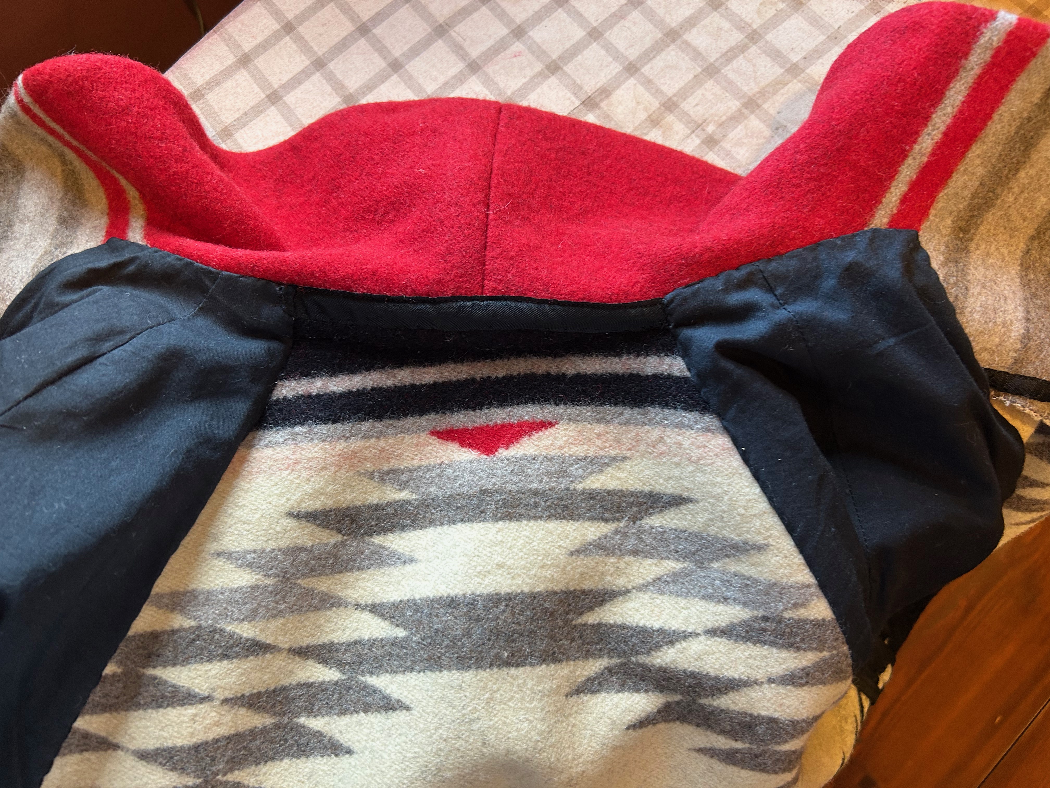
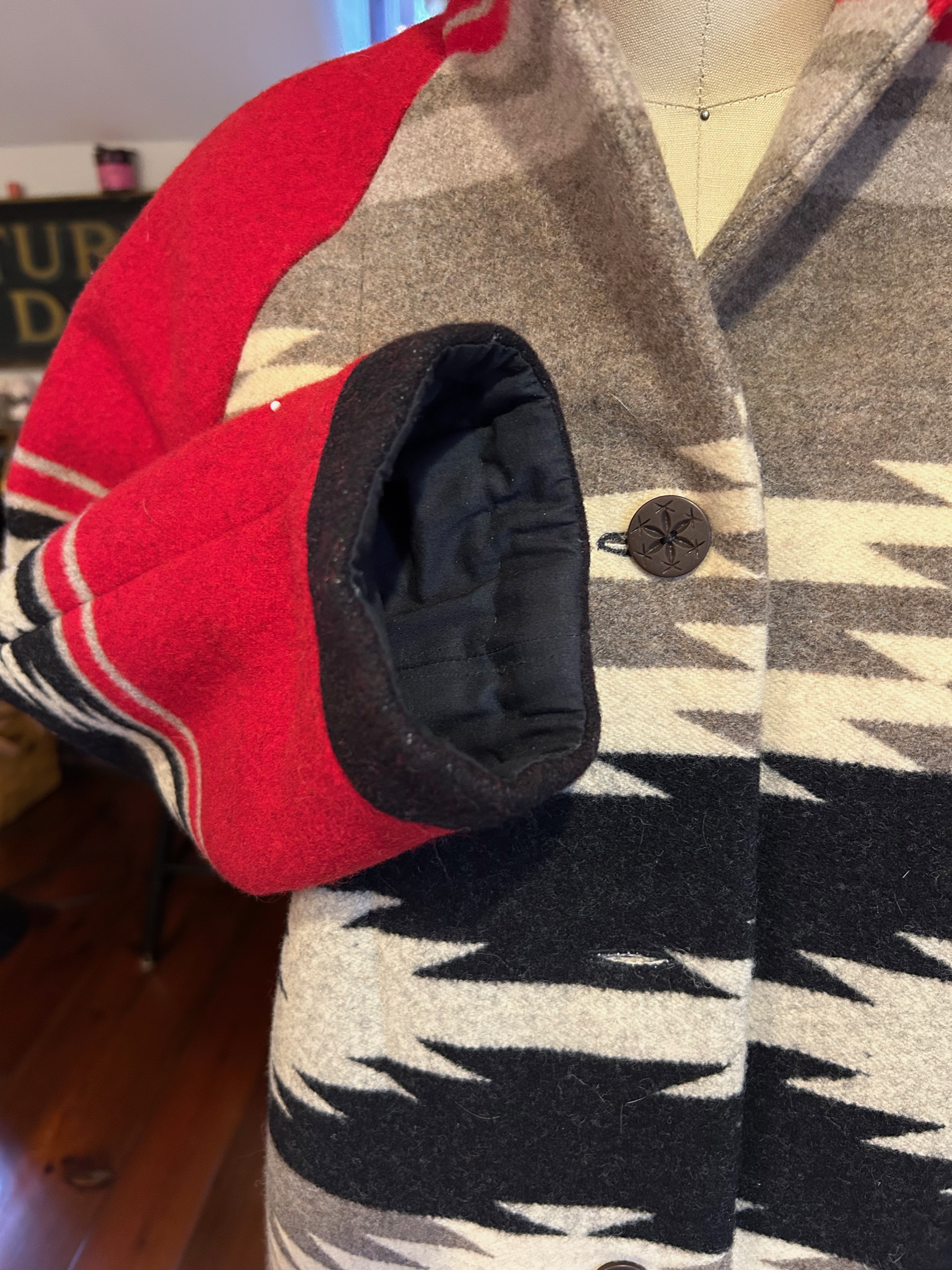
Almost finished! The final touches on the coat involved under stitching the collar to hold the turn in place, and securing the sleeve lining to the underside of the black “cuffs.” 

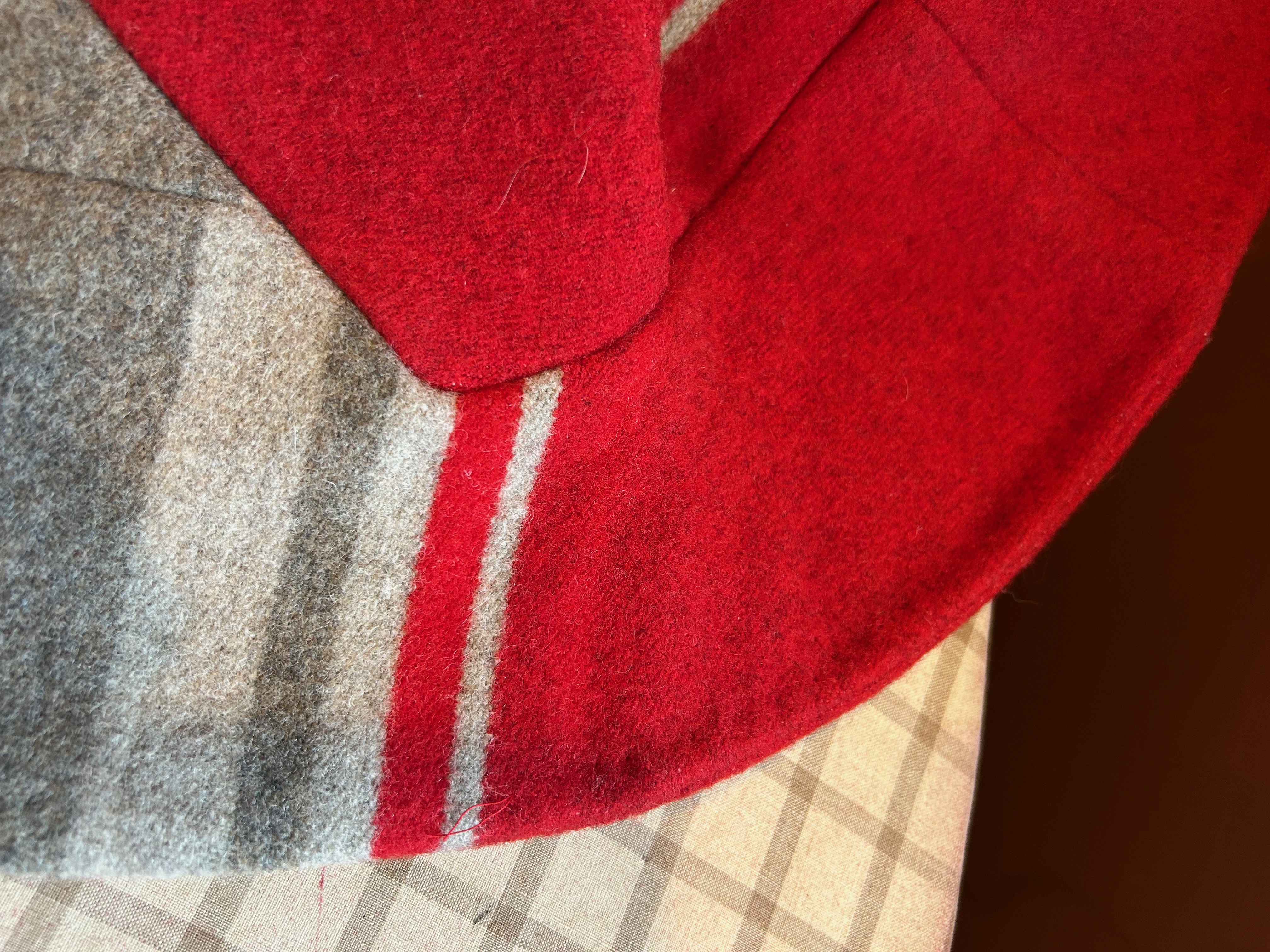
What do you think of the black cuffs? I had no choice but to do them this way; hopefully they look intentional rather than contrived.

Understitching on the collar.
Hand stitching holding the sleeve linings in place.

I have to say I was pretty thrilled with how my jacket turned out, considering the parameters facing me.  

Now I do indeed match my chair! More importantly, however, I have a very classic, one-of-a-kind, Pendleton wool, western-style jacket which is going to be fun – and warm – to wear.  

48 Comments

Filed under Blankets and doll blankets, Buttons - choosing the right ones, car coats, Coats, fabric labels, Pendleton Woolen Mills, Sleeves, Uncategorized, vintage buttons, vintage Vogue patterns from the 1950s, woolens

One for Winter

And Winter it has been!  BRRRR….  Seriously cold weather calls for some seriously warm fabric, and I had just the right piece waiting for such an occasion.  

When I found and purchased this vintage piece of Viyella several years ago, I thought the plaid was of a larger format.  I’m not quite sure what I thought I might make with it, but I tucked it away for another day.  After making so many casual cotton blouses over the past few years, last Fall I had one of those “Aha” moments, and decided this Winter would be good time to make one for cold weather – and what better fabric to use than this small-scaled plaid Viyella?  

It is always reassuring when there is documentation attached to a piece of vintage fabric. Two of these paper labels were attached to the fabric when I purchased it.

I have had direct experience with the warmth that Viyella provides, having made two bathrobes out of this storied fabric.  And unlike some wool (Viyella is a wool/cotton blend), this fabric does not itch against bare skin.  I made the robes pictured below in 2017 and 2019, respectively. I expected the Viyella which is the subject of this post to be of the same scale as these two plaids. Yes, purchasing vintage fabric online can have its surprises!

I’m not sure any single garment I have made has been worn and appreciated more than this robe.
I made my second Viyella robe to keep in our vacation home in Wyoming.

The background of this current fabric “reads” blue, but it turns out gray thread and gray buttons seemed to be the best complement to it.  

Always on the hunt for vintage pearl buttons, I found these gray ones to use for this blouse.

This is the time-tested and altered Simplicity pattern I have used repeatedly – with its yoked back – and shirttail hem.  

Every time I make this pattern, I have to go to the instruction sheet for the yoke construction details, and EVERY time I get confused!  

This may be the first time I have actually made this pattern without having to take out at least one seam in the process of joining the yoke to the back and fronts. 

How difficult can it be to attach a yoke? Somehow I make it difficult every time!

There is really not too much more to say about this blouse, except perhaps to wonder why it took me so long to decide to make it. 


I have a number of Viyella labels in reserve, so I was happy to use one for this blouse.
Staying warm!

Hmmmm.  One for Winter might become Two for Winter… 

27 Comments

Filed under Bathrobes, Blouses, Buttons - choosing the right ones, fabric labels, Uncategorized, vintage buttons, Vintage fabric, woolens

A Dress That Was Meant to Be – in Vogue

Sometimes the sewing stars align to ensure success (and sometimes they don’t.)  But this story is a success story, although it played out differently than I originally planned.  

I wrote about this vintage Forstmann wool fabric in a previous post.

Having only 1.25 yards of this vintage wool restricted my options to either a simple sheath dress or a skirt.  I opted for the sheath, with all good intentions of using the princess-lined pattern I had recently used for a pink dress in vintage Linton wool.  In fact, one of the reasons I made the pink dress was to see if I would be able to successfully match plaids when I started on the red/green wool.  (The weave of the pink Linton has a plaid woven into it, which I knew would be helpful to me in determining the pattern’s useability for a multi-color plaid.)  Only one problem – when I laid out the pattern pieces on the Forstmann wool, I didn’t have enough fabric.  I should have realized that the 7-panel princess dress would take more fabric than I had – and this time there was no making it work.

SO – I had to find another pattern.  I have, over the years, made several sheath dresses using a newer Butterick pattern, but I really wanted to use a vintage pattern for this wool.  Now, I have a lot of vintage patterns in my collection – and I went through every single one looking for the right sheath dress.  At first I didn’t realize this pattern had the look I wanted.  

I had originally purchased this pattern for that gorgeous shawl collared coat.  But – BINGO – when I took another look, there was the perfect sheath looking right at me.  

Although the pattern was not dated, I knew it was from the early 1960s.  But of course, I thought it would be wonderful to know the year it first appeared.  A lengthy search through old Vogue Pattern Magazines proved to be successful – not only successful, but timely.  This pattern was included in the December 1962/January 1963 issue, and was the featured pattern for a Special Capsule Catalog included in the issue.  Not only that, the caption read: “110 IDEAS TO START THE NEW YEAR IN VOGUE.”  Yes, I thought, that’s what I want to do!  

What a glamorous look!
And here is the entry for this pattern in the capsule catalog.

Of course, starting with a pattern I had not before used meant I had to make a muslin (toile)  and fit it.  That little effort took two days.  But then I got started in earnest, cutting out the silk organza underlining and positioning it right where it needed to be on the fabric.

You will notice that this fabric has a center front, woven to provide a mirror image of the plaid on each side. Really a brilliant way to handle an uneven plaid.

There were two important considerations for placing my silk organza underlining “templates” on the plaid:  1) the orientation of the plaid vertically and 2) the correct placement of the hemline on the grid of the plaid and making this placement work with the position of the waistline and neckline.  

I thought the wider, darker part of each woven “block” on the plaid should be oriented to the bottom of the dress, which I believe is apparent above.  

I find, when working with plaid, it is very important to have the hemline determined before you cut out your fabric.  Visually it is more appealing if the hem does not cut a block of the plaid directly in half or, especially with smaller plaids, end right at the edge of a block.  I think it looks better if there is a bit of a “float” around the bottom of the dress to anchor the bottommost blocks. (Larger plaids have their own considerations. Look at the art on the pattern envelope above to observe this.)

The red “band” at the hemline serves as this “float.”

One of the design features of this dress is the kick pleat, which has its origin in the back seam starting at the bottom of the zipper.  I wasn’t sure how I was going to work the lining around this, but I also thought I could probably figure it out.

The instruction diagram shows the kick pleat quite well.
I angled the raw edges to finish the bottom edge of the seam.
Here is the finished kick pleat.

I loved that fact that this type of kick pleat made the perfect setting for a lapped zipper, shown below.  

The left side is pressed slightly to the middle to accommodate a lapped zipper.

You will notice this dress has two shaping darts on either side of the front panel, in addition to the bust darts.  The back has one shoulder dart and one shaping dart on either side.  

All these darts make for such a lovely fit. In addition, I used a trick I have learned from Susan Khalje. Instead of sewing the bust dart into the side seam, I allowed it to float free, stitching the seam above and below the dart. I did this for both the fashion fabric and the lining. Using this method provides more ease to the bust.

This photo shows what I did with the side seam at the bust dart.

I did lower the neckline by about ½ inch, and I cut the shoulders in by about an inch on either side.  These changes just seemed to look better on me, as determined by my muslin (toile).  

I lined the dress in black silk crepe de chine. (I find almost all my lining silk at Emma One Sock.)  When it came to the kick pleat, I found that a slanted seam below the end of the zipper was necessary to divide the lining between the two sides of the kick pleat. 

Black is so difficult to photograph, but hopefully the angle is apparent.

 I have no idea how to explain what I did to finish the lining in this area.  Just know that whatever I did – worked!  I ended up with no lumps and no restriction on the functionality of the pleat.  

How lovely to have a label for this vintage wool.

This dress was such a fun project.  I loved working with such a beautiful wool and such a beautiful pattern.  There will be more such sheath dresses in my future. 

I now would like to make a black jacket to wear with this dress; I do have a small amount of fabric remaining to use as trim in some way…

So now, how about you?  Have you started the new year in Vogue? I hope so!

52 Comments

Filed under couture construction, fabric labels, Hems, Linings, Mid-Century style, Pattern Art, Sheath dresses, Uncategorized, underlinings, Vintage fabric, vintage Vogue patterns from the 1960s, woolens

A Fabric and Its Label

Find me a beautiful vintage fabric, accompanied by its original label, and I will tell its story. 

 
What started off as a simple eBay purchase evolved into something quite unexpected, with secrets and history to reveal. It is all about this piece of vintage Forstmann wool, purchased within the last two years.  

This wool is 56″ wide and I have 1 1/3 yards, just enough for either a skirt or a simple dress.

I was drawn to its vibrant plaid combination of red and green and black and white.  An extra bonus was its attached label and famous brand name.  I was familiar with Forstmann woolens from the time I was a child in the 1950s, and I was aware of its renowned quality.  But I was quite unprepared for the reality of my purchase.  

Immediately upon opening the package, I was struck with two things:  the saturation of the colors and the buttery softness and easy hand of the wool.  I was thrilled with my purchase, and carefully placed it away in my fabric closet, intending to think about it until I had a plan in place.   I would occasionally get it out to admire it, so I felt I was quite familiar with it.  However, it was not until this past Spring when I suddenly realized it was an uneven plaid.  Having just agonized over a dress made from an uneven Linton tweed plaid, and having by this time determined that I wanted to make a sheath dress from this wool, I had one of those dreaded “uh-oh” moments.  My plan seemed to be self-destructing.  An uneven plaid would not do for such a dress.

And then I did something I had yet to do – I opened out the full expanse of the yardage.  That was when I realized the brilliance of the woolen manufacturer.  The wool was loomed with a right and left side, with a center “panel,“ making it possible to have an even orientation of the plaid. Thus, I would be able to balance the plaid on the front and also on the back of the dress I hoped to make.

In the center of this photo is the center point of the wool, with half the width to one side and half to the outer side. Absolutely brilliant.
Here is a close-up, in which the lovely herringbone weave is also beautifully apparent.

With this exciting discovery, I then wanted to know more about when this fabric was manufactured.  I knew that Forstmann Woolen Company had advertised in Vogue Pattern Book Magazine in the 1950s and ‘60s, and I also knew Forstmann woolens were often the fabrics of choice for fashions displayed in the magazine.  A little bit of perusing and detective work helped me narrow down an approximate span of years for the production of my wool.

This full-page advertisement from the October/November 1953 Vogue Pattern Book Magazine features the label current at that time.  It is probably a precursor to the label I received with my wool.  

I love this ad for many reasons, but especially for the red coat. Isn’t it just so elegant?

I found no label pictured from 1955, but the cover from February/March features a suit made from Forstmann tweed:

This has to be one of my favorite magazine covers of the vintage Vogue Pattern Book Magazines I have.

The inside front cover from October/November 1959 is once again a full-page ad for Forstmann.  The label shown is similar to mine, but not exact. 

This label is another variation, without the descriptive phrase “100% Virgin Wool.” Again, this ad has beautiful depictions of wool, with Vogue patterns chosen for each of them.

It seems that by the second half of 1960, Forstmann Woolens had entered into a partnership with Stevens’ Fabrics.  

This ad was prominently placed on the inside front cover of the October/November 1960 edition of Vogue Pattern Book Magazine.

Proof of this partnership was quite apparent by the second half of 1962.  The label featured in this ad actually has Stevens Fabrics woven into the logo.  

From the August/September 1962 Vogue Pattern Book Magazine.

My best guess, from the above references, is that my piece of fabric was manufactured in the second half of the decade of the 1950s.  I have always considered that span of years as the golden age of American fashion.  My fortunate purchase reinforces the knowledge for me of the excellence of design, quality and craftsmanship available to the home sewing industry at that time.  Now – it is up to me to do justice to this piece of Forstmann wool. Amazingly, and with good fortune, the story of this fabric continues some 65 years after its manufacture. 

And here’s to a new year – 2021 – with its own secrets and stories to reveal. May they all be happy ones, waiting to be discovered and shared . . .

30 Comments

Filed under fabric labels, Fashion history, Mid-Century style, Uncategorized, Vintage fabric, vintage Vogue patterns from the 1950s, vintage Vogue patterns from the 1960s, woolens