
“You can never go wrong with a little pink… a lot works for me.” Dana Dalgetty
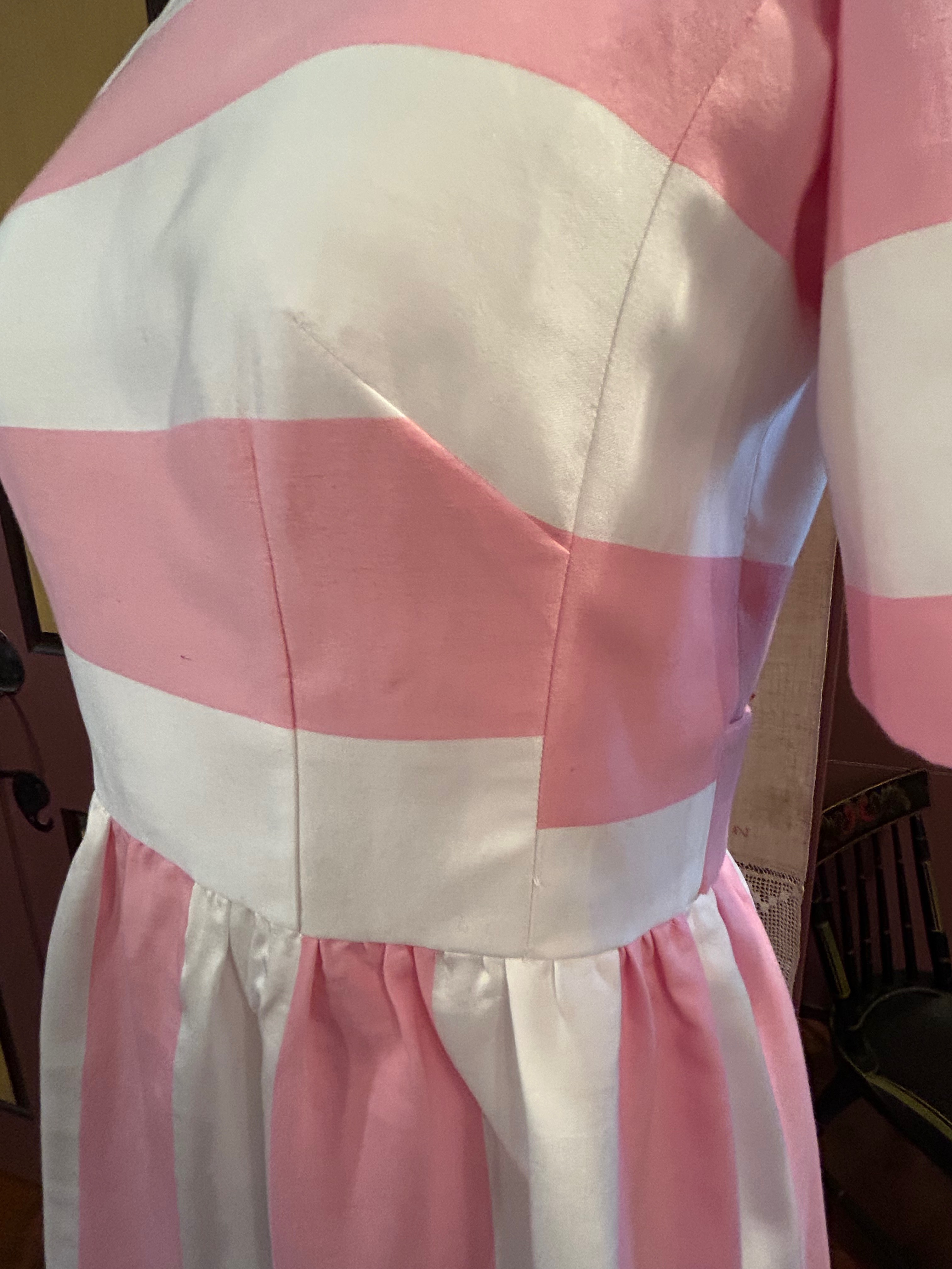
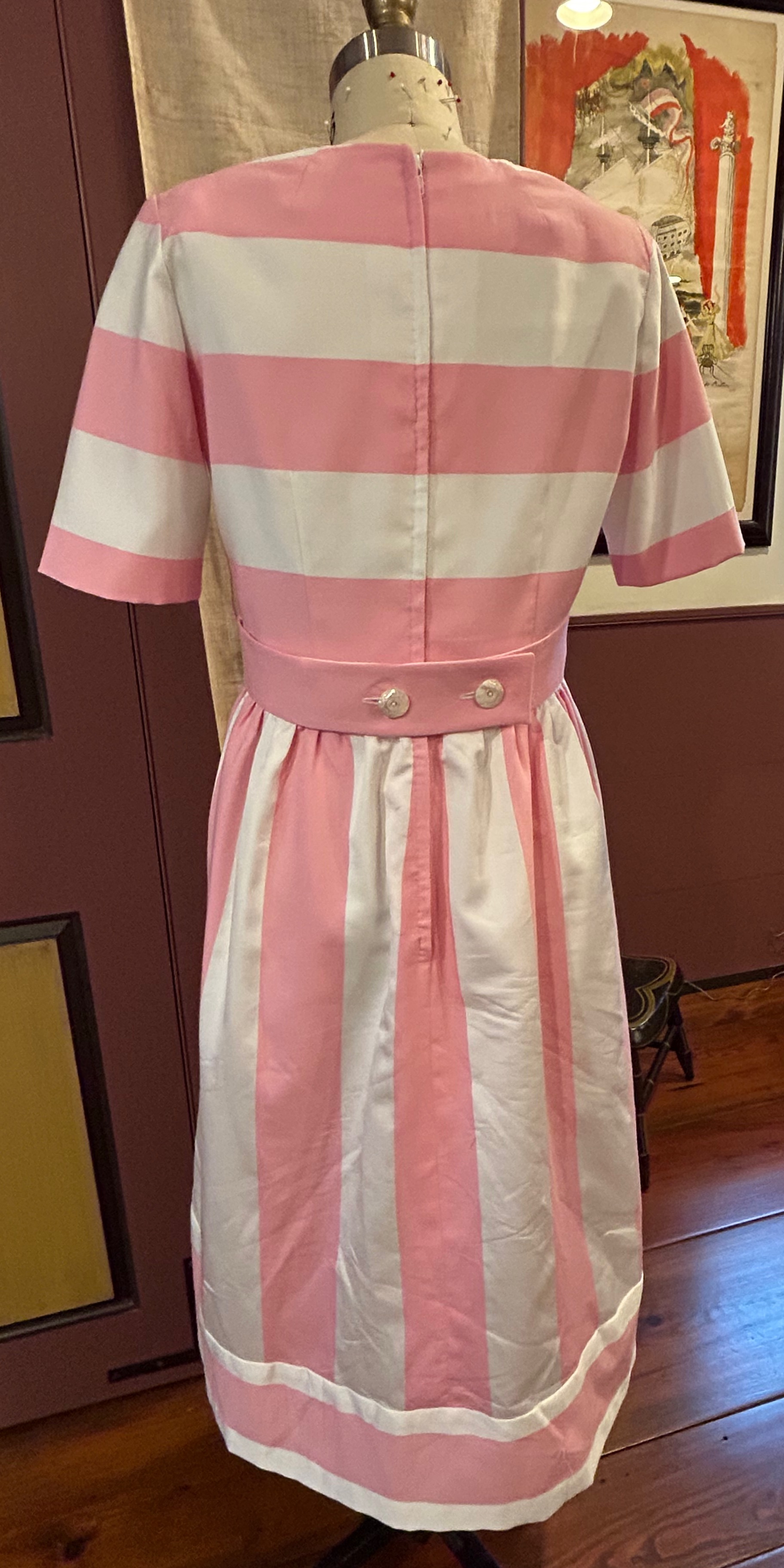
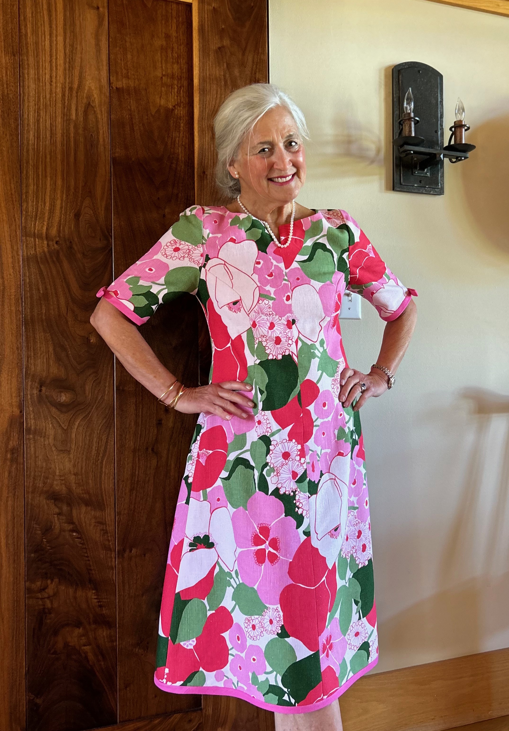
It is extremely difficult for me to resist a bubblegum pink fabric. And if it is a stripe, too, the odds are very good that fabric will end up in my sewing room. So it was with this silk and cotton blend found on the website of Mendel Goldberg Fabrics.
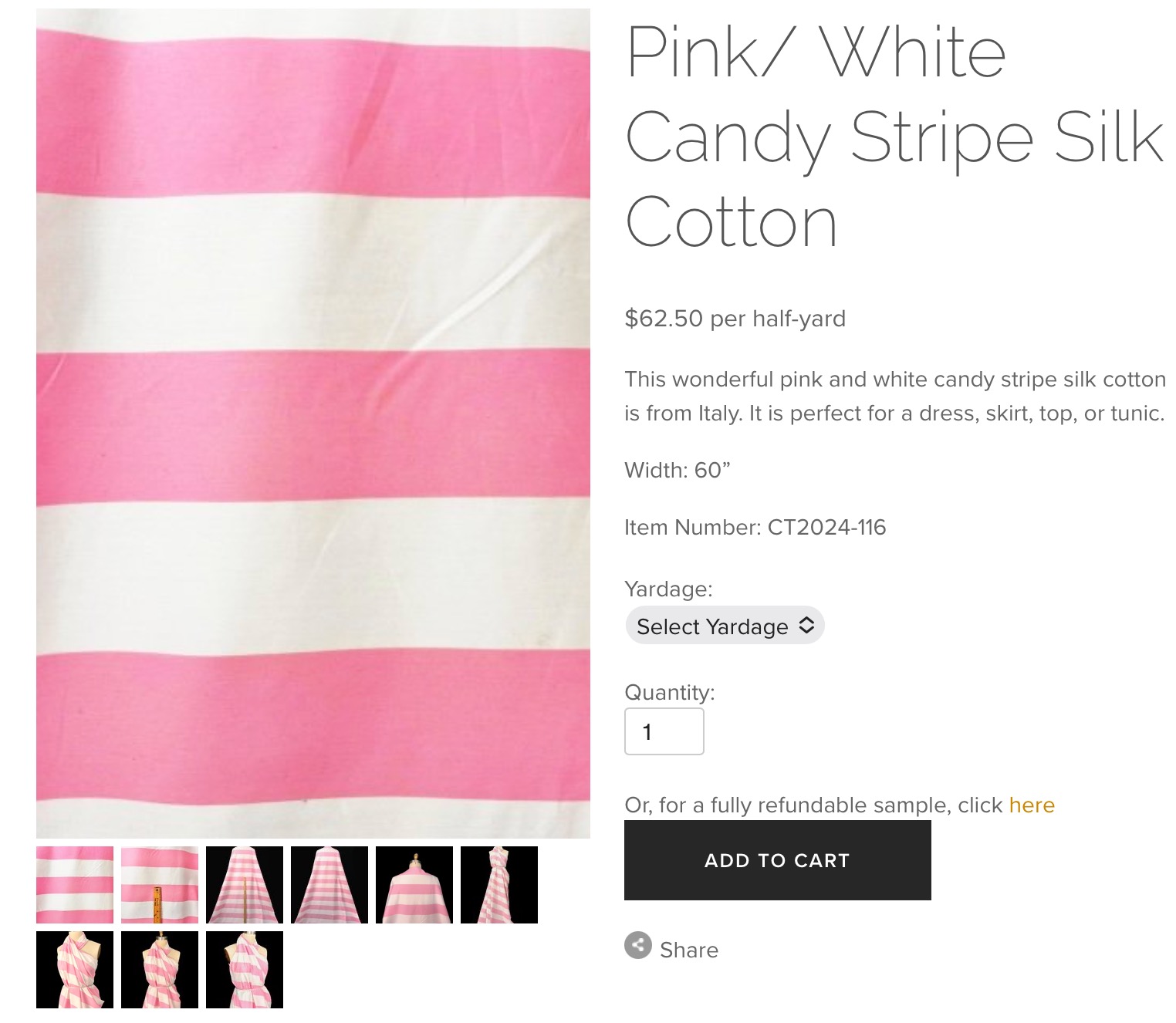
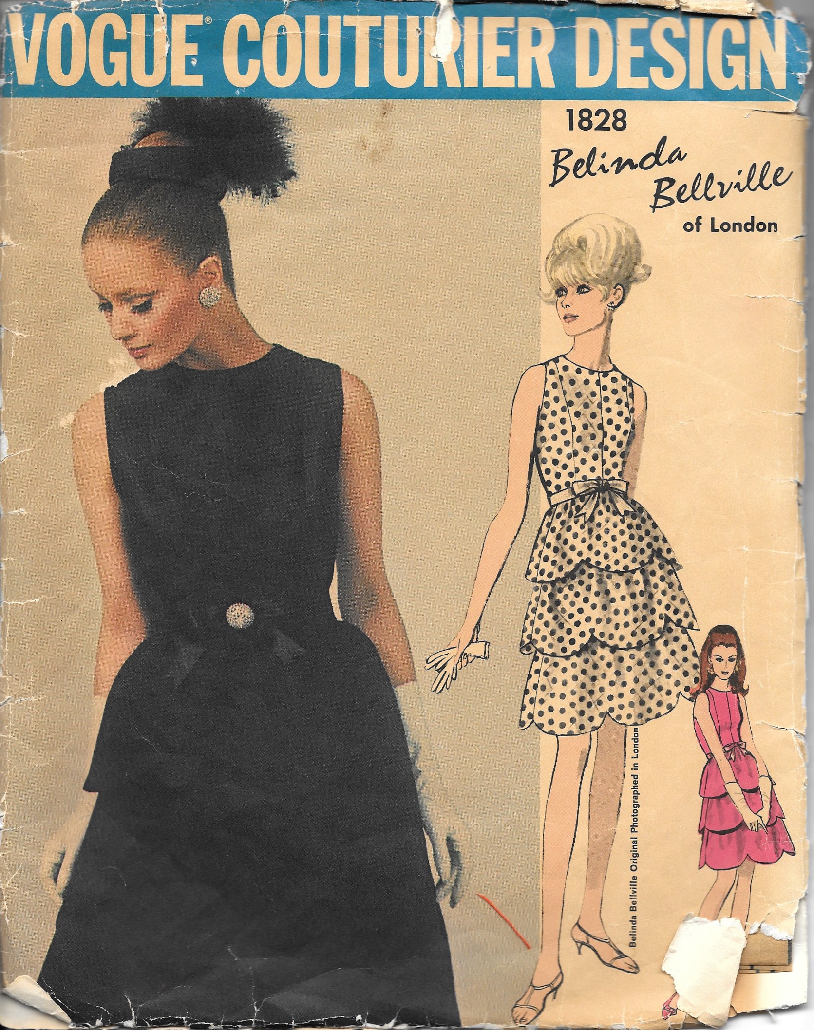
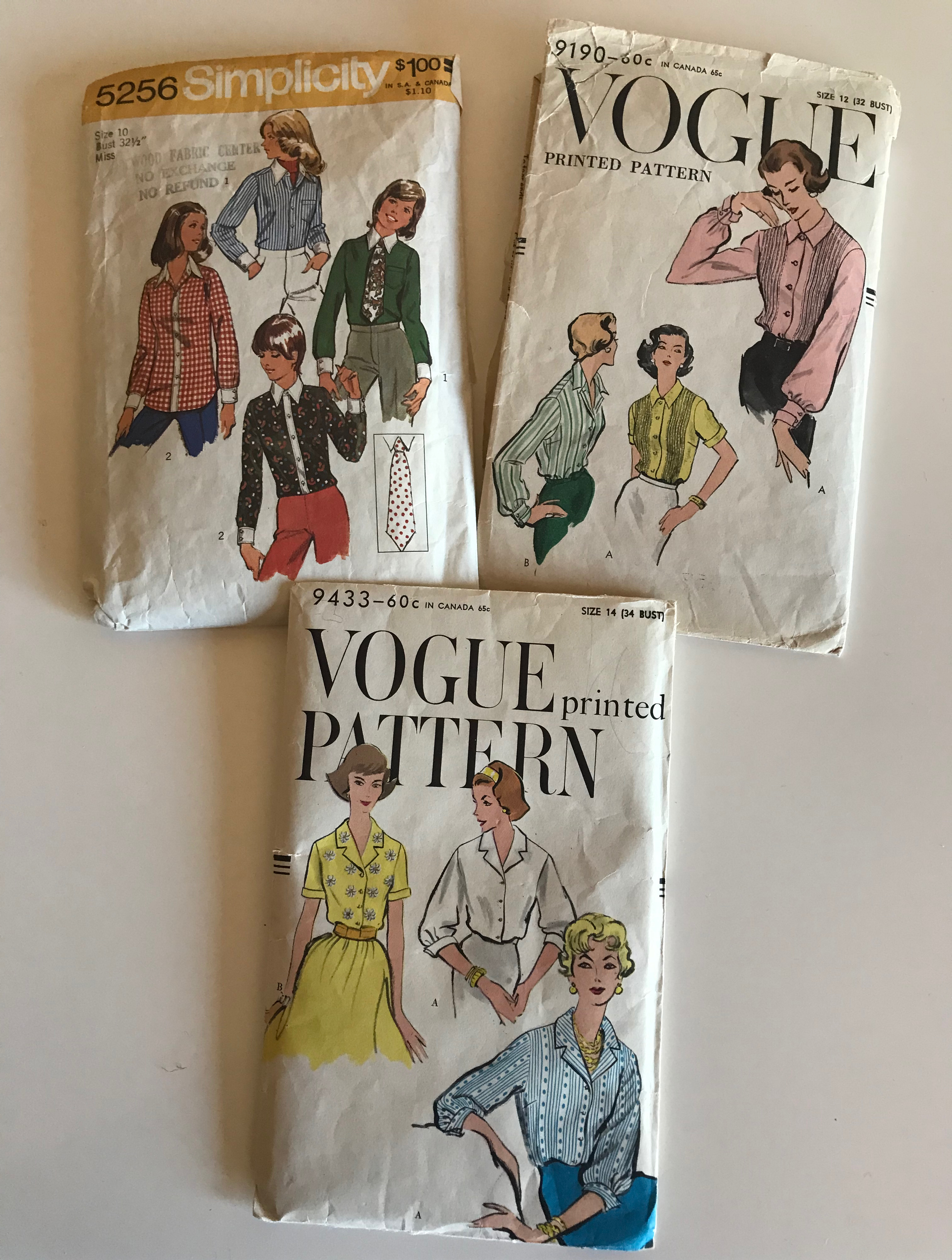
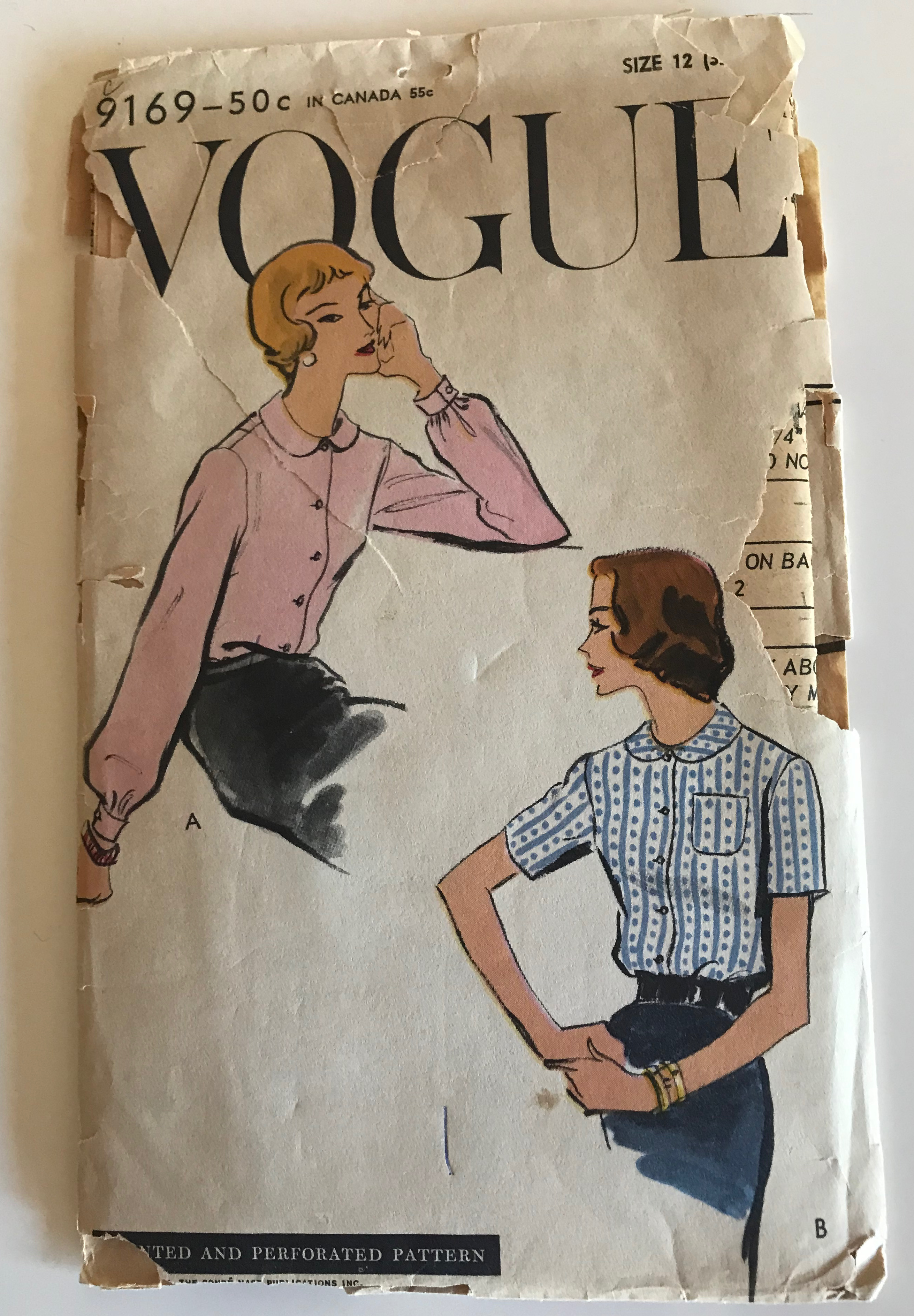
I purchased it last summer during a 20% off sale, and when it arrived, I knew I had made the right decision – although the stripes were a bit bolder in person than I anticipated. As usual, I wasn’t sure what I was going to make – a coat? a dress? a skirt? I needed more thinking time so I tucked it away until this Spring. In the meantime, I purchased this vintage Vogue pattern which I saw as a good basic design which could be easily changed, adapted and altered.
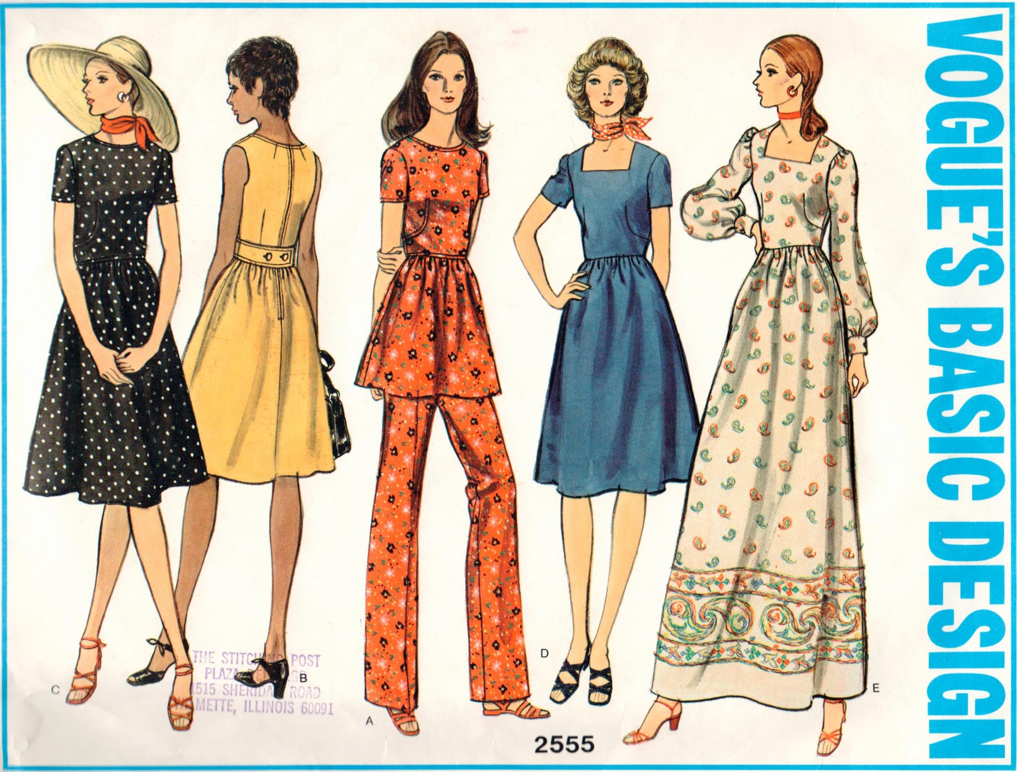
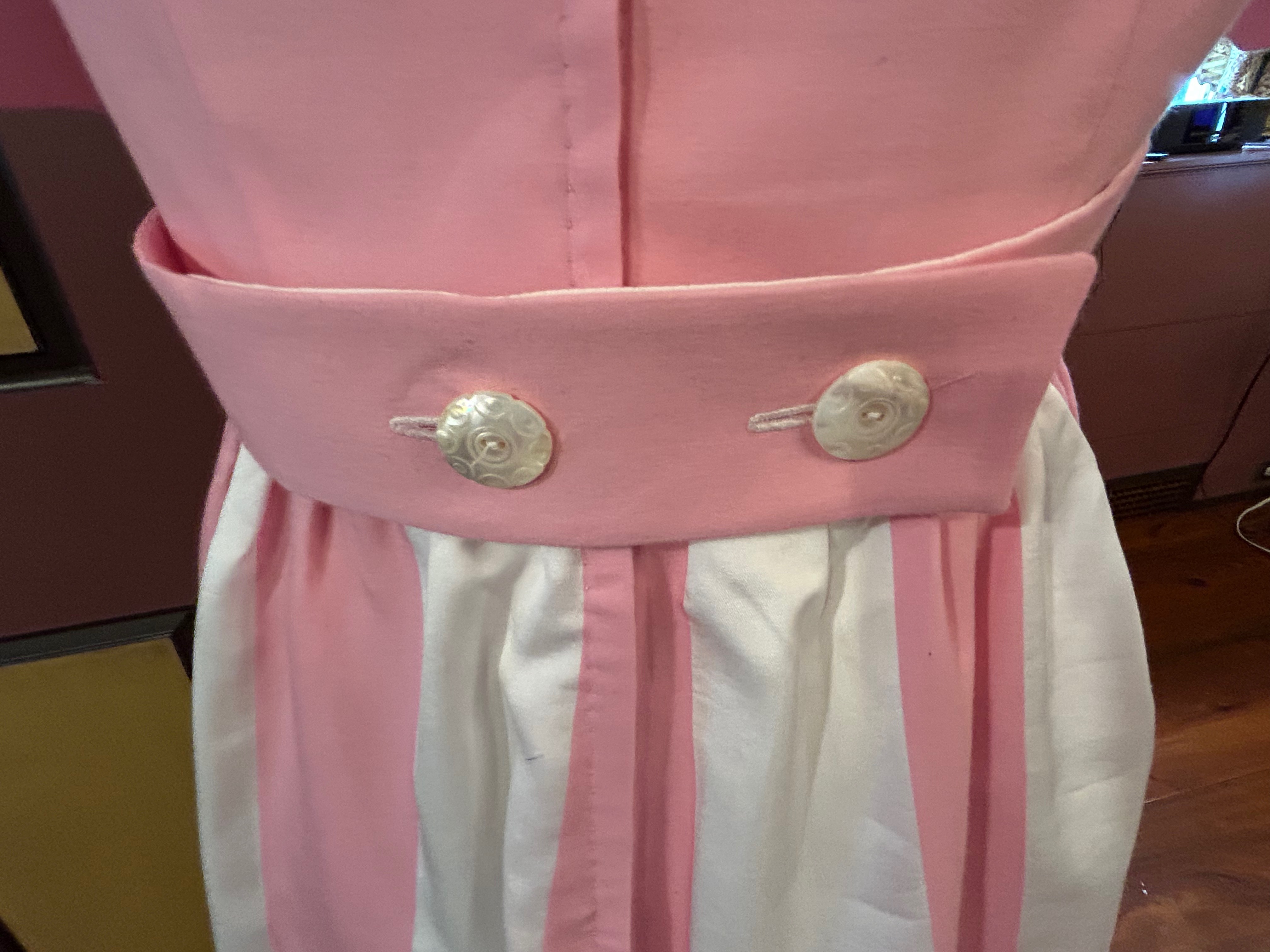
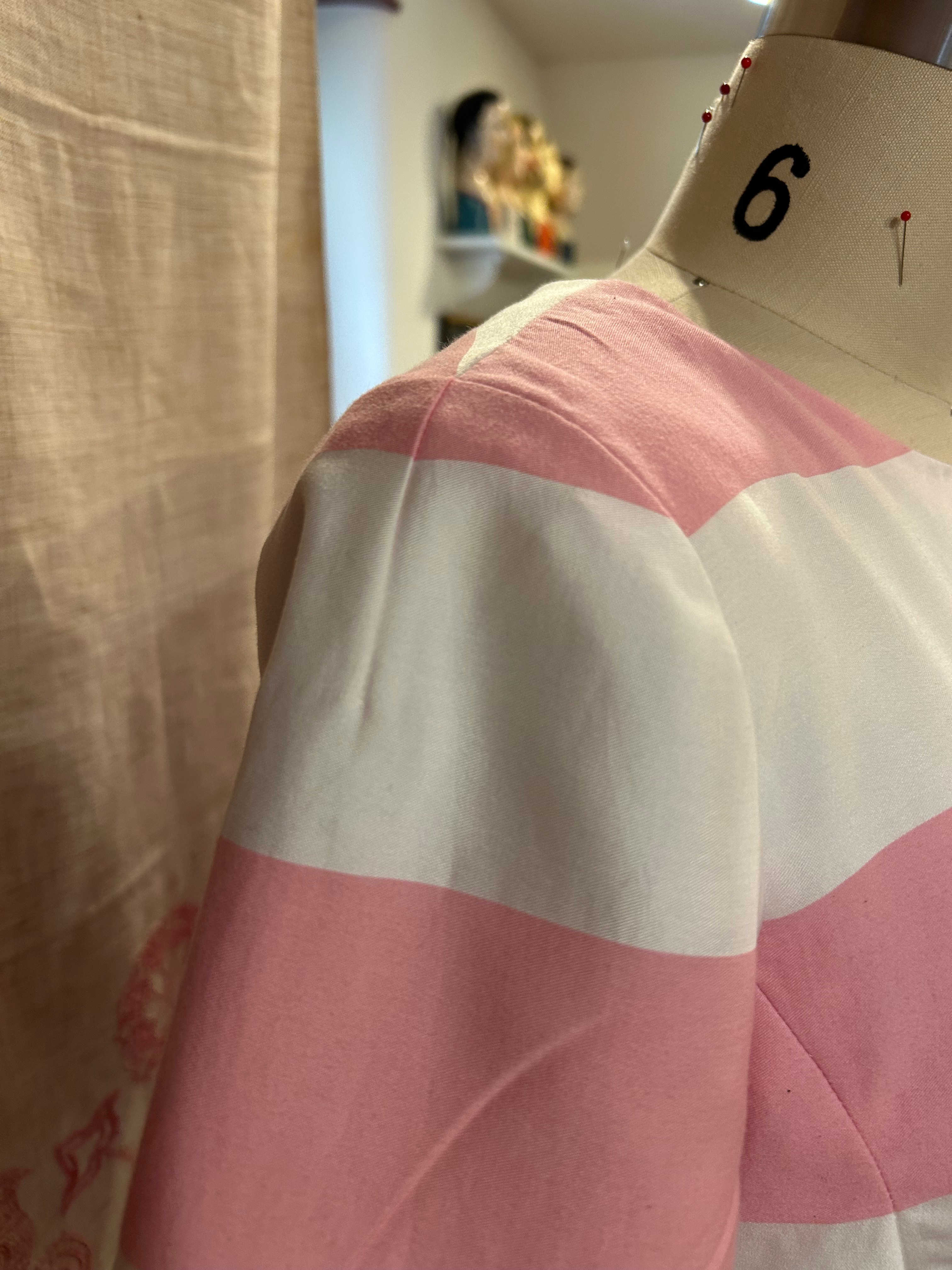
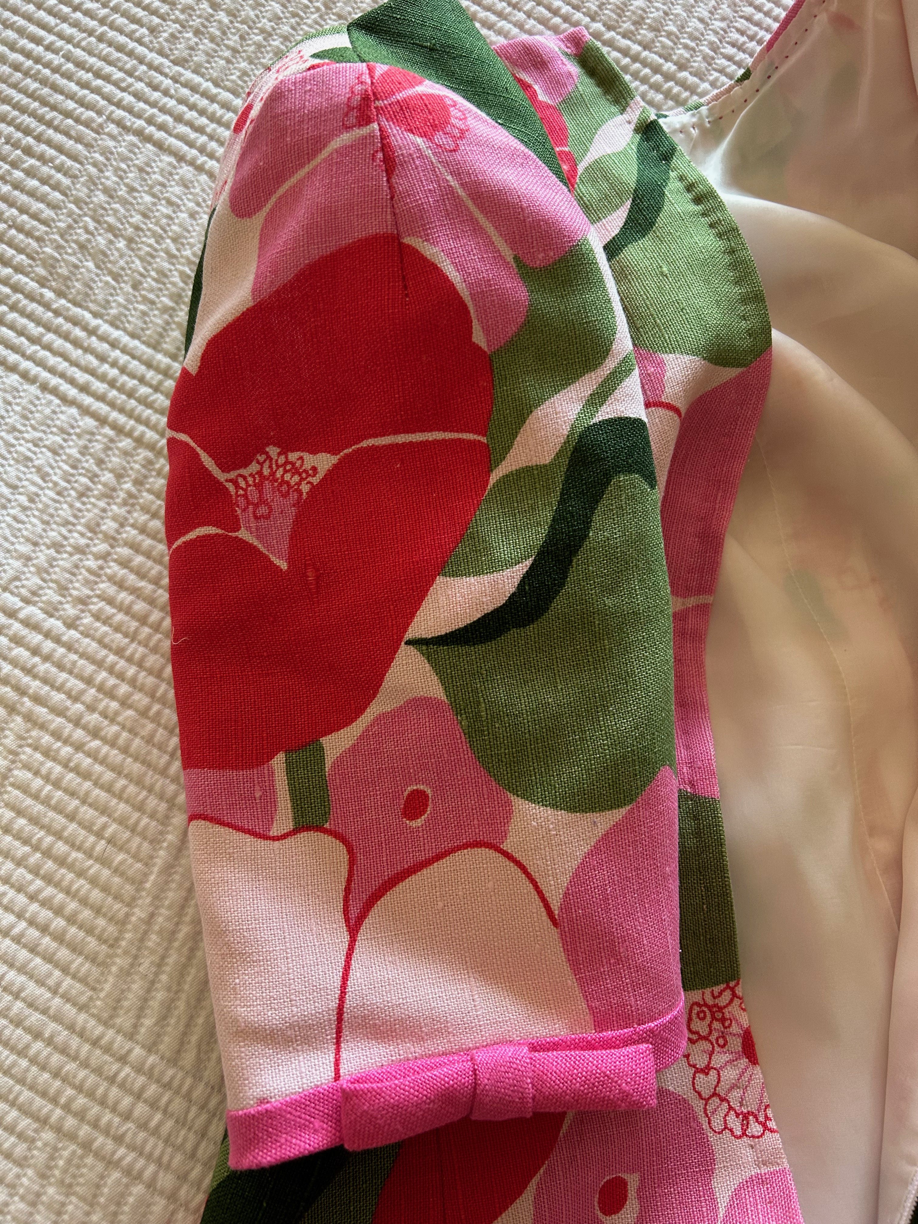
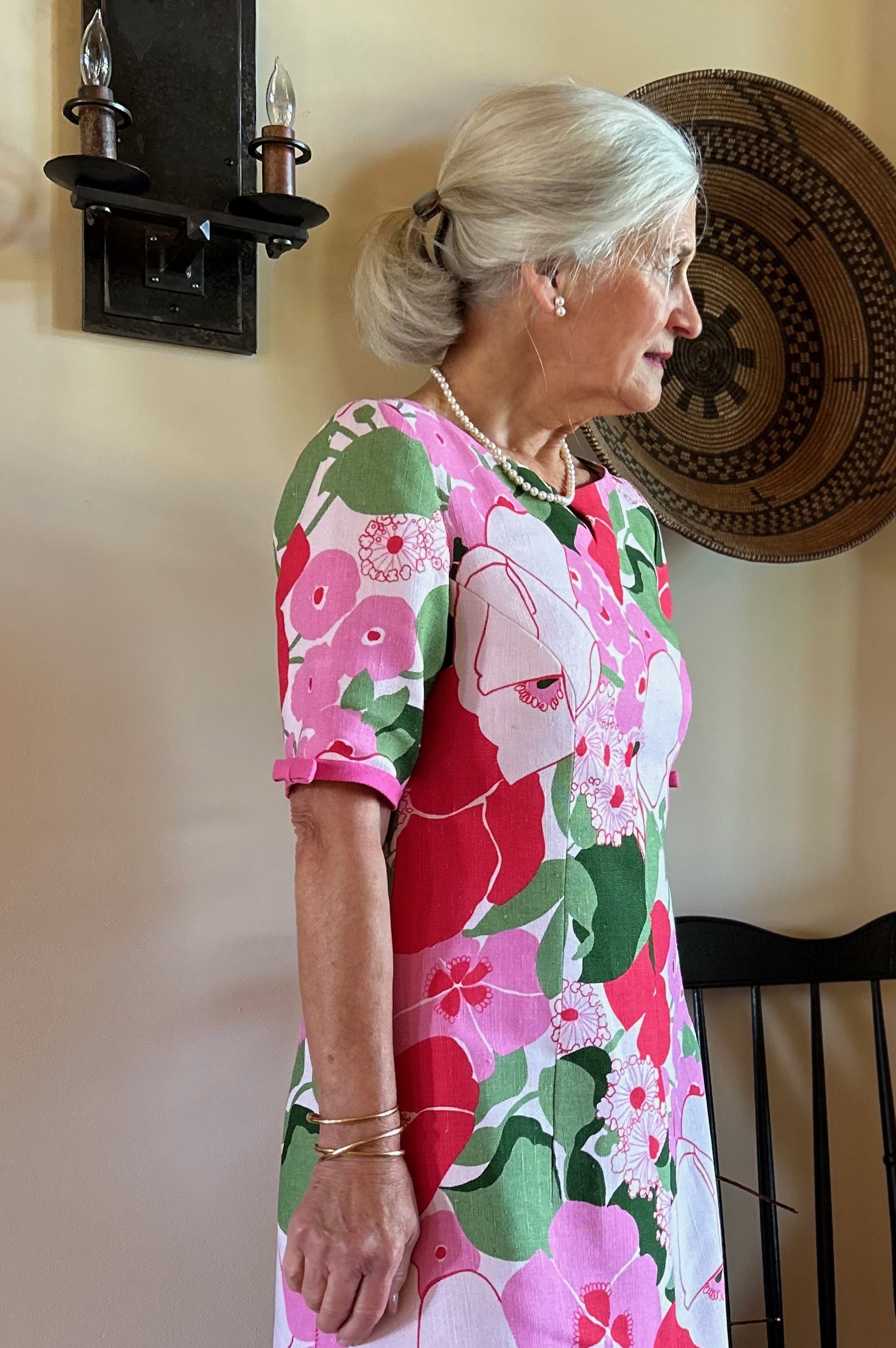
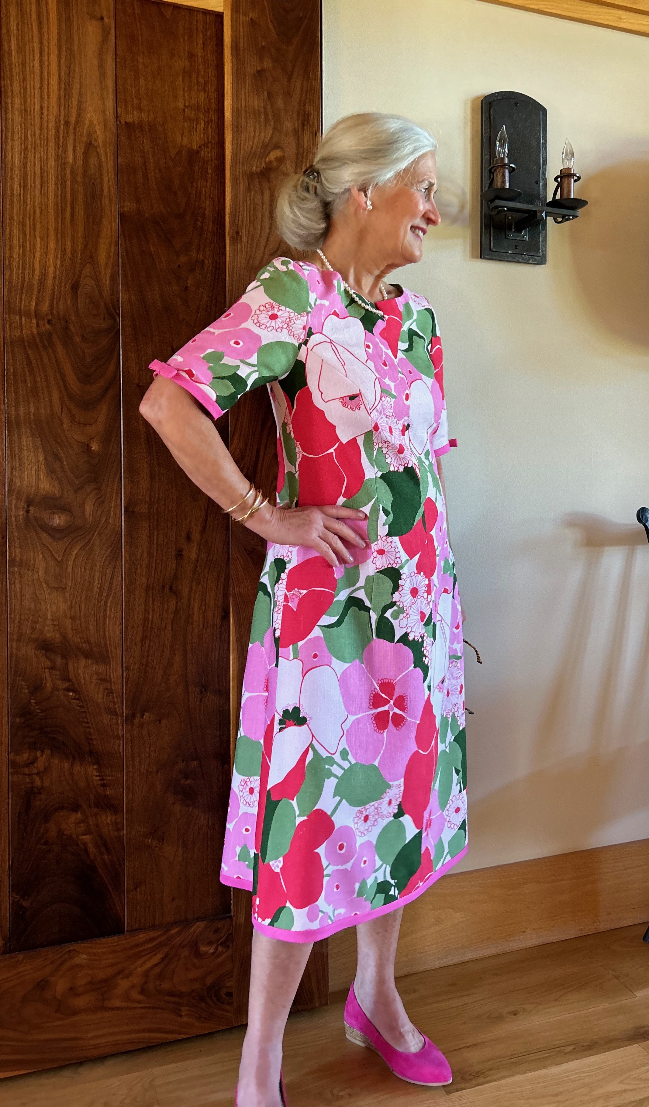
I like dress designs which have some “back“ interest, here the buttoned half belt. Although I loved the sleeveless view, I have become less comfortable wearing sleeveless dresses as I have gotten older. Thus, I was drawn to the short-sleeved view (C), knowing I could easily lengthen the sleeves to reach almost to the elbow, if that seemed the way to go. Thus, it was a logical progression to imagine the pink striped fabric made up in this design, despite the note on the pattern “Not suitable for striped fabrics.”
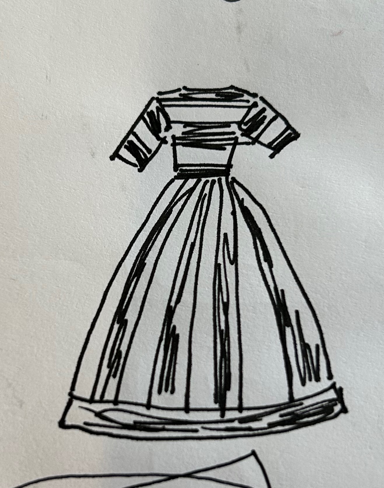
I wasn’t quite ready to forge ahead, however. My fabric was such a bold stripe, I feared a horizontal orientation of the fabric would be too much, but a vertical orientation was equally problematic. I went to my Pinterest feed to get some inspiration and in no time at all, the lightbulb went off in my head. The dress needed a combination horizontal and vertical orientation. I made this quick sketch, and I knew I had the solution I needed.
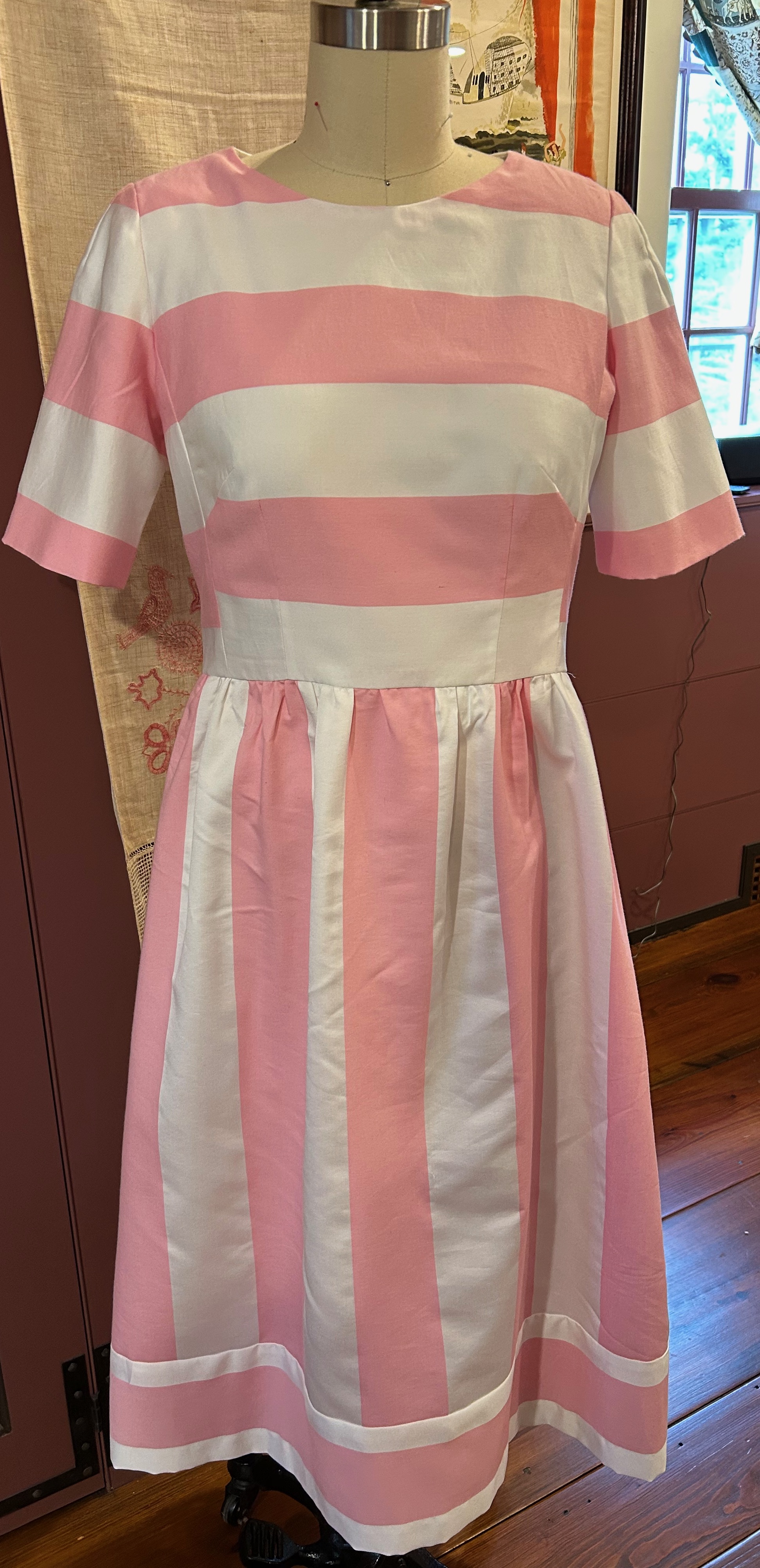
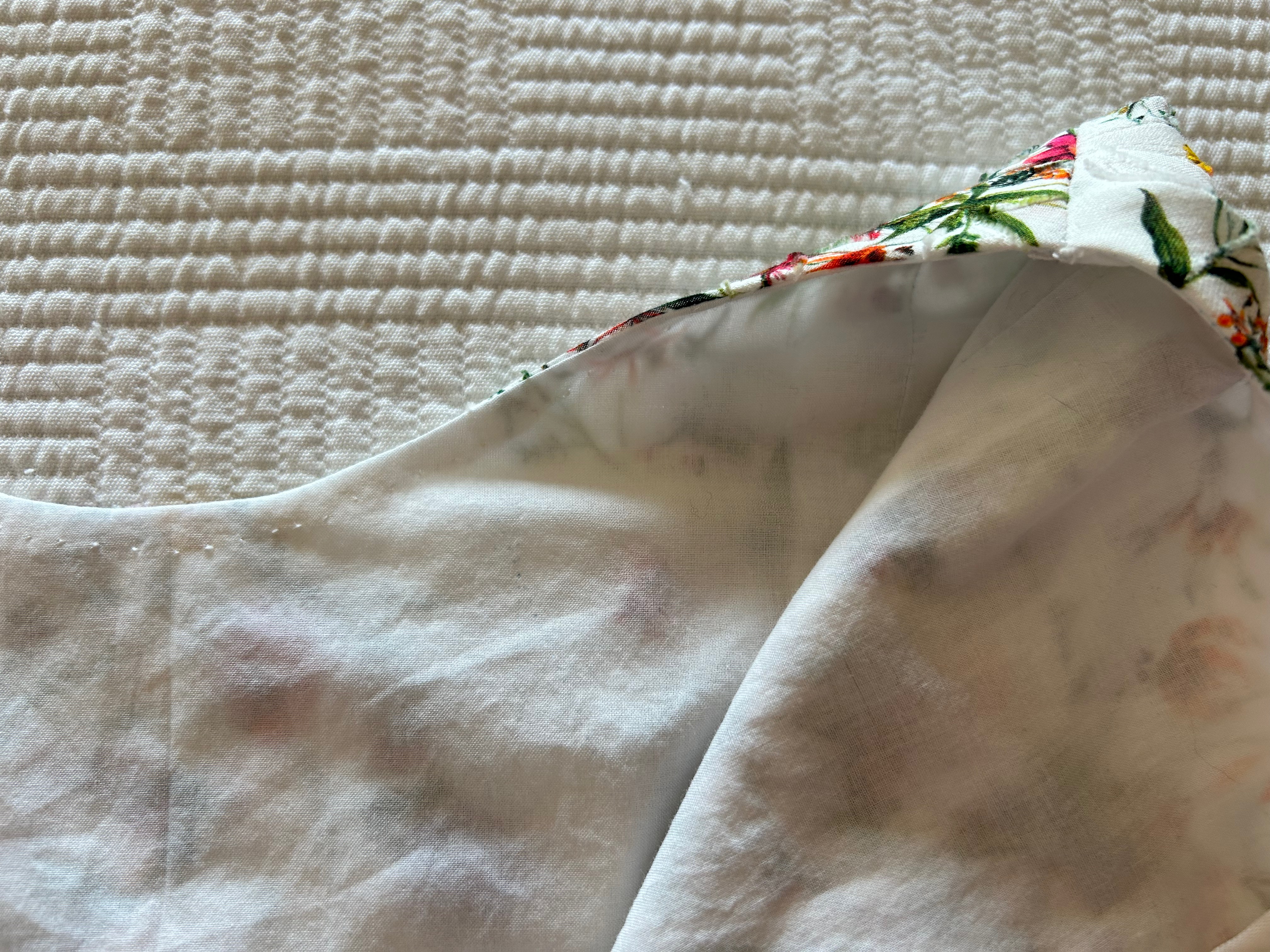
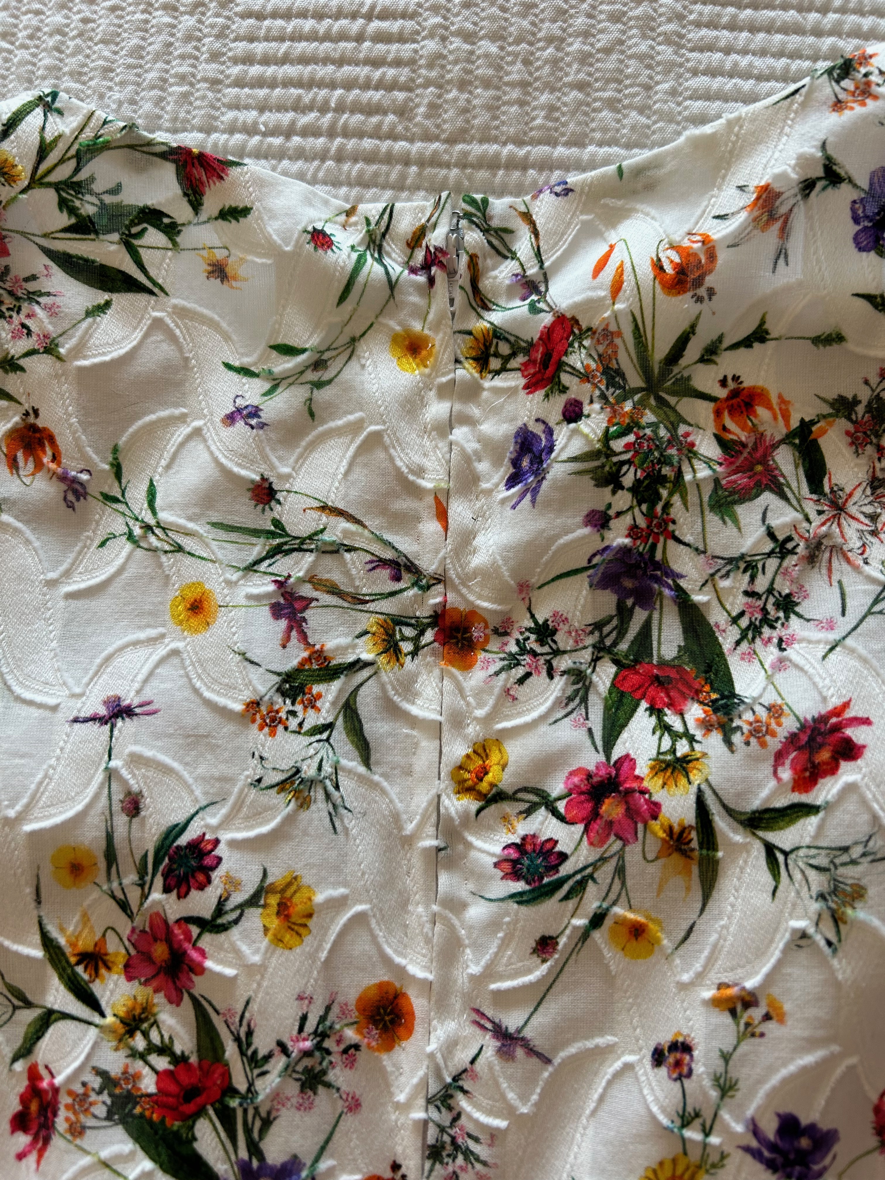
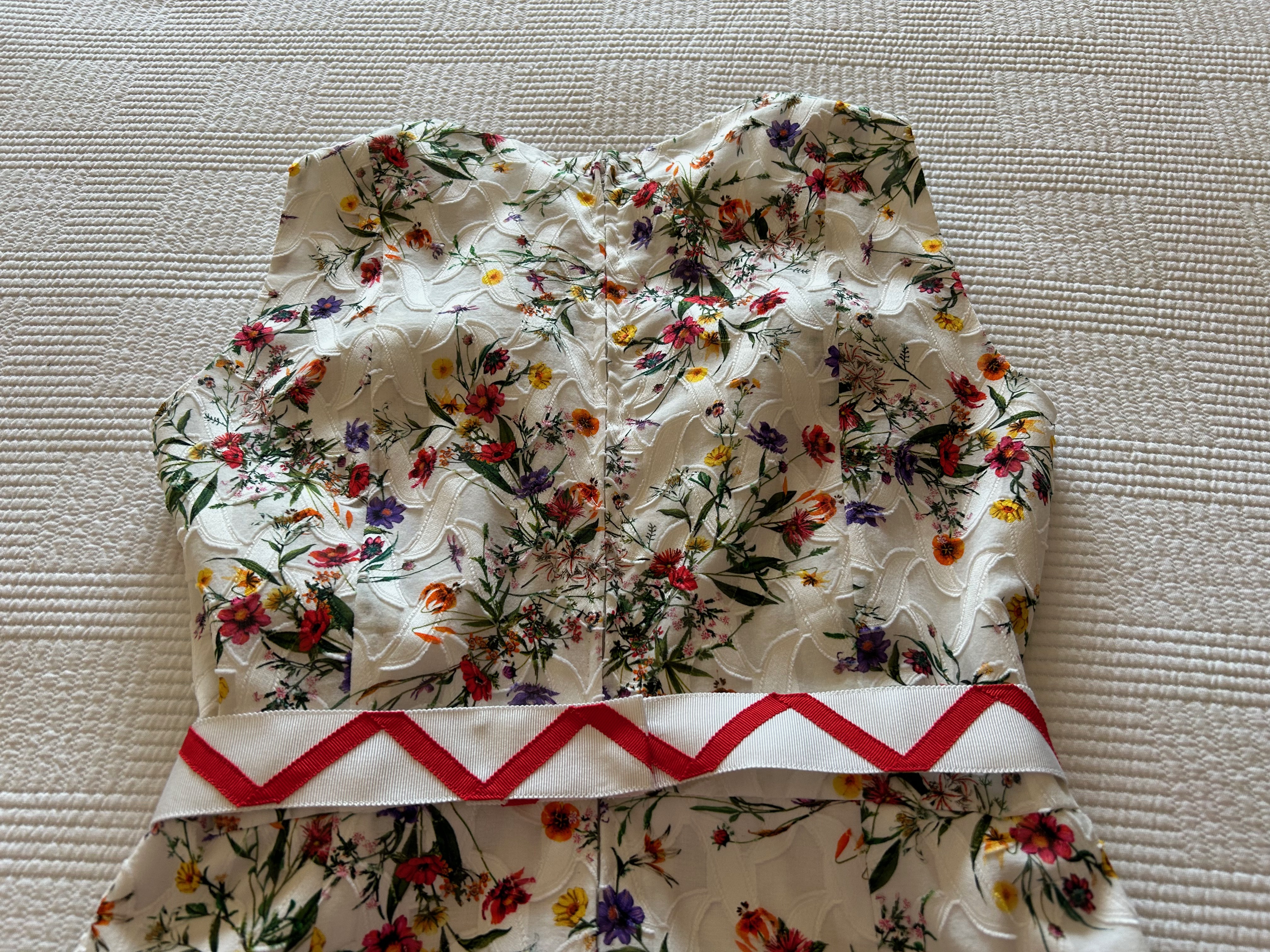
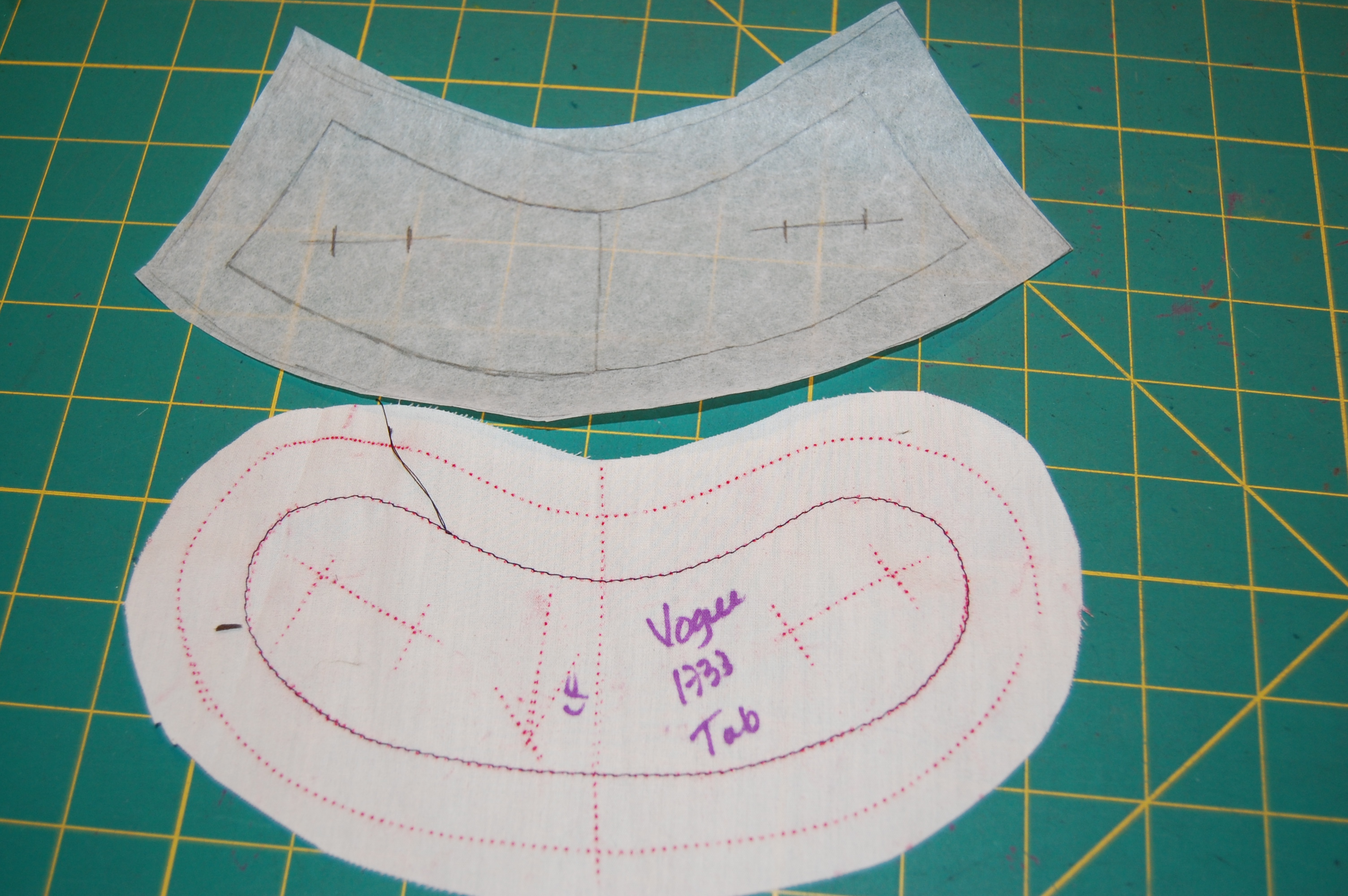
I set about making a muslin/toile for fitting, and then I hit a brick wall. Those curved darts you see on the pattern bodice just were not flattering to me, despite my working and reworking them multiple times. I finally gave up. I would need to find a substitute pattern for the bodice front and make it work with the bodice back toile which I had fitted successfully. This was all terribly time-consuming, as you can imagine, but I finally was able to find an existing bodice front in my stash of patterns/toiles which, fingers crossed, would work. I didn’t know how well it would work until I had the happy surprise of seeing the darts feed into the bold stripes successfully.
What was not as successful was the proper alignment of the buttons on the back belt to the center of the dress. That is one of the many downsides of fitting oneself – I could not see what I was doing, and although I measured and fiddled, I was still off by a couple of inches.
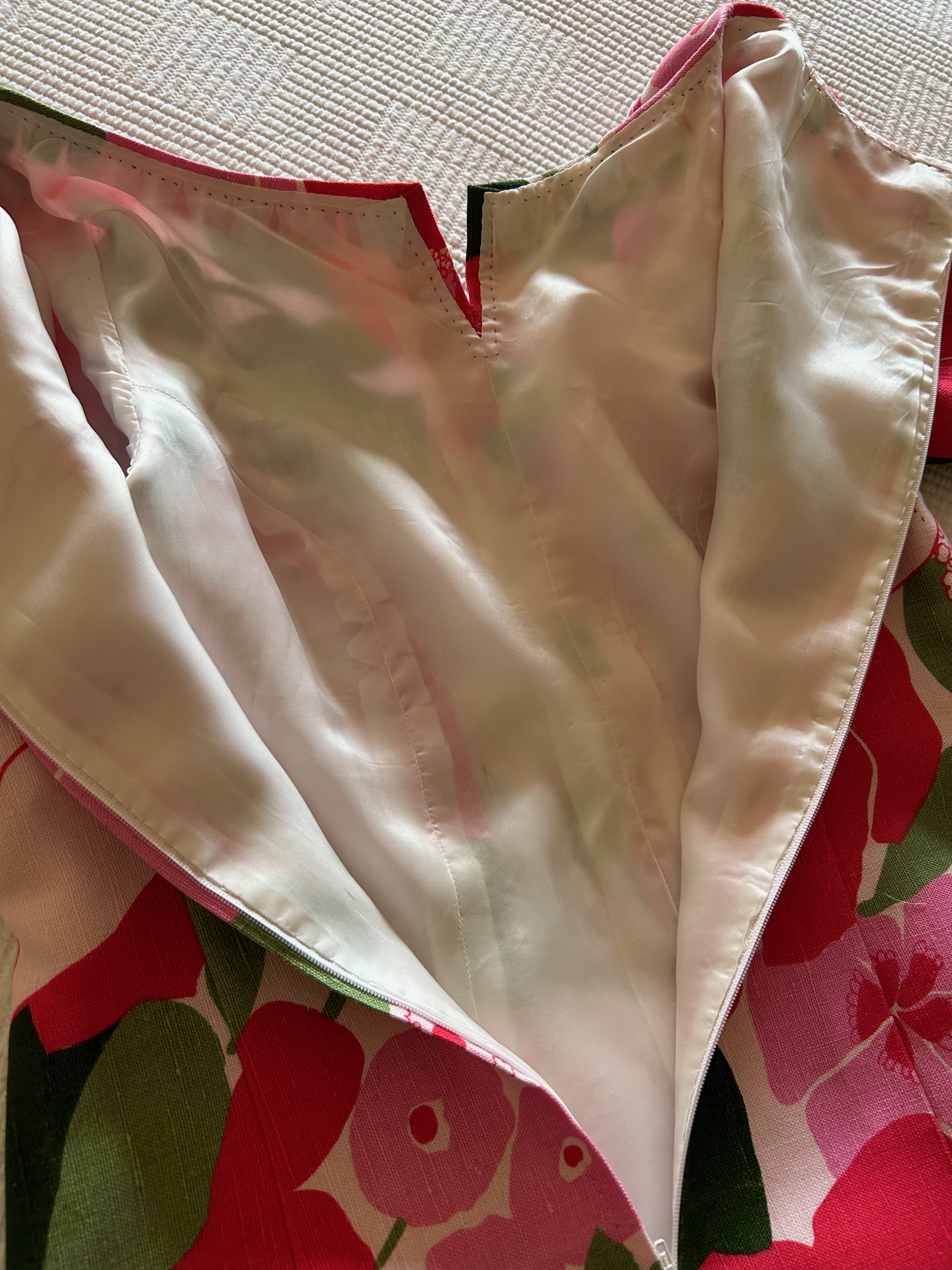
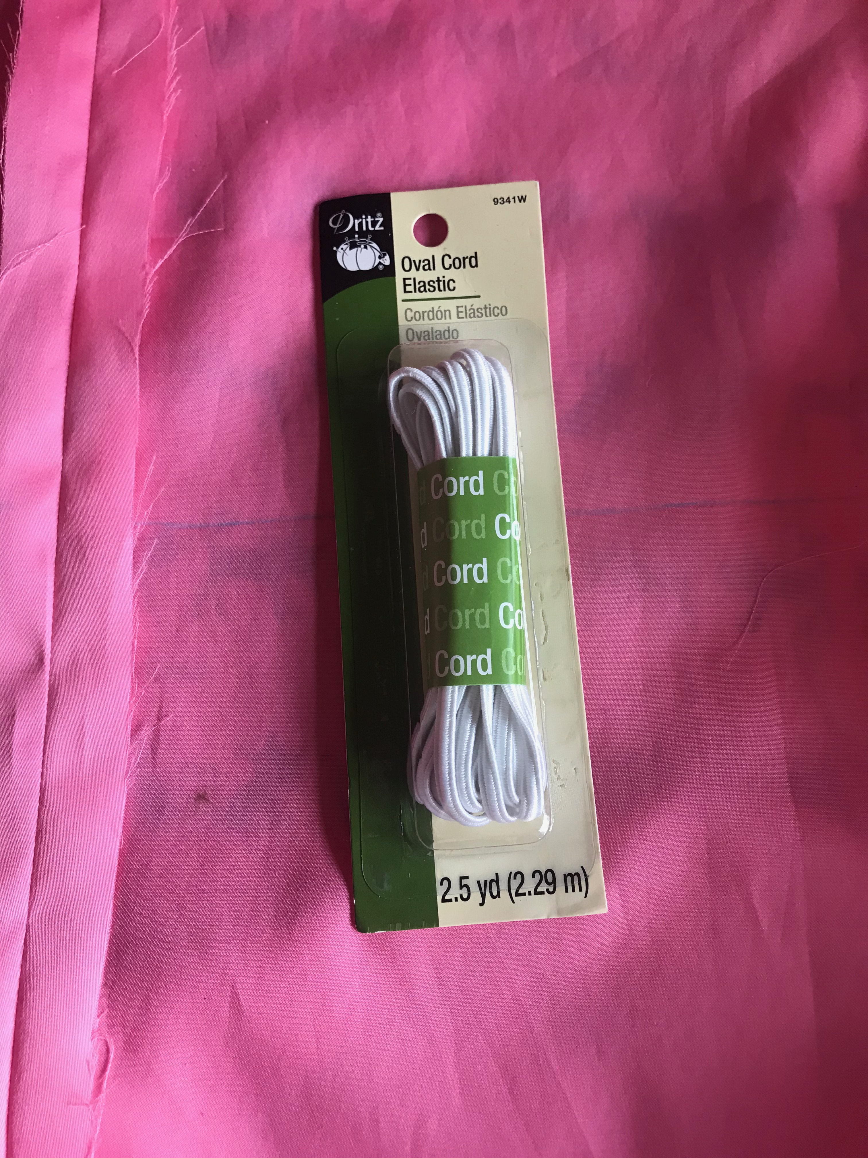
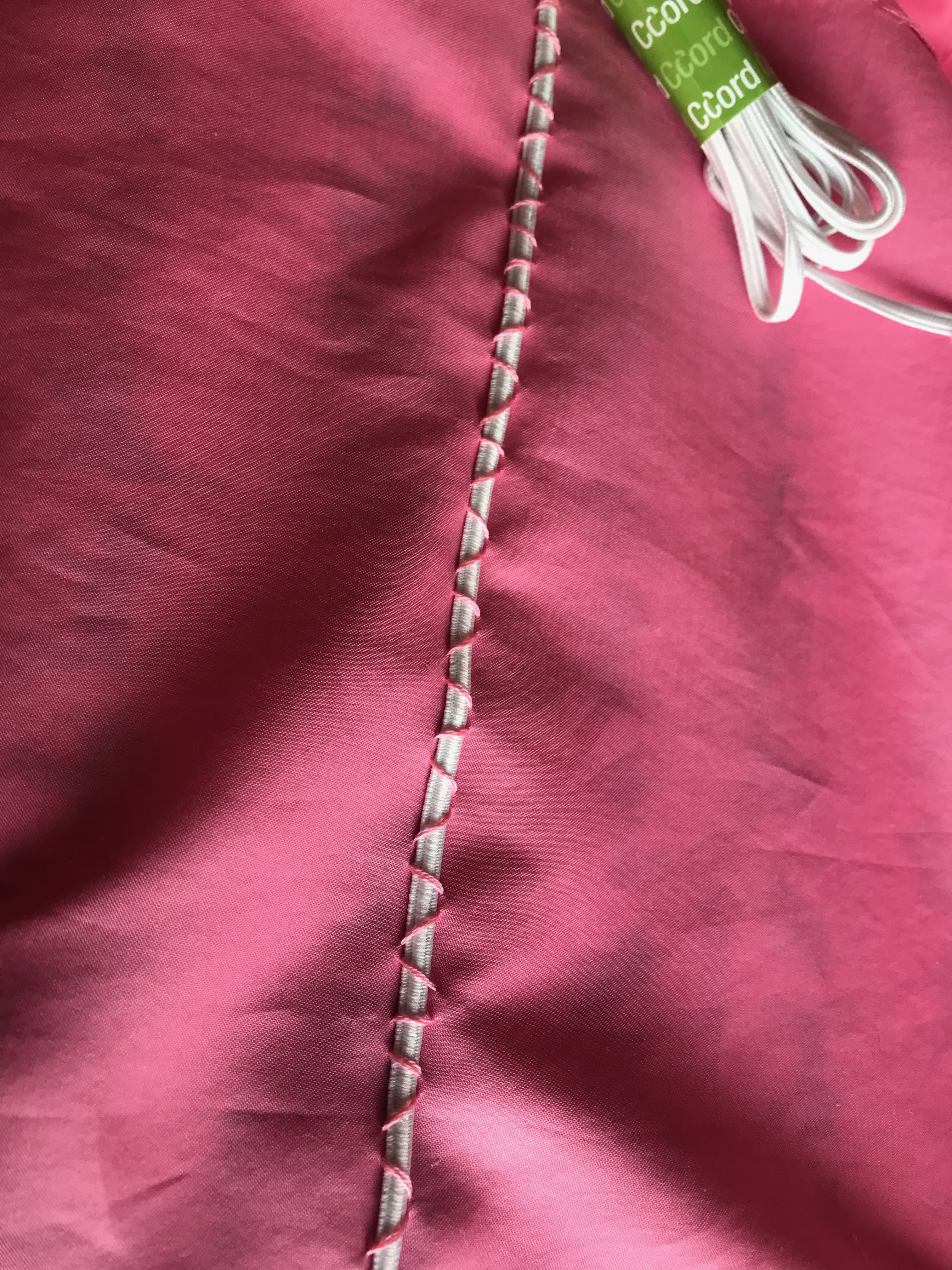
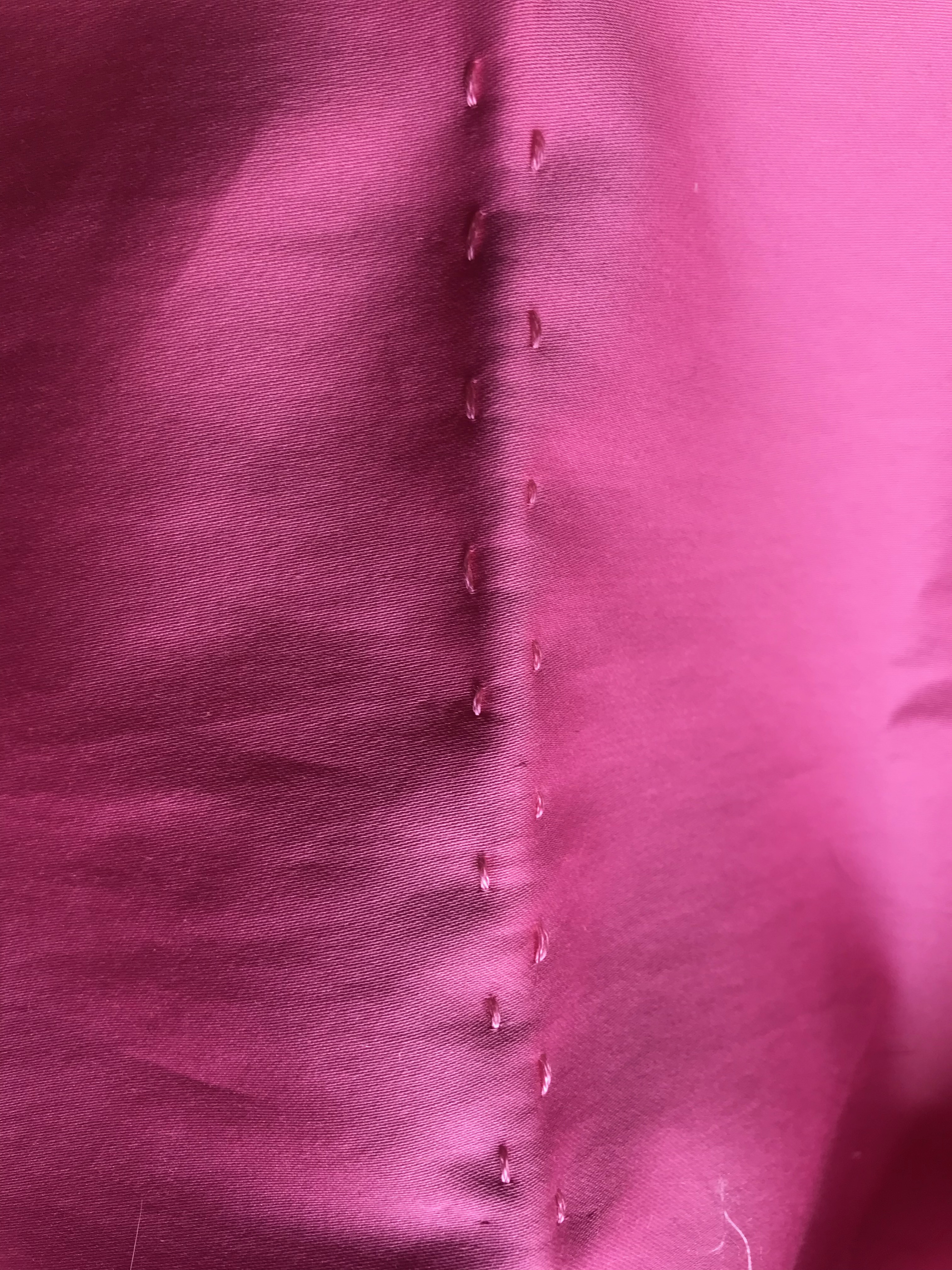
I lined the entire dress with a soft cotton batiste which complimented the softness of my fabric, adding a little more opaqueness to the finished dress. I did not use an underlining, reasoning that more structure would not be conducive to the soft flow I wanted in this garment.
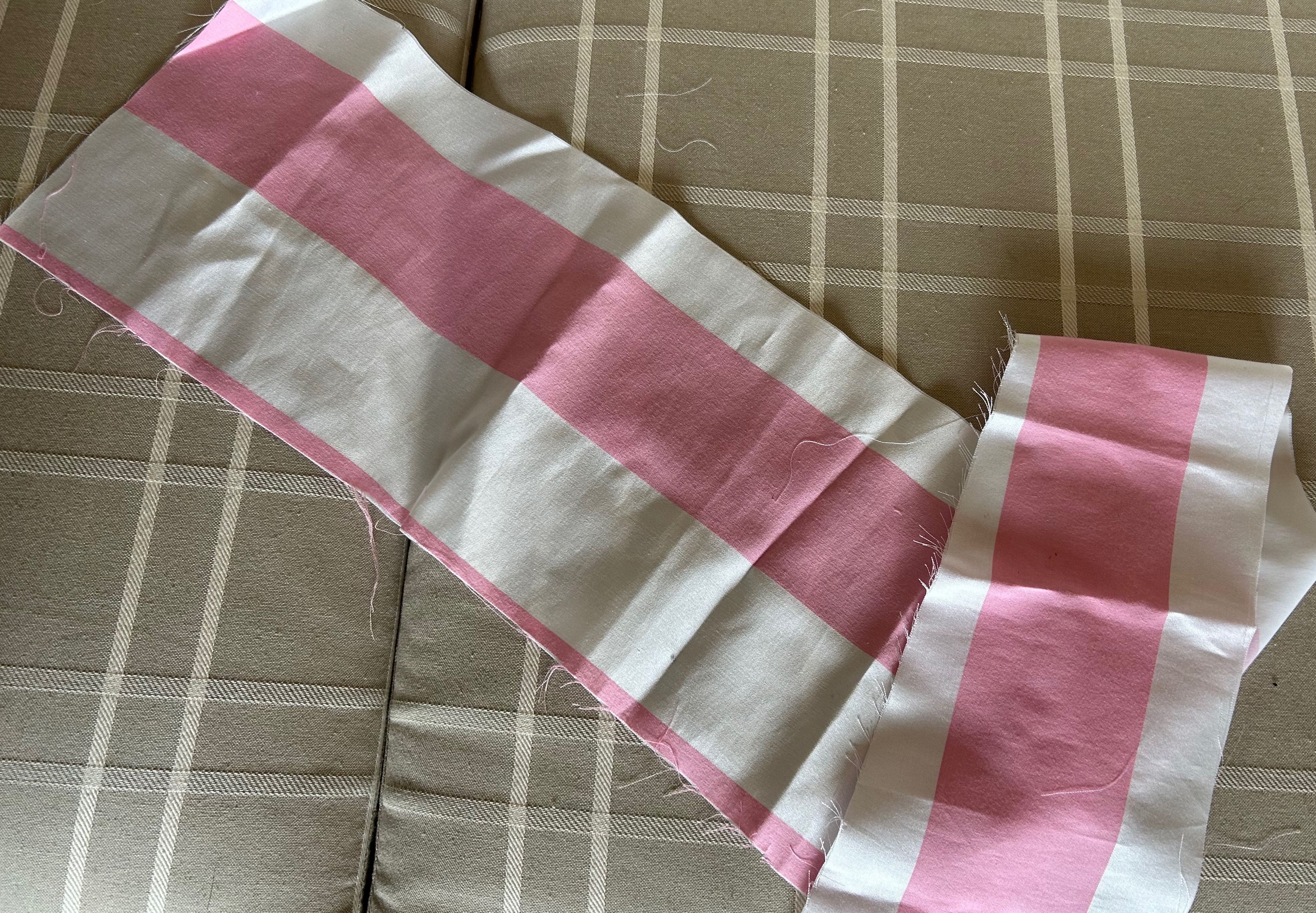
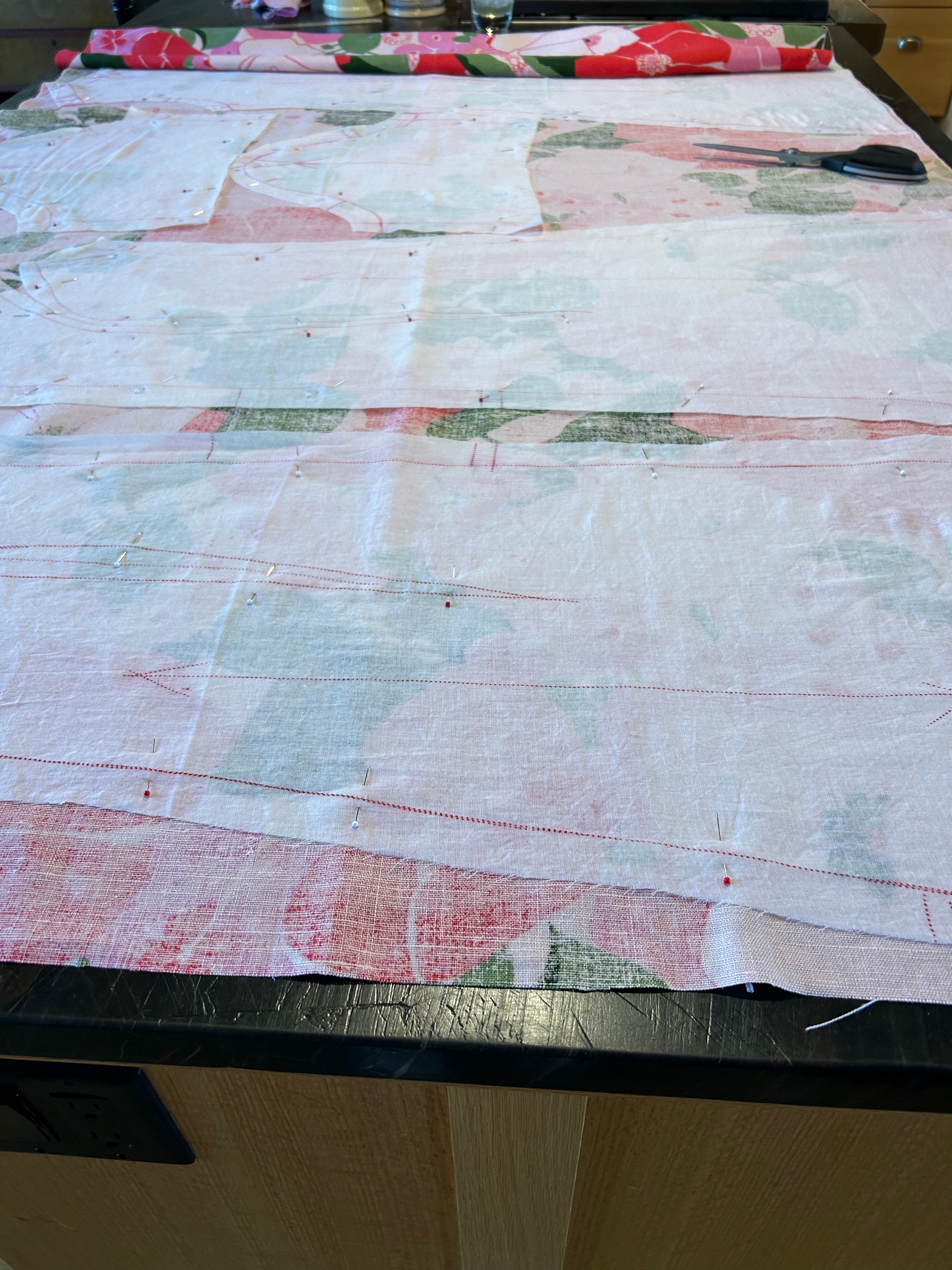
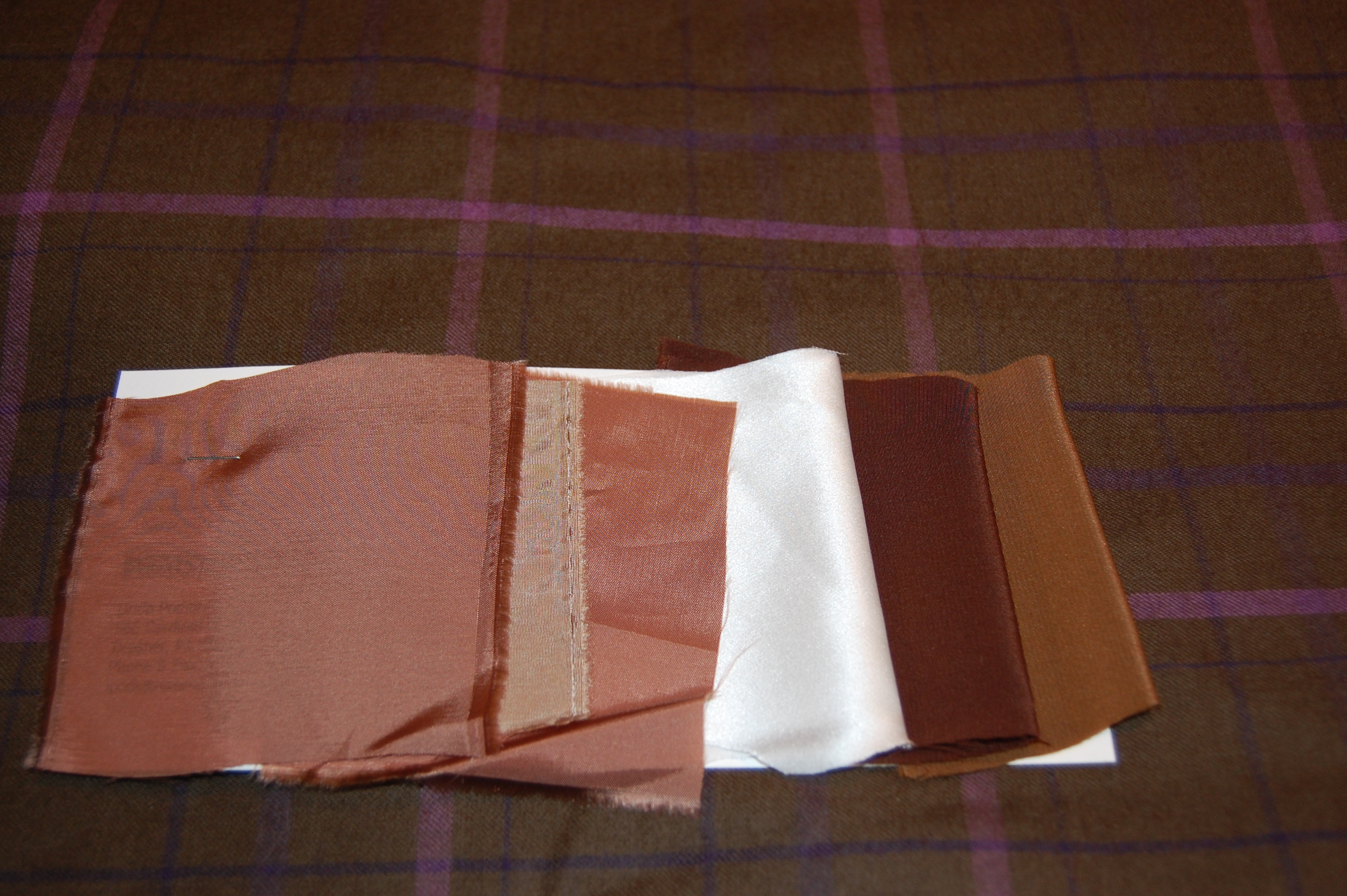
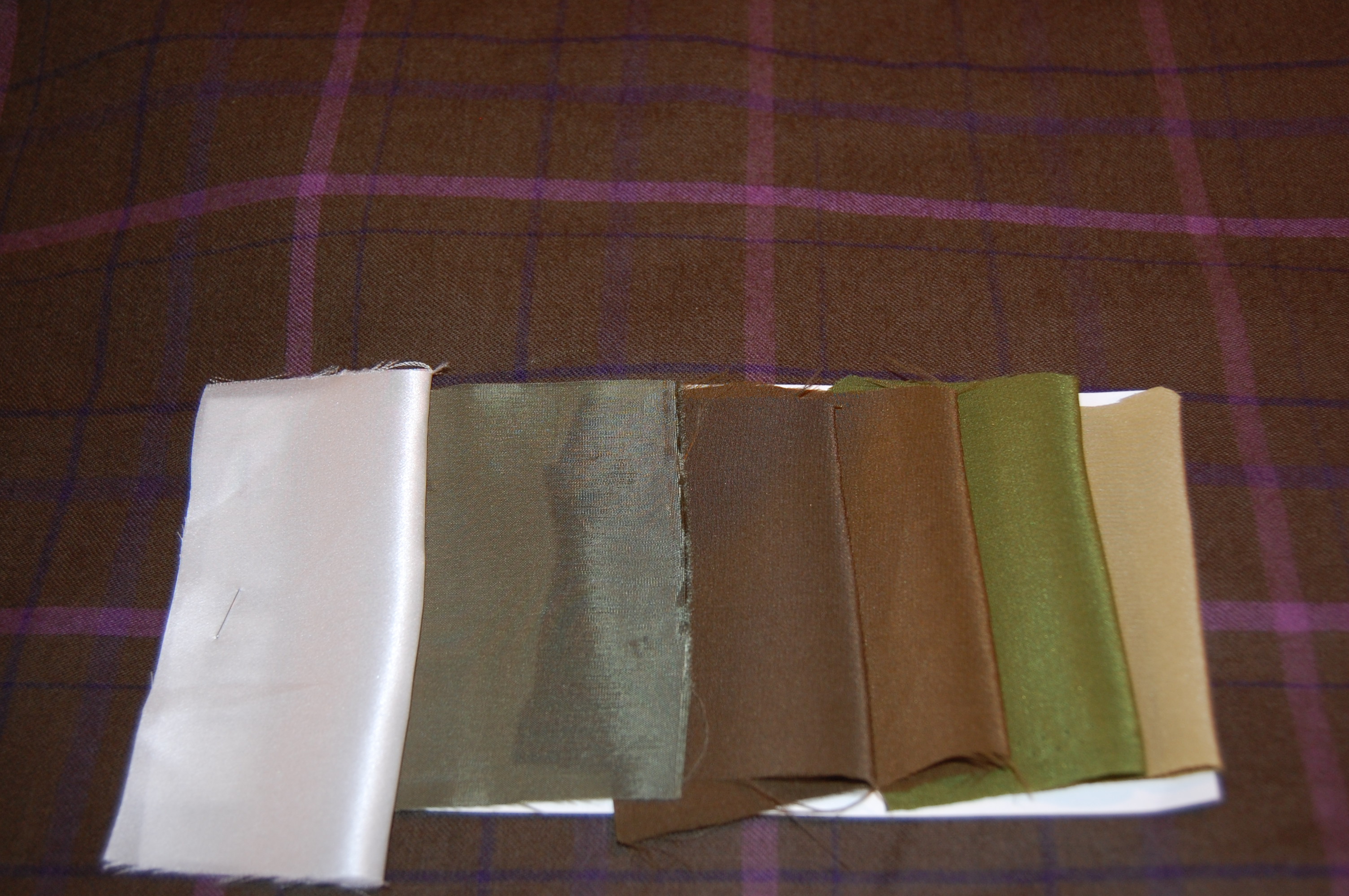
A word here about the panel for the hem. Wow, was I tight on fabric! I thought the panel should feature one bold pink stripe, bordered by “half” white stripes. I barely had enough fabric to make this happen, and because the width of the skirt was just a bit bigger than the width of the fabric, I had to piece that panel. Whew, I just made it. Here is all the fabric I had left over:
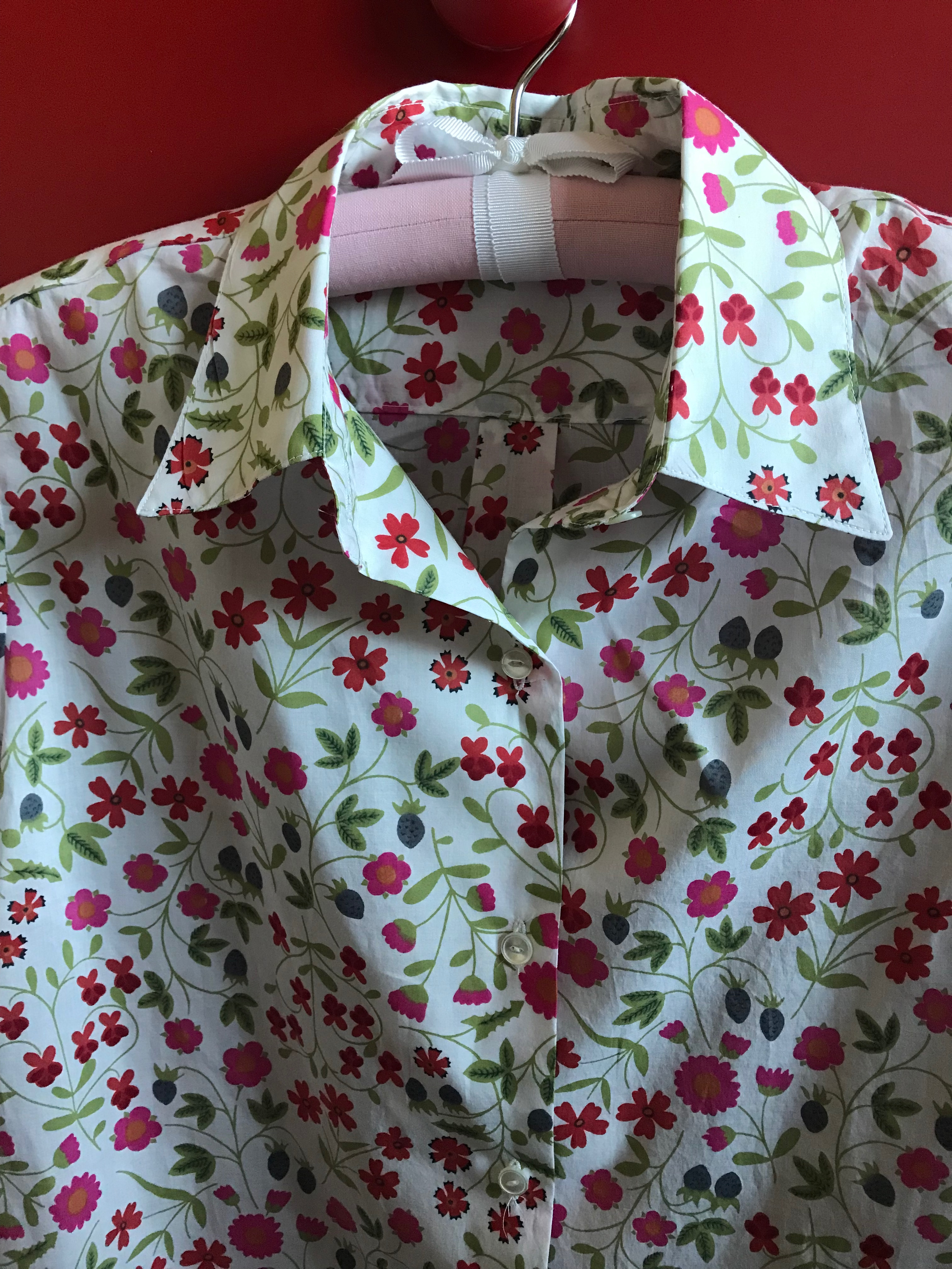
I was able to wear this dress for two events in May, feeling perfectly dressed for both of them.
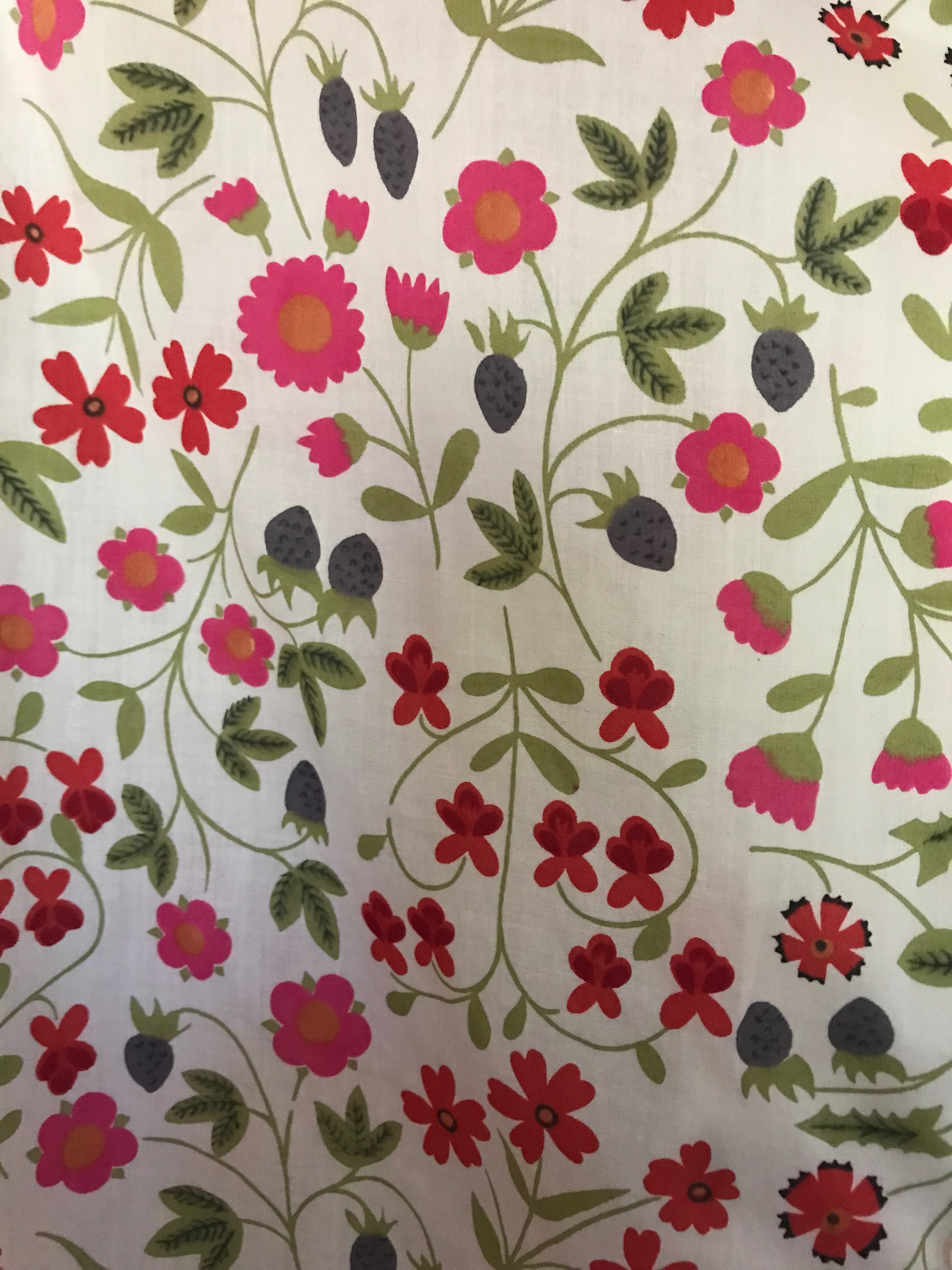
And that little bit of left-over fabric? I had plans for that, too, which I will share in a future post.


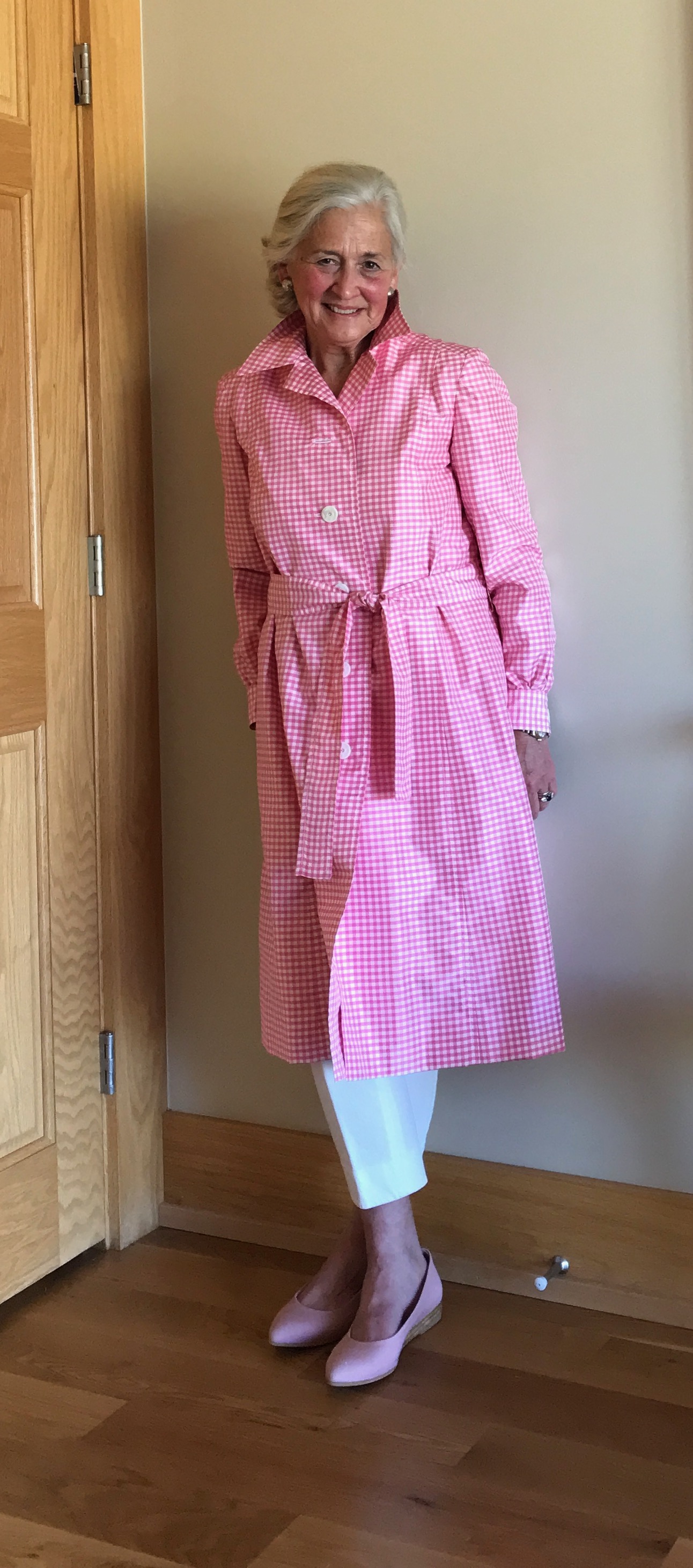


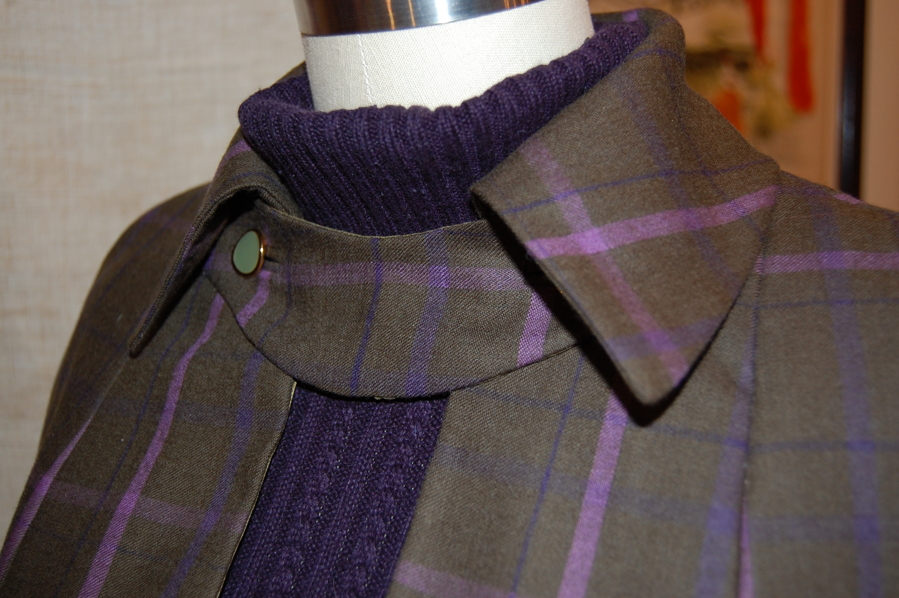
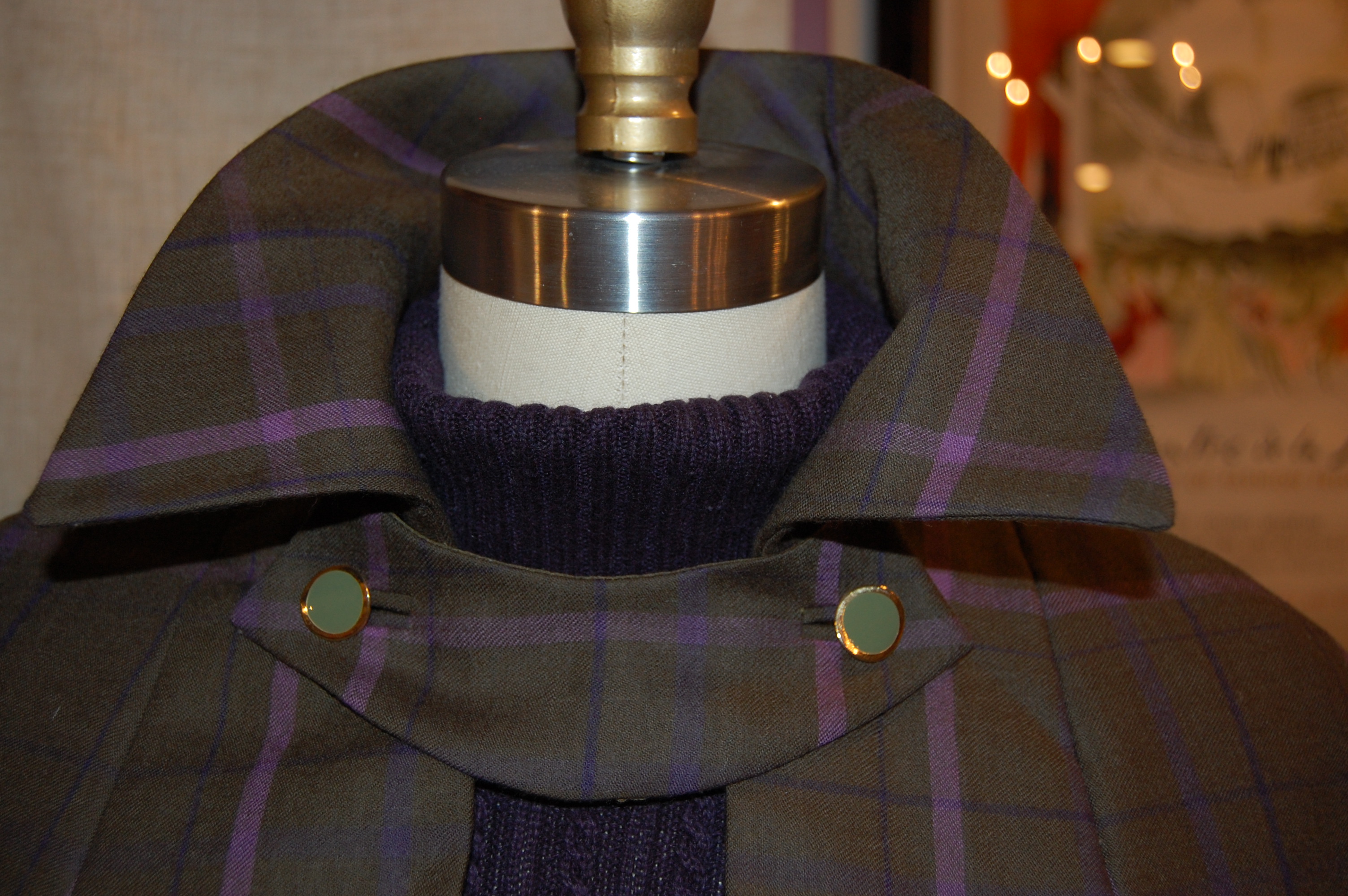


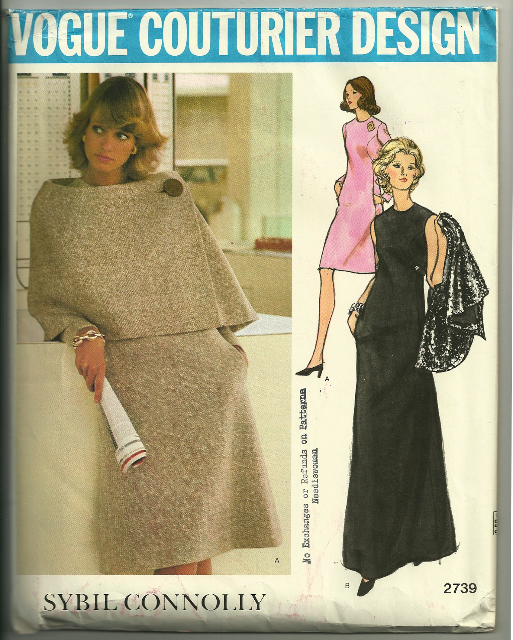


Is It a Trench Coat – or Is it Not?
It is not. However, I am quite sure this classic look from 1974 was inspired by the classic Trench Coat as we know it.
I am certain this Vogue pattern is from 1974, as it is featured in that year’s July/August issue of Vogue Pattern Book Magazine. It is part of a section entitled NEW ARRIVALS.
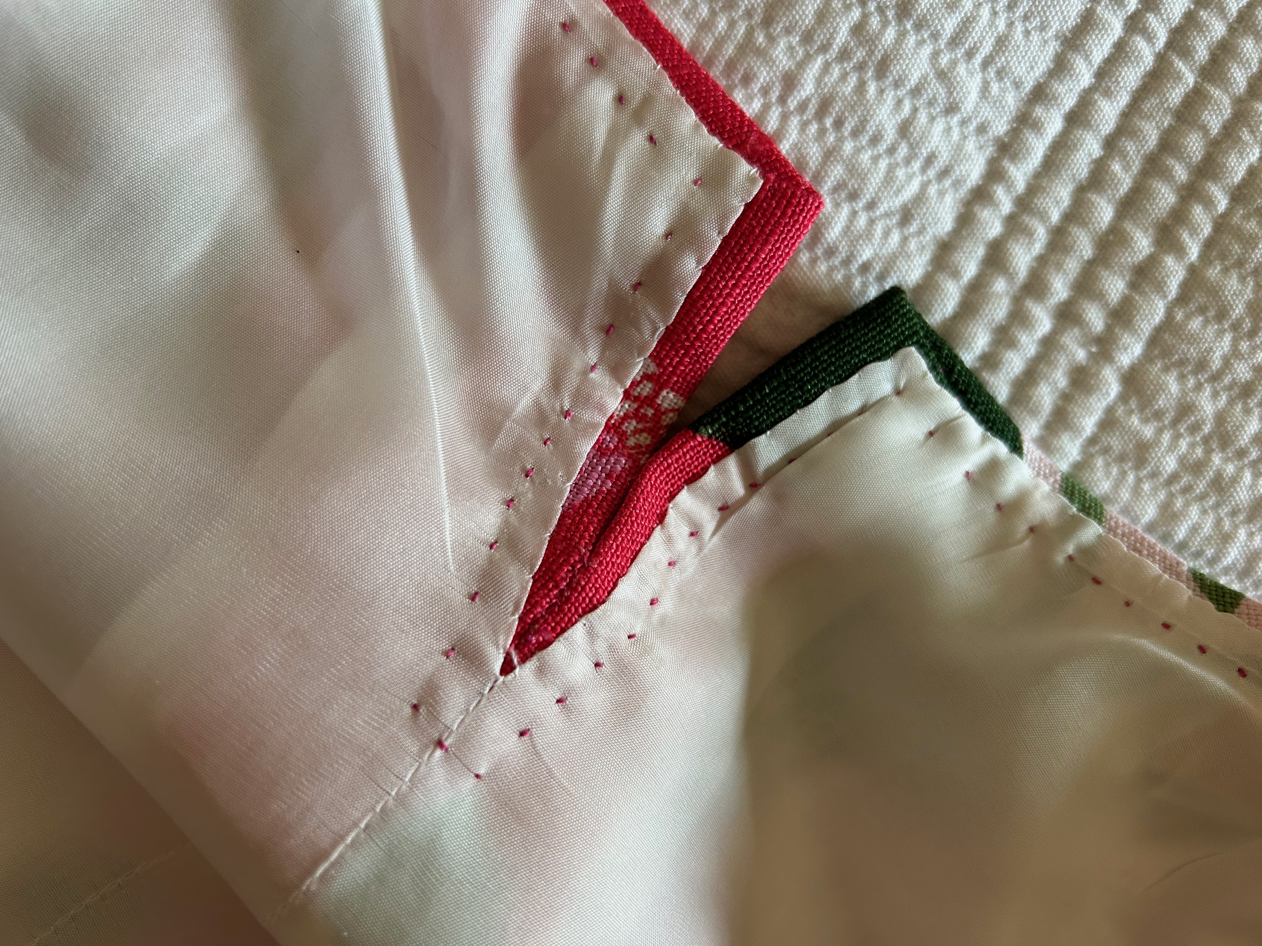
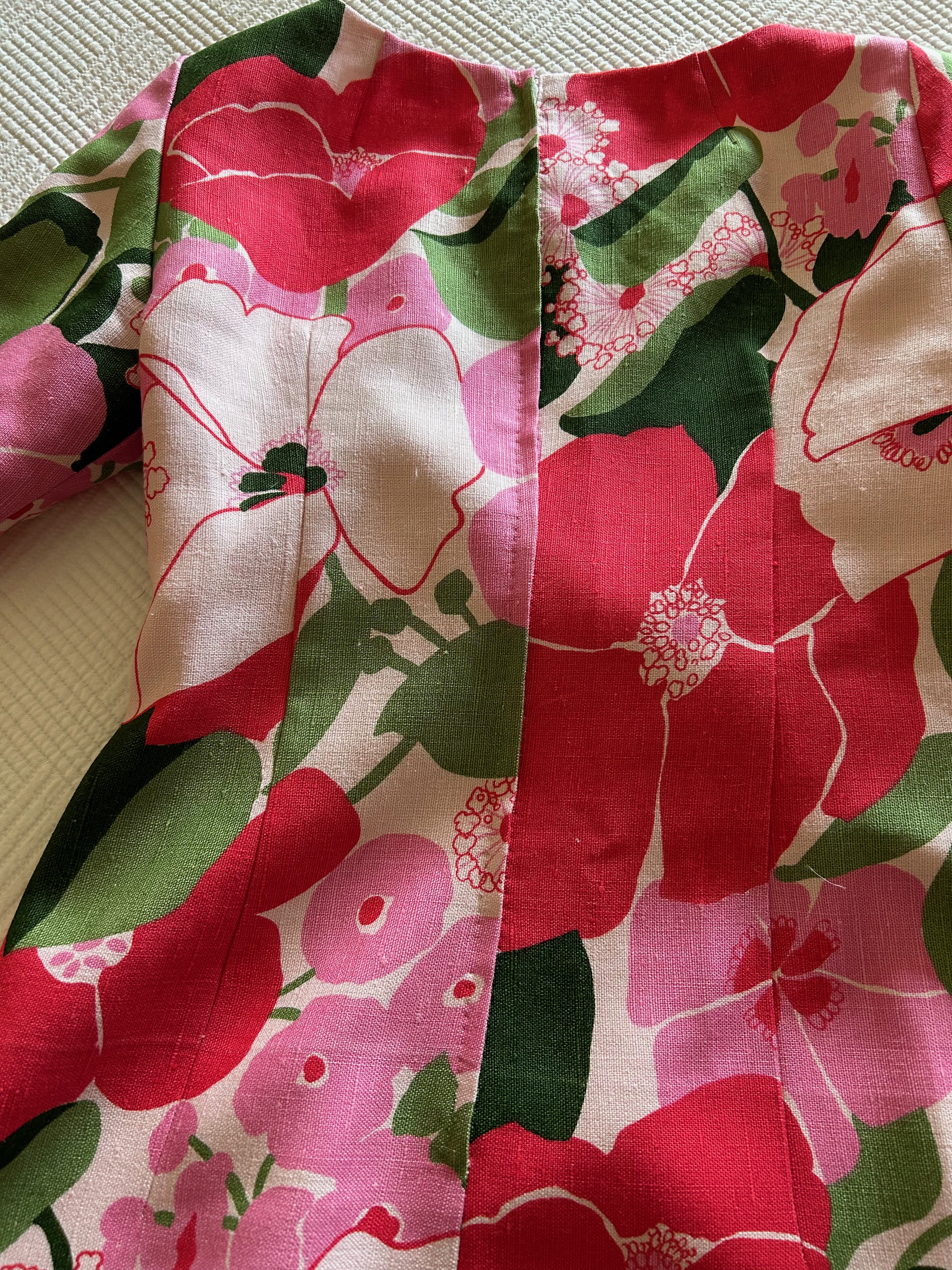
The caption tells me it is made in silk shantung, a little bit of information unknown to me when I decided to make my (new) version of it in silk taffeta.
Interestingly, in the same NEW ARRIVALS section, a dress by Patou also is reminiscent of Trench coat style, with its epaulets, slotted pockets with shaped flaps and a belted waist. It also has a center back inverted pleat.
Fast forward two years and here is a very classic Trench in the 1976 September/October issue of Vogue Pattern Book Magazine.
The caption reads: “Come rain, come shine, what more liveable coat than the trench! All that star reporter elan in epaulets, front & back shields, center back inverted pleat.” This particular pattern also includes a detachable lining for the coat and additional detachable collar. I believe that is the collar you see in red in the above picture from the magazine. The thumbnail drawings of the pattern are helpful in seeing these details:
Now, hang onto your hats and fast forward 46 years to 2022. The Trench Coat, despite being in fashion since the 1940s, is apparently enjoying new attention and reimagination according to an article in the Style & Fashion section of The Wall Street Journal, April 23-24, 2022. Although I am a little doubtful as to the long-lasting appeal of some of the Trench Coat variations shown and suggested in the article by Katharine K. Zarrella – which include a skirt, pants and a corset (really?) – some of the reflections and thoughts on Trench Coat style by various fashion insiders are worth sharing.
Michael Kors is quoted as saying: “A trench coat inherently feels like an old friend that makes you feel very secure… But you want an old friend to surprise you.” (Pink checks, anyone?)
Jane Tynan, author of a soon-to-be-released book entitled Trench Coat, says the appeal of the Trench to contemporary women is the “danger and sensuality it conveys.” (Think spies and clandestine meetings.) However, a certain Loa Patman of Boston, Massachusetts, says, “Anything trench-inspired tends to look somewhat pulled together and professional.”
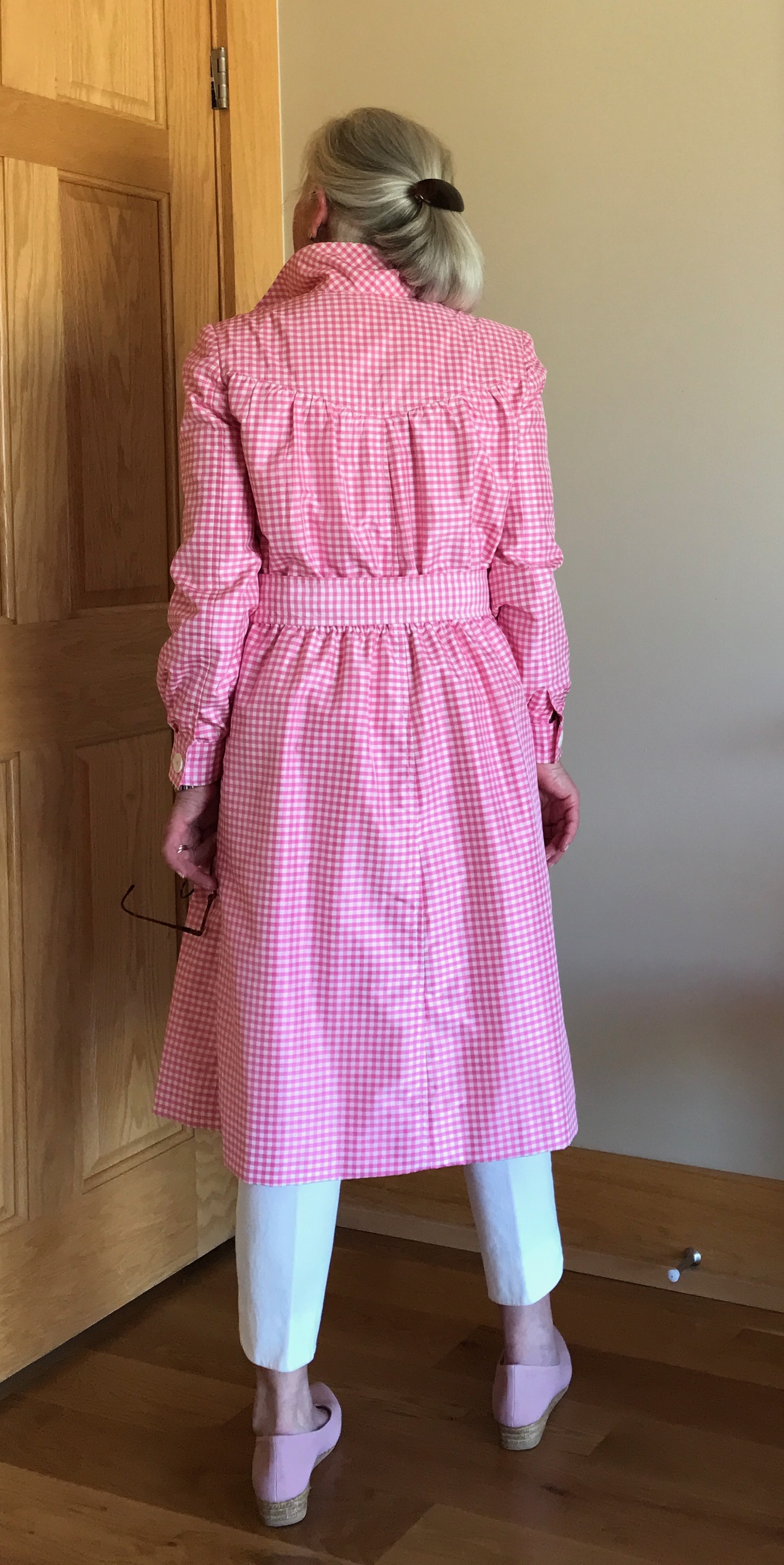
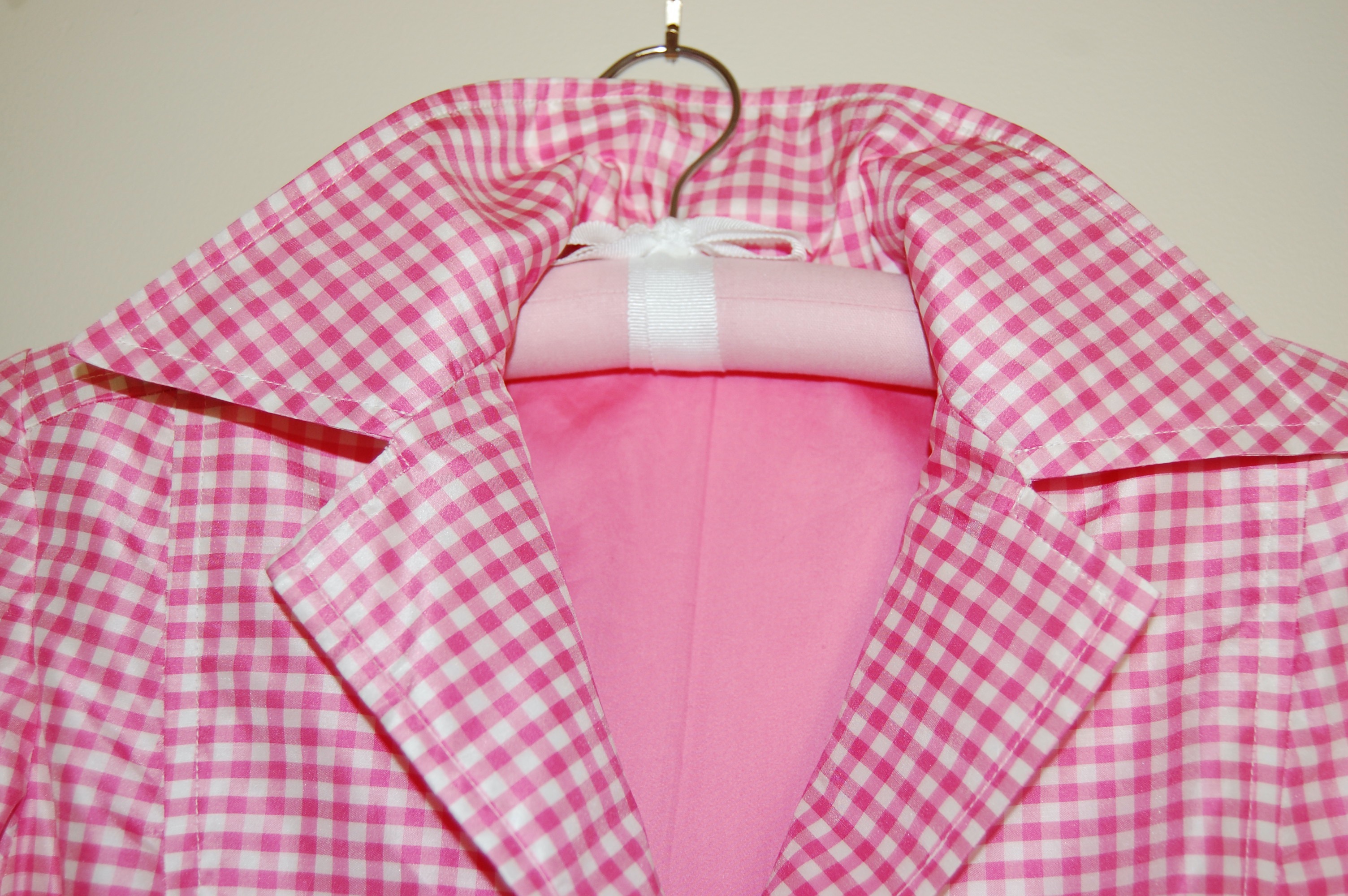
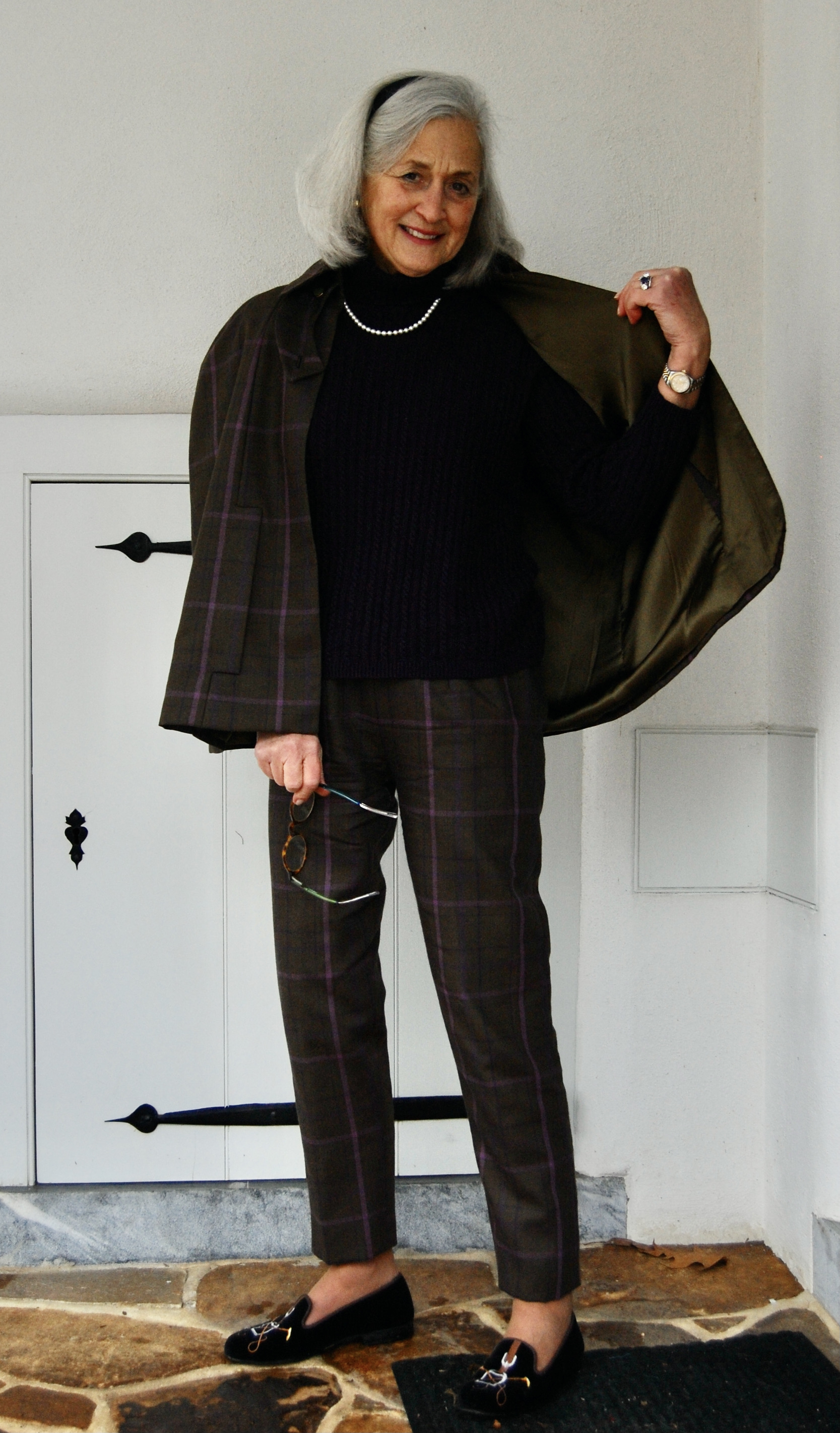
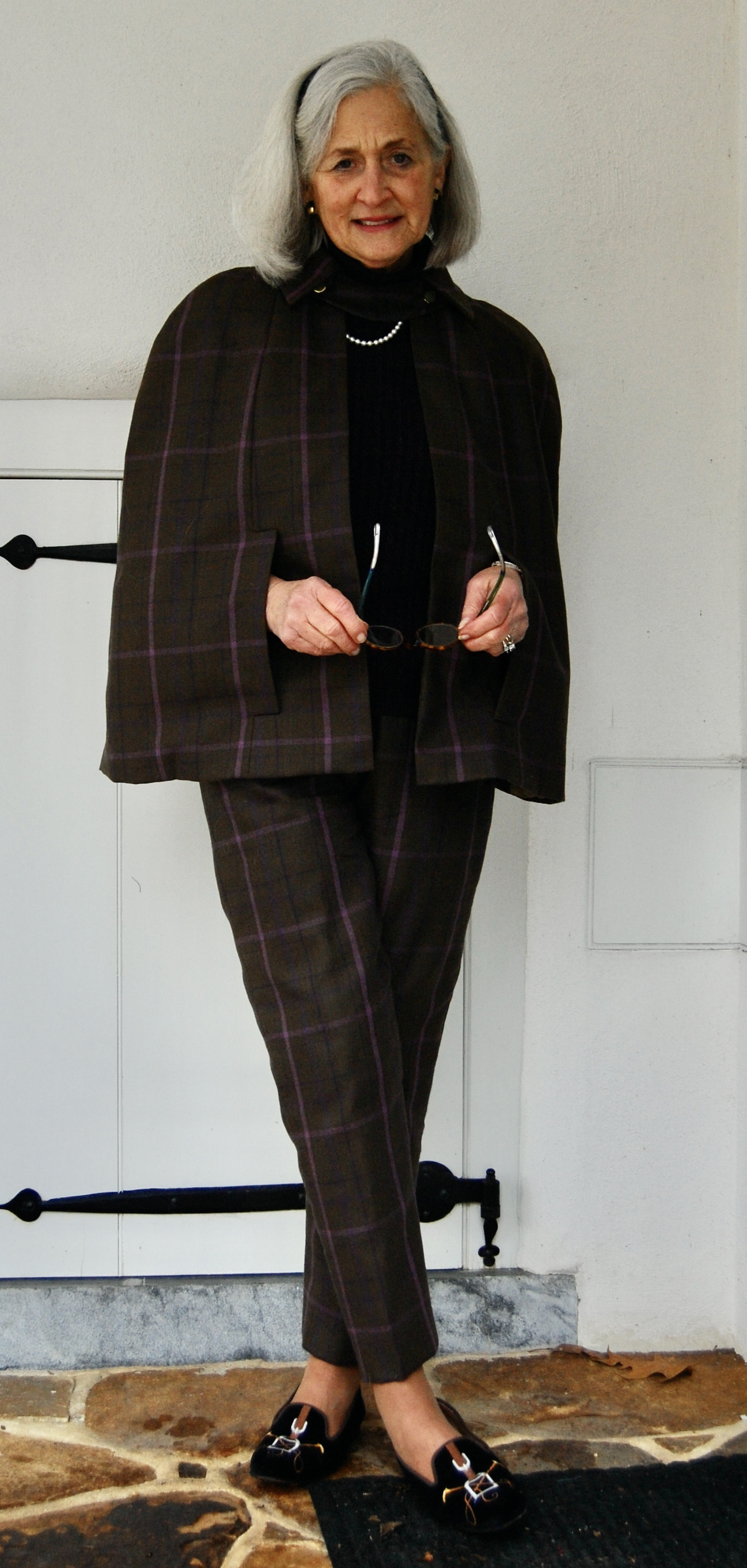
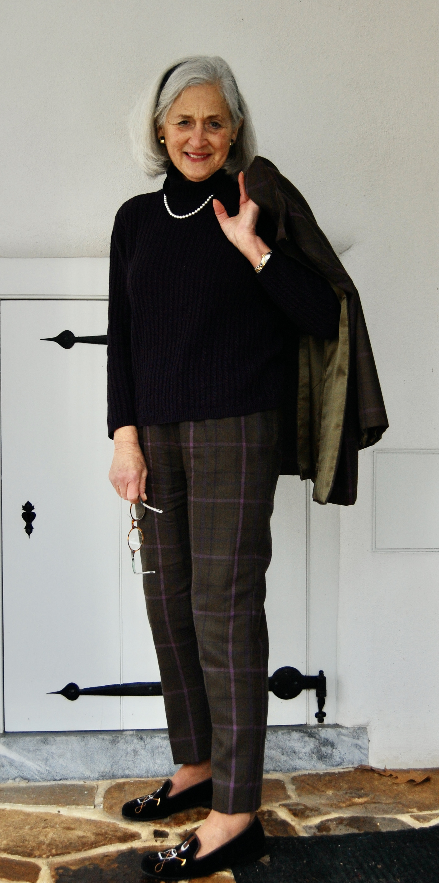
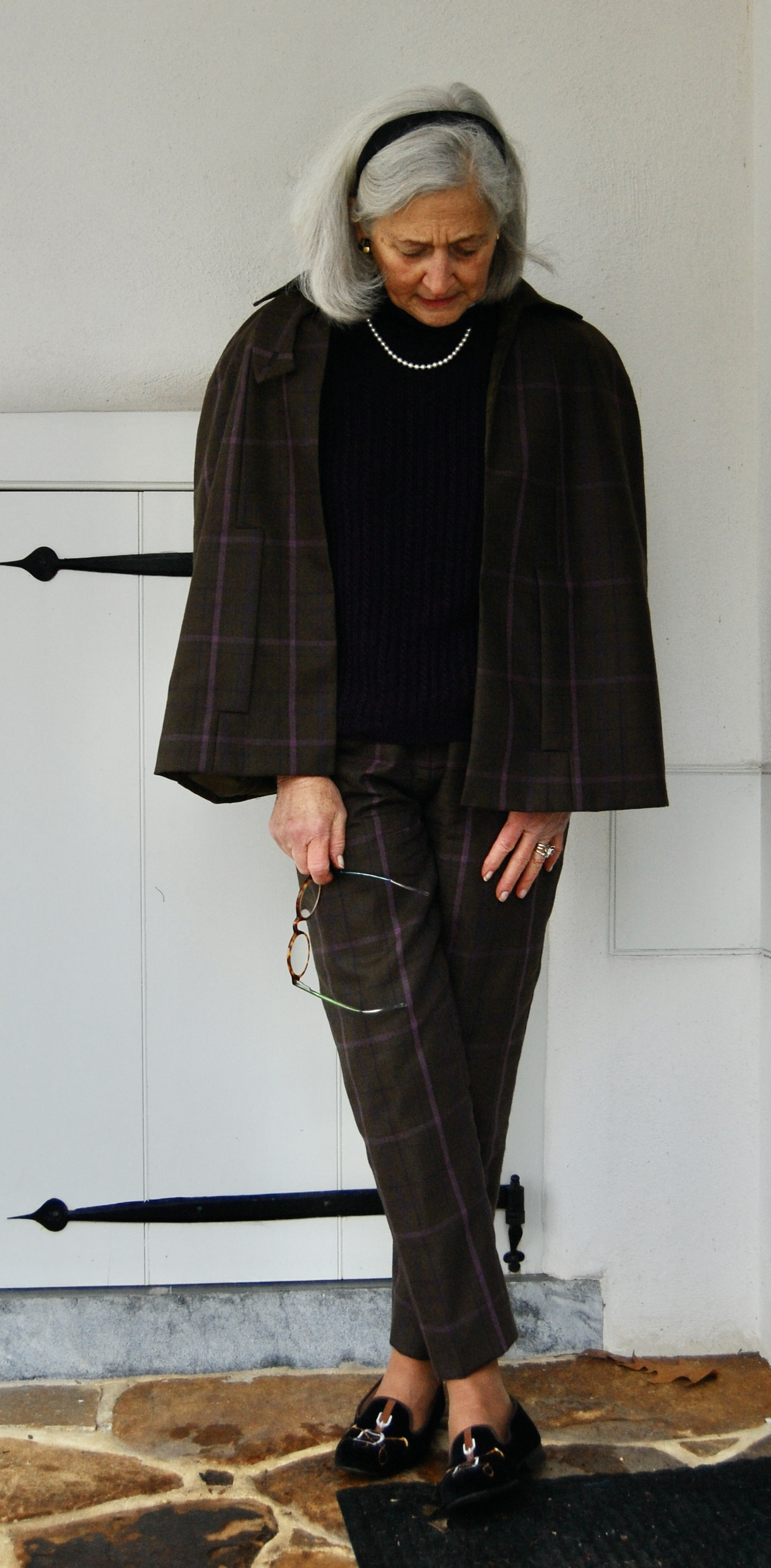
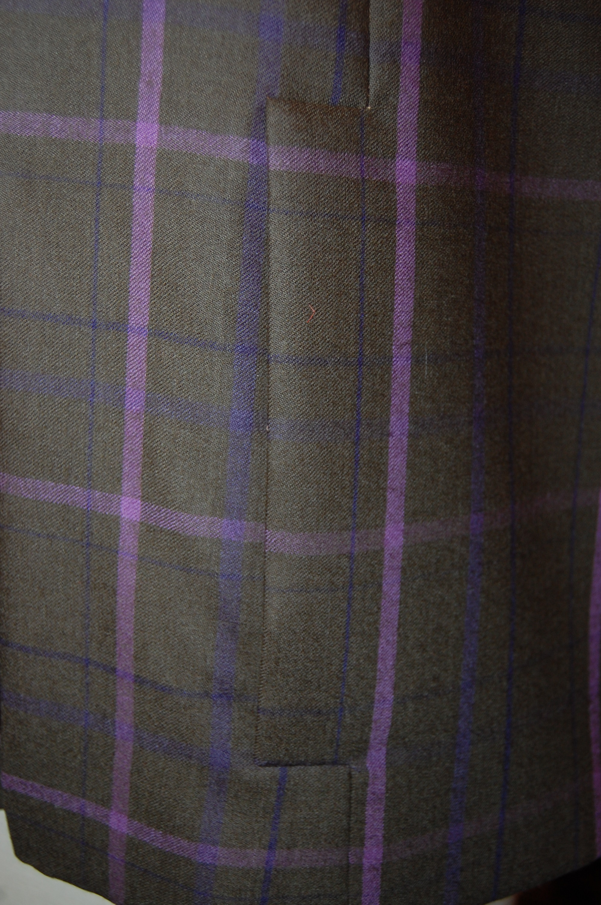
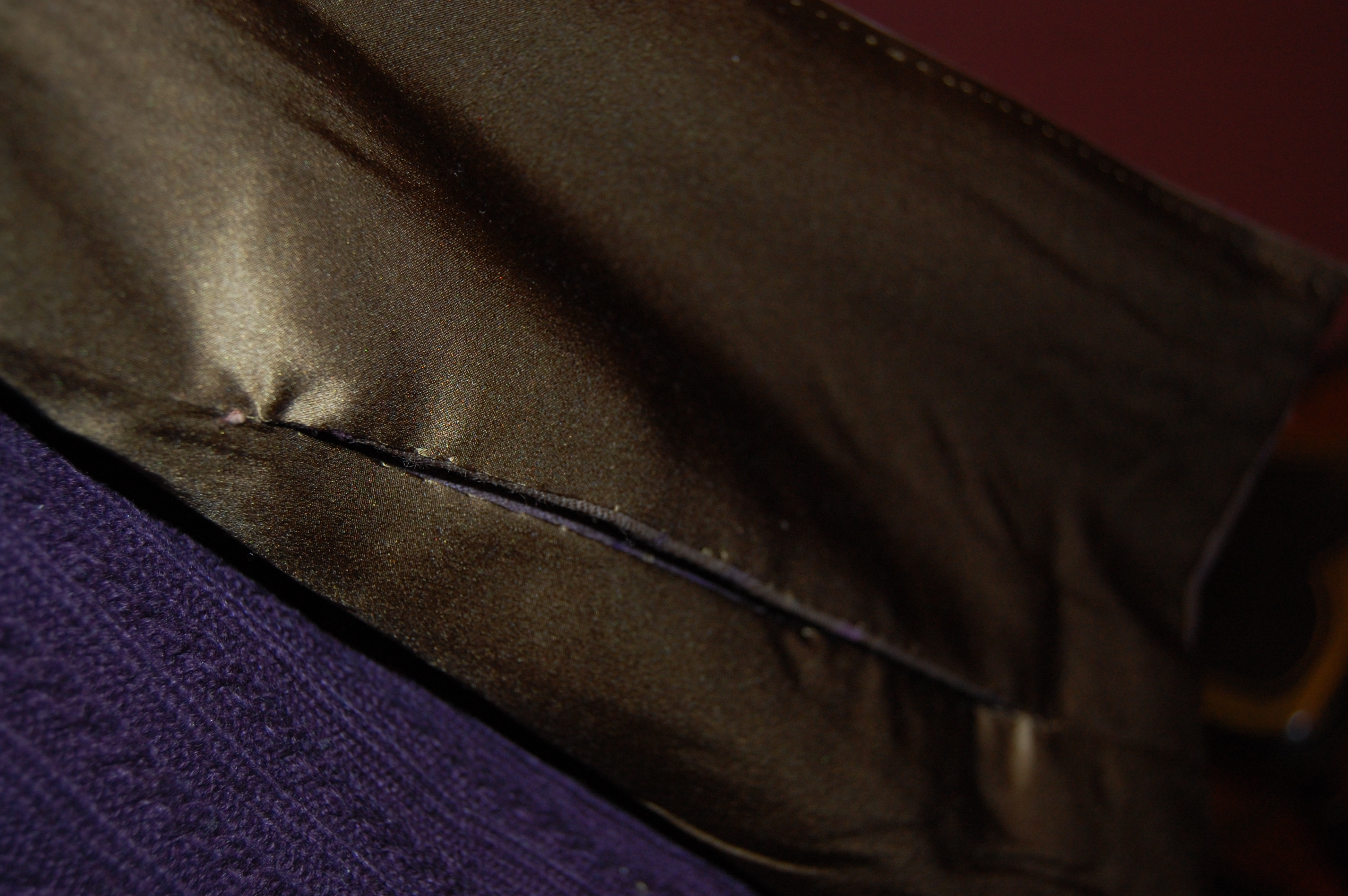
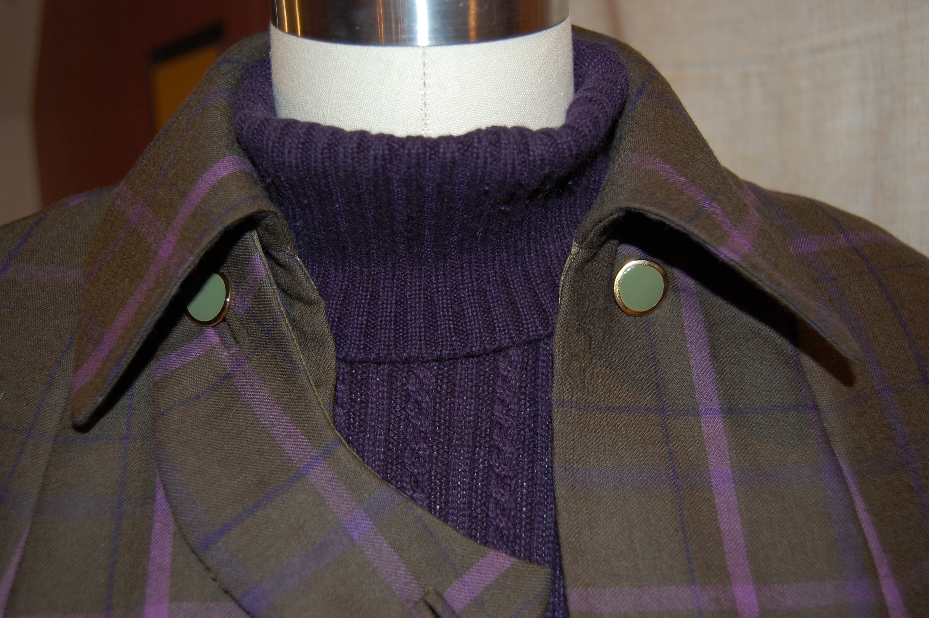
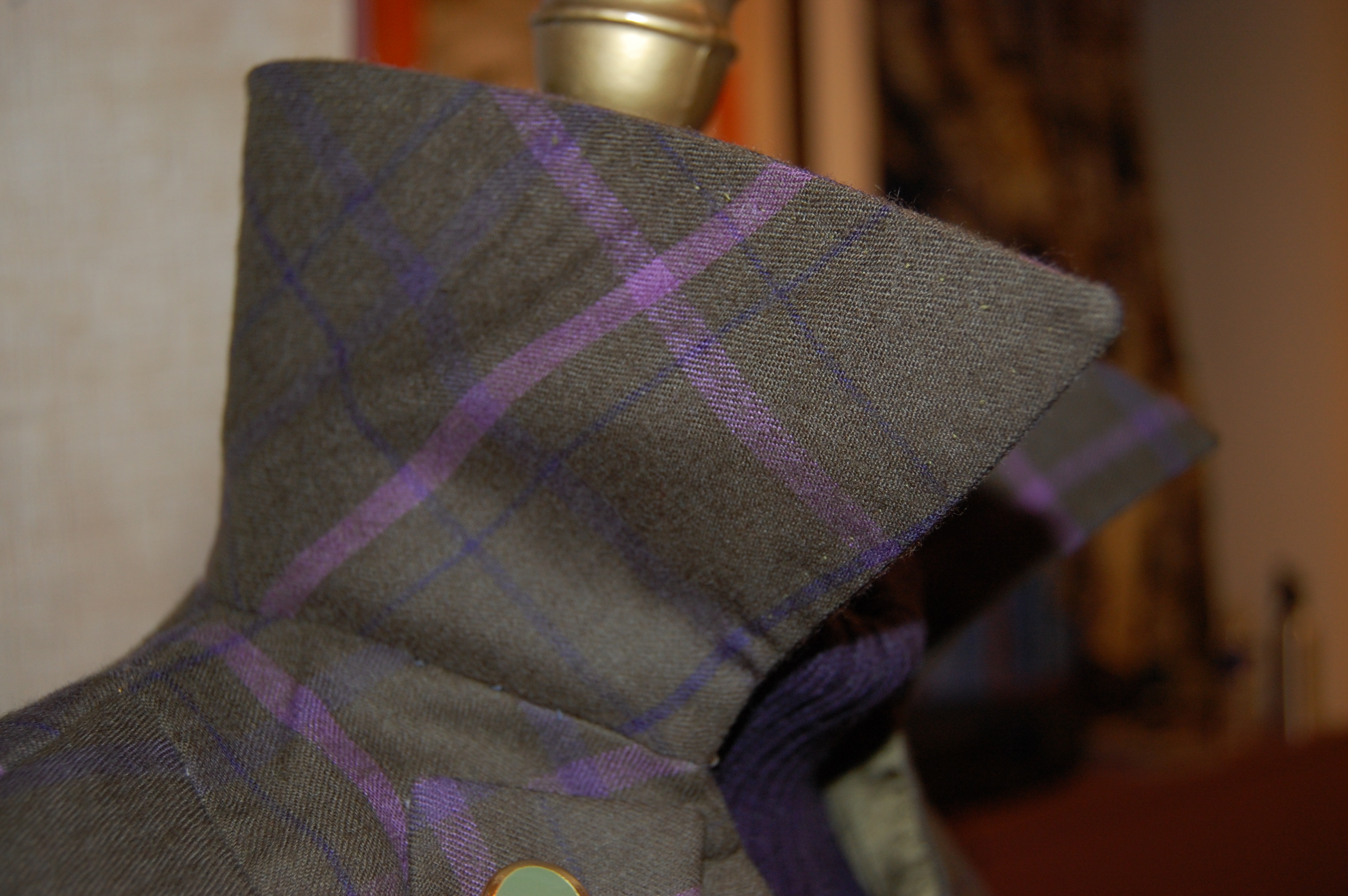
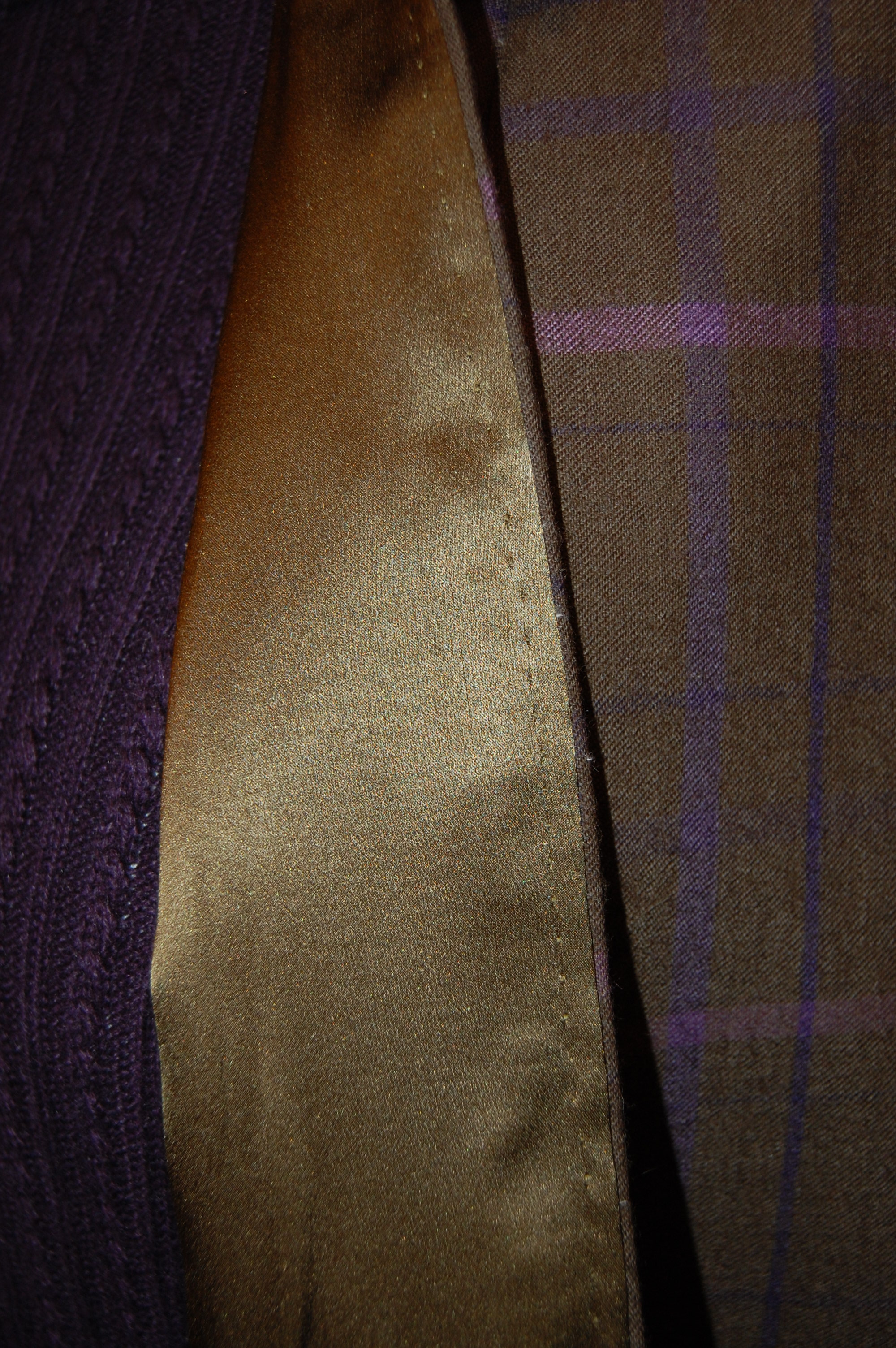
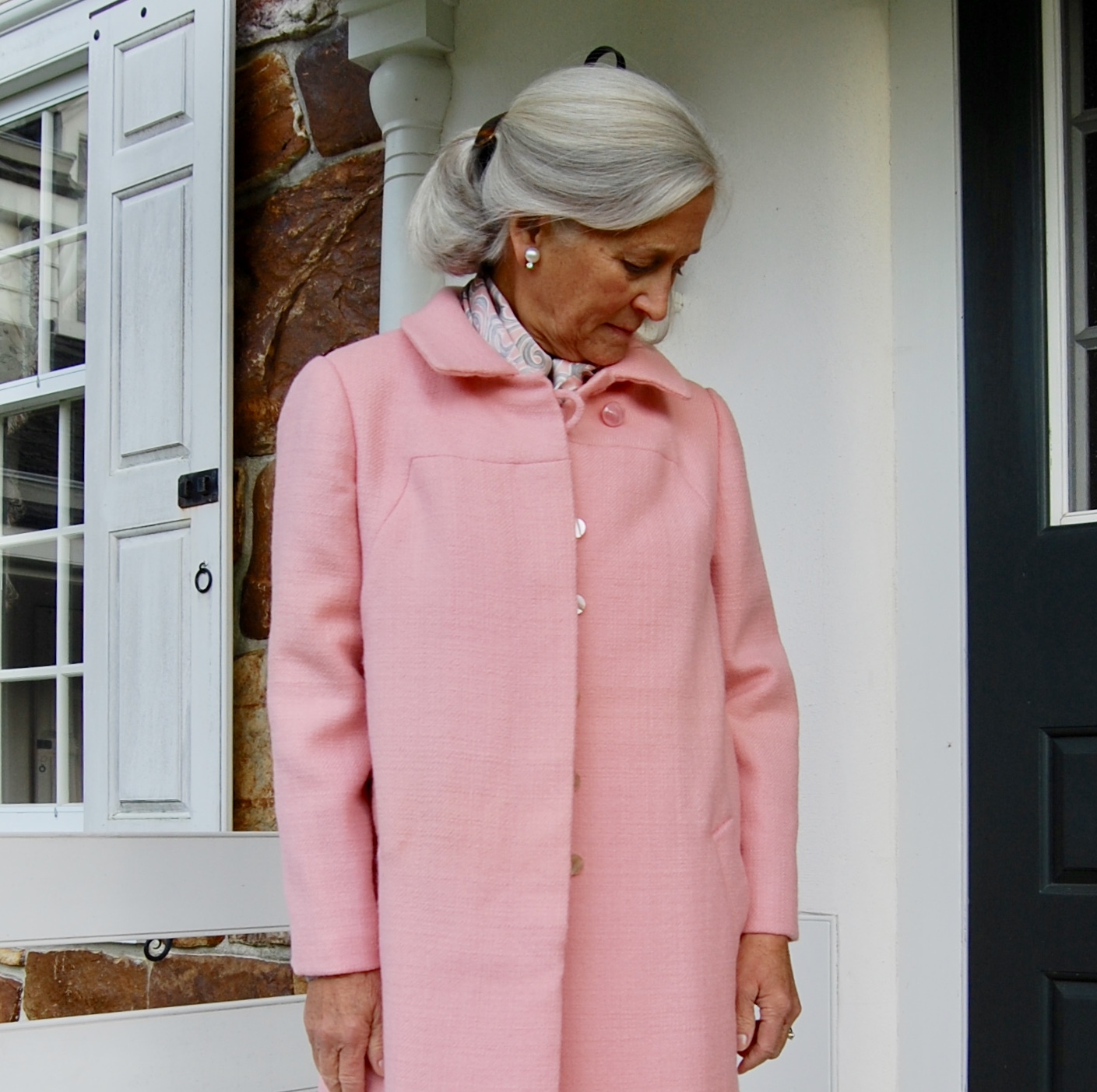
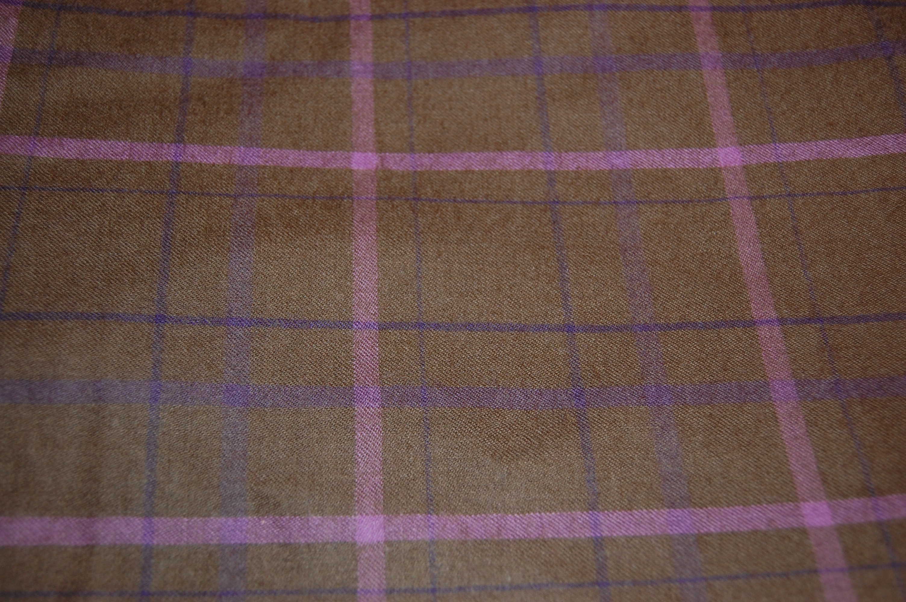
Well, I don’t expect to be doing any sleuthing in my Trench-inspired Christian Dior design from 1974, but I do aspire to feel “pulled together” while wearing it. Right now it is anything but pulled together, as you can see from the photos of my “work in progress”.
Thinking further about the origins – and definitional category – of this particular design from the House of Dior, it seems to me to be a cross between a dressmaker coat and a Trench. Perhaps “Dressmaker Trench” might be the best description. As you will recall, if you follow this blog, I have referred to “dressmaker coats” before. Fairchild’s Dictionary of Fashion describes it as: “A woman’s coat designed with softer lines and more details than the average coat. May have a waistline and unusual details, e.g., tucks or pleats.” (p. 92, ibid.)
I’m not sure Dressmaker Coat is a descriptor many use anymore, but it certainly is useful. One thing I am quite certain of, once this Trench-inspired Dressmaker Coat is finished – it promises to stand the test of further time. I anticipate it as a staple in my Spring and early Summer wardrobe.
5 Comments
Filed under Christian Dior, Coats, Dressmaker coats, Fashion commentary, Mid-Century style, Silk taffeta, Uncategorized, vintage Vogue patterns from the 1970s
Tagged as Dressmaker coats, fashion sewing, sewing, silk, vintage fashion, vintage Vogue patterns, Wall Street Journal Fashion coverage