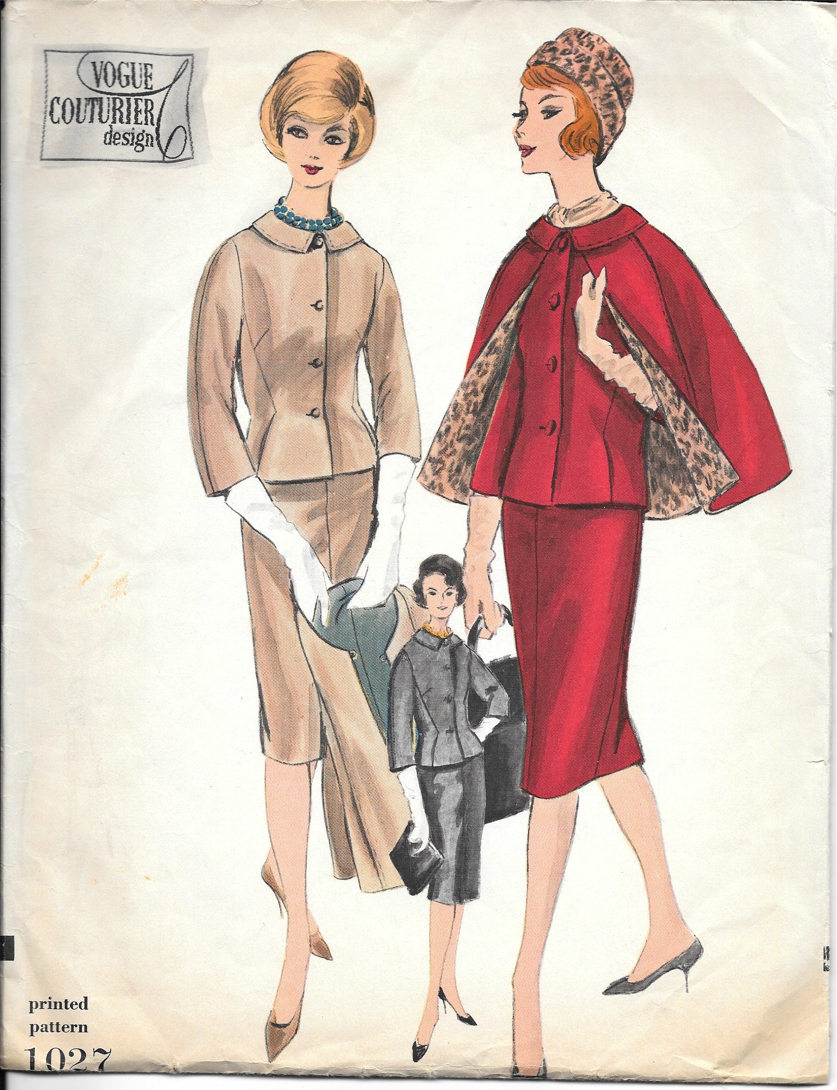
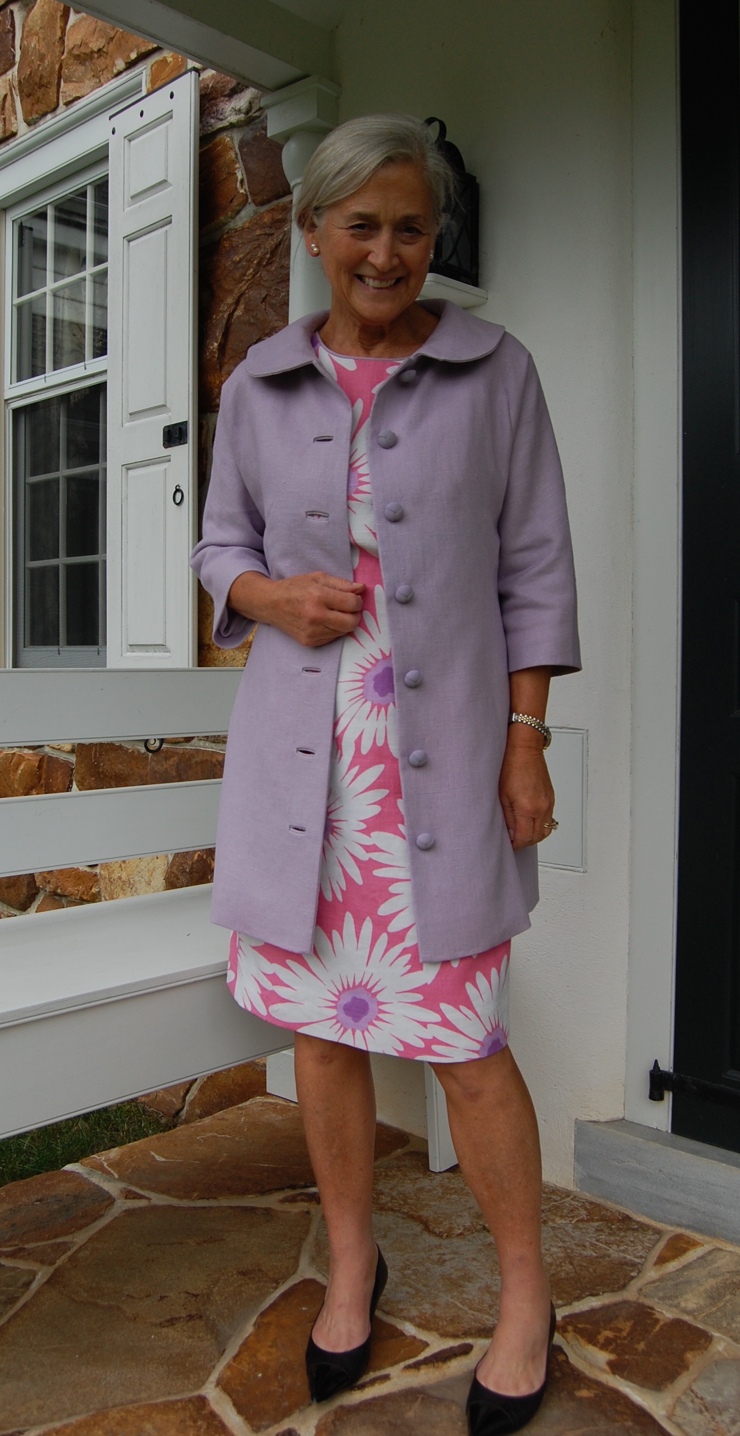
Summer slipped quietly away this week with nary a peep except for the sighs coming from my sewing room. No matter how hard I tried, I could not keep up with the calendar to finish my final Summer project. However, a few days late on “delivery” doesn’t really upset me, as I can look forward to wearing my Madame Gres-designed coat next Spring.
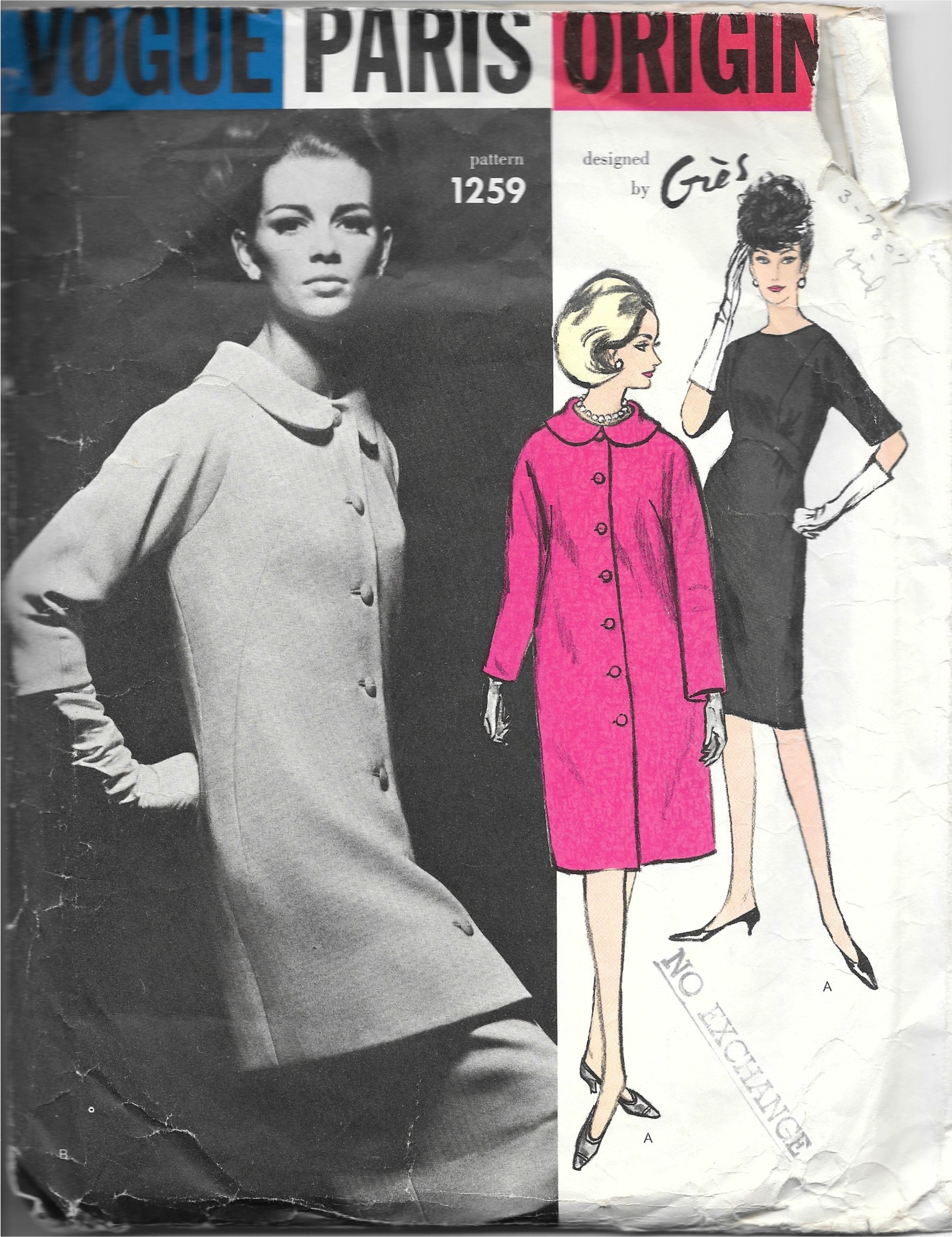
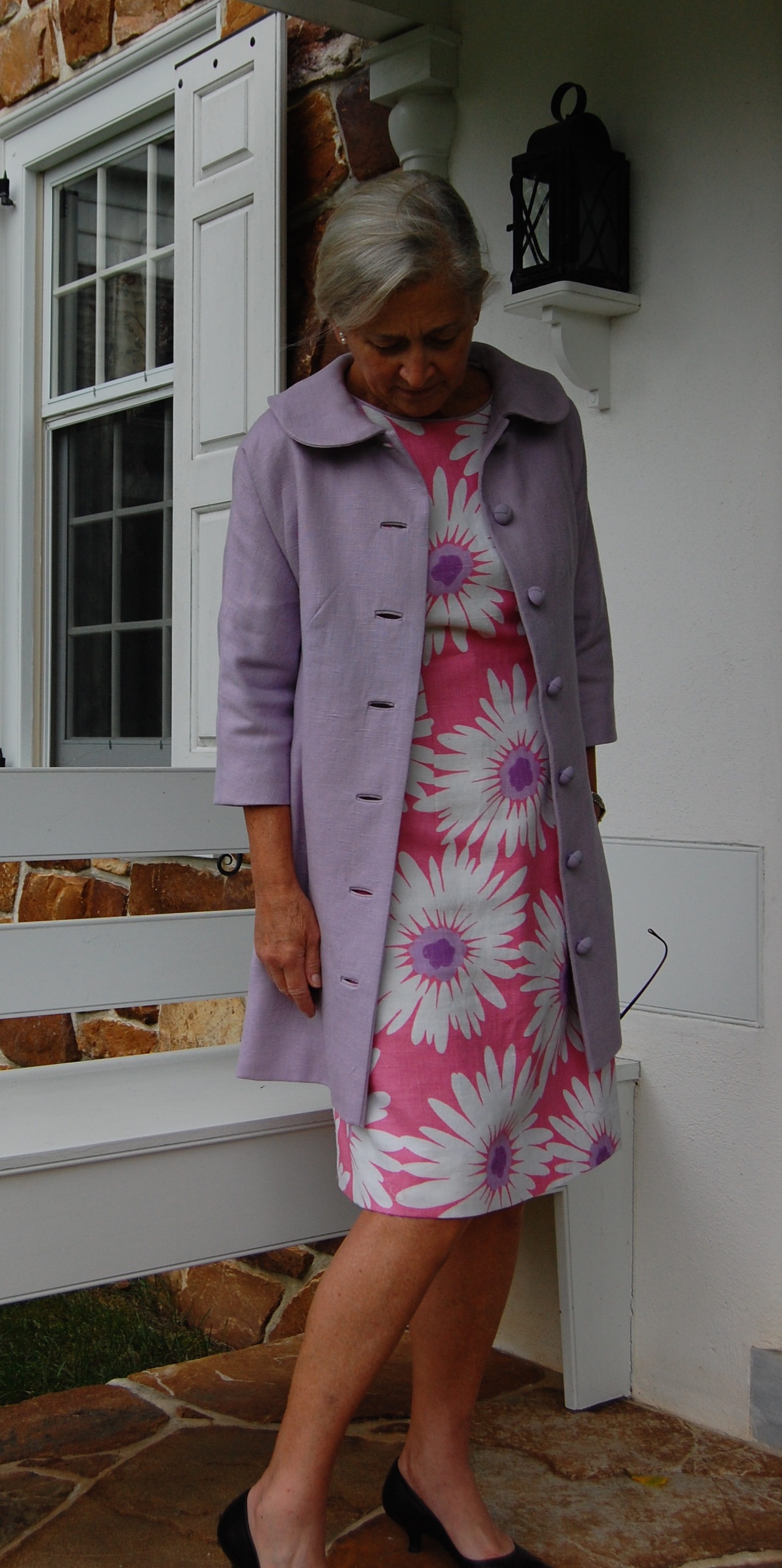
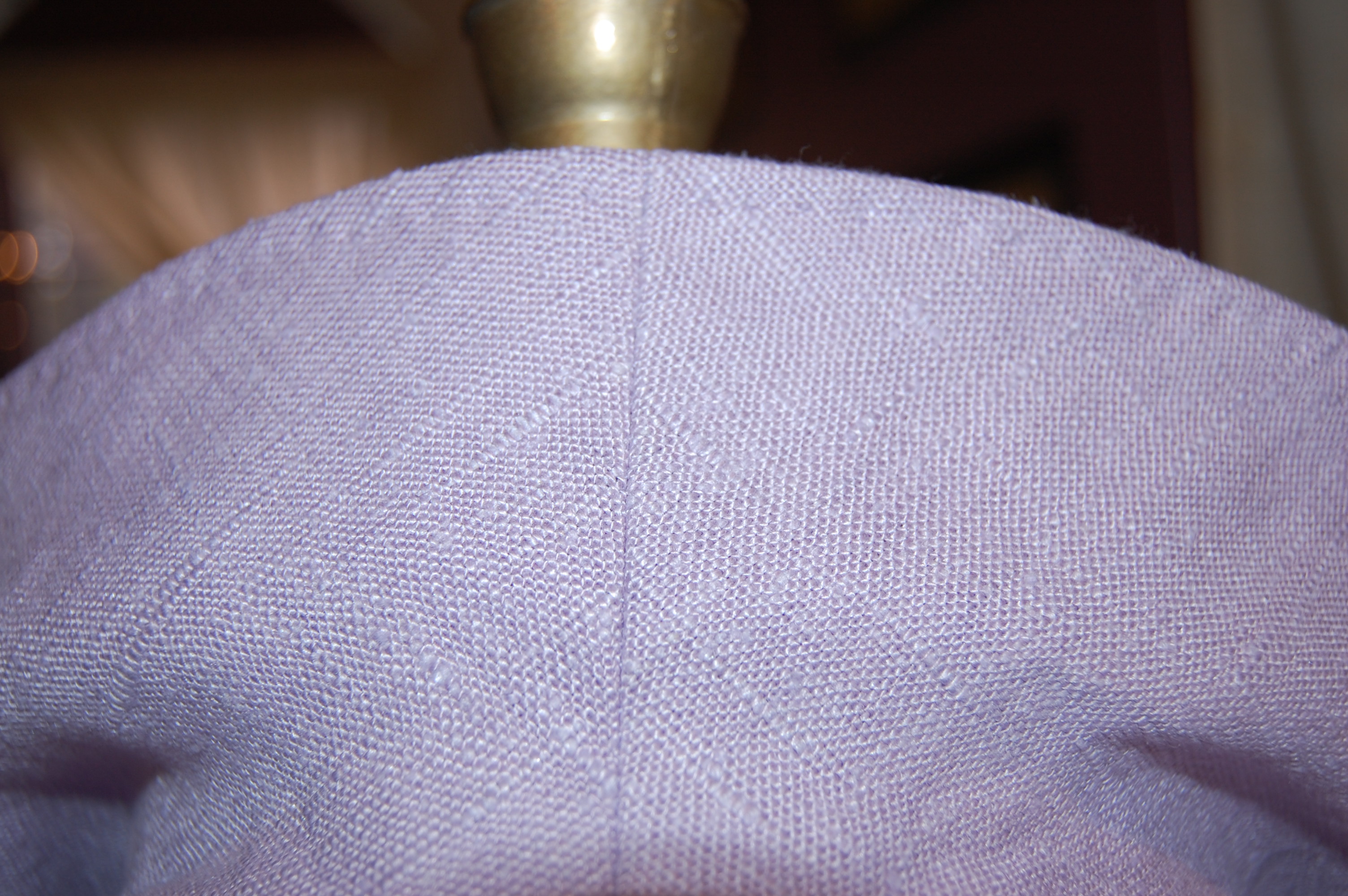
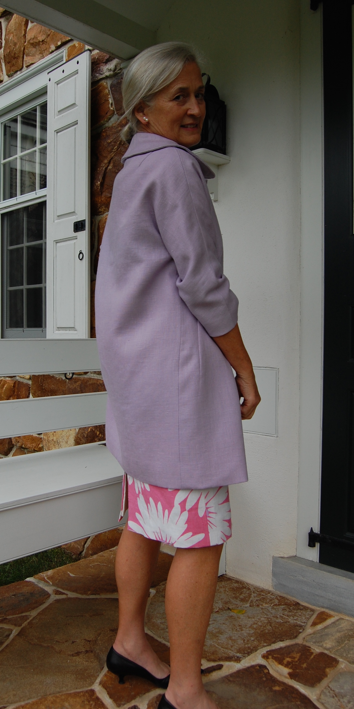
I am not sure I can remember a sewing project which I have enjoyed more. The coat pattern is actually quite a simple design, imaginatively shaped with unusual darts and seams. Perhaps the fact that I made it from vintage Moygashel linen helped make the sewing of it enjoyable, as the linen is so stable. Darts and seams can be crisply sewn and ironed, the grain of the fabric is so easy to see, and the fabric drapes with a fluid sturdiness, if that makes sense.
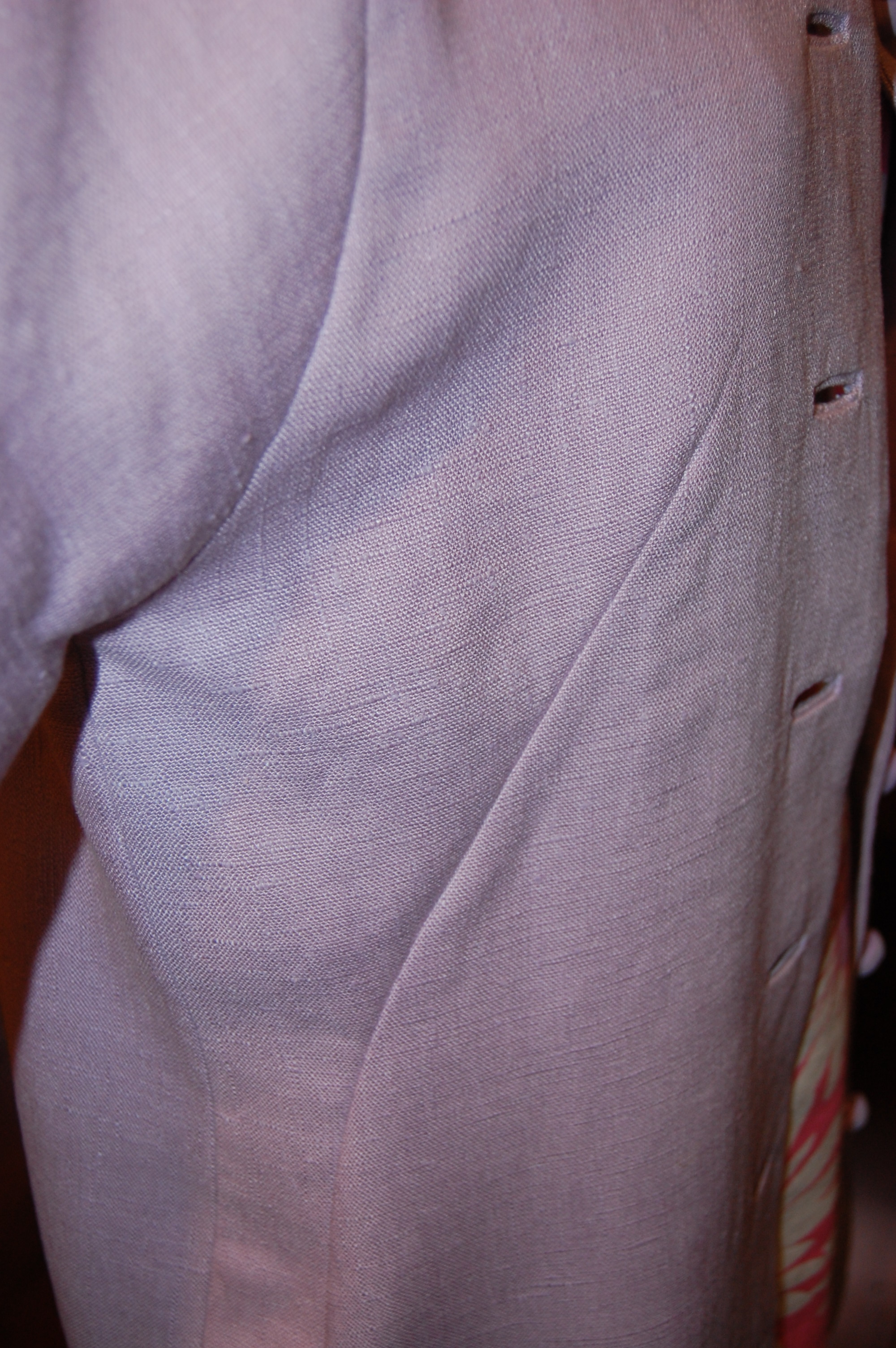
This shows the side darts which shape the coat and the dart/seam at the front of the kimono sleeve.
I covered the changes I made to those front darts in an earlier post; those were the only alterations I made to the final design except for lengthening the sleeves by one inch and the length of the coat by 1½ inches. Besides those shaping darts, there is one other feature of this coat which defines it. Do you know what it is? Yes, it is the bound buttonholes and their buttons. Seven of them, to be precise.
The pattern instruction sheets call for bound buttonholes, as shown here:

I love how these vintage Vogue patterns give such precise instructions; there are various ways to make bound buttonholes, but the method described here is my favorite.
I have made a lot of bound buttonholes in my sewing life, but seven of them lined up as the focal point of the front of my coat is still a little intimidating. First of all, I had to find buttons that were “perfect.” I found some lavender buttons on the Britex website, and although they looked like a good match in color and appearance, ordering something like that online is always imprecise. However, when they arrived, they were, indeed, “perfect!” With buttons in hand, I made a sample buttonhole, as I always do.
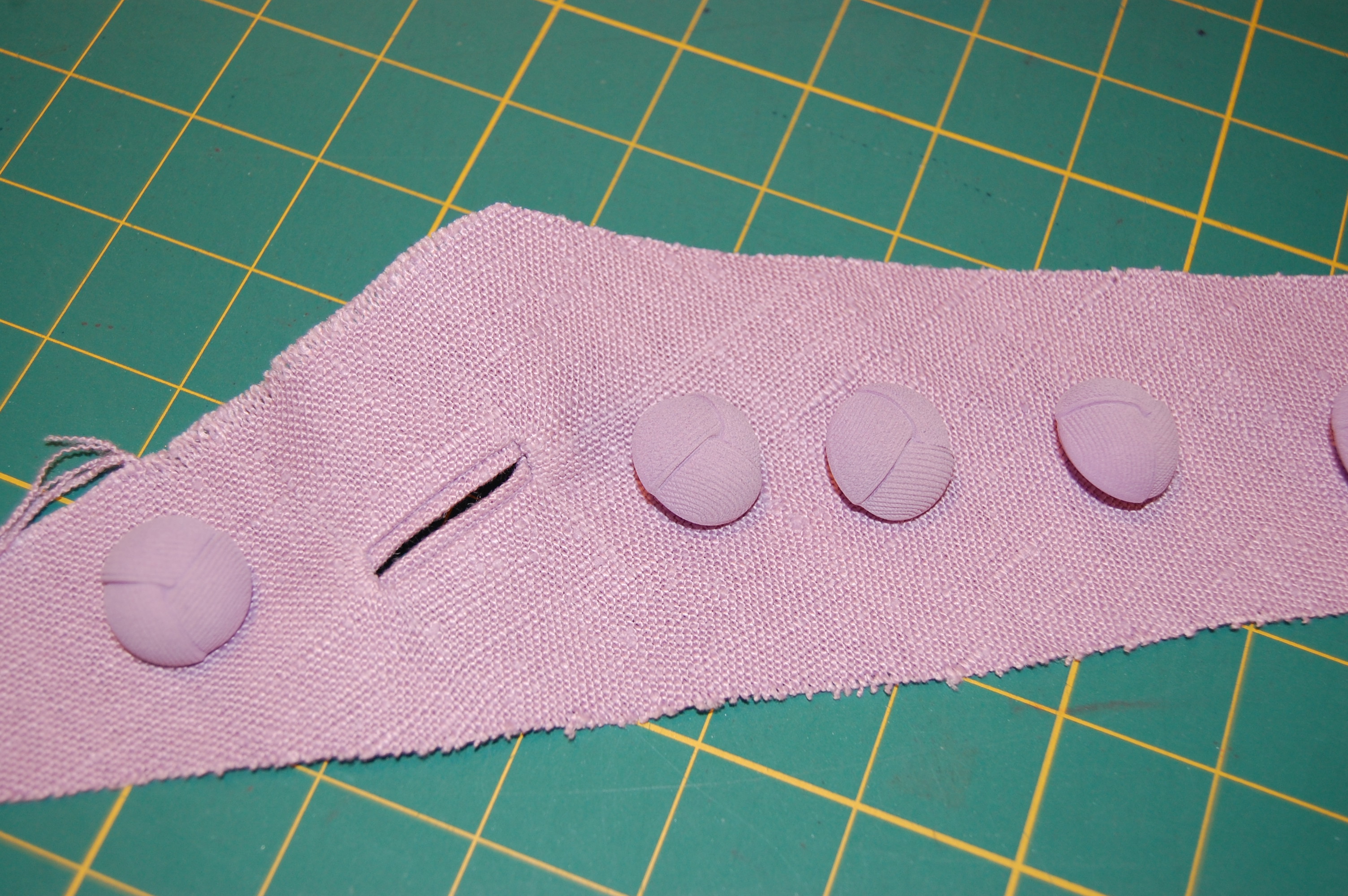
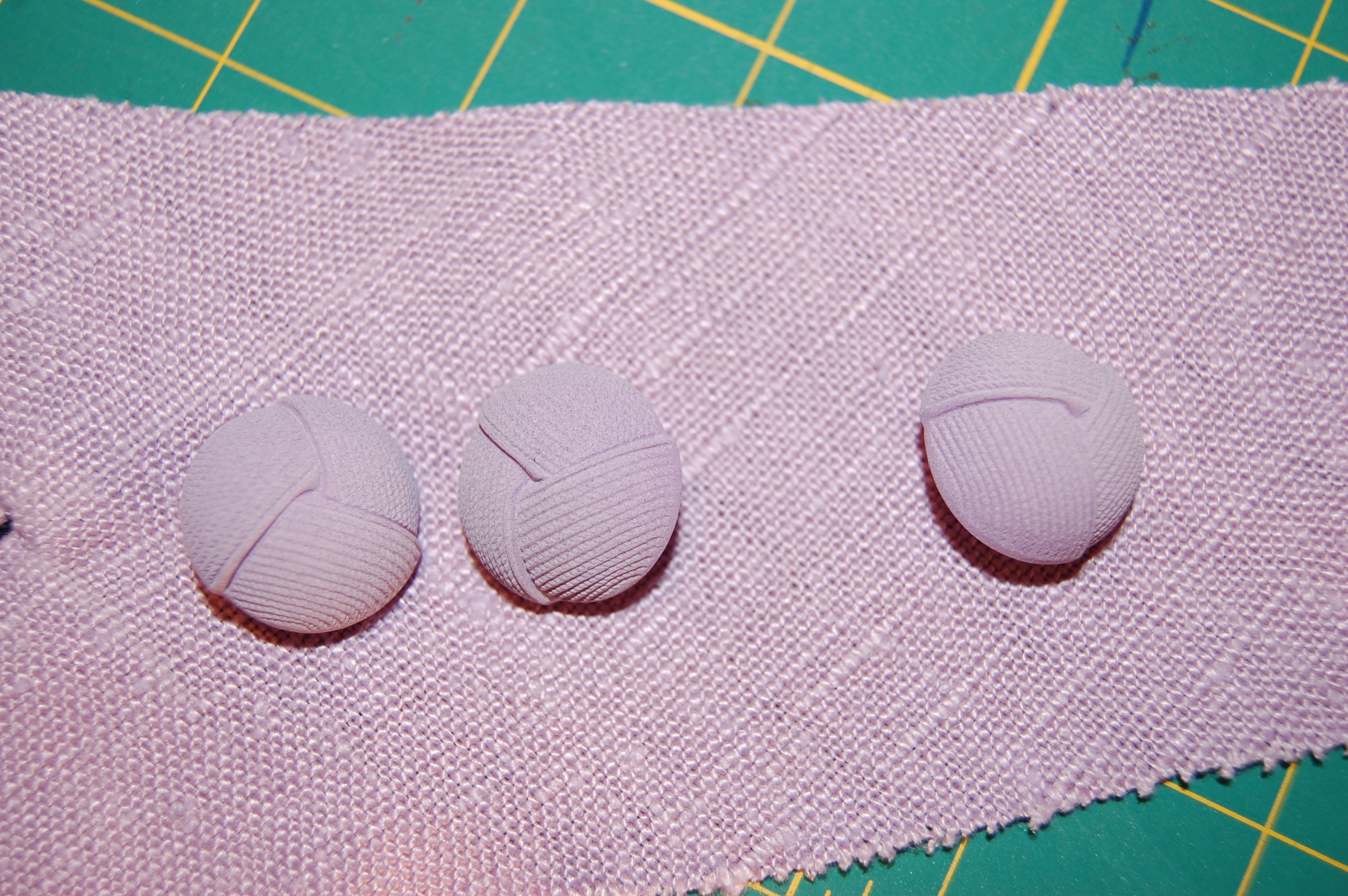
This photo shows the “monkey’s knot” design in the buttons, which compliments the linen weave, I think.
Then it was on to a marathon buttonhole session one afternoon.
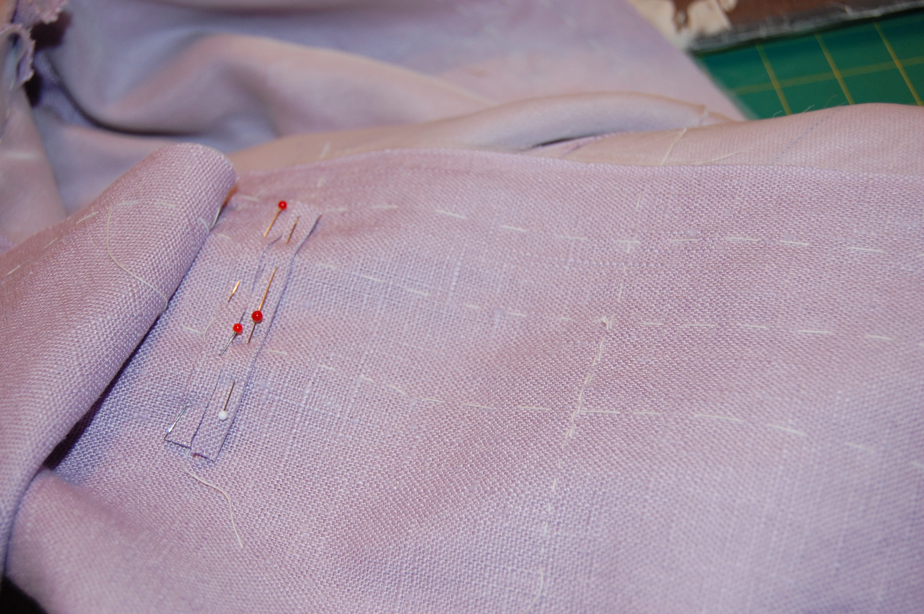
The most important ingredient in making successful bound buttonholes is precise marking.
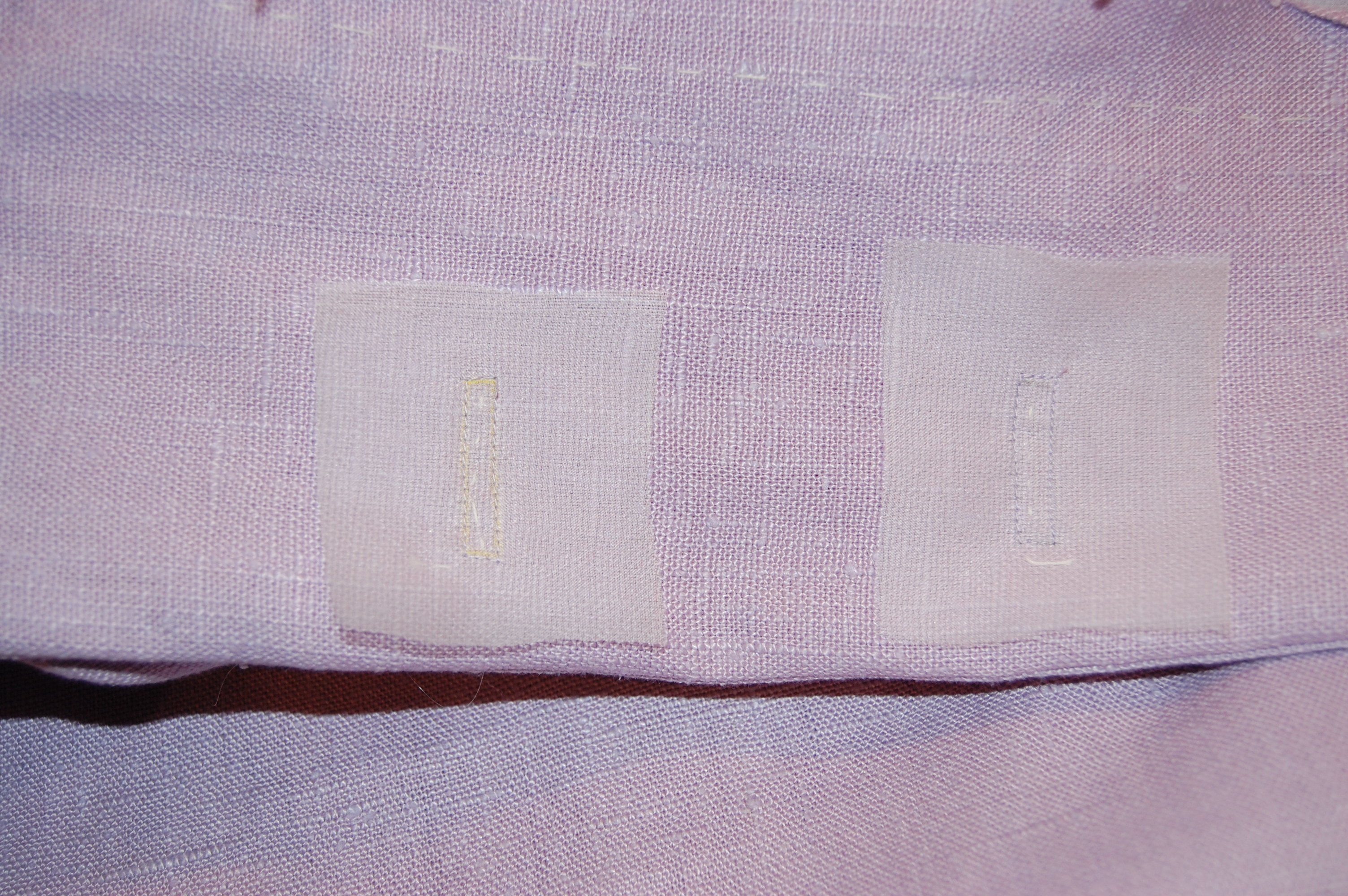
I finished the underside (on the facing) of the buttonholes using organza patches, which makes a beautiful, sturdy finish.
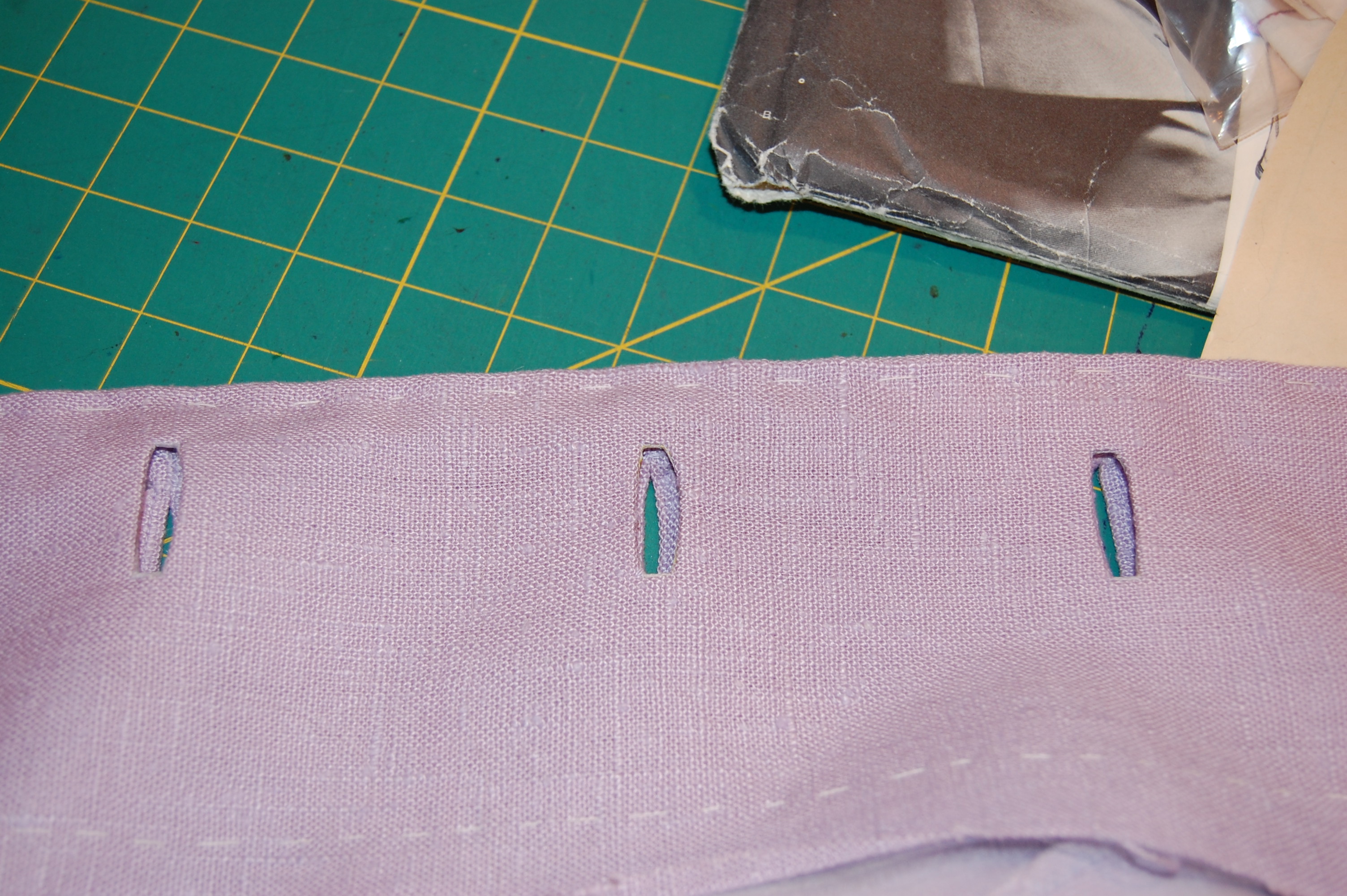
Here is the underside of the buttonholes before I finished the edges.
And here is the facing side, finished.
Another charm of this pattern is the coat collar, which is seamed in the center back on the bias, causing it to “turn” beautifully. I under-stitched the undercollar to help keep the perimeter seam properly in line (this is a trick I learned from one of Susan Khalje’s classes):
This is the undercollar, showing center back seam and the under-stitching I used to secure the perimeter seam.
When it came to the lining, I knew I wanted to use silk crepe de chine. I ordered some swatches from Emma One Sock fabrics:
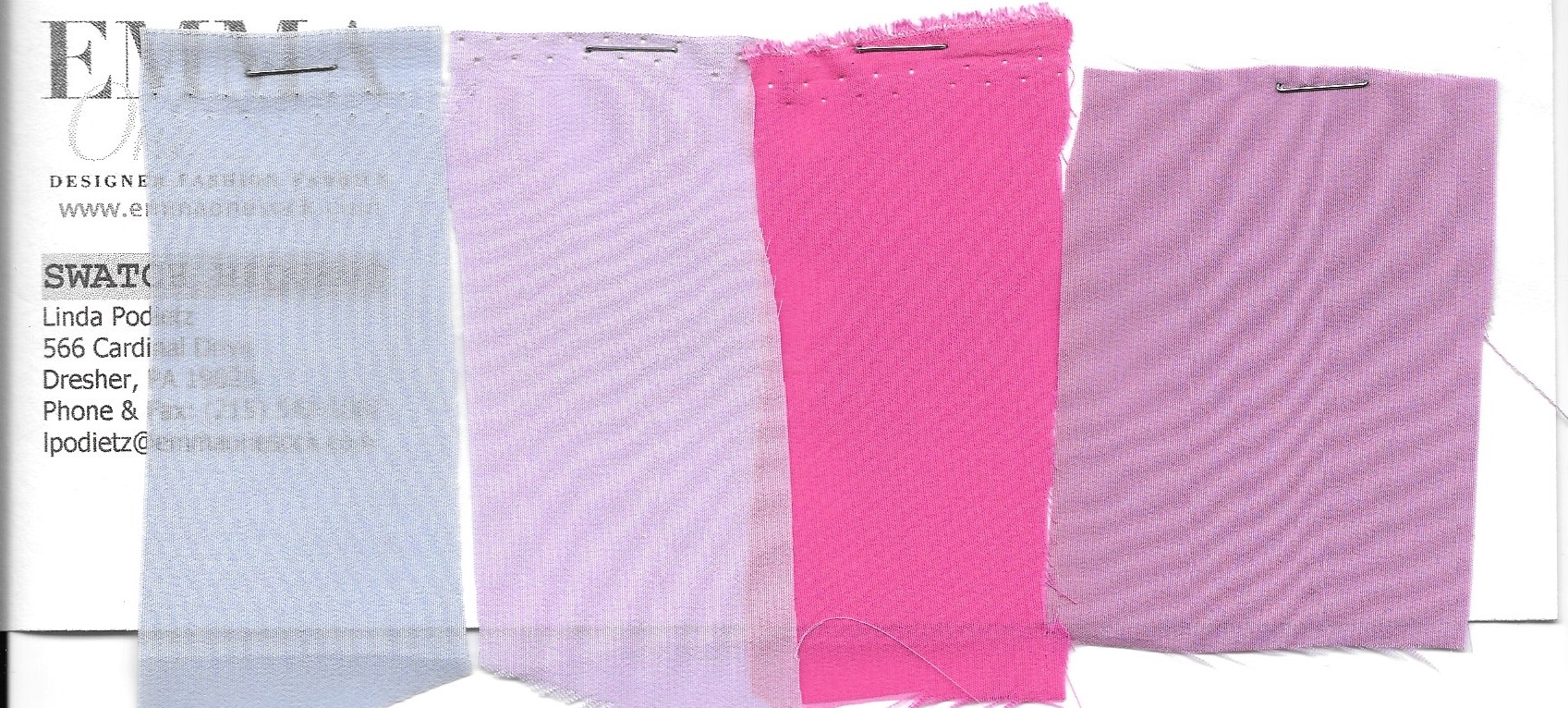
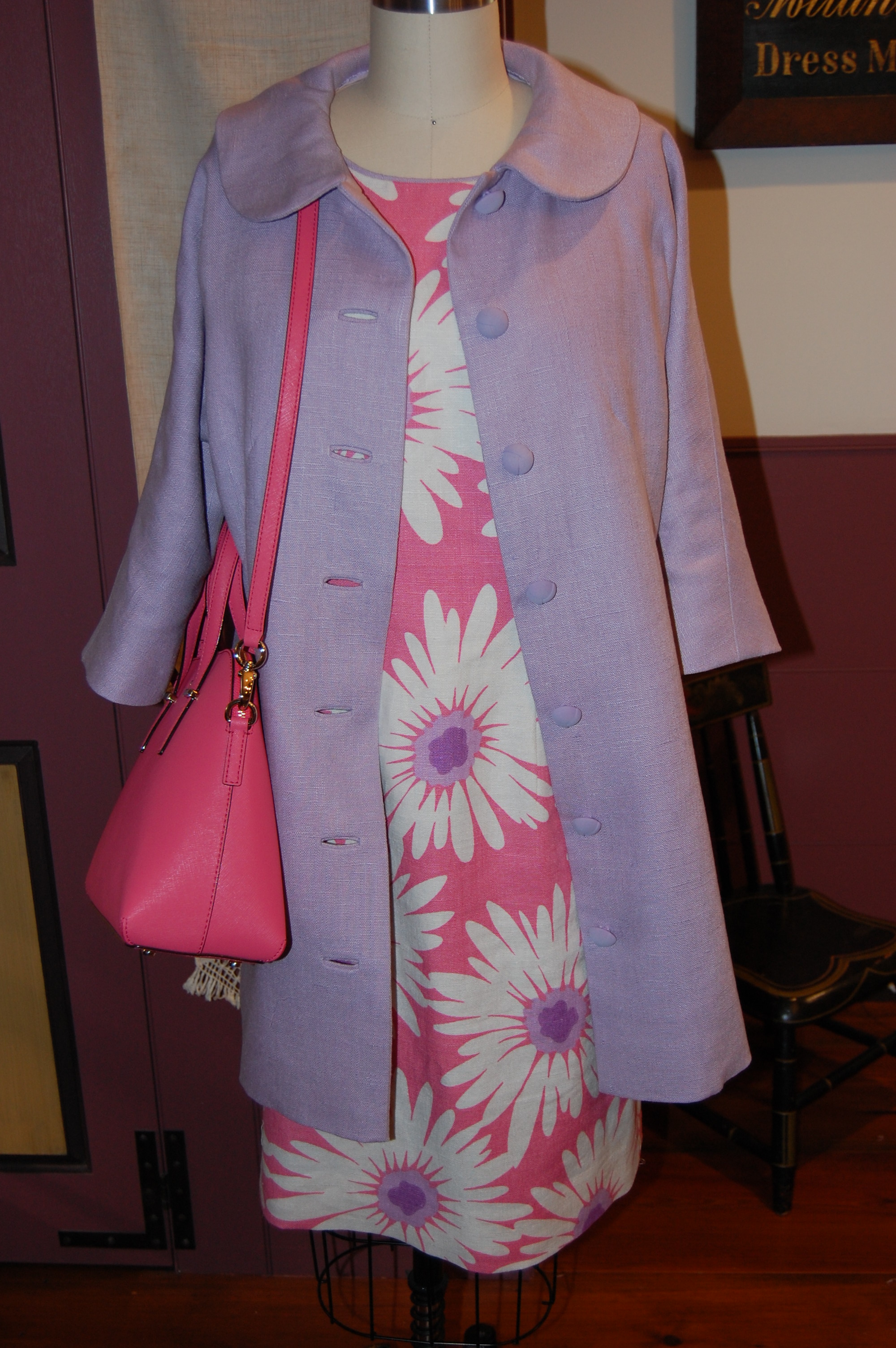
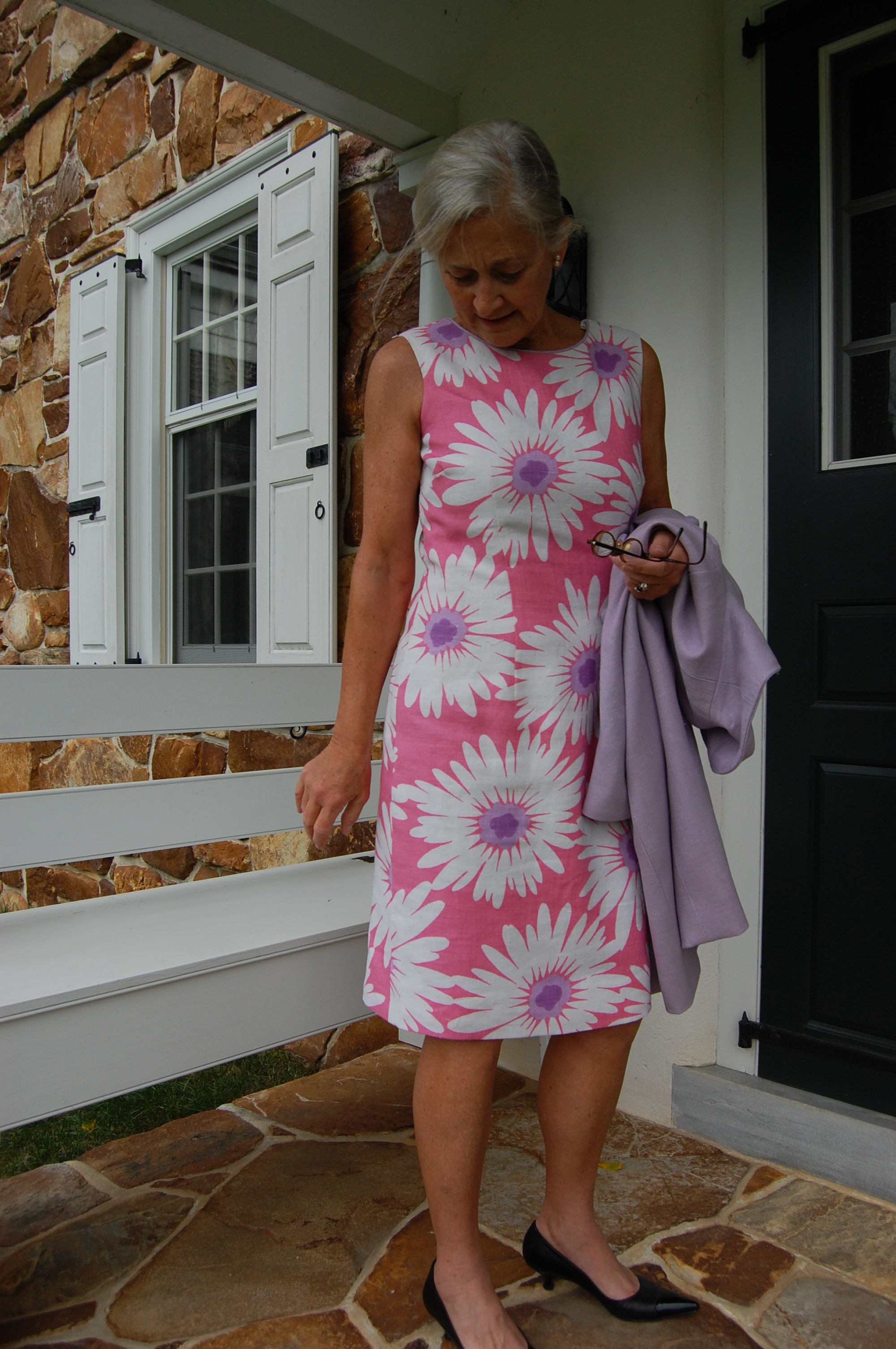
Fortunately my sister was visiting and so I could get her opinion on which one to order. I was a bit smitten with the idea of a bright pink lining, but she wisely asked if I hoped to wear this Spring coat with dresses other than the pink flowered one which had inspired it. Well, yes, I do want that flexibility! That made the decision easy – I chose the pale lavender silk, which is just about a perfect match. I added a bias, flat piped edge to the lining, which is now something I always do with coats and jackets I make. It is so easy and adds so much!
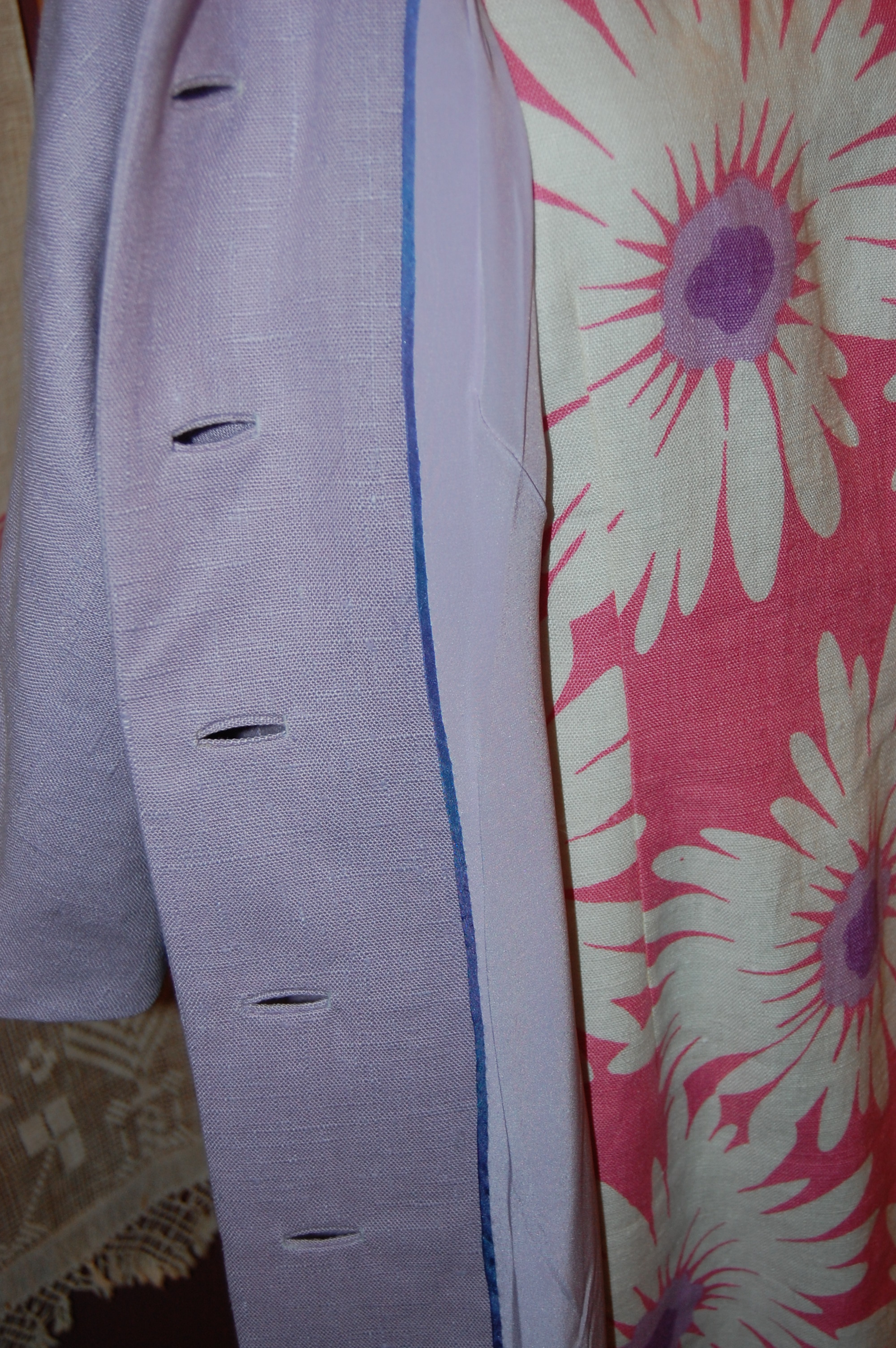
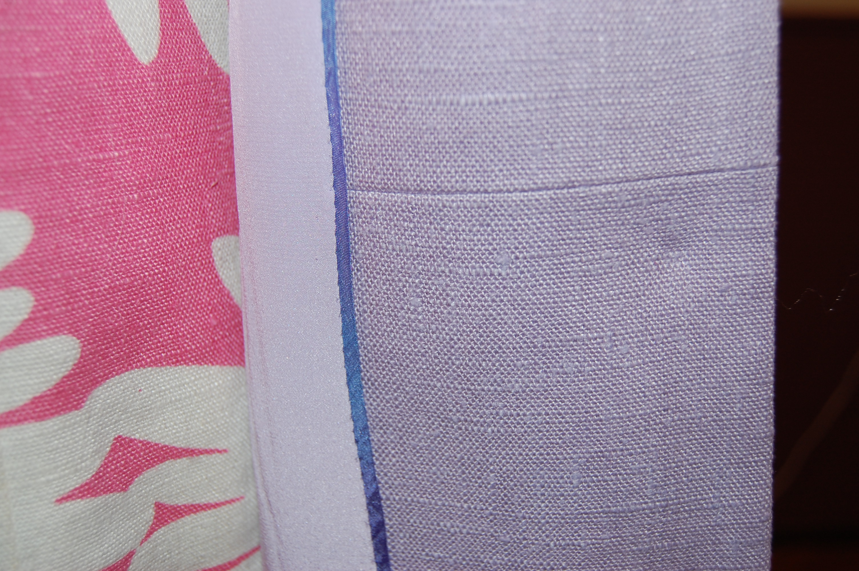
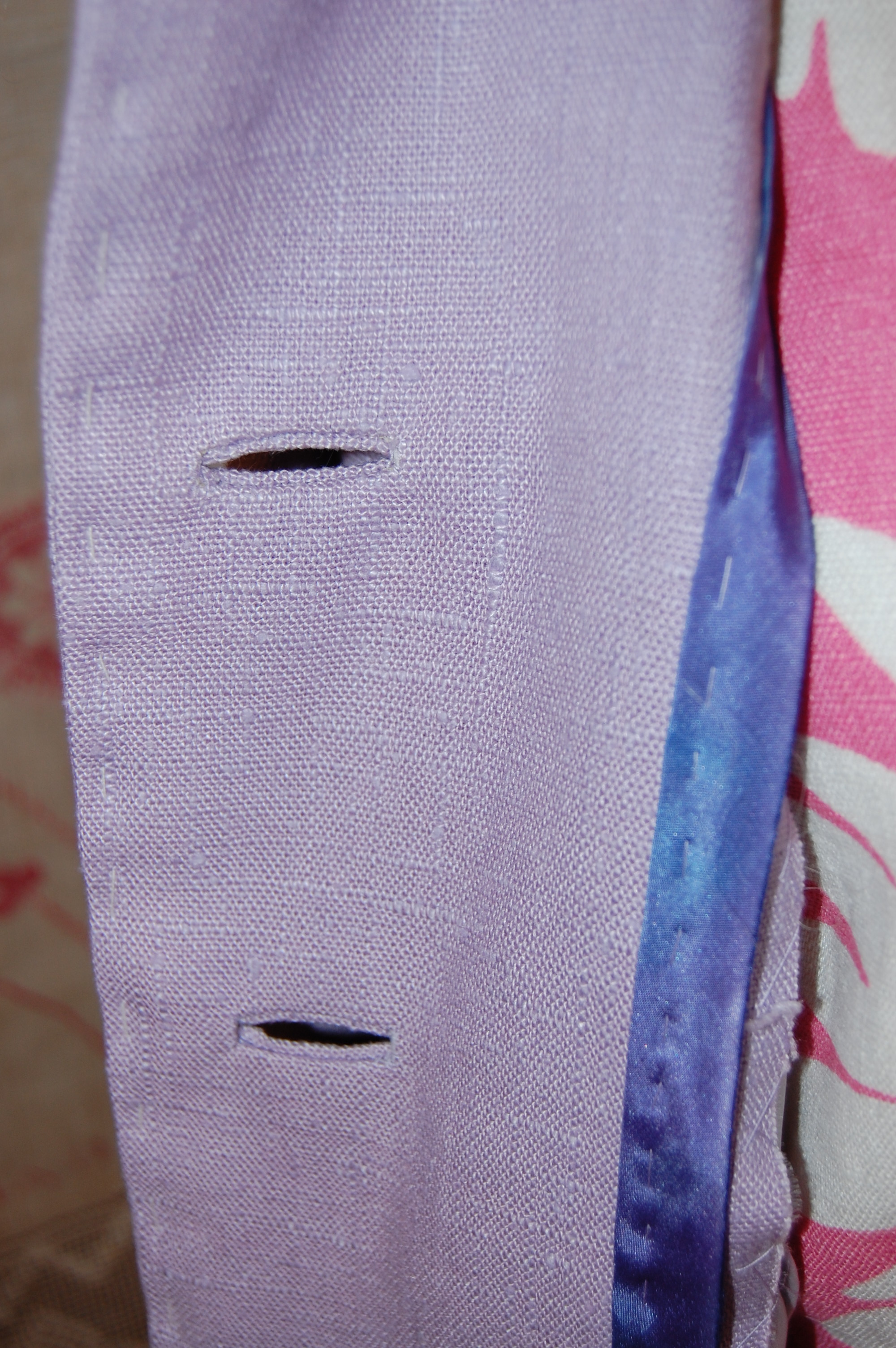
Some of you may recall that I had to piece one of the facings because I was just a little short of fabric. Here is the seam on the left facing. I really don’t think anyone will ever see it (except all of you, of course!)
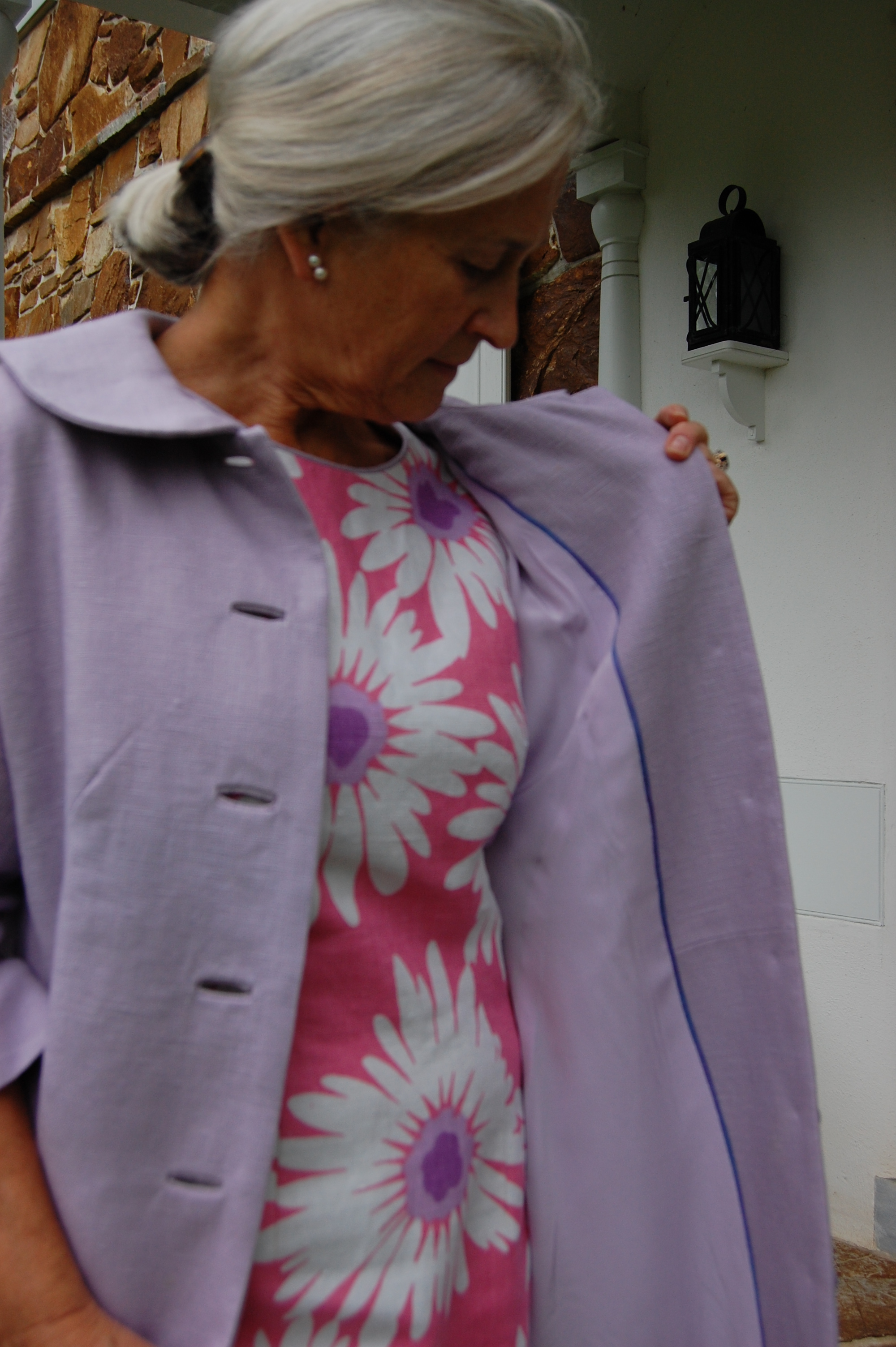
This is a good look at the bound buttonholes and what they add to the overall look of the coat. If you visualize machine made buttonholes in their place, you will get an idea of how vital the bound ones are to the design of the coat.
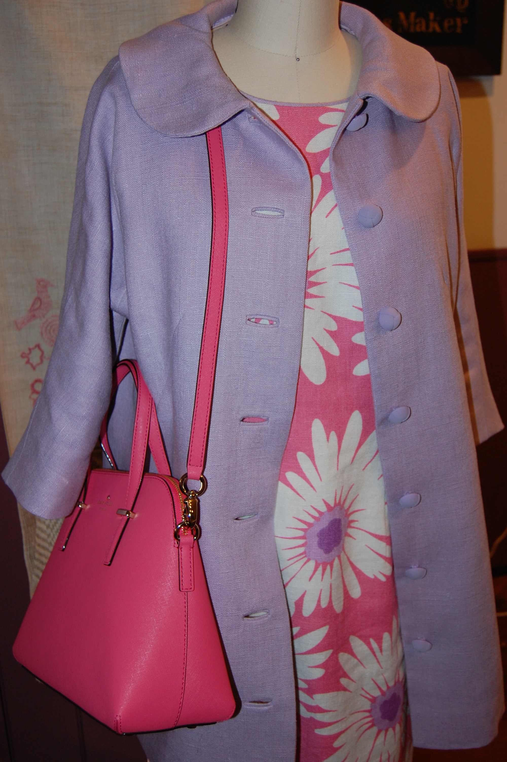
Another thing that will add to the total look of my 2016 Spring ensemble is this Kate Spade handbag which my grown children gave to me:

Now all I need are lavender pumps…