It was not planned this way. Not much so far this year has been planned in the way it is going, truth be told. Which makes my most recent make both tinged with nostalgia and hopeful. Mostly hopeful, I think.
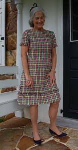
For over thirty years I have had this length of Liberty Lawn surface time and again from its storage basket in my fabric closet. I never had the right pattern for it, not when I purchased it on the island of Bermuda back in the 1980s, nor over the ensuing years – that is, until this year. After making my wool challis shirtdress earlier in the year, I realized that same pattern was how I had subconsciously – for years – envisioned this fabric being used.
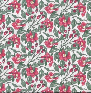
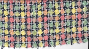
It has been satisfying to use this fabric, finally, as it deserves to be used. Liberty is one of the world’s famous manufacturers of cotton. Did you know it has its own entry in Fairchild’s Dictionary of Fashion? Actually two entries – one under Liberty and another under Liberty Print. Here is the latter entry: “Trademark of Liberty, London, for wide range of printed fabrics. The best known are small multicolored floral designs.” (The Fairchild Dictionary of Fashion, by Charlotte Mankey Calasibetta and Phyllis Tortora, Third Edition, Fairchild Publications, Inc, New York, New York, c2003.) I wrote about Liberty cotton way back in 2012 when I was still pondering the use of this red and green floral print. But voila! Now I have used it!
Enough of the blah, blah, blah, here are the details: I underlined the fabric with a very lightweight white cotton batiste, purchased from Farmhouse Fabrics. Then I finished the raw edges of the seams with Hug Snug rayon seam binding. I love this finish for garments which are underlined, but not lined.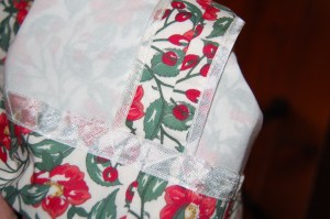
Here is a detail of the cuff. I did not underline the sleeves.
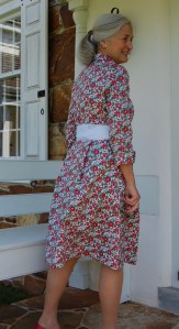
As I mentioned in my post on the wool challis shirtdress, I added shoulder darts to the back of the bodice, and instead of using an eased-in sleeve, I converted the necessary fullness into a dart at the very top of the sleeve. The button placement guide for this pattern indicates using 8 buttons. I think next time I make this pattern (and I’m sure there will be a next time), I am going to increase that number to nine. I think the distance between buttons on the bodice is just a bit too much, now that I have it finished.
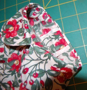
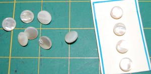
Speaking of buttons, I found white pearl, metal shank buttons in my collection, and they seemed just perfect for this fabric, which has such a fresh appearance. The only substitution I made was the button on the collar band, where I used a button which was 3/8” rather than 1/2”. Fortunately I had a card of 4 buttons in this size which mimics the appearance of the other buttons.
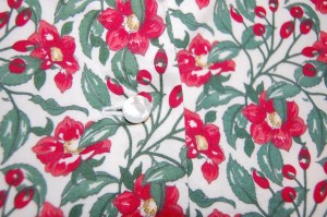
A detail of one button on the bodice.
For the belt/sash, I got my inspiration from RTW which I detailed back in January. My first thought was to use a red grosgrain ribbon sash. But it just didn’t look right. Fortuitously, in looking in Promenade Fabrics Etsy store for ribbons that might work, I came across a white Seersucker-look 2 ½” wide light weight ribbon which I thought looked wonderful. I ordered three yards, and it was just as wonderful as it looked online. However, in holding it up to my fabric, there was enough “show-through” to be problematic.
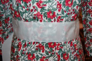
The ribbon was not opaque enough to cover sufficiently the print of the fashion fabric.
To remedy this, I used a fusible interfacing for the middle section of the sash which would be the initial circling of my waist. (I rarely use fusible interfacings, although I keep some on hand for some of the sewing I do for my granddaughters, but this time it came in handy.) This did the trick and also added just a bit of stiffness to that section of the sash. Then the un-faced end sections of the sash are still soft and flowing.
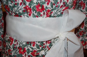
This shows the sash with fusible interfacing applied to the mid-section of the length of the sash, but not to the top layer nor bow. It adds just enough coverage to minimize the appearance of the fashion fabric beneath it.
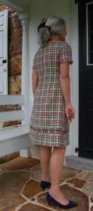
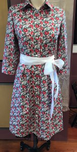
After I took photos, I got the idea to fold the interfaced part of the sash in half lengthwise to make it narrower and maybe a bit more flattering. Here it is on my dress form:
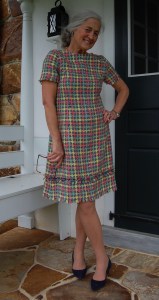
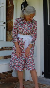
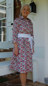
One of our few warm, sunny days allowed me to get these following photos.
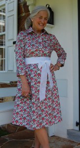

While I was making this dress, I could not help but remember the fun trip my husband and I took to Bermuda when I purchased this Liberty cotton. I still remember trying to decide which piece of Liberty print to purchase (so many from which to choose), how many yards to get (it was still manufactured in 35” width at that point), and being delighted to get a label with it. Those were the times when one dressed for dinner, had breakfast served in one’s room , and tea in the afternoon. Yes, I could not help but be nostalgic. But then I had so much fun bringing this fabric to life, I could not help but feel hopeful. It was a lovely way to spend the hours in my sewing room. And how fitting to sew with fabric which perfectly expresses my sentiments right now. Please, give me Liberty!