
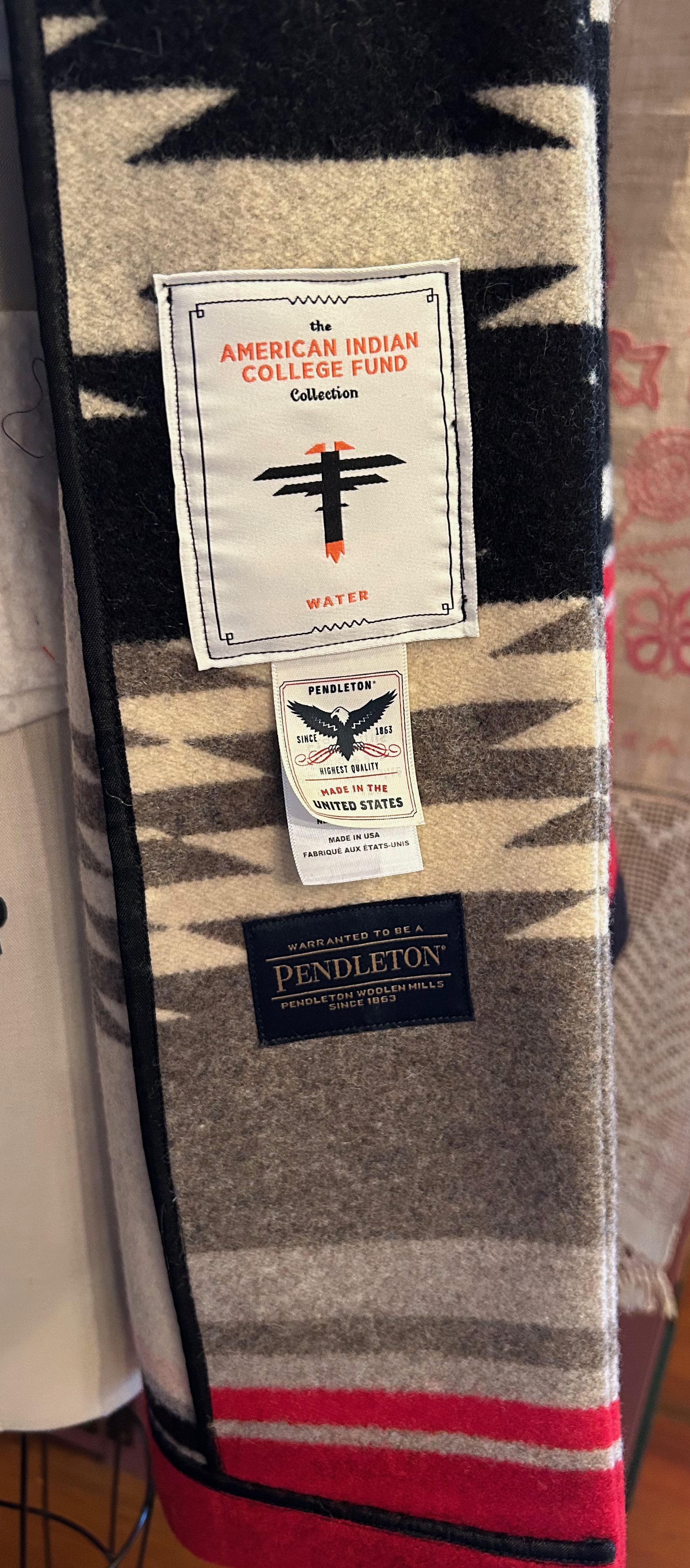
Isn’t a good pattern worth its weight in gold? When I purchased this jacket pattern several years ago, I just liked it, no plans in place, and thought the day might come when I could use it. The more I studied it with my Pendleton blanket in mind, the more I thought it was perfect for my project. First task, of course, was to make a muslin toile and check the fit and size.
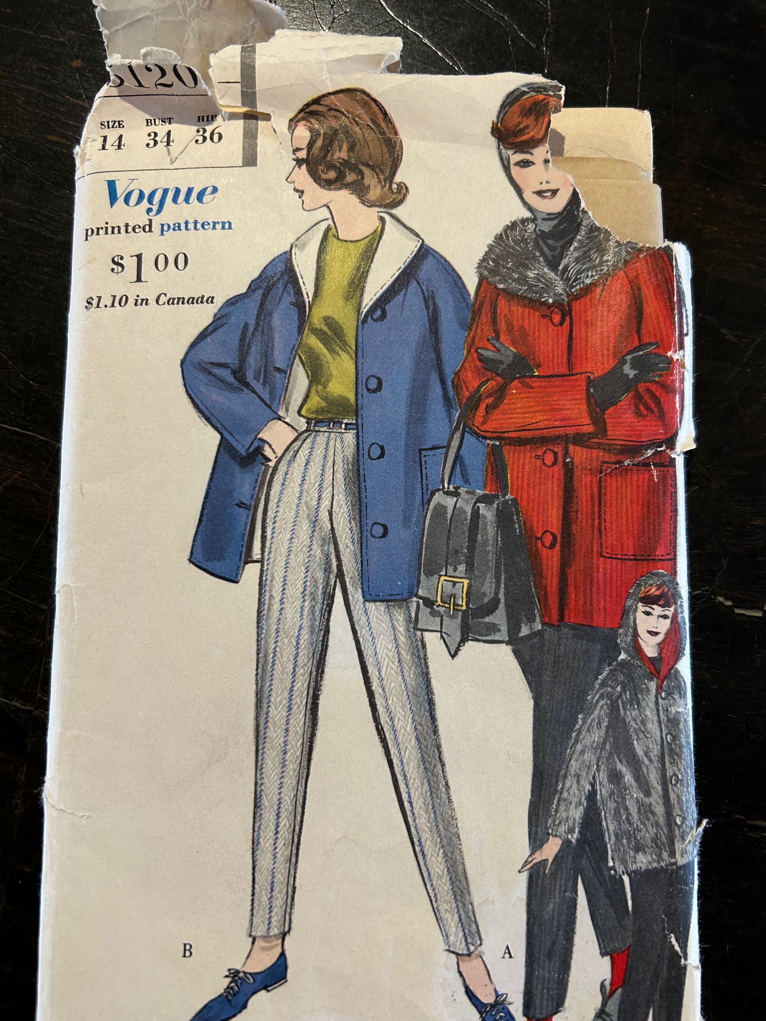
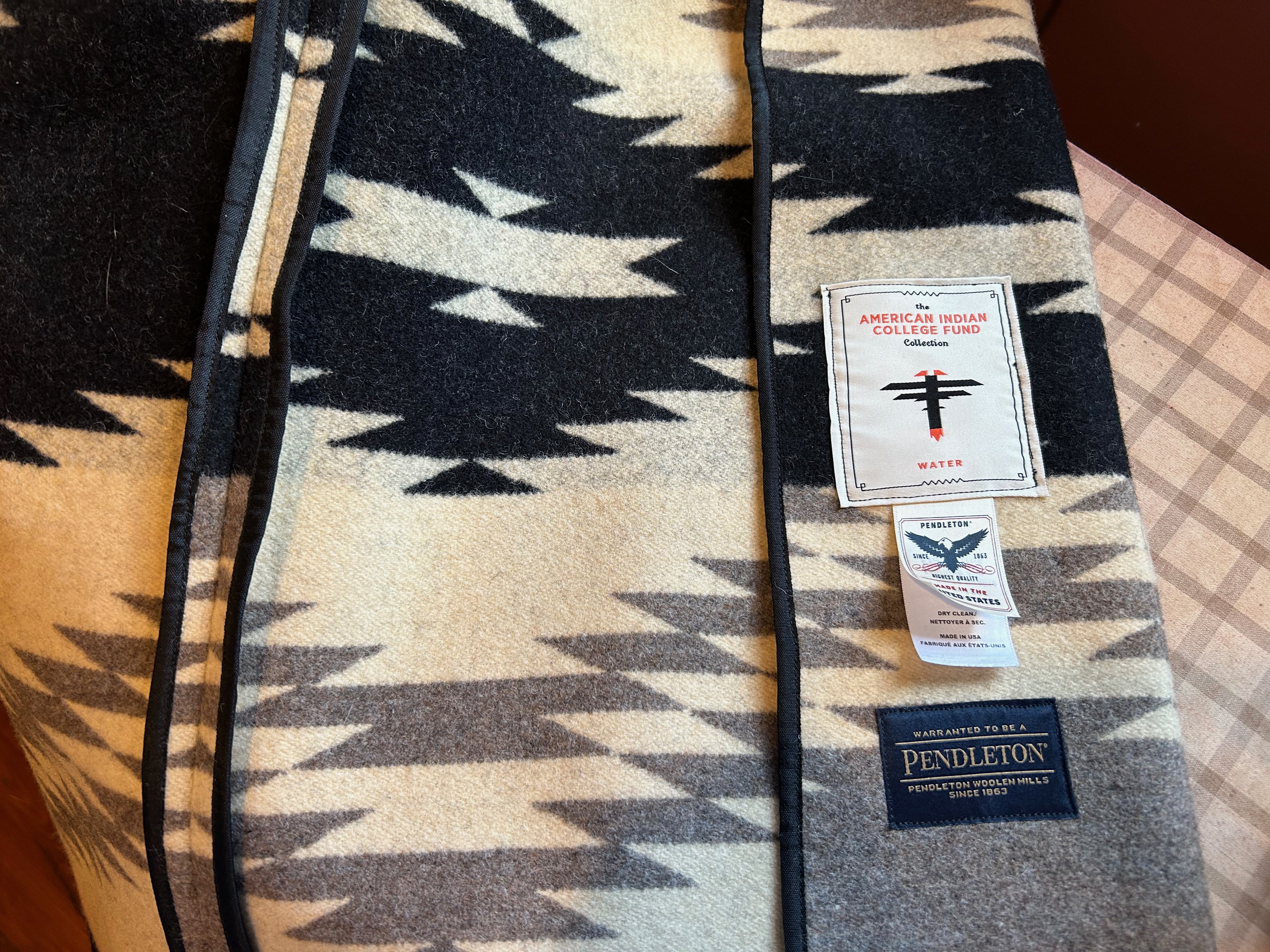
By now, November and early December had passed with my life taken over by bathroom renovations and holidays looming on the horizon. We headed back to Wyoming for Christmas, and then the new year of 2026 dawned, with all its promise and things unknown. January was the perfect time to get back to my project. The jacket as designed was to be fully lined, either with fleece, contrasting fabric, or self-lined. I determined I would need to line the sleeves, while the rest of the jacket should remain unlined. However, I needed a facing for the shawl collar and front edges. Because there was a pattern piece for interfacing the collar and front edges, I thought I could use that for my facing. My toile confirmed that for me.
The coat muslin seemed very large overall on me, requiring a lot of alteration. It can be tricky with coats, as enough ease must be allowed for wearing a heavier sweater or layers underneath. Also, the thickness and relative non-fluidity of the blanket dictated a looser fit. I spent a few days perfecting my toile. Then the real test was upon me.
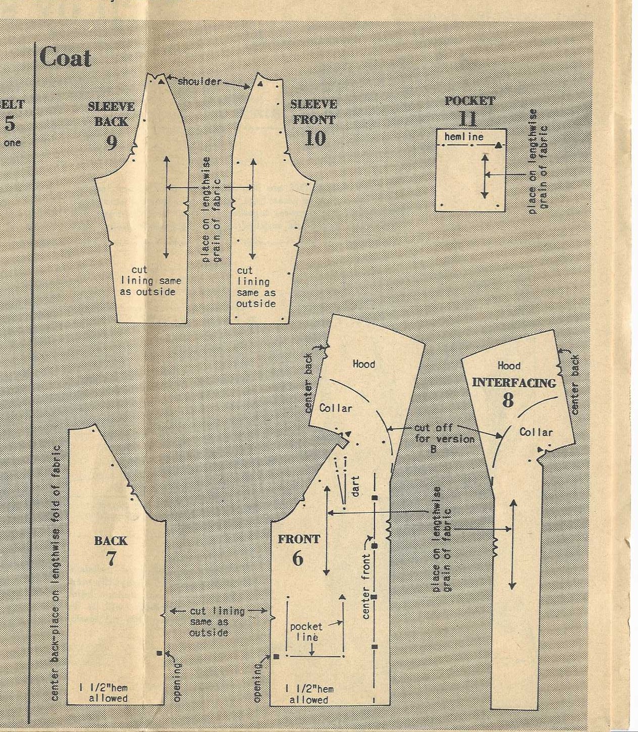
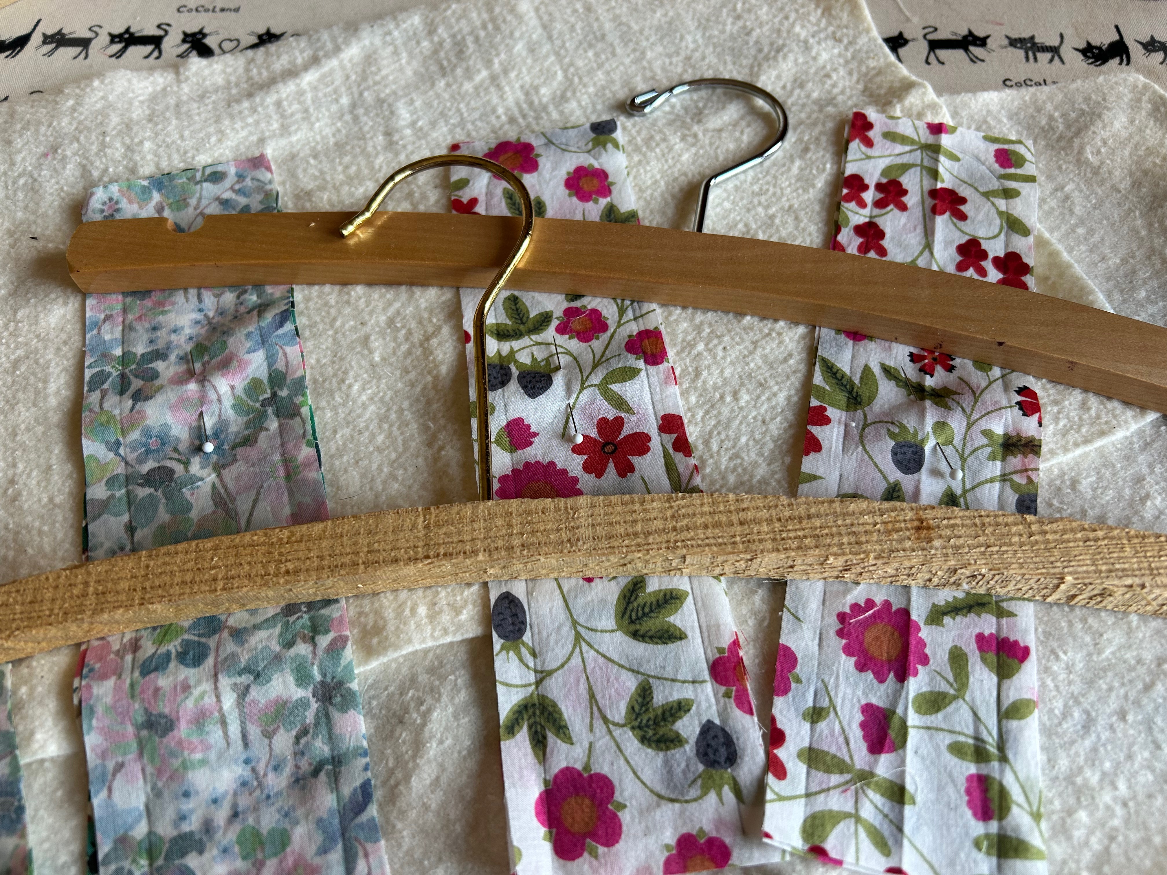
I took my muslin apart, producing pattern pieces to fit onto my fabric/blanket. Was making this jacket out of what I had left of the blanket even going to be possible? If so, how would the placement of the pattern pieces on the very graphic and large design work out?
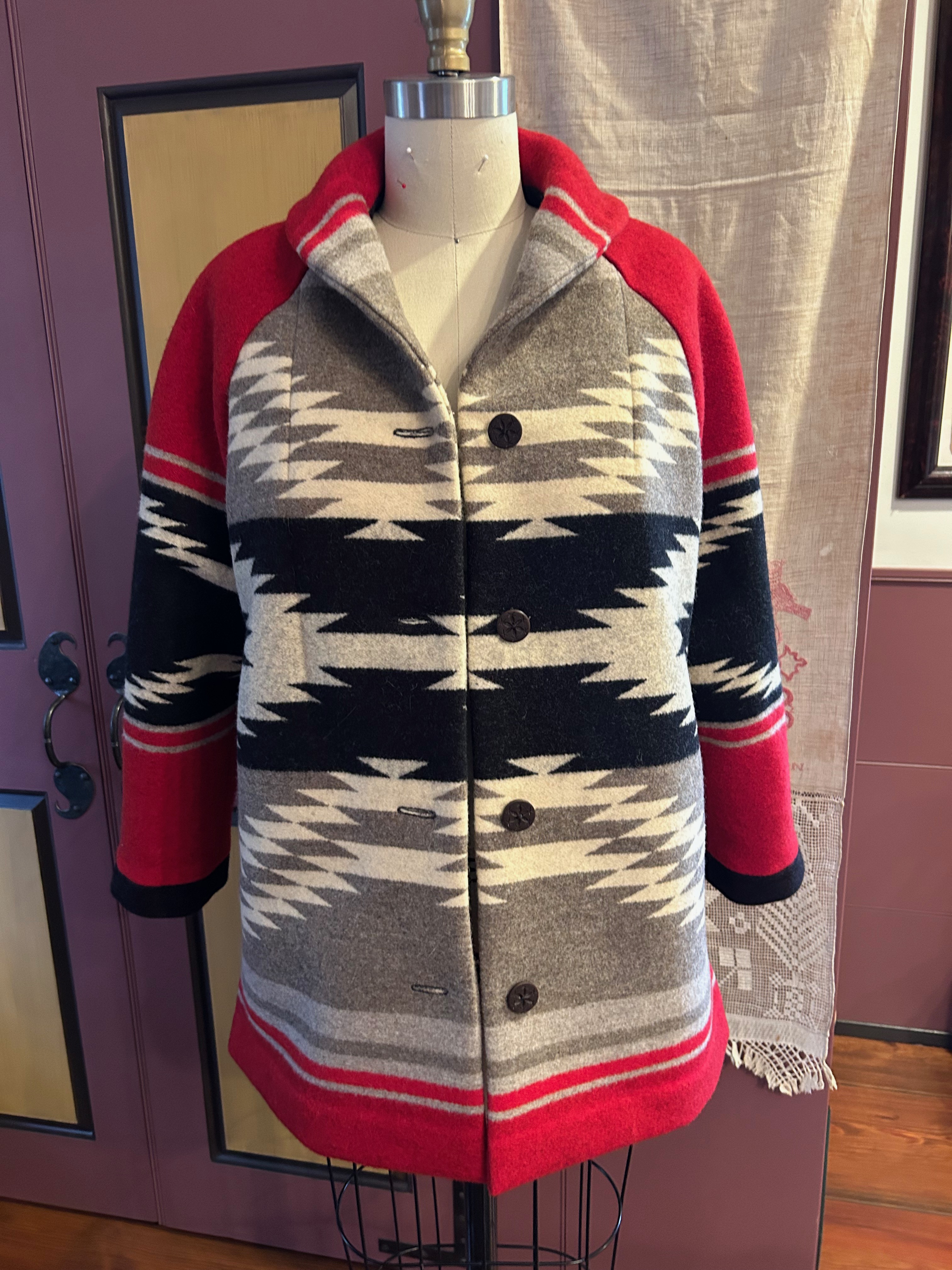
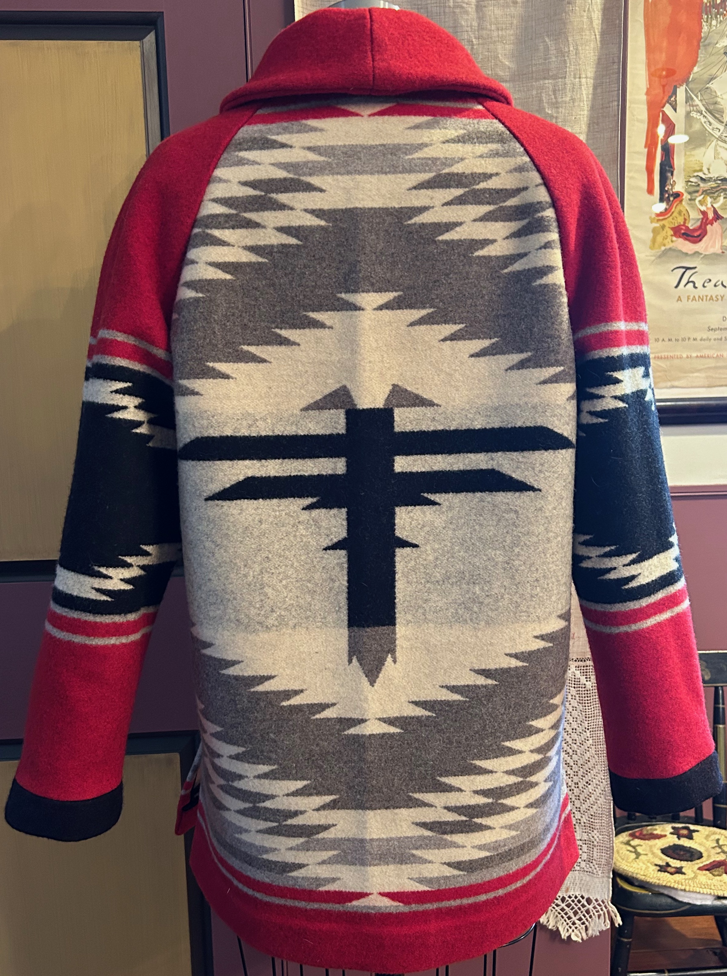
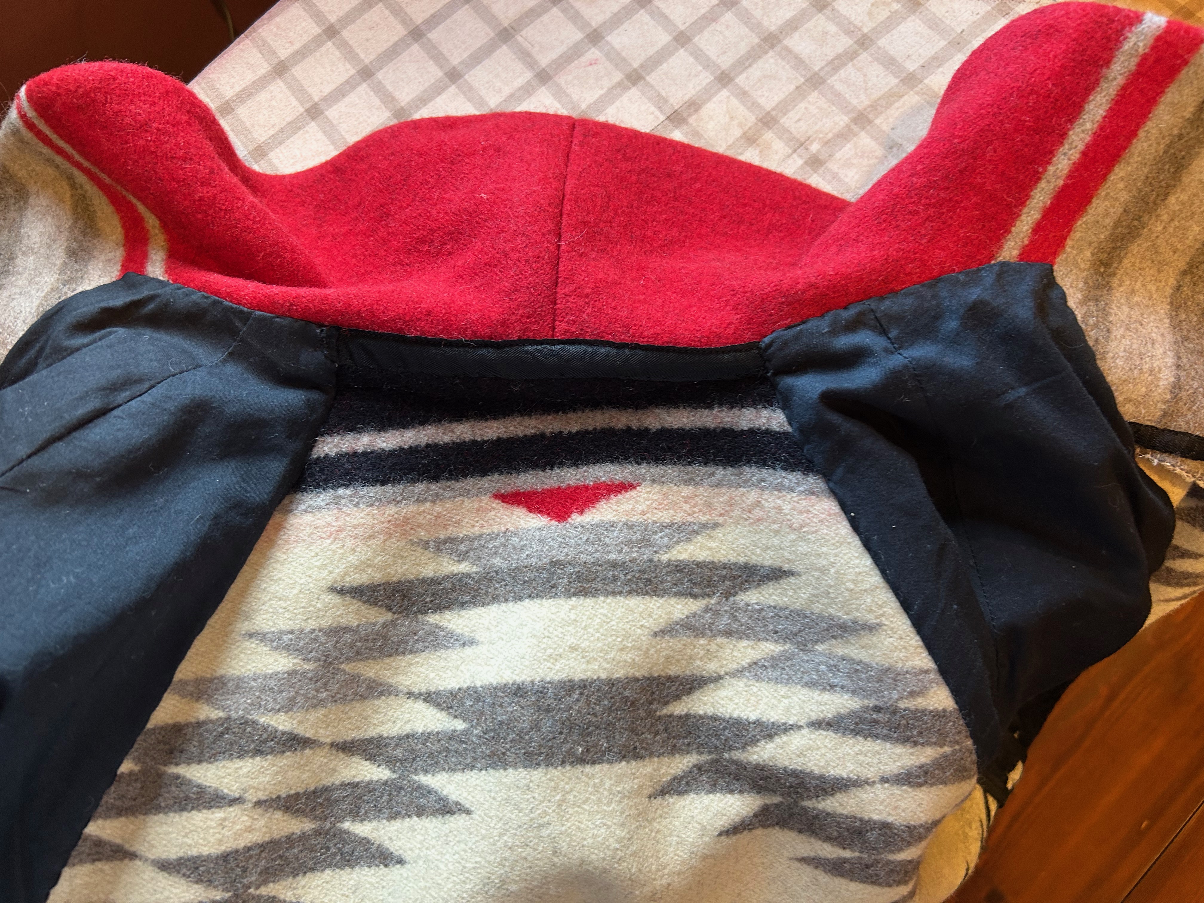
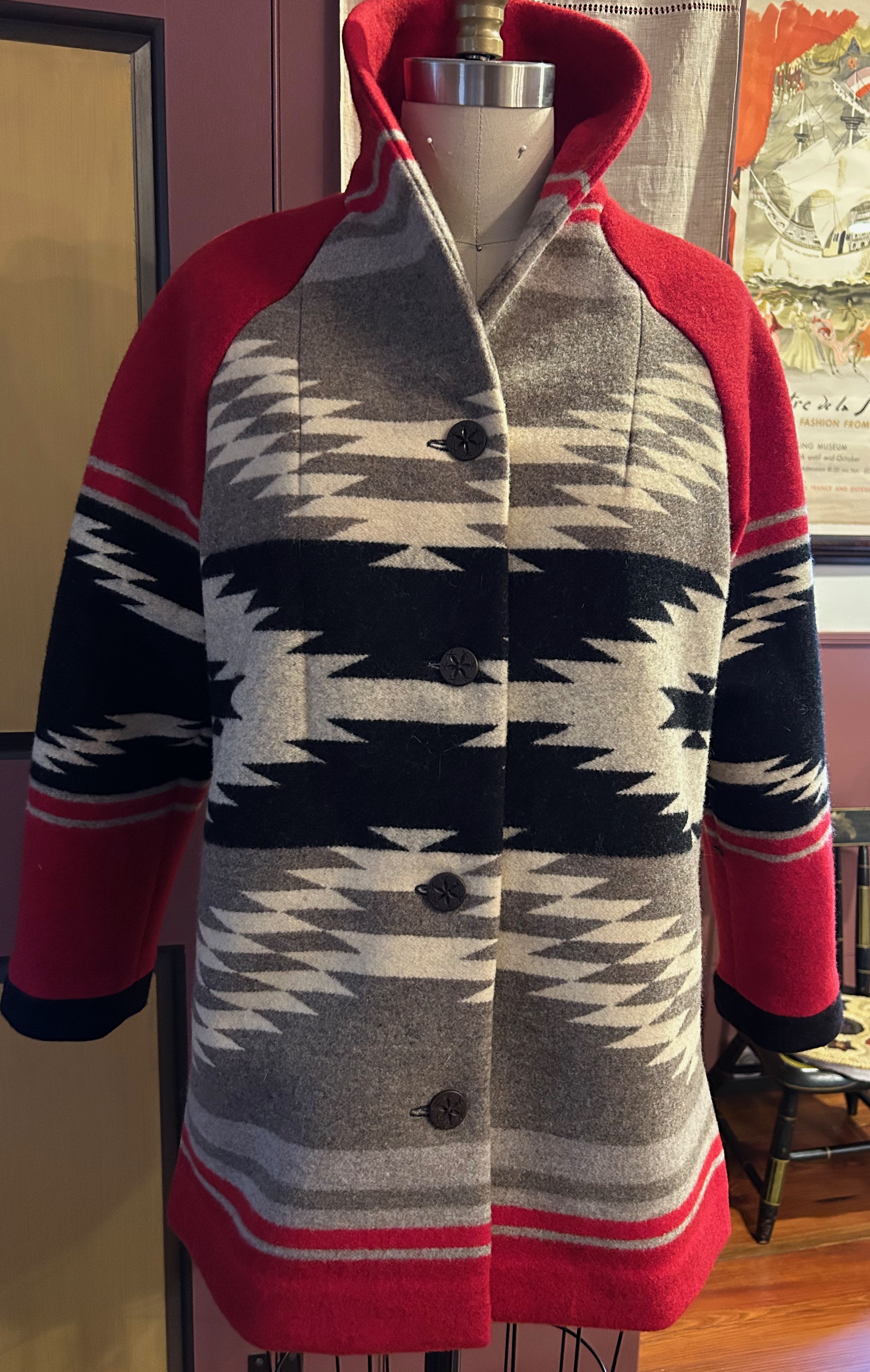
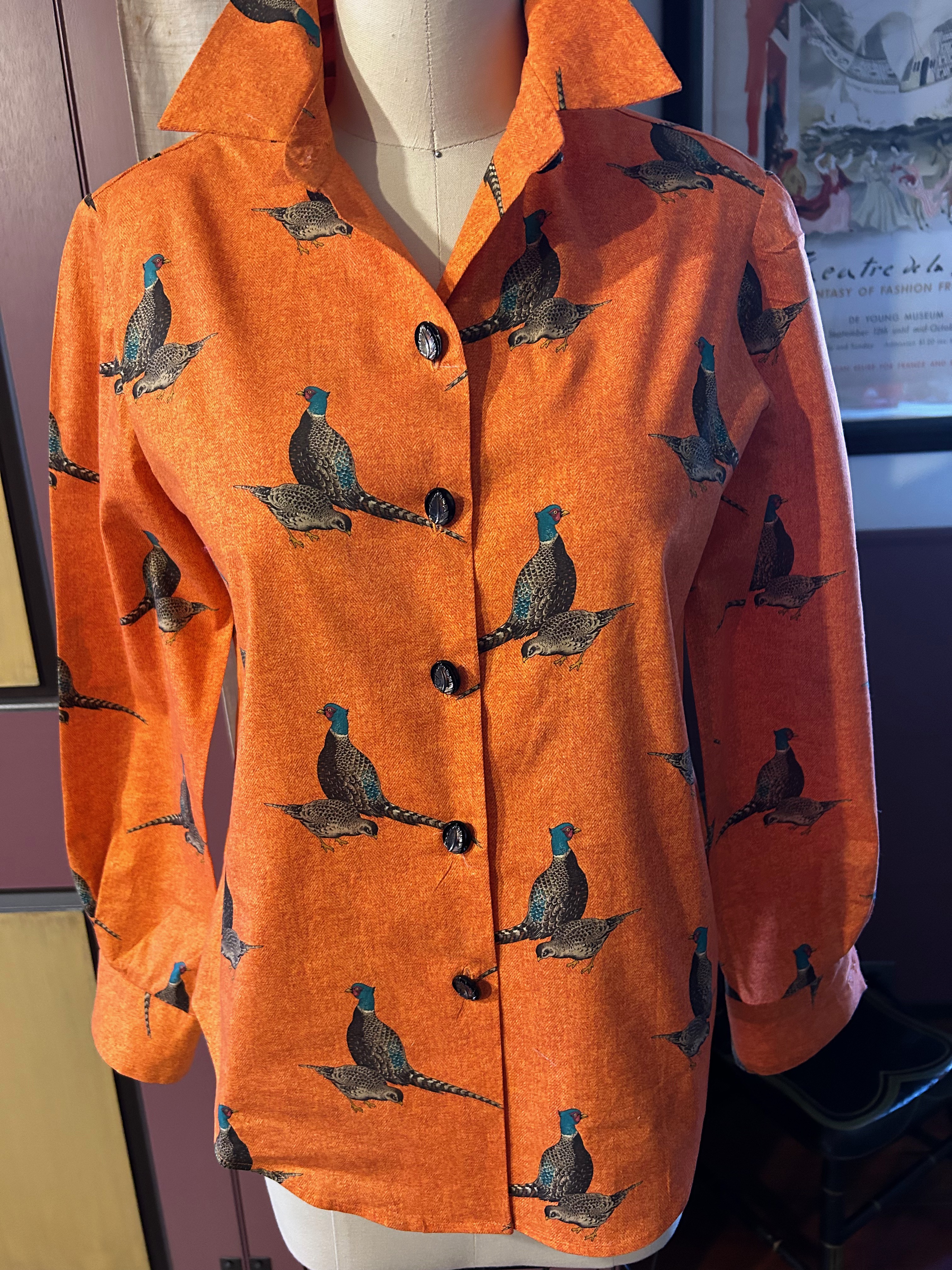
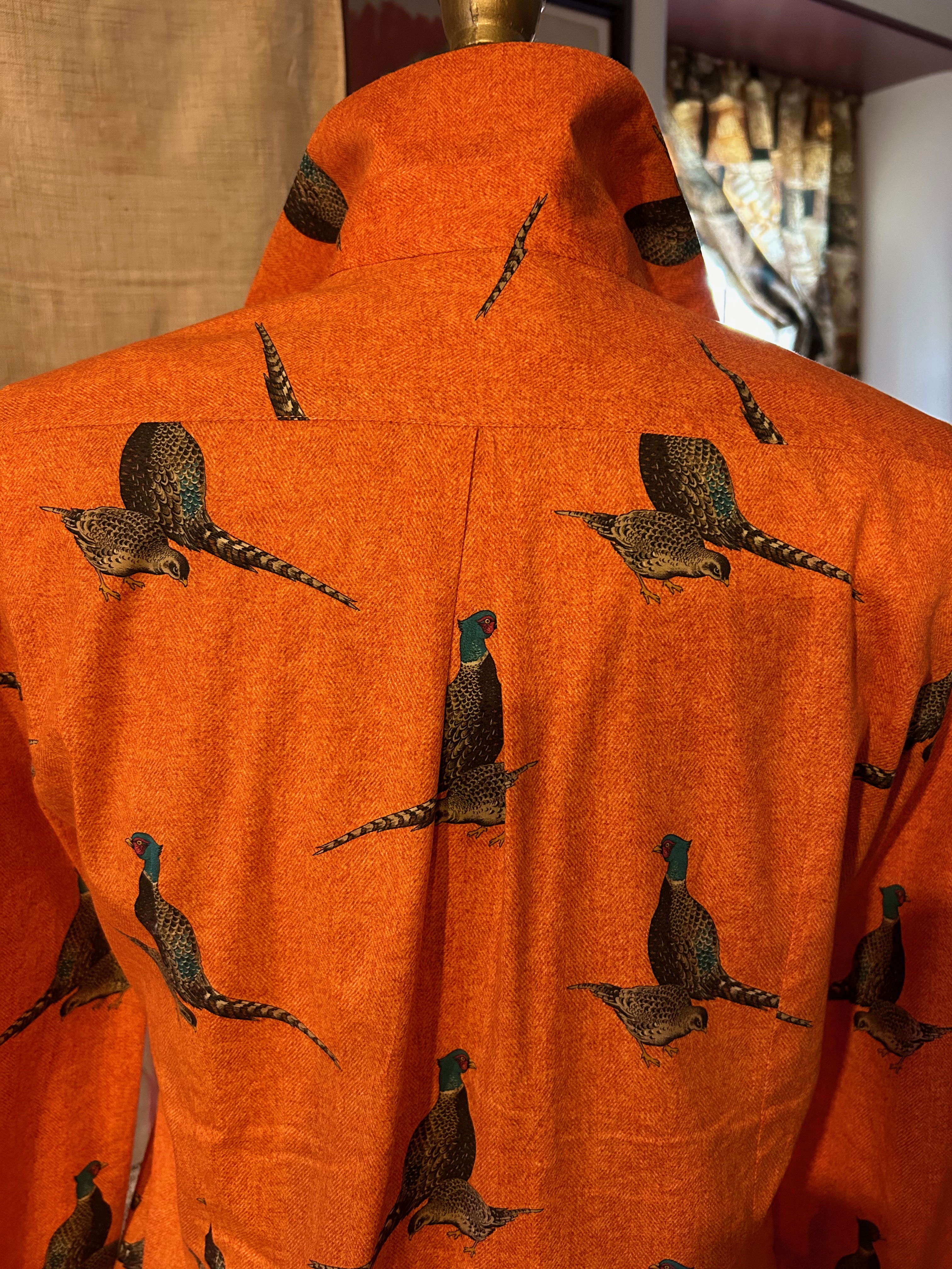
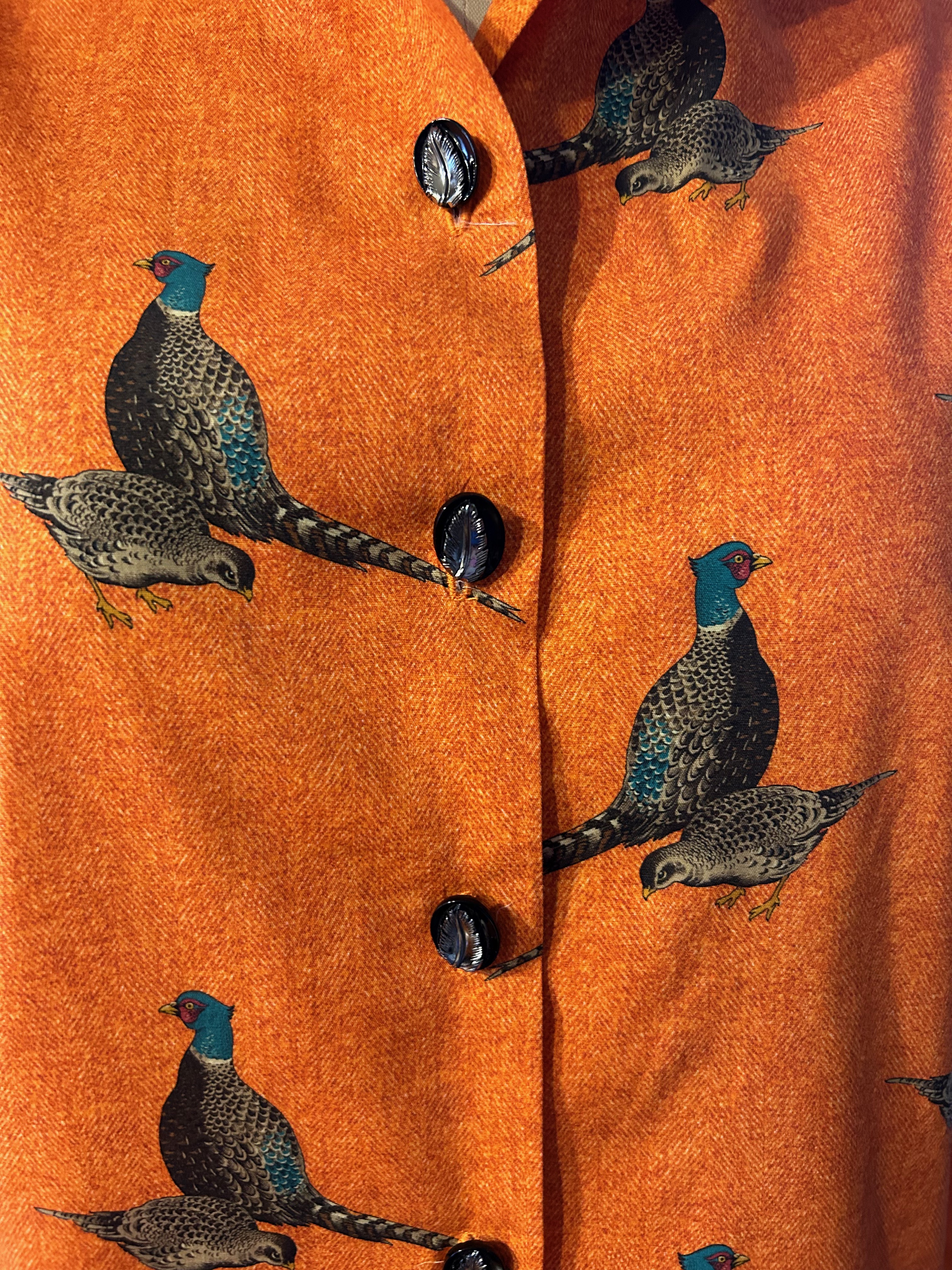
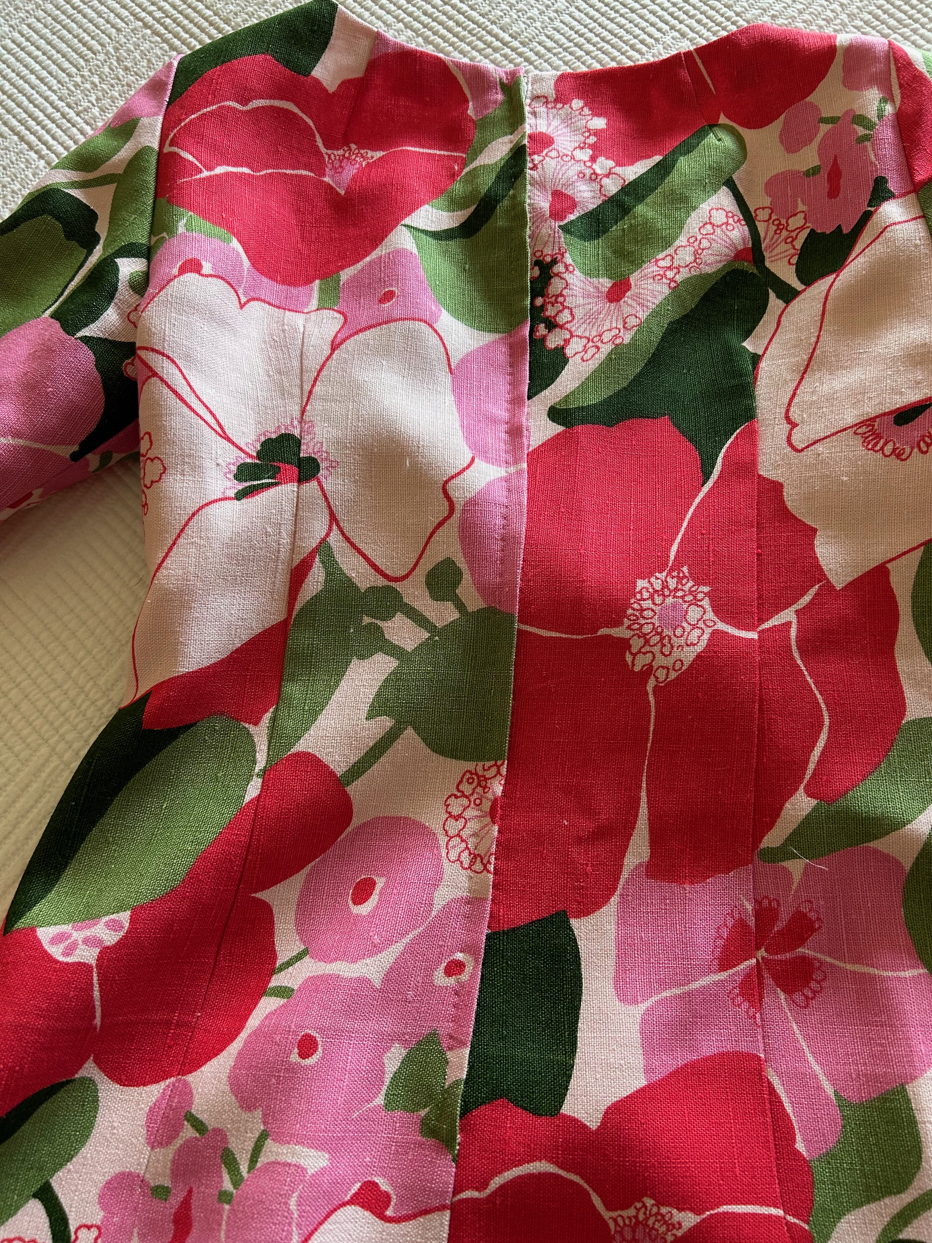
I got to work with everything spread out on my dining room table, starting with two main objectives: 1) The large “dragonfly” motif on the blanket would be centered on the back of the jacket, and 2) I wanted the “portrait” or neckline area of the shawl collar to feature the dominant color of red.
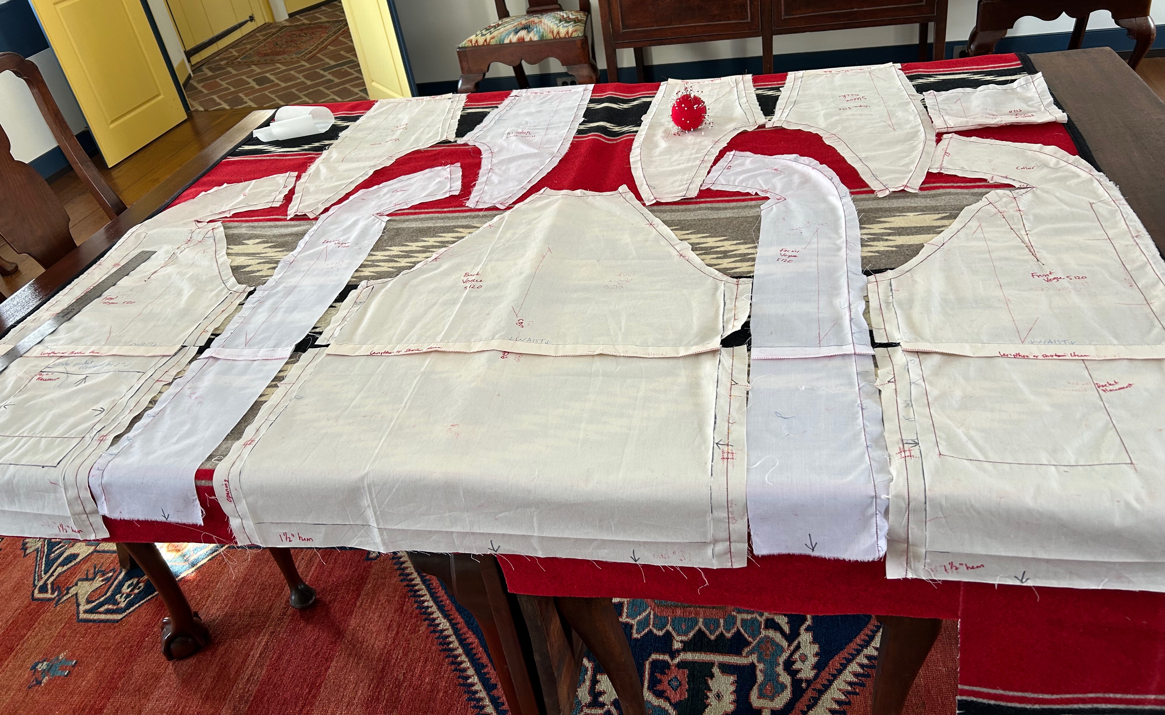
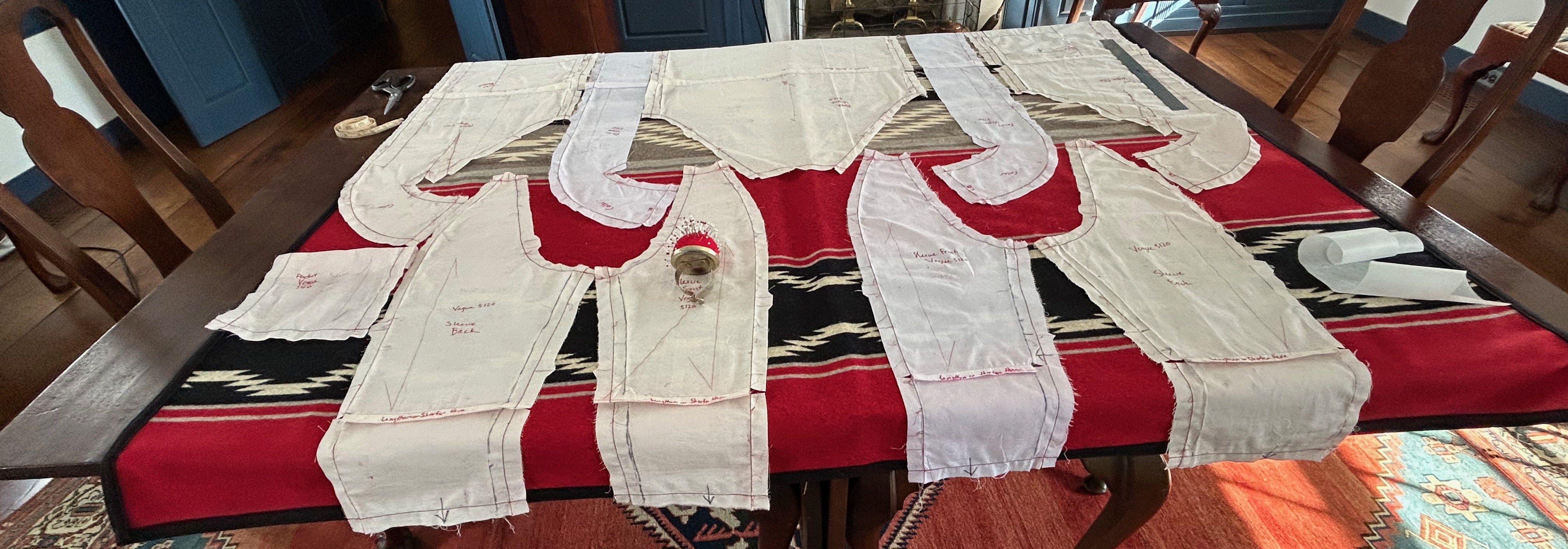
From there the fabric told me what I could do and what I could not do, and the best way to explain my decisions is to show you the finished coat.
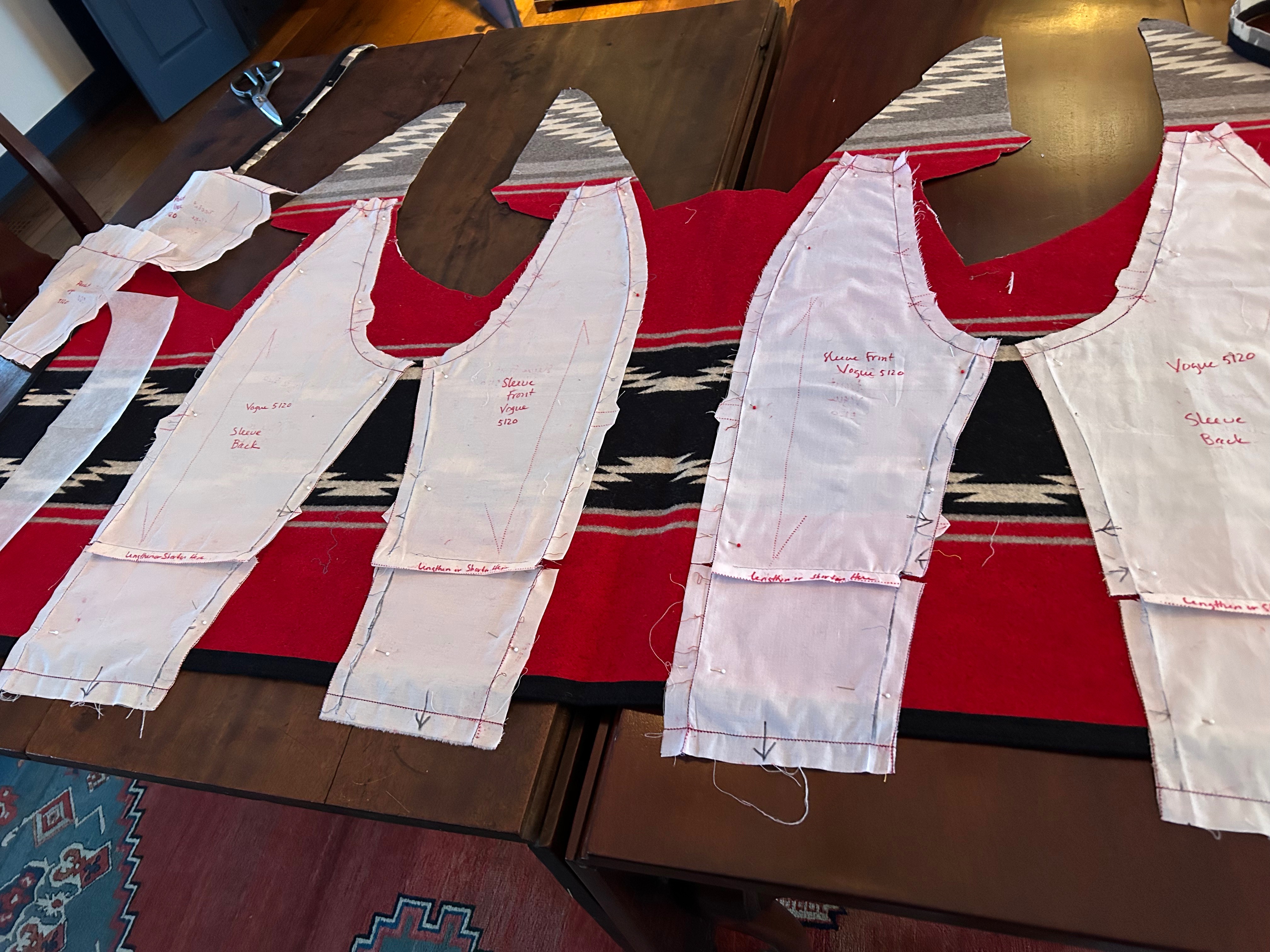
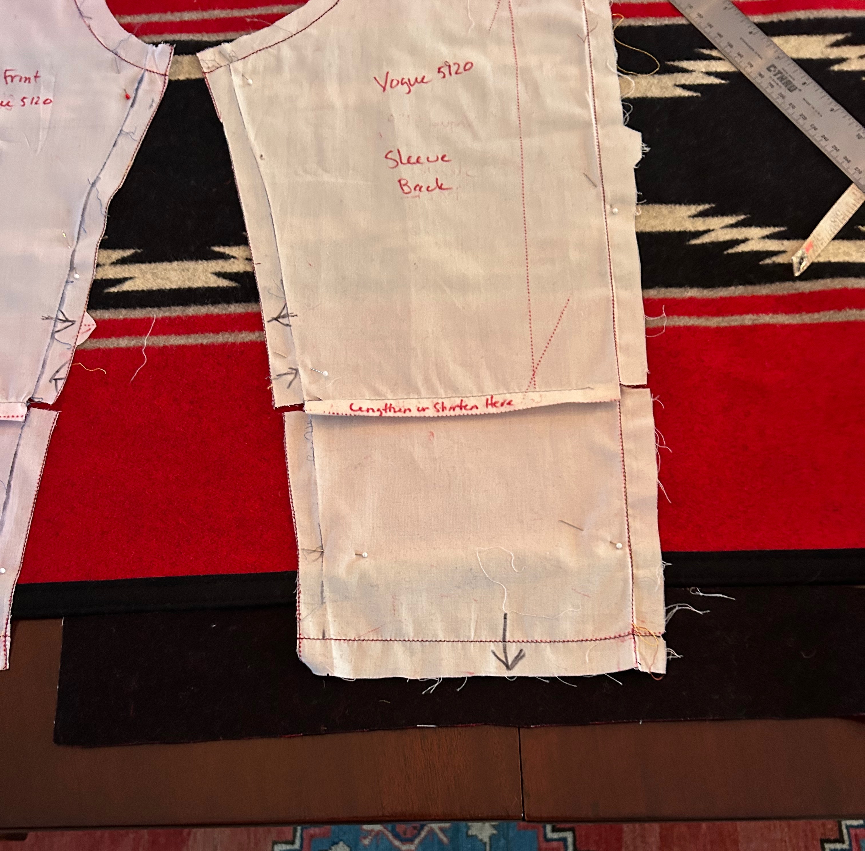
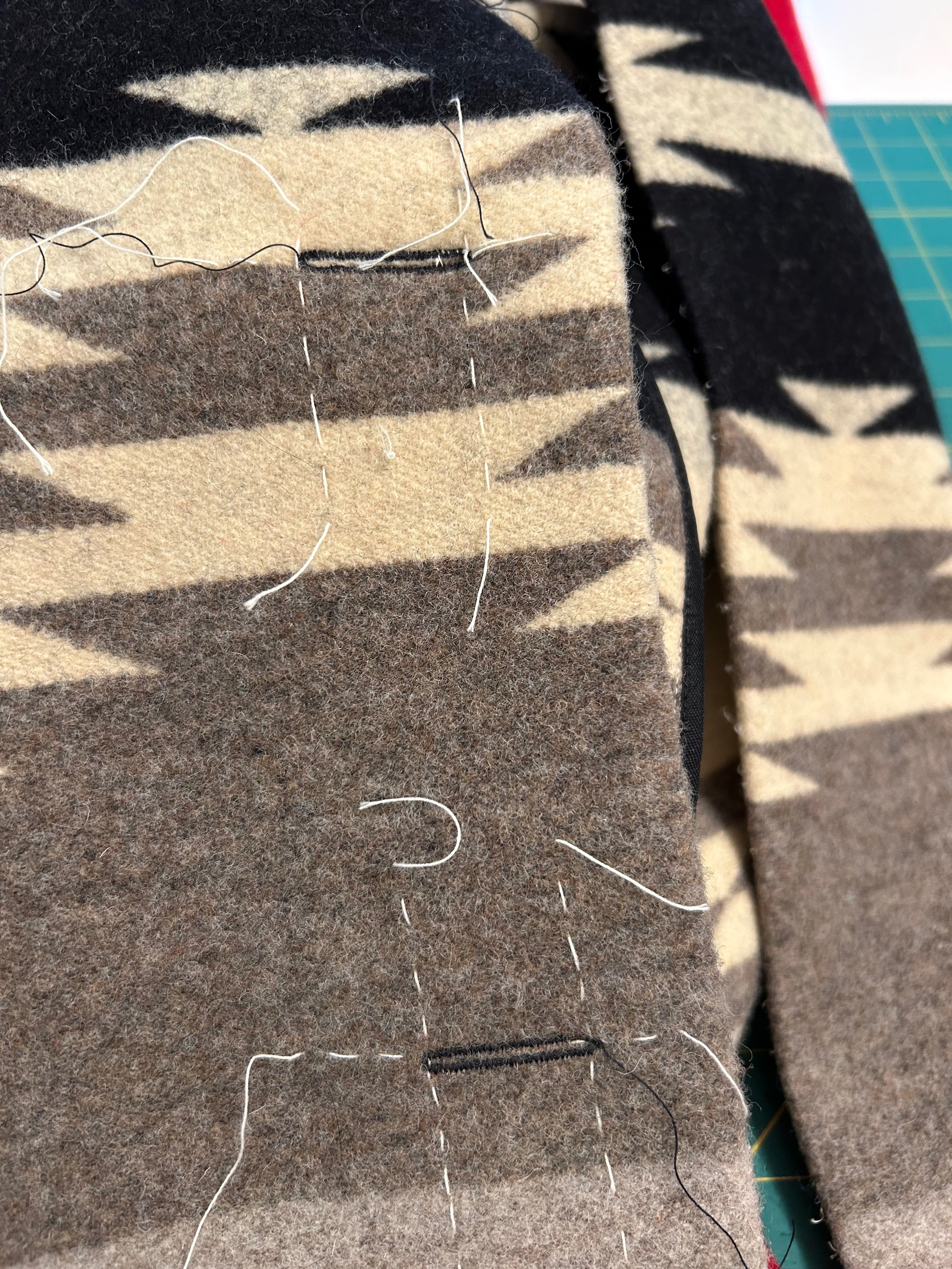
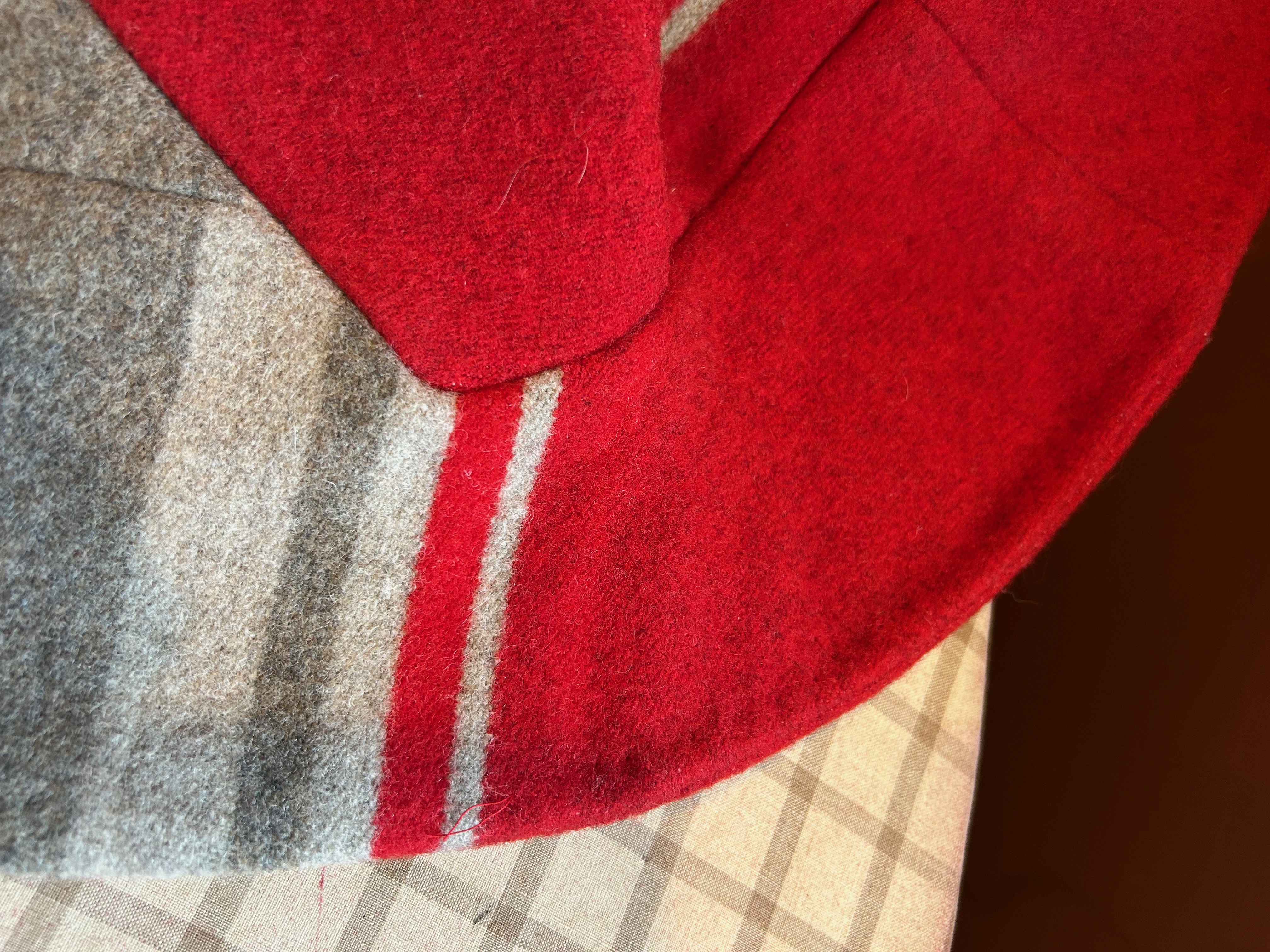
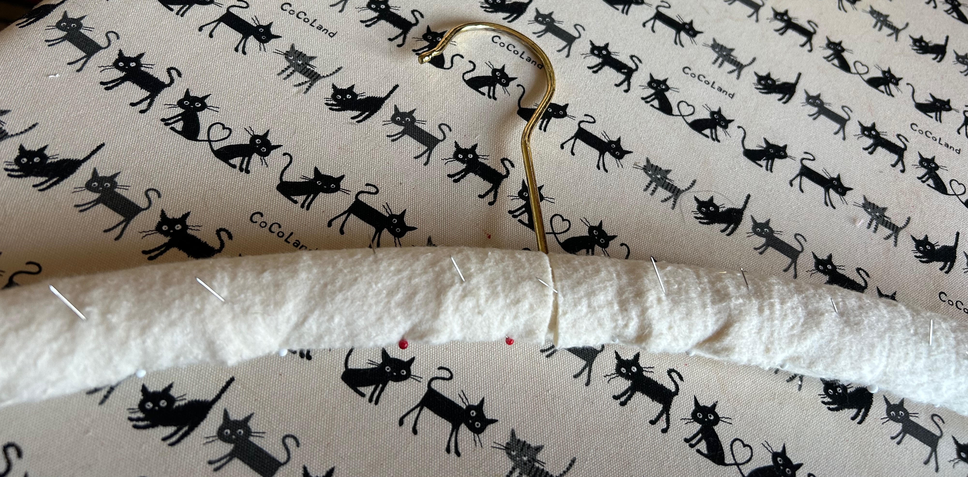
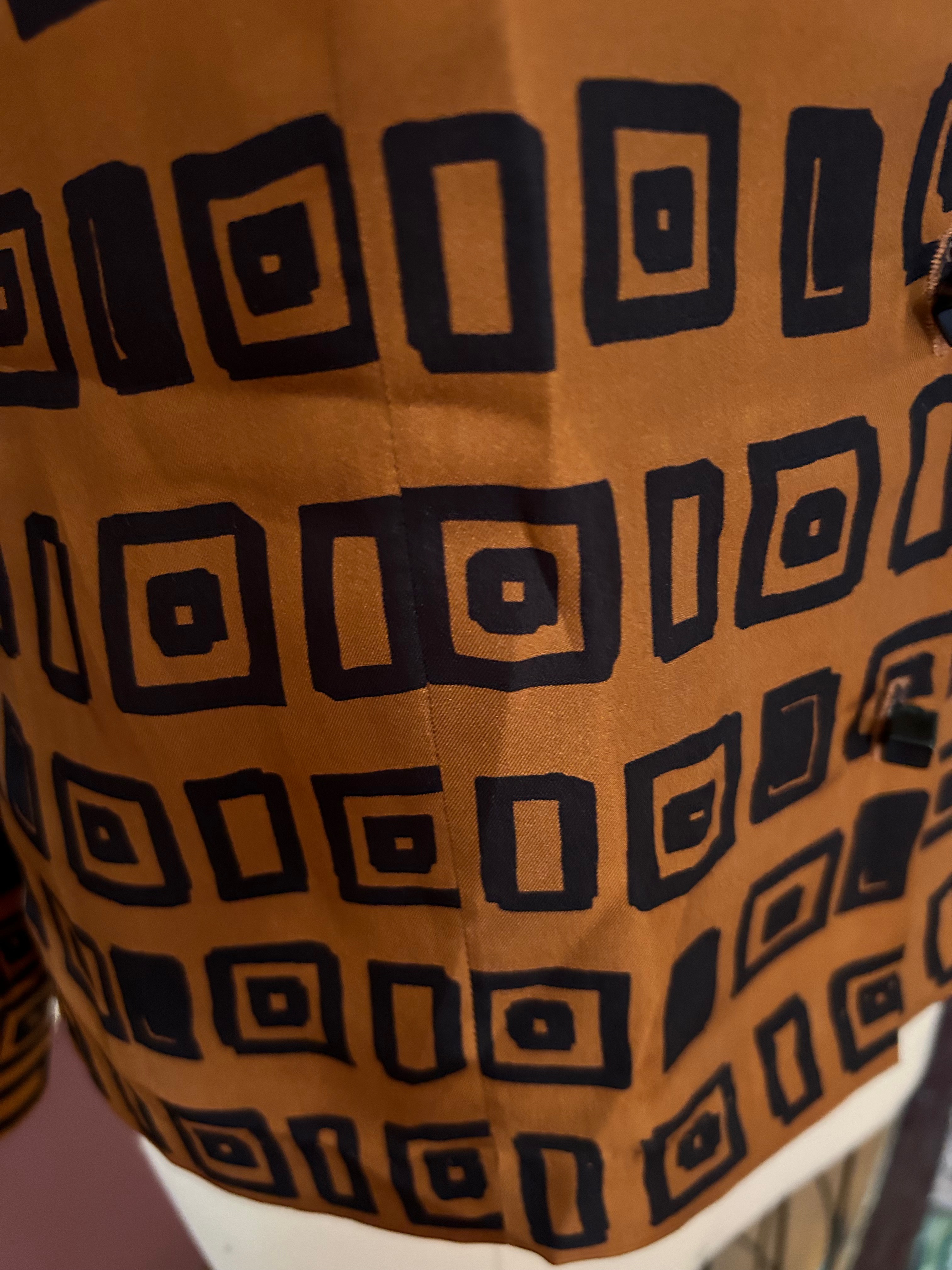
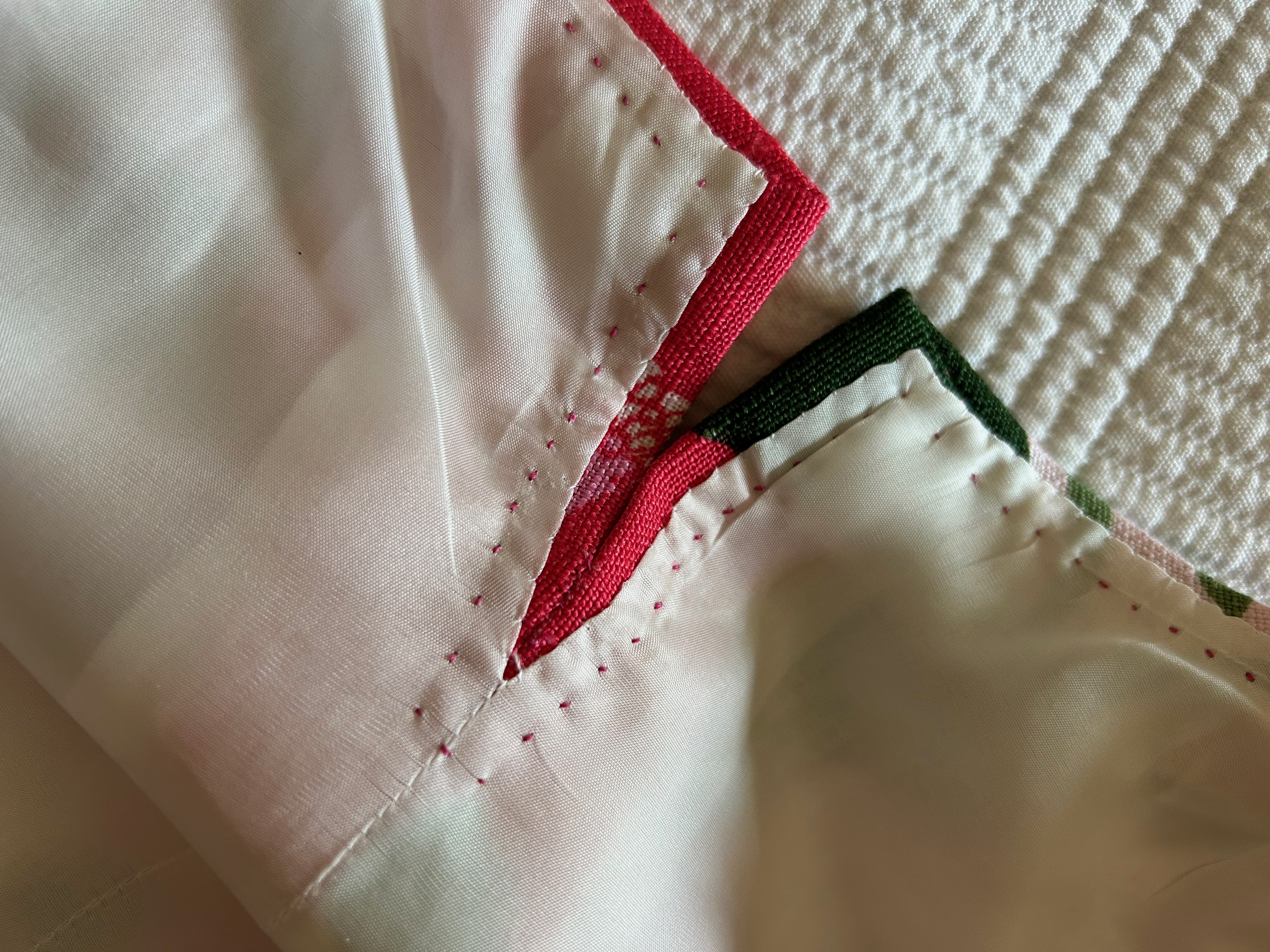
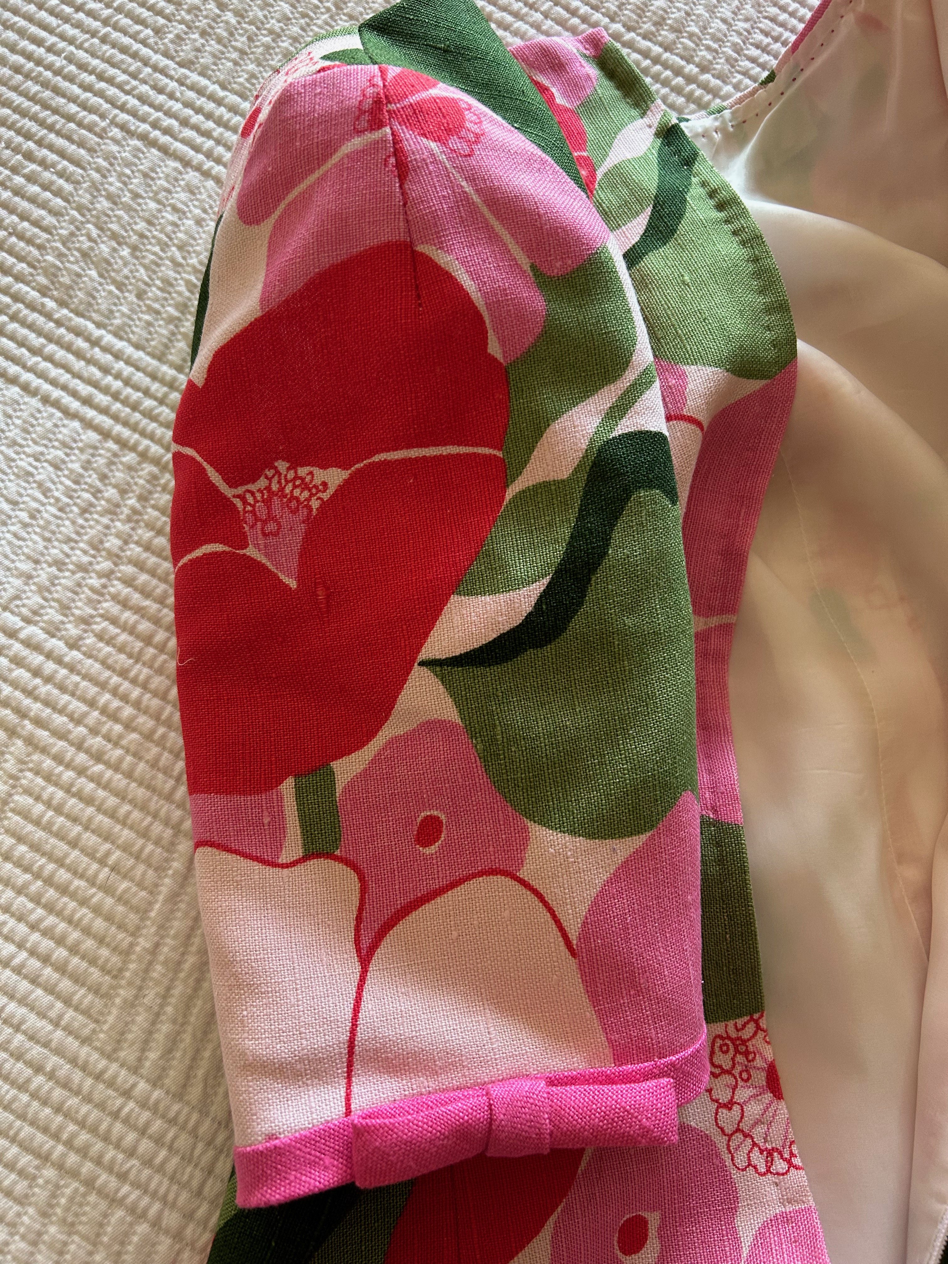
I thought it would be “easy” after getting to this point. Easy is not a word I should ever use while sewing. I should know that by now. Every seam had to pressed with loads of steam, followed by a clapper to help set it, usually more than once. Every exposed seam edge needed to be encased with rayon tape. I split the two vertical darts and needed to hand-stitch the raw edges to prevent fraying. Every seam needed to be basted together before machine sewing in order to keep the horizontal lines in the design matched.
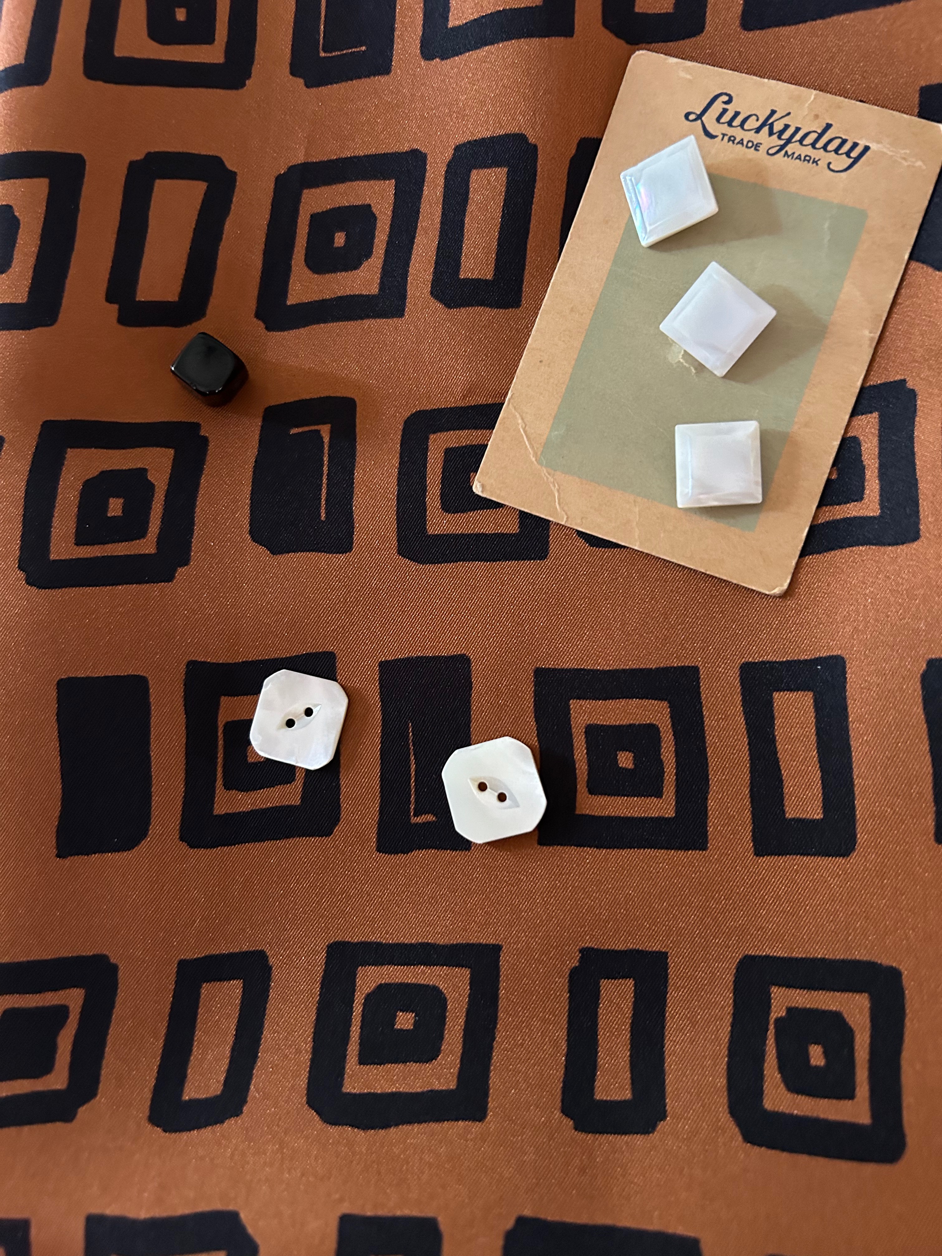
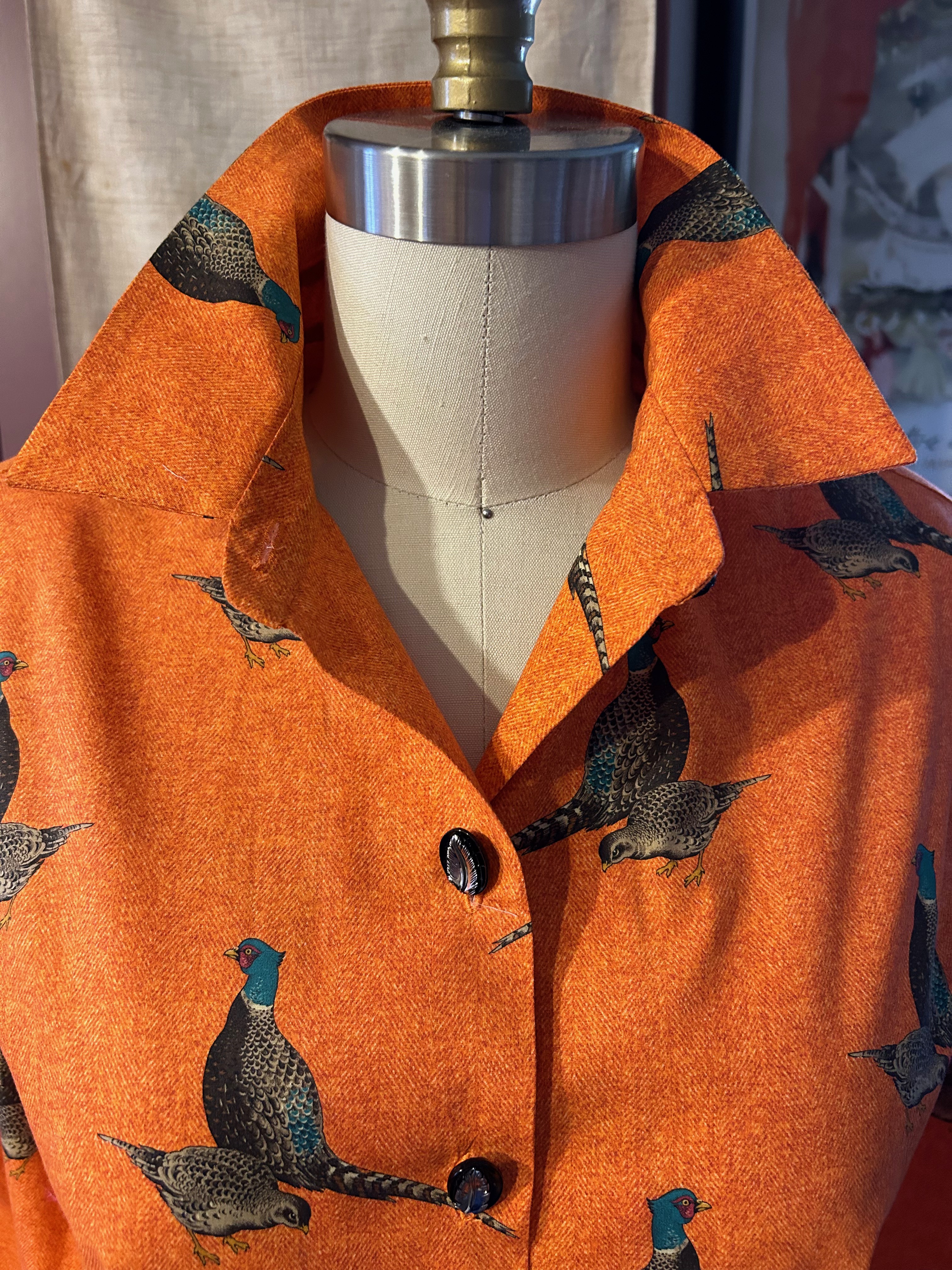
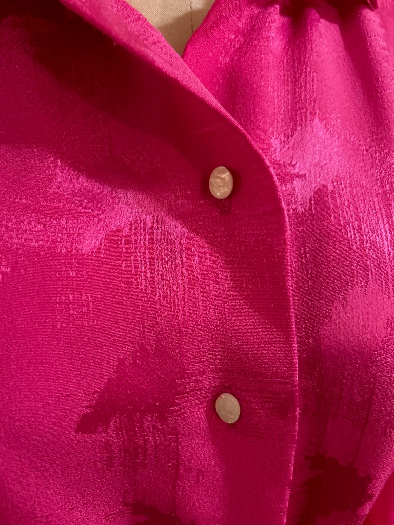
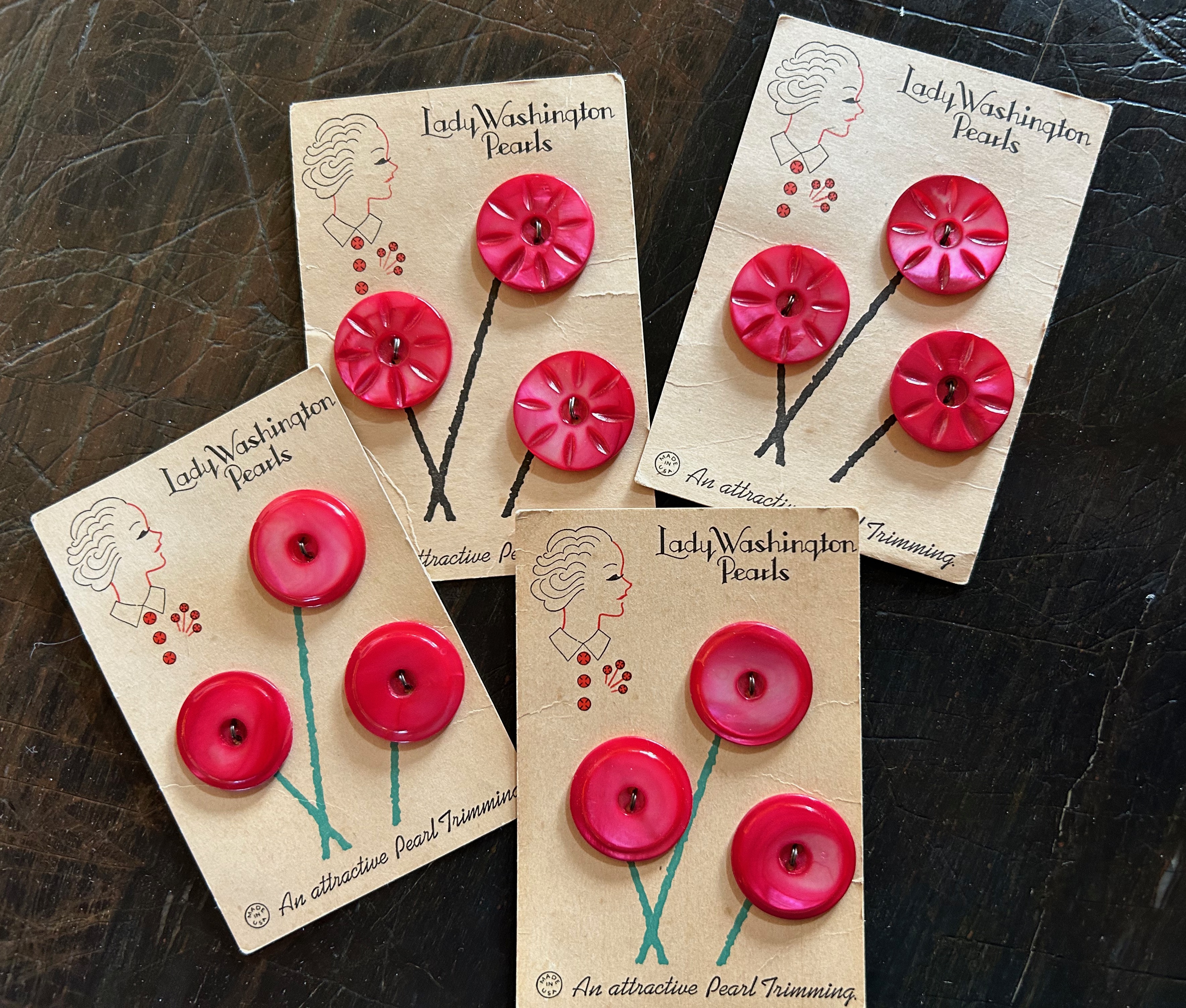
I had found a set of taupe-colored vintage buttons in my collection which, at first glance, did not look like they would work. But after auditioning black buttons and red buttons, I was convinced those taupe ones would be perfect. However, I had no idea how I was going to do buttonholes in that thick fabric. I fiddled around with fabric scraps to make practice bound buttonholes, using a lightweight fabric for the “lips.” They looked awful. I thought of using large snaps and just securing the buttons on the coat front for effect. That did not appeal to me at all. So I went to my two failsafe sewing maxims: 1) I’ll figure it out later, and 2) Plan B – it BETTER work.
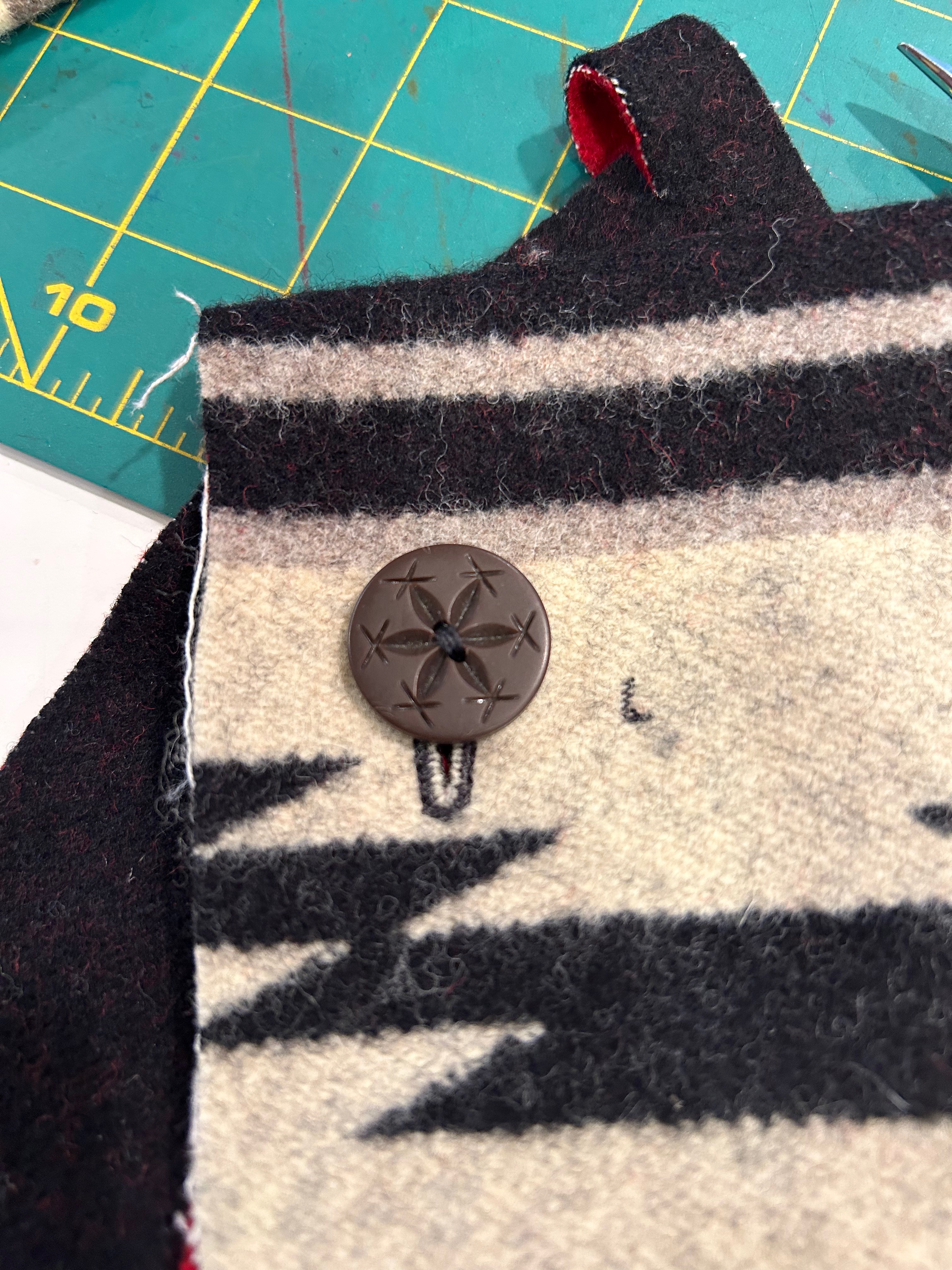
The jacket was practically finished before I found a method to make those buttonholes. Because the fabric was so thick, I could successfully only do a machine buttonhole on one layer of it. I experimented around and discovered if I made the buttonhole on the front of the coat, I could then line up the facing and use a straight machine stitch through both layers around the buttonhole. I used very small stitches to make it secure. Then I sliced them open. It worked!
Are you still reading at this point? Or did I lose you back at the dining room table?
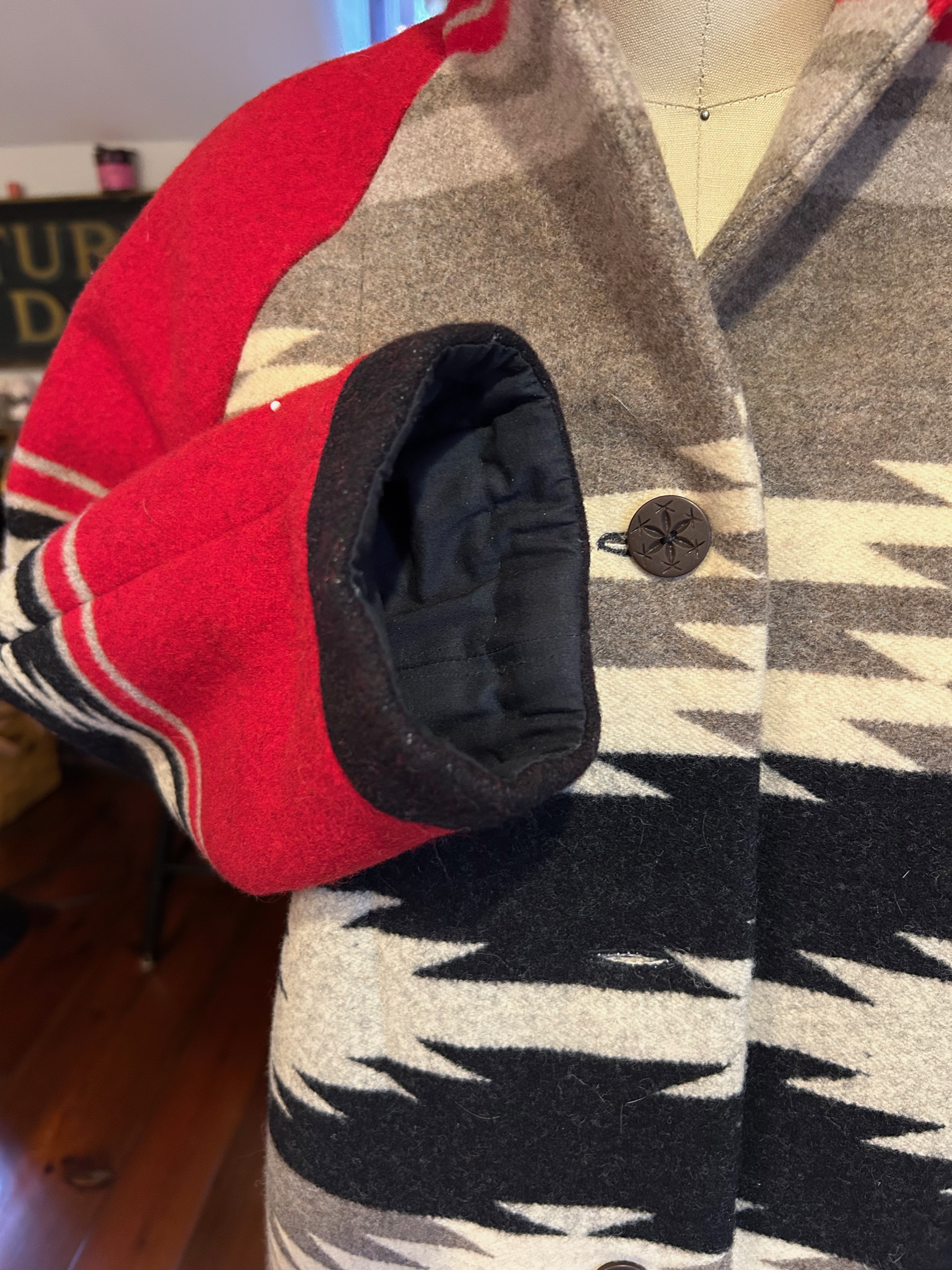
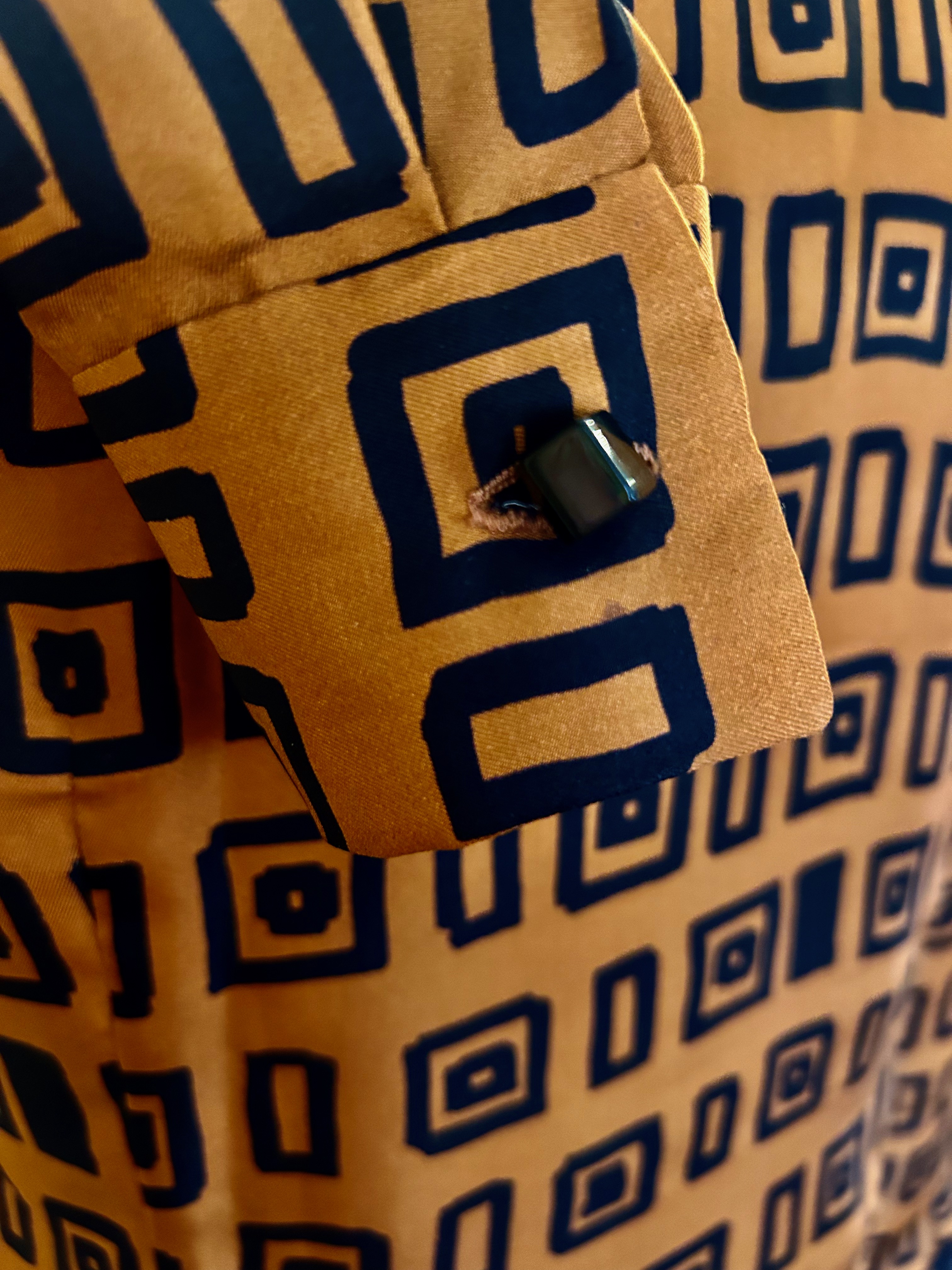
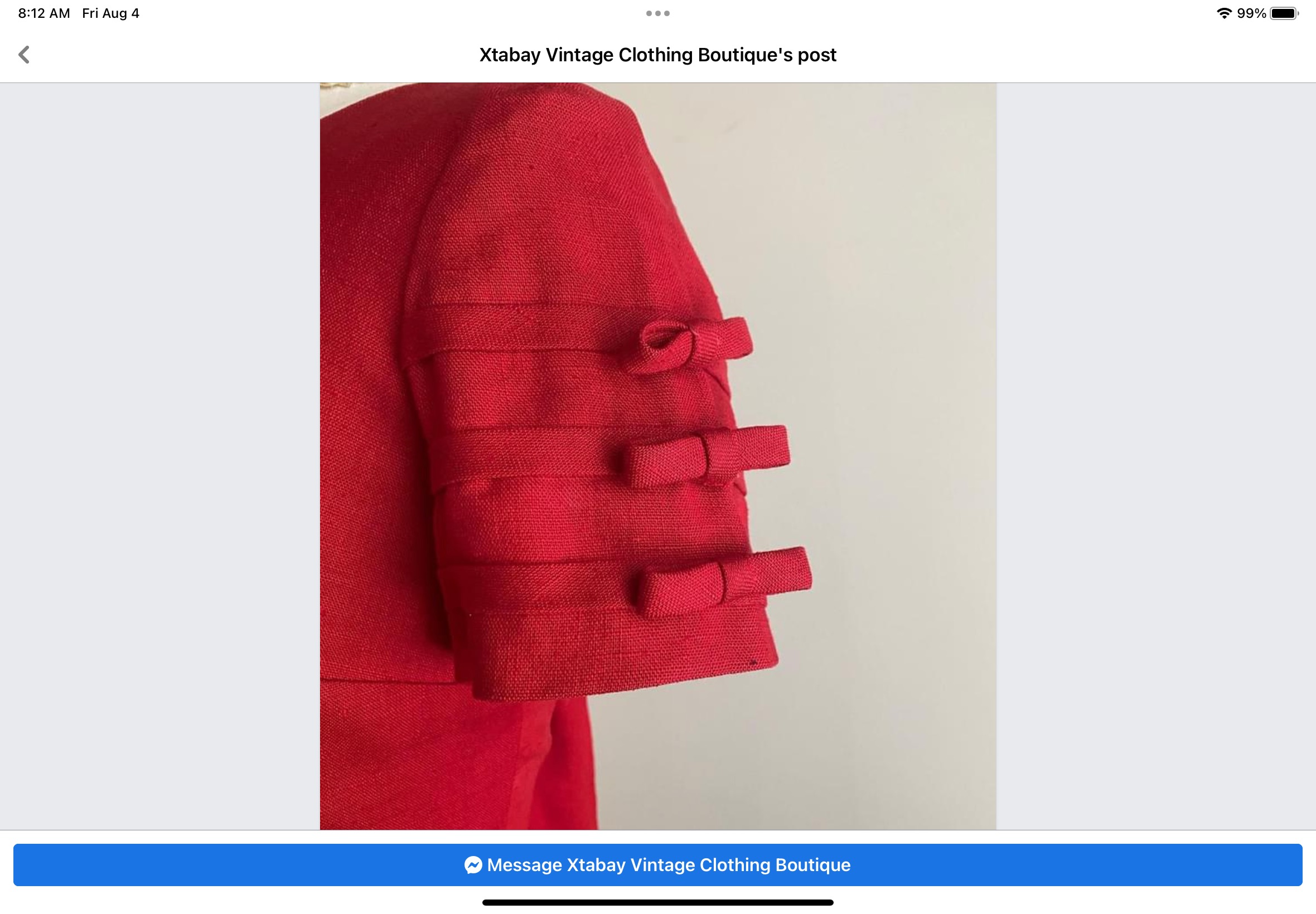
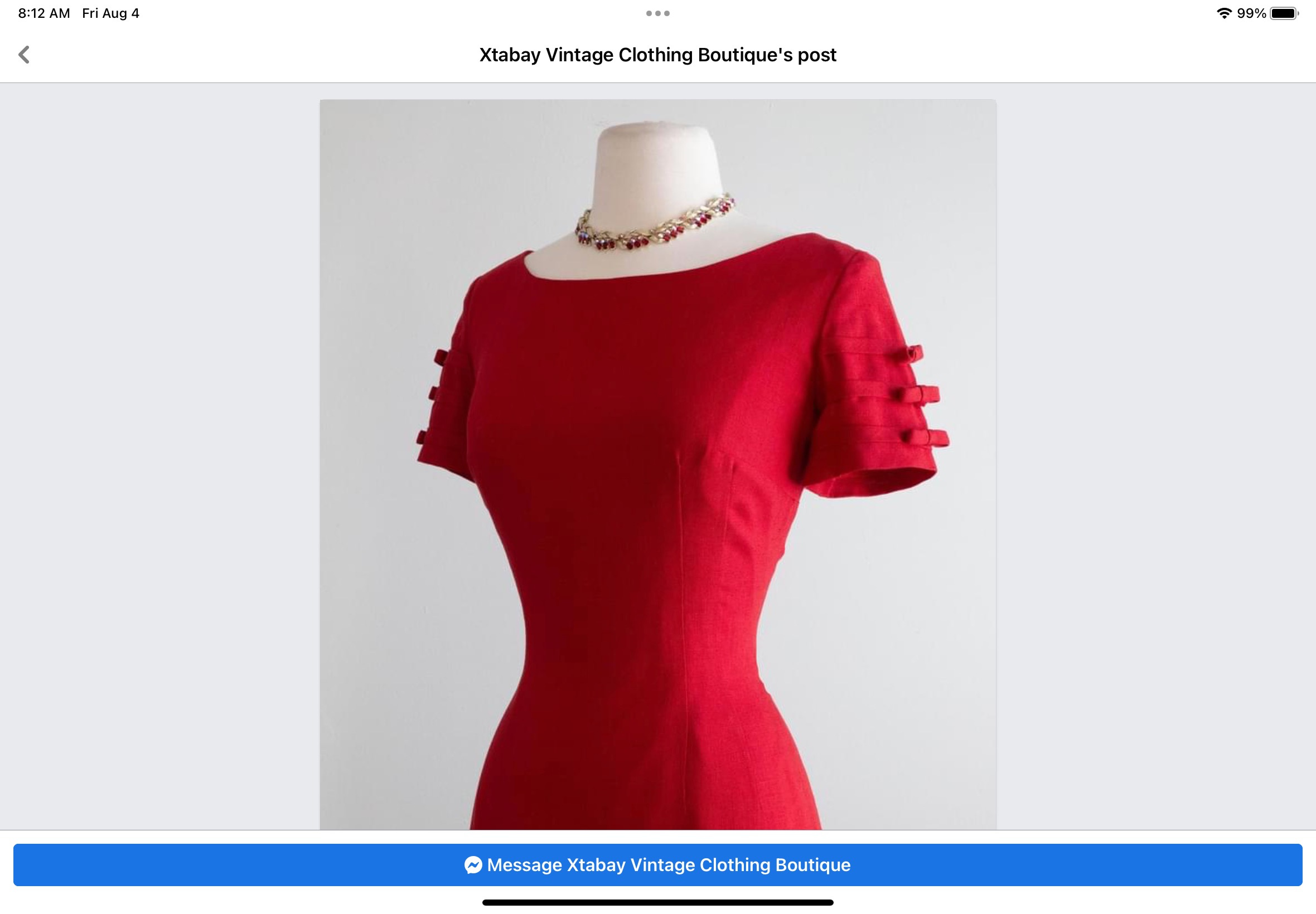
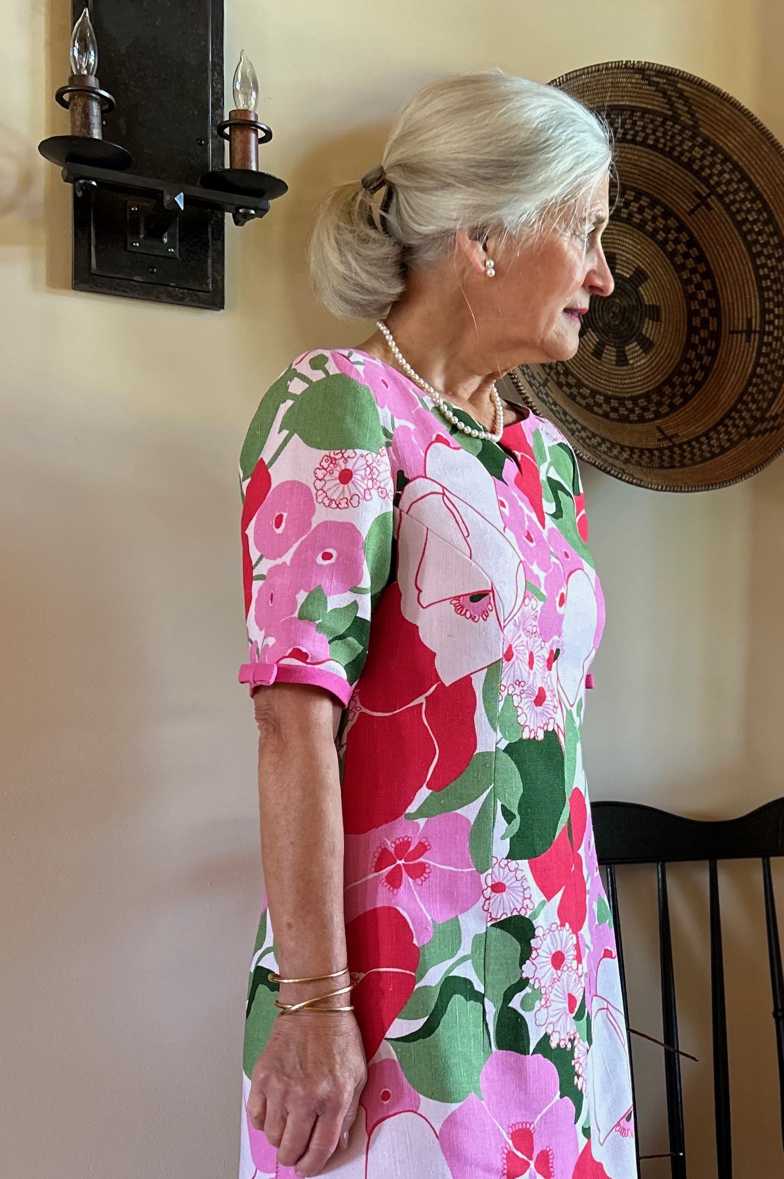
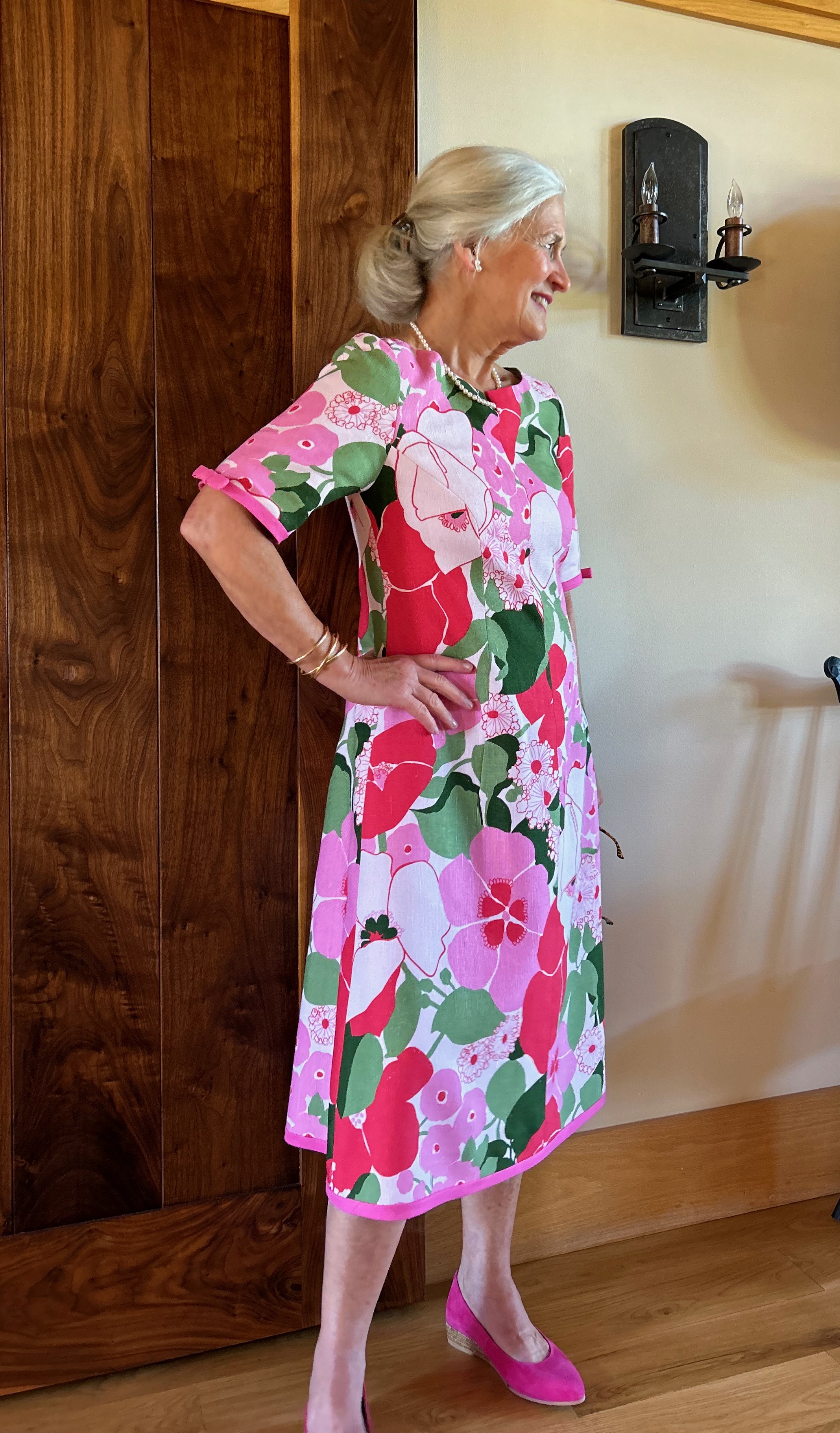
Almost finished! The final touches on the coat involved under stitching the collar to hold the turn in place, and securing the sleeve lining to the underside of the black “cuffs.”
What do you think of the black cuffs? I had no choice but to do them this way; hopefully they look intentional rather than contrived.
I have to say I was pretty thrilled with how my jacket turned out, considering the parameters facing me.
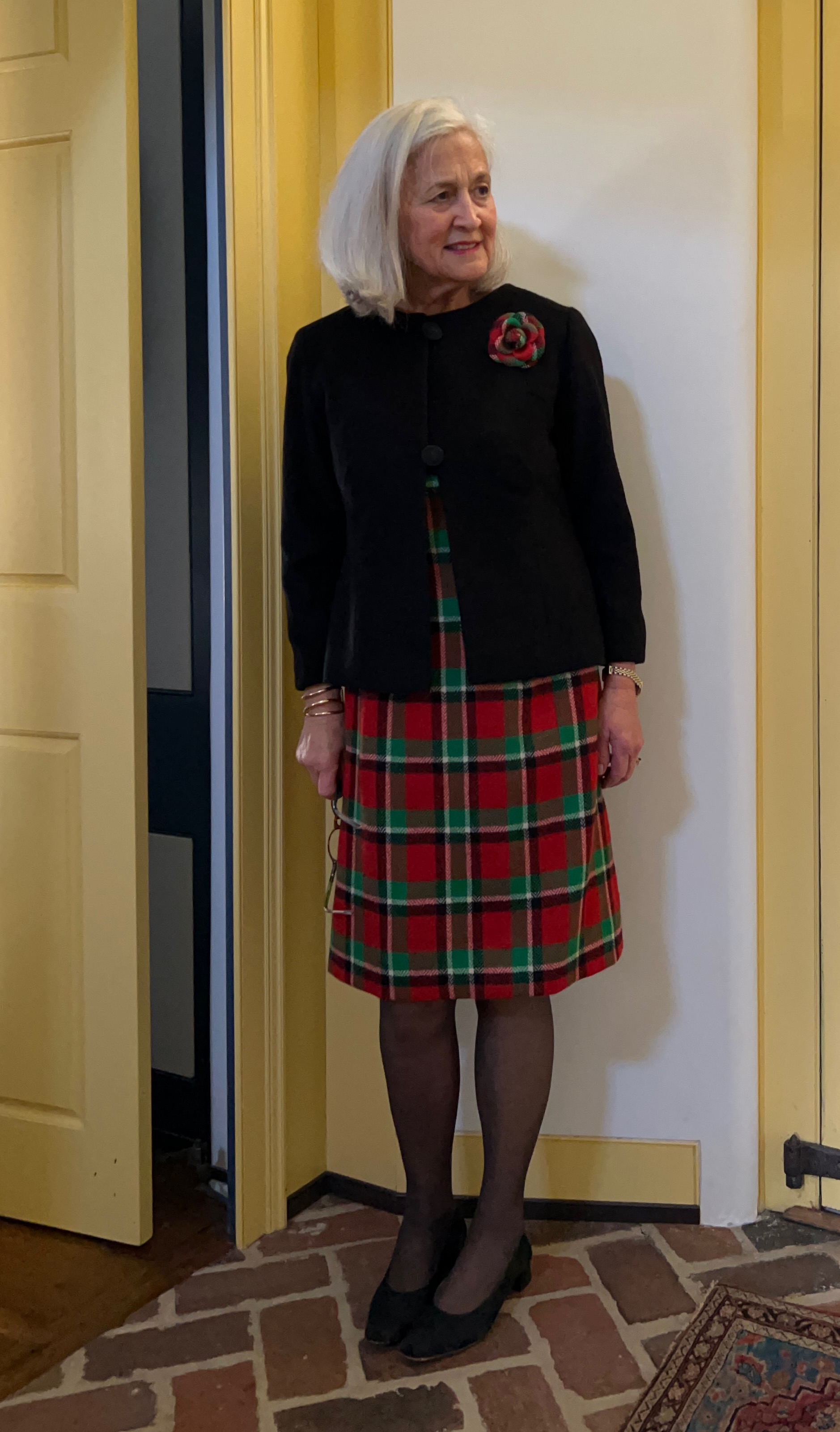
Now I do indeed match my chair! More importantly, however, I have a very classic, one-of-a-kind, Pendleton wool, western-style jacket which is going to be fun – and warm – to wear.


Going Around in Circles
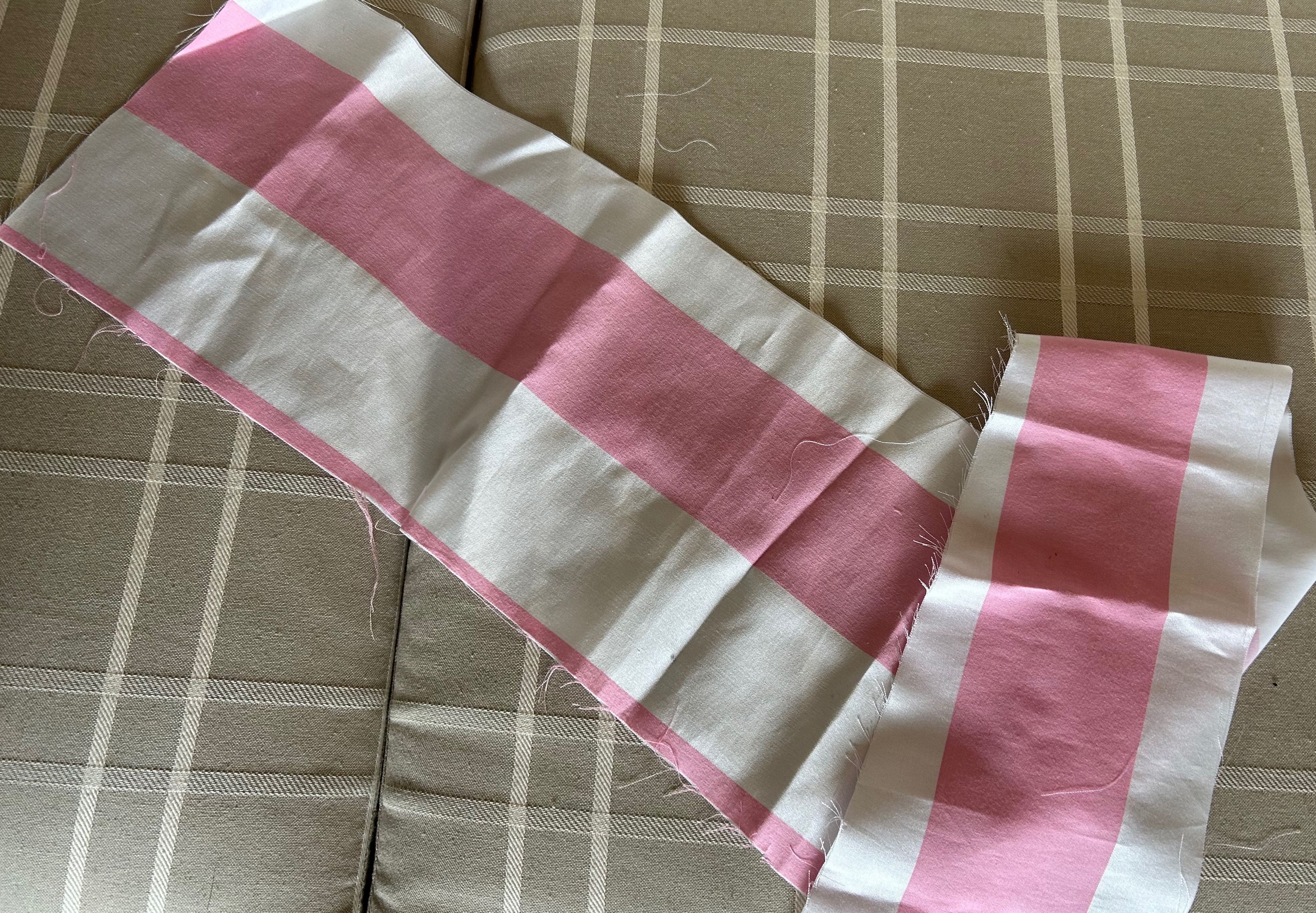
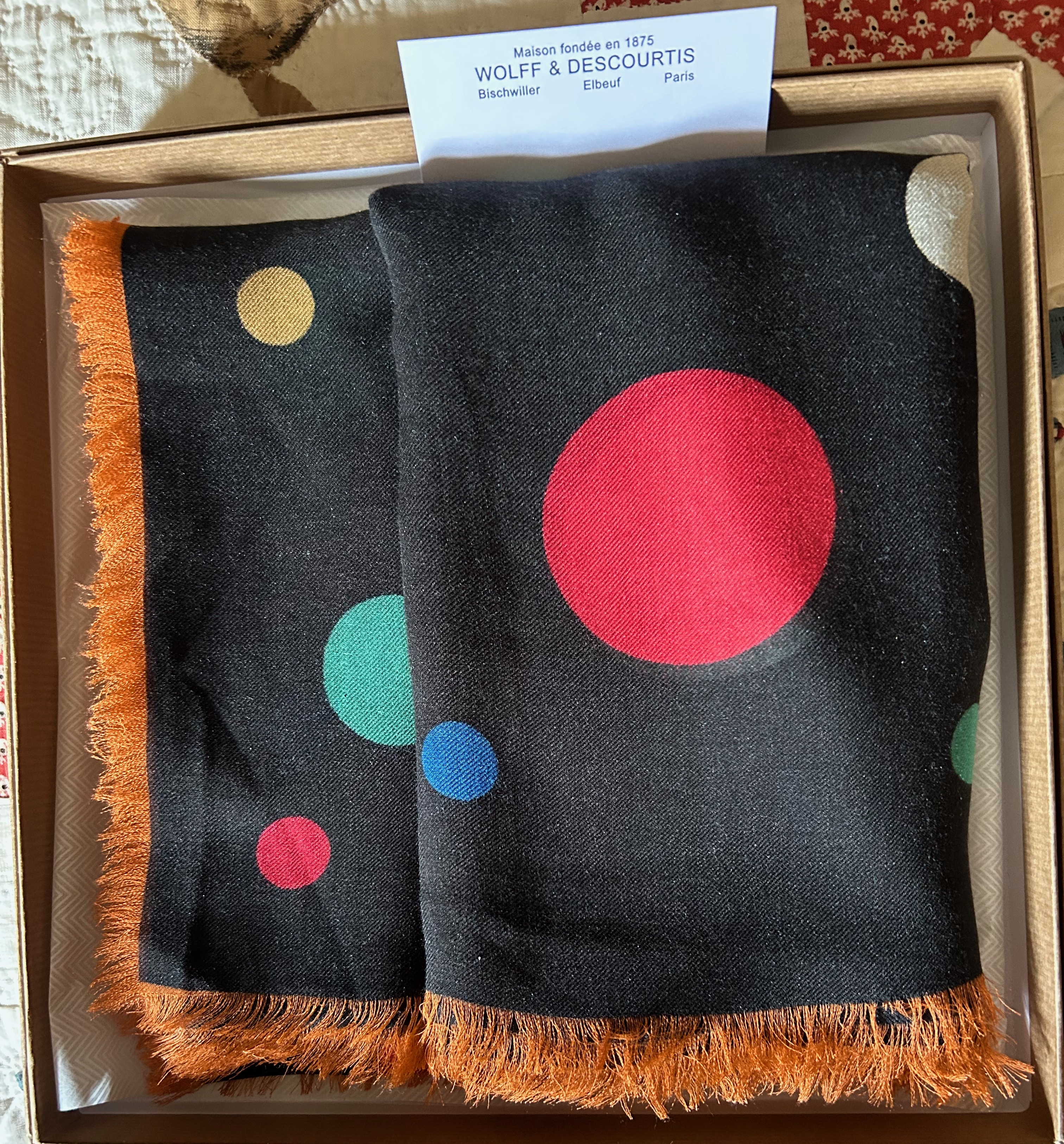
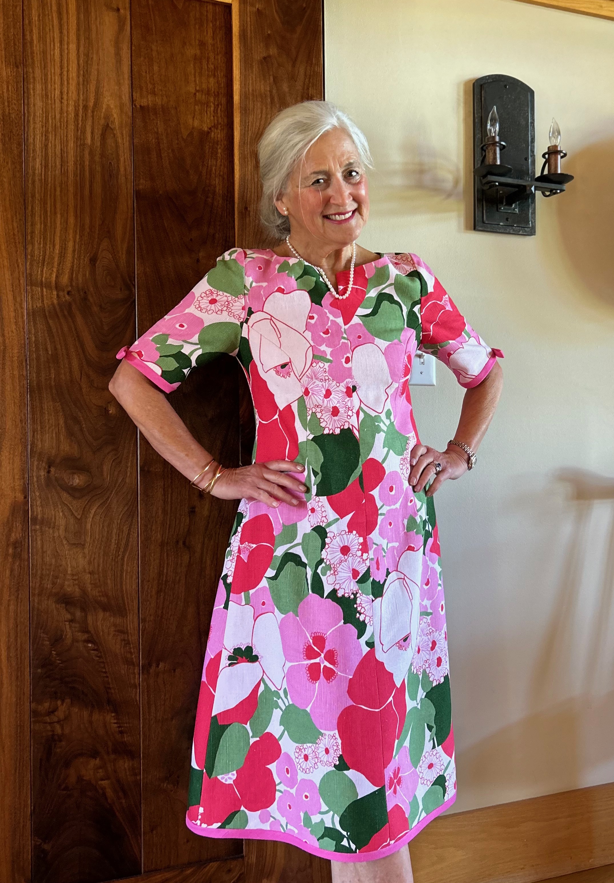
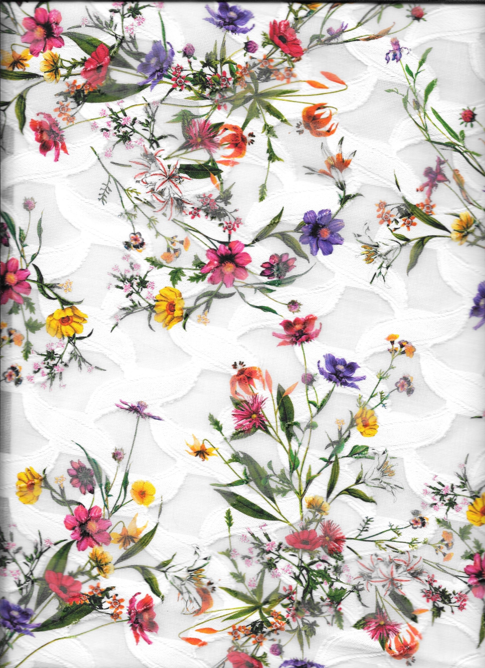
When I purchased this sateen, jacquard-woven fabric from Mendel Goldberg a couple of years ago, I wasn’t sure what it would eventually become. It had a wide repeat to the design (which is something to consider when you know you are facing considerable matching of the design), but it was a lovely 60” wide. I bought just 2 yards (it was expensive) and hoped I would have enough fabric to finagle something.
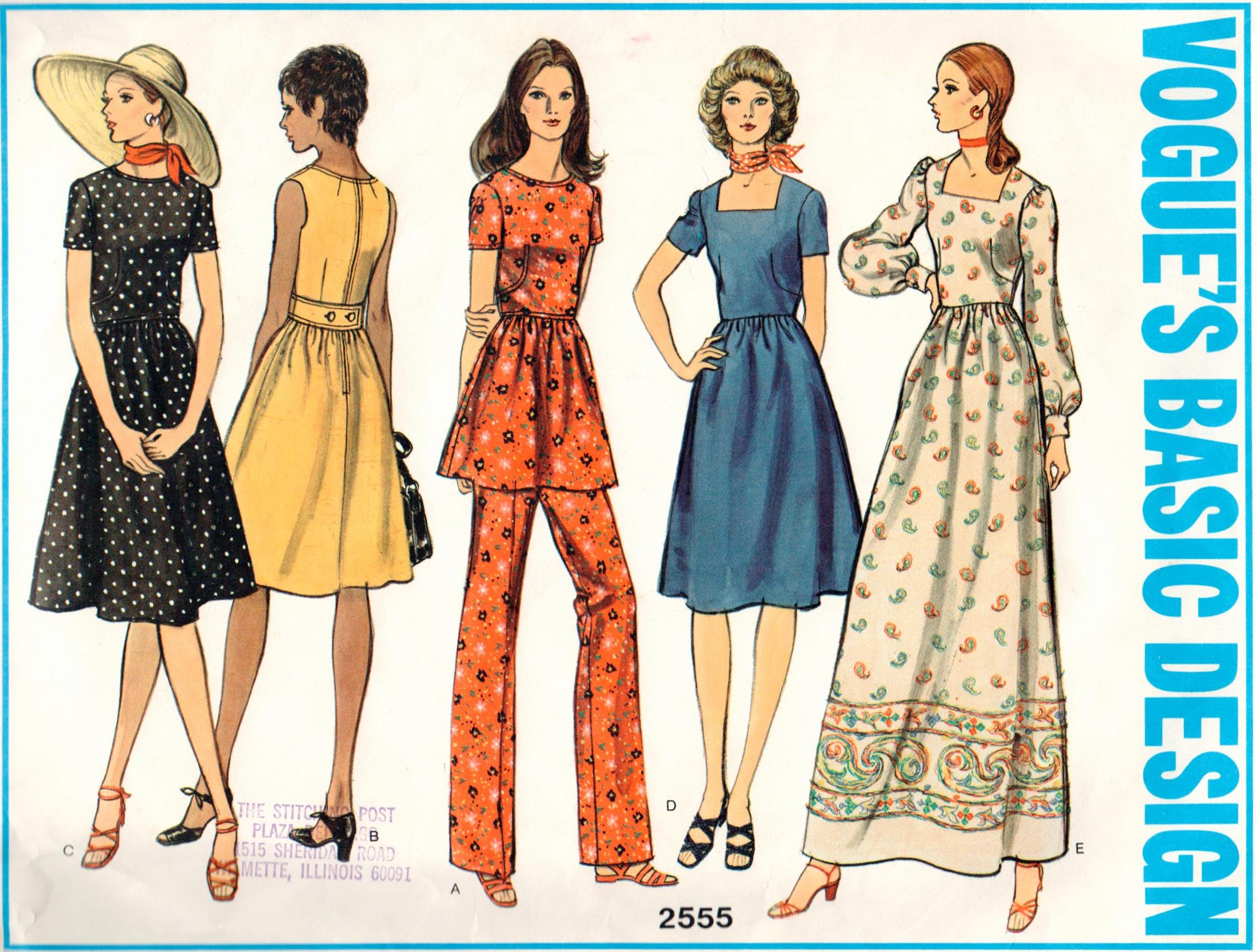
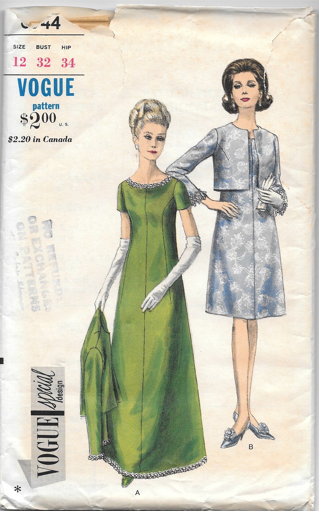
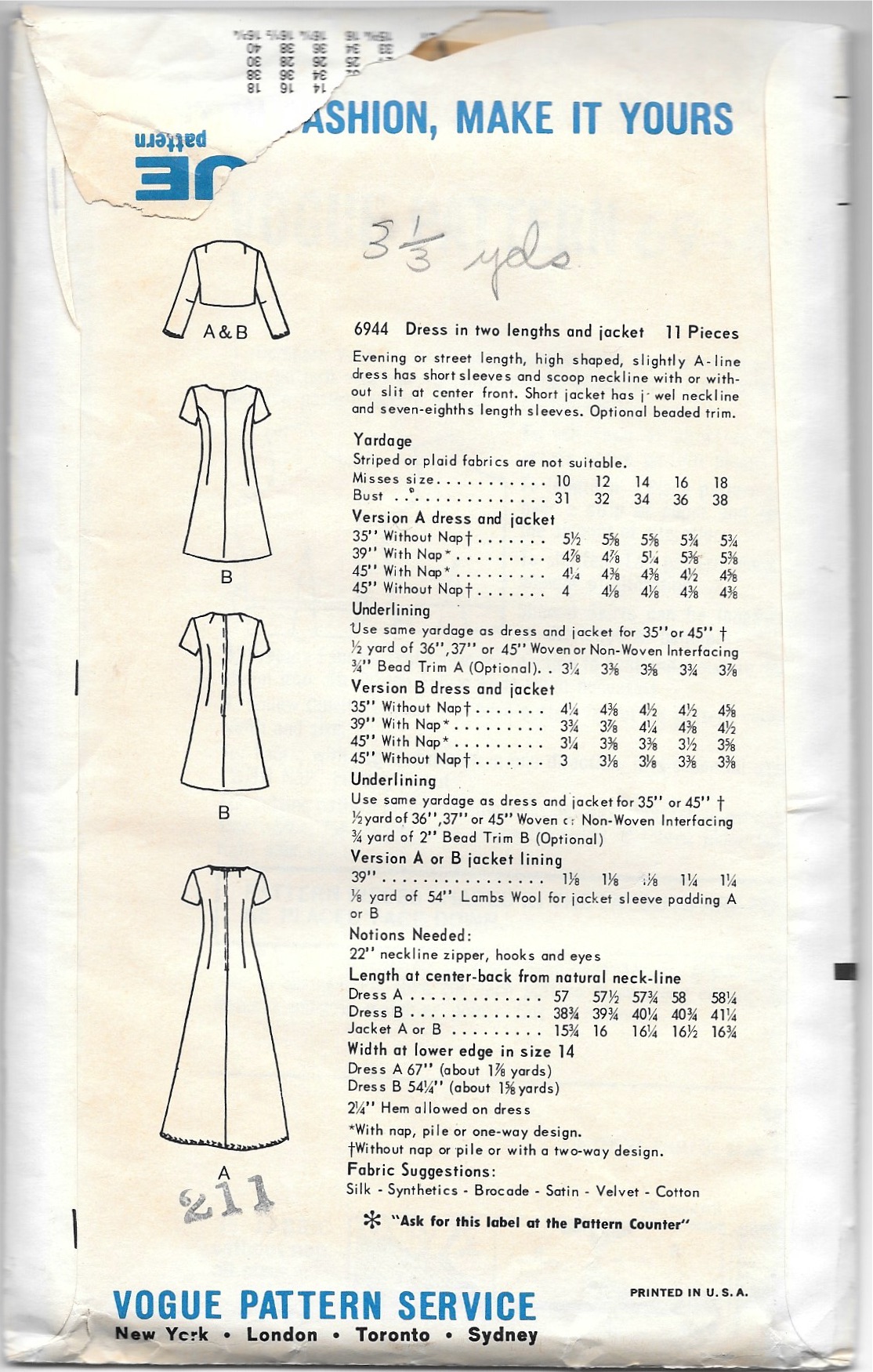
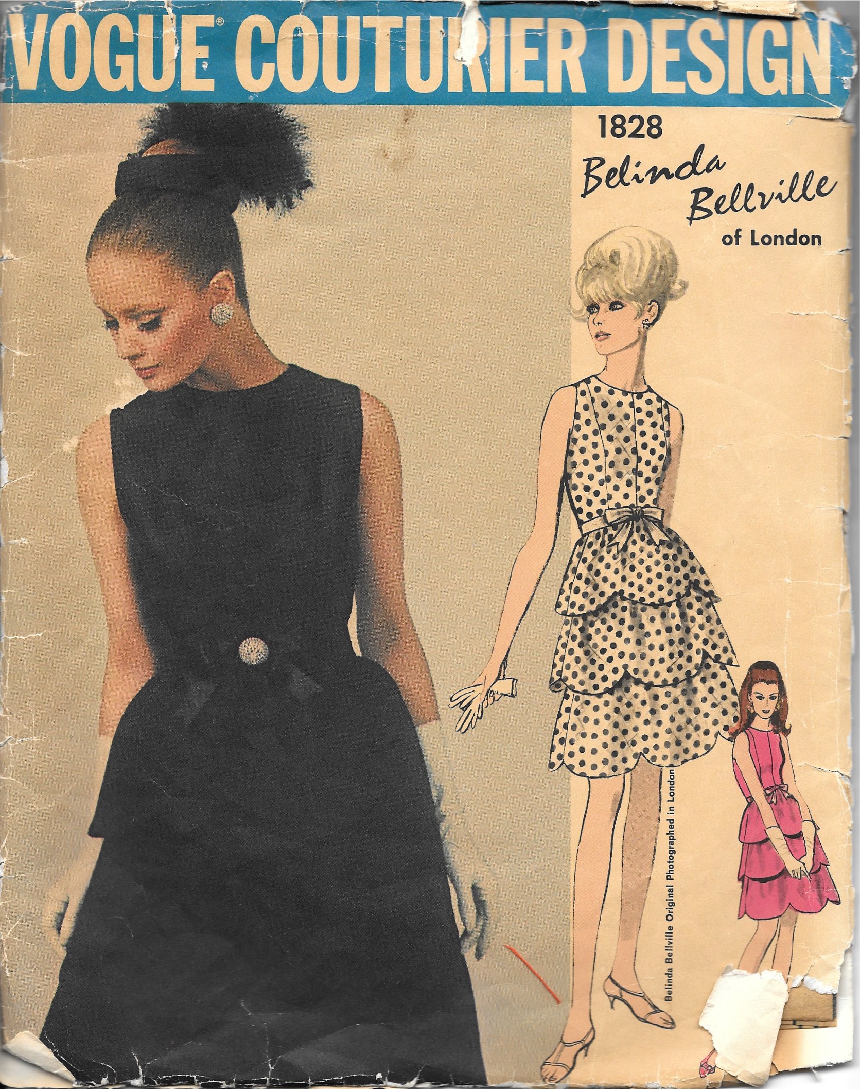
First I thought I would make a midi-skirt to wear with a pretty silk blouse or something. I even got so far as to make a muslin for a longish skirt, but it just wasn’t going to work. I didn’t have enough fabric to match the design and create the skirt I wanted. The next task would be to find a dress pattern which would work. I kind of viewed this fabric as a good Fall and Spring transition weight, so I wanted sleeves. And I wanted a pattern which would show off the circle design to its best effect. One of the patterns in my collection which I have seemed to dwell on frequently is this one:
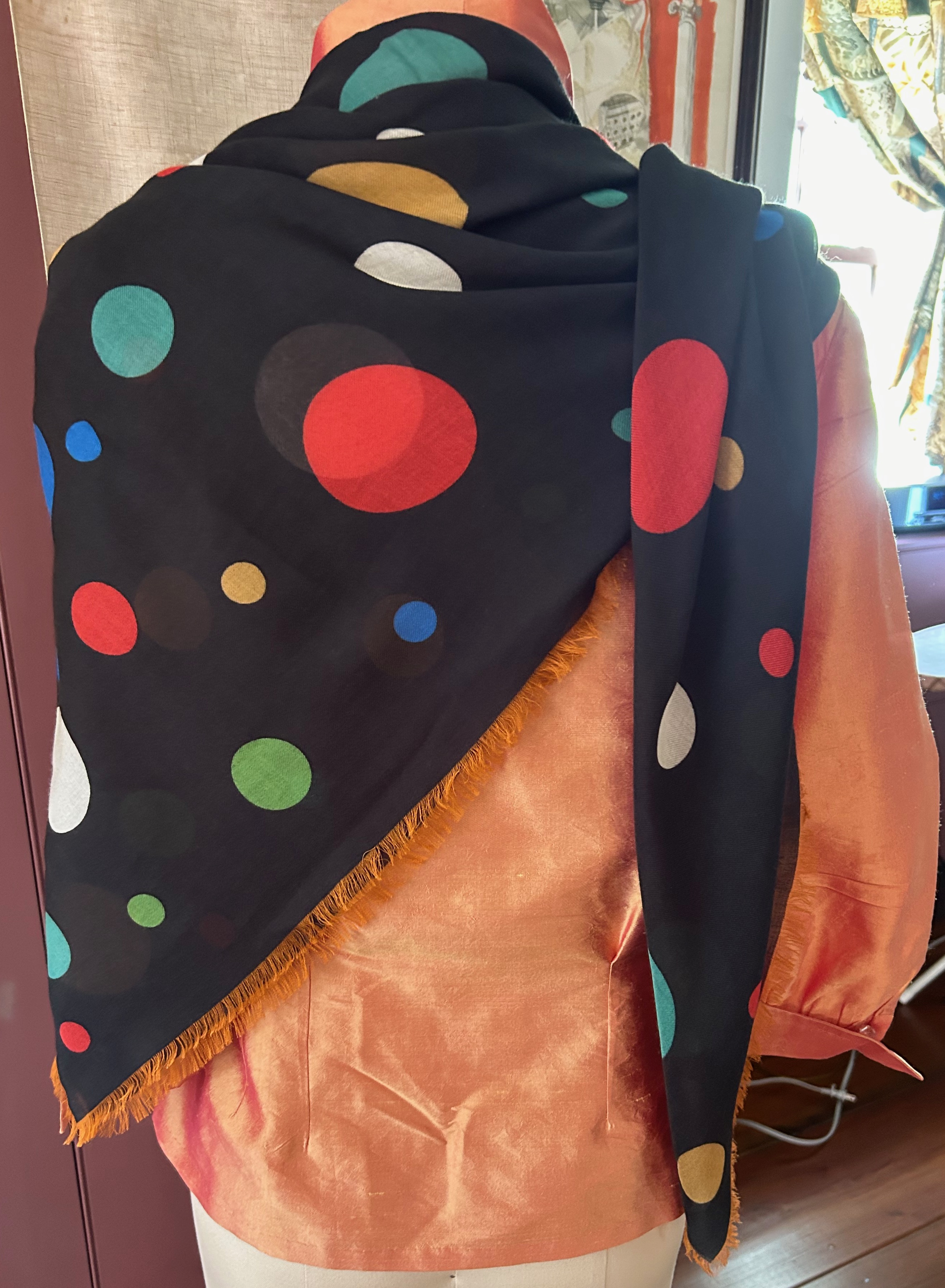
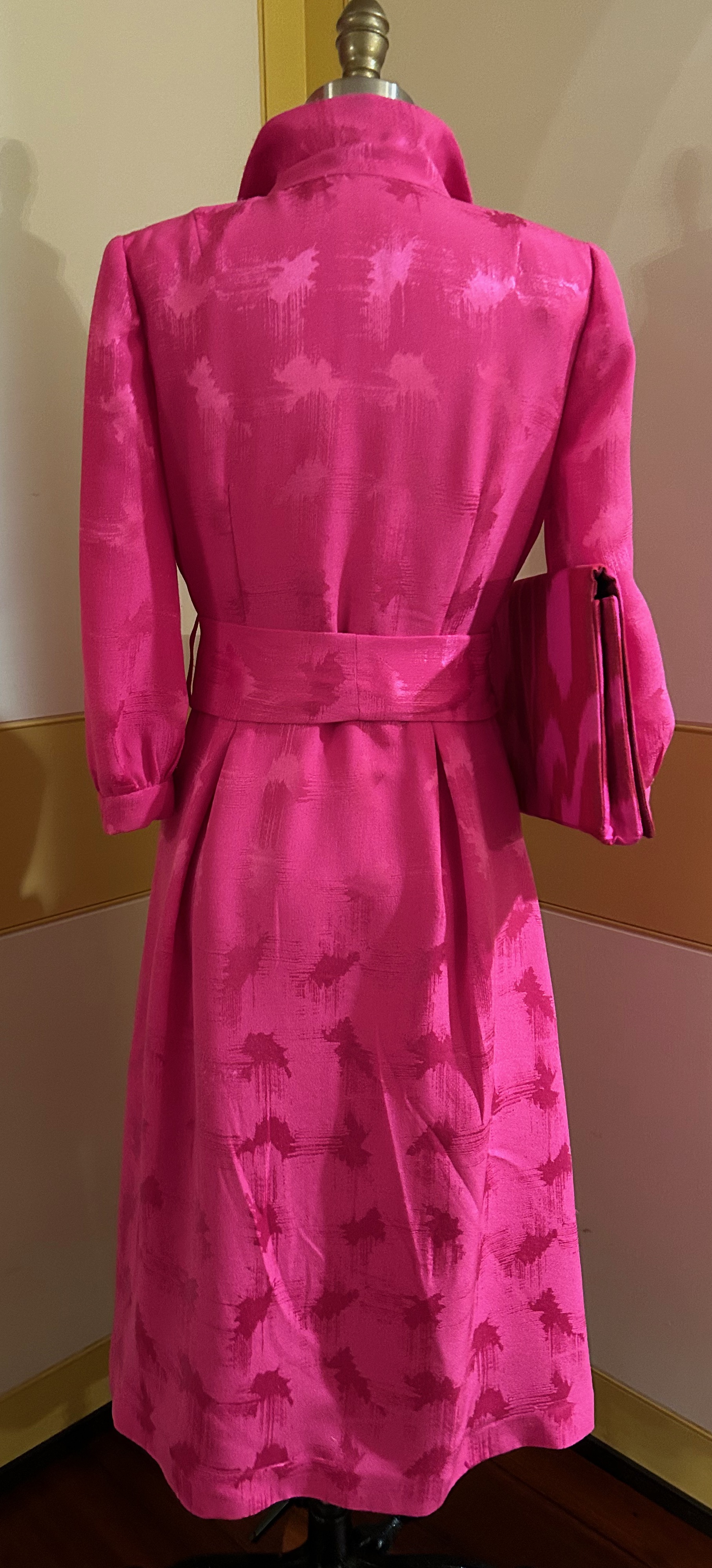
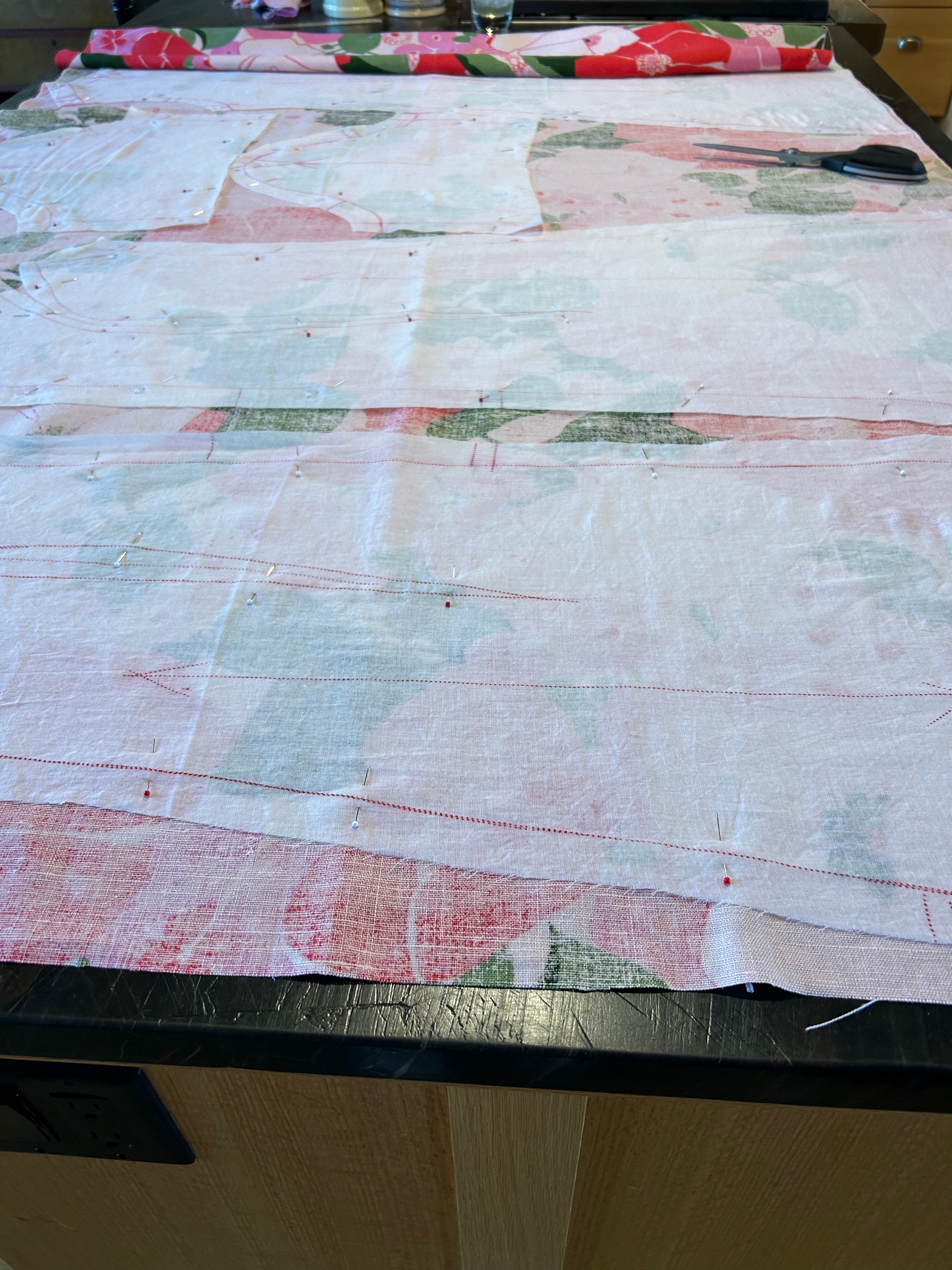
I like the styling of both the dress and the coat. I thought I’d take a stab at eyeballing the pattern on my fabric, to see if it might work. Well, it was going to be a squeaker, but I thought I could manage to get the dress out of the yardage I had – and match all those circles and dots as much as possible.
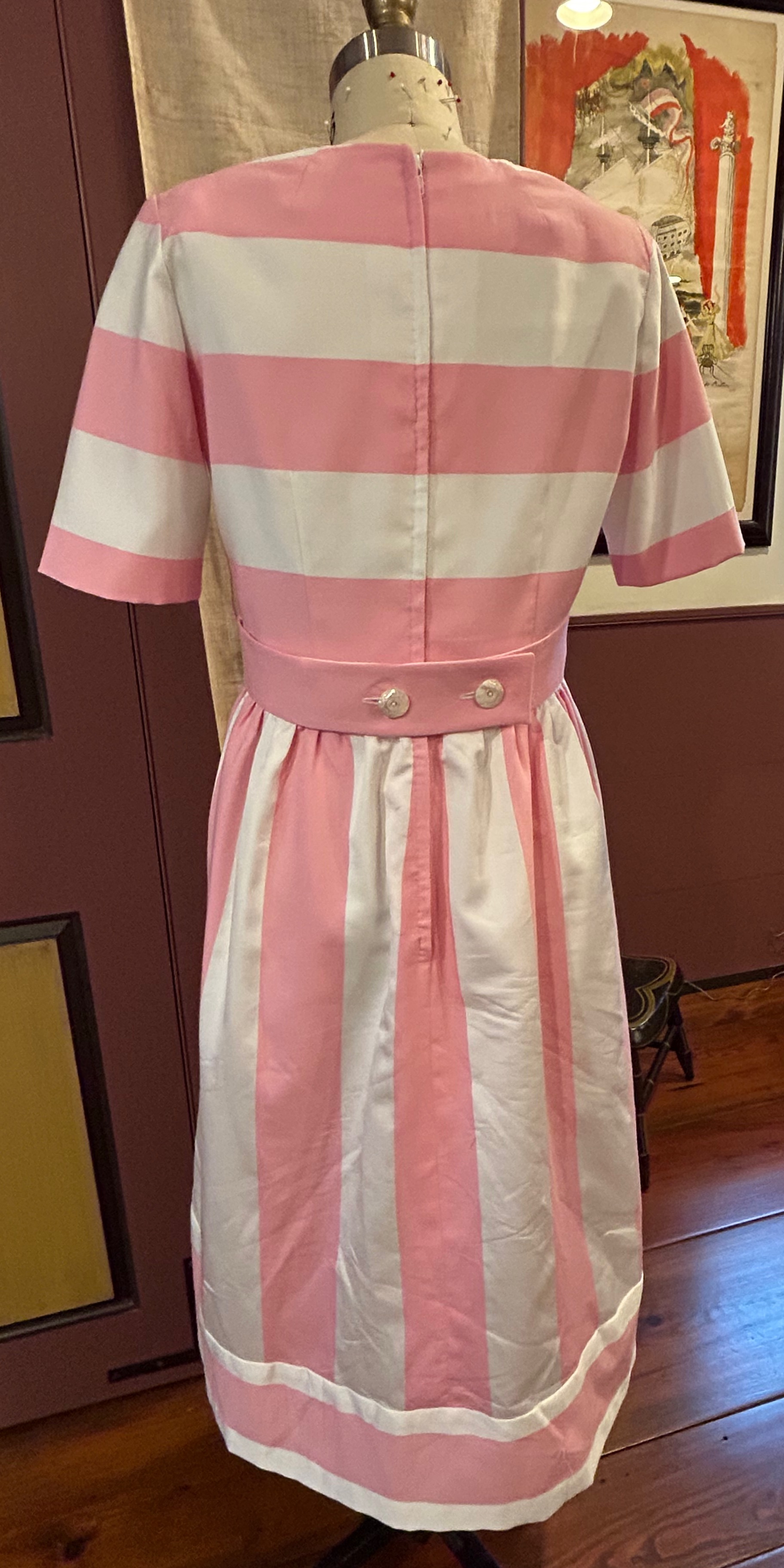
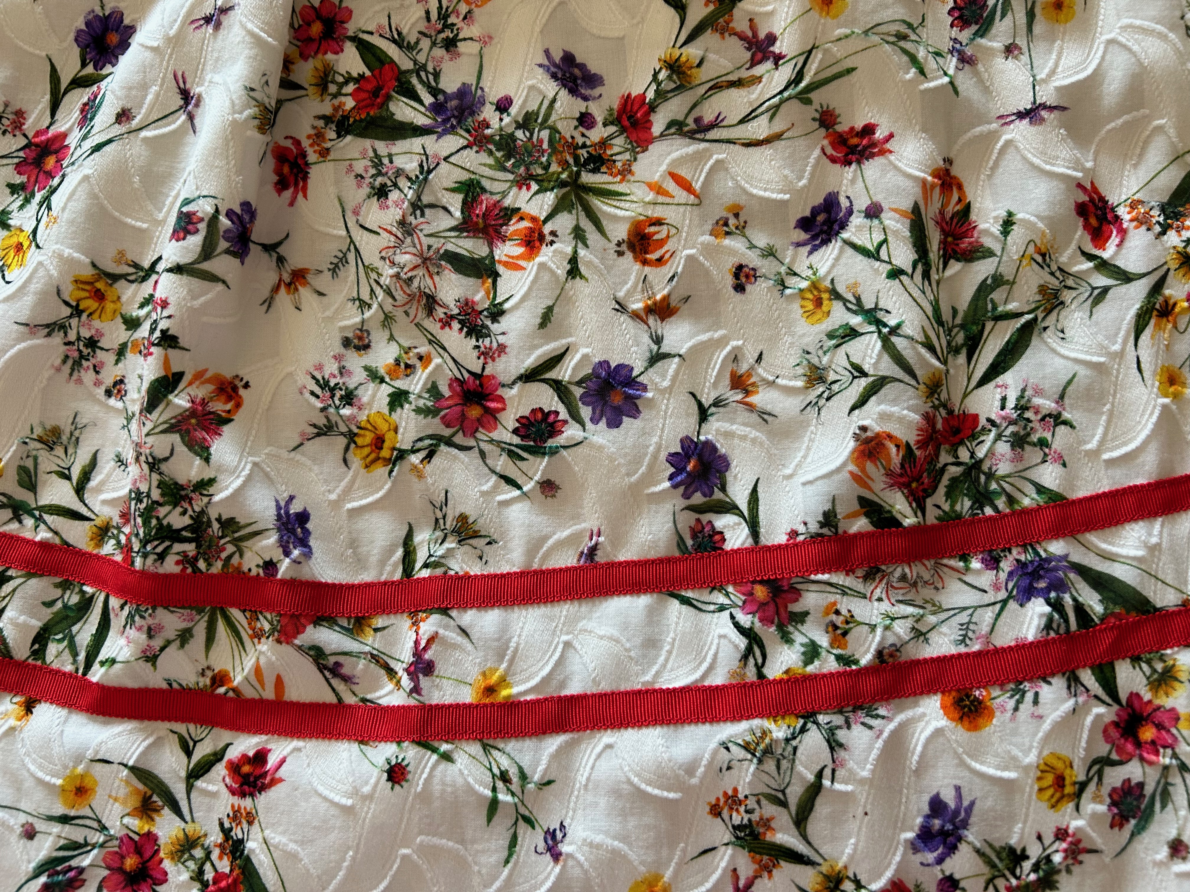
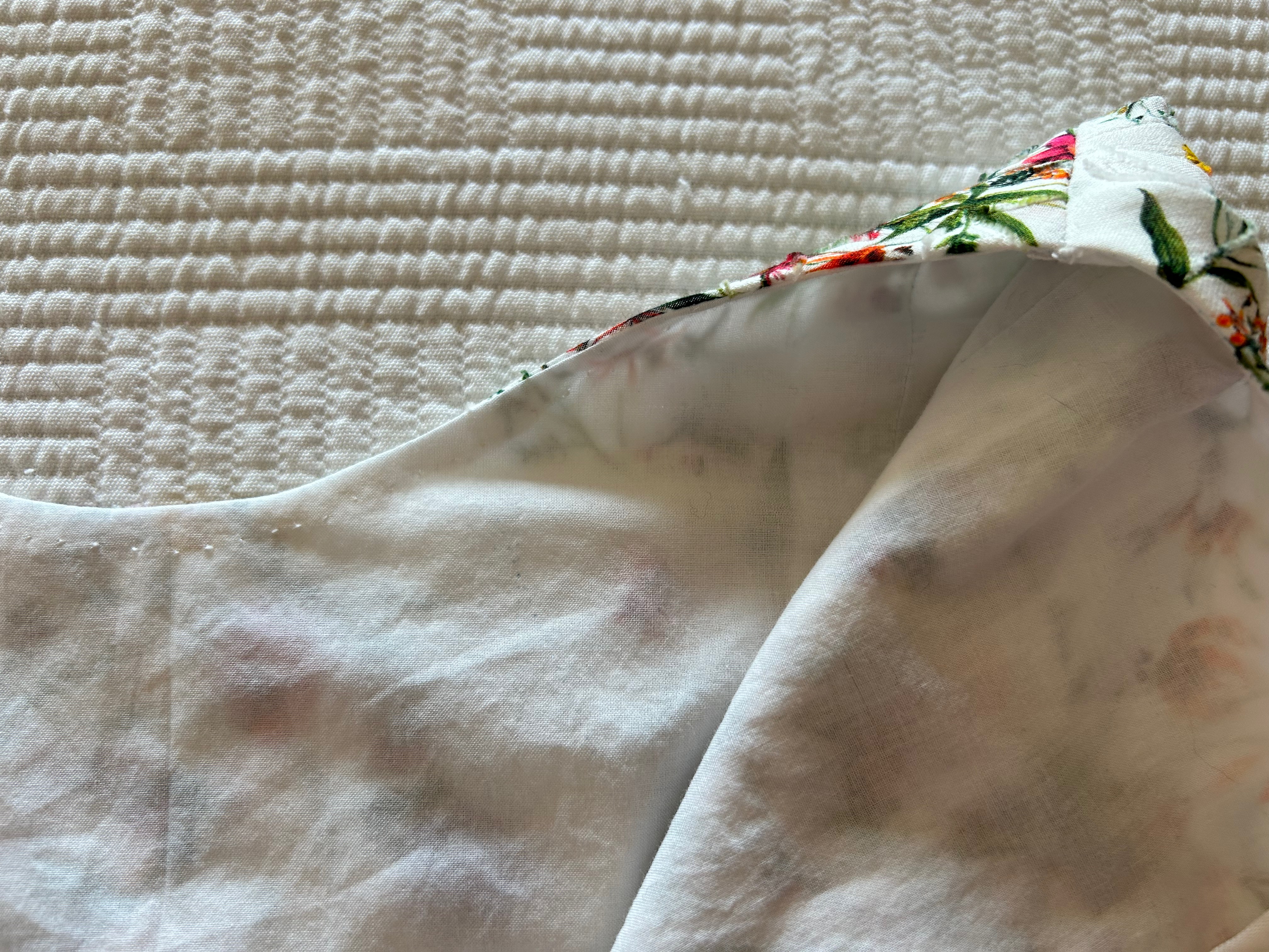
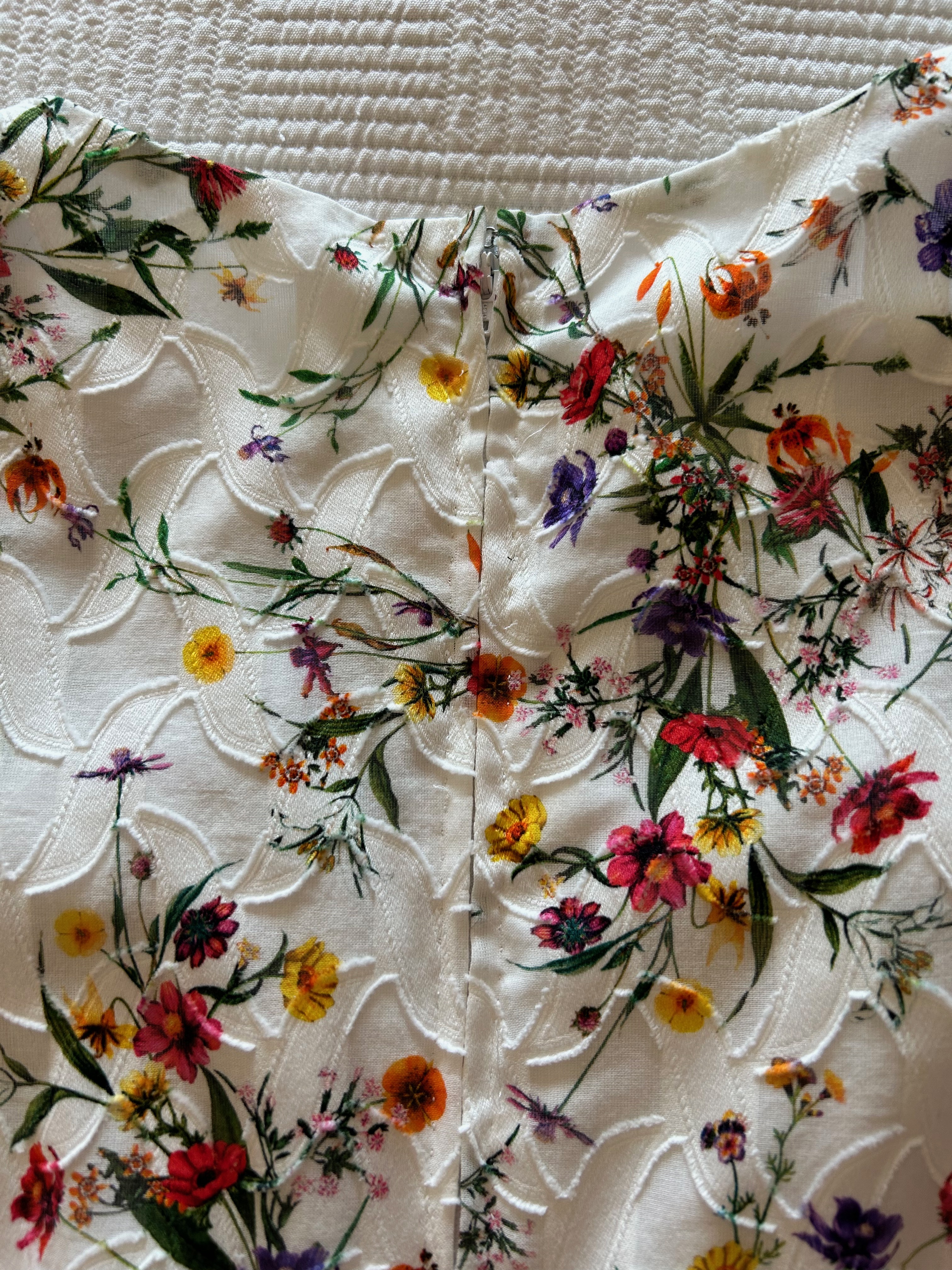
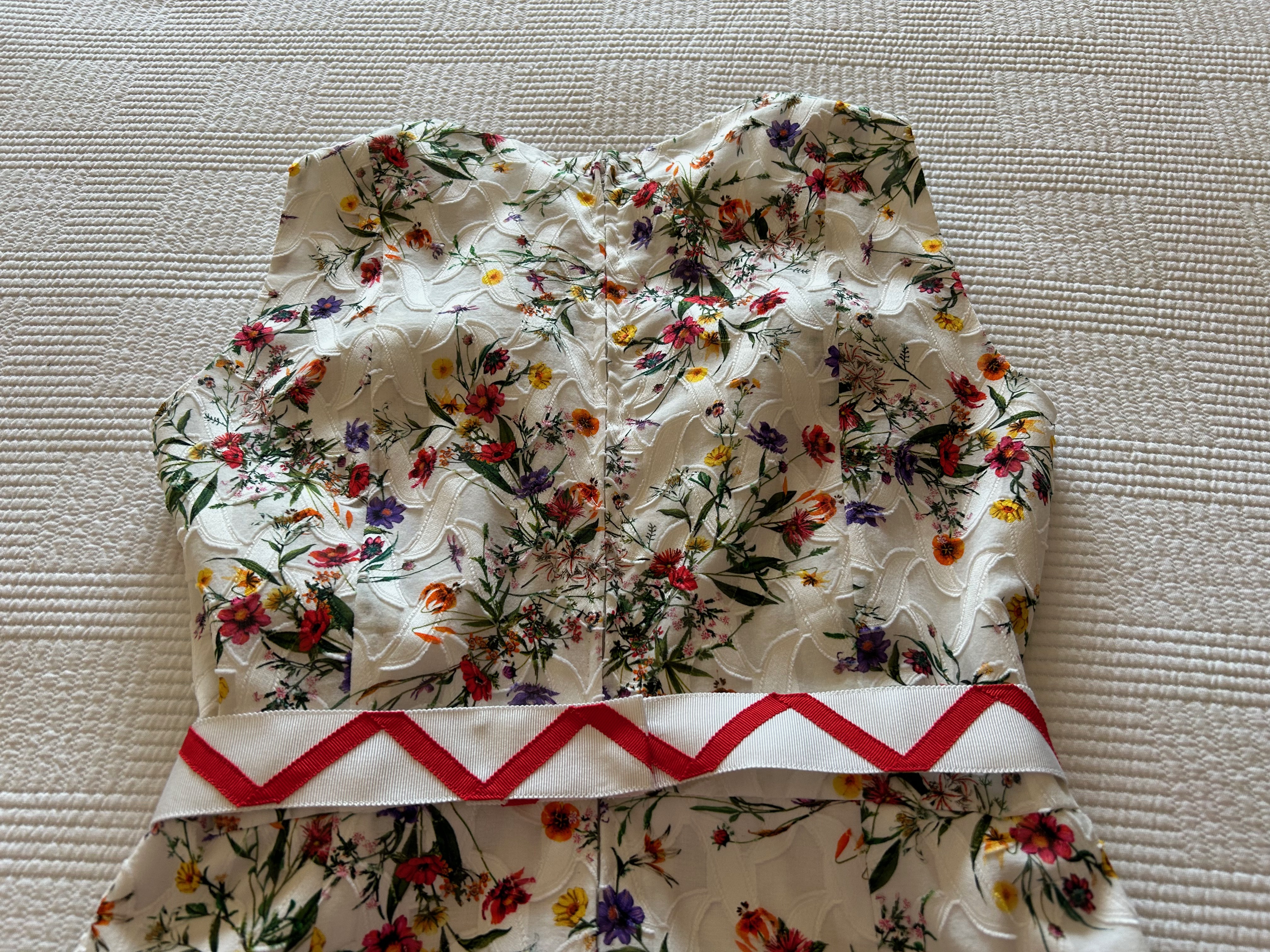
One thing I had to consider was the placement of the large dots and the smaller dots on my body. Working with dots can be a little tricky – you certainly don’t want prominent dots on top of each bust apex, for example, and a row of large dots around the waist might not be all that flattering. I thought the row of the largest dots would be best as an anchor at the hemline. That would place the wide band of smaller dots just over the waistline and somewhat below. This configuration would place one medium size dot over one bust, but I was okay with that since the dot on the other side was off to the side, and therefore not symmetrical. I also liked the repeat row of largest dots across the upper chest where they were not too obvious. And – the sleeves followed the line of varying size dots in a pleasing manner, I thought. It turned out, I had just enough fabric to get things lined up properly – except for the front facing. No way could I match that to the front of the dress.
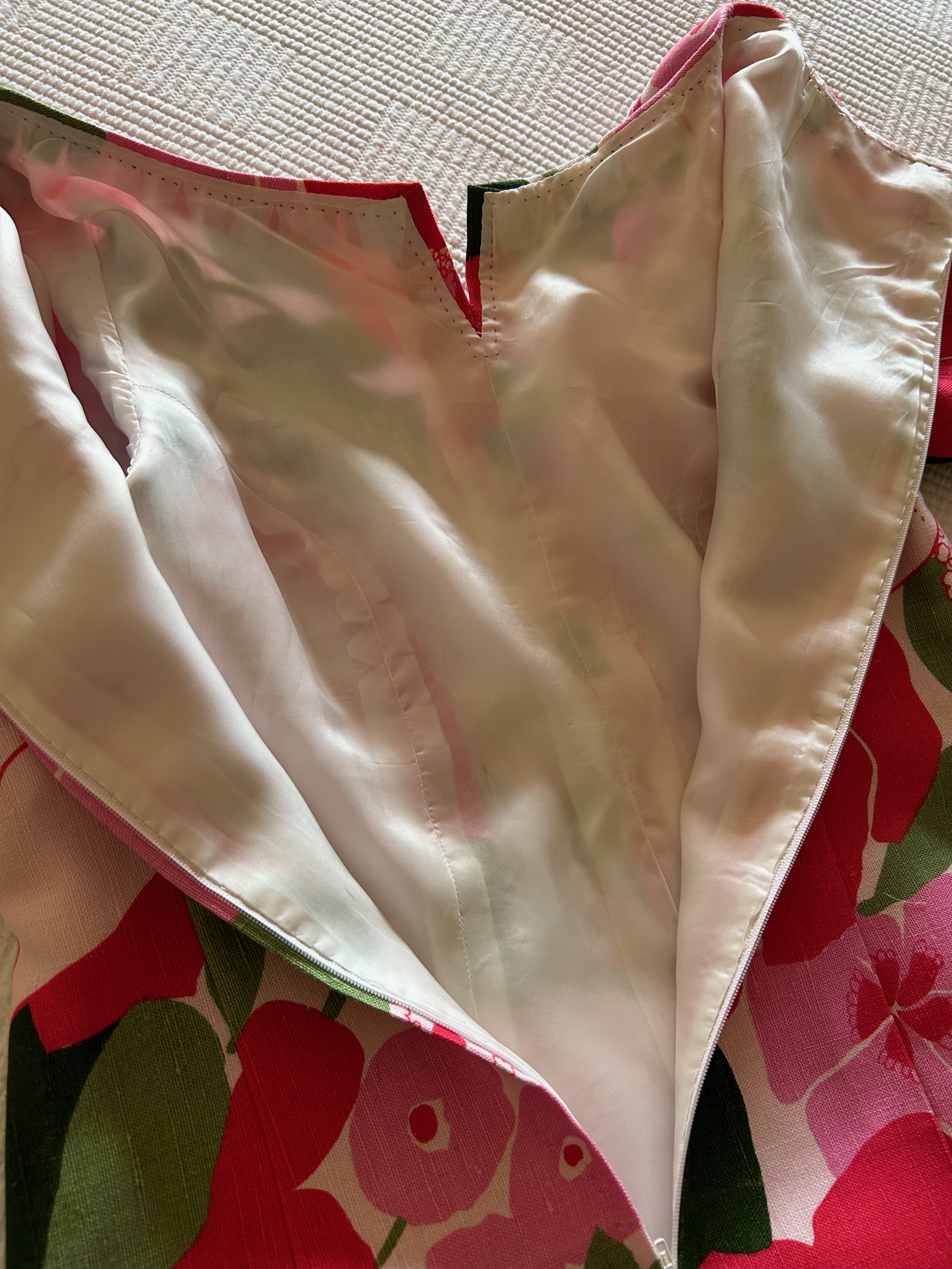
Now, obviously the facing does not show on the right side of the dress. Still, I like to match across seams if possible. Which it wasn’t. I had to give myself permission to have a mismatched facing, and then I moved on. (I forgot to take a picture of the facing, unfortunately.)
A word or two about the fabric before I go on. According to Fairchild’s Dictionary of Fashion, (Third edition, by Charlotte Mankey Calasibetta and Phyllis Tortora, Fairchild Publications, Inc., New York, New York, c2003, page 395) sateen is a “smooth glossy cotton fabric made in the sateen weave with floating crosswise yarns on the right side, giving a lustrous finish.” This fabric is a combination of cotton sateen, with circles created by a damask weave on a jacquard loom. It makes for a striking fabric. And I think the fact it is done in navy blue makes the contrast more definitive. Christian Dior was a fan of navy blue, calling it “the only one [color] which can ever compete with black, it has all the same qualities.” (The Little Dictionary of Fashion, Abrams, N.Y., 2007, page 14). It is a wonderfully versatile color.
I made a few changes to the pattern. I cut the neckline a little wider, I shortened the sleeves by a couple of inches, and the big change was I lined the dress in a lovely silk batiste I purchased at Farmhouse Fabrics. (The pattern did not have instructions or pattern pieces for a lining.) The pleat in the front of the dress was a bit tricky to line, but I figured it out after quite a bit of thought. By the way, I underlined the dress with silk organza.
One more thing about the pattern and the dress. With the pleat in the front of the dress which extends to the hem, it gives the appearance of a coat dress. However, it is not. Again Fairchild’s gives us a precise definition of a coat dress: “Dress fastened down front from neck to hem, like a coat, in single- or double-breasted style, either belted or unbelted. A classic since the 1930s.” ibid., page 84. Someday I’ll make a coatdress, but this was not it.
As I mentioned in an earlier post, I made this dress to wear on my Paris trip, but alas, I never had the opportunity to do so. I feel certain it will eventually get its debut, but not in Paris!
26 Comments
Filed under Buttons - choosing the right ones, Christian Dior, Fashion commentary, Loops for buttons, Mid-Century style, Polka dots, Sateen, Uncategorized, underlinings, vintage Vogue patterns from the 1960s, Vogue patterns
Tagged as Choosing buttons, Farmhouse Fabrics, fashion sewing, Mendel Goldberg Fabrics, polka dots, sewing, vintage fashion, vintage Vogue patterns