Tag Archives: handwritten notes on vintage patterns

The Champagne Dress

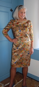
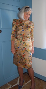
It is a fact of sewing life that the construction of some dresses is just more difficult and time-consuming than other ones. This was a difficult dress to make and at times I really wondered just how long it would take to finish.

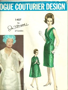
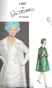
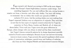
Before I go into the making of this dress, I want to put its pattern into historical context. This pattern is one of Vogue Patterns’ “Paris Originals.”

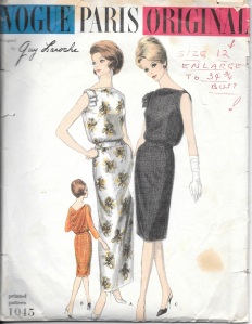
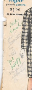
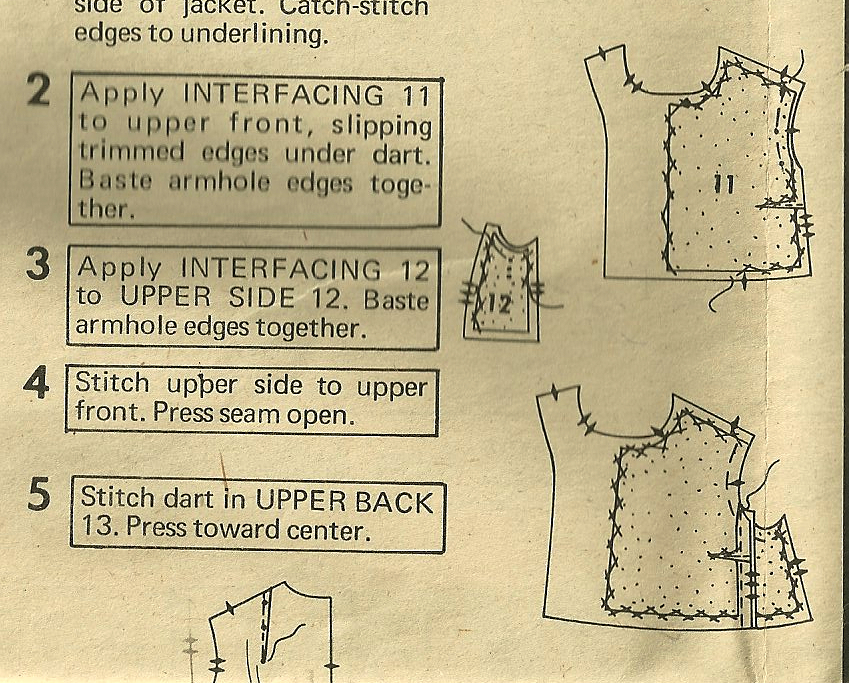
A former owner of this pattern made the notation about the bust enlargement.

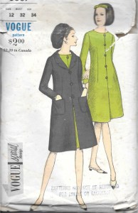
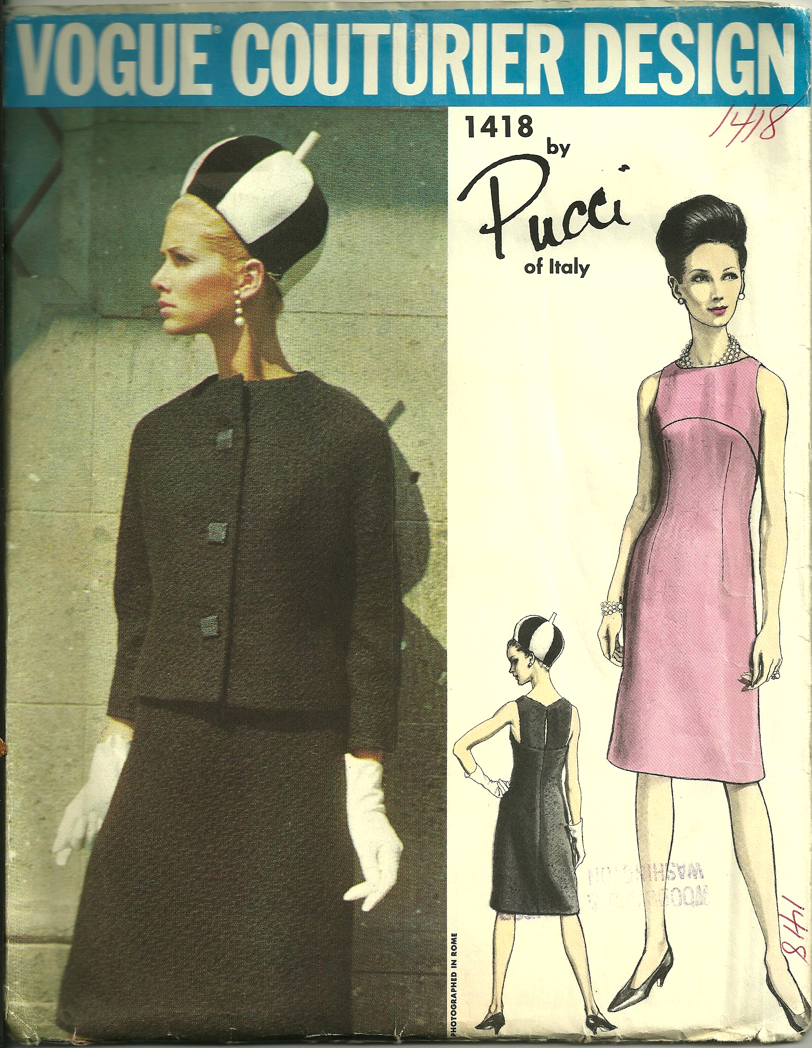
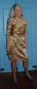
As is obvious from the envelope cover, the dress was designed by Guy Laroche (1923-1989; pronounced Ghee Lah-rush); it is copyright 1960. According to the St. James Fashion Encyclopedia, Laroche was a French couture and ready-to-wear designer who worked for Jean Desses from 1950-57. Desses was known for his intricately draped dresses, asymmetry in his designs and ornament derived from the “architecture” of the garment, according to his profile in The St. James Fashion Encyclopedia by Richard Martin, Visible Ink Press, Detroit, MI, c1997, page 100. Bingo! It appears that Laroche learned well from his time with Desses and incorporated some of the same details into his couture designs once he opened his own fashion house in 1961.

I find it interesting that this pattern is dated 1960, one year before Laroche opened his couture house. Perhaps this statement in the Vogue Sewing Book from 1963 helps to explain how Vogue Patterns managed to obtain a Guy Laroche design before he had his own eponymous line:

Please click on the image to enlarge the print.

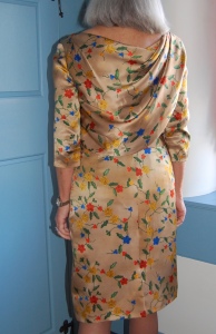
In any event, the appeal of this pattern, for me at least, was the asymmetrical draped bodice back and the tailored bow which anchors the drape on the right shoulder of the dress. It was also these details – and others – which made it a time-consuming project.

I made some alterations to the pattern before I even got started, as I wanted to eliminate some of the blousing above the waist of the dress. I do not have enough height to carry off too much excess around the mid-section, so I pulled most of the blousing into darts. Doing this made me rethink the instructions for the lining, the waistline of which was supposed to be sewn to the waistline of the dress itself. I assume the joining of these two elements was to insure that the blousing of the dress remained at the proper “elevation.”

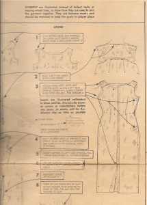
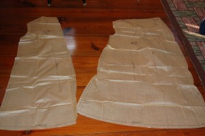
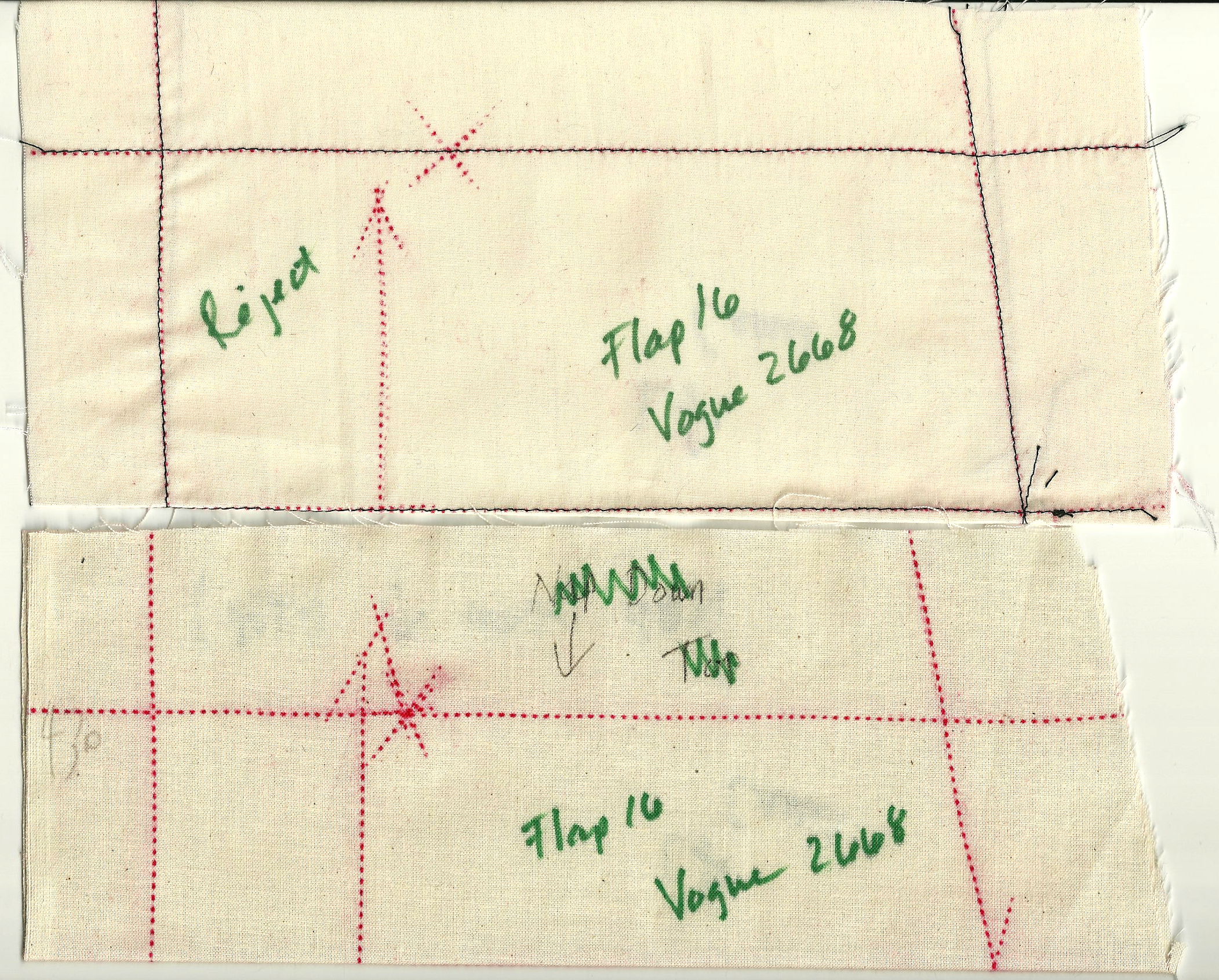
The series of dots around the waistline indicate the sewing line to anchor the dress to the lining.

Having removed most of the blousing, I did not need to anchor the dress to its lining, so I left the lining loose.

This photo shows the loose lining and also the back neckline. Ordinarily, in couture sewing, facings are eliminated. However, in this case, knowing that the weight of the drape would be added to the back neck, I chose to use the facing to add more stability. I finished its edge with Hug Snug tape.

As you can see from the diagram of the lining (above), the back neckline is asymmetrical, to accommodate the attached drape on the bodice. I’m not sure why, but I found this rather confusing, resulting in sewing the lining together, first correctly, then thinking I had done it wrong, redoing it in what I thought was correct – and then realizing I had it right the first time. Fortunately it was easy to remove the stitching from the crepe de chine lining silk, but really? Three times? And then guess what this is?

Yes, this is a backwards back bodice!  Apparently I had flipped (or marked incorrectly) my silk organza underlining/pattern when I placed it on the fashion fabric, cut it out incorrectly and even had the underlining and the fashion fabric all carefully basted together.  When I discovered my mistake,  you can imagine my panic until I realized I had enough of the charmeuse left to cut it out again, this time correctly. Of course, then I had to baste it to the organza underlining for a second time. Tick tock, tick tock!

Things then went along fine until I got to the front neckline, which presented a quandary to me. From the instruction sheet, it seemed there was to be no interior finishing of it. It appeared to be a draped version of a bateau neckline. When I tried the dress on, it was uncomfortable as it pulled too tightly from the shoulders (which did not show up in my muslin).  It also did not look good. I decided the only way out of this predicament was to reshape it. I carefully basted and clipped and trimmed and clipped and trimmed some more (no photos of this, I am sorry to say. I was too intent on the task at hand to even think about photos!) But it all worked out. The front neckline certainly isn’t as draped as was intended, but I love the way it fits and looks.

The lining is not supposed to be attached to the dress at the front neck, according to the instruction sheet. In order to finish the neckline without adding any bulk (which would surely show up on that wide bias expanse), I stay-stitched and then catch-stitched the raw edge to the organza underlining. Not as finished a look as I would like, but it works well.

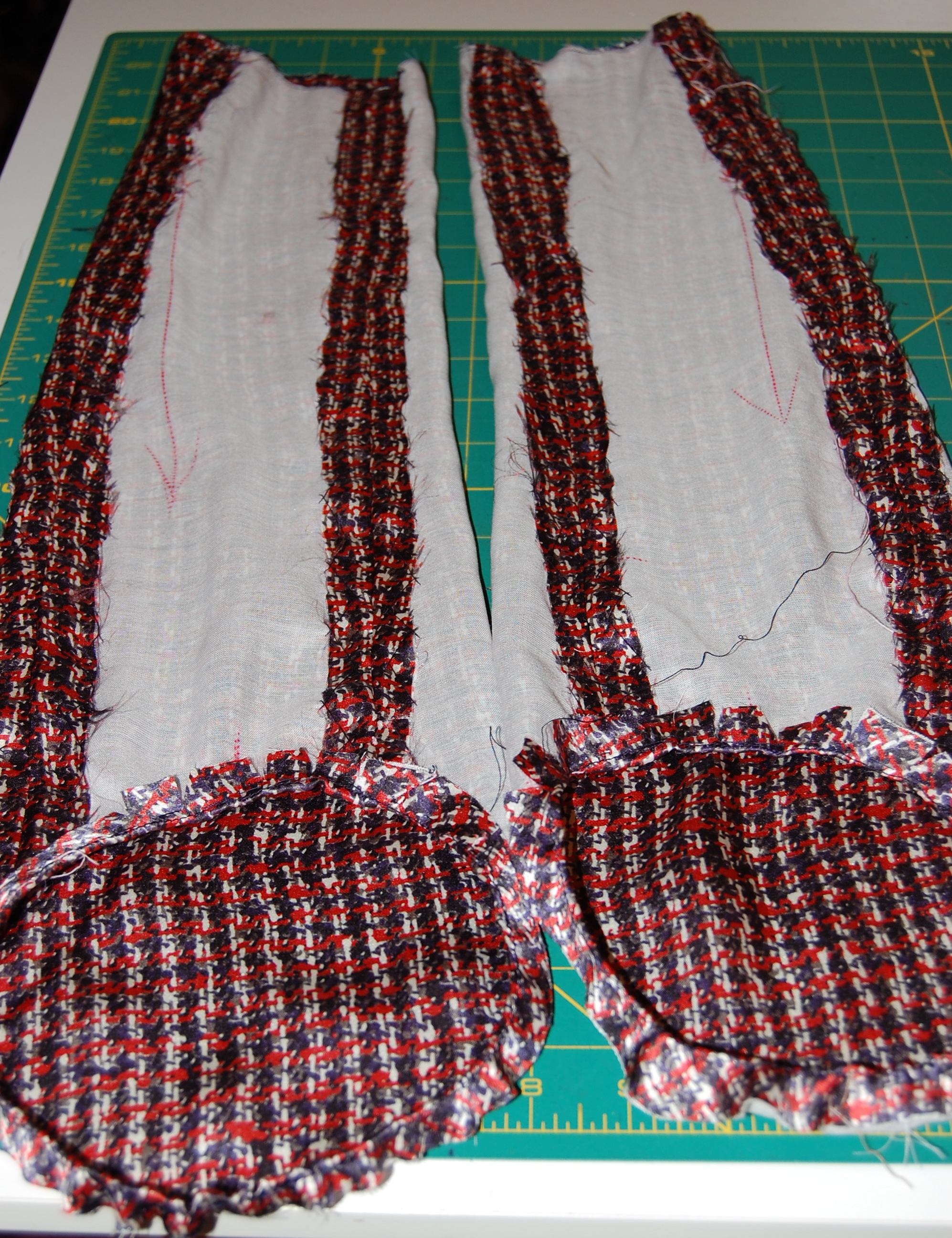
Another section of the pattern which did not present a proper interior finish for this very particular dressmaker, was the drape. It is partially gathered as you can see from the instruction sheet.

#7 shows the gathering of the interior drape.

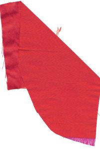
As I did not care for a raw edge to be hiding under the drape, I decided to bind the edge with Hug Snug tape. This worked out so well and looks nice and tidy!

Besides these time-consuming corrections and additions, there were the hours of work involved in making the bow, attaching it to the dress, and making the belt. Then when I thought I was just about finished, I remembered I needed to add lingerie keepers, due to the wide stance of the shoulders. Okay, I thought. What else??

I have decided the belt is a little loose, so I need to reset the fasteners… What else, indeed!

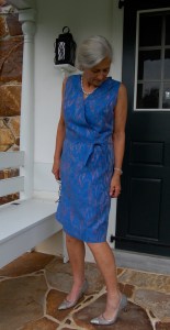
What a good feeling of accomplishment to finish this dress and like it!

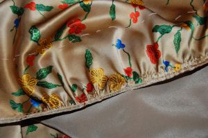
Here is a detail of the bow. I do love a tailored bow!

I haven’t worn it yet for any occasion, but when I do, I hope there is champagne involved, as I am going to toast myself for successfully finishing this one!


46 Comments

Filed under Bows as design feature, Cocktail dresses, couture construction, Linings, Messages from past owners of vintage patterns, Mid-Century style, sewing in silk, side-placed zippers, The Conde Nast Publications, Uncategorized, underlinings, vintage Vogue Designer patterns, vintage Vogue patterns from the 1960s

“Mrs. Scimpy”

Two years ago I made this dress:

The Year of Magical Sewing

From this pattern:

Perfect Blue - Mattli pattern

Once I had the dress finished, I liked it so much that I decided a coordinating coat, with a lining to match the dress would be wonderful – sometime. I even went so far as to order more of the blue silk blend fabric from EmmaOneSock, while I knew it would still be available.   Tucked away in my fabric closet, it has patiently waited while I searched and searched for the right coat fabric in a coordinating/contrasting color and in silk. I finally found it last Spring, during a online silk sale at Britex Fabrics in San Francisco.

Taffeta coat - swatch

The fabric is lightweight silk taffeta, with the weft in persimmon color and the warp in fuchsia pink, giving it a shimmer which changes color with movement. I decided it would be my first project after we returned from our summer travels – with the intention of having it ready to wear with the dress to a September wedding, which happens to be at a location where a light coat or wrap is advisable.

All along I had intended to use the Jo Mattli coat pattern that is shown with the dress. I liked the idea of no buttons and simple lines.

Taffeta coat - Mattli pattern

The thumbnail diagrams on the back of the pattern envelope.

The thumbnail diagrams on the back of the pattern envelope.

However, when I got the pattern pieces out, here is what I found:

Front and back pattern pieces

Front and back pattern pieces

Yep, that is one voluminous coat! I knew that, even with taking some of the bulk out, I would probably still look like I was wearing a tent. With that slim dress, I am not sure why the coat has to be so full, but I had no qualms about deciding not to go in that direction. However, I still wanted a coat with no buttons or maybe just one button. I dug through my collection and came up with several possibilities, which included this one:

I do like the looped buttons, but I just wasn't convinced this was the right look.

I do like the looped buttons, but I just wasn’t convinced this was the right look.

I have another Jo Mattli coat and dress design which I love, but I think the coat would make up much more attractively in wool rather than silk taffeta, so I ruled this one out:

Taffeta coat - 2nd Mattli pattern

Then I came across this one: View B shows it with no button/buttonholes down the front. I also like the three-quarter sleeves, with the cuff detail.

The pattern description reads: "Striaght coat with or without buttoned closing below notched collar. Long and below elbow length sleeves with button trimmed vent. Optional pocket in side. Slim skirt.

The pattern description reads: “Straight coat with or without buttoned closing below notched collar. Long and below elbow length sleeves with button trimmed vent. Optional pocket in side. Slim skirt.”  I knew this coat would take on an appropriate dressy look when made up in silk taffeta.

Now –  I try to buy vintage Vogue patterns in sizes with a 32” bust and 34” hip measurement; however, that is not always possible, so I will go up or down a size if it is a pattern I really want to have. When I make my muslin (toile) for such a pattern, I try to include adjustments for the size issues so that my final alterations will be easier. However, the handwritten note on the front of this pattern gave me pause: “too scimpy” it reads. She obviously meant “skimpy,” but those two words spoke volumes to me (no pun intended!) Maybe I would just follow the pattern exactly (except for lowering the bust which I always have to do), and see if the size is okay.

Taffeta coat - pencil notes

And that is exactly what happened! Little did Mrs. “Scimpy” know that her simple pattern review, circa 1961, would save me both time and effort in 2016!

It looks like Mrs. Scimpy made her coat out of red wool, with a matching skirt. Her pencil notes on the yardage required indicate such, along with the cost of the fabrics: $22. I certainly hope she figured out that the coat was too skimpy in time to make adjustments, as a red wool coat with matching skirt would be lovely indeed!

8 Comments

Filed under Coats, Dressmaker coats, Messages from past owners of vintage patterns, Mid-Century style, silk, Silk taffeta, Uncategorized, vintage Vogue Designer patterns, vintage Vogue patterns from the 1960s

Magnificent Obsession

Sometimes the dreams and aspirations of our younger days take a long time to come to fruition.  Although I was doing a lot of fashion sewing for myself when I was in my twenties, there were many more Vogue pattern designs which I never had the opportunity to make.  One was Vogue Paris Original #2668 by Hubert de Givenchy (1927-).

Coats of certain length - 7 I never forgot the jacket, in particular, featured in this Designer Pattern.  Over the years I occasionally obssessed about this pattern, regretting that I had not purchased it.  I never imagined I would have a second chance to make it mine, but thanks to the marvels of the Internet, I did.  When I saw a listing for it in this Etsy store months ago, and it was in my size, I knew it was time to buy it.

The use of color blocking, as featured in View A, became stylish in the mid-1960s, when Yves Saint Laurent introduced his classic Mondrian dress.

This little sketch from The Fairchild Dictionary of Fashion, Fairchild Publications, Inc., New York, New , York, 2010, p. 329, shows the classic blocked design.

This little sketch from The Fairchild Dictionary of Fashion, Fairchild Publications, Inc., New York, New  York, 2010, p. 329, shows the classic blocked design.

The appeal of the use of large geometrical sections of contrasting colors was widespread then and has, for many of us, never lost its cachet.  The clean precise lines, and diverse use of fabrics in color blocking must have appealed to Hubert de Givenchy’s sense of design.  Known for simplicity and refinement, according to Arlene C. Cooper, writing in the St. James Fashion Encyclopedia, Givenchy emphasizes “line rather than decoration”.  Further, Givenchy is known for “coats that are marvels of line and volume…”  (St. James Fashion Encyclopedia, Visible Ink Press, Detroit, MI, 1997, p. 154).  Vogue Patterns must have been exceptionally pleased to have the rights to this design for its Designer Series in the early 1970’s.

I started my jacket in early February this year in Susan Khalje’s Couture Sewing School class in San Francisco.  I just finished it.

Magnificent Obsession

Magnificent Obsession

I like it worn open as well...

I like it worn open as well…

A look inside...

A look inside…

A back view.

A back view.

Making this was one of the most enjoyable sewing experiences I have ever had.  Being privileged to get Susan’s expert guidance on some parts of the jacket certainly was part of the equation.  In addition to that, however, were the preciseness and subtle design details of the pattern, which made it a pleasureable sew.  A few of those details are:

1)  the genius of the extra side panel, which enhances the “swing” line of the coat.

2) that side panel  also allows the use of a Dior dart which adds just enough to the bust to keep the line smooth, but ample.

Th instruction sheet gives a good diagram of the small Dior dart tucked into that front side seam.

The instruction sheet gives a good diagram of the small Dior dart tucked into that front side seam.

3) the concealed front allows the clean appearance of the coat to be unencumbered by buttons.

I chose these navy blue buttons for the concealed front.  They are flat, simple, and match the blue exactly.

I chose these navy blue buttons for the concealed front. They are flat, simple, and match the blue exactly.

4) the flap pockets, which conceal the openings, again with minimal interruption to the clean and “simple” look.

The concealed opening, with a flash of pretty pocket lining.

The concealed opening, with a flash of pretty pocket lining.

I did make a few changes/alterations to the jacket, ensuring a better fit for me in 2014.

First, with Susan’s assistance, I took some of the volume out of the back seam, as it was just too full for my frame.  Second, I added ½ “ to the diameter of each sleeve, as they were just a little too slim for comfort.  Doing this allowed me to enlarge the lower armscye, also adding comfort and more flexibility.  I felt like I was able to do these alterations without changing the look of the jacket.  I also made two “visible” changes, although still in keeping with the design.  The original flaps looked a little too “’70s” to me.  I reduced the “depth” of them by 7/8″, so that they are more in keeping with modern sensibility.

These muslin patterns are folded in half to show the depth of the original flap and the depth of the altered one below.

These muslin patterns are folded in half to show the depth of the original flap and the depth of the altered one below.

The pattern had separate pieces for the lining, and even the lining followed the blocked design.  I had chosen a printed silk charmeuse (at Britex , naturally!) for my lining, which did not need to be block sewn.  So, using the muslin I had made for the lining, I cut the “lengths” as one piece, eliminating 16 horizontal seams.  I also underlined the silk charmeuse with a very lightweight rayon voile, which made the lining fabric easy to control, and adds another layer of warmth to the overall coat.  This photo shows the underlining in the sleeve linings before I sewed them into the coat.

Magnificent Obsession

The jacket turned inside out, showing the lining.

The jacket turned inside out, showing the lining.

The inside back of the coat.

The inside back of the coat.

Finally, the pattern called for topstitching the exterior edges of the coat.  Due to the nature of my napped fabric, I thought machine topstitching would detract rather than add.  But – I wasn’t happy with the thought of no topstitching, either.  So I decided to do it by hand.  It wasn’t nearly as time-consuming as I thought it would be, and I am happy with the result.

The topstitching is very subtle, but you can see it here on the pocket flap.

The topstitching is very subtle, but you can see it here on the pocket flap.  Click on the photo for a close-up.

One more thing about this pattern.   When I received it, the pattern pieces for the pants and sleeveless tunic were cut and had obviously been used (although every piece is intact).  The tissue pieces for the coat were still in their factory folds.  On the outside of the pattern in the upper right hand corner is the name Georgia Sanders.  I guess I’ll always wonder if she had plans to make the jacket, too.  I’m so glad she bought this pattern and kept it in such good condition so that it could find its way eventually to me – to help me realize my magnificent obsession from my younger self.

20 Comments

Filed under Buttons - choosing the right ones, Coats, Color blocking, couture construction, Dior darts, underlinings, vintage Vogue Designer patterns, vintage Vogue patterns from the 1970s, Vogue patterns, woolens

Suited for Spring

Last Fall when I found emerald green matka silk on Waechter’s website, I quickly purchased 3½ yards.  At 45” wide, I knew that amount would be enough for a Spring suit although I really did not know which pattern I would be using.  It seems I often  purchase fabric and then end up not actually using it for a year – or more.  But with emerald green so front and center in fashion this year, I definitely decided to make this project a top priority.

This is the silk I ordered from Waechter's Fine Fabrics

This is the silk I ordered from Waechter’s Fine Fabrics.

I envisioned what is known as a “dressmaker suit.”  Fairchild’s Dictionary of Fashion (3rd edition, Fairchild Publications, Inc, New York, New York, 2003) gives this definition:  “Woman’s suit made with soft lines and fine details, as contrasted with man-tailored styles that have the sharply defined lines of a man’s suit made by a tailor.  Fashionable in 1950s and revived in the mid-1980s.”  Specifically, I envisioned a straight skirt (aka pencil skirt in today’s fashion parlance), a short-ish, dressy jacket with some neat detail on it, and adorned with buttons to compliment the sheen and slubby texture of the silk.

First step was to go to my pattern box, brimming over with vintage patterns (and a few new ones).  I quickly had my selection narrowed down to two possibilities, but one was actually a sheath dress with coordinating jacket, not a jacket and skirt. (Yes, there is a definition for this category as well, according to Fairchild’s:  “Suit dress:  Used in 1960s to refer to a jacket and dress ensemble that resembled a tailored suit.”)

Is it the hat that makes this ensemble so appealing - or just good styling?

Is it the hat that makes this ensemble so appealing – or just good styling?

I hashed over the two reservations I had about using this pattern:  1) I was a little short on yardage – about a quarter of a yard – and just not completely confident that I would be able to cut this pattern out with the generous seams that I have come to like so much, and 2) I have a RTW (gasp!) silk shell top which will look stunning, I think, paired with an emerald green silk skirt and matching jacket.  So in the end, I decided to go with a dressmaker suit to be made from this pattern:

I'll be making View B, which just happens to be shown in emerald green!

I’ll be making View B, which just happens to be shown in emerald green!

And then, the bonus!  Actually three of them . . .  I had forgotten that tucked inside the pattern envelope were two clippings obviously placed there by the original owner of the pattern.  She was doing some “comparison shopping” for styling.

The first clipping is for another pattern – a Spadea, available through mail order from the newspaper.  Fortunately, the date of 1964 shows up on one corner.

Dressmaker suit - 3

The second clipping is from Vogue magazine, showing a fashion from 1968.

The jacket of this suit, just like the Spadea pattern, is very similar to the Vogue pattern.

The jacket of this suit, just like the Spadea pattern, is very similar to the Vogue pattern.

Perhaps the original owner was trying to decide between a striped fabric and a plain one?  Maybe she was really undecided about making this style suit?  I’d love for her to sit down with me over a cup of coffee so we could discuss this pattern!  As it turns out, she never made the jacket, as its pieces were still in factory folds when I obtained it.  The skirt pattern shows signs of having been used, however.  I’ll never know why,  after all her thought about this suit, she never made it.  However, her decision afforded me the third bonus – the original pattern label – pristine after so many years.

I am looking forward to sewing this label into my green silk suit.

I am looking forward to sewing this label into my green silk suit.

I’ve made my initial adjustments to the pattern and am now making the muslin.  Like my “pattern predecessor” I am dreaming of a certain look.  Now it’s up to me to finish what she started.

11 Comments

Filed under Dressmaker suits, kimono sleeves, Messages from past owners of vintage patterns, sewing in silk, Uncategorized, vintage Vogue patterns from the 1960s, Vogue patterns

Eating my words.

I never expected to find a pattern from the decade of the ‘80s that I liked, as my refrain about fashions from that span of time has always been:  “Those ’80s’ styles were just too awful”.  But I humbly ate my words when I finally found a pattern (from an Etsy shop) for a sarong skirt, which just happens to be from 1985.

I won’t be making the bra top… And notice the “big” shoulders on the blouse, which otherwise would be kind of cute, I think!

It’s quite obvious where the Vogue pattern designer got the inspiration for this sarong and “bra-type top” look.  Here is the scoop from Fairchild’s Dictionary of Fashion , p. 395 (Fairchild Publications, Inc., New York, New York, 2010):

“Long straight wraparound skirt made of bright-colored tropical design fabric with deep fold in front, held on by a scarf around waist.  Worn by men and women of the Malay Archipelago.  Adapted as a beach dress style with wraparound skirt draped to one side and strapless top first designed by Edith Head for Dorothy Lamour film Hurricane, in 1937.  Worn by Lamour in many films of the 1930s and 1940s. [my emphasis]

This sketch accompanies the entry for sarong skirt/dress in Fairchild’s Dictionary.

The original owner of the pattern made the long version skirt while I decided to make the shorter version.  She left cryptic notes throughout the instruction sheet.

Here is an example of some of the notes which the original owner made on the instruction sheets.

I made some of my own notes, but I wrote them on the muslin which I made to test the pattern before cutting into my fashion fabric.   I am glad I did, too, as I discovered that the overlap for the skirt was not quite enough for a “street” skirt (as opposed to the beachy/resort intent of the pattern).  So – I made the side panels each about 2” wider.  Then to make the waist still work, I added a dart in the left side front (which is the hidden side of the wrap).  I  made the ties each about 2 inches longer, as I thought they would be more becoming and lay flatter if they had a little more length to them.

Here is the diagram from the envelope which shows the thumbnail details of the two skirts.

I had picked out this tropical-look fabric, ordered a swatch, then the yardage from B & J Fabrics in New York.

Here’s how it all turned out:

Not quite Dorothy Lamour.

A close-up view, showing the ties.

When I was putting my new skirt in my closet, I spied my chartreuse green Tommy Bahama top, which is almost vintage itself, it’s so old.  But, h-m-m-m-m, the wheels started turning and I paired the two together here:

The green in the top actually matches the green in skirt better than it shows here. Just wish I had some green shoes to match…

From 1937 – to 1985 – to 2012, I suspect this is one style which will never go out of style.

16 Comments

Filed under 1980's dress patterns, Asian-inspired dress designs, Uncategorized, vintage Vogue Designer patterns, Vogue patterns

Messages from the past: handwritten notes on vintage patterns

Many vintage patterns have a visible stamp on them which tells the name of the store where it was originally purchased.  (Those of us who sew know that patterns, once purchased, are non-returnable – and it seems it was ever so…)  Sometimes the stamp also lists the location of the store, but not always.  Either way, that stamp is a visible clue to the pattern’s past life.

In the upper left hand corner, you can see the stamp for "Fashion Fabric Center" in Albuquerque, New Mexico. This pattern is from the early '70s.

If you look closely, you can see the stamp on this envelope which tells you it was purchased from Meier & Frank Pattern Department, Portland, Oregon. This pattern is from the 1950s.

I can’t help but visualize a well-put-together woman perched on a stool at the pattern counter of the mentioned store,  thoughtfully flipping through the pages of the Vogue Pattern catalogue, and finally settling on this one pattern.  I wonder what occasion, if any, she was making it for?  Was she, like I was in the ‘60s and ‘70s, agonizing a bit over spending 75 cents or $1 or $3 or $5 for just a pattern, and then loving it once the decision was made?  Was she buying it to make it herself or in coordination with a dressmaker who would be the one to create it for her?  What fabric and color was she intending for the pattern?  Or did she buy the pattern and then, for one reason or another, never make the intended garment?

And then, every once in a while, there is a handwritten note or diagram on a pattern envelope.

These jottings, sometimes cryptic, other times precise, provide clues which begin to answer some of those questions.  In the months I have been buying vintage patterns, I have found myself privy to some of these “messages” from the past – and here are the small stories they tell:

Fit seems to be an important focus.  Kudos to those dressmakers who recorded their difficulties on the pattern envelope!

I think this lady should have purchased a larger size! She needed to add 1" center front and center back!

Beware! Poor fit in jacket! But I bet it was lovely in coral nonetheless.

Check out this listing on Etsy to see a rather melancholy note about fit:  “would have been best to have gotten the med. size.”  I guess that pattern ran large!

Choice of fabric and color (see above image) are also details which have been noted, sometimes multiple times on the same envelope.

I think this pattern must have belonged to a professional dressmaker. She made it up in red and green wool for Audrey Dolan, with long gathered sleeves. It looks like she also made it in tan and in a print (Prt) with 3/4 sleeves. The pattern tissue is still in great condition, despite all that pinning and cutting!

This pattern obviously belonged to a lady who was either a dressmaker, noting her expenses, or a home sewer who kept careful records for her household/clothing budget.

This lady must have made this dress in coordination with another pattern. Both patterns together cost her $2.50. She was also buying multiple zippers, to the tune of 80 cents! Her big expenditure was fabric (material), which she lists at $8.00.

And here is a pattern which Mrs. John Morton “Chgd” [Charged]  Perhaps she did not have to be as careful with her expenditures!

I think Mrs. John Morton was one stylish lady!

This next pattern is a study in contradictions:  The owner has carefully noted some yardage requirements, written notes to remind herself to “get seam finisher for beige jacket” and “also get seam binding for dress”.  But the pattern came to me uncut, factory-folded and therefore unused, with its original Vogue label included.  I wonder what prevented her from ever making this lovely jacket and dress?

We know she intended to make the jacket in beige, but she doesn't tell us about her color choice for the dress!

Next, it’s always fun to see someone’s intended changes to the line or details of the pattern.  Here are two examples:

View A on the far left just did not suit this sewer. She wants to extend the length of the coat, and add the collar. What she is really saying is that she wants to make view B, but with top-stitching!

It seems lengthening coats was a popular thing to do! This lady drew the longer version of the coat (on the left) and was still deciding on making the pockets "slash" pockets instead of flap pockets!

Finally, sometimes all that is on a pattern envelope is a name – a simple notation, which quietly transcends the years!

Look below the figure in red and blue for the name written in pencil.

Here is a close-up of the signature. This pattern belonged to Mrs. Jim Spencer.

Mrs. Jim Spencer, I bet you looked fabulous in this suit!

7 Comments

Filed under Coats, Dressmaker details, Uncategorized, vintage Vogue patterns from the 1960s, vintage Vogue patterns from the 1970s, Vogue patterns