Tag Archives: vintage buttons

Red Letter Day-Dress

Red Letter Day:  “A day that is pleasantly noteworthy or memorable.”  (Cambridge Languages)

Day Dress: “The perfect all-in-one outfit, a day dress is a versatile and fashionable way to look chic and stay comfortable at the same time.”  

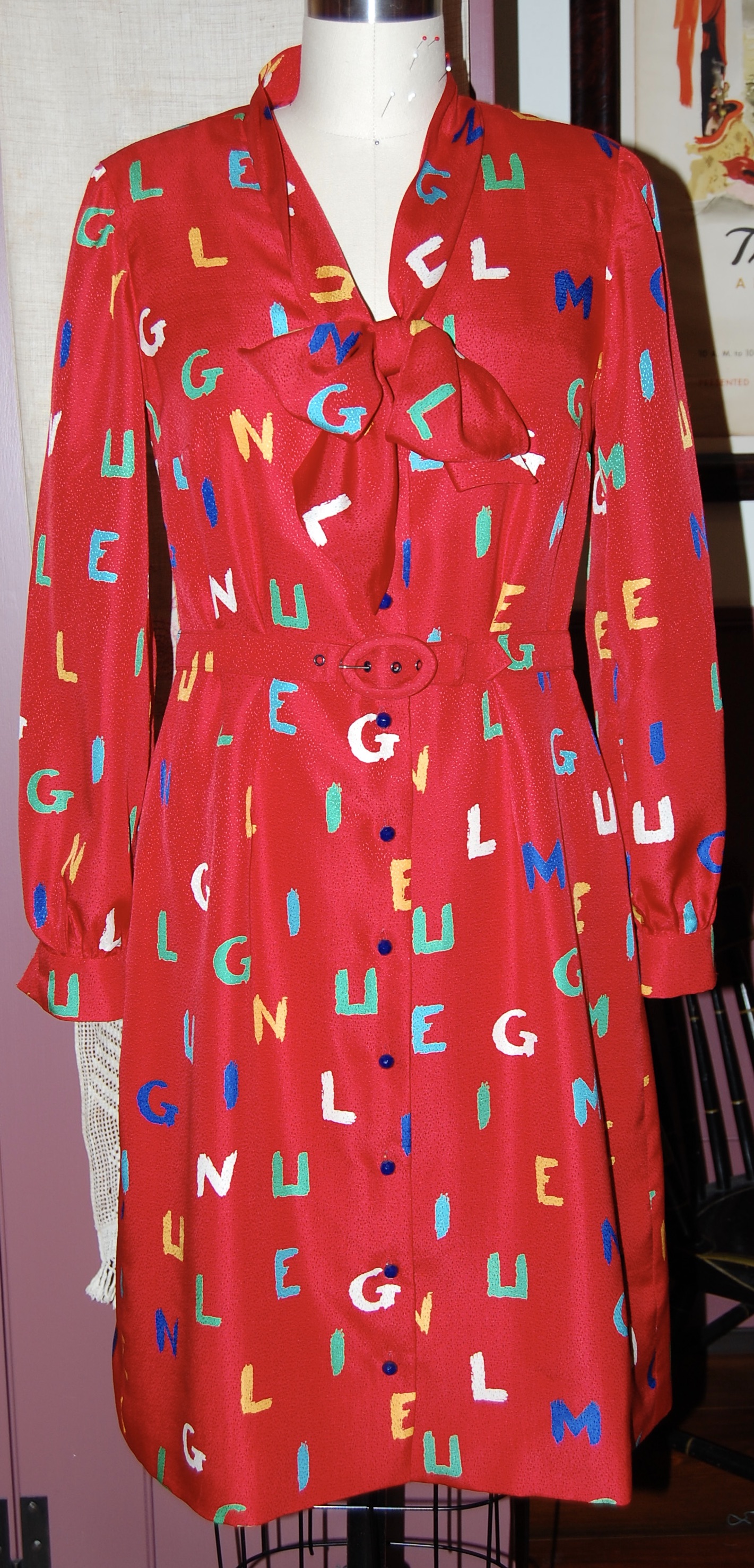
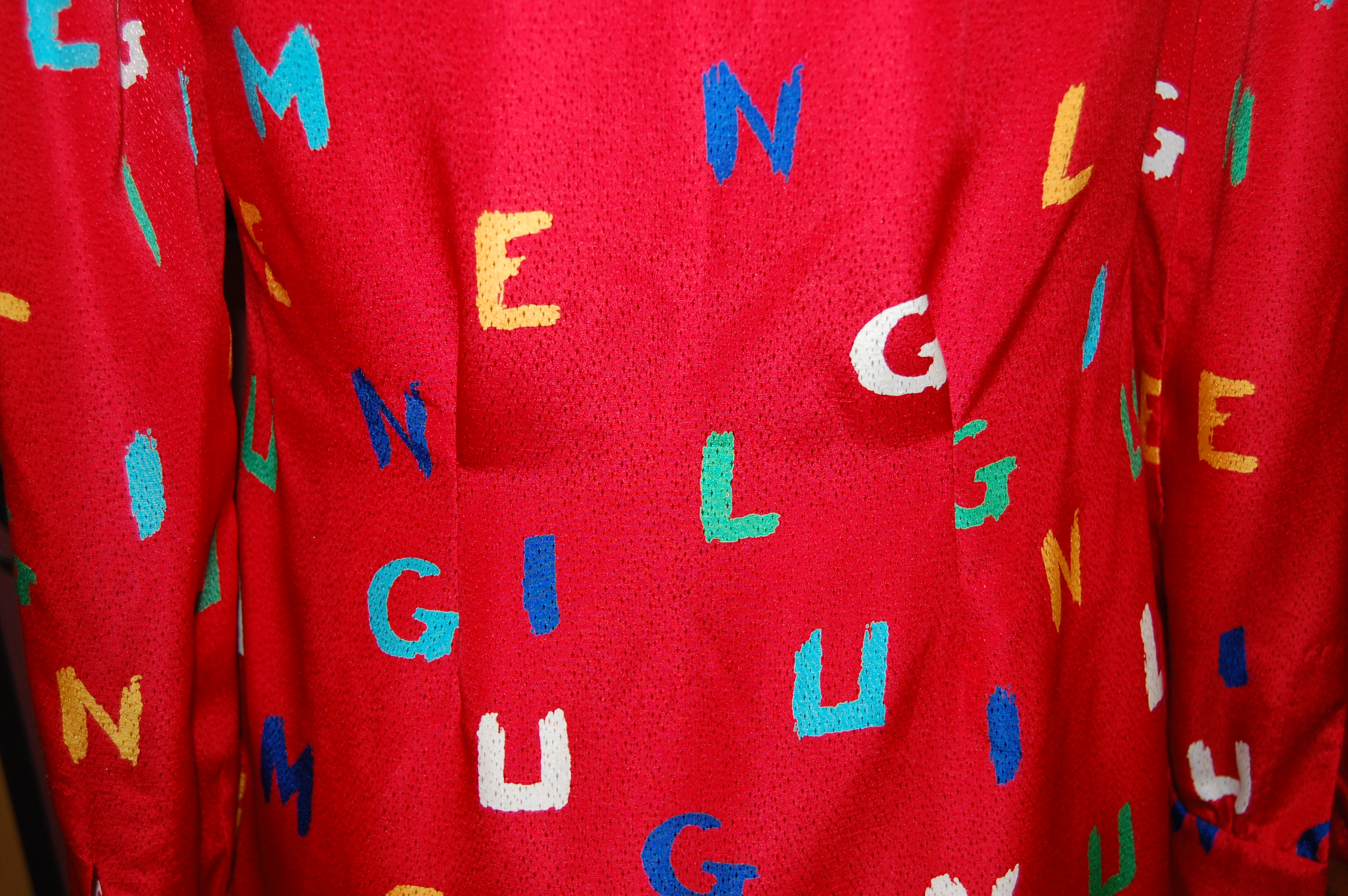
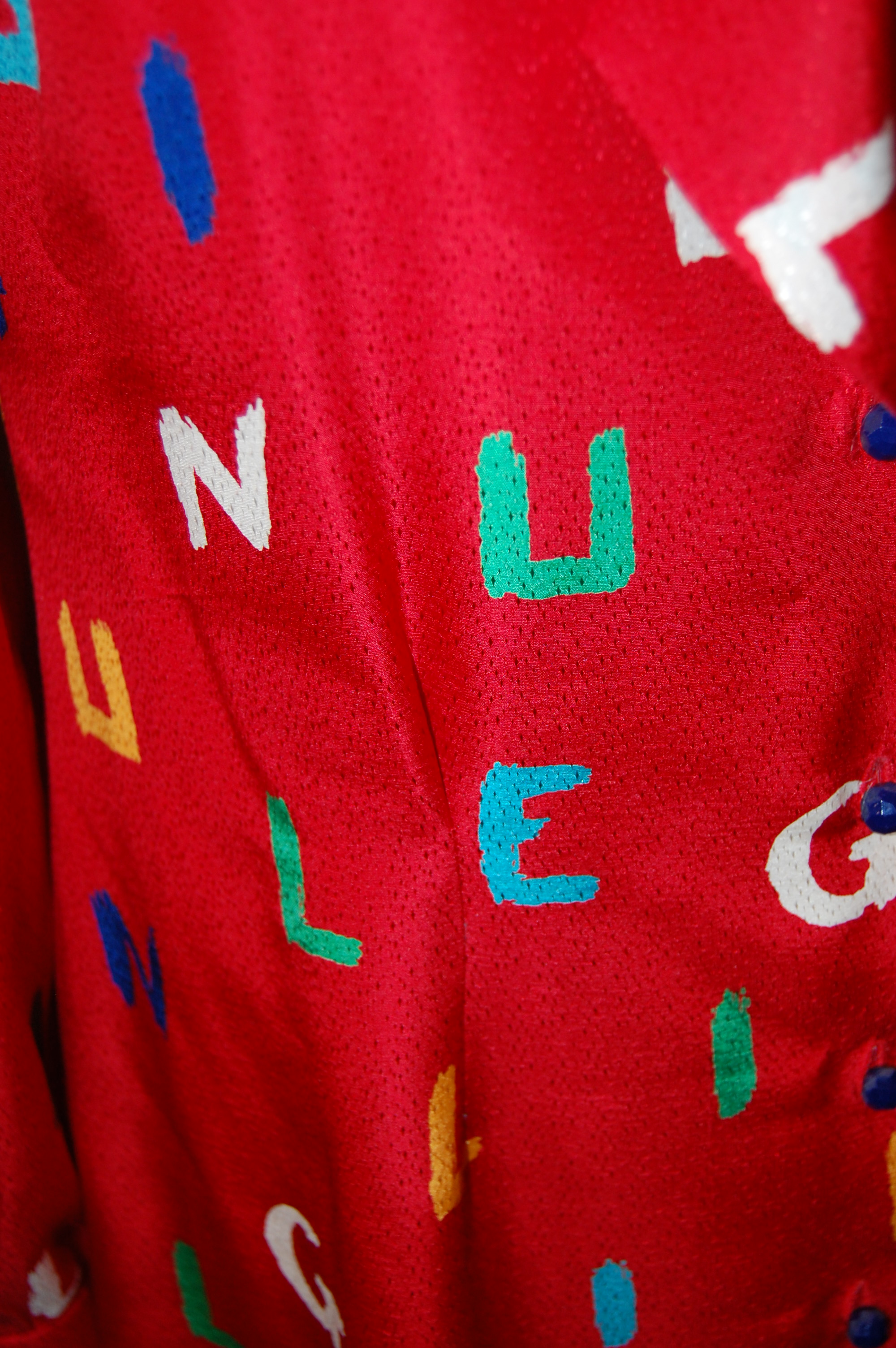
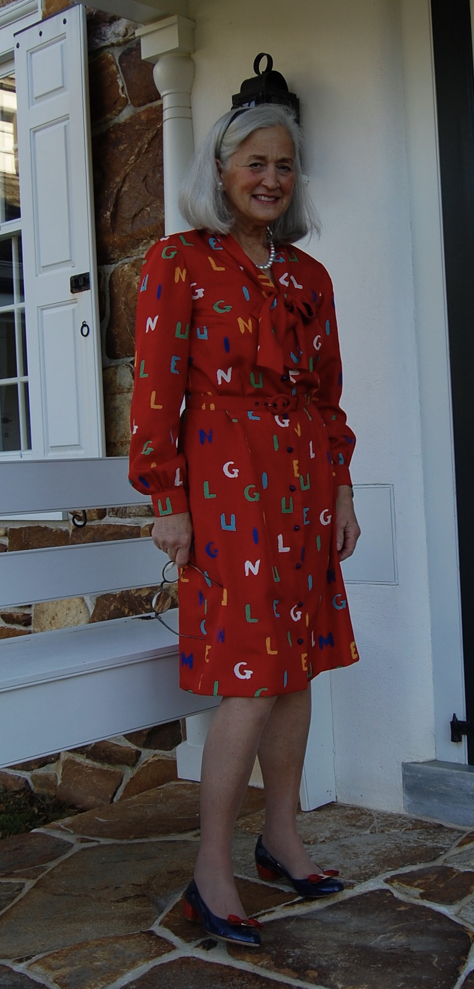
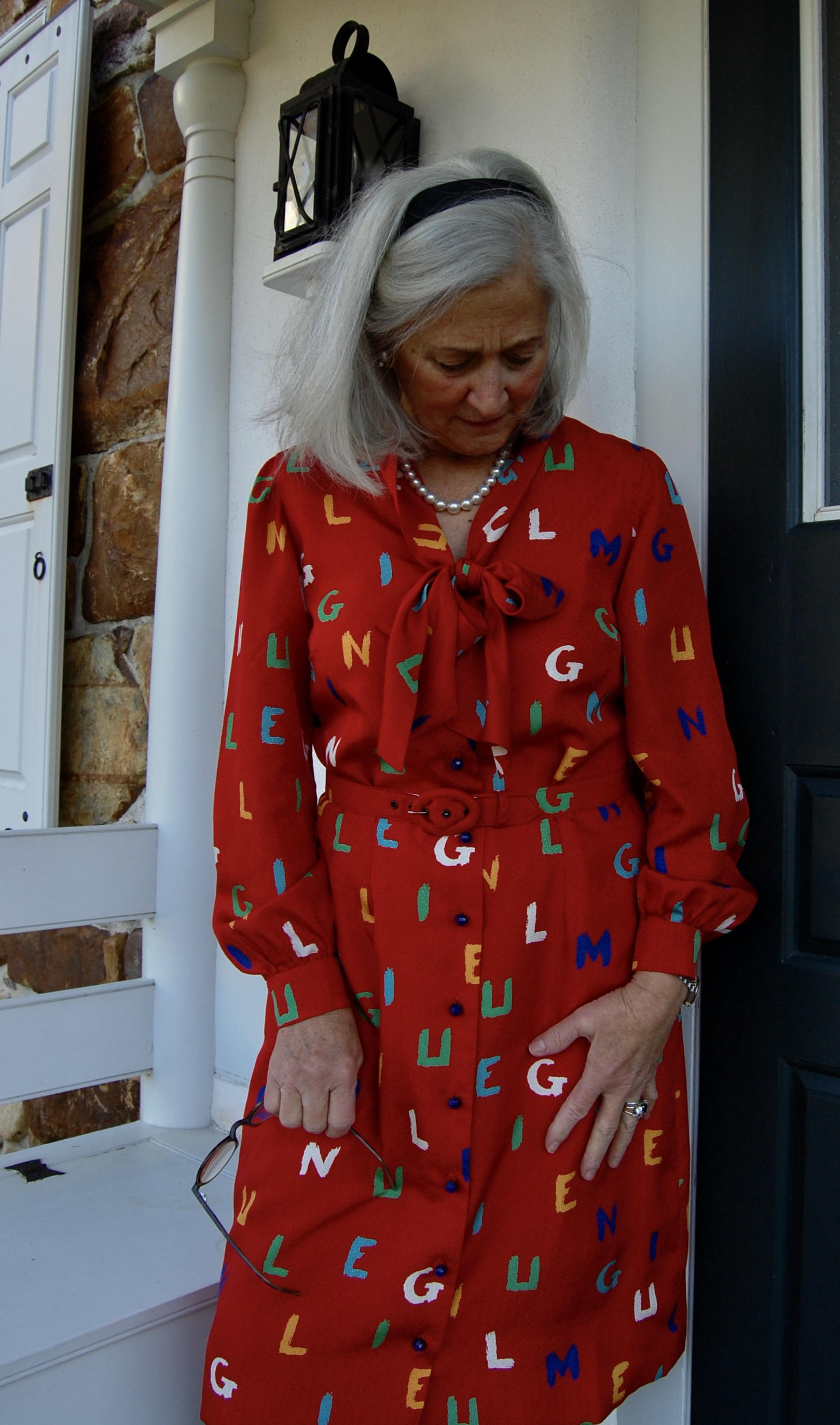
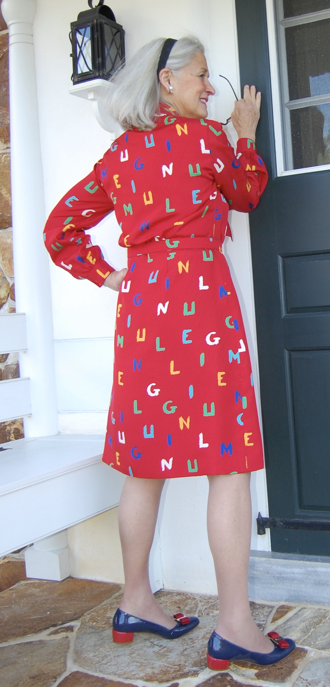
Any day I finish a lengthy project (successfully) is definitely a “red letter day.”  This dress just happens to be red, adorned with letters, and “back in the day,” as they say, it would have been considered a “day-dress,” although the apt description above is actually from a current website. (DavidJones.com)  

I found this silk at Britex Fabrics in San francisco.
I used this blouse pattern from 1957 as the basis for the dress, opting for long sleeves and the lower bow. I did not have enough buttons to make French cuffs, so I did plain cuffs.

I go into a little bit of how this dress evolved in my last post.  But of course there were many more decisions to be made along the way.  I had to decide: 

  • Do I underline this crepe de chine? 
  • If I underline it, what do I use for my underlining fabric?
  • Do I also line this dress?
  • If I line it, do I also line the sleeves?
  • The blouse pattern has floating, released darts at the waist.  Do I use that technique for this pattern transformed into a dress?
  • What color and type of buttons will most enhance the fabric?
  • Do I make bound buttonholes or machine-stitched ones?

So, let’s start at the beginning.  Because this was a very soft, fluid, lightweight crepe de chine, I thought it best to underline it.  My normal go-to for underlining – silk organza – would have reduced the fluidity of the silk, so I ruled that out.  Cotton batiste just did not seem the way to go.  When I found a silk batiste on the website for Farmhouse Fabrics, I knew I had my solution.

I believe you can, in this photo, see how lightweight and lovely this silk batiste is.

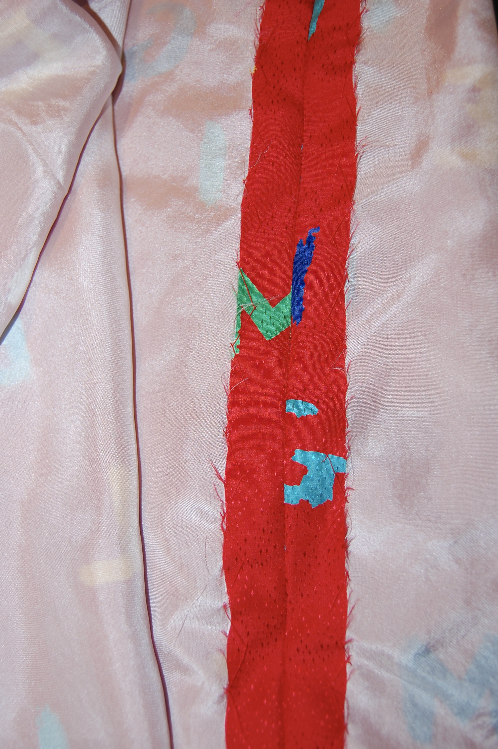
However, even with the ethereal nature of the silk batiste, I decided not to underline (or line) the sleeves.  I wanted them to retain their uninhibited flow.

I clipped the armscye seam carefully and pressed it to the interior of the dress. Then I fell-stitched the lining to the interior edge.

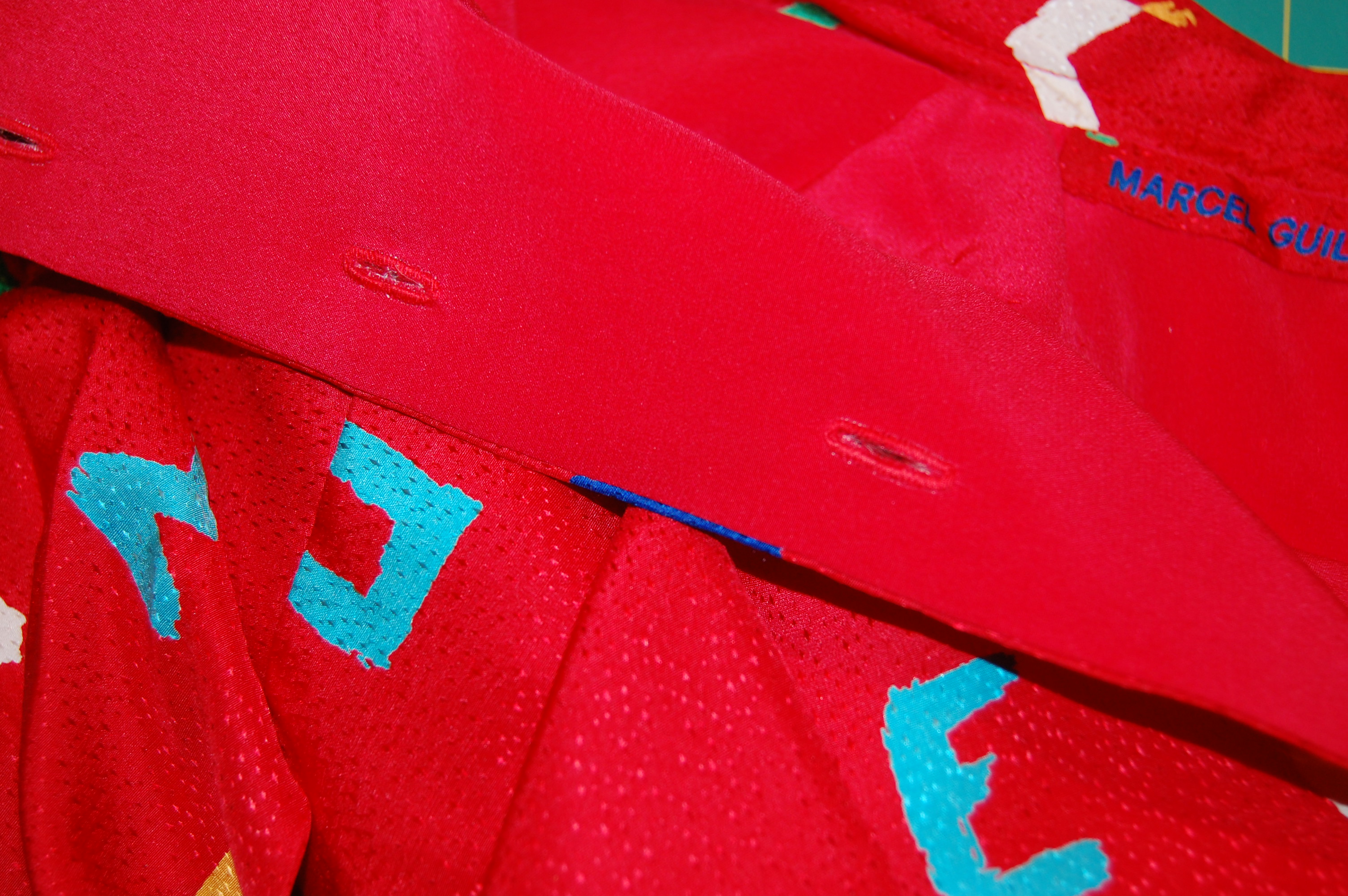
Once I had the underlining basted to the fashion fabric, I weighed whether or not to line the body of the dress.  I went with my gut feeling about this and decided to line it with a soft and lightweight red silk crepe de chine – almost a perfect match in color, as is evident in the above picture – which I purchased from Emma One Sock Fabrics.  

In doing so, I eliminated the front and neck facings which were replaced with the solid red lining. 

I eliminated the facings and used the red crepe de chine lining fabric to finish the interior of the body of the dress. Here is the right front edge.

I had worked out the floating dart question in my muslin/toile and decided to use them for the dress.  This left above the waist “blousy” and made it more fitted below the waist.  

This shows the released darts on the back of the dress.
Here is a side released dart on the front of the dress.
The released dart on one side of the dress front.

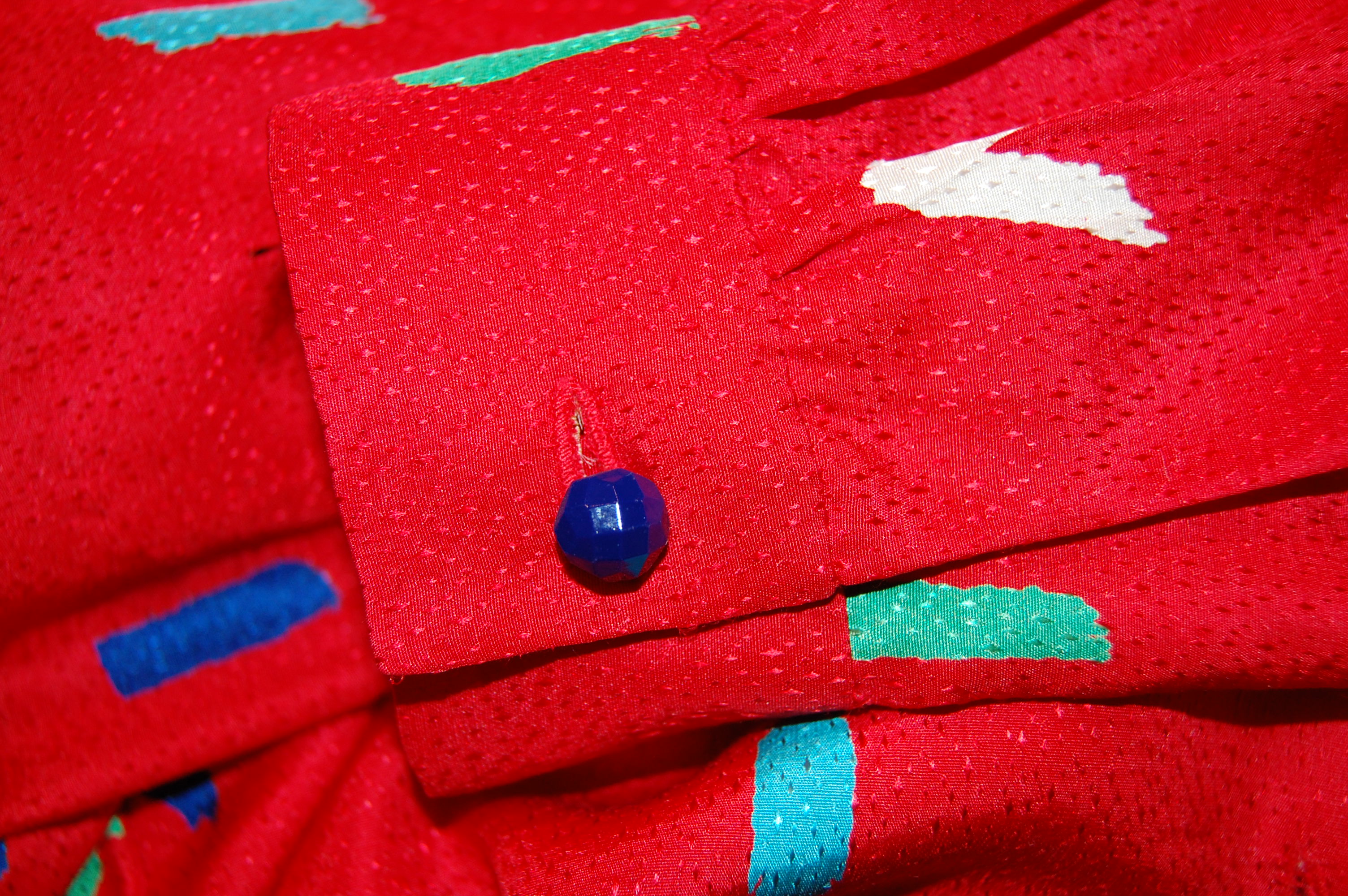
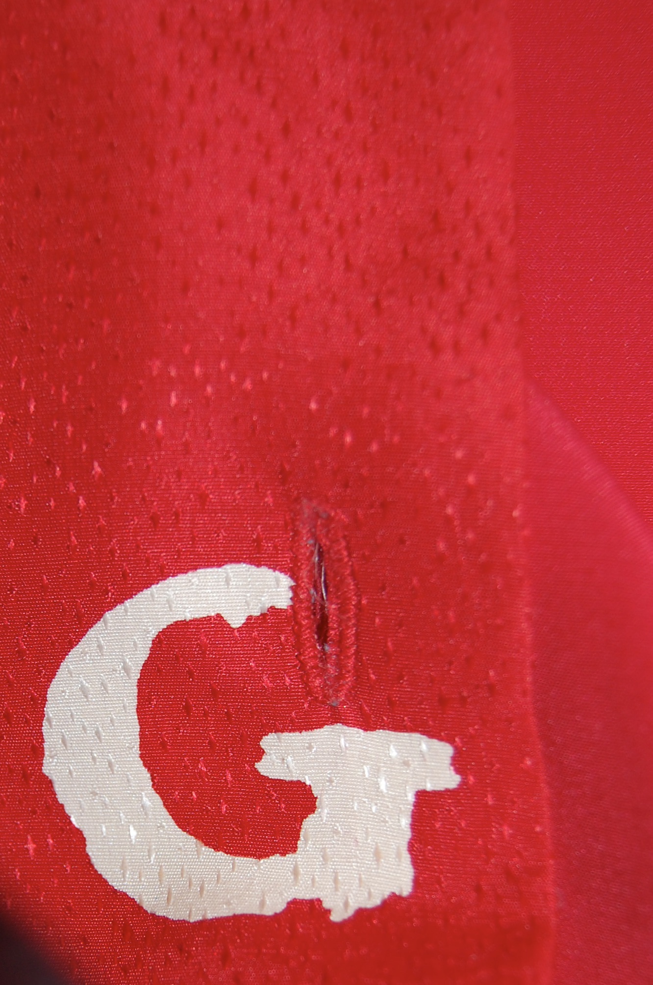
Buttons are always one of my favorite parts of a project.  I simply love looking for buttons – and I really love finding the perfect ones.  In this case, I knew I needed a large quantity – at least 10, depending on the size I found.  I did not think red buttons would do anything to enhance the dress, and I thought white pearl buttons would be too much of a contrast.  But then I found these buttons on eBay:

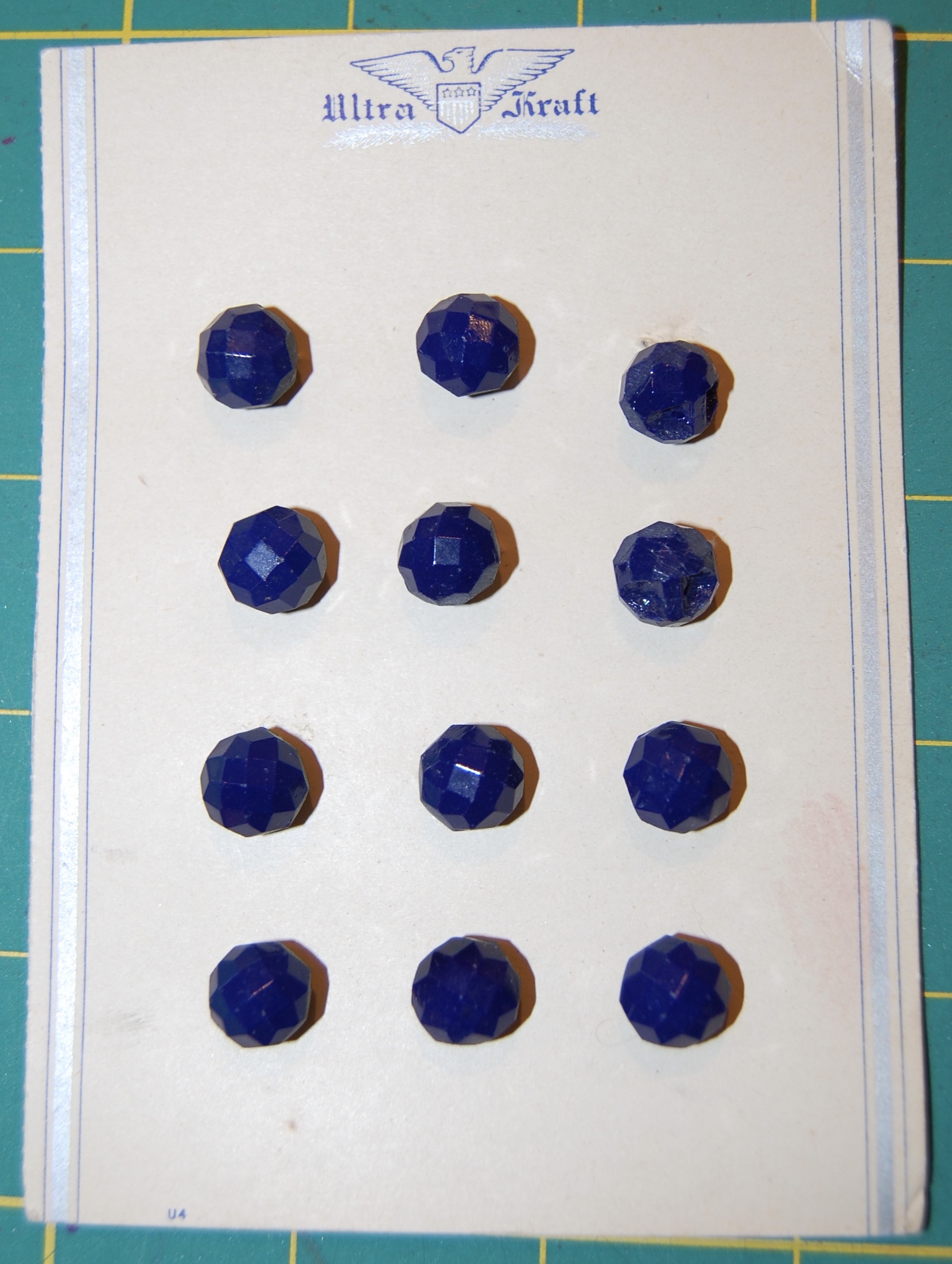
They are probably from the 1940s, cut glass, made in Czechoslovakia.  The card held 12 buttons, a good quantity for my purpose.  I think of these buttons as “small, but mighty.”  They provide the right contrast, and the faceted surface picks up the shimmer from the slight jacquard weave in the fabric.  I think they are perfect!

I used ten buttons for the front of the dress. These buttons are small so I was able to space them closely together to get the effect I wanted. I always know I have found the right buttons when they look like they “belong” – they do not steal the show nor are they too weak.
The right top neck edge, with a snap to keep things tidy under the tied bow.
The lone button on the sleeve, showing a bit of shimmer to match the shimmer in the fashion fabric.
The importance of the buttons shows off well in this photo, I think.

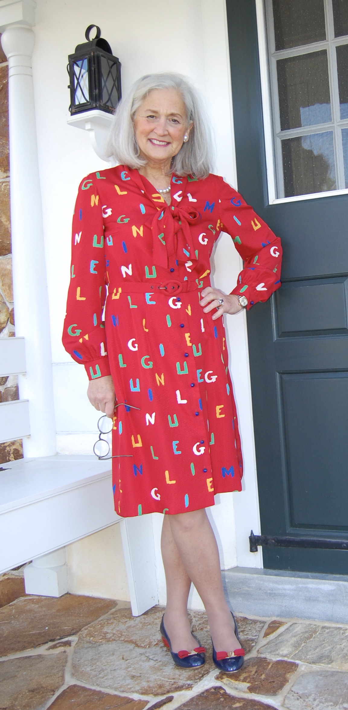
And finally, bound or machine-made buttonholes?  I did a sample of each.  I have recently started using my automatic buttonholer for my 1951 Singer Featherweight, and I must say, it is an engineering marvel.  It makes such amazing, precise buttonholes.  And although I do love bound buttonholes, I decided in this instance I would be happier with machine-made ones.  

I haven’t even mentioned the belt! I wanted a self belt, so I knew I would have to make it myself. I found a belt-making kit from the 1960s on eBay and used it for the buckle and the belt canvas.

So that about sums it up.  I had just barely enough fabric to eke out this dress (which seems to be a theme with me!), so I think it was meant to be.  Here’s to Red Letter Days – and the dresses which make them happy.  

36 Comments

Filed under Blouse patterns from the 1950's, Bows as design feature, Buttons - choosing the right ones, Day dresses, Linings, silk, Uncategorized, underlinings, vintage buttons, vintage Vogue patterns from the 1950s

What should a button do?

The last several things I have sewn have been button-free, using zippers or hooks to accomplish that all-important task of “closure”.  I’ve discovered I can go button-free just so long, and then I have to indulge my passion for those small wonders, with their miraculous power to be both eye-catching and practical.

I will leave a serious discussion of vintage buttons to the experts, but looking anew at some of my still-carded vintage buttons has revealed some interesting tidbits, too good not to share.  For example, it seems a lot of attention was given to “presentation” of the buttons on their cards.  These Luckyday buttons not only have a sweet lady on the front of the card, there is also a “Handy Rule for Mending” on the back.

I am guessing these buttons are from the late 1930s or early ’40s.

I love this feature!

It also seems that patriotic themes were commonplace.  There is no company named on these buttons, just the American eagle on a shield with the words TRADE MARK.

These simple buttons are quite eye-catching on this deep red card.

This is one of my favorite button cards of all time, the Maid in America. I doubt I’ll ever use these buttons, as it would seem a shame to take them off this amazing card.

This button card is like a small piece of folk art!

La Mode buttons are still manufactured – and still “Superior Quality”, and Costumaker buttons were “made in the U. S. A.”.

Two well-known button companies!

La Mode advertised frequently in Vogue Pattern Book magazine.  This ad from the October/November 1956 issue has the byline:  “You can tell just from the buttons it’s an important outfit!”

An ad from February/March 1958 features a fashion picture which looks incredibly timely today!

The featured fashion colors are certainly right for 2012!

And by 1960, their ads were beginning to take on a more modern look.

This ad appeared in the October/November 1960 issue of Vogue Pattern Book magazine.

Costumaker buttons also advertised in Vogue Pattern Book magazine.  In August/September 1958, this ad had the byline “Buttons that are more than buttons.”

This ad from April/May 1963 asks the question:  “What should a button do?”  Read the ad to get the answer!

One thing I know a button CAN do is be small but powerful!  The real truth of the matter mentioned in my first paragraph is that I have a set of buttons which I must use, as they have occupied my mind for the past weeks since I received them – it’s really quite that simple.  But they are not simple – they are actually quite demonstrative, and therein lies the rub, to paraphrase from Shakespeare.

The buttons which won’t let me sleep! Notice the American eagle motif on the card!

I have been pondering how to use them and with what color and type of fabric to pair them.  They deserve the perfect venue for more reasons than one.  They were gifted to me by my dear friend, Nancy C., who, when we met for coffee a couple of months ago, met me with her family button box in tow.  She invited me to pick out any buttons which I thought I could use for future sewing projects!  When I got past my incredulity at her offer, I picked out a few amazing single buttons (which you will see eventually) and about three beautiful sets of loose buttons.  These orange shells, however, sewn neatly to their original card, kept catching my eye (how could they not??)  At first, they struck me as just too orange.  I wasn’t sure I would ever be able to use them. Nancy and I kept talking about them over our coffee, pondering their color and shape, and then, before I knew it – I was hooked.

So you know by now that they came home with me.  And something with so much personality moves up in priority on the sewing list!  You’ll soon see them sewn onto a “Fifty Dresses” creation.   Thank you, Nancy, for this amazing gift, which is only eclipsed by your generosity and friendship!!

A little closer look at these bright beauties!

Stay tuned to see them doing what good buttons should do…  Gulp!  I’m hoping to do them justice!

6 Comments

Filed under Buttons - choosing the right ones, The Conde Nast Publications, Uncategorized, vintage buttons