
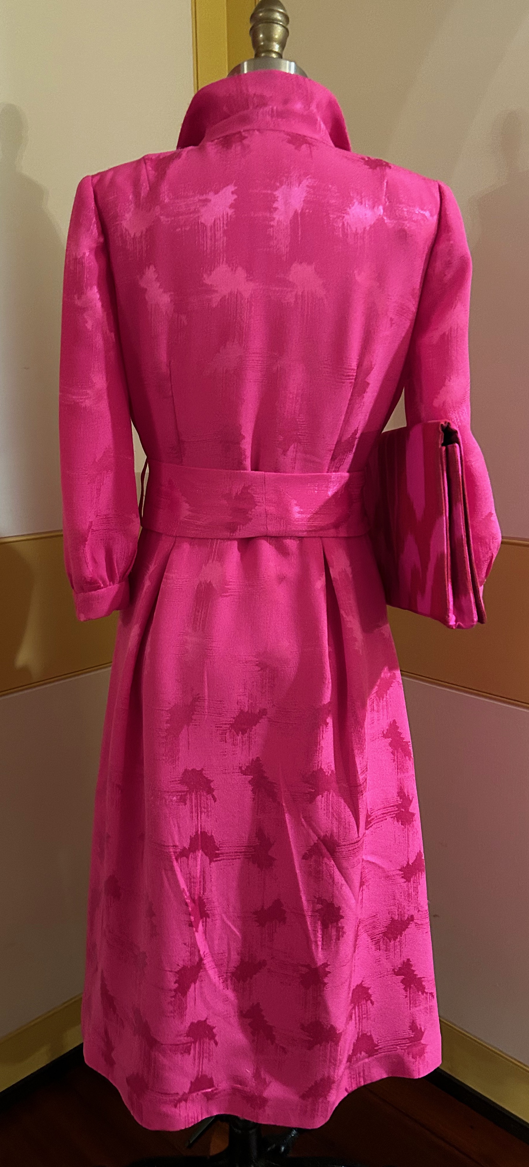
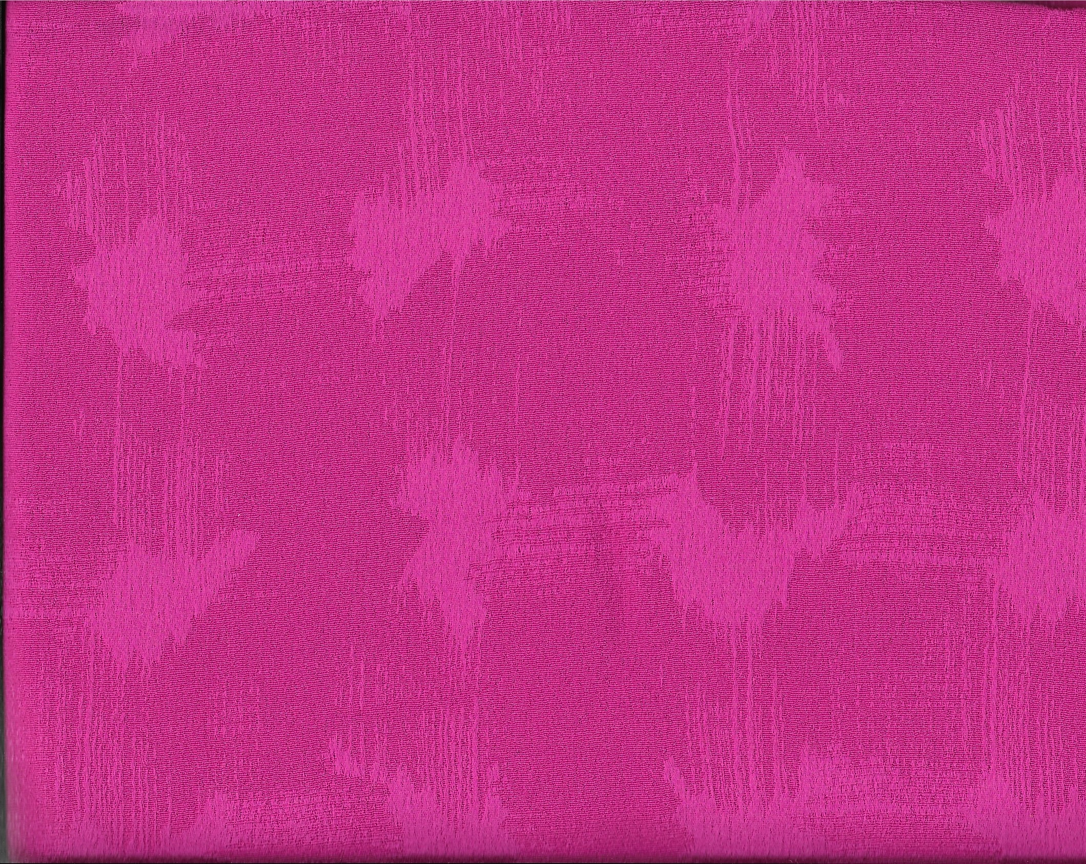
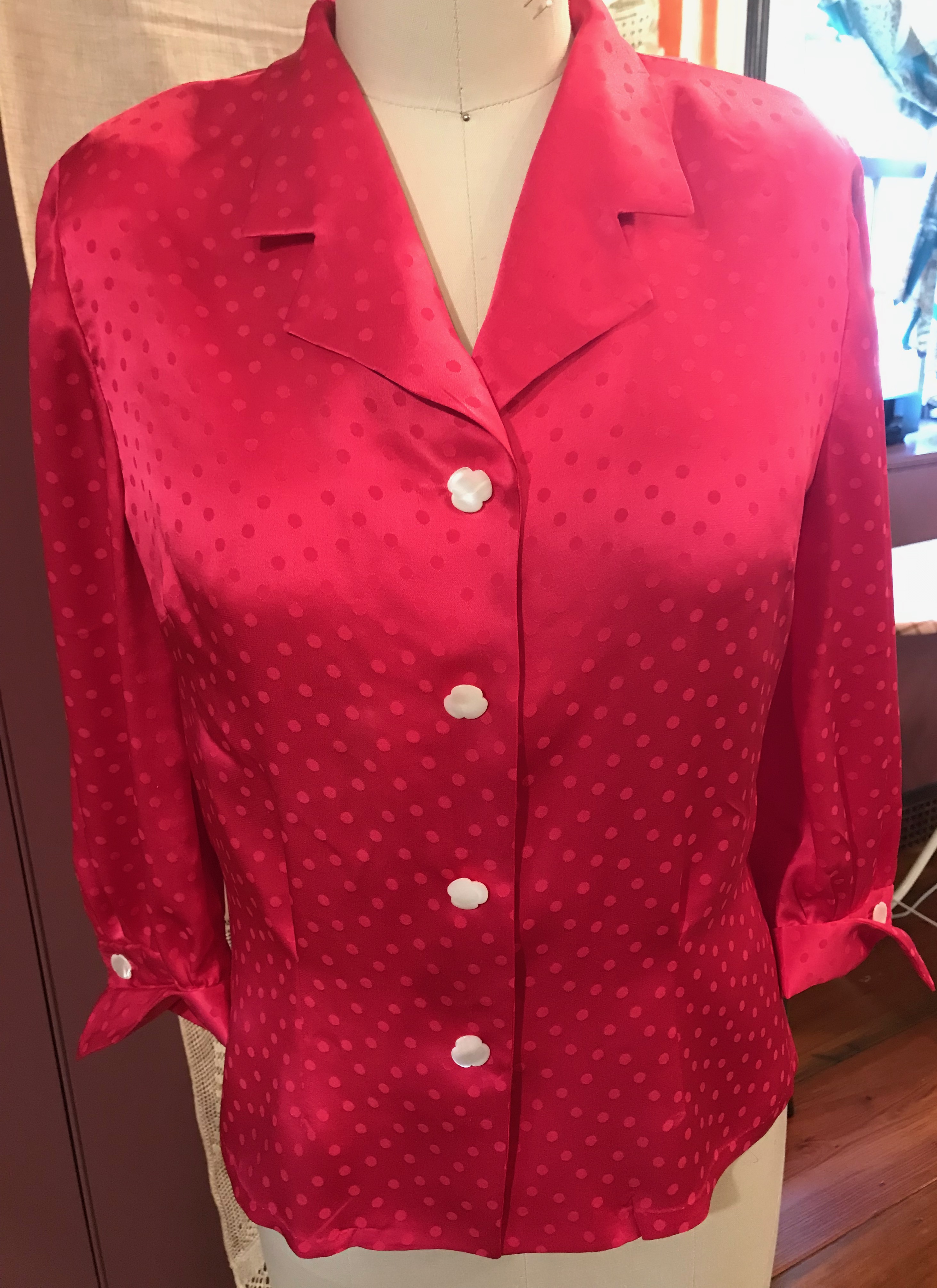
Sometimes extra incentive is needed to push through a project which turns out to be more difficult than anticipated. Such was the case with this pink silk jacquard dress.

I had purchased this fabric quite a few years ago online from Britex Fabrics. I knew it was a dressy fabric, and unsure of what form this dress would take, I made the decision to purchase four yards of this 58” wide silk. That gave me some latitude in my selection of pattern.
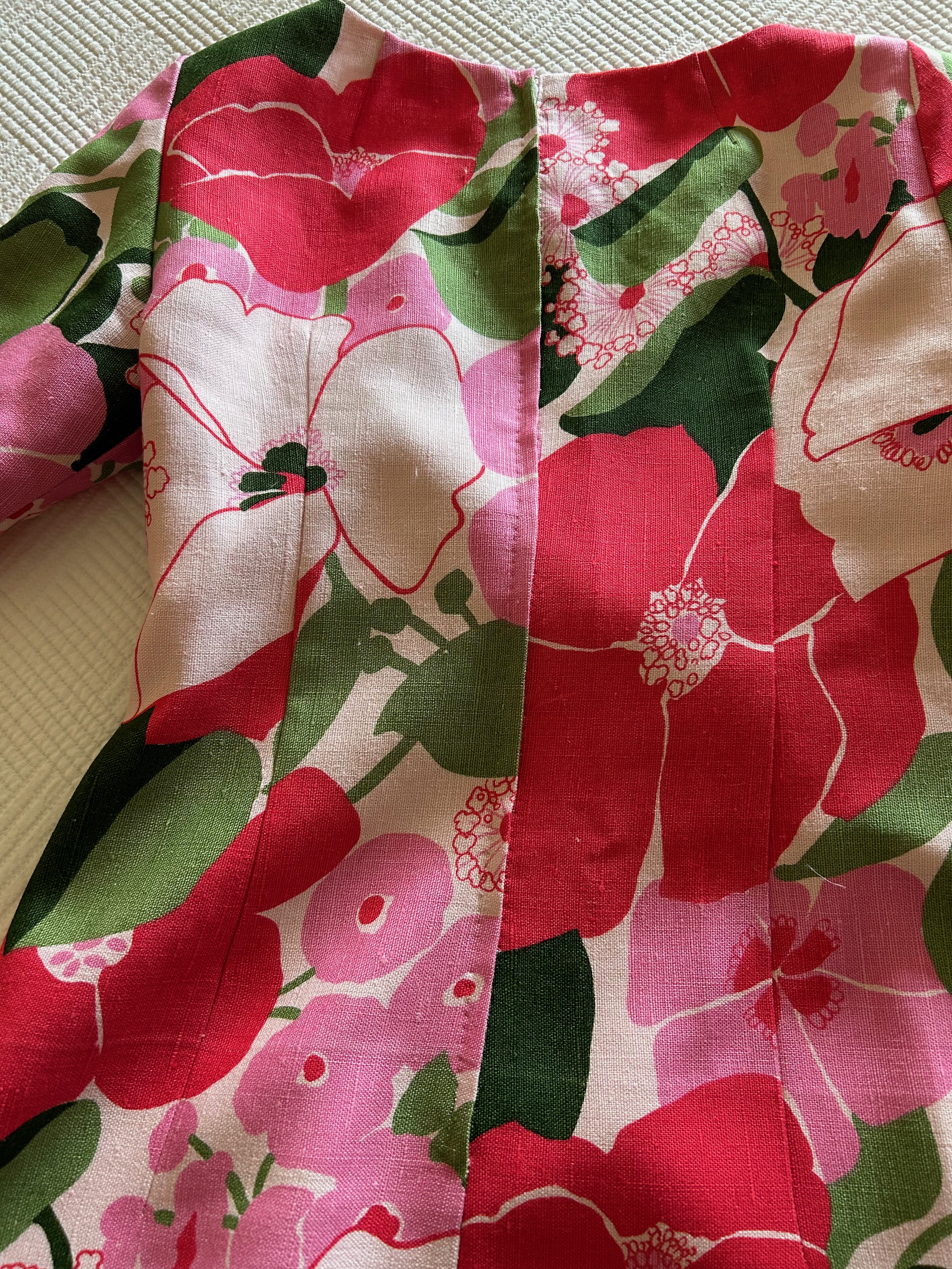
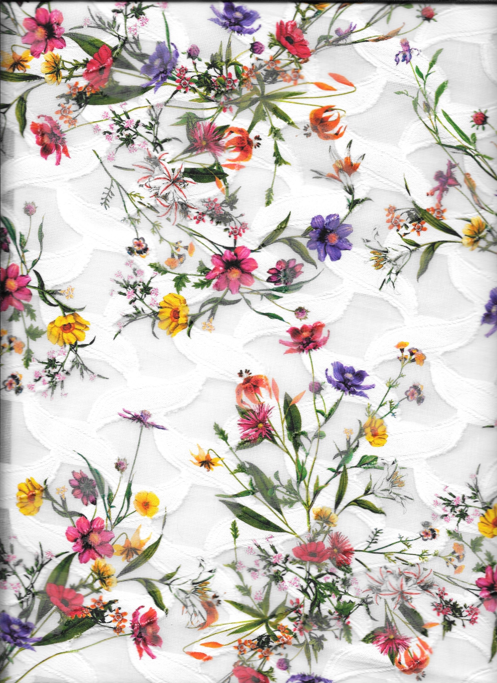
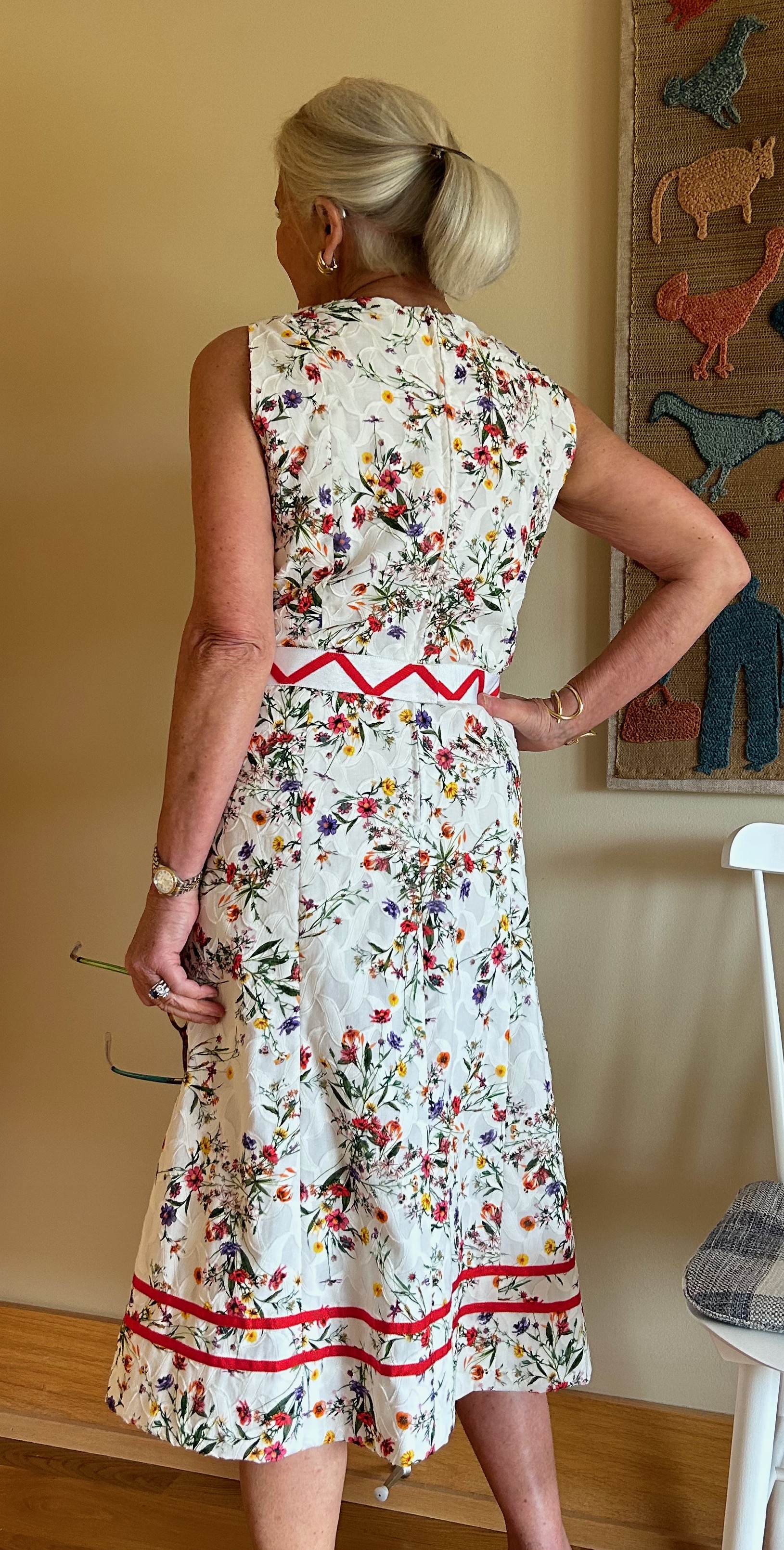
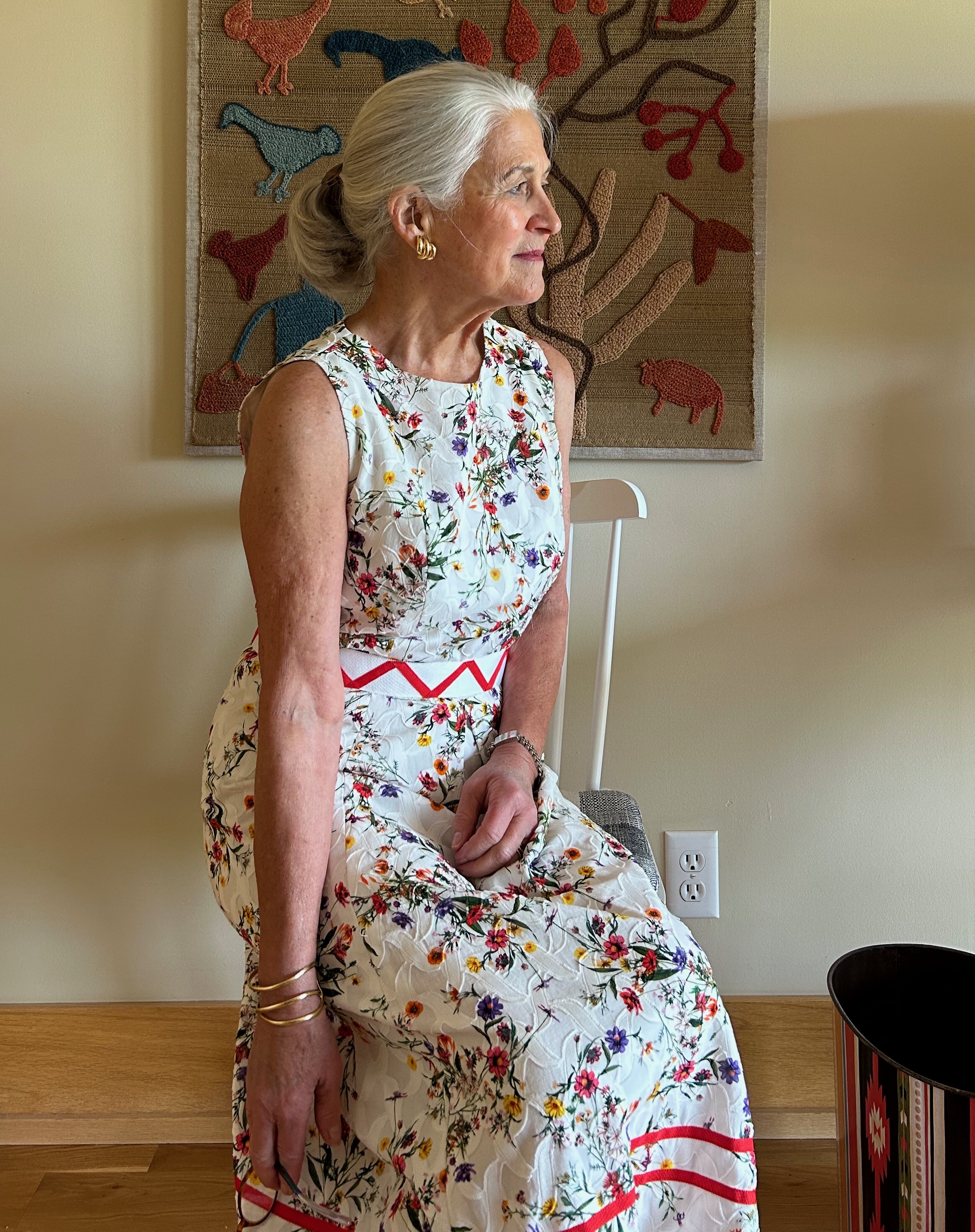
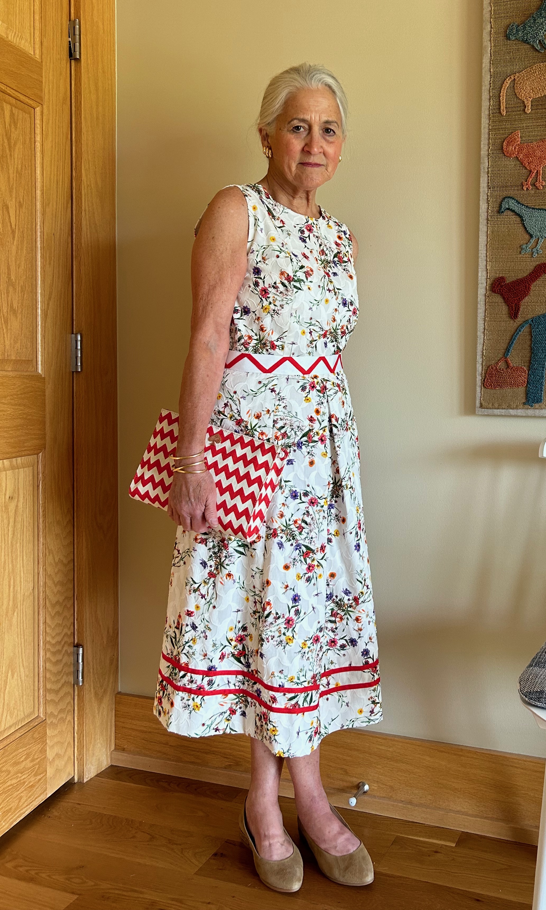
Finally last Spring I made a decision about what I wanted this dress to be. That was precipitated by the arrival of a beautiful invitation to a very special event this Fall, and of course (!) I needed a new dress to wear to it. The fabric is a dressy, shimmery silk jacquard, so by its very nature it would make up into a dress which had a certain glamour to it.
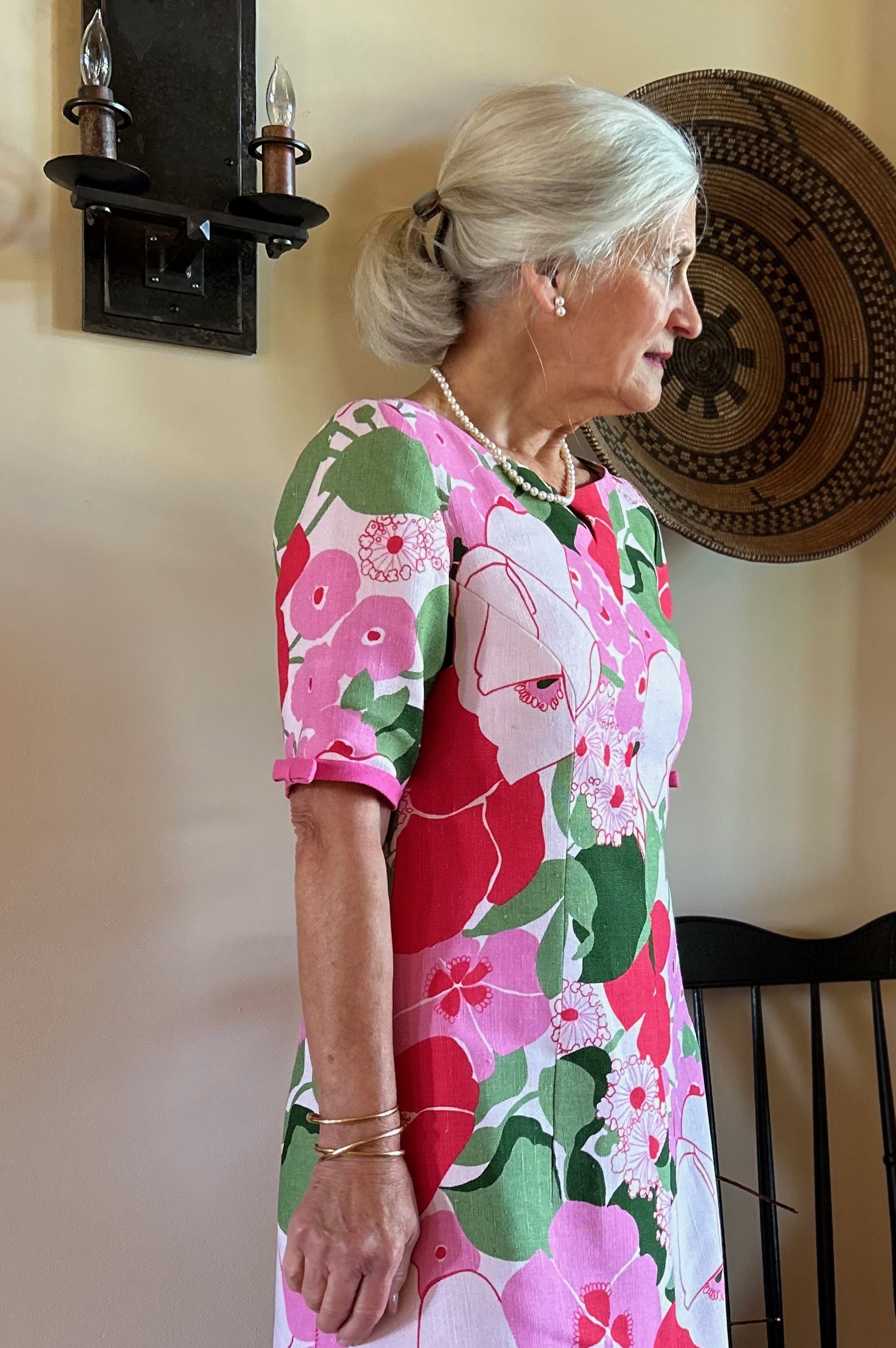
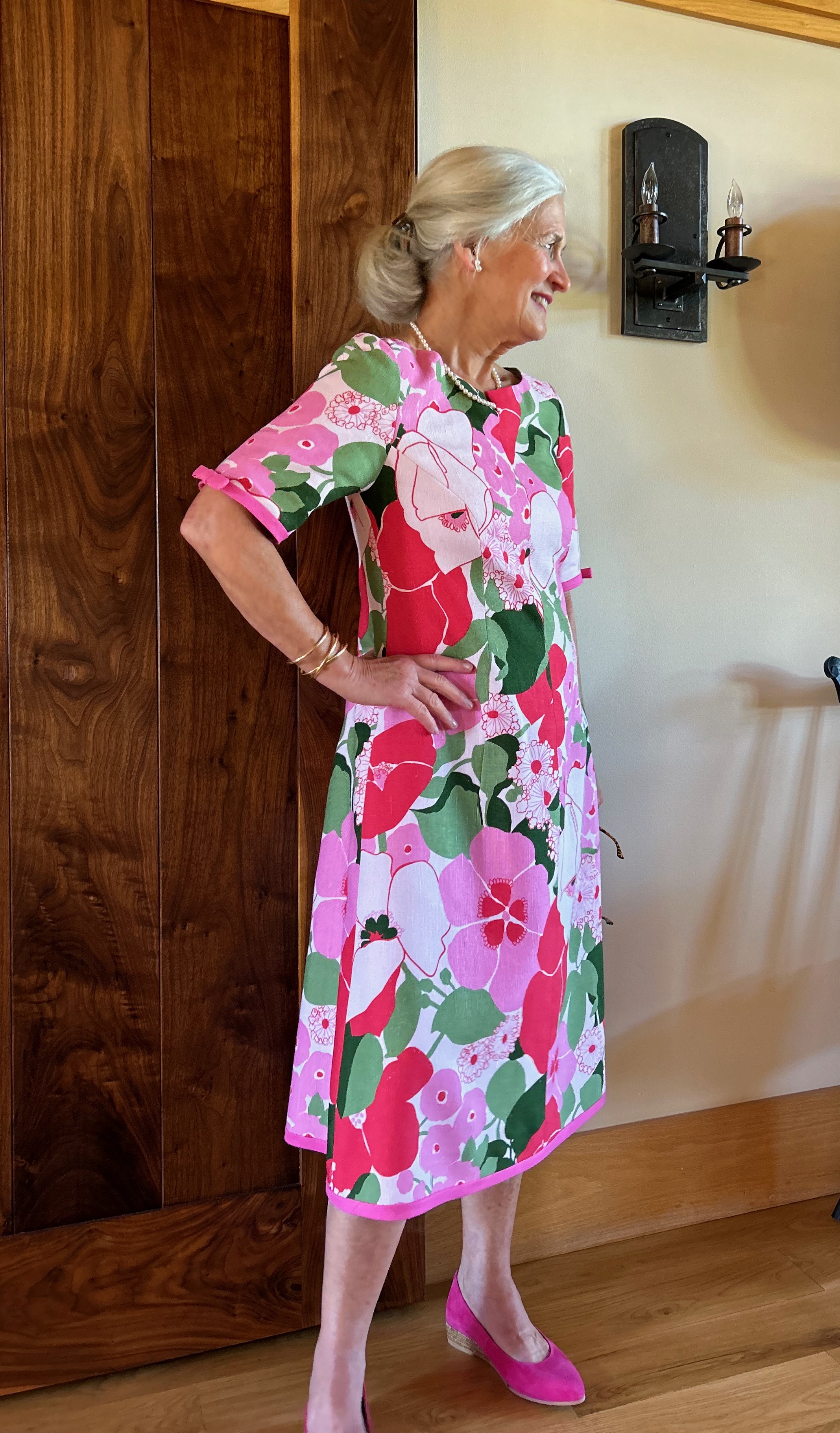
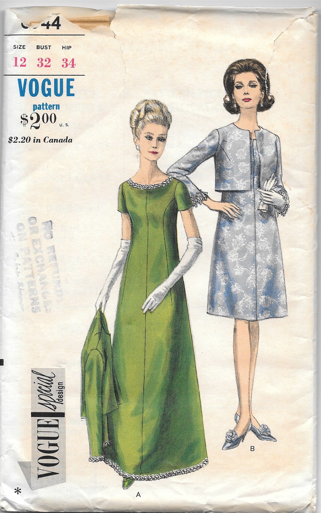
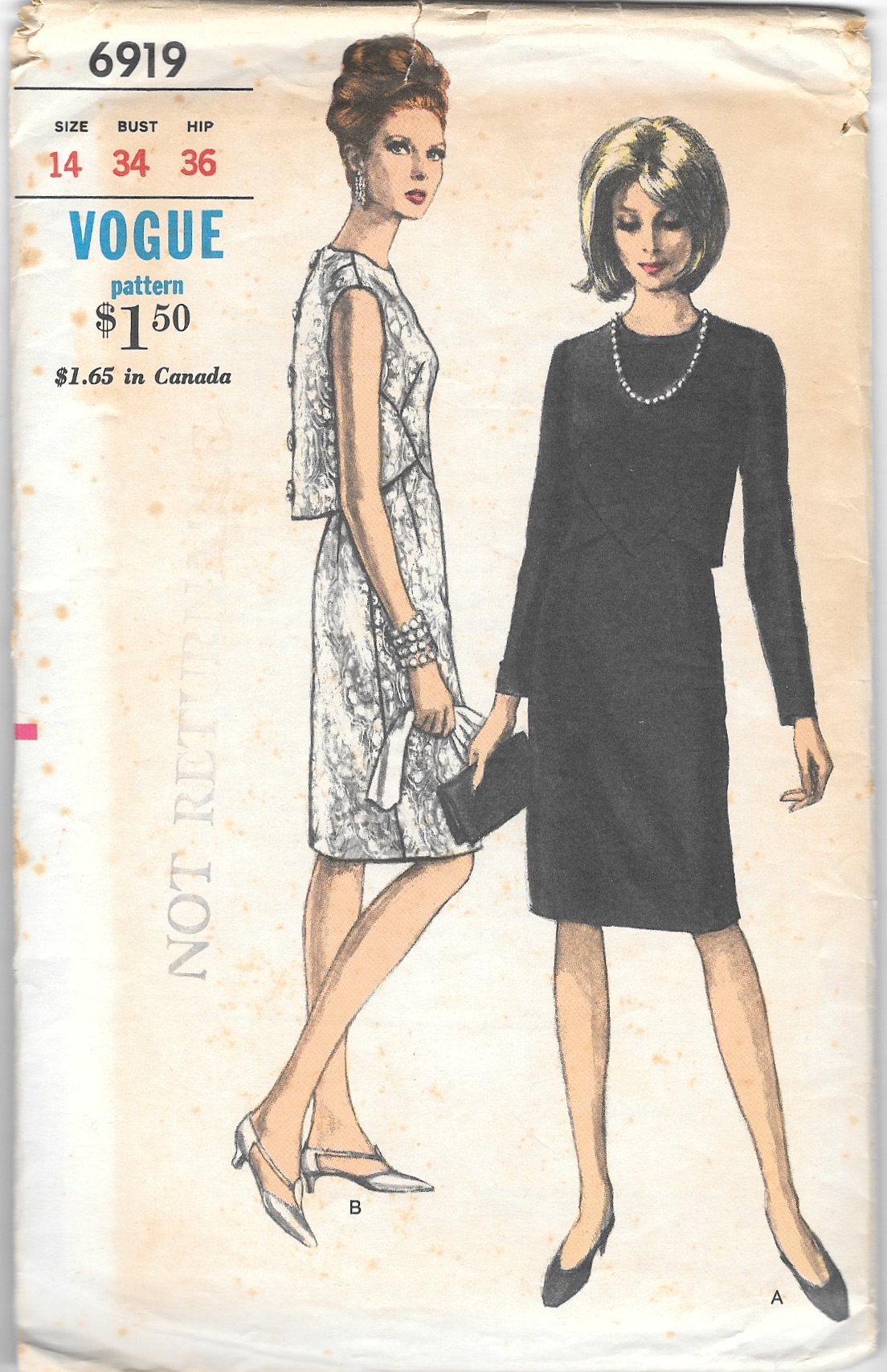
I decided to use a go-to pattern I have used a few times already and make a classic shirtdress. That may seem like a strange choice, but I envisioned it as very dressy and flowing, and quite appropriate for the fabric.

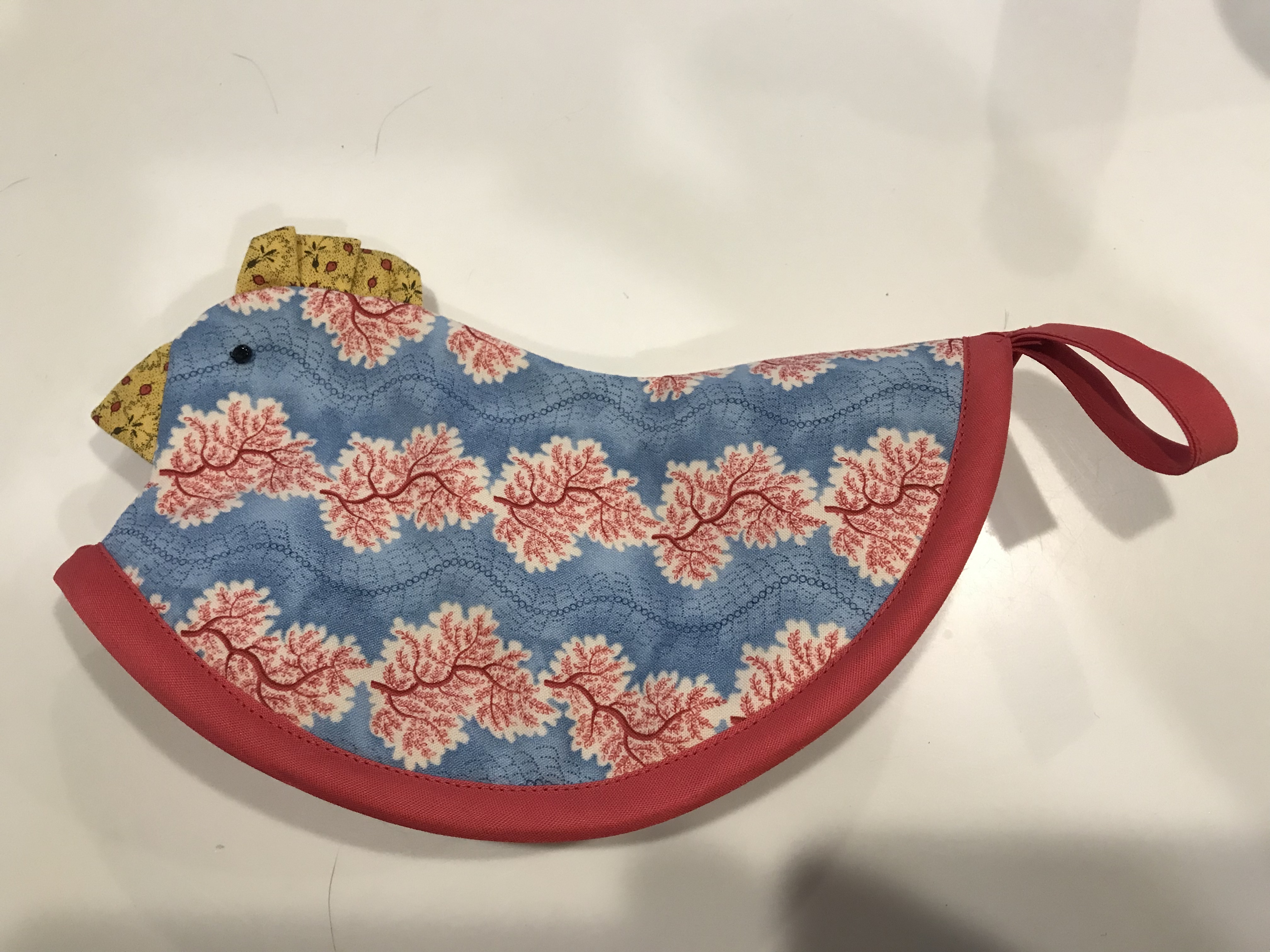
While this idea was percolating, I happened to attend a luncheon/presentation by a wonderful organization called the Ibu Movement. (Pronounced ebu, with a long “e,” this is an Indonesian word meaning “a woman of respect.”)
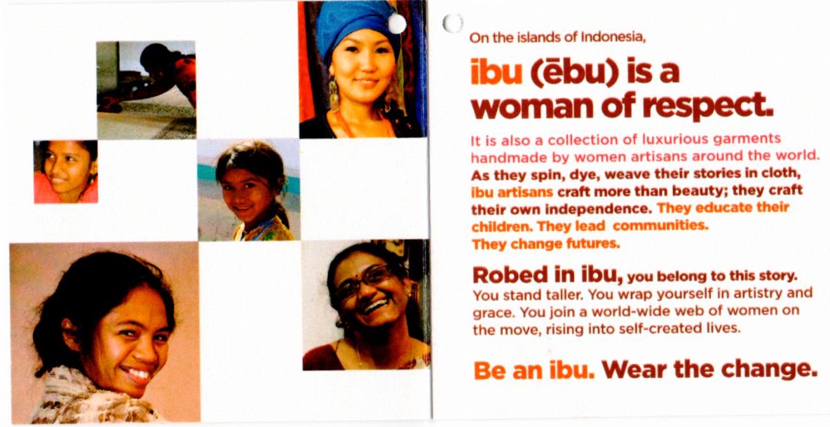
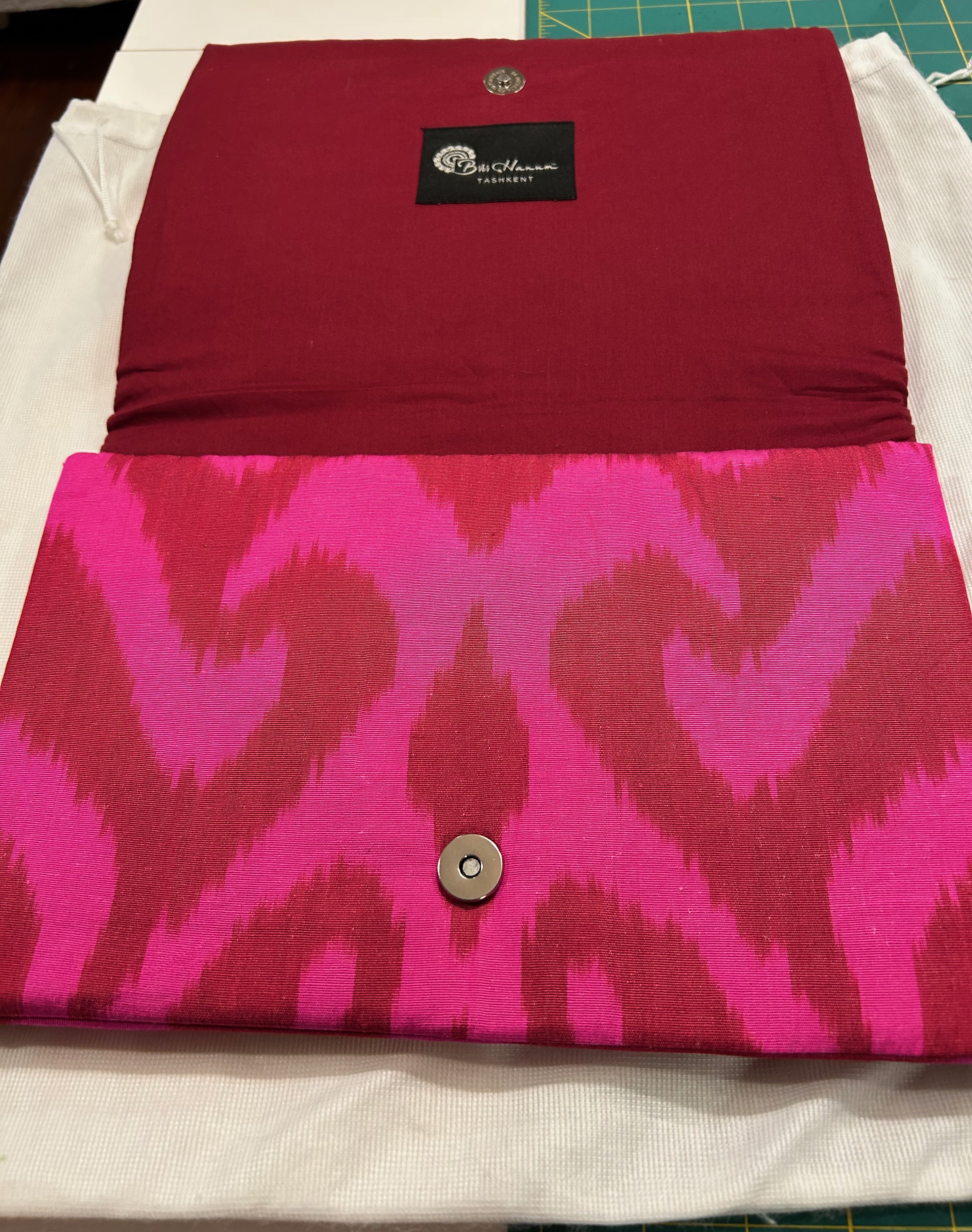
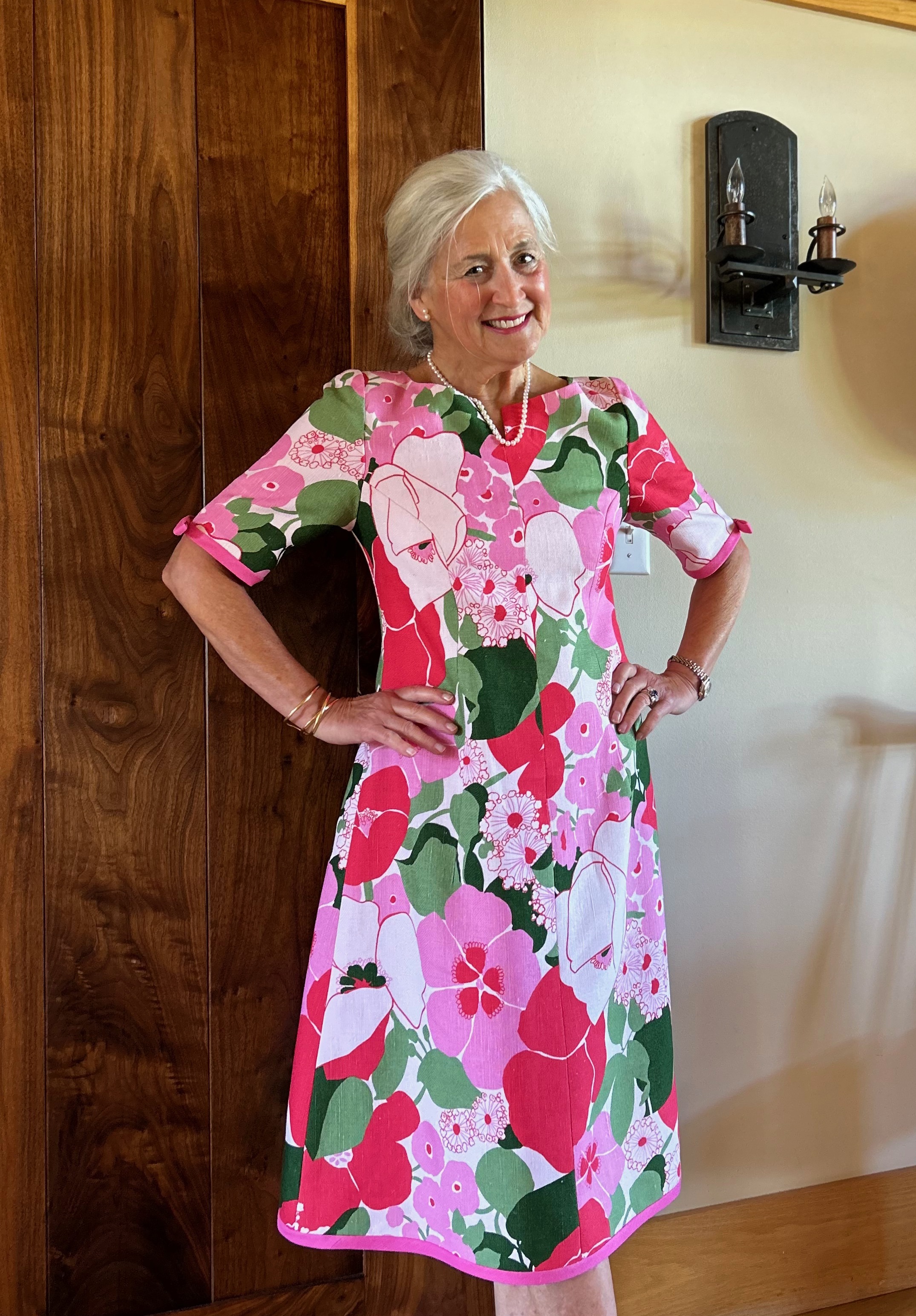
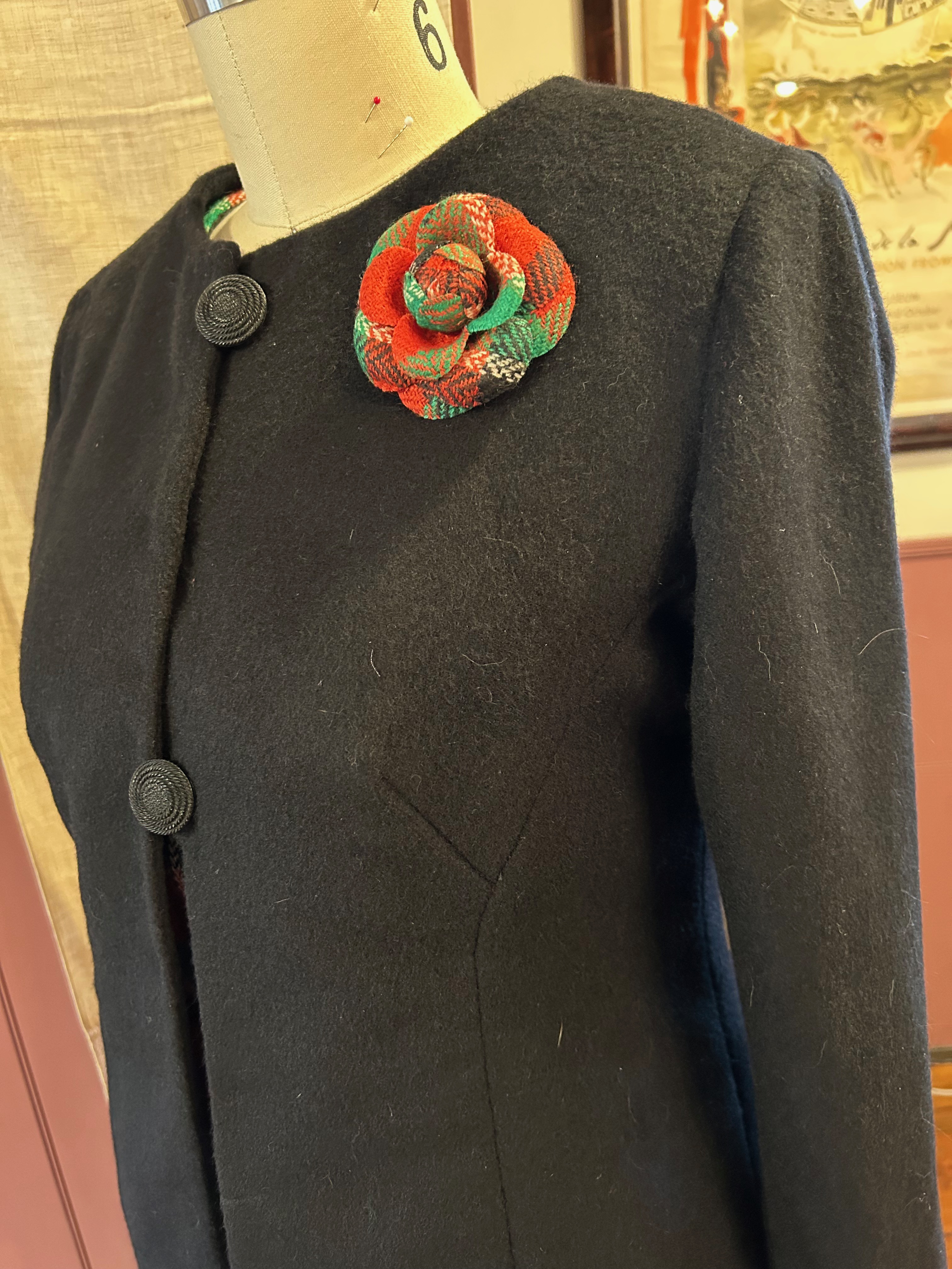
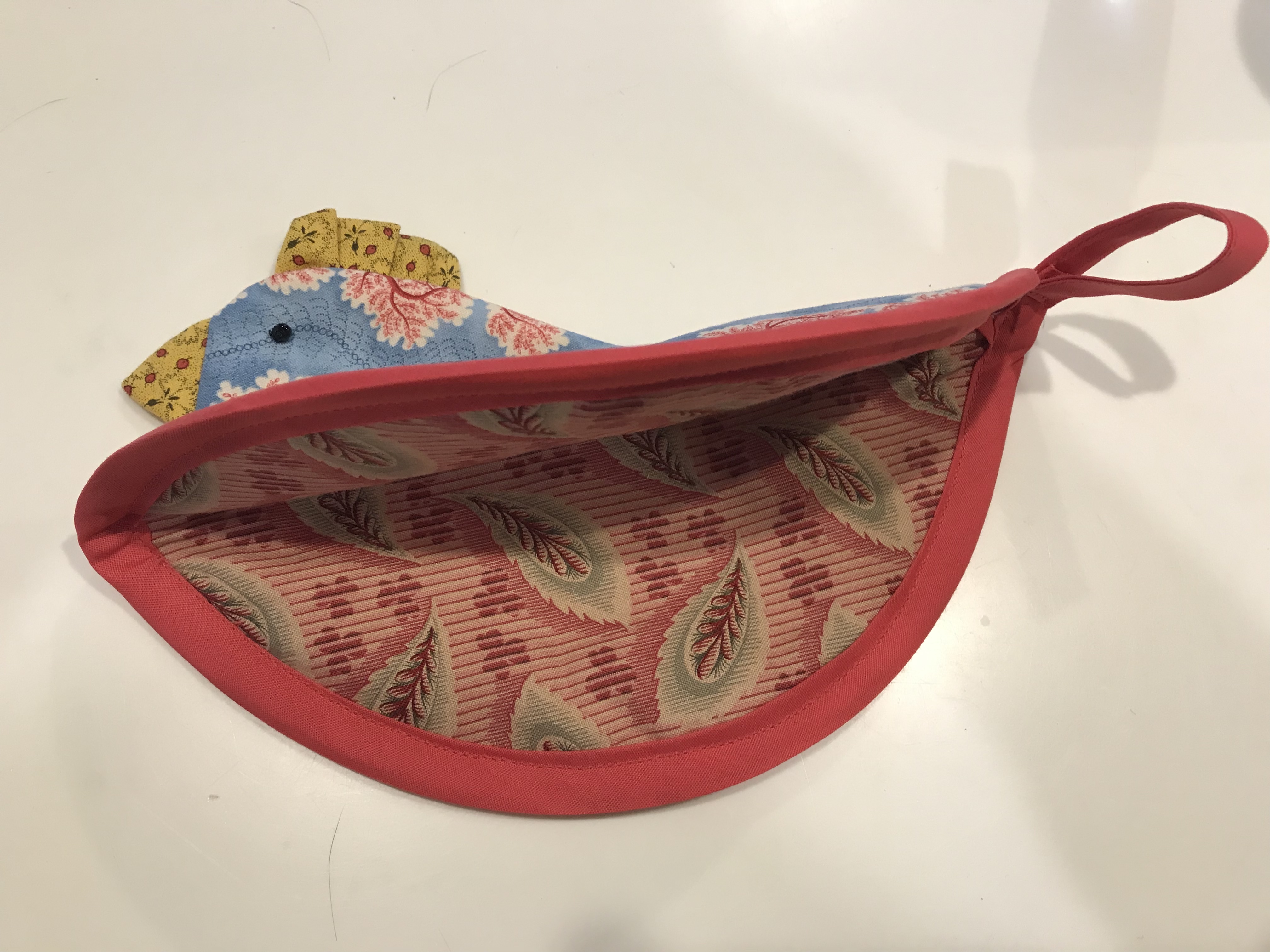
The pop-up shop accompanying this event was filled with gorgeous clothing, accessories, even shoes. When I saw this envelope clutch, I knew it would match my silk fabric perfectly and would be the perfect addition to my as-of-yet-to-be-sewn pink dress. Little did I know at that time it would be the catalyst to make sure I finished the dress!

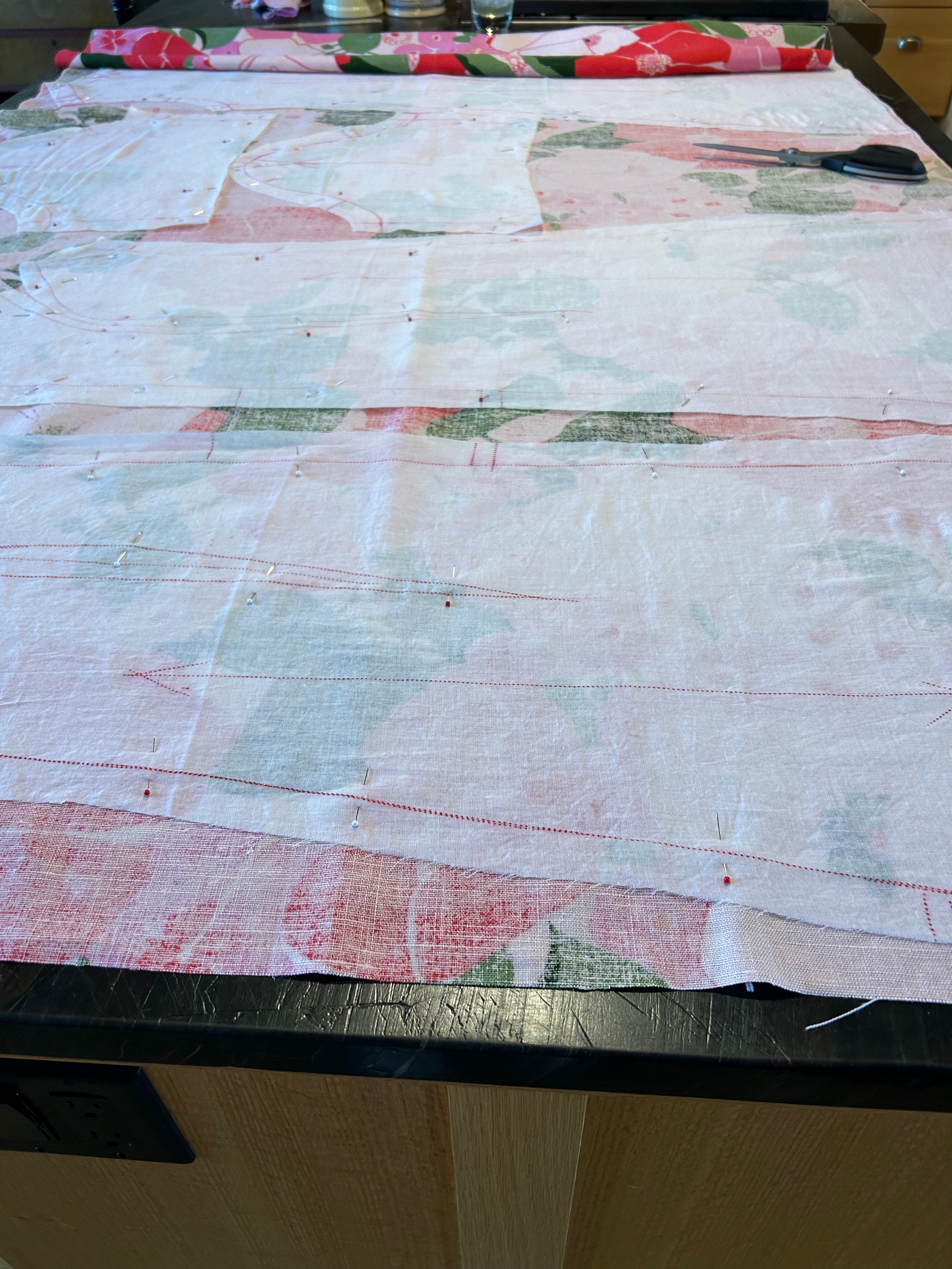
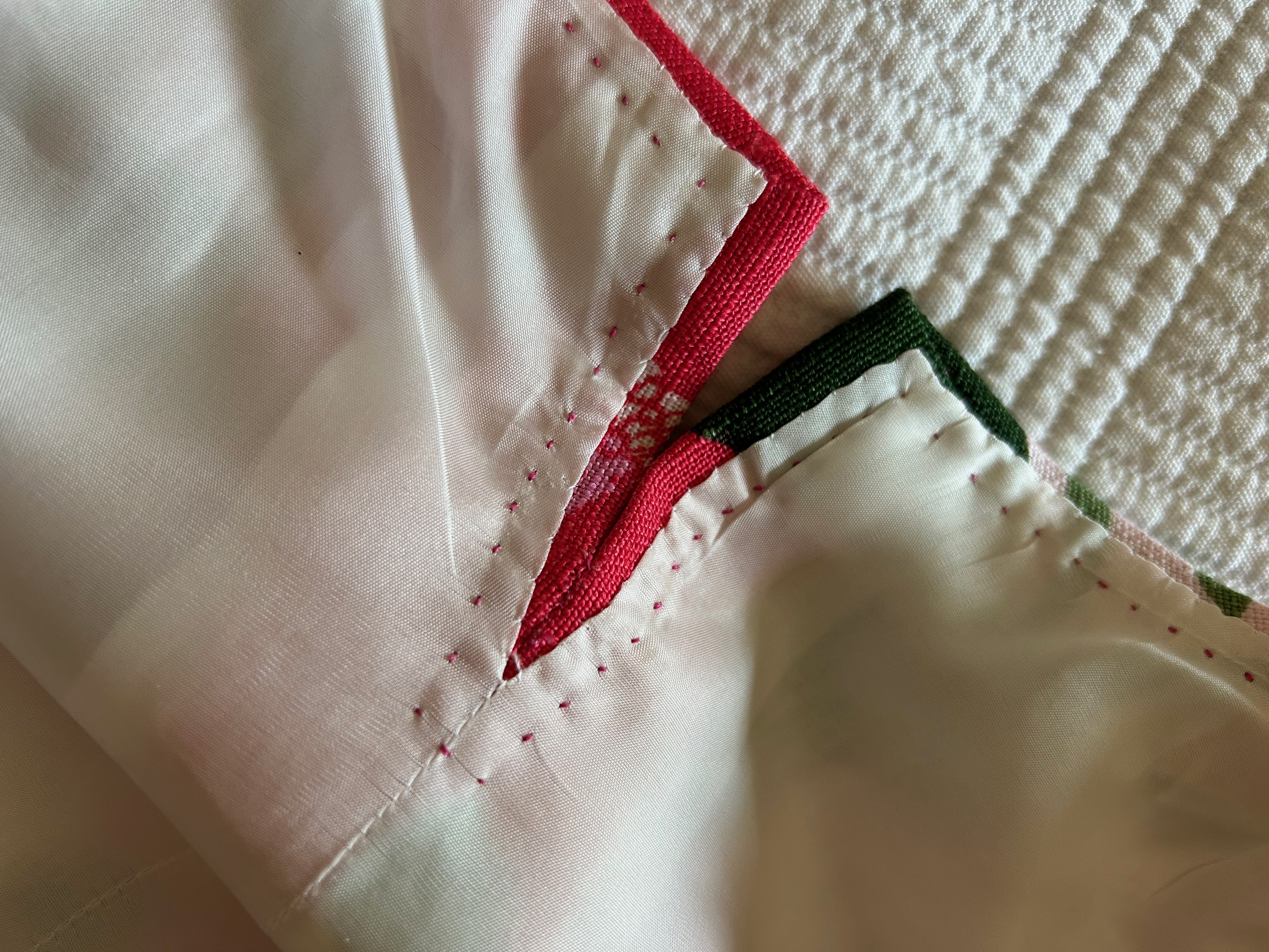
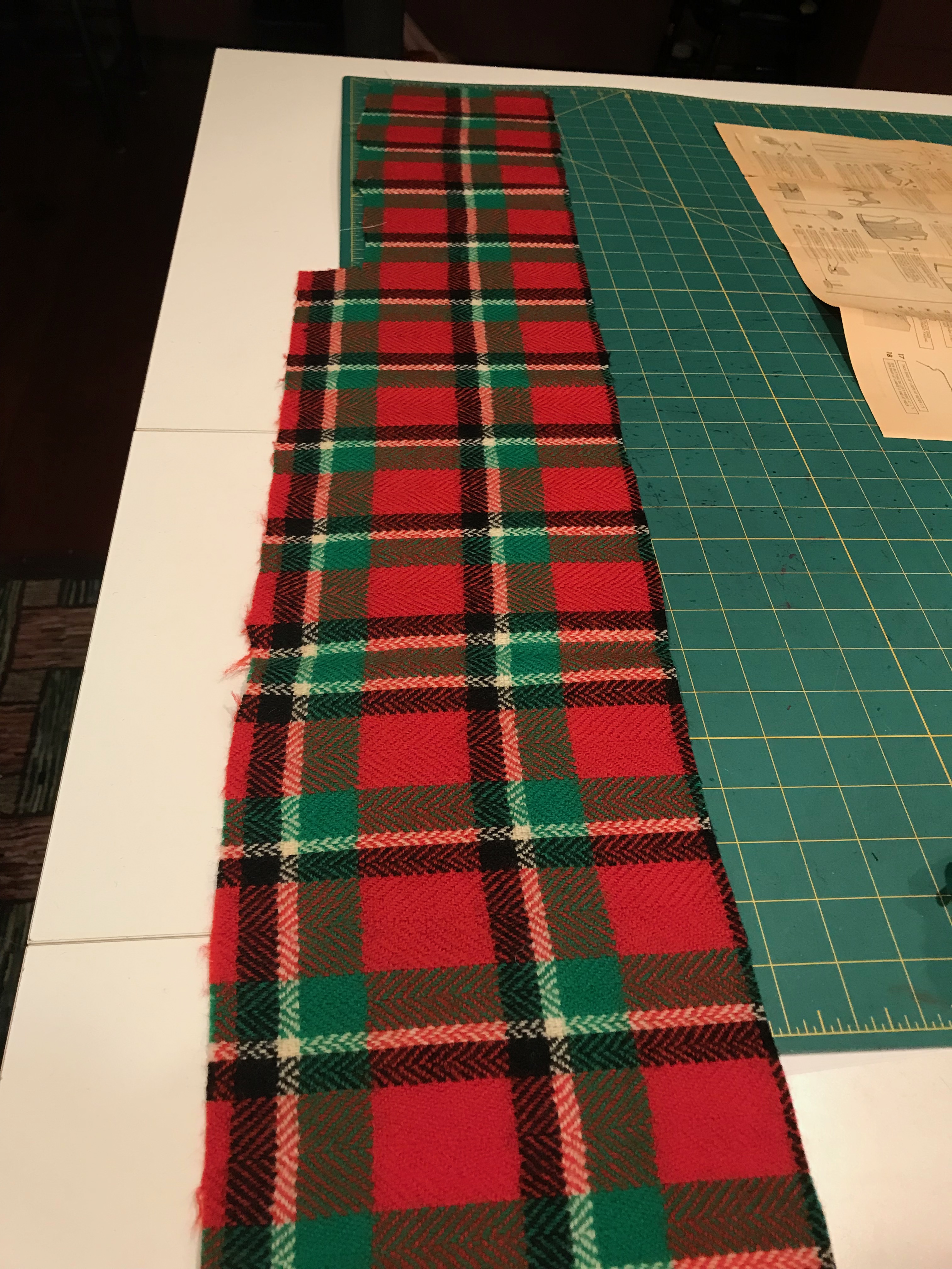
My first clue as to the fussiness of the fabric was as soon as I pressed it and laid it out for the placement of my muslin pattern. Here is what I noticed:
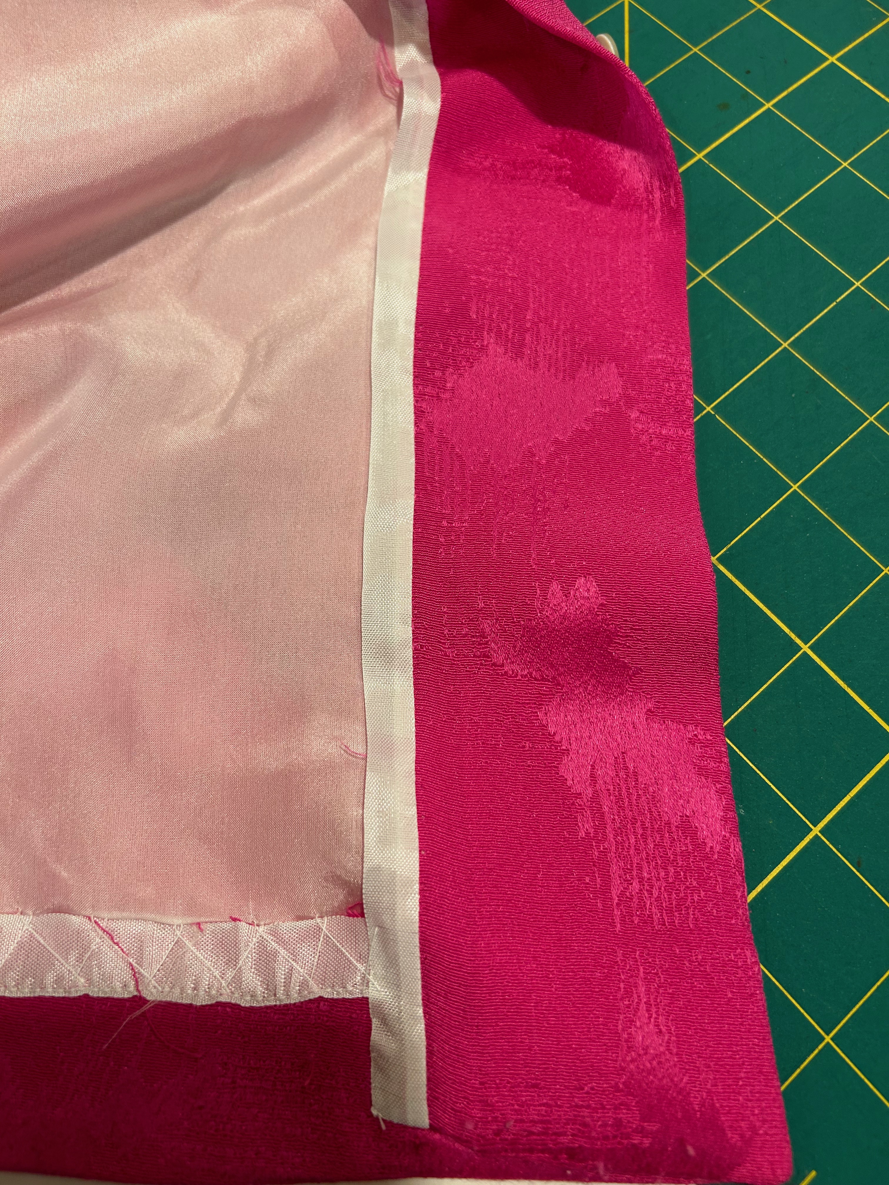
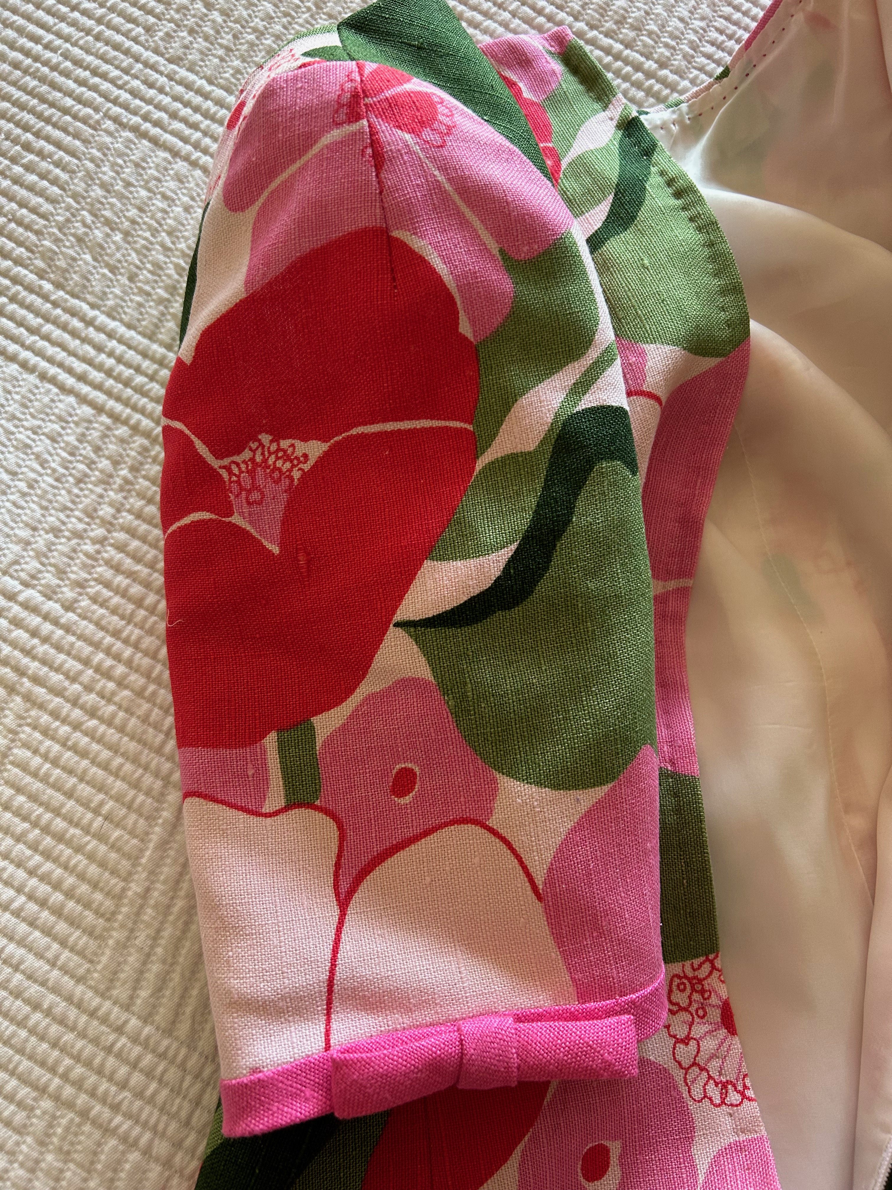
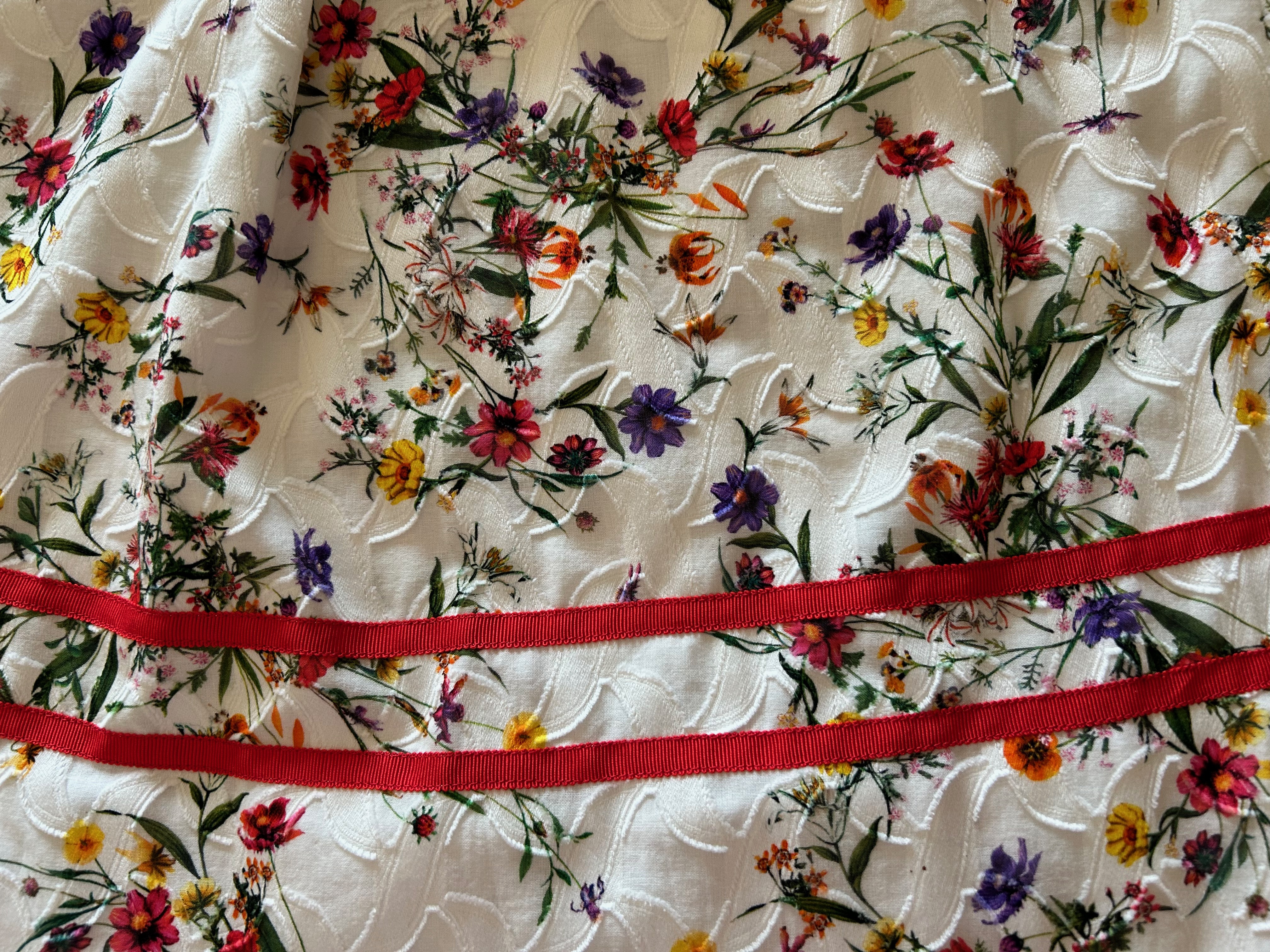
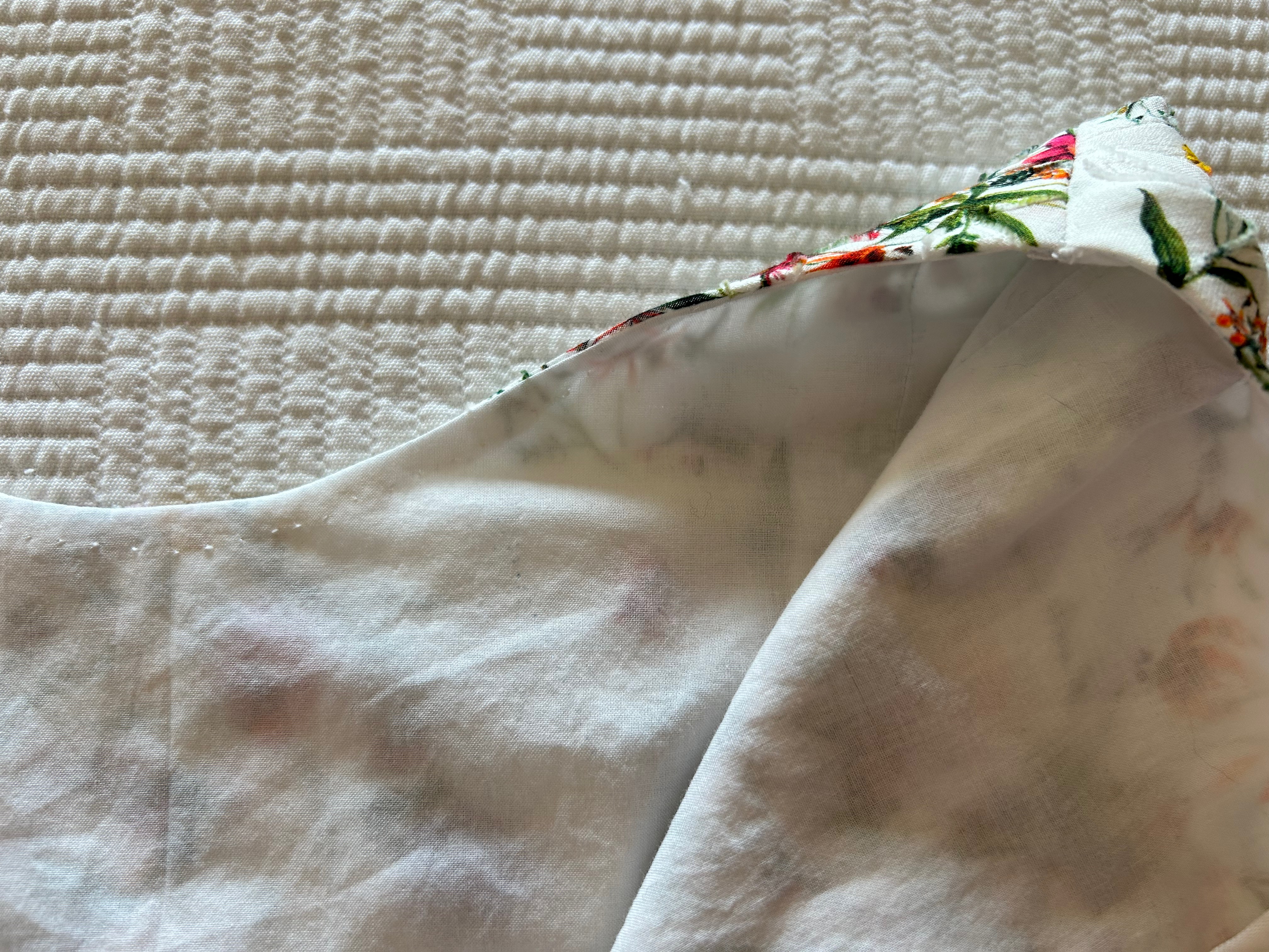
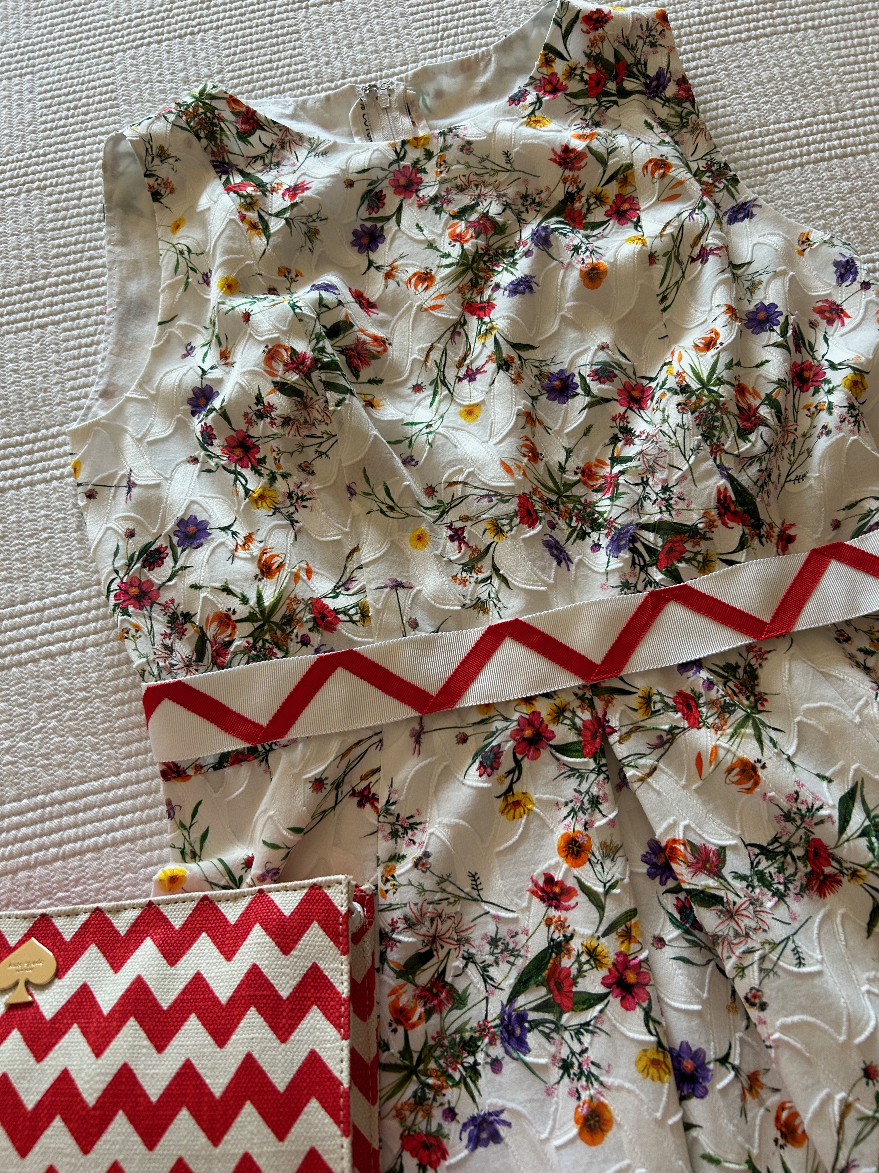
- The fabric had a slightly loose weave to it, making it almost stretchy, certainly very slinky. Keeping it properly aligned on the straight of grain was going to be a challenge.
- The fabric frayed easily.
- It also was prone to shedding silk fibers. I decided I needed to handle it as little as possible to mitigate this situation.
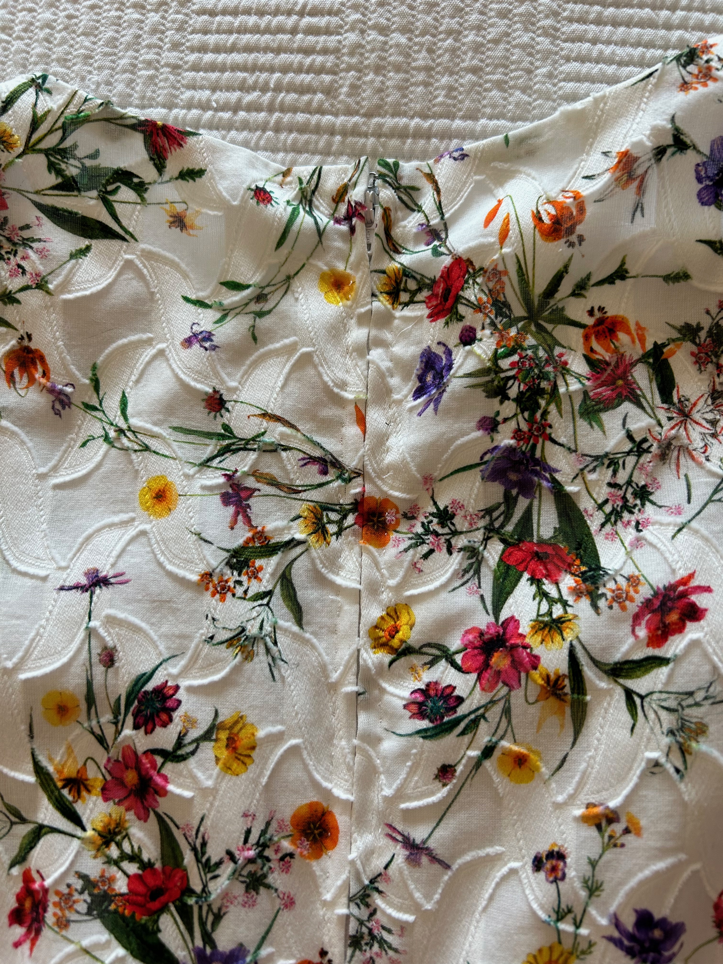
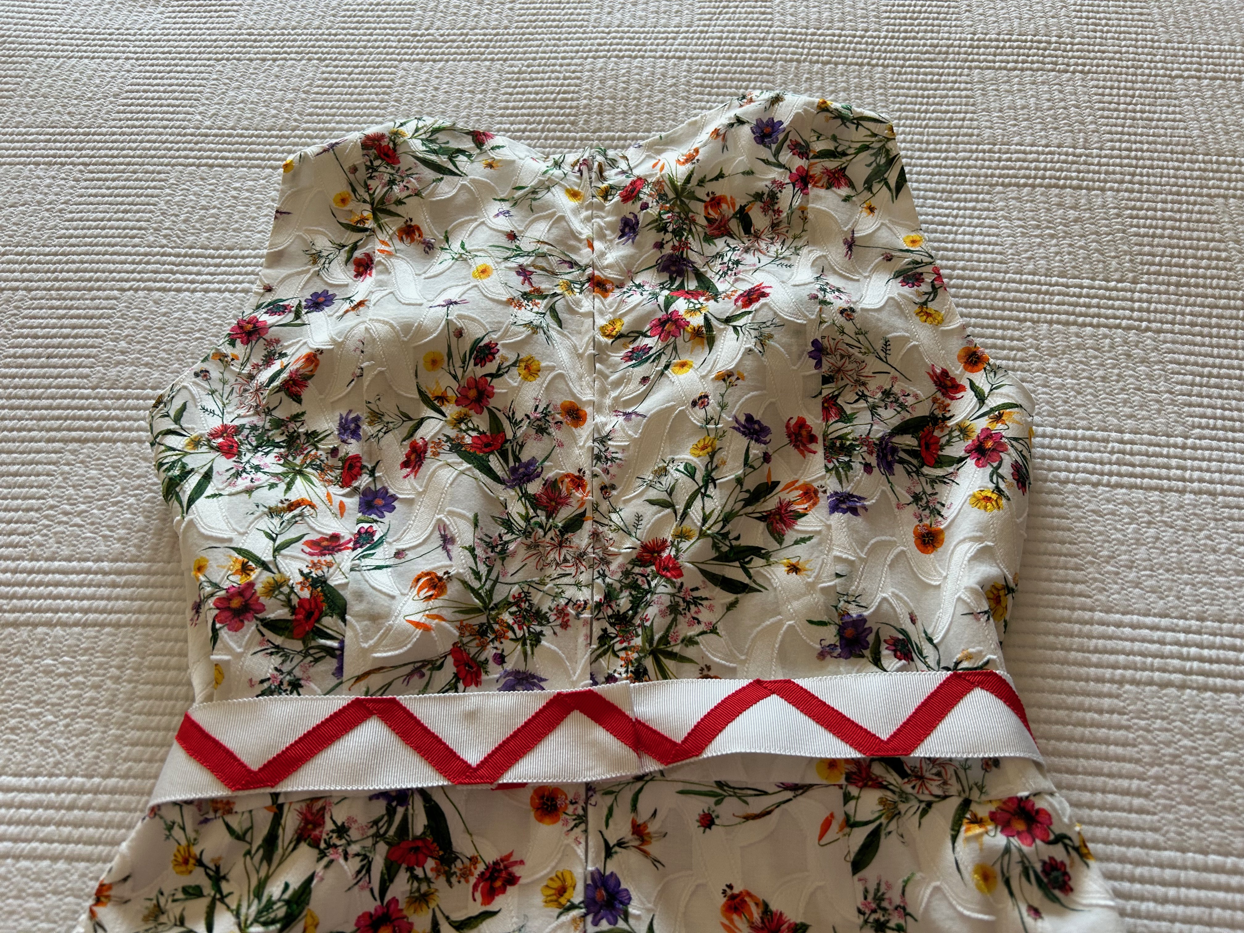
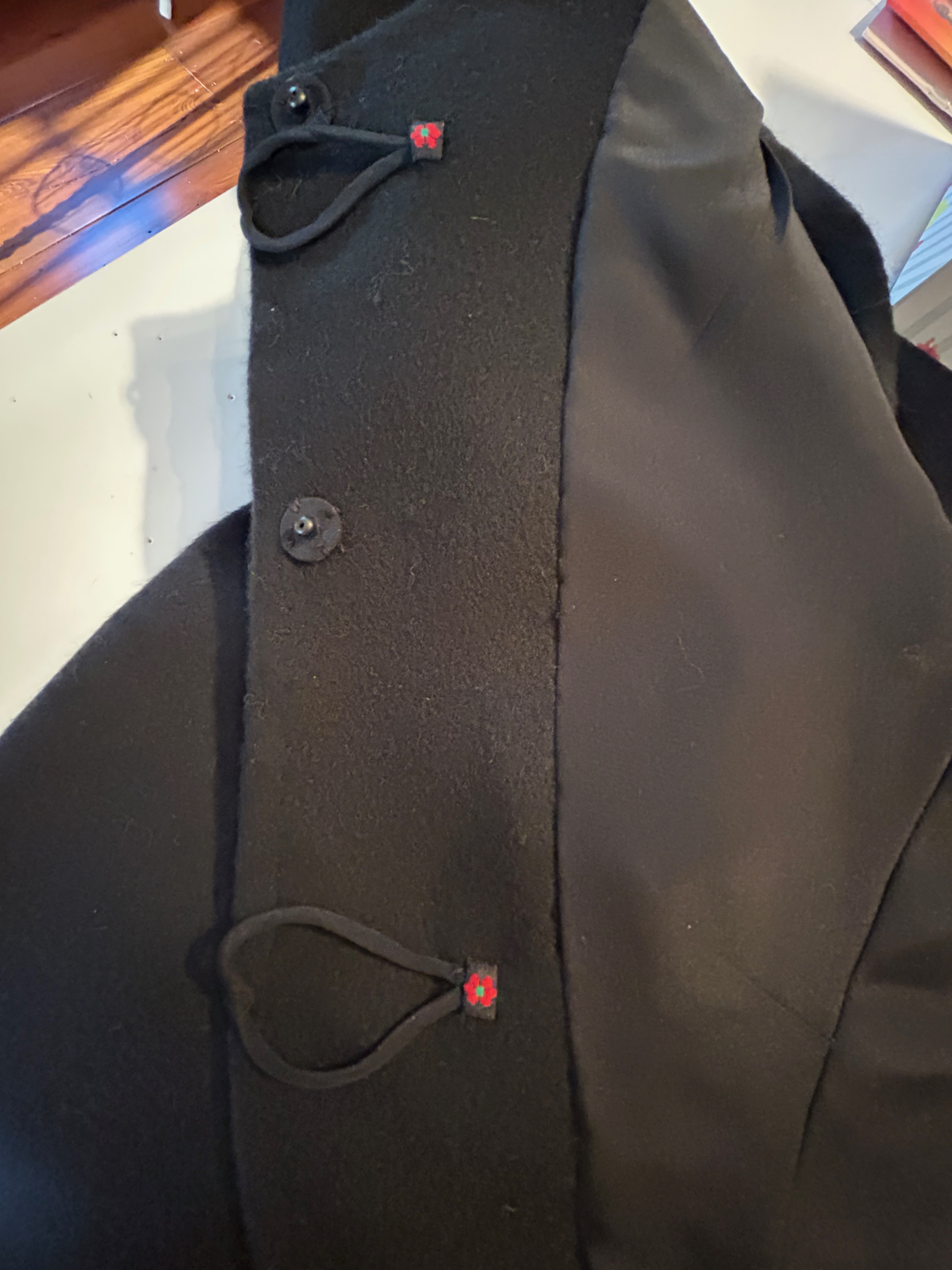
- The jacquard weave in it had a definite horizontal and vertical pattern to it, meaning I would have to match the design horizontally and vertically across seams. Although I am used to matching plaids and prints, this was a little different as the woven design was of irregular form.

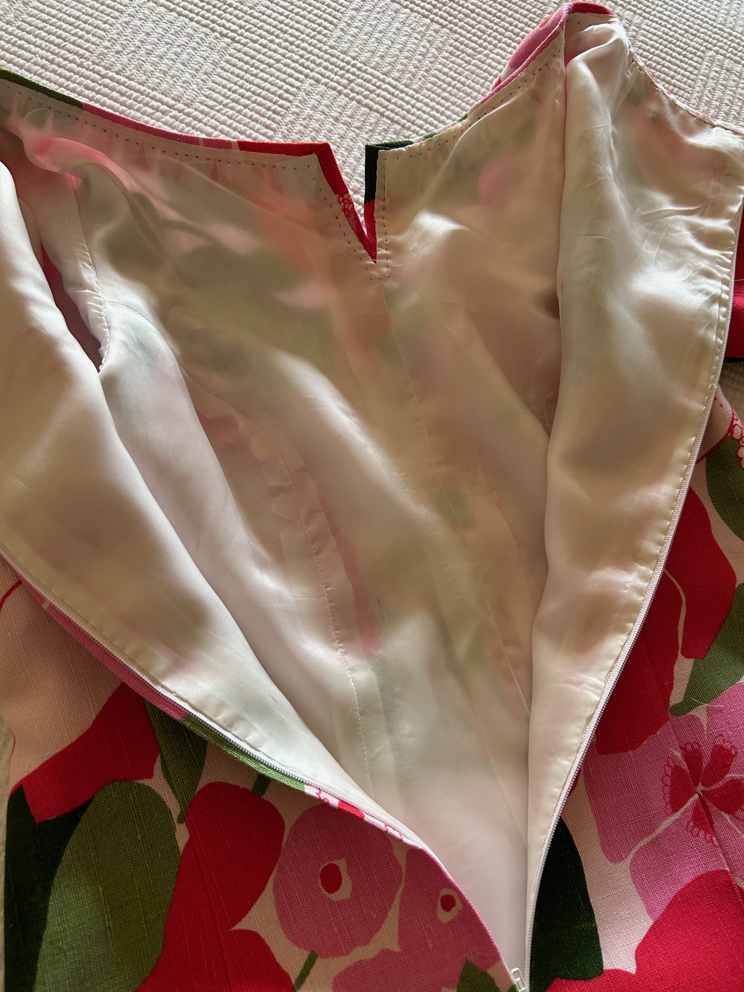
I decided to underline the dress (except for the sleeves) with a very lightweight silk batiste, which I hoped would give it some substance, but still preserve the flowing nature of the fabric. I made the conscious decision not to add an additional lining to the dress.
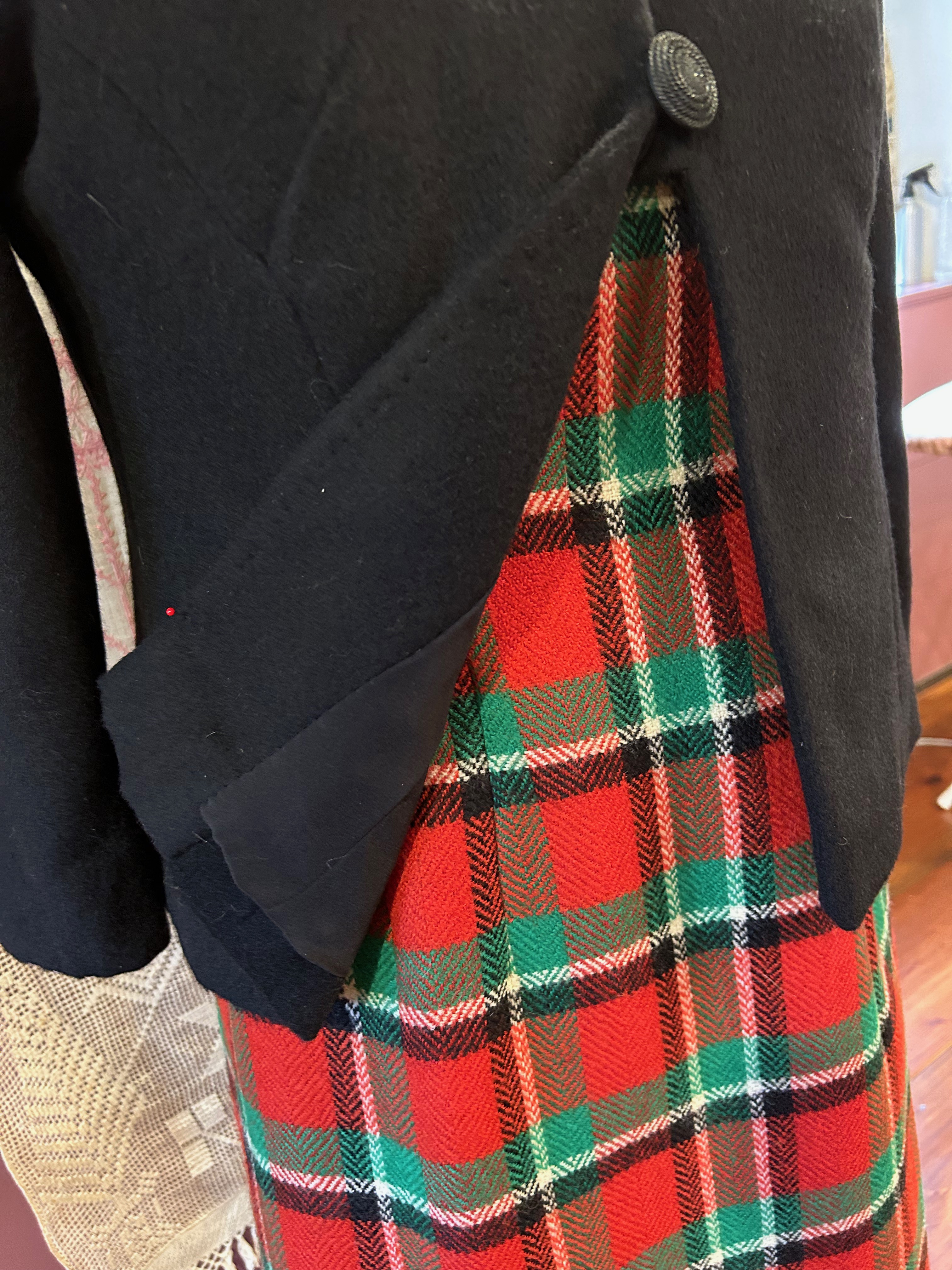
Although I rarely use fusible interfacing, I realized very early on that sewn-in interfacing was going to shift around and cause all kinds of problems. Luckily, I had been introduced to a very finely woven, fusible German interfacing available from Farmhouse Fabrics. I had some on hand and found it to be the perfect stabilizing foundation for the cuffs, the front facing, the collar, the collar stand, and the hem.
So, that solved one big problem for me. I was still concerned about being able to get the hem even. I had good reason to be concerned! It took two tries to avoid having either a bubble appear or uneven dips around the perimeter.
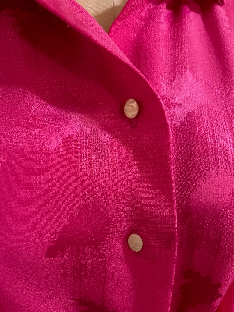
The final quandary I had was the buttonholes. Because the fabric shed silk fibers so easily, I was really worried that my buttonhole attachment might grab onto those fibers and make a mess. I did some sample buttonholes, which confirmed my suspicions. So – I used wax paper between the foot of the attachment and the fabric, cutting little windows in the wax paper where the buttonholes would be sewn. It worked like a dream.


This was not a particularly fun dress to sew, but that “perfect” handbag kept me focused. And I am glad it did, as the dress was a success in the end. And it always feels like an accomplishment to use fabric which has been lying in wait for so long.


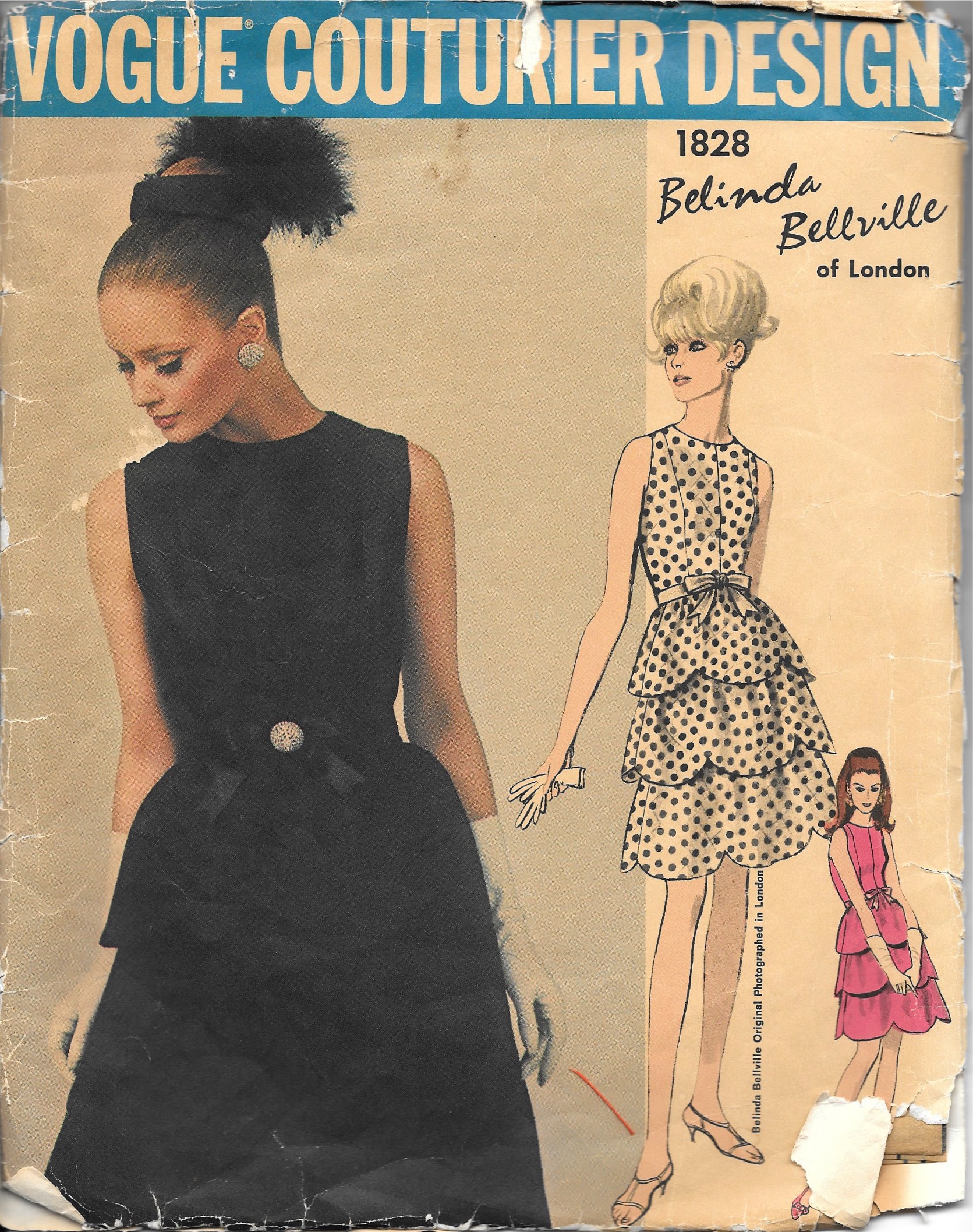


A Book Review: The Dress Diary of Mrs. Anne Sykes – Secrets from a Victorian Woman’s Wardrobe, by Kate Strasdin.
Every once in a while, I find myself having fallen under the spell of a particularly noteworthy and engaging book. Such was my fate with this remarkable story of an Englishwoman (1816 -1890) and her journal of fabric swatches, saved from her own life and collected from family, friends, and acquaintances over the course of decades, beginning in September of 1838.
With over 1200 fabric entries, the diary – or journal – gradually revealed its secrets to the author, a fashion historian, who painstakingly transcribed the often sparse notations accompanying each fabric sample, piecing together the fascinating life and times of Anne Burton Sykes. The research is meticulous, and the author, Kate Strasdin, shares her eureka moments which allowed her to expand not only Anne’s life, but those of her friends and family as well. Written in an engaging style, this non-fiction book often reads like a novel, a wonderful story of love, friendship, adventure, and vibrant personalities.
There is so much to learn here about Anne’s life in the larger context of world history and events, but it is the personal experiences and expressions which spoke so loudly to me. Yes, there are many details which, by the nature of the journal, must be extrapolated and surmised, which the author is careful to note. But the picture of Anne – and her husband Adam – which evolves is one of two very likeable people, engaged in their community, industrious and thoughtful, friendly and adventurous, and undoubtably well-dressed.
The first entries in the journal, of Anne’s wedding attire, were actually placed and annotated by Adam. He was the one to give Anne the journal on their wedding day. He refers to her as “my charming Anne.” Not beautiful, not sweet, not dear, but “charming.” That single selection of adjective spoke volumes to me about each of them.
She also must have been brave, enduring a four-month sea voyage from northern England to Singapore, where Adam’s business took them two years after their marriage. There they built a life among other English-speaking neighbors and acquaintances, in the stifling heat and humidity of the south China sea. After seven years in Singapore, they went on to Shanghai for two years (where the diary goes silent for the duration), and then back to England.
Anne’s friendships with other women throughout her life are apparent in the swatches she receives from so many in her circle. The exchange of gifts and tokens of friendship take form in dress-goods (cotton, wool, silk), ribbons, pieces of lace, and snippets of sashes. There appeared to be a remarkable camaraderie among all ages and between the sexes.
The author has done a masterful job in deciphering the life and persona of Mrs. Anne Sykes through so many diverse fabric swatches. Anne’s kindness, her circumspection, her devotion to family and friends, and her small place in history make for a wonderful, enlightening story. I am very grateful to have had the opportunity to read and savor this book.
11 Comments
Filed under Book reviews, Fashion commentary, Fashion history, Uncategorized, Vintage fabric
Tagged as Book reviews