
Do you love pockets and add them to your sewn creations wherever you can? Would you be happy never to have to sew another pocket? Do you tolerate them in a garment, preferring to do without if possible? Many people have very strong opinions about pockets or the lack thereof. I think those of us who sew are among those with the strong opinions, primarily because we have it in our power to add them or delete them. My personal mantra on pockets is “Let’s see if we can do without them, unless we can’t.”
I generally divide my thoughts about pockets into three categories: those in dress pants (slacks), those in dresses and skirts, and those in dressier coats and jackets. (A little caveat is probably useful here before I get any further. Yes, jeans should have pockets, as should hiking and/or activewear pants and shorts. And absolutely, pockets are part of the functionality of active outdoor coats and jackets and vests. Those categories are not part of this discussion.)
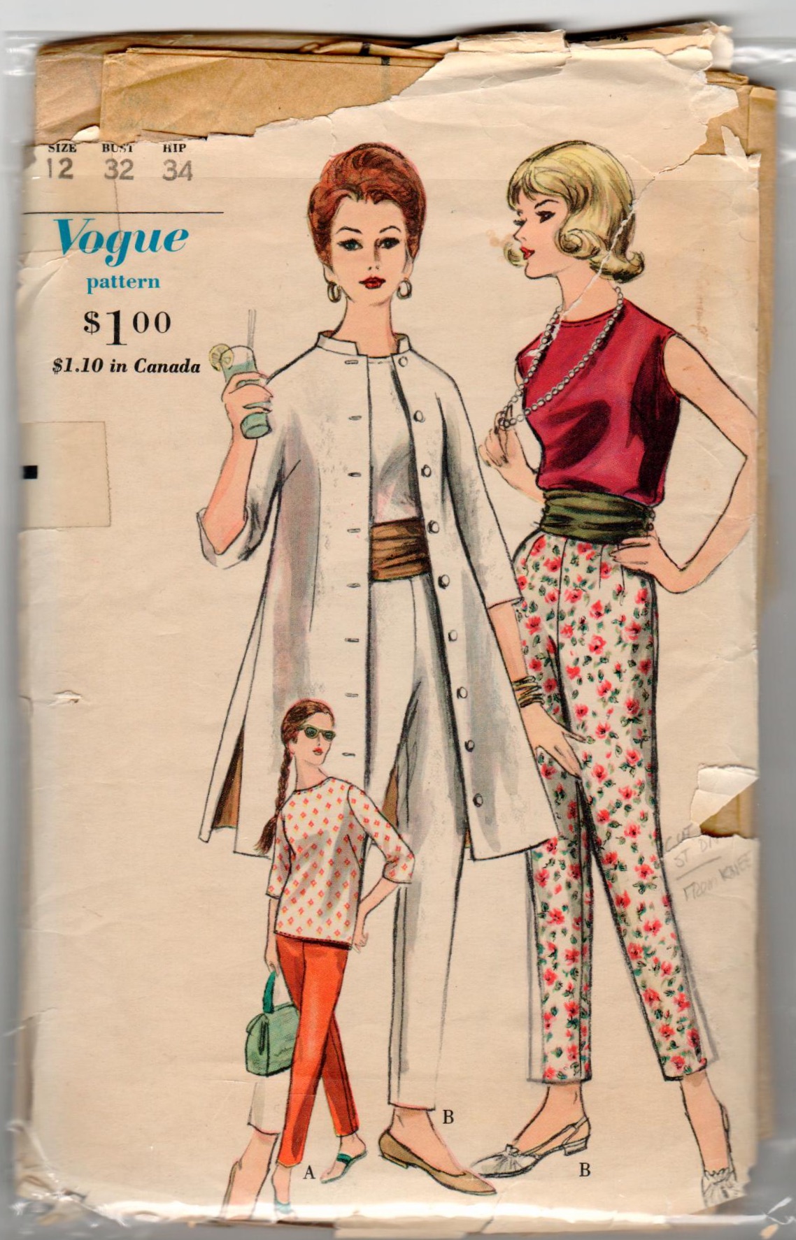
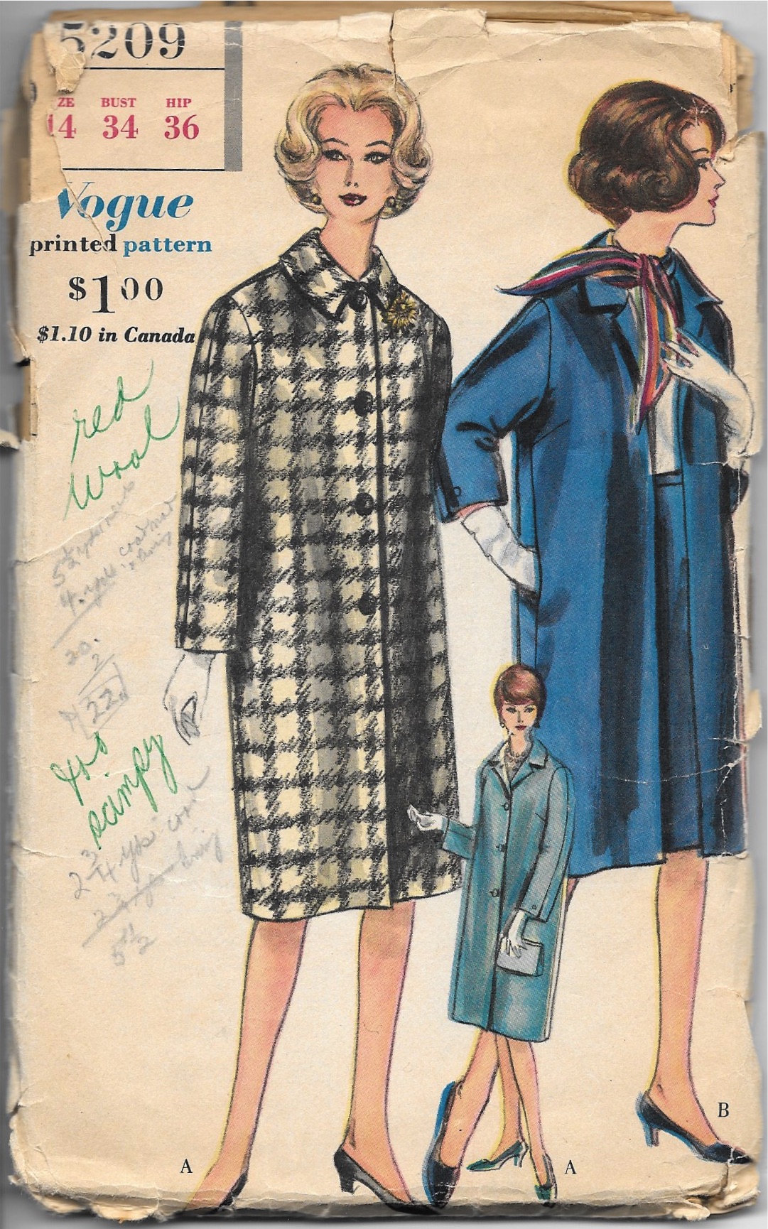
It was over two decades ago when I first started thinking about the dilemma pockets in slacks present. I had just purchased a navy blue wool flannel, dressy pair of slim pants, which fit well and were flattering. There were two welt pockets on either side of the front which were basted closed, as is the custom in better clothes (leaving it up to the purchasing customer to remove the basting.) I left the basting in and preserved the slim silhouette of the slacks. Had I removed the basting, the front, I am sure, would have “pooched” out at those two spots and, well, not done my tummy any favors. Once I started buying vintage patterns a decade ago, I began to notice the slacks in the patterns from the 1950s generally were pocketless. (I have long thought fashion and style in the decade of the 1950s was at its zenith, both in elegance and in silhouette, which is a topic for another discussion.) Here a few examples of patterns from the 1950s:


In my mind, pockets in dress slacks are superfluous at best, detrimental at worst, and just unnecessary. Although I rarely make pants and slacks, I have yet to put a pocket in any of them.
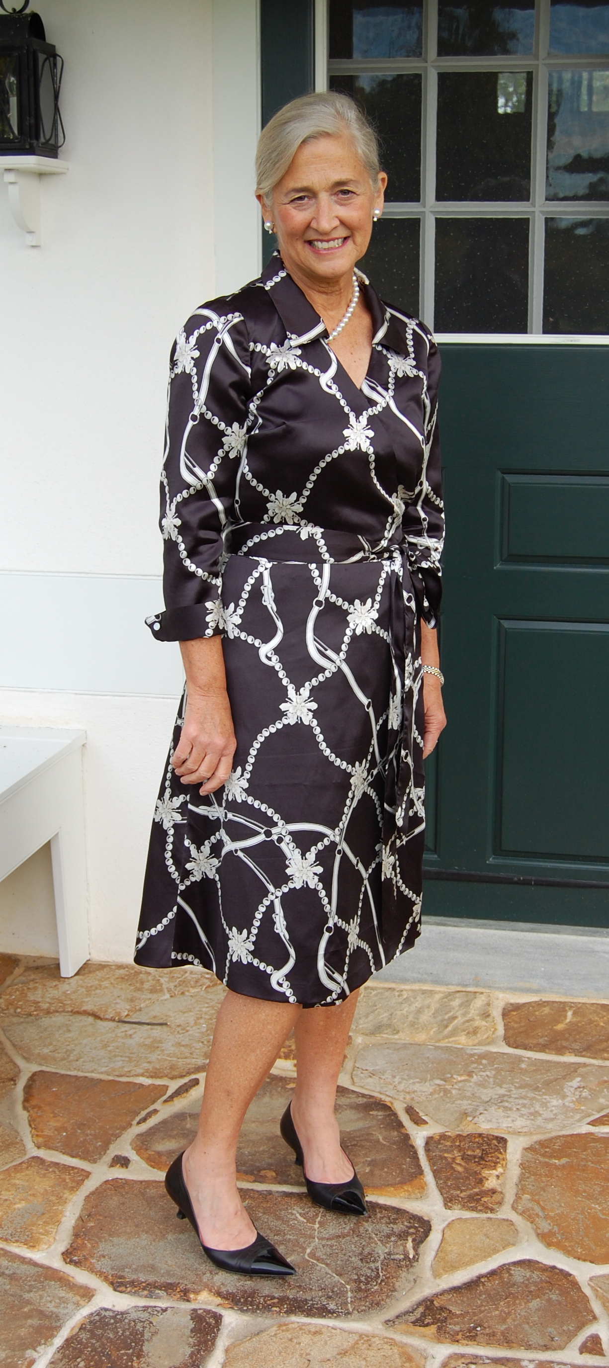
Dresses and skirts are a bit more complicated. Fuller skirts often provide the perfect camouflage for in-seam pockets. I have sewn at least three such styles, the patterns for which included pockets in the side seams. Interestingly, two of them were vintage Diane von Furstenberg patterns from the 1970s; the other is a more recent Vogue shirt dress.

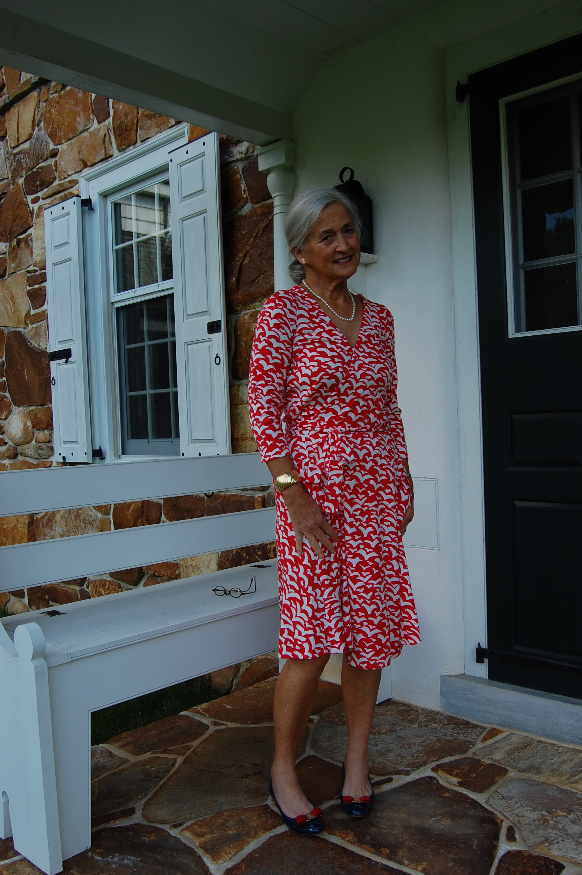

There was a charming article appearing this summer in a Weekend Edition of The Wall Street Journal by author Jasmine Guillory and her “perfect dress” which, alas, has pockets. (Check her website here to read the article under “About”.) Here is what she wrote, “The only element that mars this dress’s perfection is its pockets. This might be a controversial statement, but I don’t like dresses with pockets. They pooch at my hips, even when empty, and if you put something in them, it’s worse…. What’s this great need for dresses with pockets?” She goes on to say she regularly takes her dresses with pockets to the dry cleaner to have the pockets removed. (Alas, again! Her dry cleaner closed during the pandemic, meaning that her “perfect dress” still has its pockets, making it “almost perfect.”)
But what about slimmer silhouettes? In-seam pockets could cause the same “gapping” situation, which begs the question “Would you put anything in those pockets which would cause that pocket to gap even more? Probably not. I would place my hankie or my cell phone or lip stick in my handbag, not in my pocket – and that goes for fuller skirts as well. (Besides, like Jasmine Guillory, I am quite smitten with handbags.)
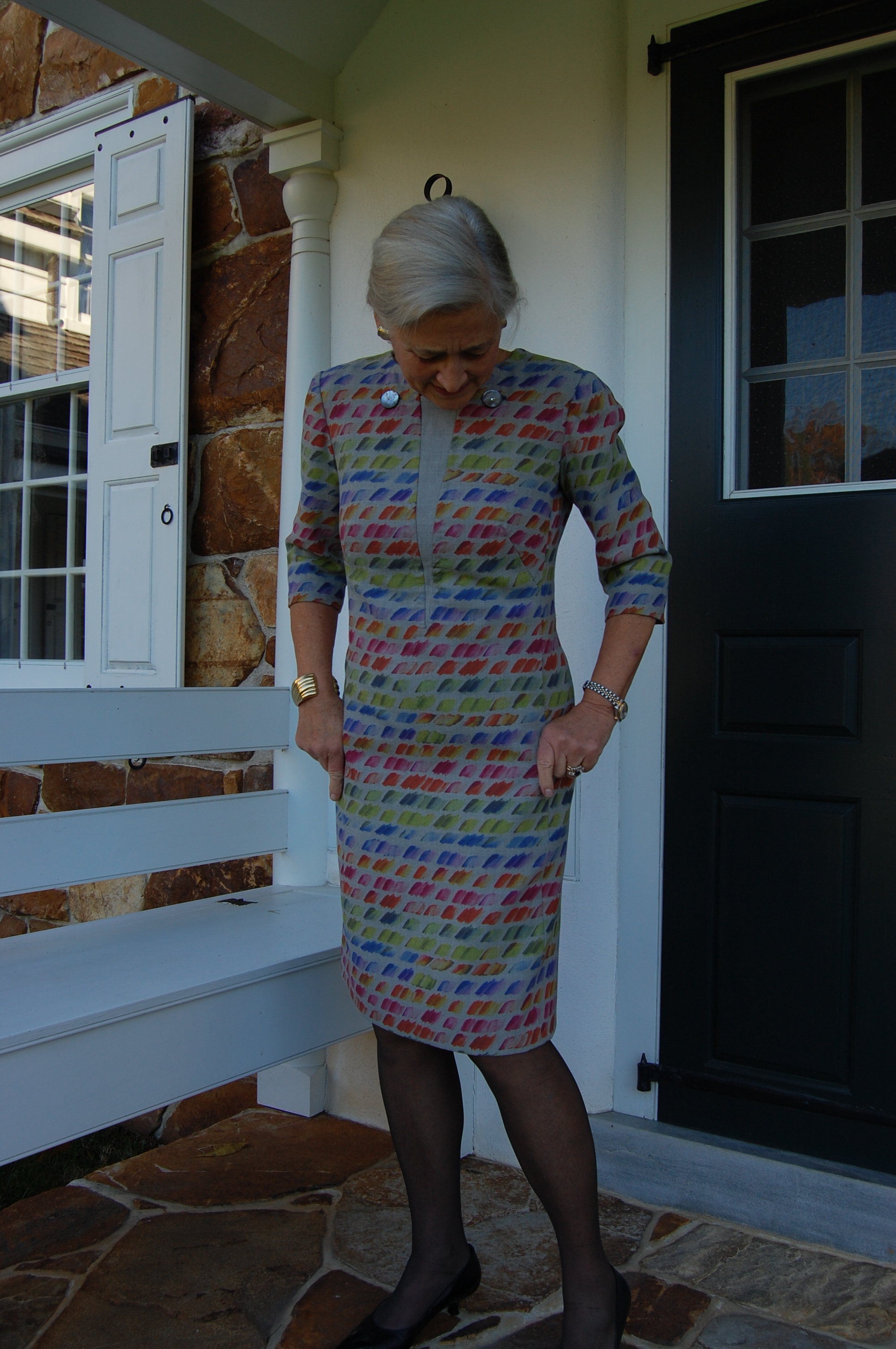
However, what about in-seam pockets which are part of the design? Here is a notable example:
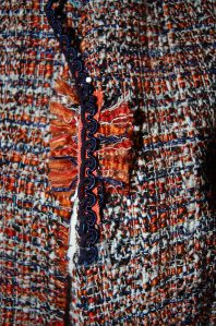
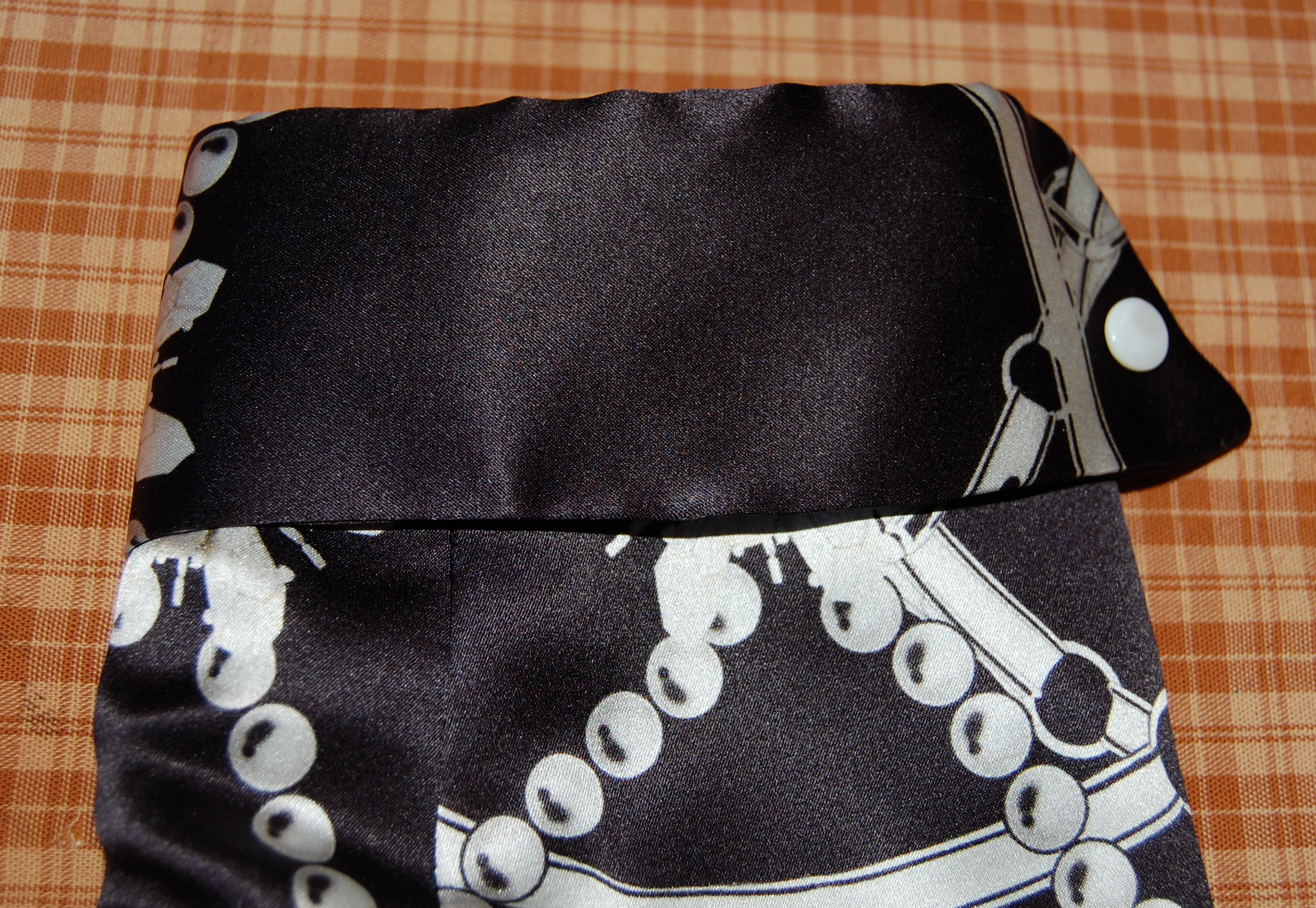
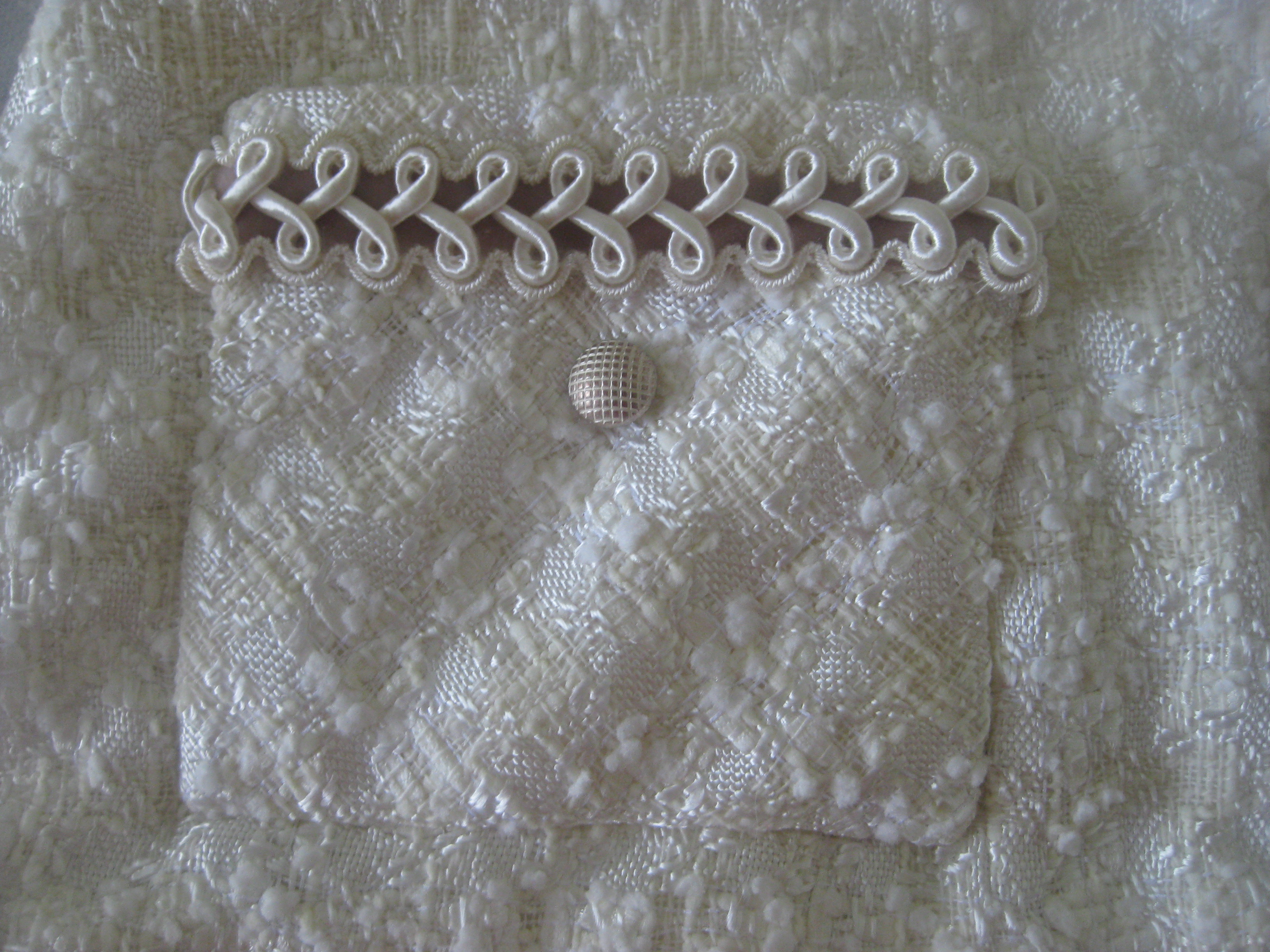
And then, of course, applied pockets are often part of the design, but not really intended for practical use. Take a look at this evening gown:


You might be able to tell I have decided I am not so keen on pockets in skirts and dresses either – UNLESS they are integral to the design.
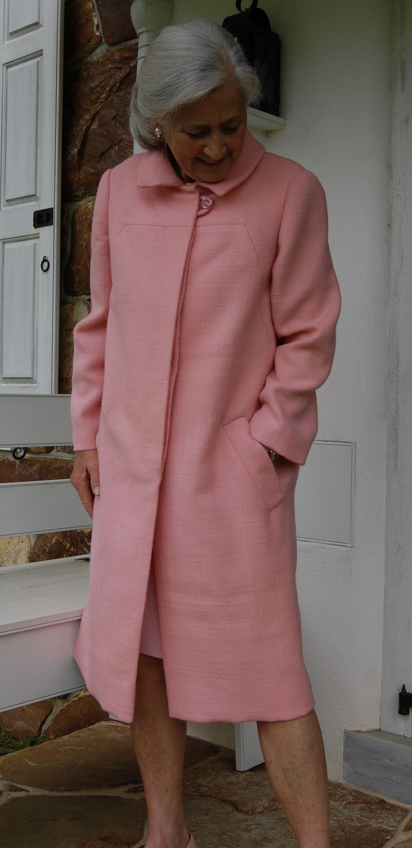
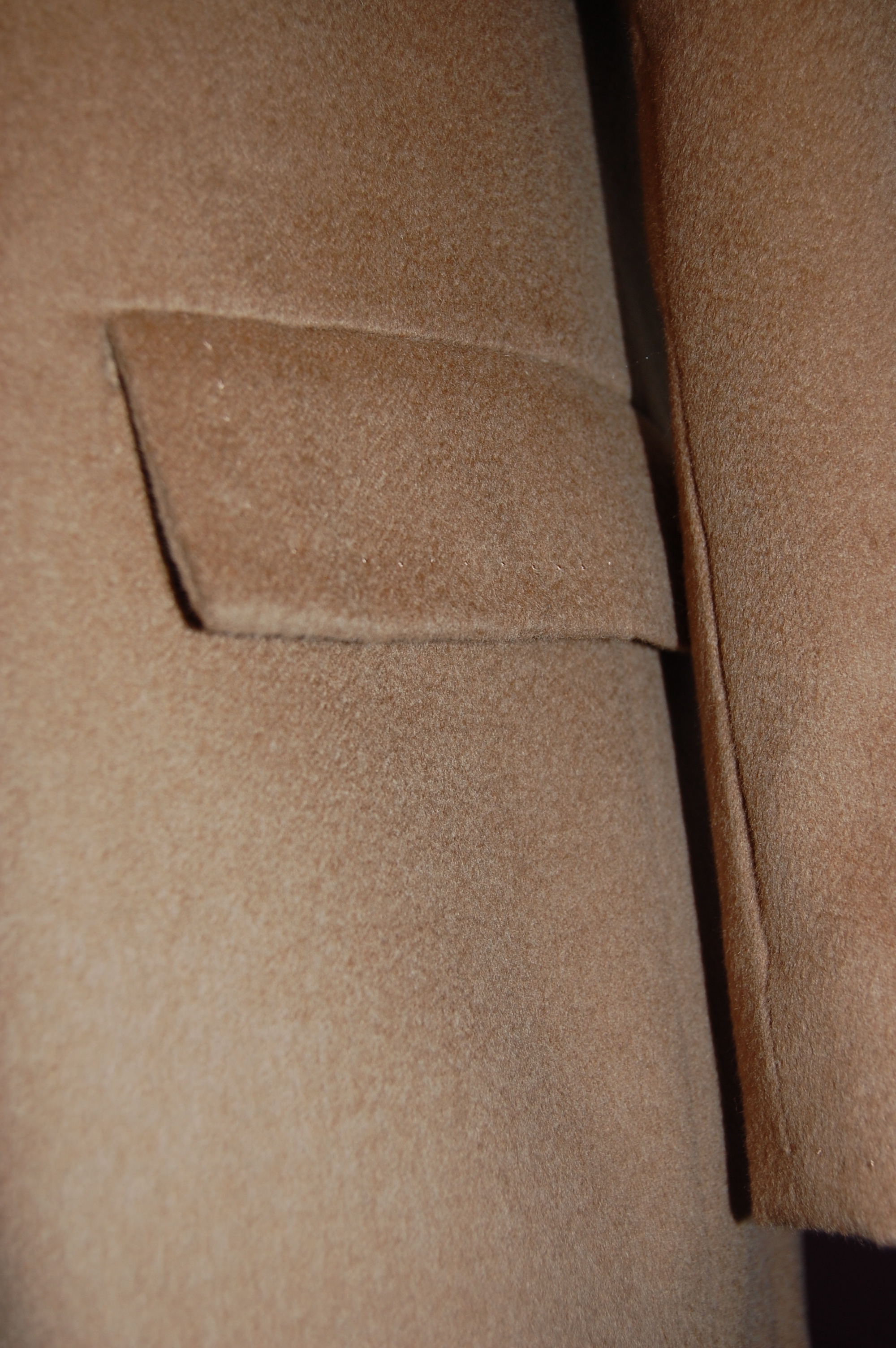
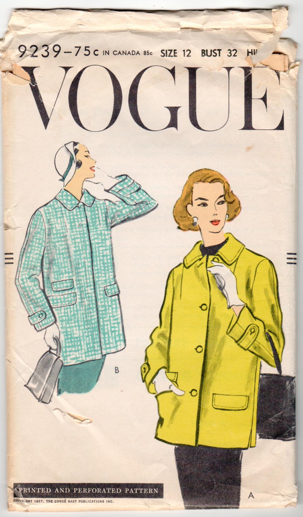
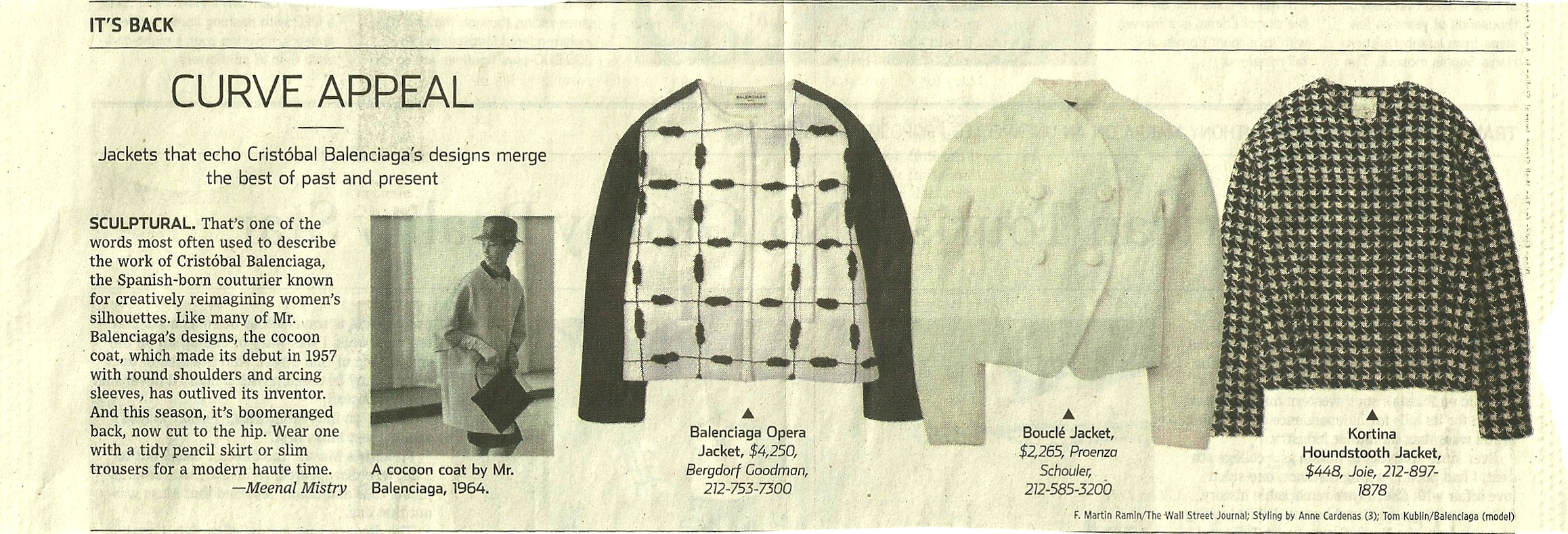
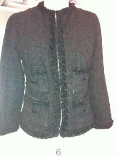
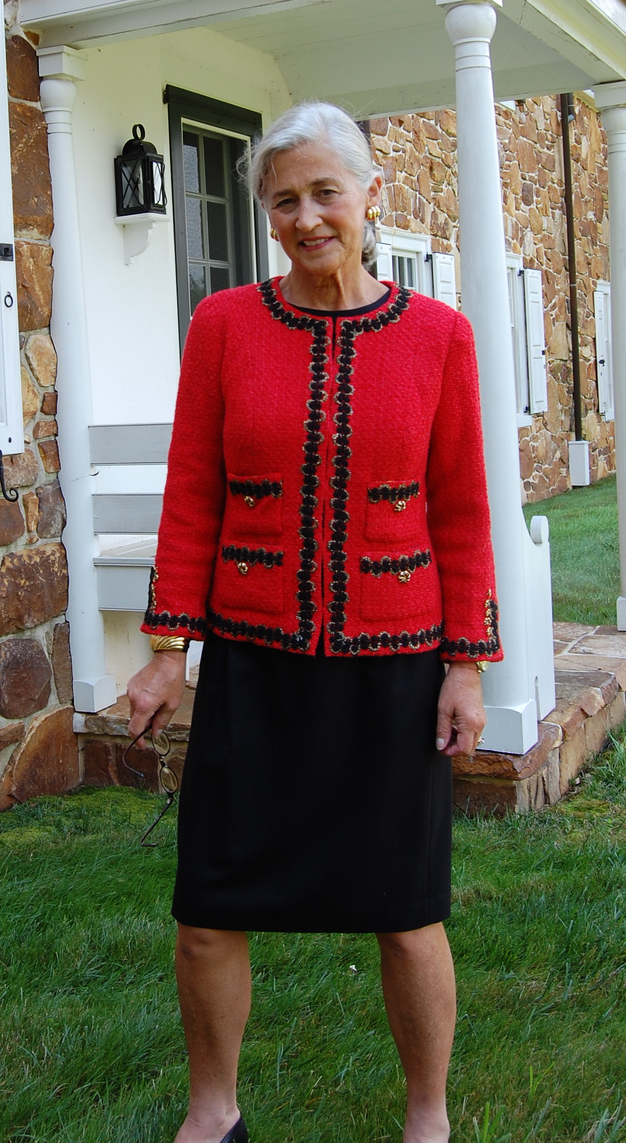
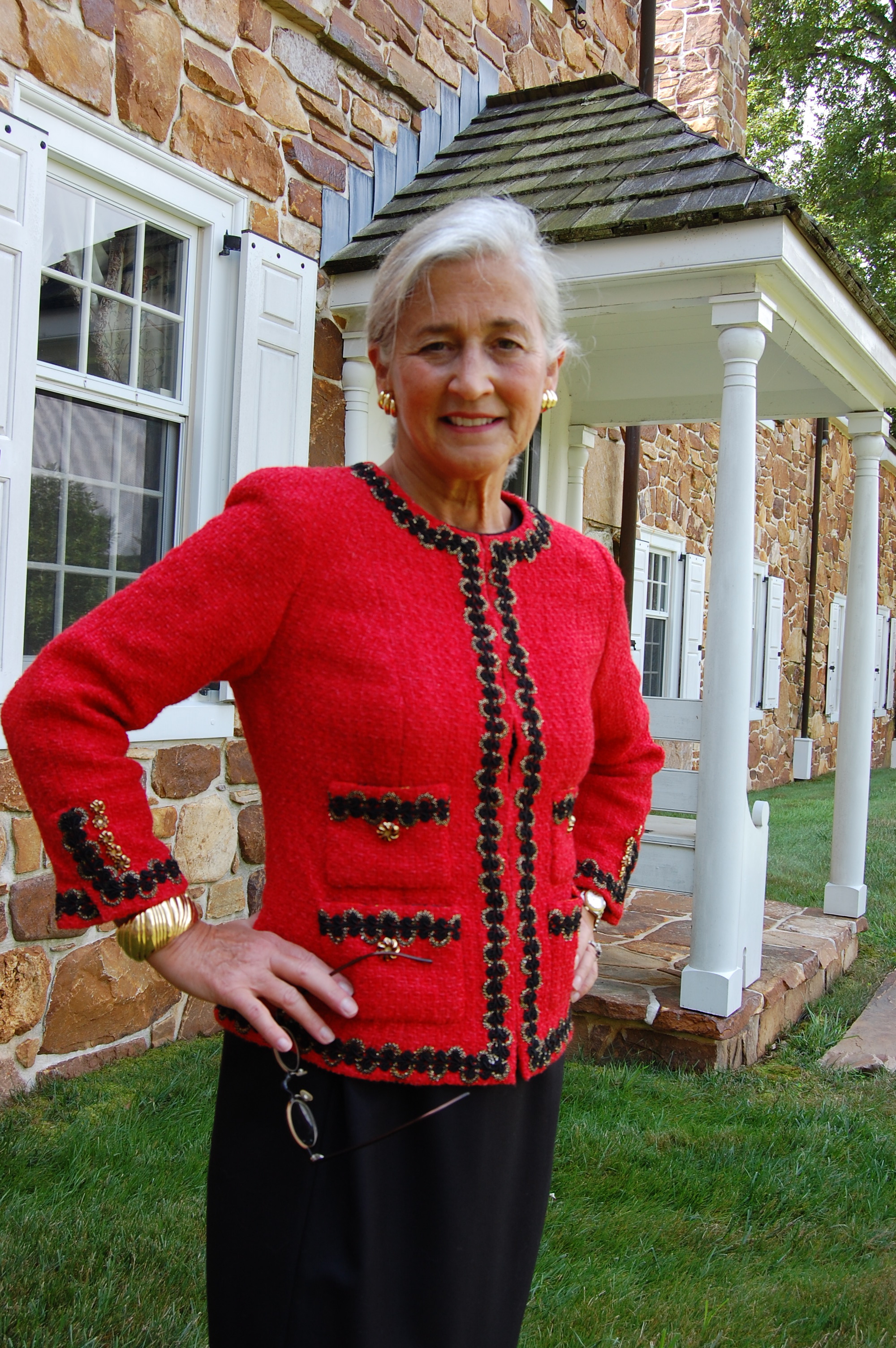
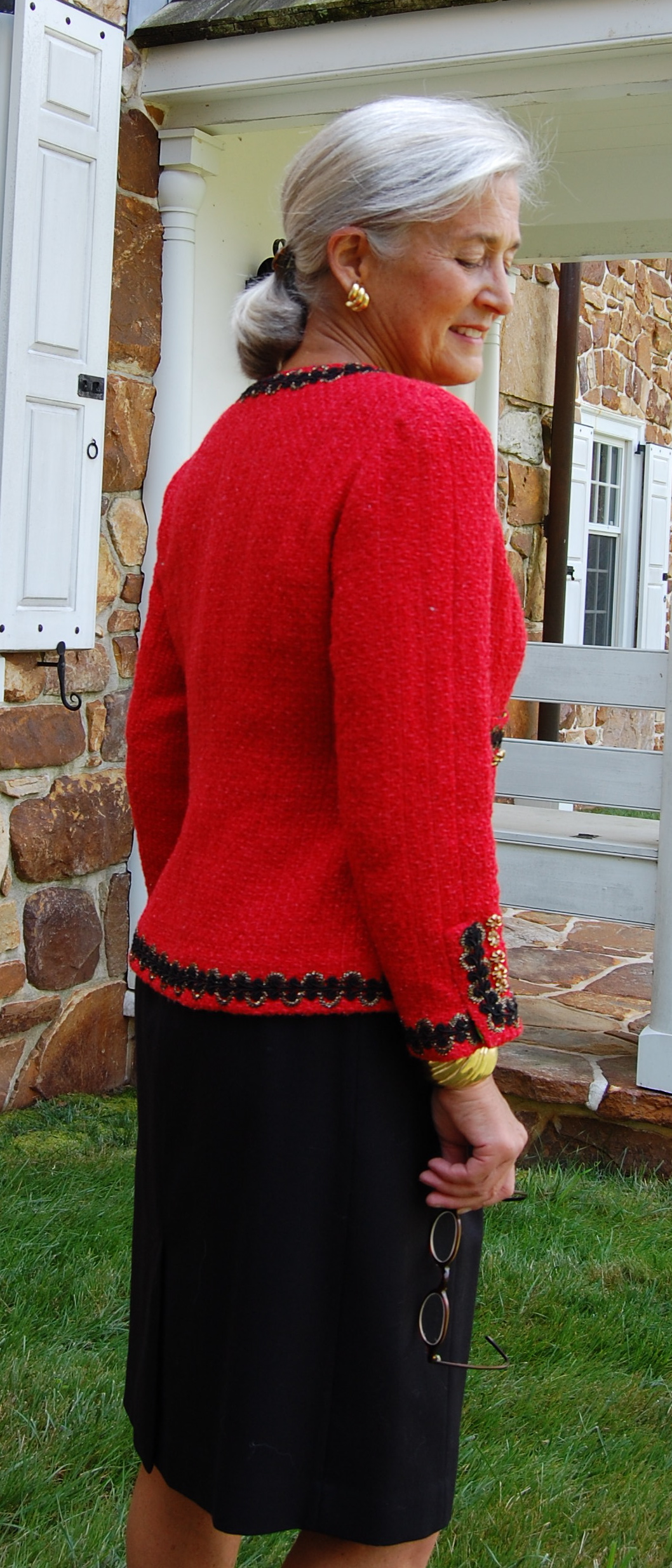
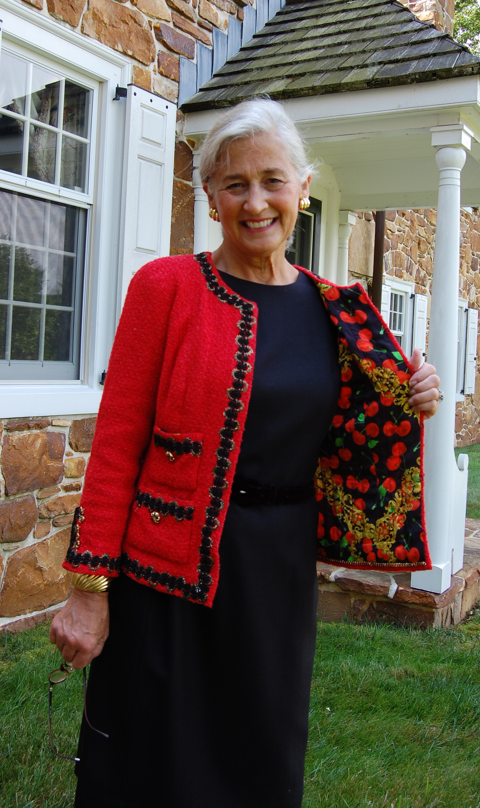
Which brings us to coats and jackets. I think one’s first reaction to this category would be “Well, of course, jackets and coats need to have pockets.” And for the most part, I would agree with that. Often pockets in coats and jackets are part of the design and add stylistic interest as well as functionality. Here are a few examples of coats I have made, with such pockets:

Here is a jacket pattern which is in my sewing queue for 2022. I absolutely love the pockets.
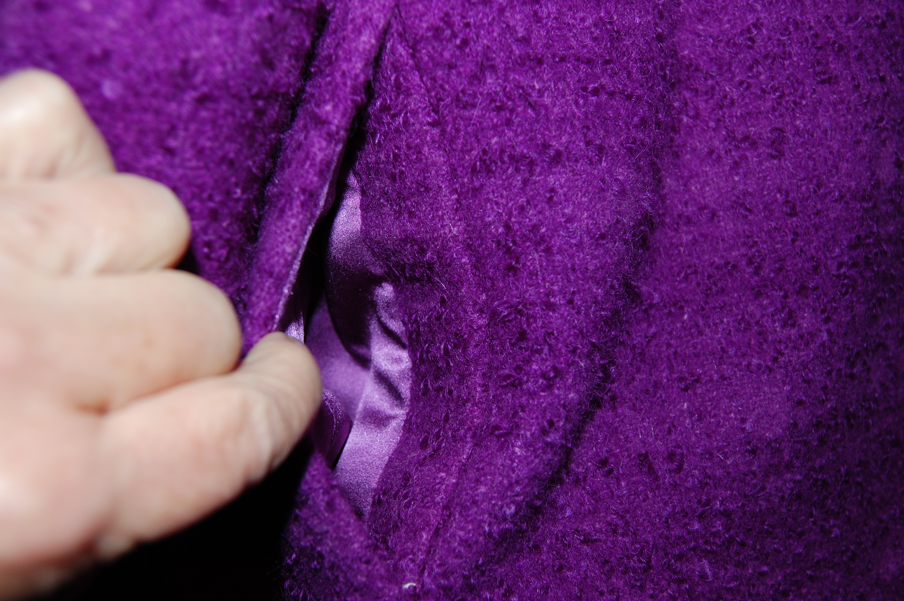
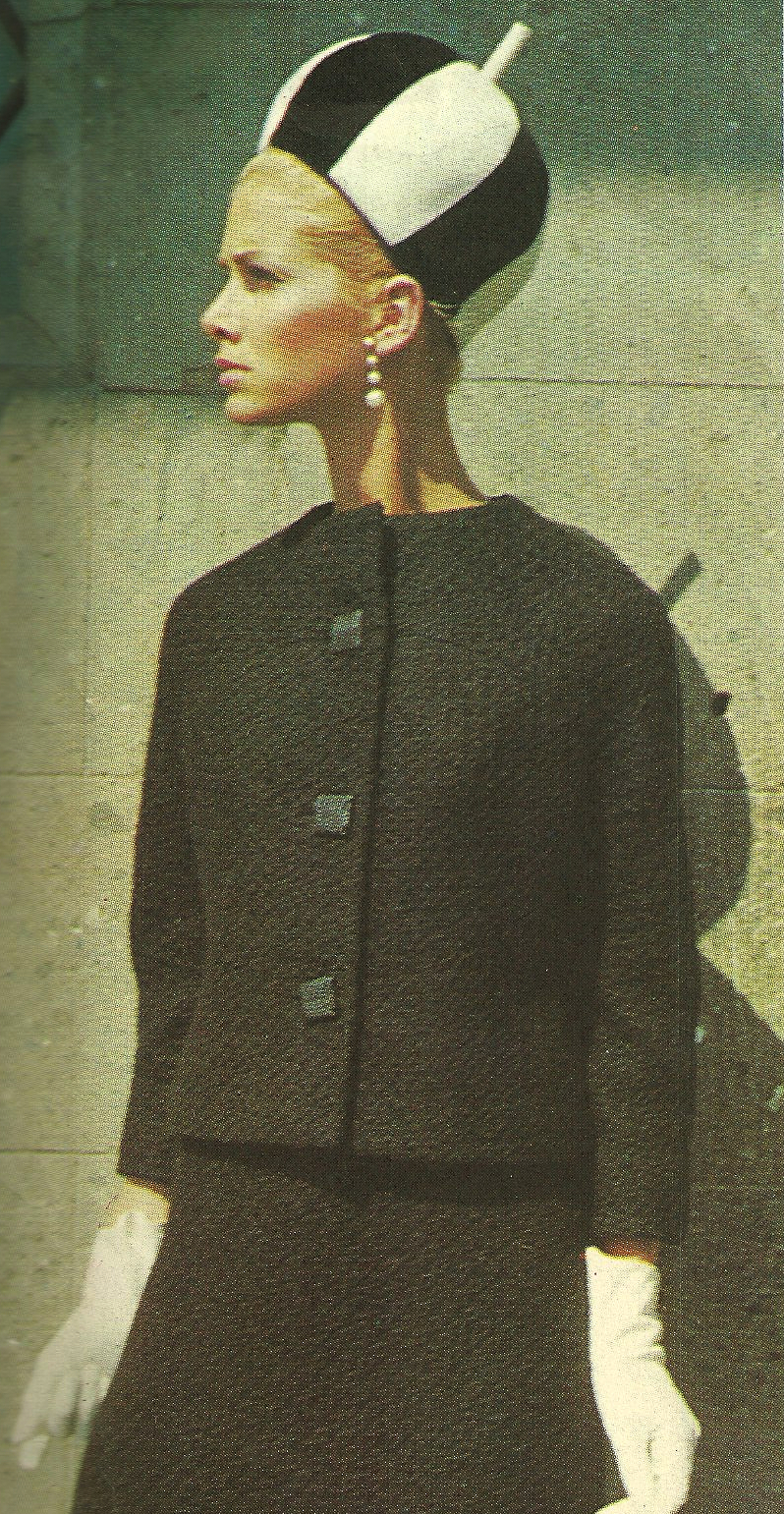
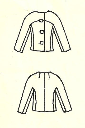
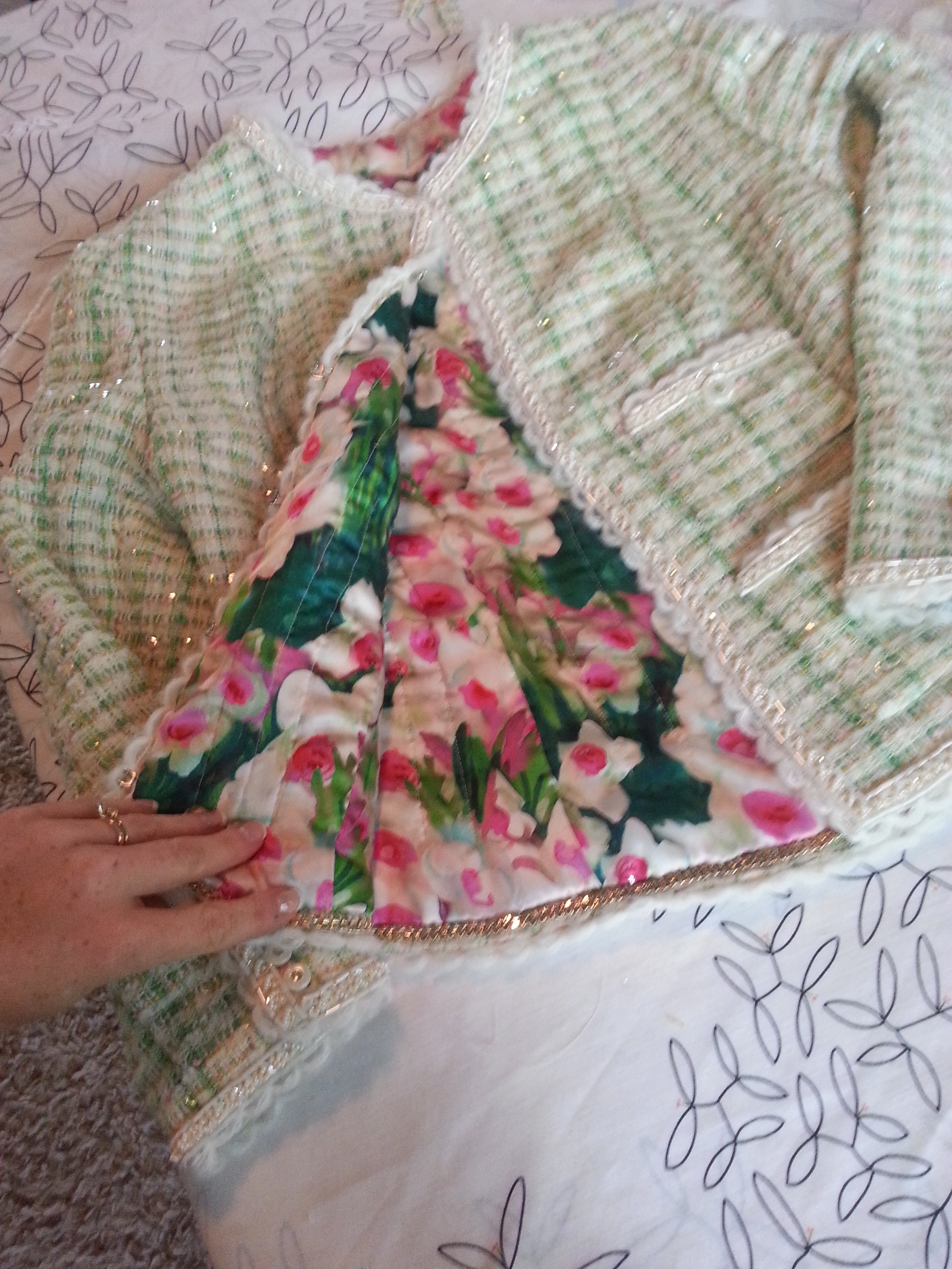
And where would a Classic French jacket be without its pockets? They are not really functional, but undeniably integral to the design.

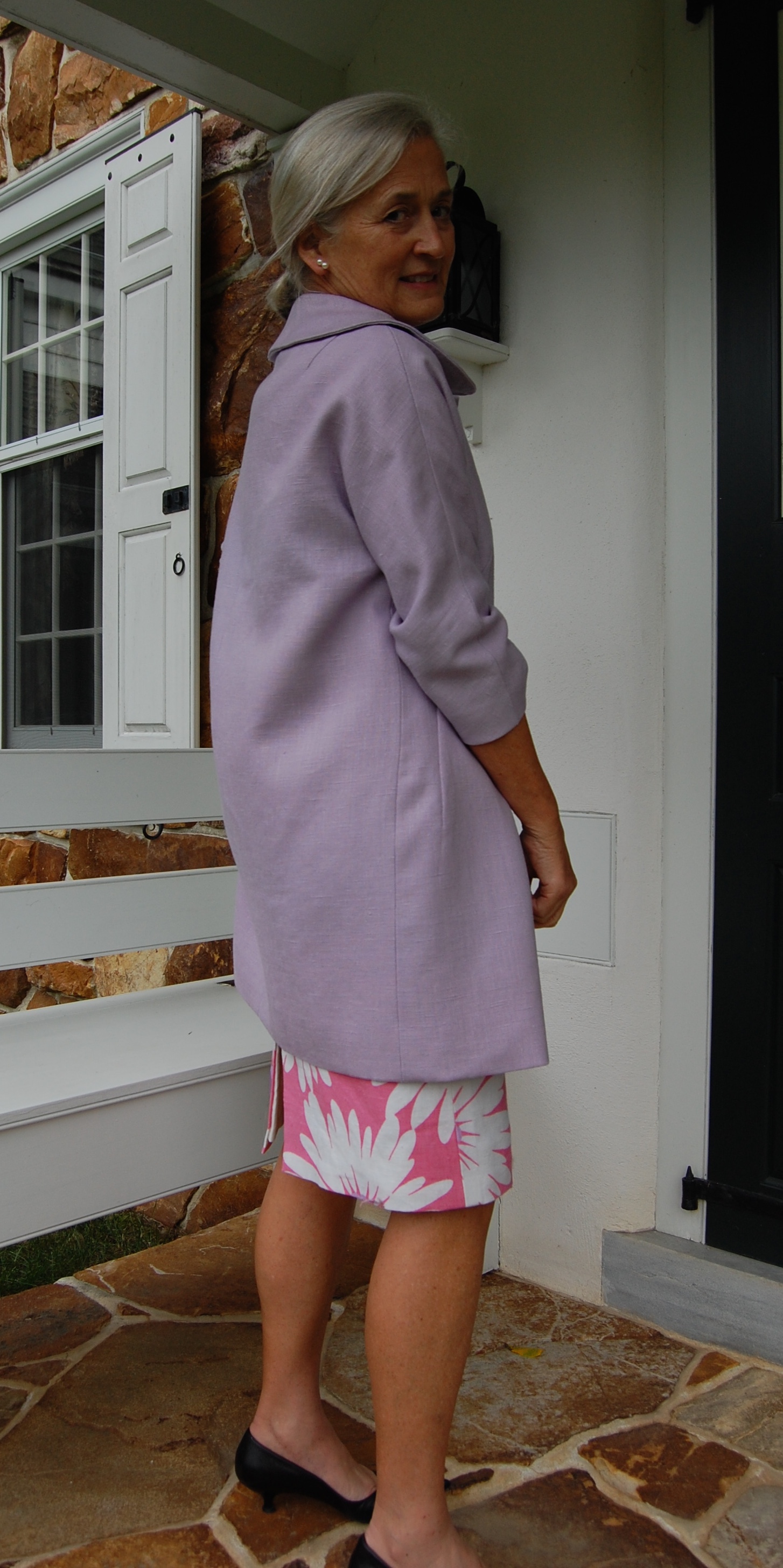
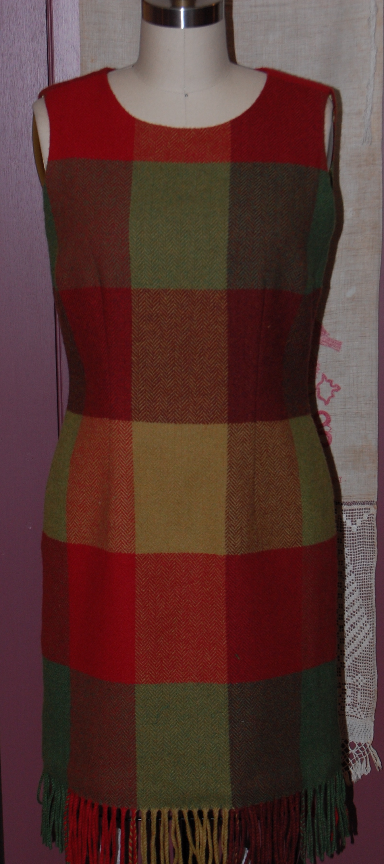
Not all coats have pockets, however. Take a look at this Madame Gres design which I made in a lavender linen. It has no pockets, nor would I want them in this Spring coat.
And here is a “summer” coat which I think is just so chic. No pockets.
I have made this coat pattern twice – once with pockets and once without.
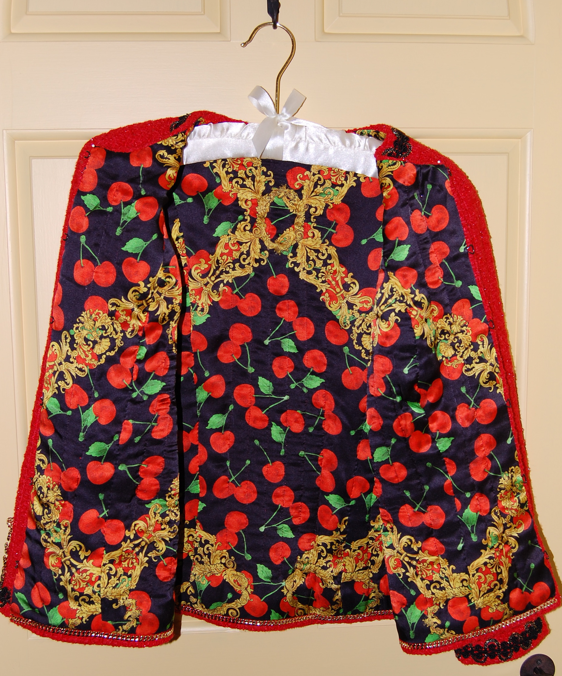
The wool version has in-seam pockets which I find useful:

But here is the same pattern, made as a “cocktail” coat. I made it pocketless and love it.

Clearly there is much to consider when it comes to pockets. When we add them to a garment, or delete them, or change their placement, or baste them shut to eliminate that dreadful “pooch” problem, we are admitting that not all pockets are equal. Some are perfect in every way, some not so much, and some – are never missed.


Is It a Trench Coat – or Is it Not?
It is not. However, I am quite sure this classic look from 1974 was inspired by the classic Trench Coat as we know it.
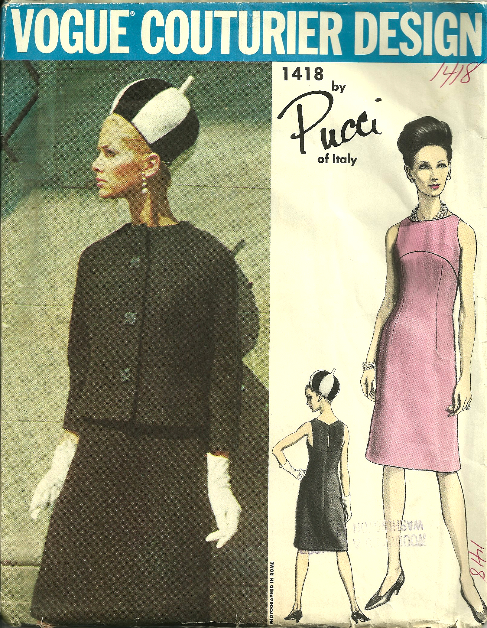
I am certain this Vogue pattern is from 1974, as it is featured in that year’s July/August issue of Vogue Pattern Book Magazine. It is part of a section entitled NEW ARRIVALS.
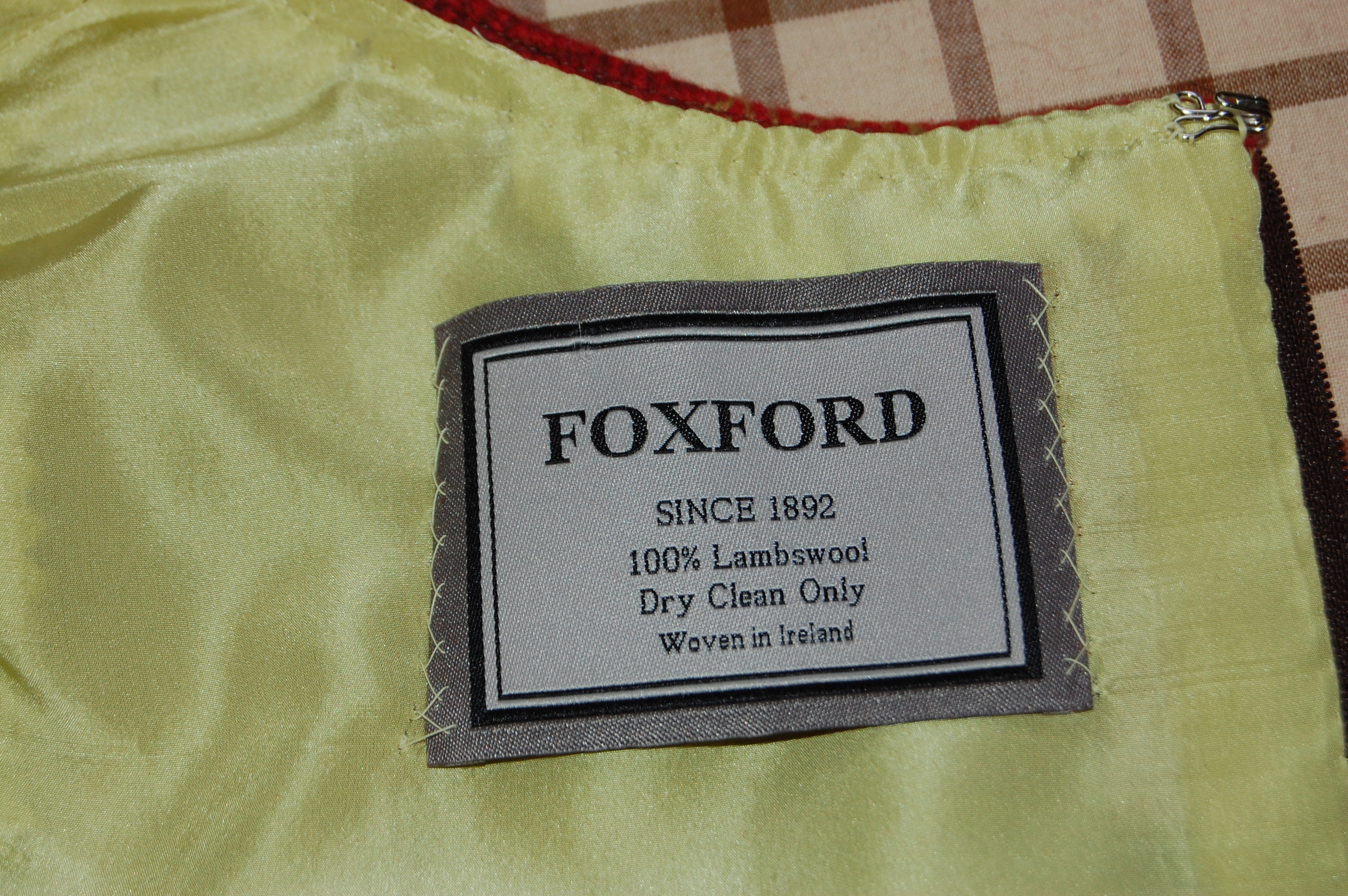
The caption tells me it is made in silk shantung, a little bit of information unknown to me when I decided to make my (new) version of it in silk taffeta.
Interestingly, in the same NEW ARRIVALS section, a dress by Patou also is reminiscent of Trench coat style, with its epaulets, slotted pockets with shaped flaps and a belted waist. It also has a center back inverted pleat.
Fast forward two years and here is a very classic Trench in the 1976 September/October issue of Vogue Pattern Book Magazine.
The caption reads: “Come rain, come shine, what more liveable coat than the trench! All that star reporter elan in epaulets, front & back shields, center back inverted pleat.” This particular pattern also includes a detachable lining for the coat and additional detachable collar. I believe that is the collar you see in red in the above picture from the magazine. The thumbnail drawings of the pattern are helpful in seeing these details:
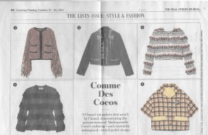
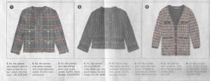
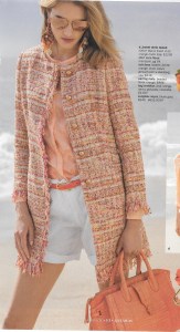
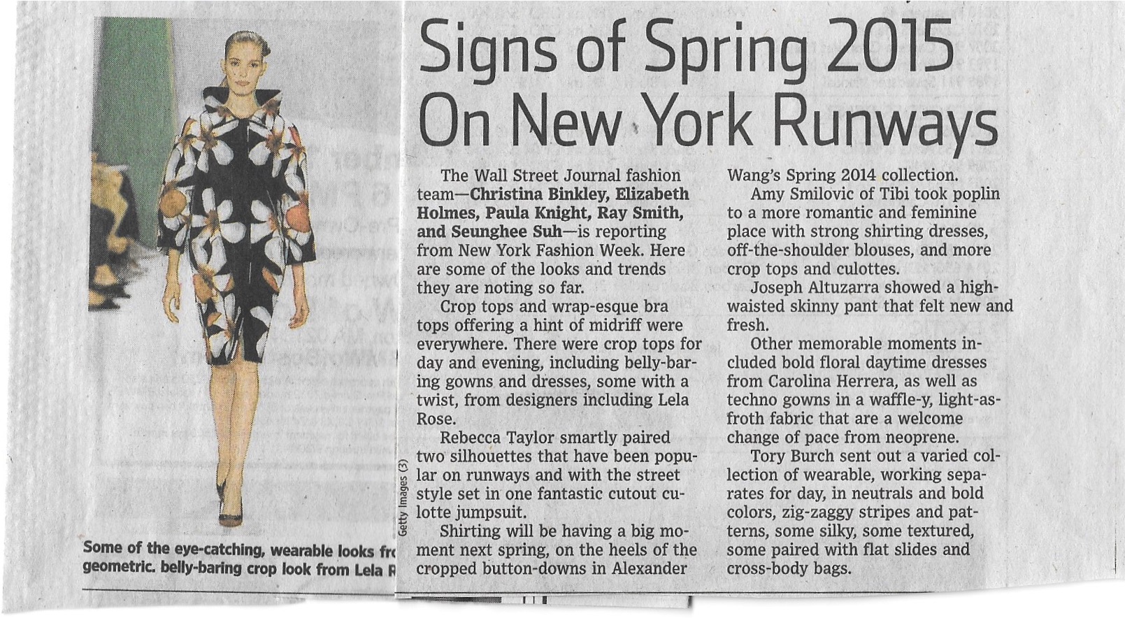
Now, hang onto your hats and fast forward 46 years to 2022. The Trench Coat, despite being in fashion since the 1940s, is apparently enjoying new attention and reimagination according to an article in the Style & Fashion section of The Wall Street Journal, April 23-24, 2022. Although I am a little doubtful as to the long-lasting appeal of some of the Trench Coat variations shown and suggested in the article by Katharine K. Zarrella – which include a skirt, pants and a corset (really?) – some of the reflections and thoughts on Trench Coat style by various fashion insiders are worth sharing.
Michael Kors is quoted as saying: “A trench coat inherently feels like an old friend that makes you feel very secure… But you want an old friend to surprise you.” (Pink checks, anyone?)
Jane Tynan, author of a soon-to-be-released book entitled Trench Coat, says the appeal of the Trench to contemporary women is the “danger and sensuality it conveys.” (Think spies and clandestine meetings.) However, a certain Loa Patman of Boston, Massachusetts, says, “Anything trench-inspired tends to look somewhat pulled together and professional.”
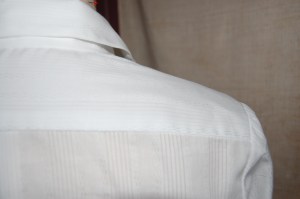
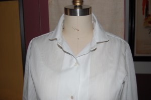
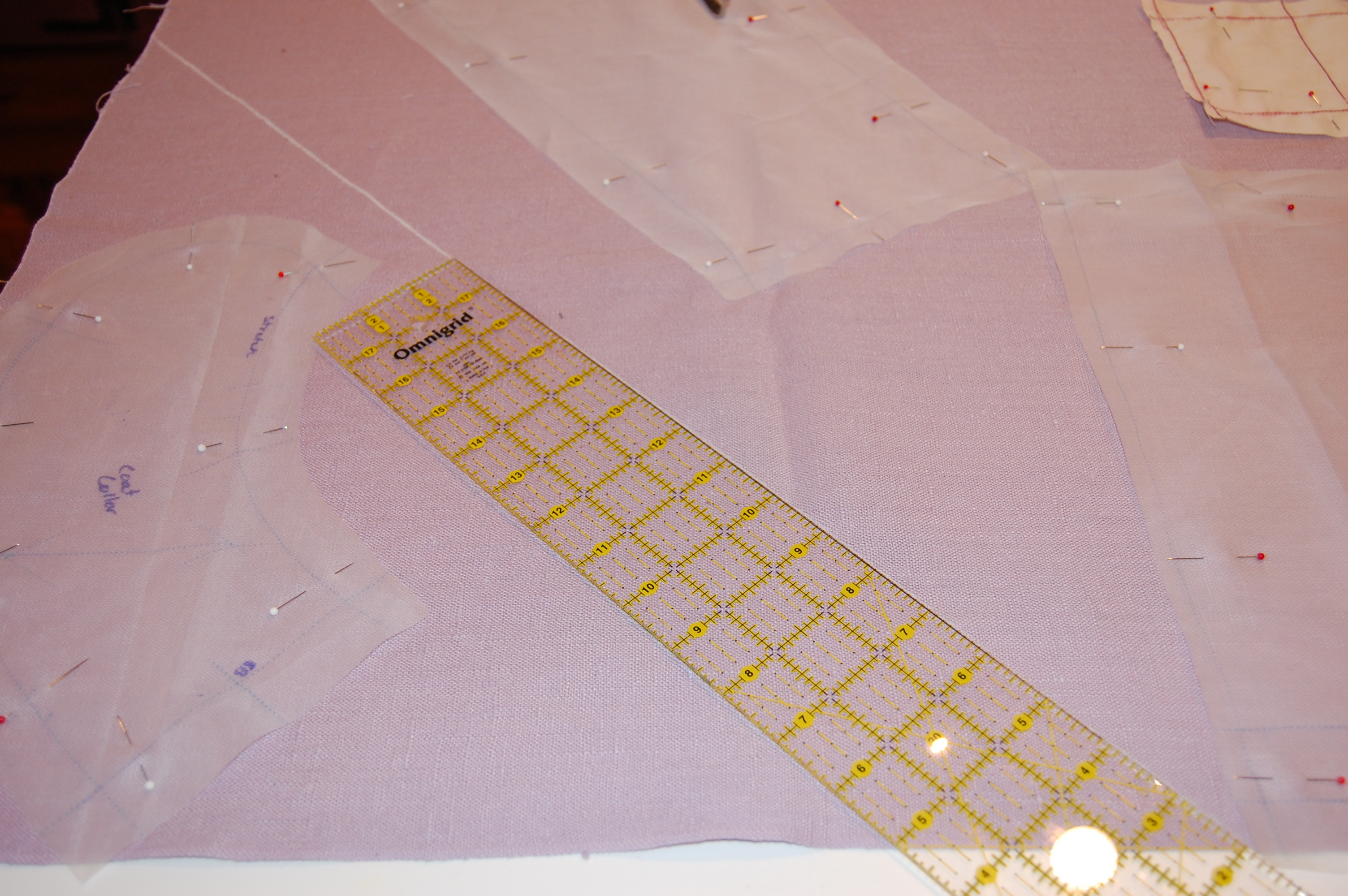
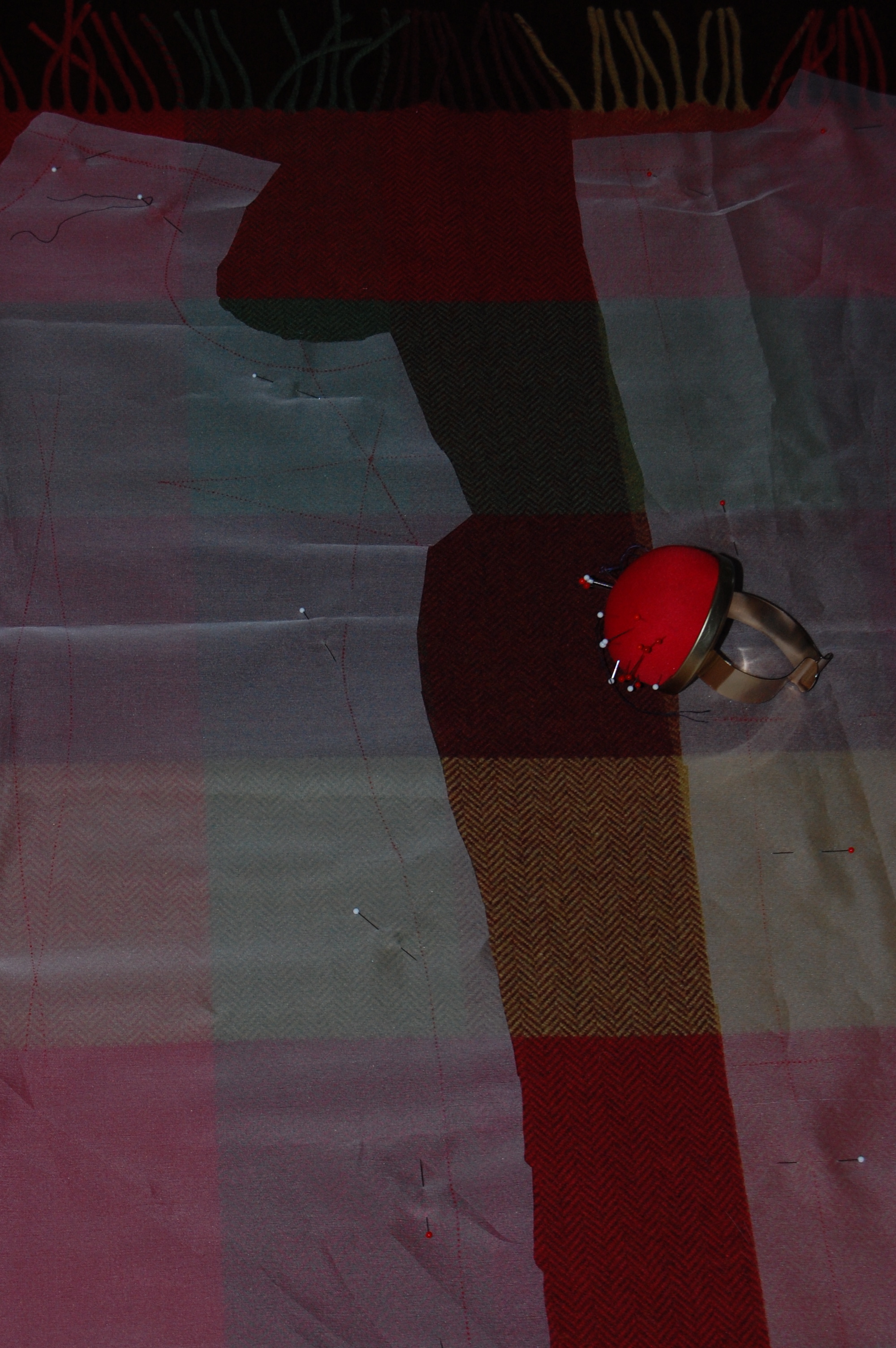
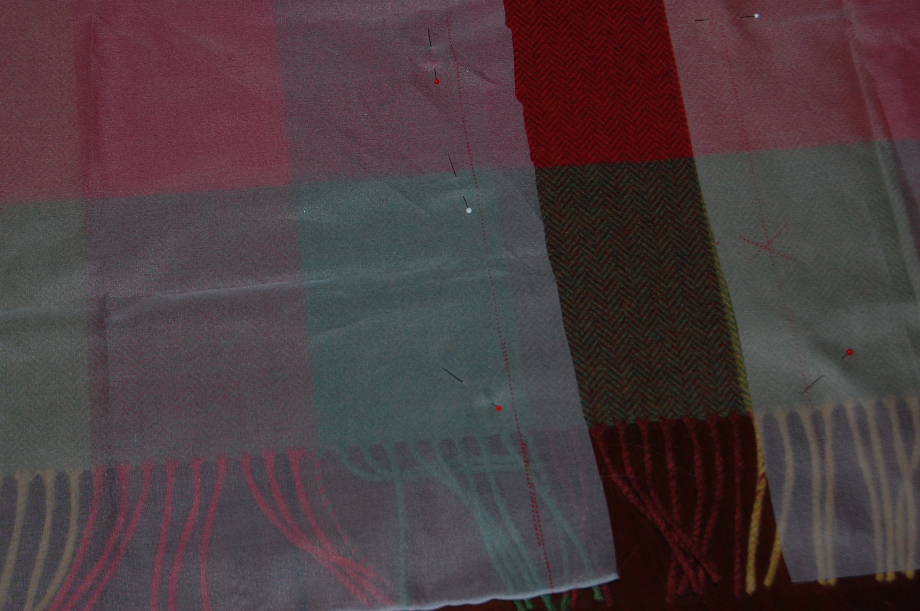
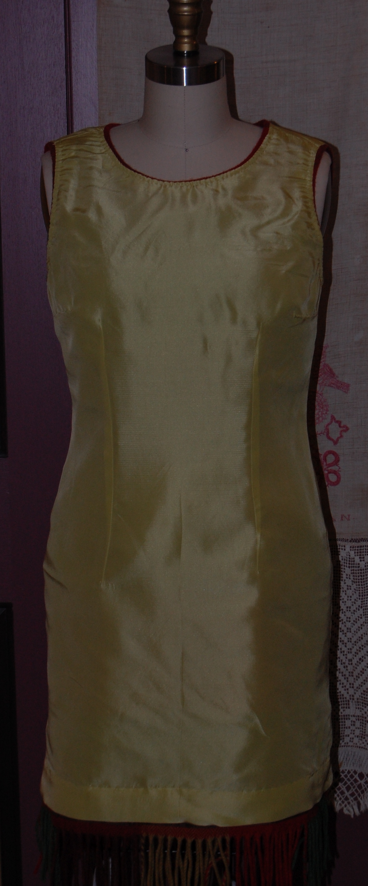
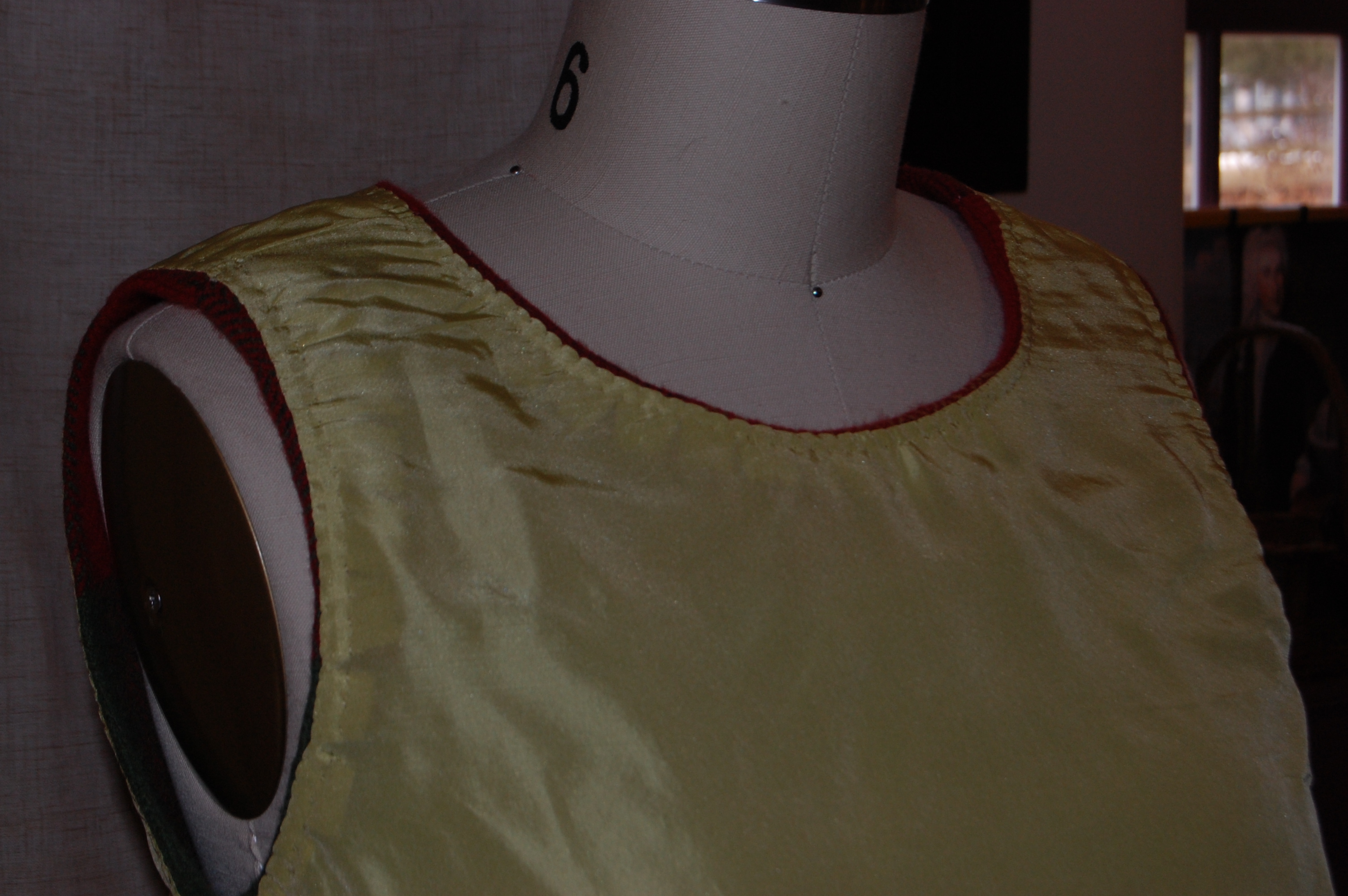
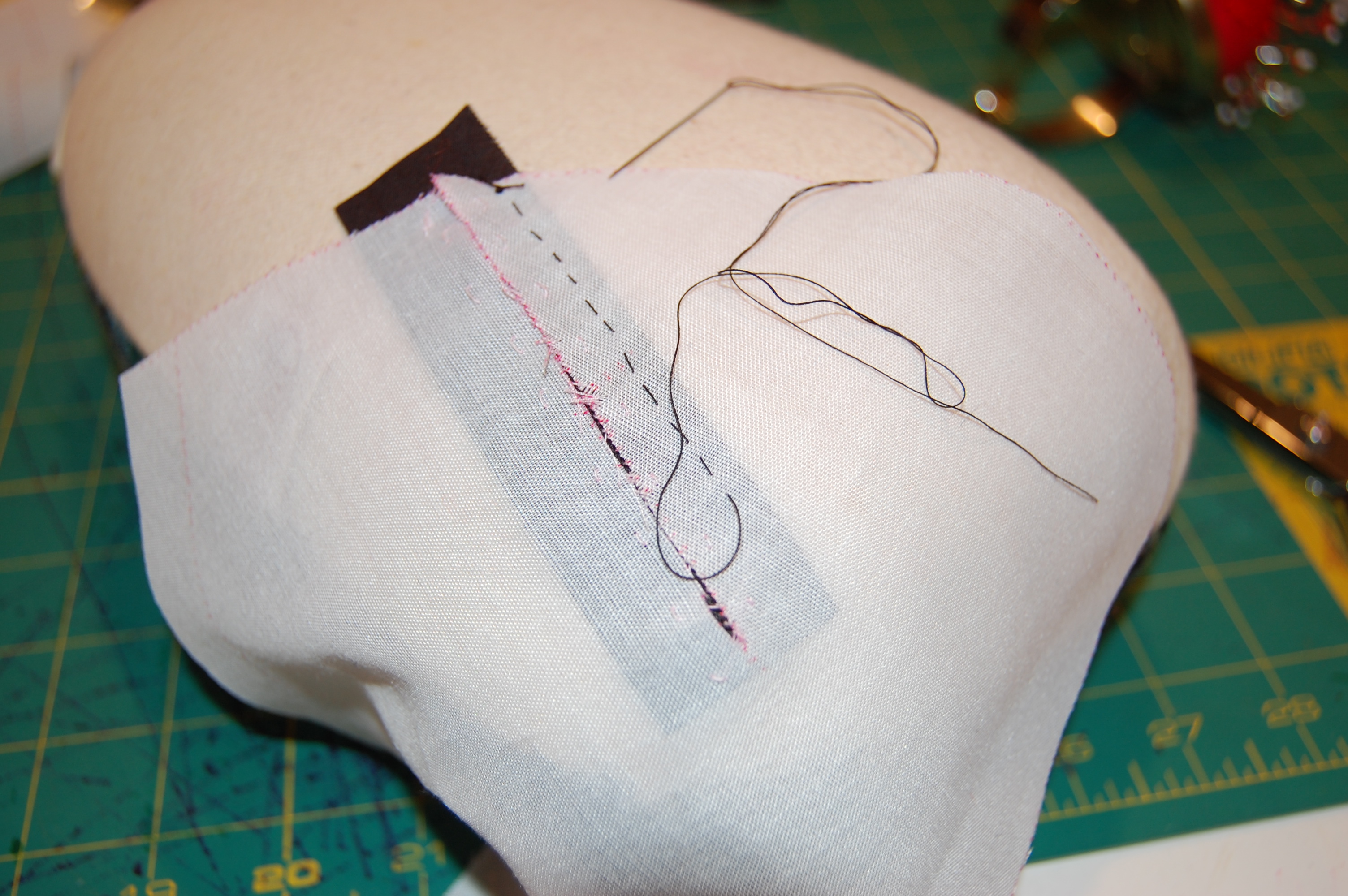
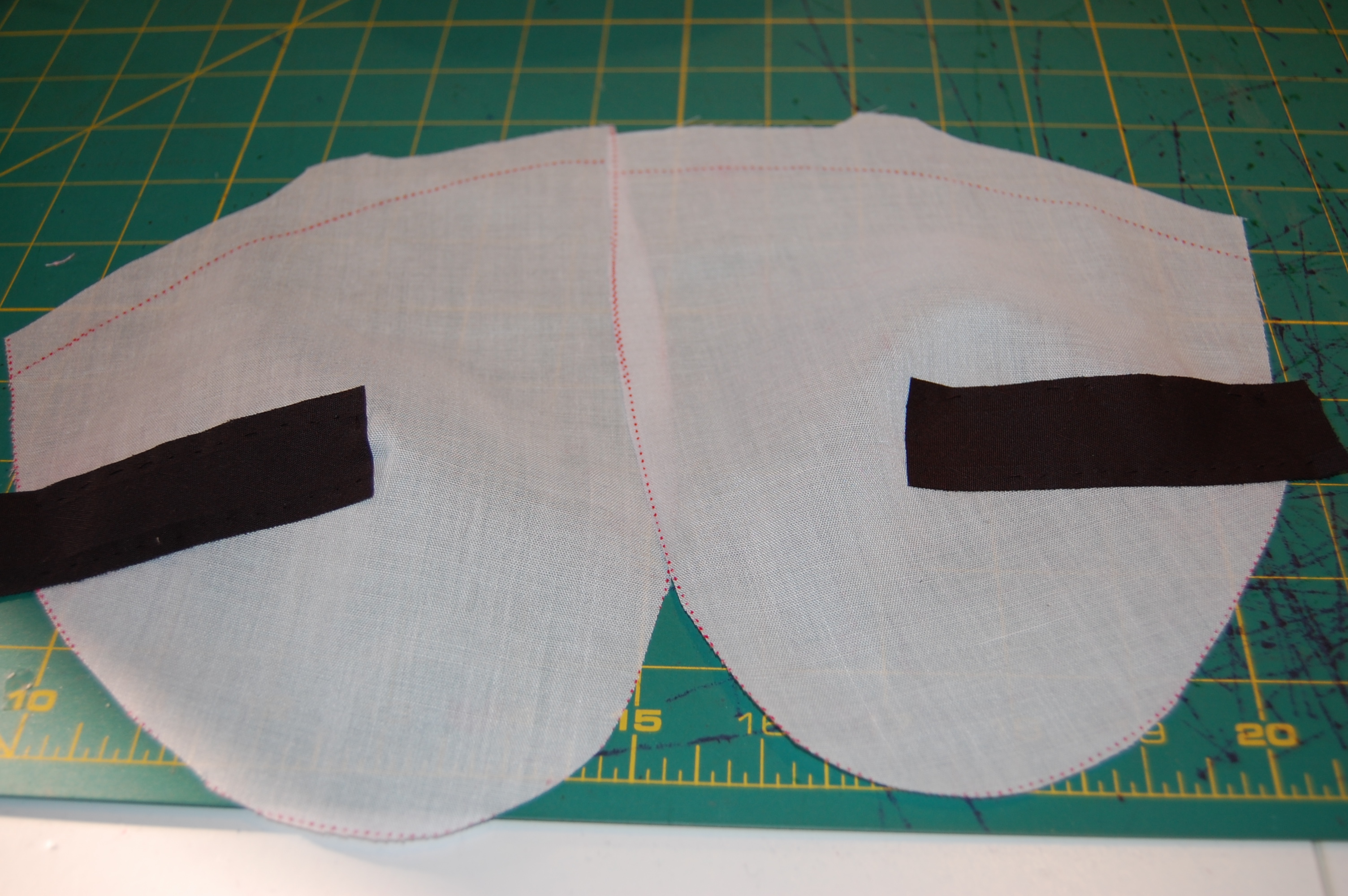
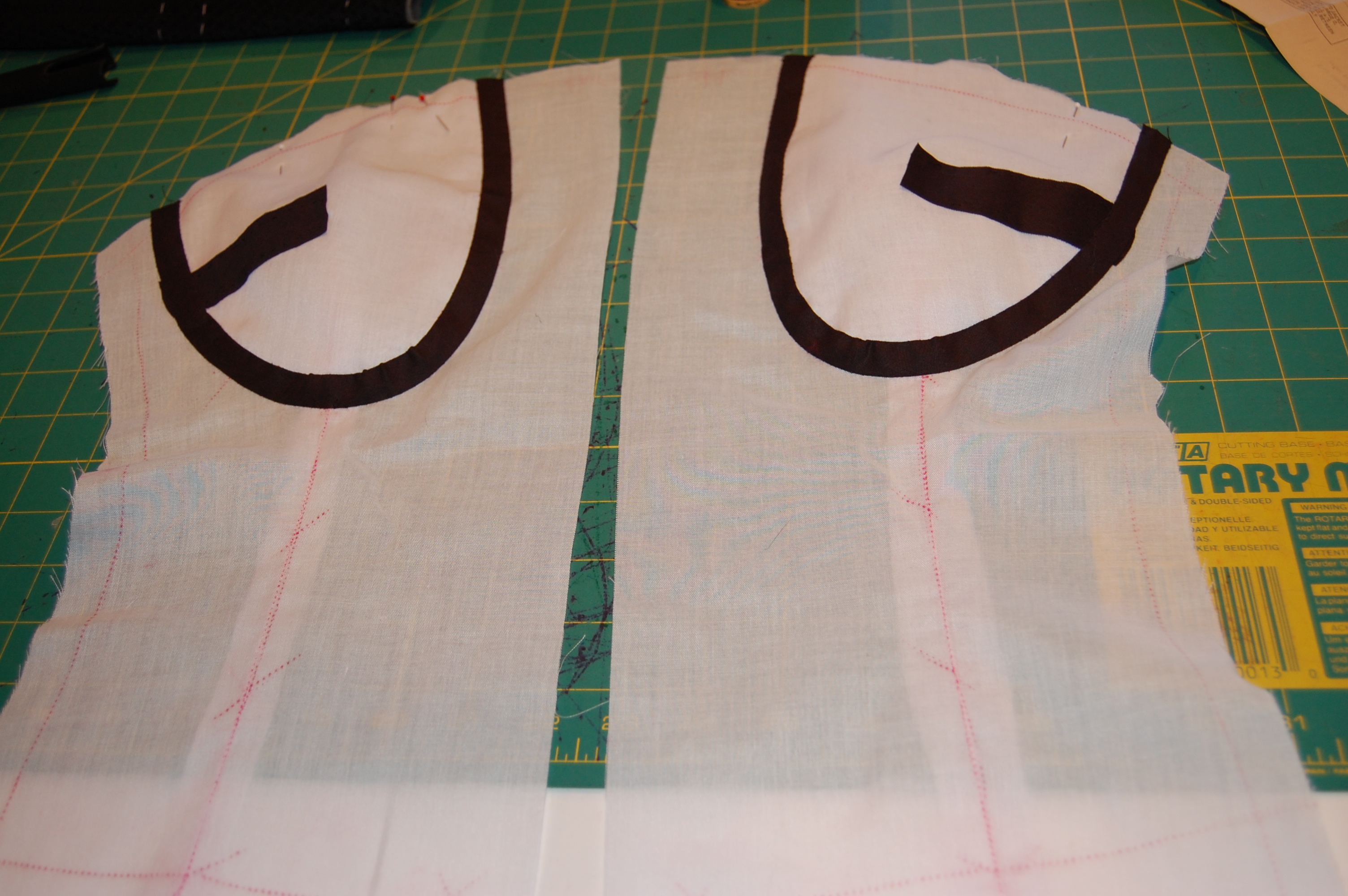
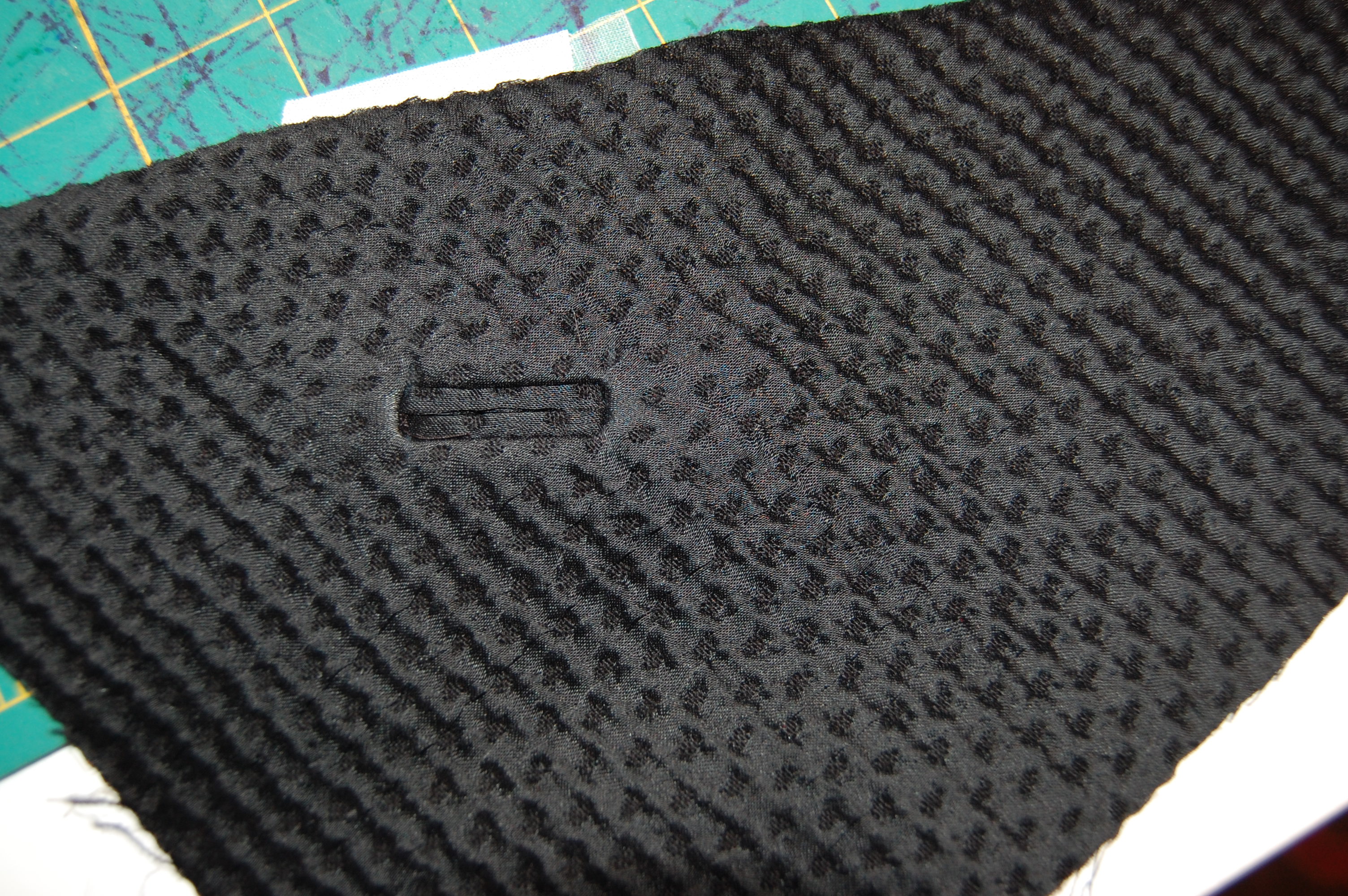
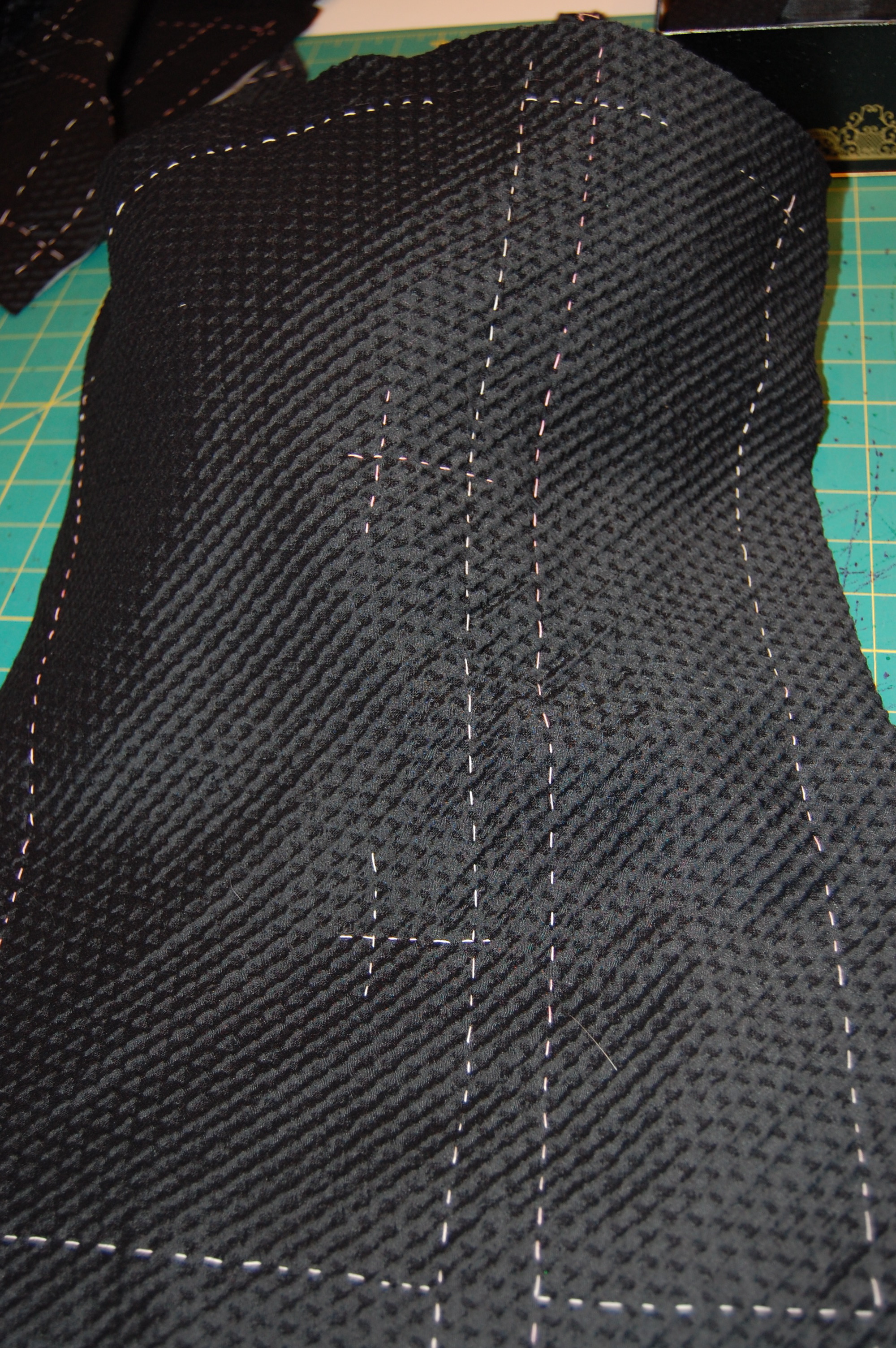
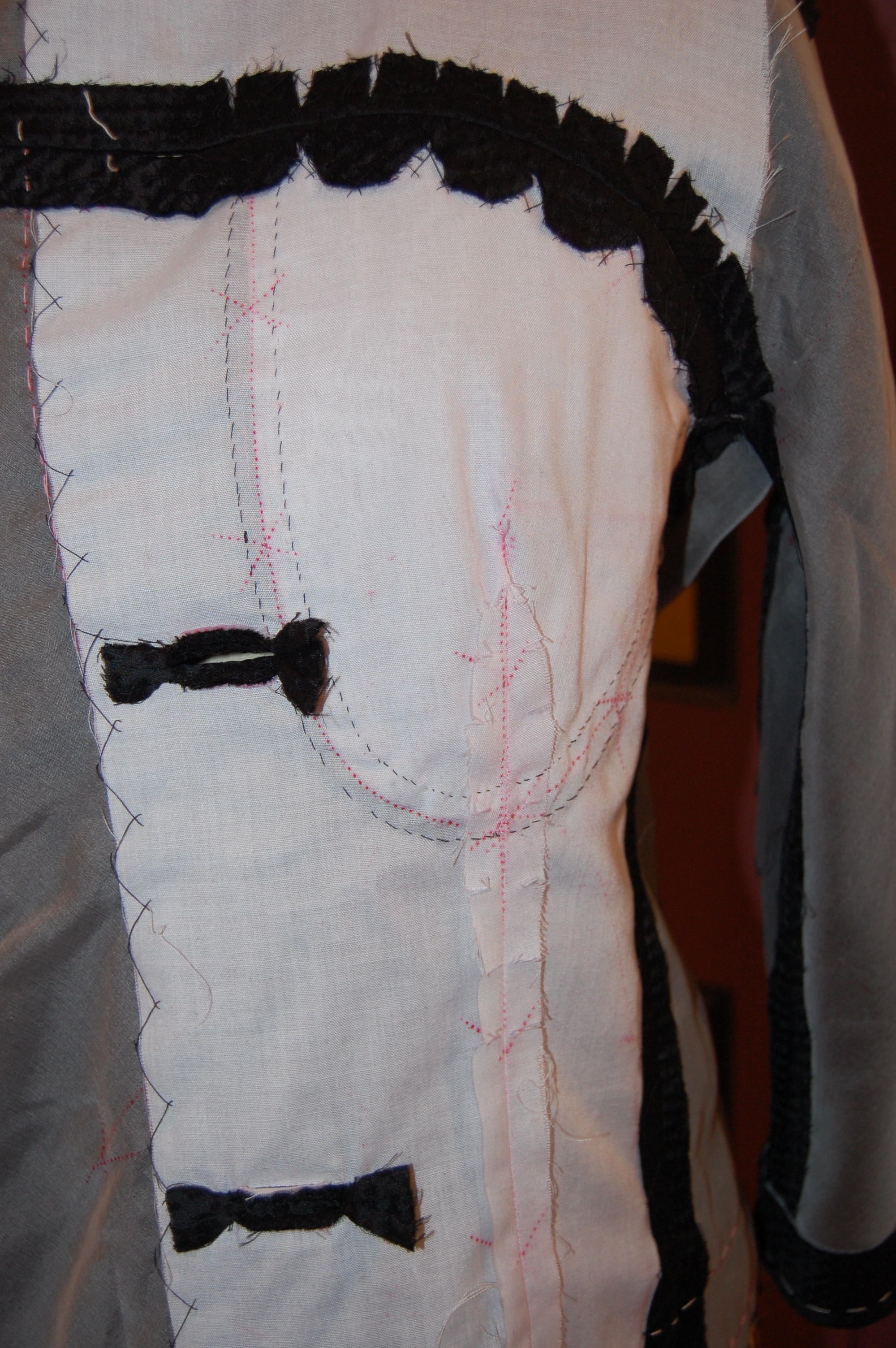
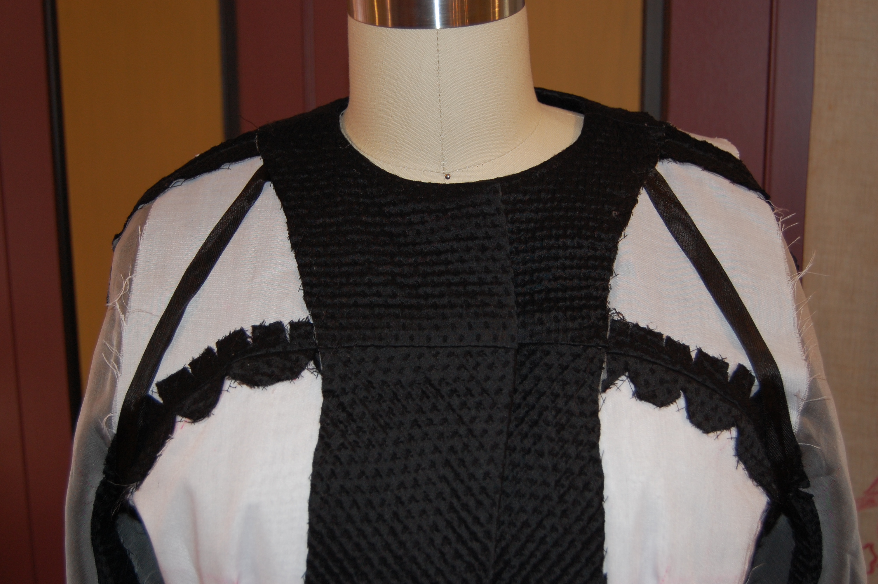
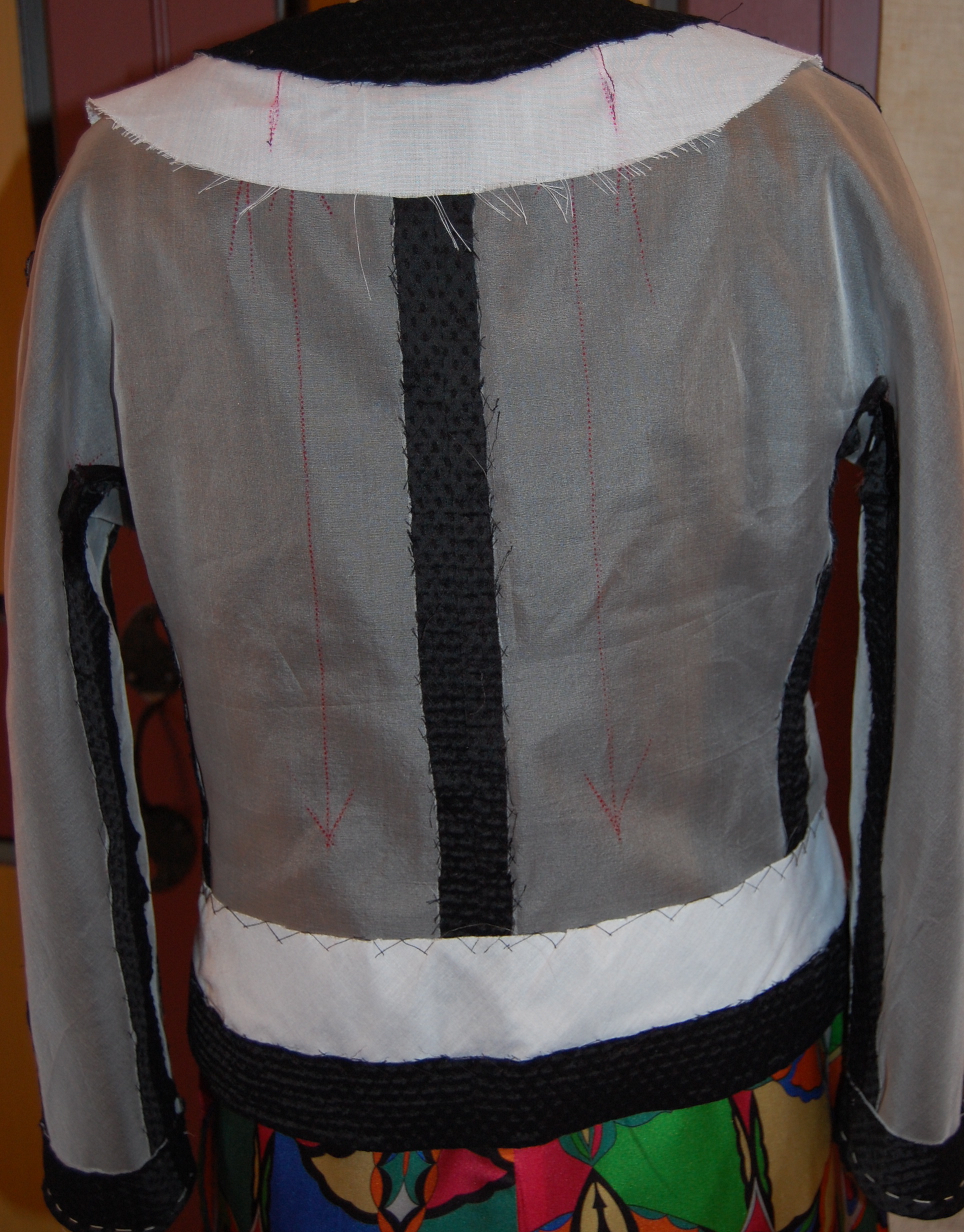
Well, I don’t expect to be doing any sleuthing in my Trench-inspired Christian Dior design from 1974, but I do aspire to feel “pulled together” while wearing it. Right now it is anything but pulled together, as you can see from the photos of my “work in progress”.
Thinking further about the origins – and definitional category – of this particular design from the House of Dior, it seems to me to be a cross between a dressmaker coat and a Trench. Perhaps “Dressmaker Trench” might be the best description. As you will recall, if you follow this blog, I have referred to “dressmaker coats” before. Fairchild’s Dictionary of Fashion describes it as: “A woman’s coat designed with softer lines and more details than the average coat. May have a waistline and unusual details, e.g., tucks or pleats.” (p. 92, ibid.)
I’m not sure Dressmaker Coat is a descriptor many use anymore, but it certainly is useful. One thing I am quite certain of, once this Trench-inspired Dressmaker Coat is finished – it promises to stand the test of further time. I anticipate it as a staple in my Spring and early Summer wardrobe.
5 Comments
Filed under Christian Dior, Coats, Dressmaker coats, Fashion commentary, Mid-Century style, Silk taffeta, Uncategorized, vintage Vogue patterns from the 1970s
Tagged as Dressmaker coats, fashion sewing, sewing, silk, vintage fashion, vintage Vogue patterns, Wall Street Journal Fashion coverage