
Every December when Pantone announces its Color of the Year for the upcoming annum, I think of it as a holiday gift for the mind and senses. The commercial implications of the selection are obvious, as the manufacturers in the lifestyle and fashion industries are guided to a degree by the chosen color. Or perhaps the Color of the Year is more of an affirmation of the direction these manufacturers were headed anyway. Nevertheless, the color serves as a guideline and often an inspiration. The color for 2019 is Living Coral, Pantone 16-1546.
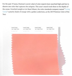
Described as “a peachy shade of orange with a golden undertone,” the color shown here is not nearly as vibrant as the real thing!
Its description reads as follows: “ Vibrant, yet mellow, Living Coral embraces us with warmth and nourishment to provide comfort and buoyancy in our continually shifting environment. Sociable and spirited, the engaging nature of Living Coral welcomes and encourages lighthearted activity. Symbolizing our innate need for optimism and joyful pursuits, Living Coral embodies our desire for playful expression.”
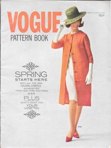
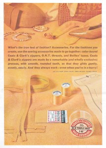
Pantone has been selecting a Color of the Year for 20 years, although the company had its beginning in 1962. It certainly appears that they went back to their early roots in when choosing Living Coral for 2019. Take a look back 58 years at this cover of a 1963 Vogue Pattern Book Magazine:
This cardigan coat is paired with a white wool dress underneath.
One of the prominent colors featured inside this issue from February/March 1963 is referred to as “absolute orange” and “sun-tinged melon.”
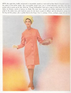
This 7/8 length tunic coat is in “the softest of the melon shades.”
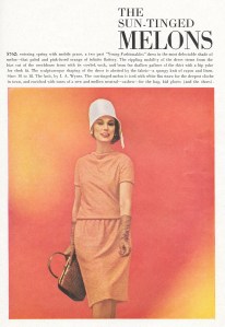
And this is a “pink-infused shade of melon.”
Even the back cover of the magazine shows a golden-tinged orange color.
Well, I do not need any convincing to be excited about the chosen color for 2019, as I already have made several garments n this hue. Not only do I love this coral color, I admire its versatility and wearability with other contrasting colors. Following is a quick run-through of my examples of Living Coral.
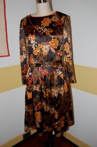
Although this dress gave me fits when I was making it (because of the pattern and the fact that it called for knit fabric and I used a stretch charmeuse silk instead), I do get compliments whenever I wear it, so I guess I did something right. Even the print in the fabric looks a bit sea-life and like living coral.
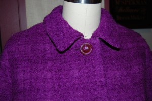
This dressy coat has to be one of my favorite makes:

To me this is a perfect example of Living Coral color. One of the reasons I love this coat so much is because it pairs so well with blue.
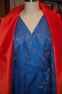
Another example of coral and blue – this time navy blue – is this dress I made a few months ago.

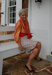
And then last year about this time of year, I made this blouse to pair with a bronze-and-white-lace skirt, tied together with a coral sash.
My most recent make for me (I’ve been sewing for my little granddaughters, too, soon to be revealed!), is this coral wool skirt. I have worn it with gray , and it will also look good with navy blue and light blue , and of course, winter white.

Although I haven’t tried it yet, I think Living Coral will look spectacular with this year’s color of Ultra Violet, and 2017’s Greenery.
I made this coat last Spring in a color very close to Ultra Violet.
With three weeks left in December, I am presently concentrating on the more traditional colors of red and green and blue and gold. But Living Coral gives us an optimistic view of the year to come, and that’s a vivifying message for all of us.

Great colors Karen. I remember reading about the sewing difficulties with the charmeuse dress and it turned out wonderfully. Your orange silk shirt is one of my favorites and the new coral skirt is a classic. Happy sewing.
Thanks, Mary! I was quite delighted with the choice of Pantone’s Living Coral, but then it is rare when I don’t approve of what is picked as the Color of the Year.
Color, color, color! It’s an integral part of any successful garment. Your use of color is wonderful.
Thank you, Peggy. Beautiful, colorful fabric is quite the delight, isn’t it?
Everything old is new again…except me!! The “new” coral was a key color in the early 60s and my mom created several of my block designs in coral and white combos. Some from Vogue patterns and many from my sketches (yes, I was a spoiled kid when it came to clothes & I am incredibly grateful.) I will say that, done correctly, coral can be really flattering! Your integration of the color in your styles is wonderful! So fun to see your post!
So it seems we are both old enough to remember those bright days in the 1960s! Somehow coral/orange looks better now!
I love the colour “the softest of the melon shades”! In 1963 this colour even reached the remote part of the Norwegian countryside where I grew up! My mother made me a wonderful dress in exactly this colour. I was 16 years young and the colour is still one of my favourite colours. Thank you for sharing it with us and Merry Christmas and God Jul!
Aud Steier Griem
I loved reading your comment. Those memories of homemade dresses stay with us forever. Merry Christmas to you as well, Aud!
So lovely to see how the ‘new’ coral works with your style and makes. I really enjoyed this cheery little post in the midst of grey sky, grey ground, and, for the most part, morbidly dressed people in the ‘safe’ colour, black.
Here’s to colour!
I quite agree – here’s to color!!
It is a lovely colour. I try to use it in all my graphics too. It’s been a favourite for a while. I love your coral shirt!
Thank you, Linda! Coral is one of my favorite colors, too, in case you didn’t guess!
When I first saw the new Pantone colour I immediately thought of your latest wool skirt. It’s a beautiful colour!
So did I, Marianne. I was a bit smug thinking how prescient I was with the coral skirt!
Such a great colour. I immediately thought of your 3 piece outfit with that lovely irridescent blouse!
Ah, thanks, Mel! I love wearing that blouse – thanks for remembering it!
Hi Karen!
Oh I do so love this colour too! And although I love all of the garment examples you show, the coat is especially my favouite! So classic and minimal in structure – elements that attract my eye.
Very fine work, Karen. I love it all!
Jacqueline
Thank you, Jacqueline. I presently have a classic tartan wool draped over my dress form, ready to tackle after the holidays. Whenever I look at it, I think of you and your love for tartans!
Oh nice! I look forward to seeing your new tartan work!