
And – what do you know about them? One of the more venerable sewing contests is the annual Make It With Wool. Founded in 1947, it is still going strong and features winners in various categories/age groups. Prizes for winners and runners’-up include scholarships, sewing machines and fabrics, and of course, national recognition in the field. Pattern Review sponsors several sewing competitions throughout each year, in addition to a “sewing bee.” Its followers are legion at this point, and it is always a coup to be a winner, selected by readers’ votes.
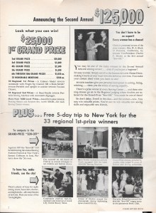
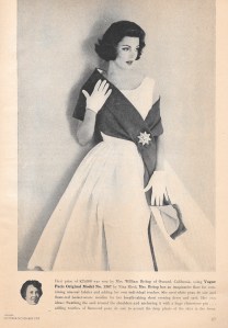
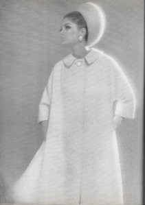
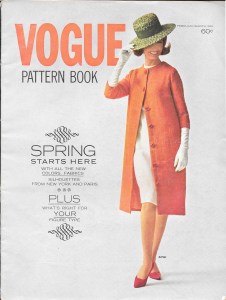
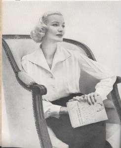
But what would you say if I told you that in 1956 the Singer Sewing Machine Company introduced a national sewing contest with prize money totaling $125,000? The 1st Grand Prize carried the unbelievable reward of $25,000. In current 2020 American dollars, that is almost $240,000! Not only that, the 33 regional first prize winners also received a free trip to New York. Take a look at the following two-page ad which appeared in the February/March 1957 Vogue Pattern Book Magazine, announcing the second year of the competition.
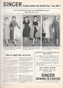
Vogue Pattern Book Magazine of August/September 1957 included this page “as we go to press…”
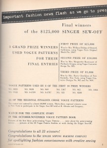
Vogue Pattern Company was rightly proud of their representation in this contest and in others.
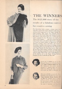
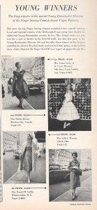
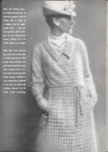
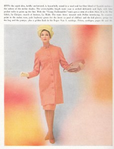
And then here is the feature article on those winners in the following issue (October/November, 1957):
Judging was based on “fashion points of appearance, fit and selection of design, colour and fabric, plus construction points of quality and accuracy of cutting, sewing and finishing.” Isn’t this what most of us strive to attain in our own sewing?
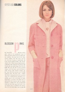
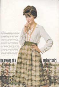
By the next year, 1958, the contest included a new category, called the Young Homemaker Division, for young women between the ages of 18 – 25. $9,000 of prize money was awarded to the top four winners. What beautiful dresses and ensembles they created!
I suspect these young women continued to sew throughout their lives.
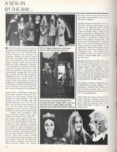
Also that year, the General Federation of Women’s Clubs sponsored their own sewing contest. The theme of the contest was “the ideal costume for a clubwoman’s wardrobe.” Points of consideration in the judging were: “fashion-rightness,” “versatility and appropriateness for club occasions,” “becomingness to the wearer,” “over-all fashion effect,” and “workmanship.” 24 of the state finalists submitted entries consisting of a dress with its own jacket or coat. That is still to this day a winning combination, classic and chic.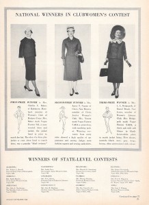
The prize money was certainly less impressive in this contest, at $250, $150 and $100 for the first-, second-, and third-place winners, but imagine the prestige of winning for “your” club, at a time when there were 1,485 clubs represented in the contest!
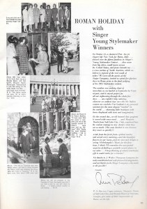
By 1963, Singer Sewing Company had started the Young Stylemaker Contest for girls aged 10 – 21. The caption on the following article tells it all: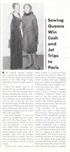
Included in the trip to Paris for the two winners was a tour of the famous Parisian couture houses. Can you imagine having such an opportunity at that point in your life?
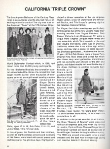
This contest had expanded its scope by 1965, ferrying fifteen finalists to Rome via a chartered jet for a 5-day stay before the final judging of the Stylemaker Contest. Notes by the contestants included the charming observation “how very chic the Italian women are.”
By 1969, this contest had drawn more than 93,000 participants! As part of their prize, the three winners each were given an all-expense paid, one-week trip for two to London, Paris or Rome. The purpose of the Stylemaker Contest was to “encourage young and creative talents in Fashion sewing.”
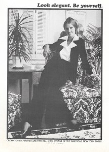
By 1971, it appears that changes were in the air for the Stylemaker Contest. Whittled down to two winning divisions, only the overall winner received a trip to London, Paris or Rome for two, although both final winners also received cash prizes of $800 and $600 respectively. The “heyday” period of home fashion sewing was sadly beginning to draw to a close.
Needless to say, fashion sewing contests no longer command such notable and generous prize money or trips. Those were heady times in the 1950s, ‘60s, and ‘70s, likely never to be experienced again. However, I would like to think a new sewing heyday is upon us – or perhaps we are it. What place do contests have in our current global community of sewing?
I rarely enter sewing contests, not for any reason other than the fact that I have so many projects in my queue that the last thing I need to put my attention on is something that is not top priority for me. But that doesn’t mean I will never enter a contest. I actually think I probably should at some point. So – again, what do you think of them? Sewing is creative, so obviously contests today still value and encourage creativity. Surely emphasis is still placed on fashion appropriateness, workmanship, style, a flattering assessment, fabric and color selection. It is precisely these goals which make fashion sewing so exciting, at least for me, and I suspect for most of us.
Let’s learn a little from the past and make it new again.


“A Stylish Guide to Classic Sewing” – Book Review and GIVEAWAY
Two of the most creative and stylish ladies I know in this global fashion sewing community, Sarah Gunn of Goodbye Valentino, and Julie Starr, have collaborated once again on a book dedicated to our craft. Their first book, The Tunic Bible, published by C&T Publishing, met with acclaim and well-deserved enthusiasm, establishing itself as the go-to standard for creating one-of-a-kind, flattering tunics. In A Stylish Guide to Classic Sewing, Sarah and Julie broaden their focus to cover a range of styles, namely those that have stood the test of time and are considered “classics.”
I love the size of this book. At 9.5″ x 7.5″, it is easy to hold and use.
The book is very handily compartmentalized into 30 chosen styles, the “classics,” thoughtfully documented by Sarah and Julie. I would have loved to be privy to their brainstorming sessions on what styles to include in this list. There are the obvious ones, of course, such as the pencil skirt, the sheath dress, the shirtdress, and the French jacket. But they also cleverly identified some styles not always necessarily thought of as “classic.” But indeed, they are, and truly deserve their place in this book. Think Halter dress or top, Palazzo Pants, Jeans-style Jacket, and Menswear Pajamas! All these and more are included in this book.
Each chapter deals with one ”Classic” and its history and who, throughout the years, has worn it. Also included are sewing tips, fabric suggestions, and styling guidelines for each classic. Some of the chapters include a cautionary paragraph on how to avoid the “Frump Factor.” Simple changes like altering the hem length or wearing the appropriate shoes can change one of these classics from frumpy to fabulous. Pay attention to the authors’ suggestions because they know about what they are writing!
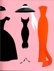
Here is just one example of tips and styling ideas included with each category.
Accompanying each chapter is also one of my favorite aspects of this book – a carefully chosen quote. I thought I had come across just about every quote about fashion and sewing that was ever spoken or written. But somehow, Sarah and Julie have discovered some real gems and placed them perfectly in the book. Take for example this quote by Winston Churchill included in the chapter for the pencil skirt: “A good speech should be like a woman’s skirt: long enough to cover the subject and short enough to create interest.”
Or consider this one by Georgio Armani in the chapter on the Bateau Neckline: “Elegance is not standing out, but being remembered.” As one who loves a bateau neckline precisely for its elegant appearance, I found this quote perfectly placed.
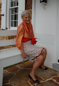
The center section of the book, nestled comfortably among the many chapters, is “the Classic Garment Gallery.” I was very flattered to be asked to contribute to this section, which is a compilation of classic styles sewn by “members” of the worldwide sewing community. Here you can see these classic styles modeled by the makers, and it is a marvel to take this all in. Yes, this is a section to return to again and again to get inspiration.
And speaking of inspiration, the absolutely delightful illustrations by Beth Briggs will not only captivate you, they will also provide you with styling ideas and concepts.
At the back of the book is a carefully considered list of Resources. Included are lists of Fabric Books; Fabric Vendors; Fabric Shopping Around the Globe; Trims, Tools, and Notions; Related Articles, Videos, and Online Classes; and Sewing Instruction and Alteration Books. No beginning or advanced devotee of fashion sewing should be without this list of Resources.
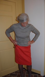
Well, no fashion sewing book is complete without a pattern, and I am happy to report that included with A Stylish Guide to Classic Sewing is a multi-sized pattern for the Goodbye Valentino modern classic pencil skirt. There is nothing quite like a pencil skirt for a basic wardrobe component. This is a skirt to be made time and again, following the precise instructions included in the back of the book.
This is a sewing book, and as such, targets those of us whose passion is sewing our own fashions. However, there is much in this book which would be of value to anyone wishing to enhance or perfect her own style. Likewise, it should be inspirational to those just beginning to sew for themselves as well as those who just aspire to it! How perfect is this quote from Audrey Hepburn (page 161): “The most attractive accessory a woman has is confidence.” With this book in hand, you will both sew and dress with confidence and style.
And now, it is with great excitement that I am able to offer my readers a chance to win a copy of this book, compliments of C&T Publishing. Should the winner be a resident of the United States, he or she will receive a print copy of the book; an international winner will receive a digital copy of the book. For a chance to win, please leave a comment with this blog post no later than Sunday, December 8th at 12 noon, Eastern Standard Time. I will draw the winner late afternoon on Sunday, December 8th.
To read more reviews, and for more inspiration, please visit the following sites (dates indicate the day of review):
Dec 2 Lori VanMaanen
Blog – girlsinthegarden.com
Instagram -@girlsinthegarden
Dec 3 Andrea Birkan
Instagram – @andreabirkan
Dec 4 Anita Morris
Blog – anitabydesign.com
Instagram – @anitabydesign
Dec 6 Alex Florea
Blog – sewrendipity.com
Instagram – @sewrendipity
Dec 7 Lucy VanDoorn
Blog – myloveaffairwithsewing.com
Instagram – @myloveaffairwithsewing
Dec 7 Cennetta Burwell
Blog – themagonanystylist@blogspot.com
Instagram – @cennetta_burwell
Dec 8 Manju Nittala
Blog – sewmanju.com
Instagram – @sewmanju
Dec 8 Dorcas Ross
Instagram – @lonestarcouture
47 Comments
Filed under Book reviews, Fashion commentary, Fashion history, Uncategorized
Tagged as fashion sewing, quotes about fashion