Category Archives: Linings

A Fussy-to-Make, Fuchsia-Pink Silk Dress

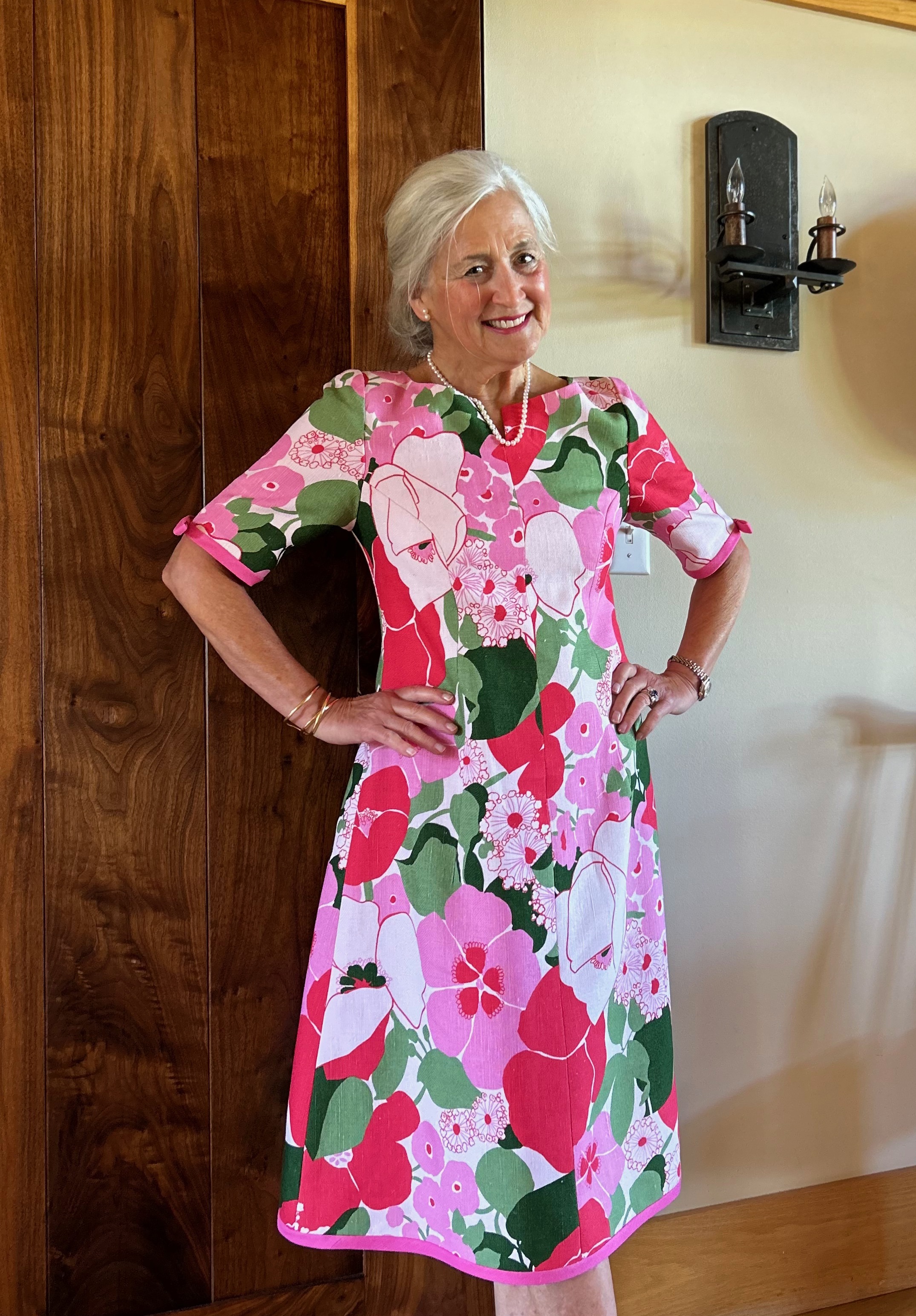
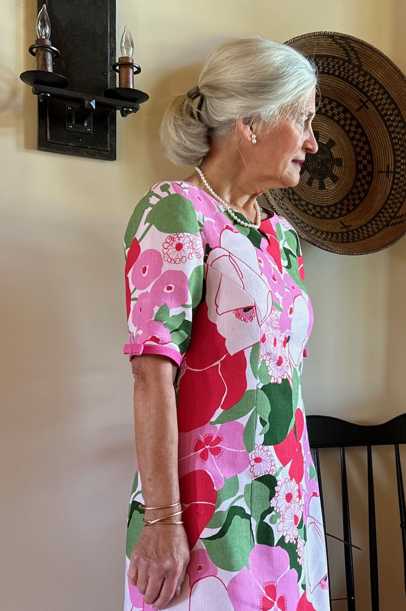
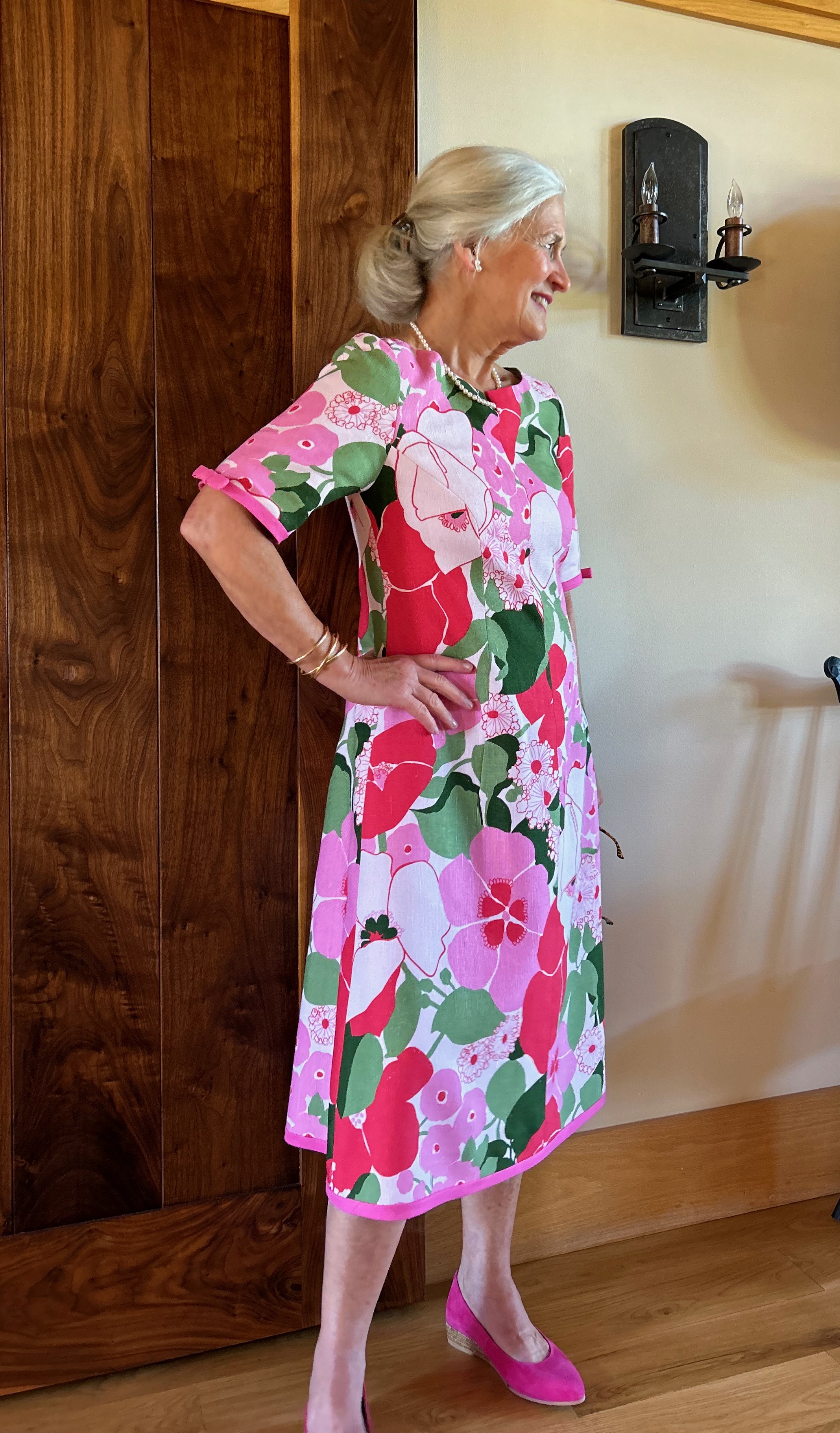
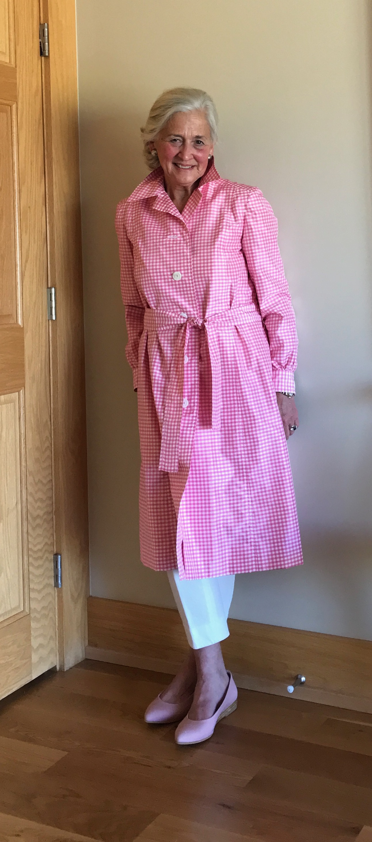
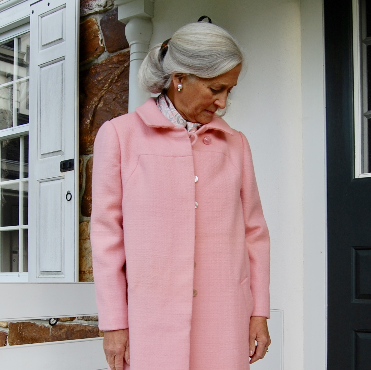
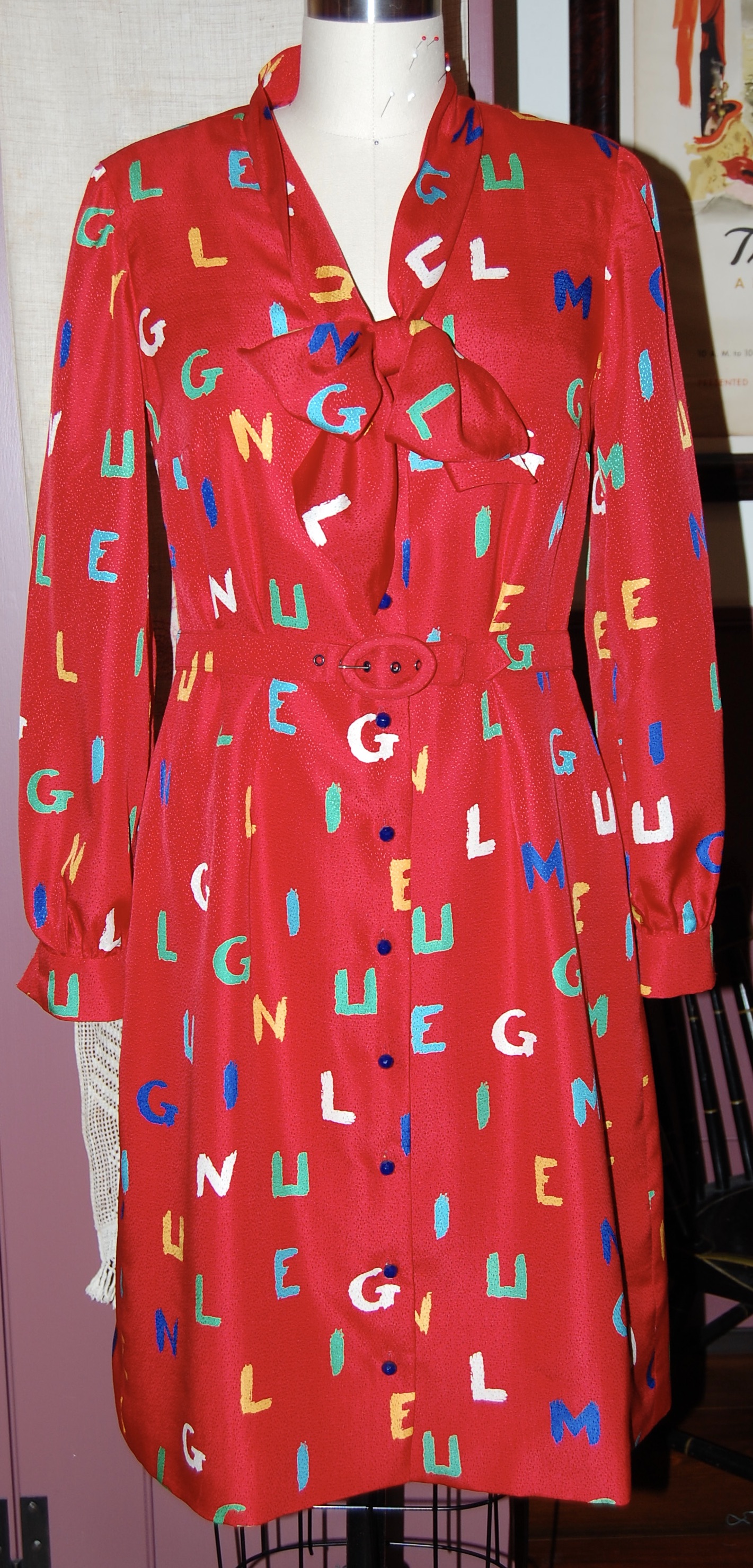
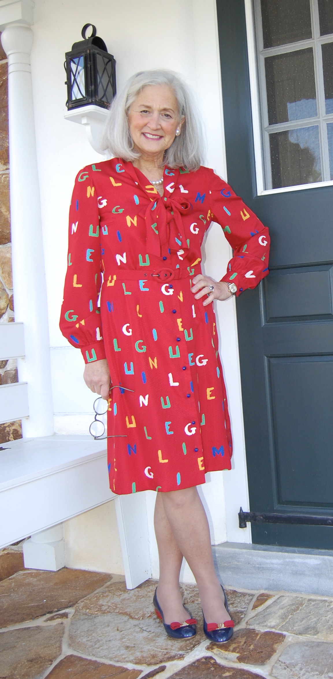
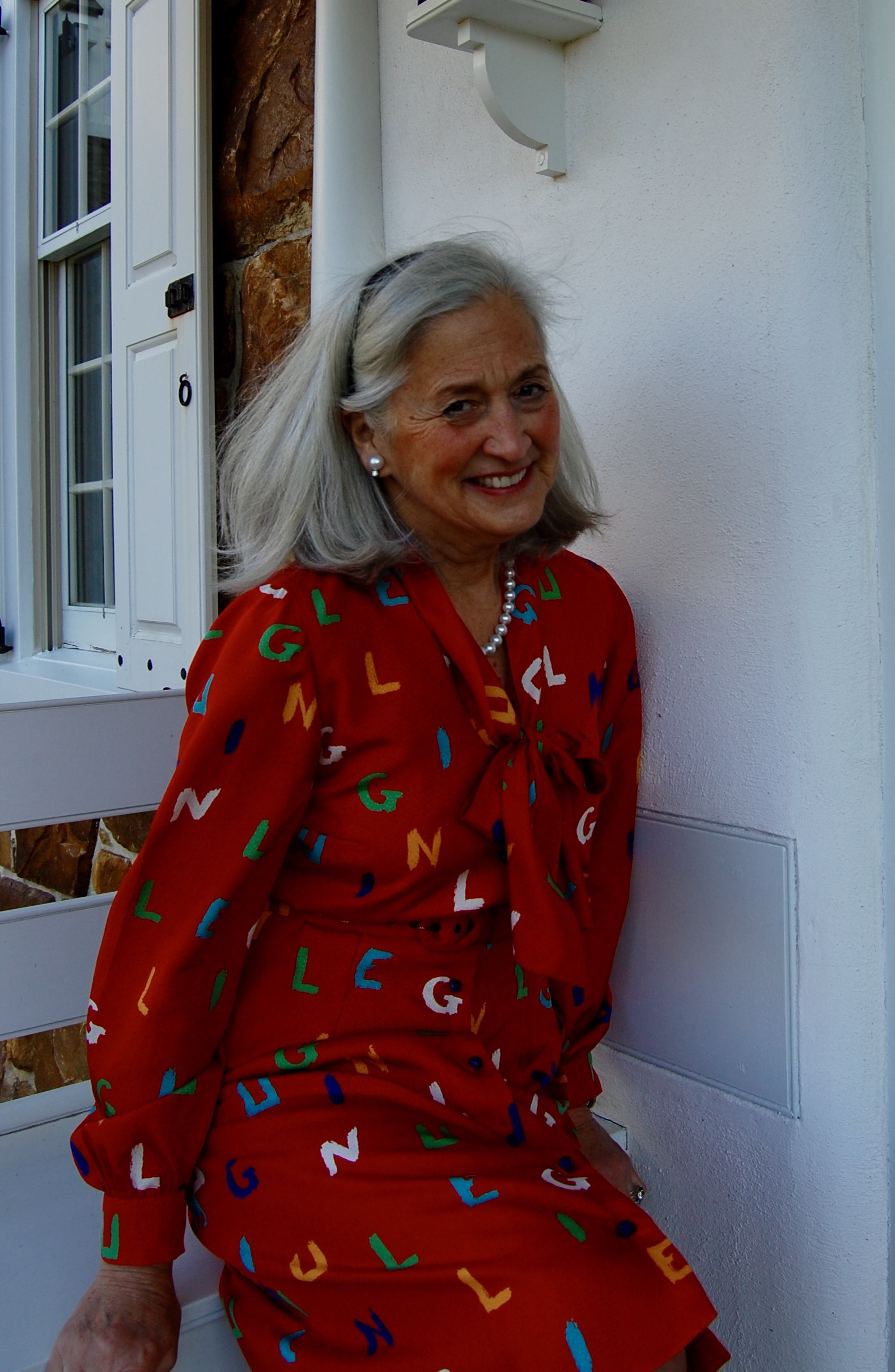
Sometimes extra incentive is needed to push through a project which turns out to be more difficult than anticipated.  Such was the case with this pink silk jacquard dress.

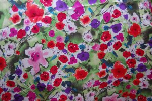
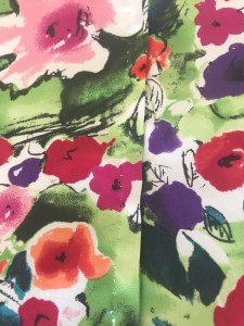
I had purchased this fabric quite a few years ago online from Britex Fabrics.  I knew it was a dressy fabric, and unsure of what form this dress would take, I made the decision to purchase four yards of this 58” wide silk.  That gave me some latitude in my selection of pattern.  

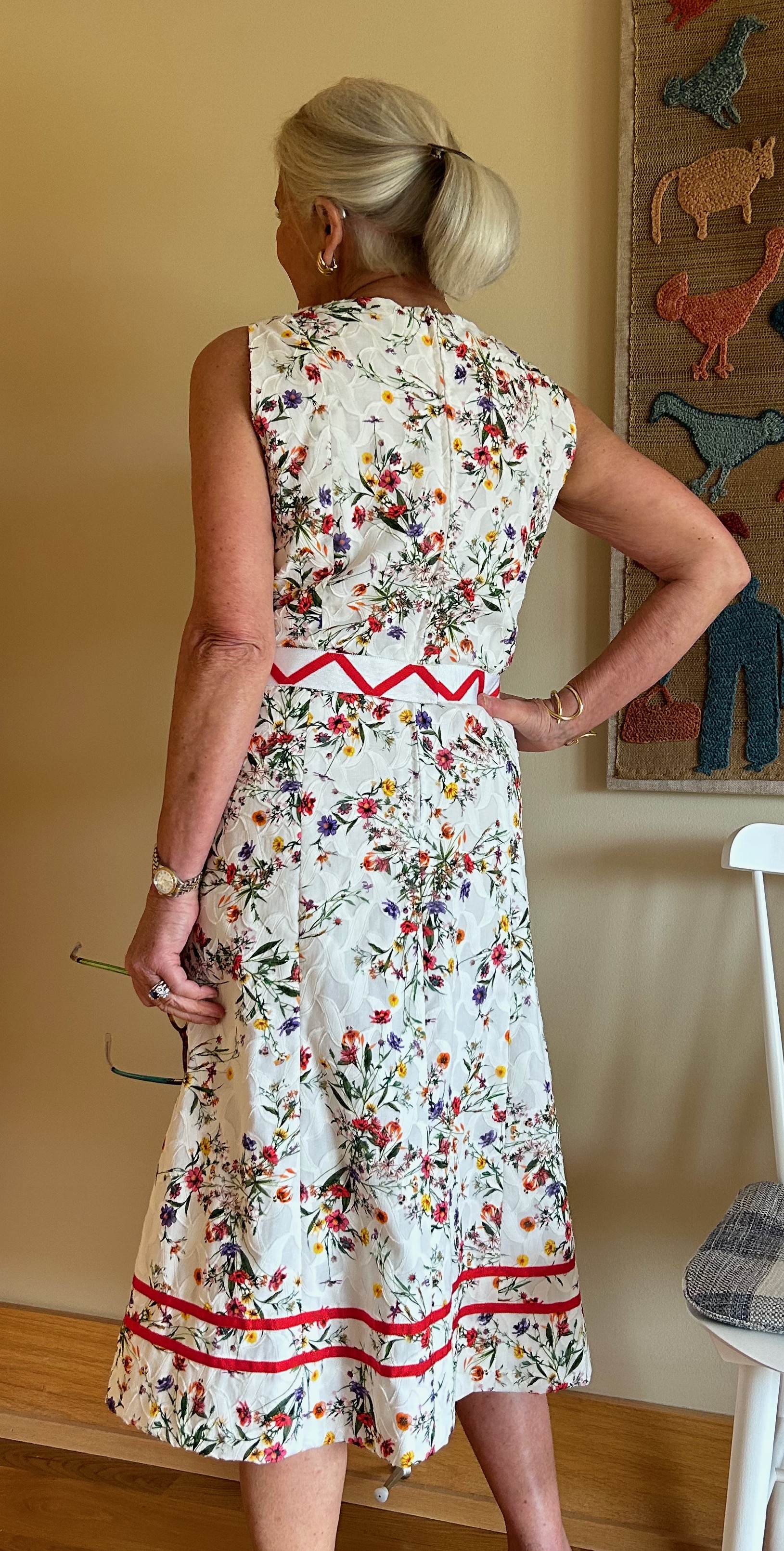
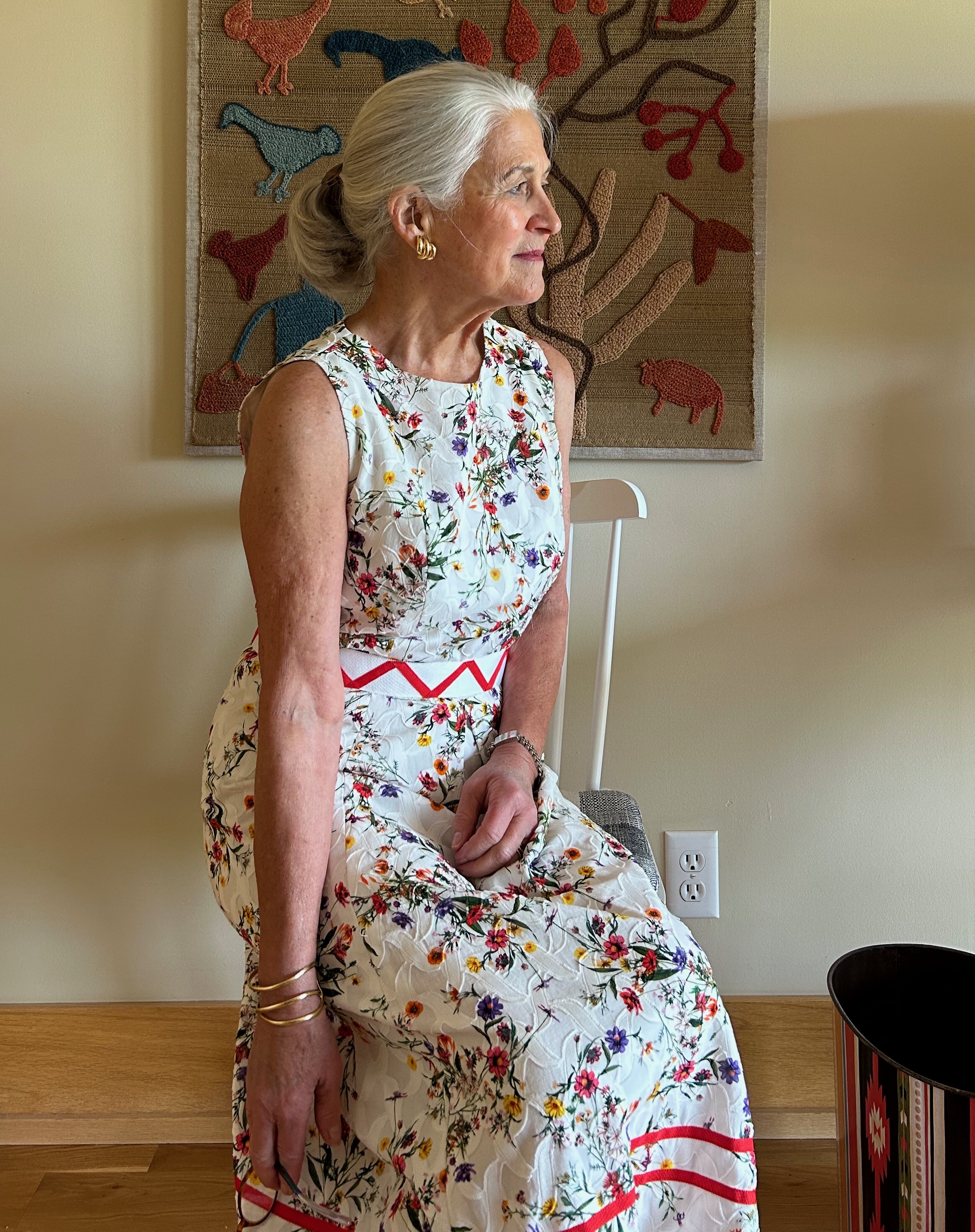
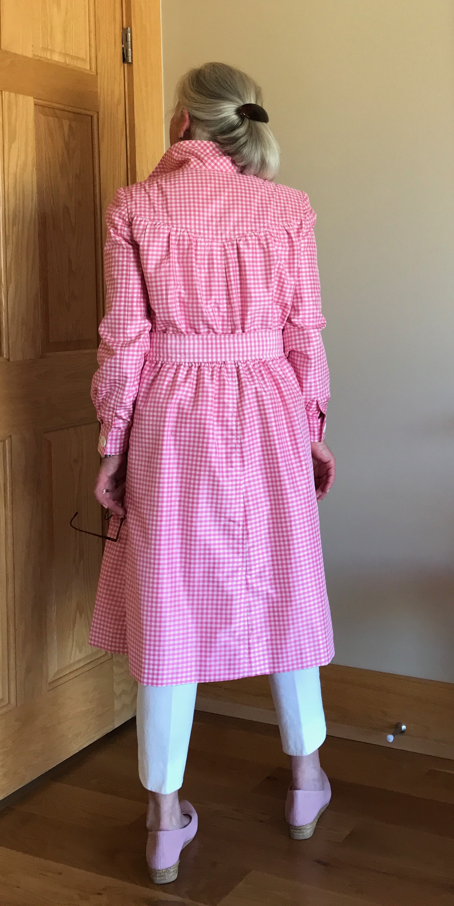
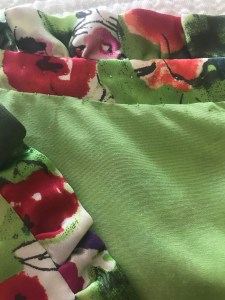
Finally last Spring I made a decision about what I wanted this dress to be.  That was precipitated by the arrival of a beautiful invitation to a very special event this Fall, and of course (!) I needed a new dress to wear to it. The fabric is a dressy, shimmery silk jacquard, so by its very nature it would make up into a dress which had a certain glamour to it.  

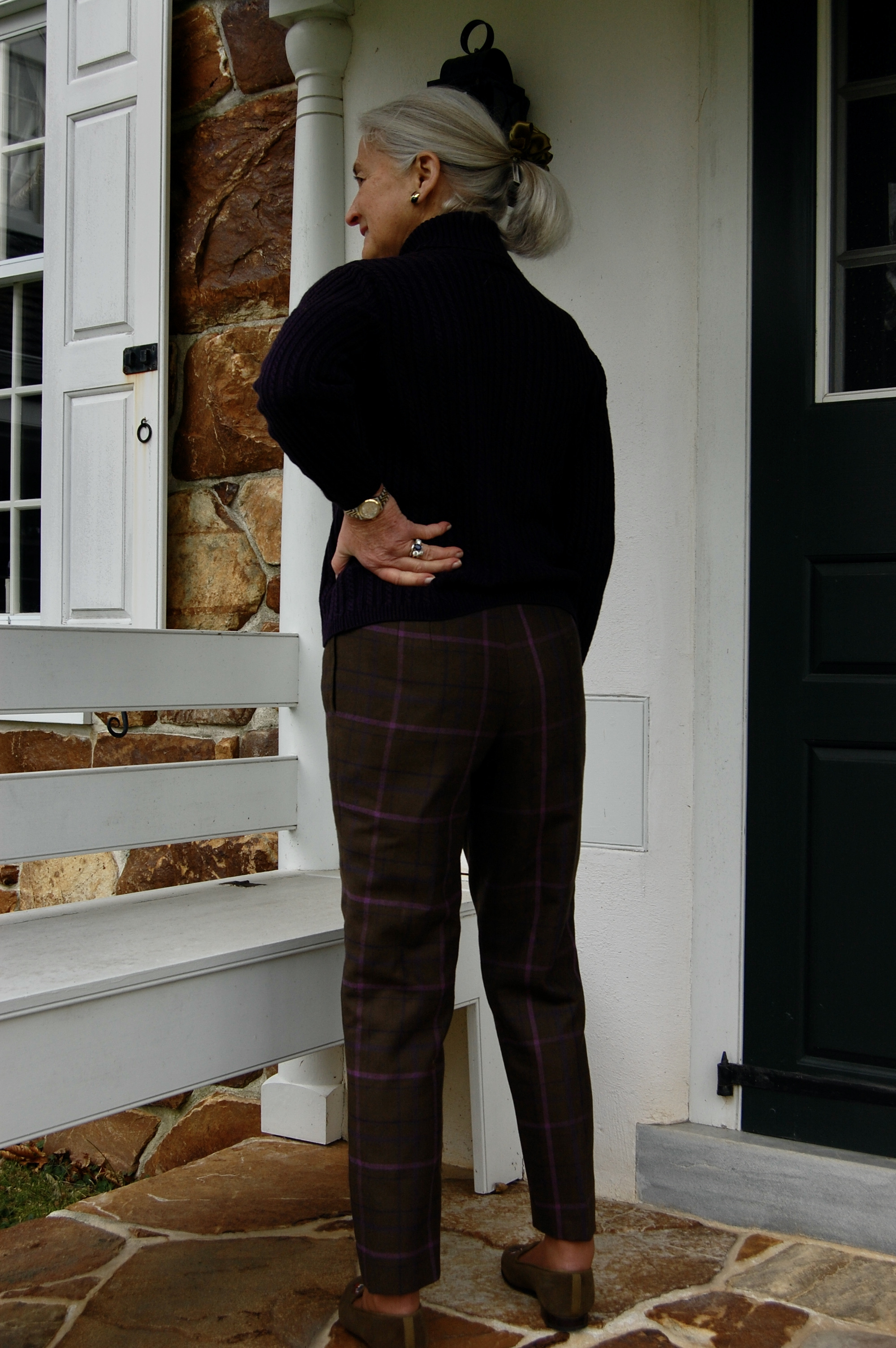
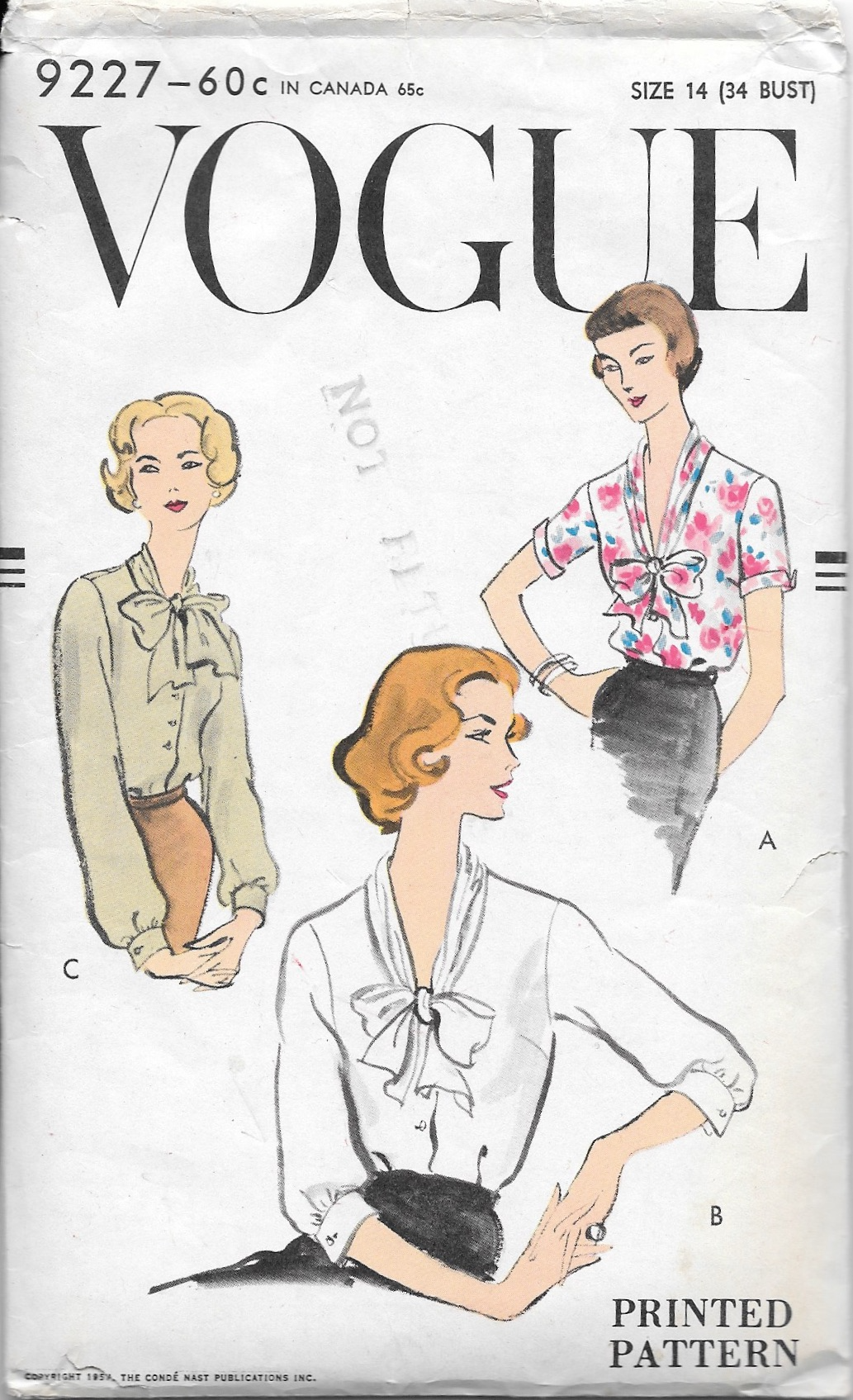
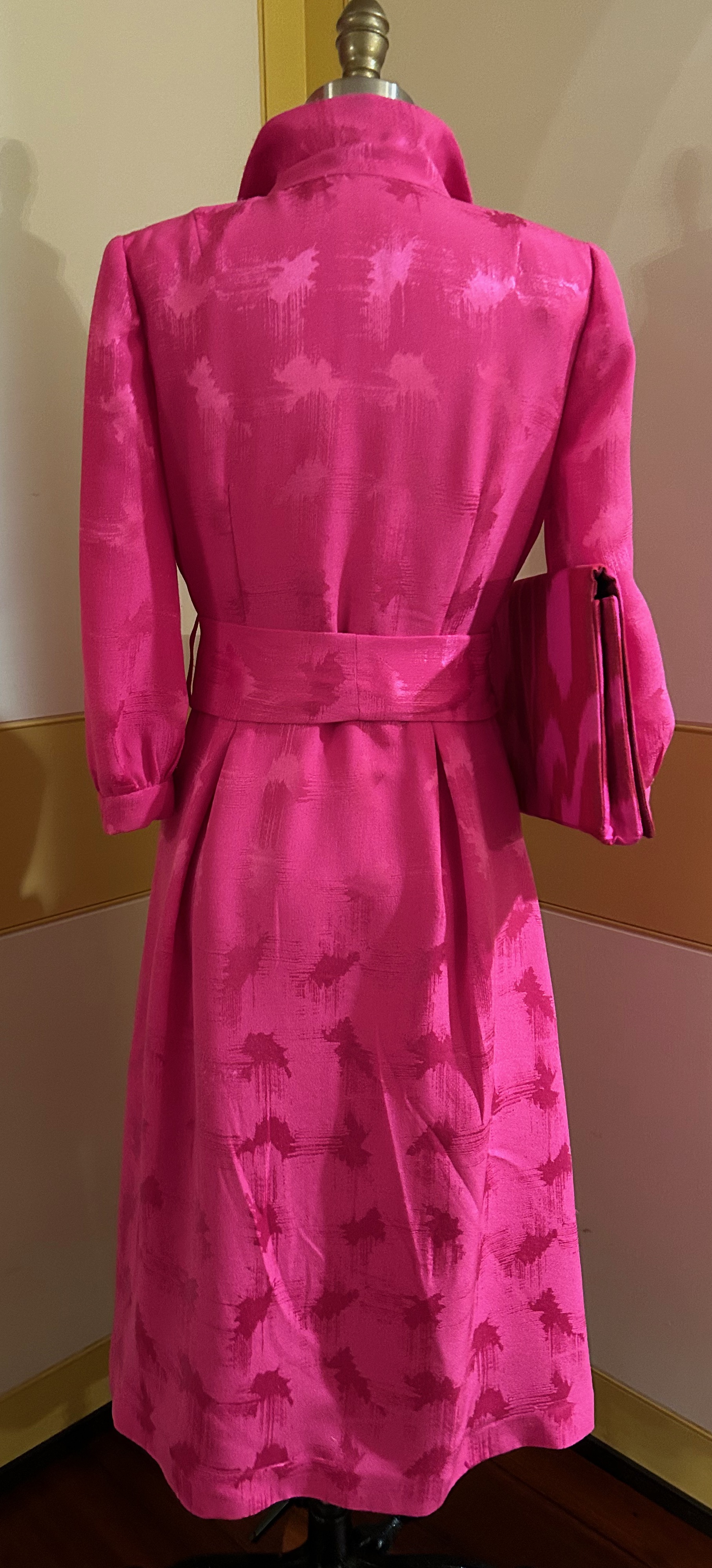
I decided to use a go-to pattern I have used a few times already and make a classic shirtdress.  That may seem like a strange choice, but I envisioned it as very dressy and flowing, and quite appropriate for the fabric.  

While this idea was percolating, I happened to attend a luncheon/presentation by a wonderful organization called the Ibu Movement.  (Pronounced ebu, with a long “e,” this is an Indonesian word meaning “a woman of respect.”)  

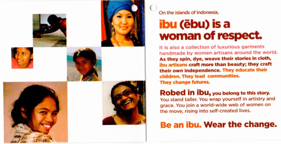
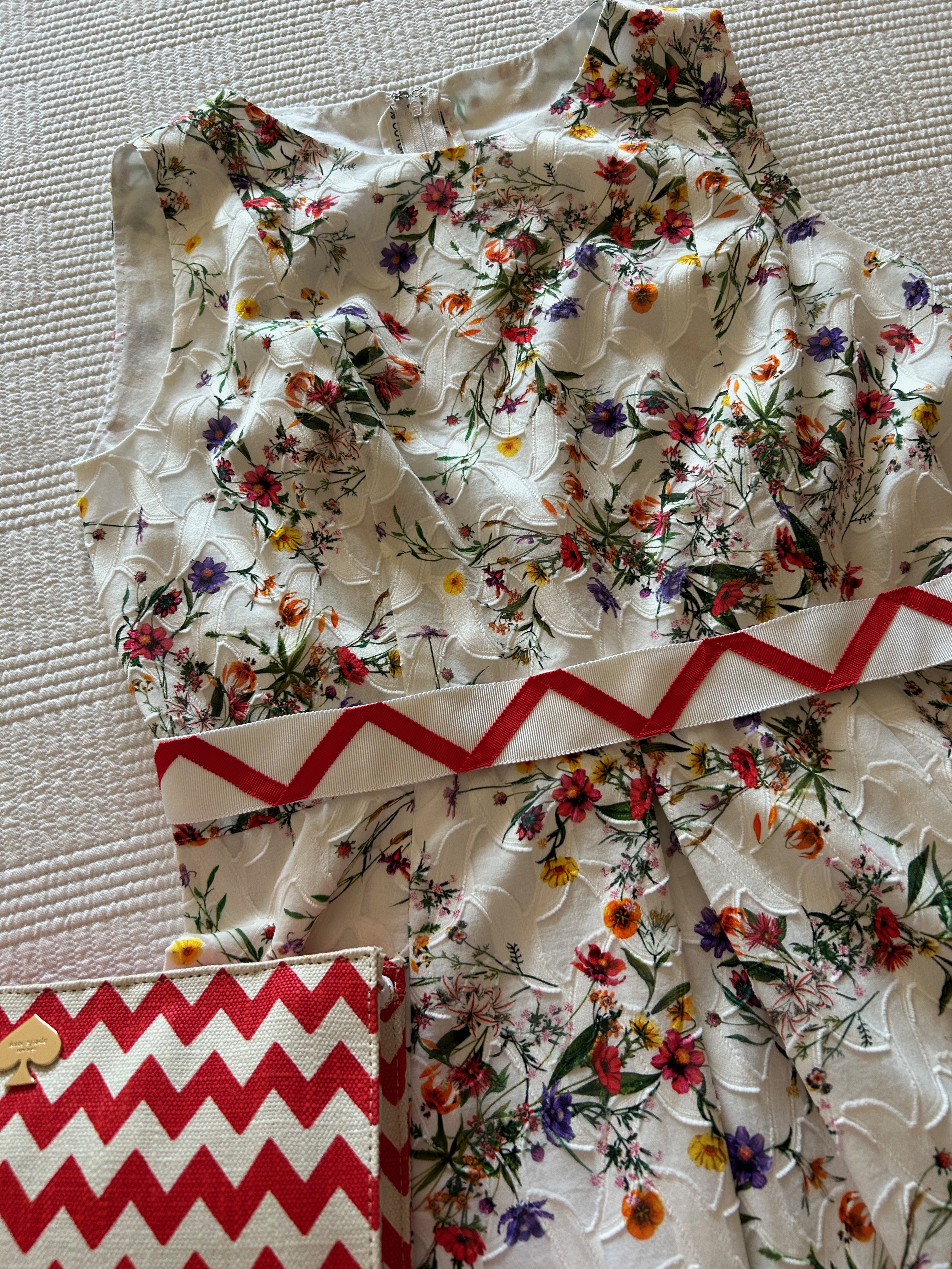
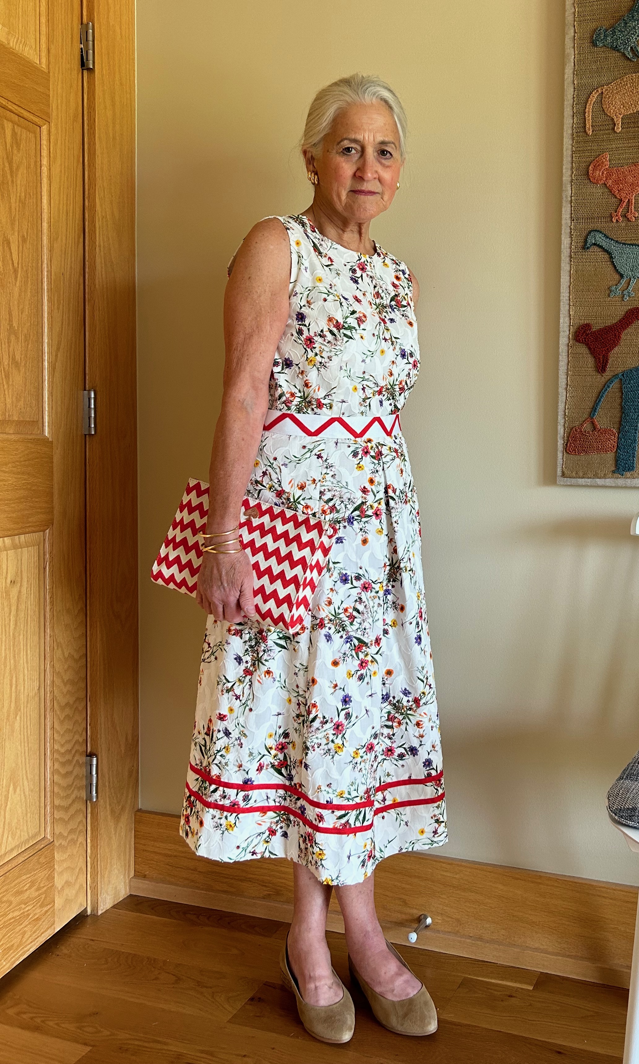
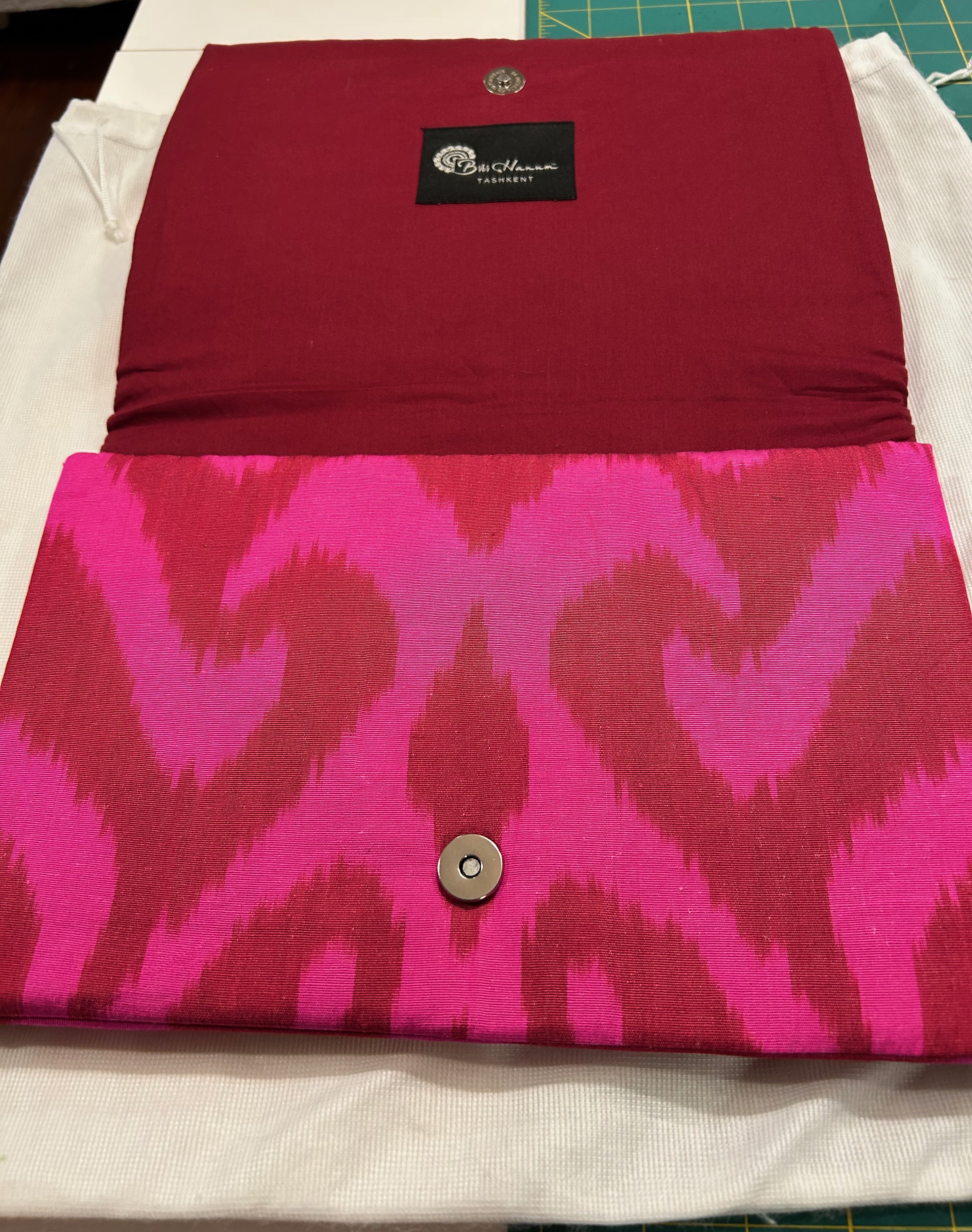
The pop-up shop accompanying this event was filled with gorgeous clothing, accessories, even shoes. When I saw this envelope clutch, I knew it would match my silk fabric perfectly and would be the perfect addition to my as-of-yet-to-be-sewn pink dress.  Little did I know at that time it would be the catalyst to make sure I finished the dress!

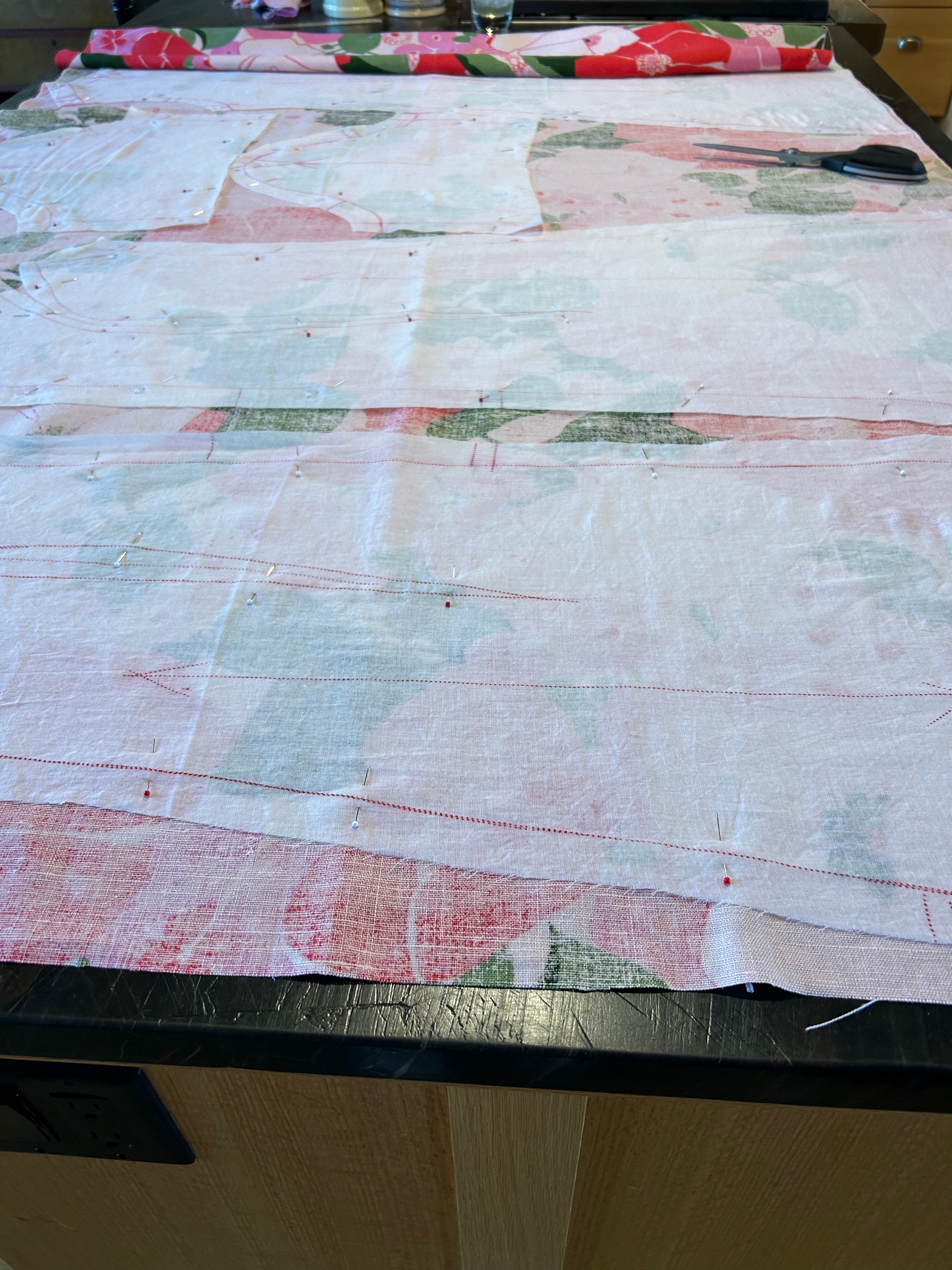
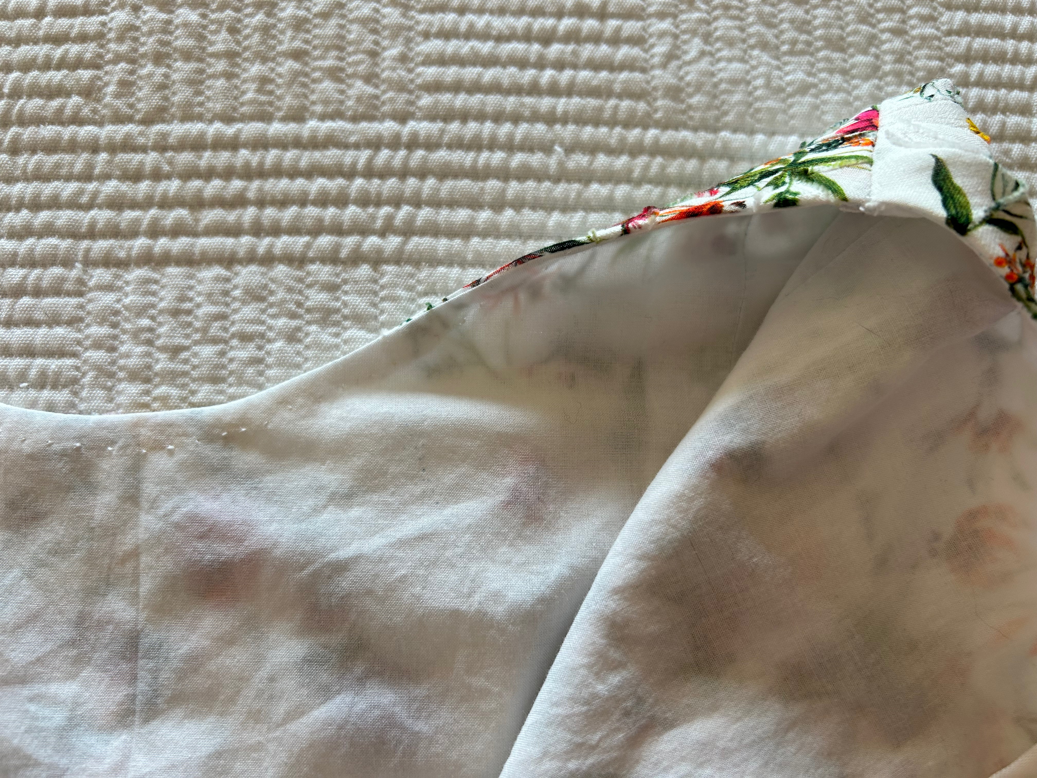
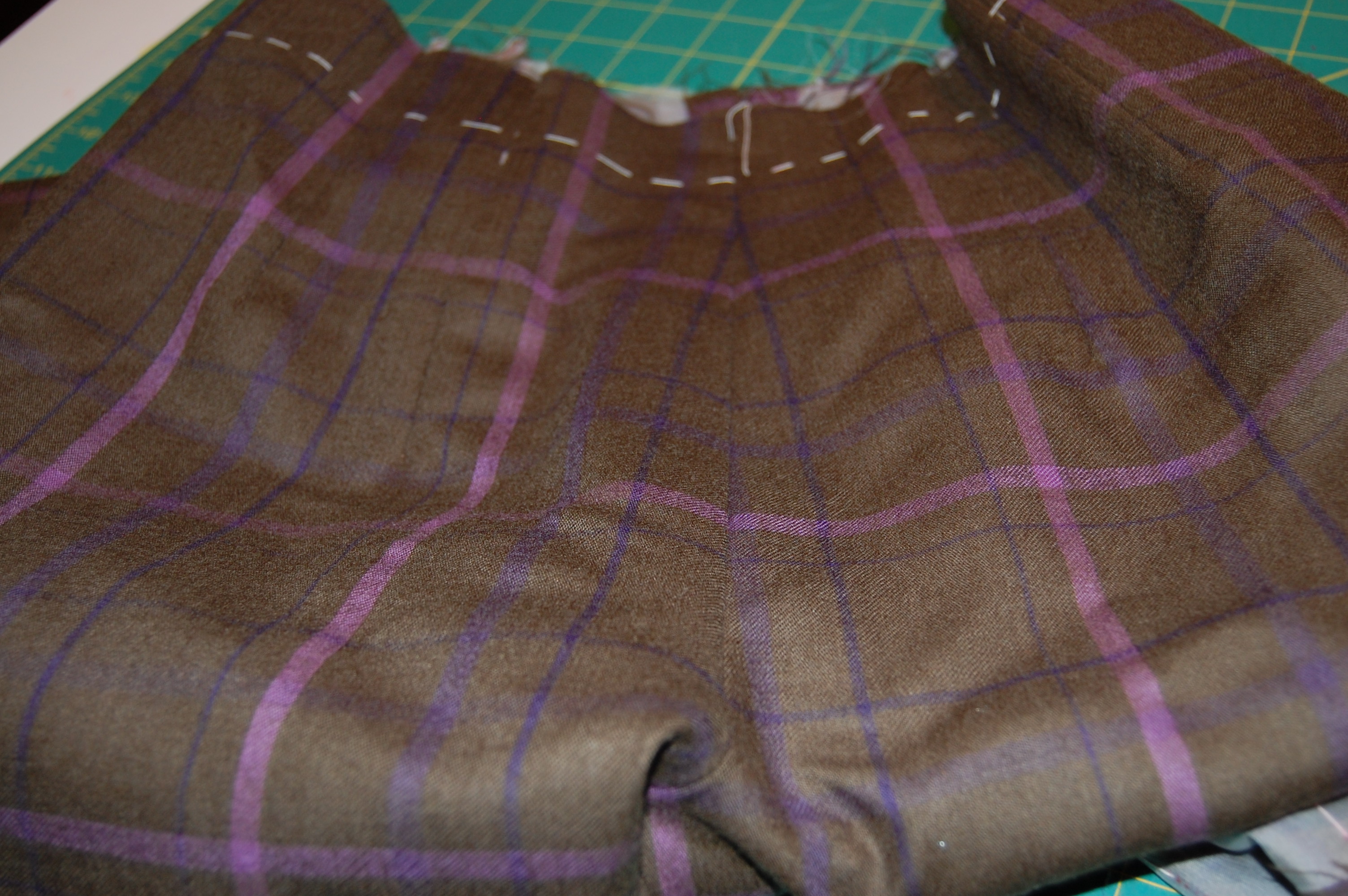
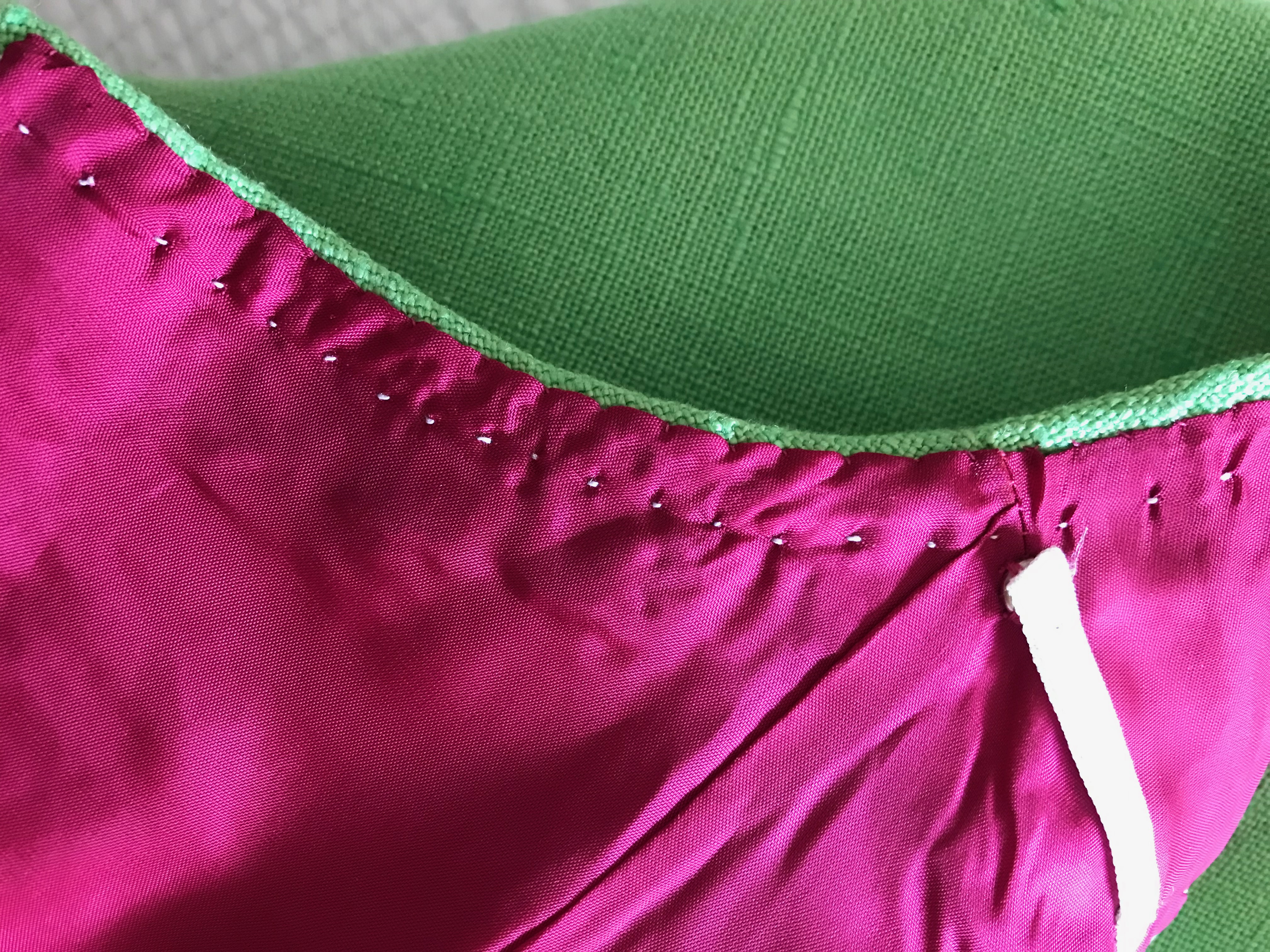
My first clue as to the fussiness of the fabric was as soon as I pressed it and laid it out for the placement of my muslin pattern. Here is what I noticed:

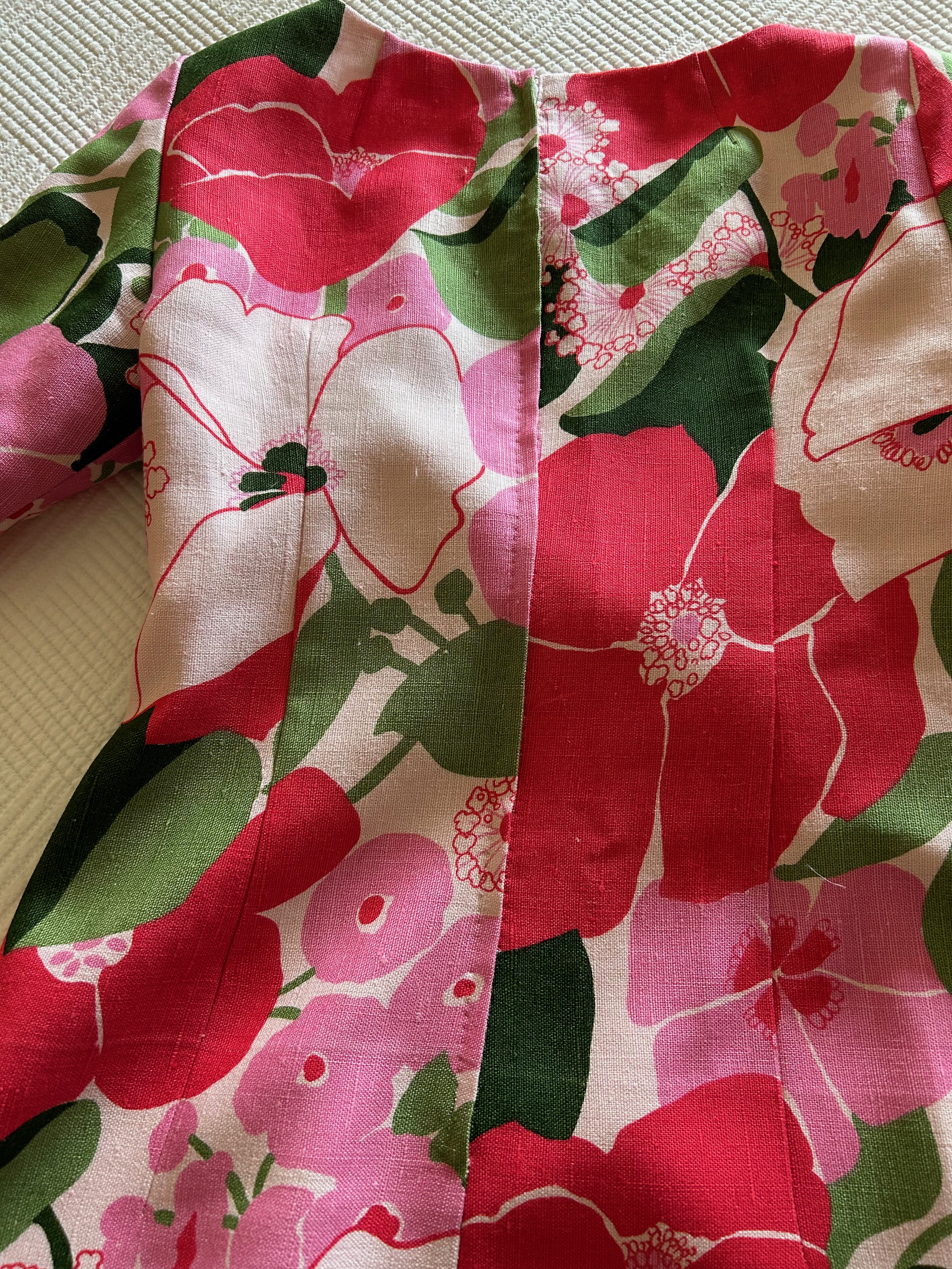
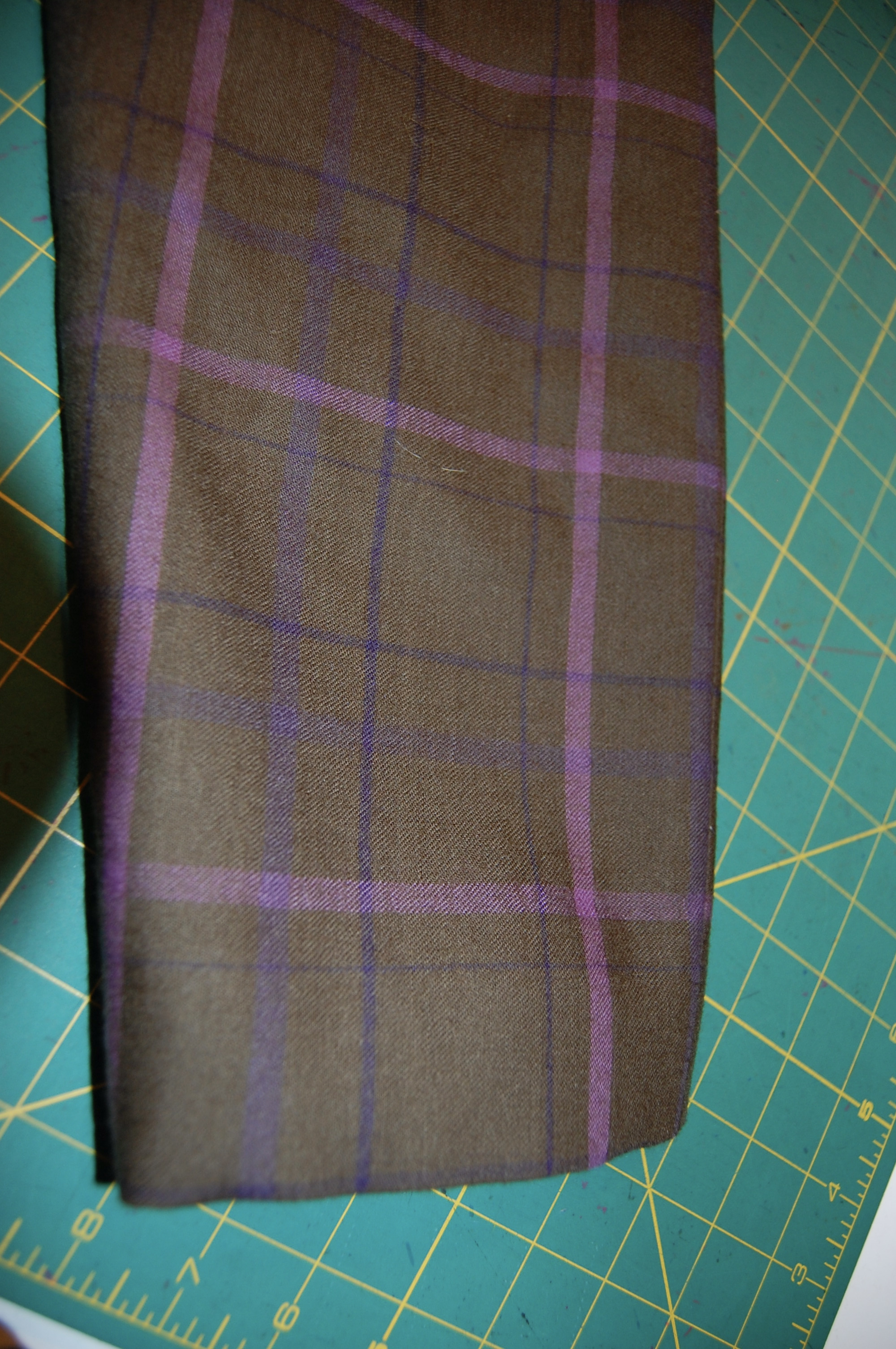
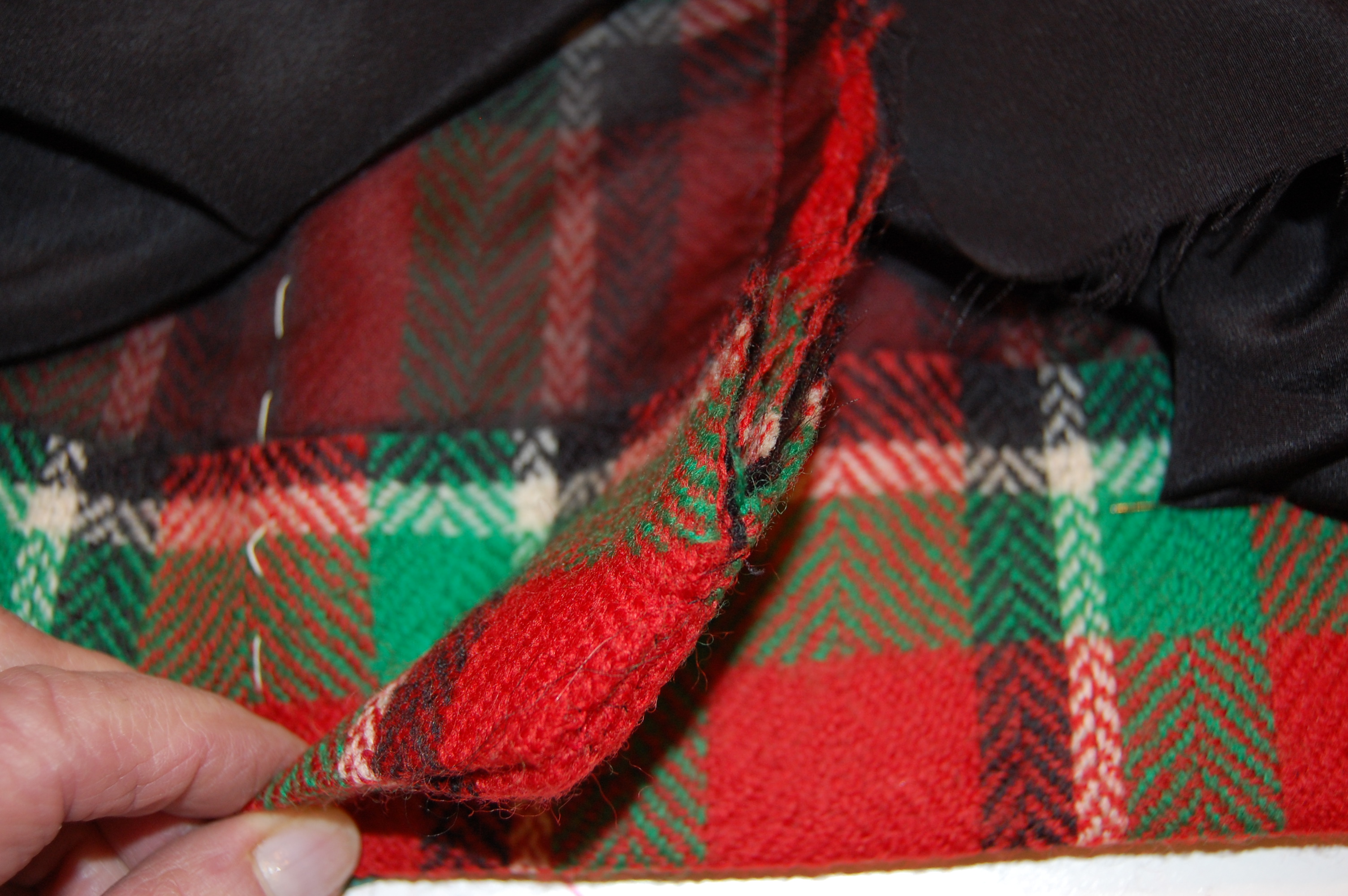
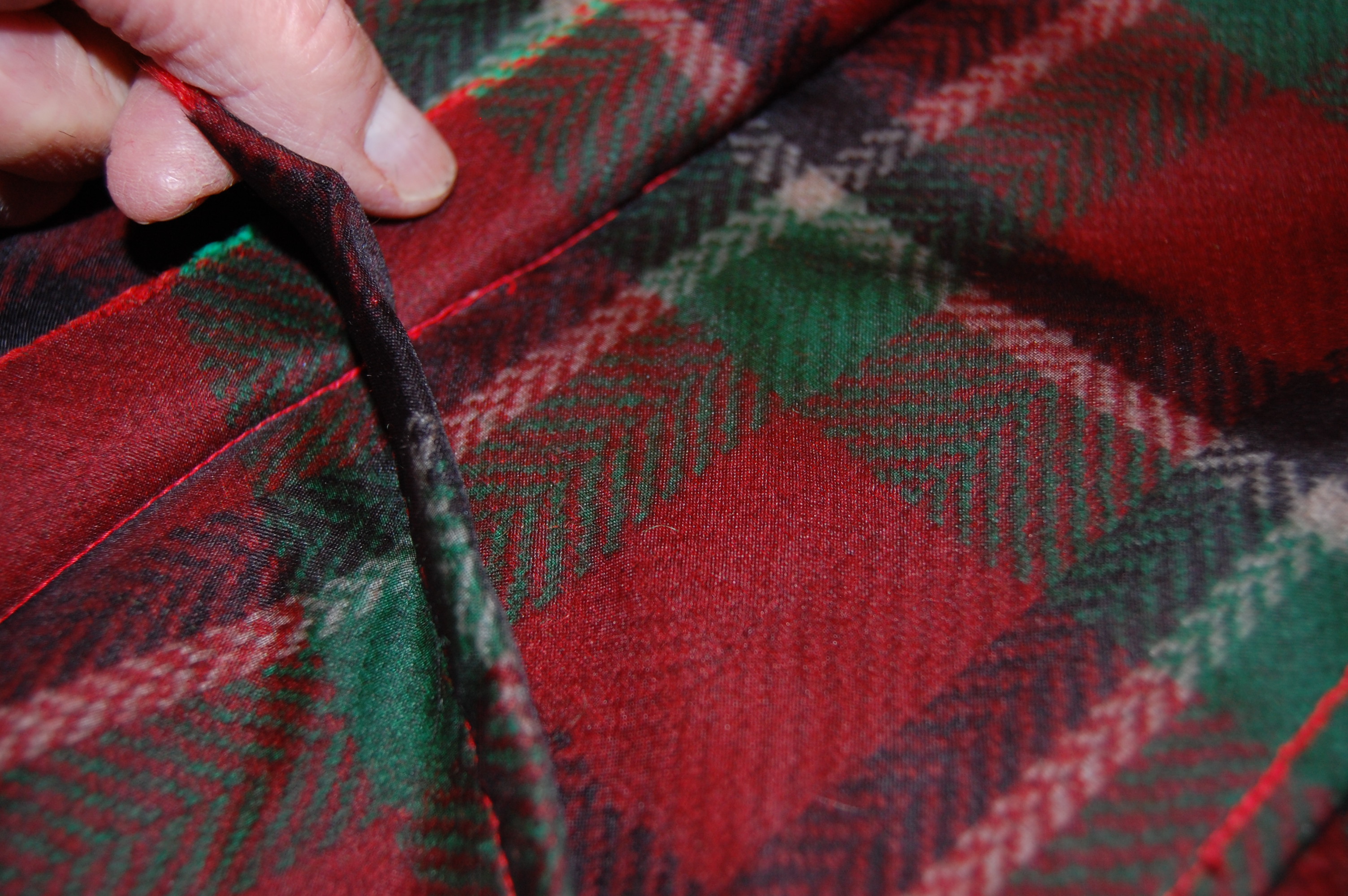
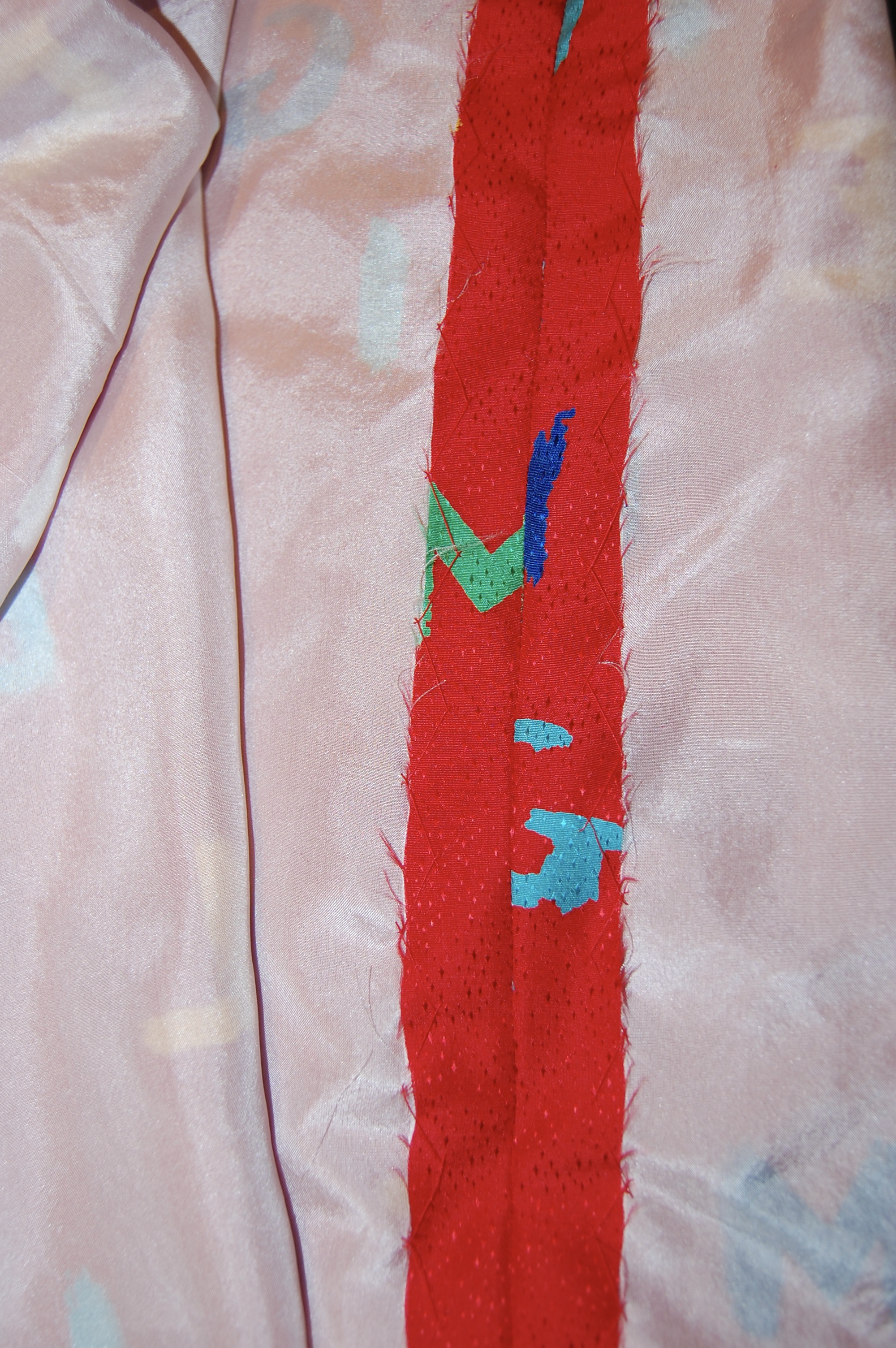
  1. The fabric had a slightly loose weave to it, making it almost stretchy, certainly very slinky.  Keeping it properly aligned on the straight of grain was going to be a challenge.  
  2. The fabric frayed easily.
  3. It also was prone to shedding silk fibers.  I decided I needed to handle it as little as possible to mitigate this situation.
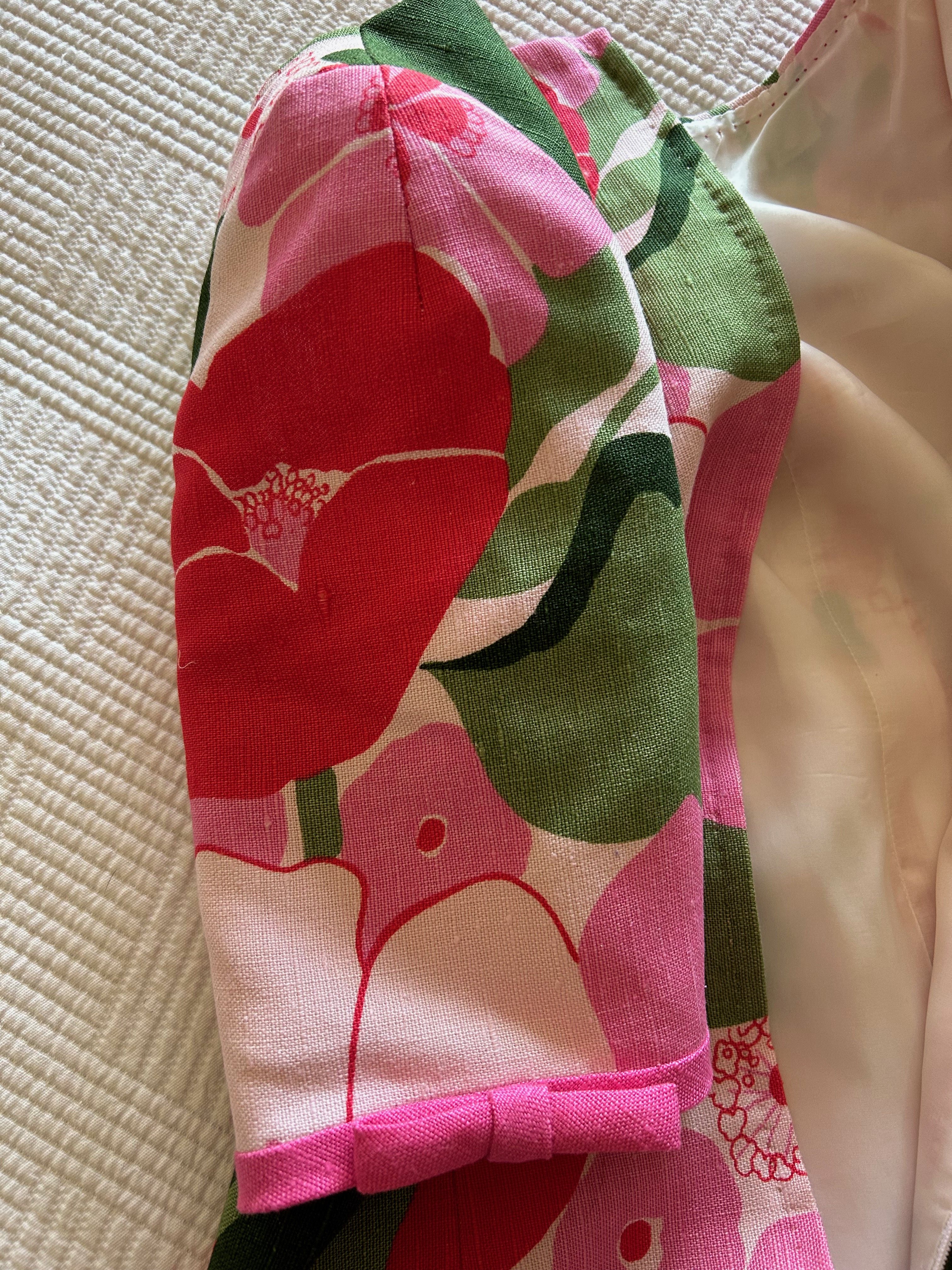
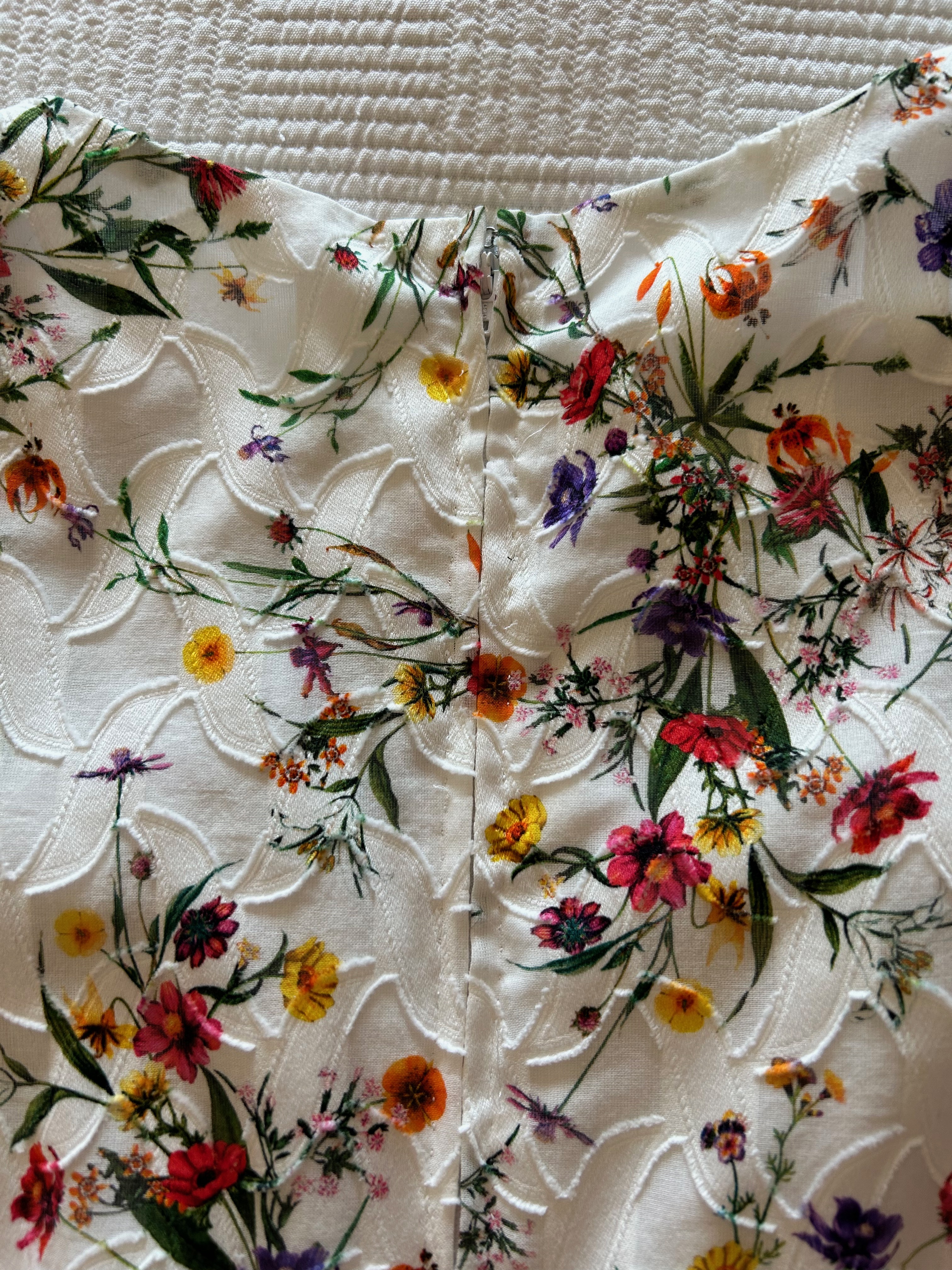
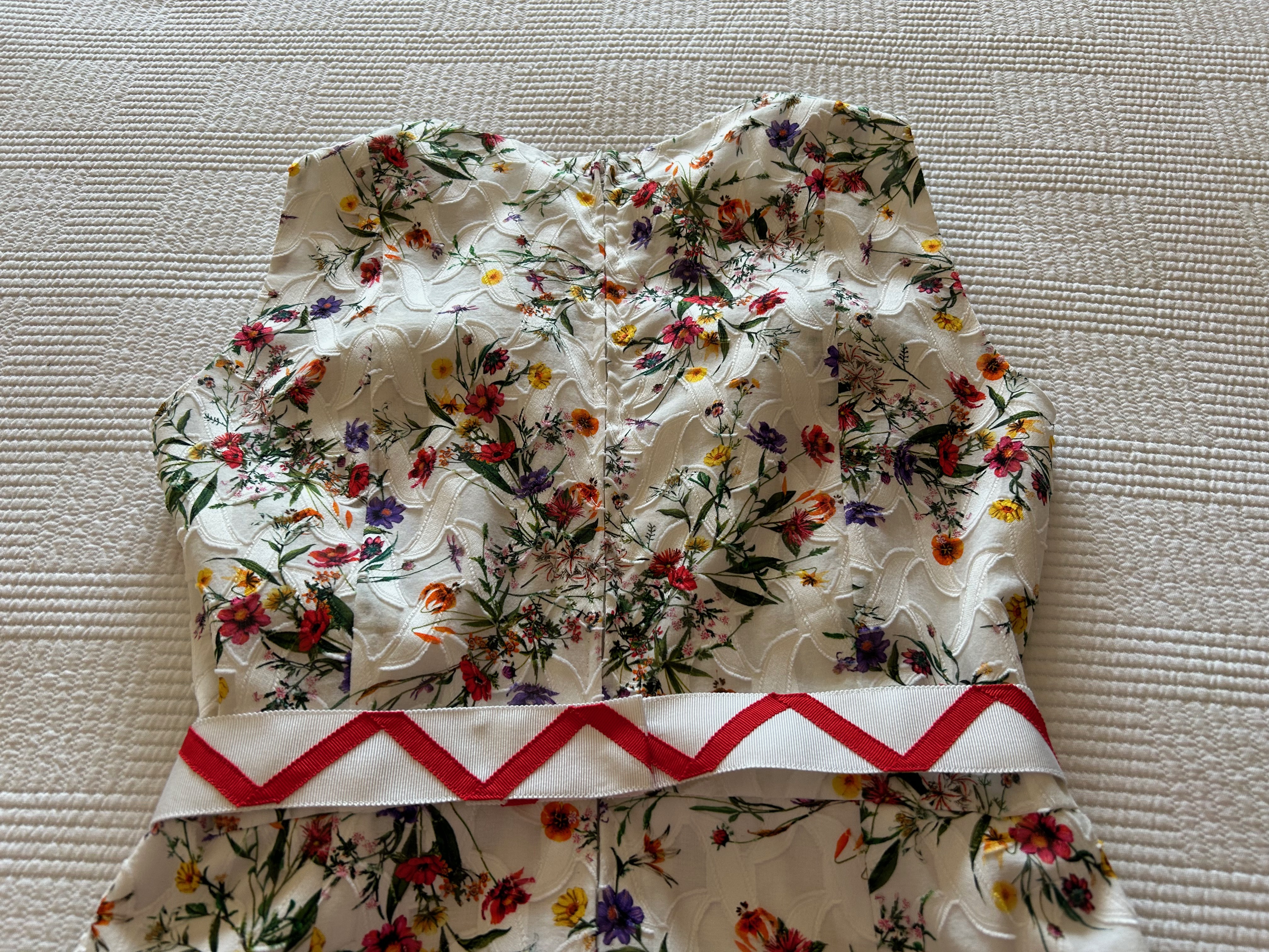
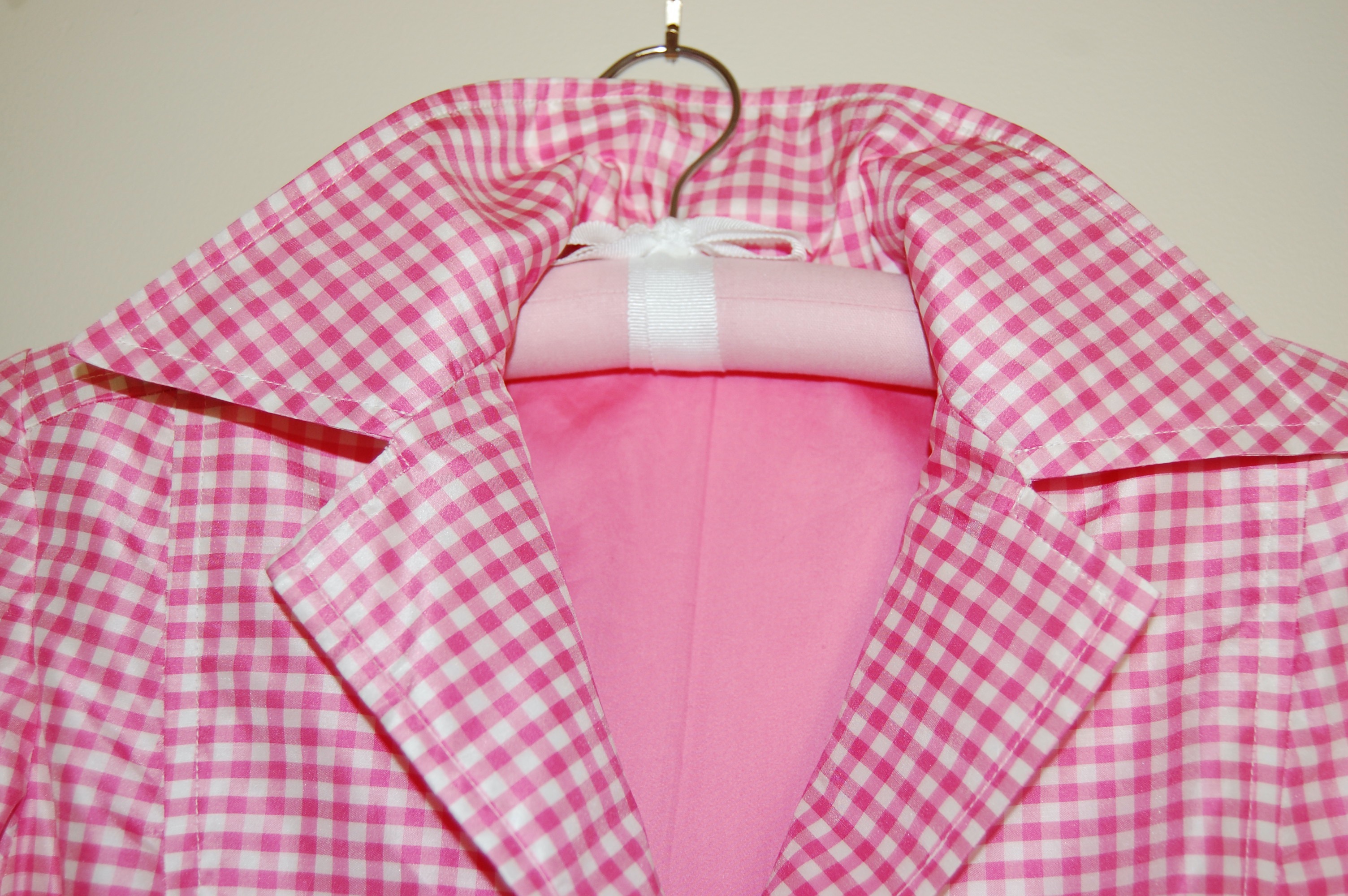
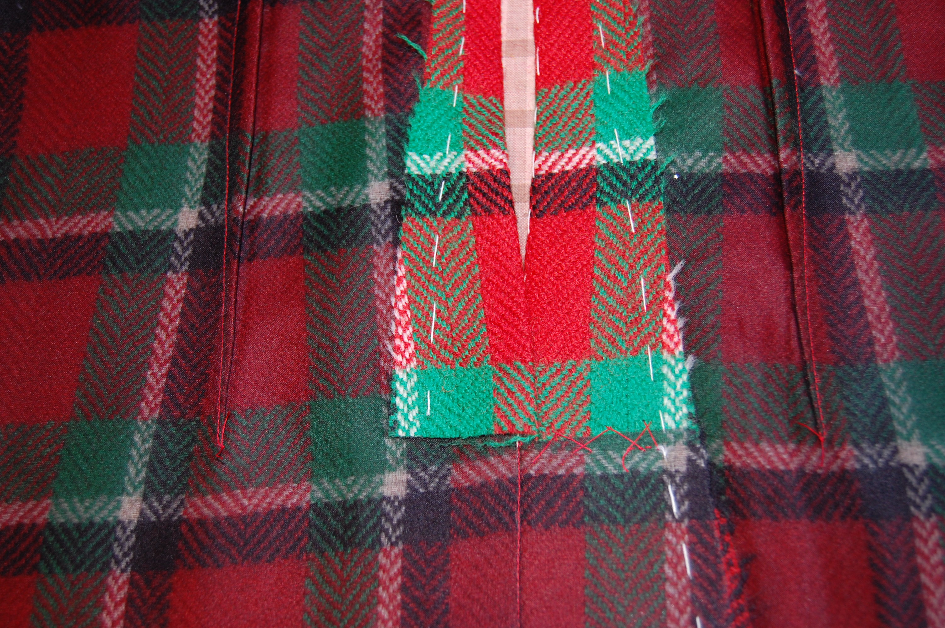
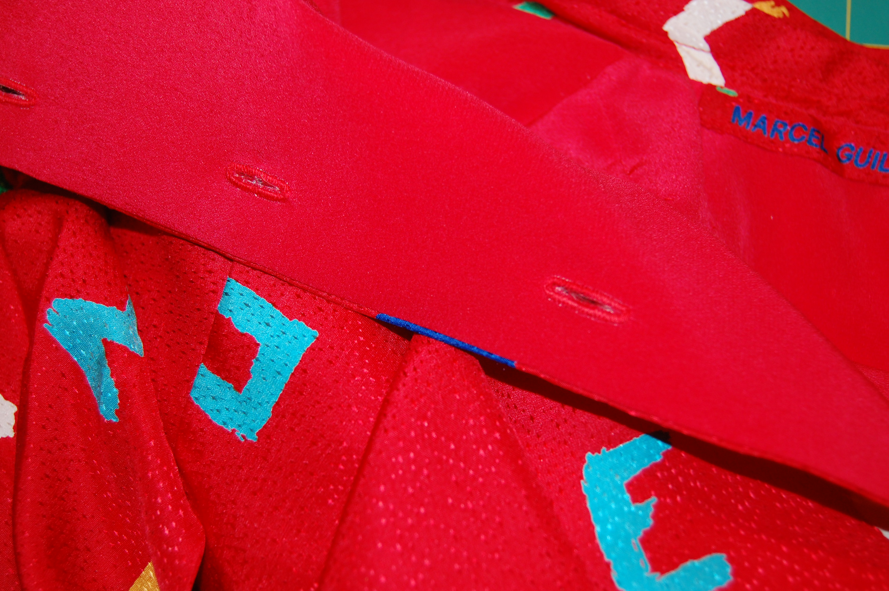
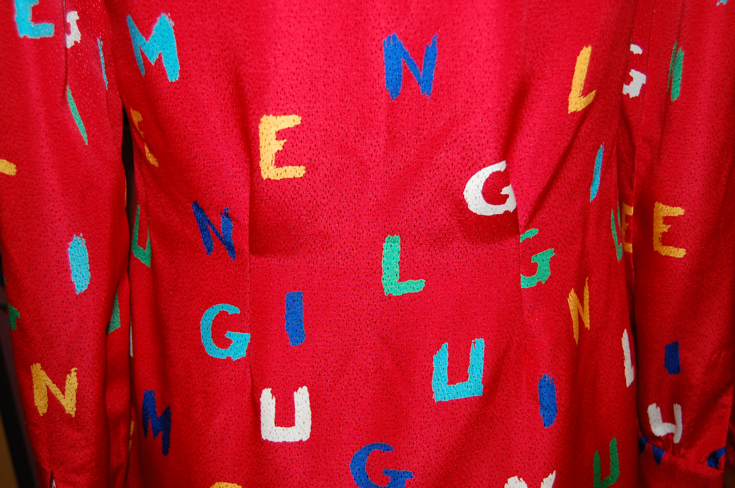
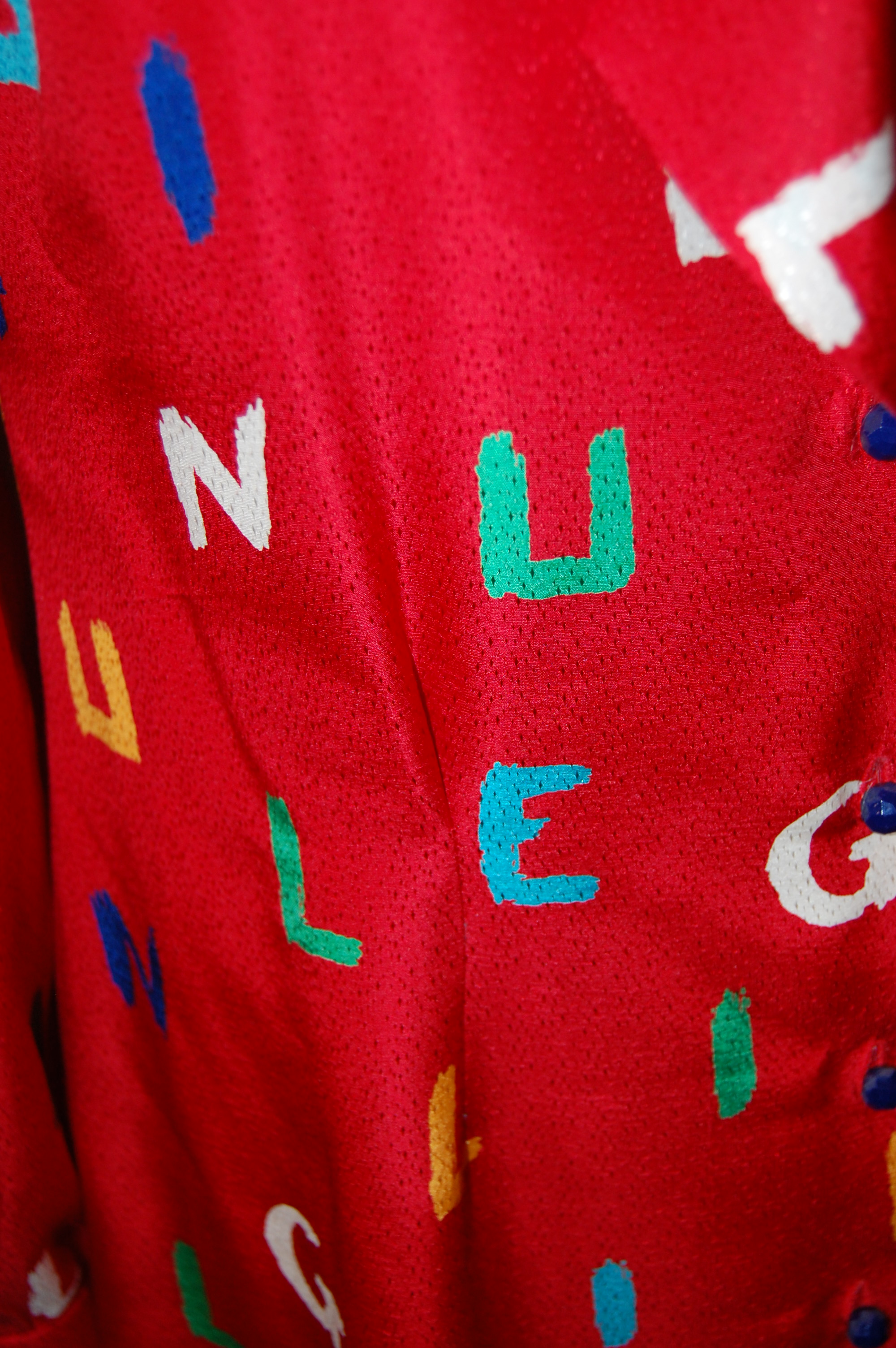
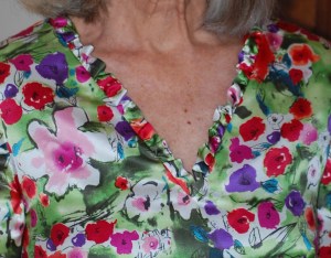
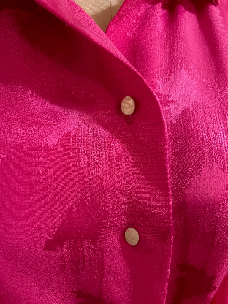
  4. The jacquard weave in it had a definite horizontal and vertical pattern to it, meaning I would have to match the design horizontally and vertically across seams.  Although I am used to matching plaids and prints, this was a little different as the woven design was of irregular form.
The irregular nature of the weave is apparent in this photo.

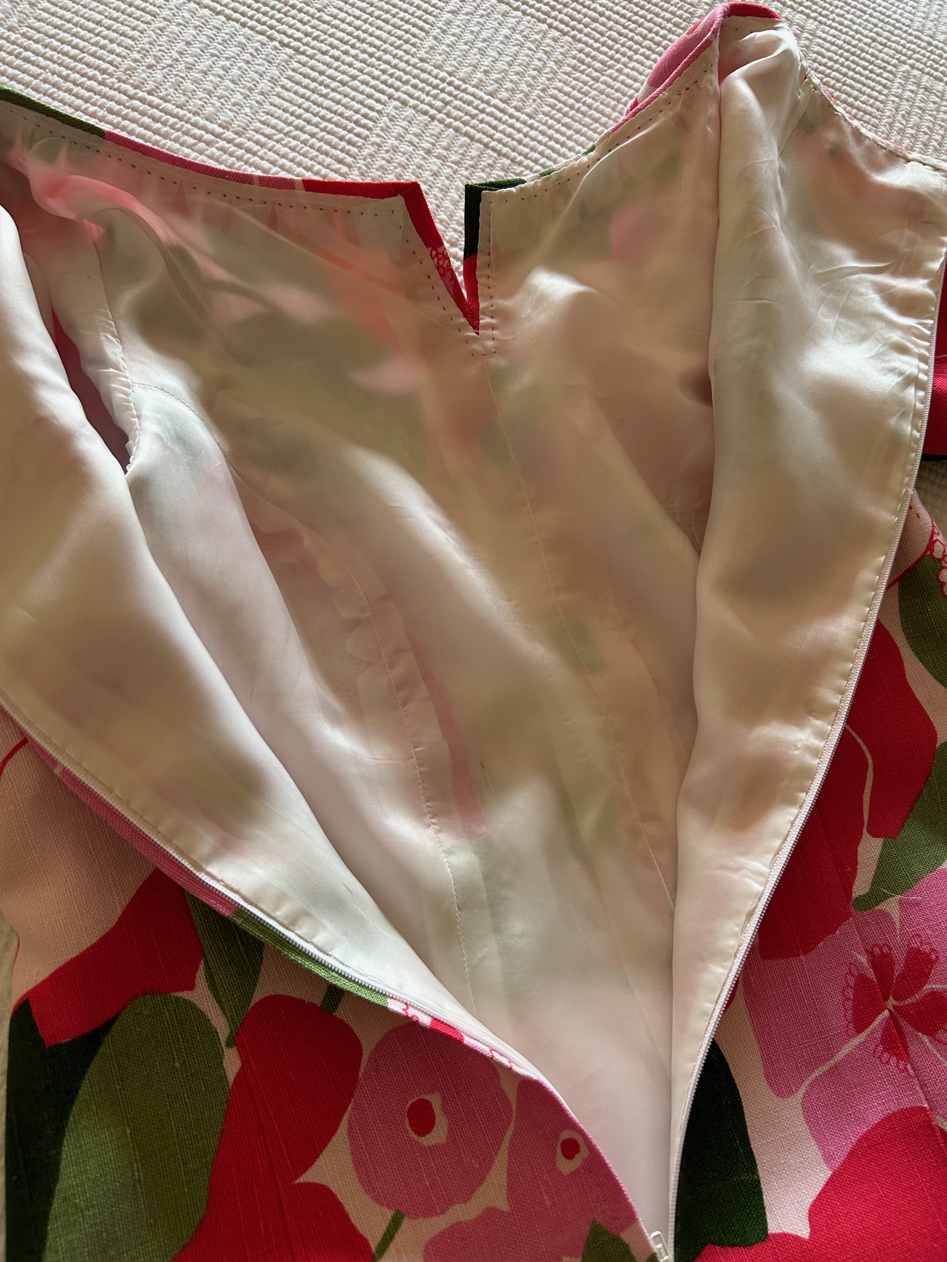
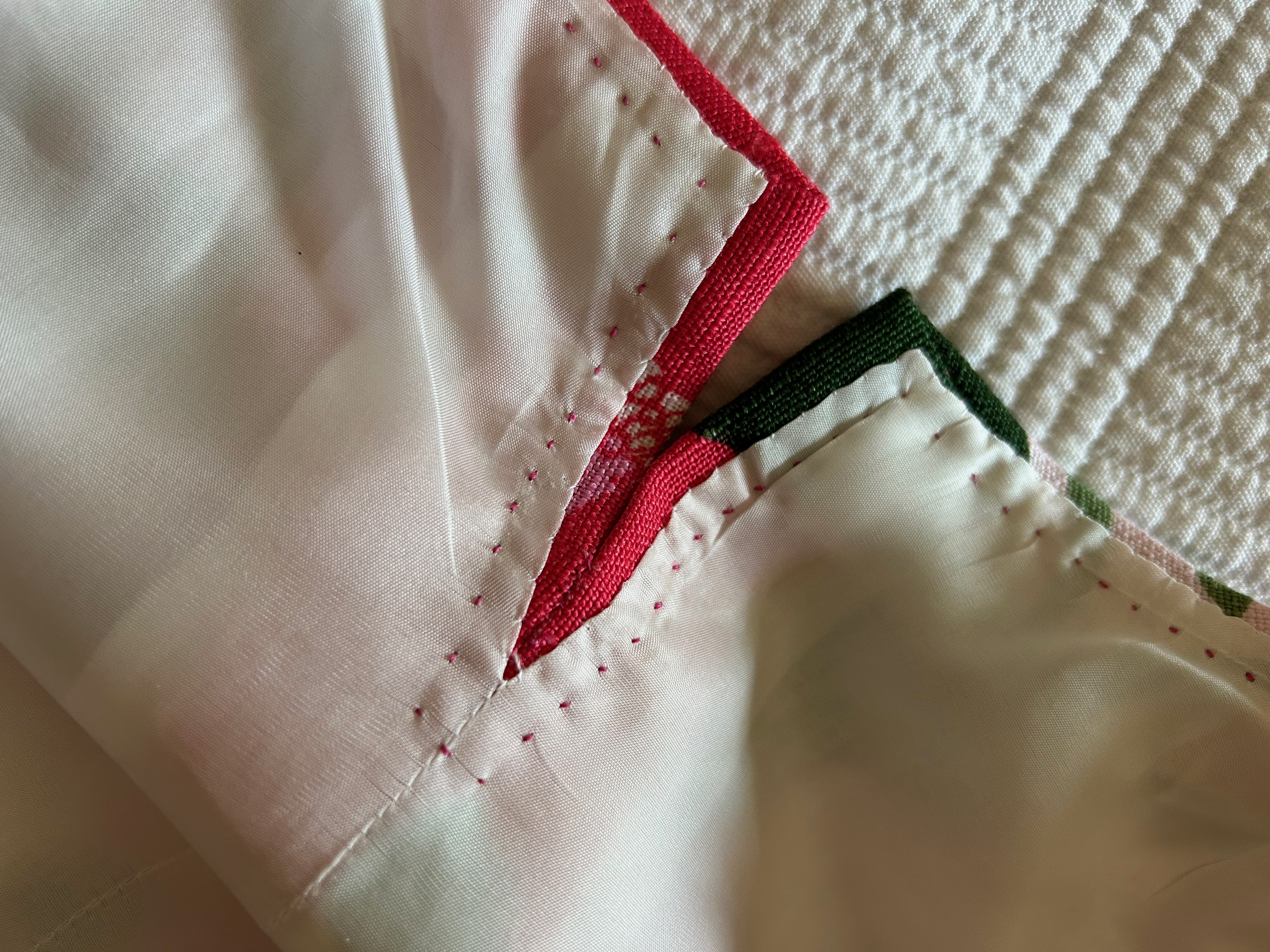
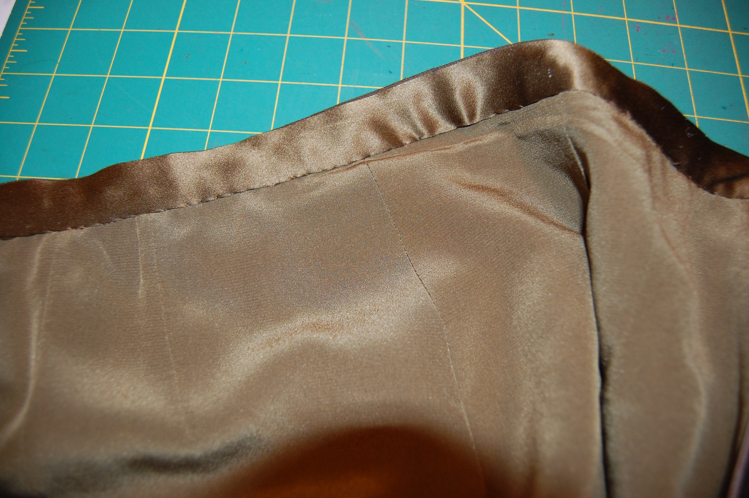
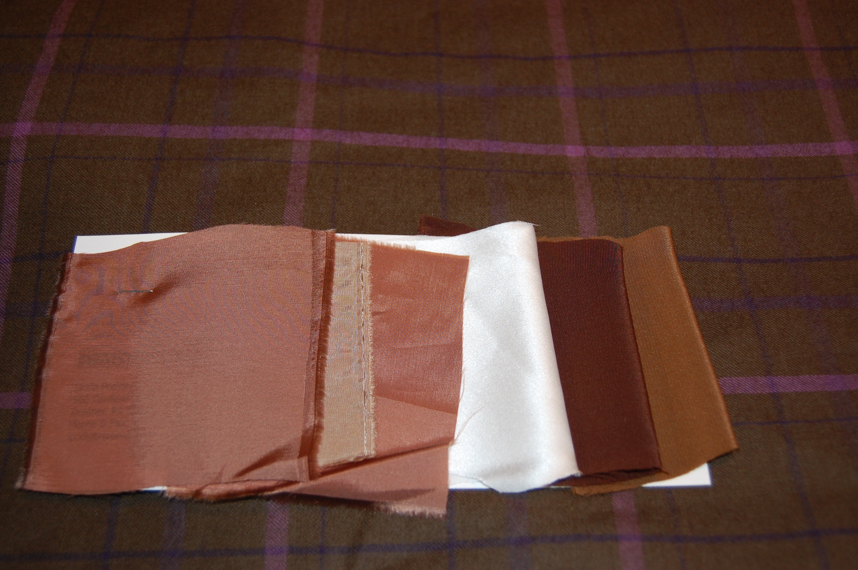
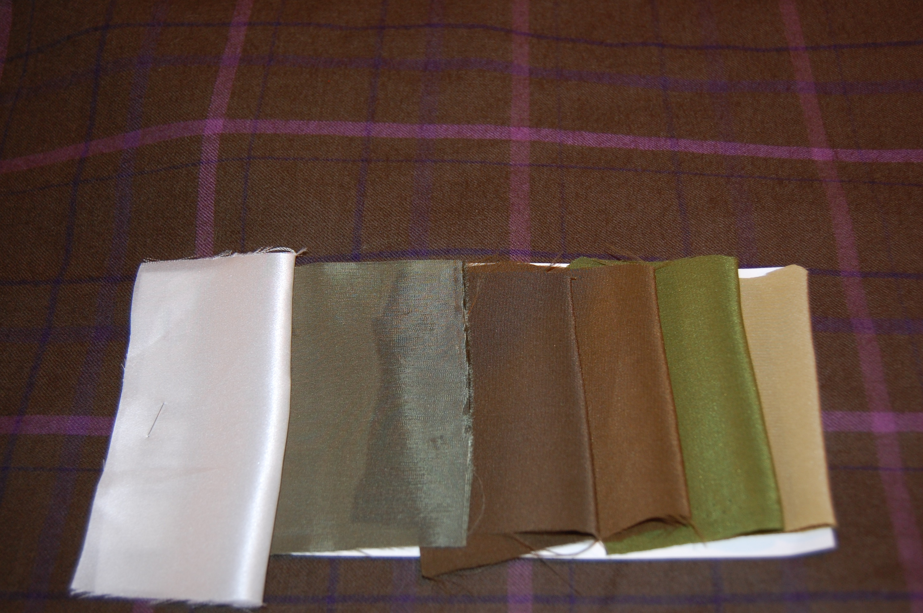
I decided to underline the dress (except for the sleeves) with a very lightweight silk batiste, which I hoped would give it some substance, but still preserve the flowing nature of the fabric.  I made the conscious decision not to add an additional lining to the dress.

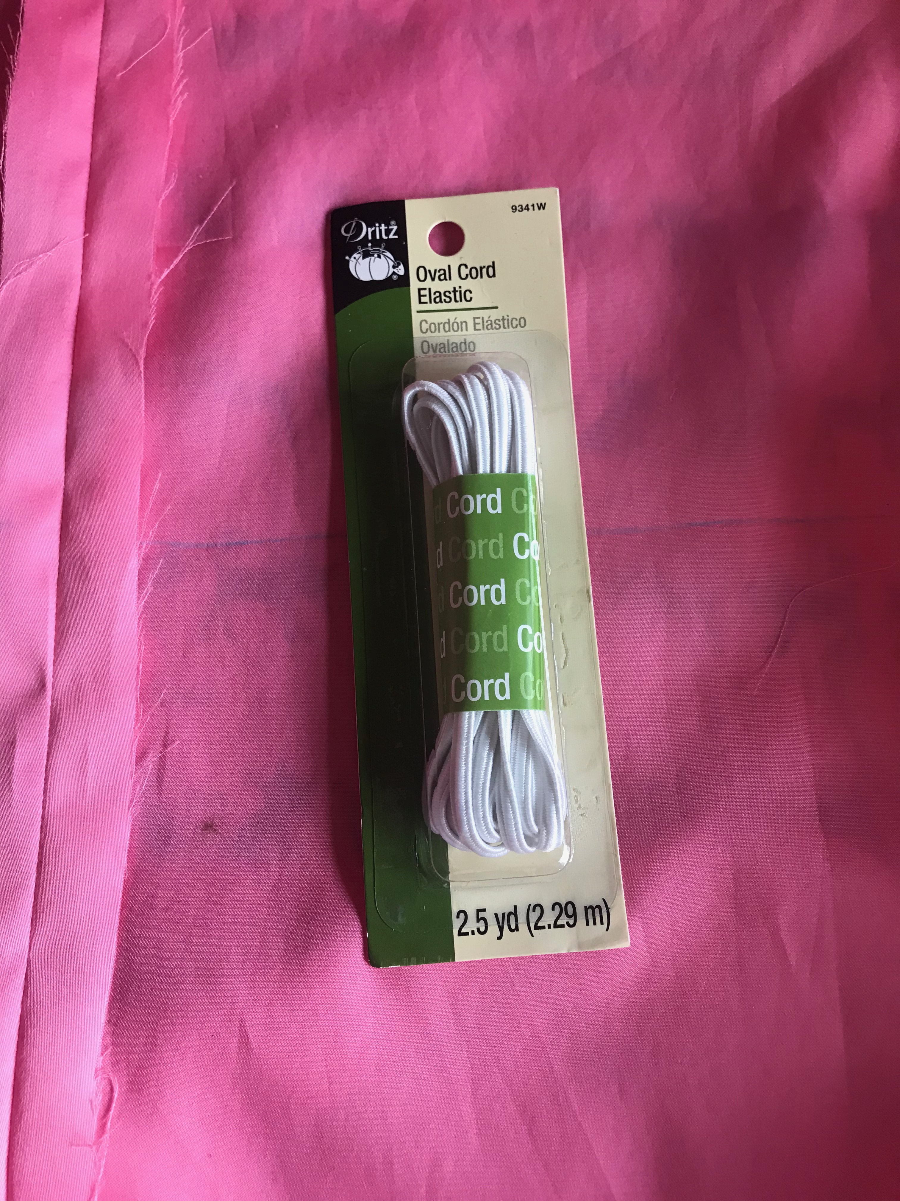
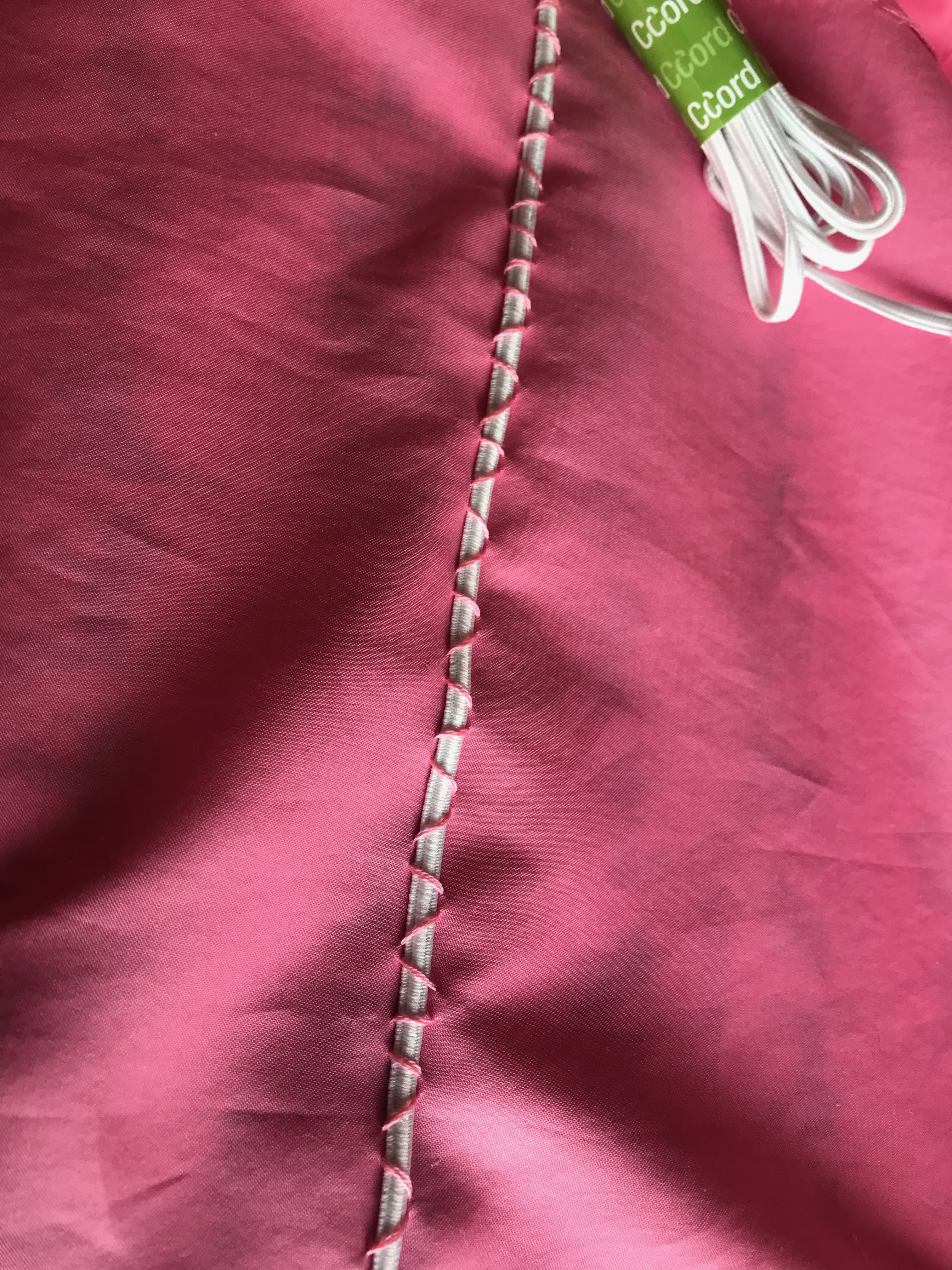
Although I rarely use fusible interfacing, I realized very early on that sewn-in interfacing was going to shift around and cause all kinds of problems.  Luckily, I had been introduced to a very finely woven, fusible German interfacing available from Farmhouse Fabrics.  I had some on hand and found it to be the perfect stabilizing foundation for the cuffs, the front facing, the collar, the collar stand, and the hem.  

So, that solved one big problem for me.  I was still concerned about being able to get the hem even.  I had good reason to be concerned!  It took two tries to avoid having either a bubble appear or uneven dips around the perimeter. 

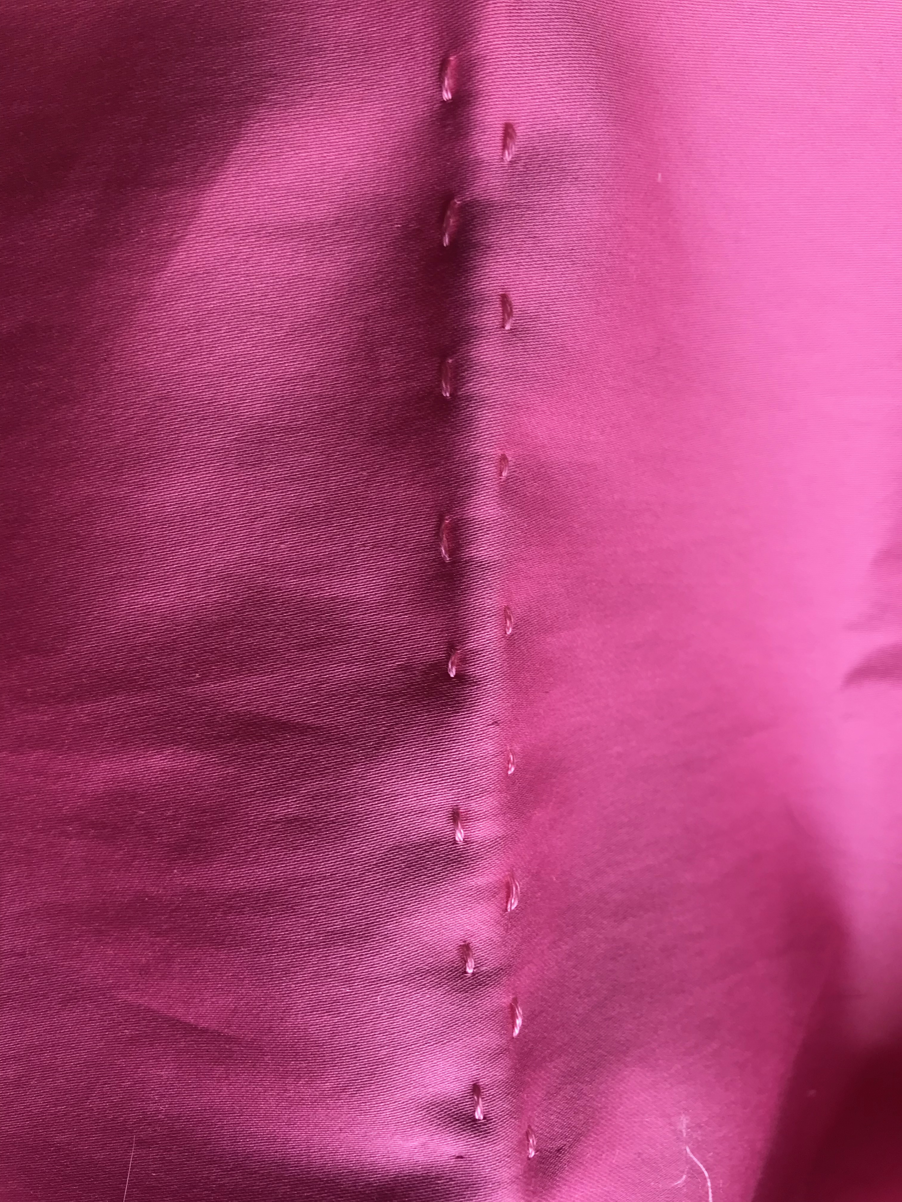
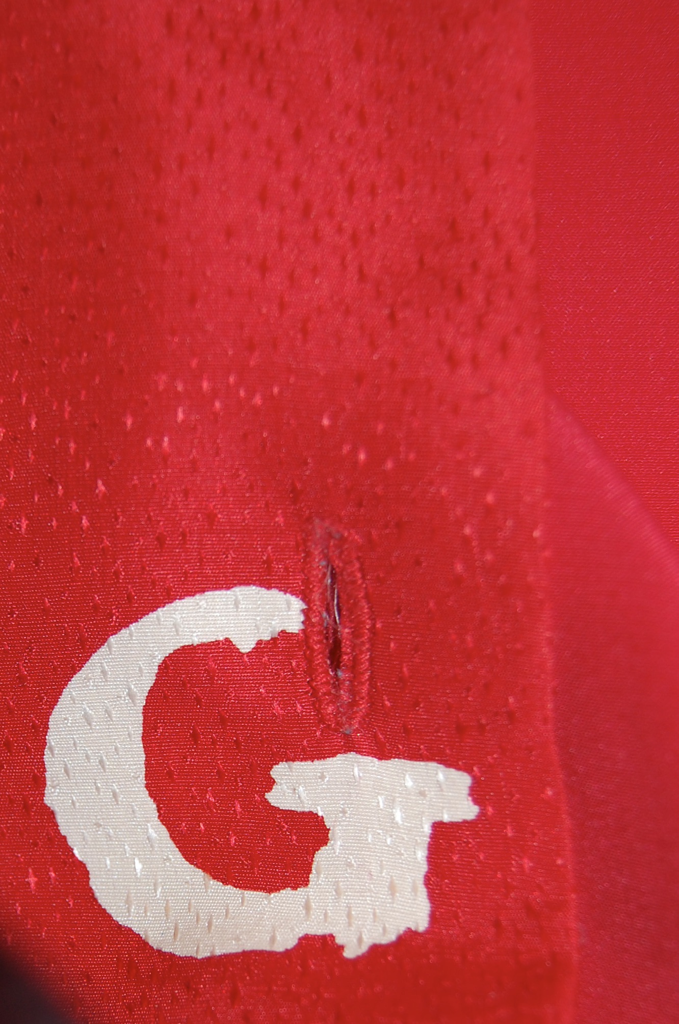
The final quandary I had was the buttonholes.  Because the fabric shed silk fibers so easily, I was really worried that my buttonhole attachment might grab onto those fibers and make a mess.  I did some sample buttonholes, which confirmed my suspicions.  So – I used wax paper between the foot of the attachment and the fabric, cutting little windows in the wax paper where the buttonholes would be sewn.  It worked like a dream.  

I found vintage pearl buttons with a slight iridescence to them which I thought worked well with the fabric.
And here is that handbag with the dress!

This was not a particularly fun dress to sew, but that “perfect” handbag kept me focused.  And I am glad it did, as the dress was a success in the end.  And it always feels like an accomplishment to use fabric which has been lying in wait for so long.  

29 Comments

Filed under Buttons - choosing the right ones, Cocktail dresses, Linings, sewing in silk, silk, Uncategorized, underlinings, vintage buttons, Vogue patterns

A Tale of Two Dresses, Part 2

Whenever I am working with vintage fabric, it seems I either have more yardage than I need or, more frequently, less than I need.  I have learned over the years there is usually a way to work around having less fabric than I really need.  I just have to get creative.  And that’s what I did when I made this dress.

I quickly determined there was no way I could get the dress I wanted by placing the pattern on the lengthwise straight-of-grain.  The flare of the skirt, which I wanted to be mid-calf, precluded any notion of such a layout.  At 45” wide, I knew I could just get the dress length I wanted if I laid out the pattern on the cross-grain, from selvedge to selvedge.  Linen is a very stable fabric, so I was confident the cross-grain would work.  In addition, there were no directional limitations in the floral design of the fabric.  Barely fitting my pattern – from shoulder to hem – on the fabric from selvedge to selvedge, however, would leave no extra fabric to turn up for the hem – or even to face the hem.  I decided to worry about that later.  First I wanted to determine how I could get the four pieces for the dress and the two lengthened sleeves placed on the fabric, keeping in mind three important things:  1) although this was not a fabric to be matched per se, the all-over design of the fabric needed to be on the same plane in contiguous seams; 2) I wanted to space out the larger floral motifs so the dress would be balanced as best as possible (looking critically at the dress I made when I was 23, I clearly could have given this more thought!); and 3) I wanted to avoid large demonstrative blooms at the bust.  Then, and only then, would I worry about the hem.  

I transposed all the markings from my adjusted pattern onto the cotton batiste, then used those pieces as my pattern. I then basted the two layers together to be treated as one, before sewing any seams or darts.

Once I was happy with this placement, I had a eureka moment when I knew I could accomplish two things with a simple bias trim made from the yardage of deep pink linen which coordinated nicely with the floral.  1) I could preserve the full 45” of cross-grain length by applying bias trim to the hem edge instead of turning it under, and I could do the same with the sleeves.  And 2) the trim would add interest to the dress, just as I had vaguely imagined.  (A quick aside here – I have ample yardage of the solid deep pink linen to make a coordinating coat at some point. Every dress needs a coat, right?) 

I underlined this dress in a very lightweight, pre-washed, cotton batiste, then I lined it in Bemberg rayon.  Moygashel linen washes beautifully, as does Bemberg lining, which is why I chose Bemberg over silk for this dress. I eliminated the neckline facing, choosing instead to bring the lining up to the edge of the neckline seam, then under-stitching it to secure that edge in place.  

I chose to do a hand-picked, lapped zipper, an application which I think looks so lovely.  Interestingly, I hand-picked the zipper in the dress I made in 1973, although it is a centered application.  

And here is a back view of the 1973 dress. The zipper is metal, which certainly is a telltale sign of a vintage dress.

When it came time to apply the bias-cut trim to the hem and sleeves, I had to experiment around a bit.  I didn’t want it too wide, but it needed to be substantial enough to look like it was meant to be and not an afterthought or decision made in desperation!  I finally settled on an exposure of 1/2”.  

Now this is where it gets interesting.  A few weeks ago I saw a vintage dress on a Facebook/Meta post by Xtabay Vintage Clothing Boutique.  It is obviously Moygashel linen (I can tell by its weave and color), but what really caught my eye were the bias strips and low-profile bows adorning its sleeves.  I tucked this idea in the back of my mind for future consideration.  What I didn’t know was that the future was right around the corner!  Yes – I “borrowed” this idea and added a single bias-cut bow to each sleeve.  Somehow, it just seems to finish the dress.  

I never would have thought of adding a bow to each sleeve had I not seen this pretty vintage dress.

In this view, the princess seam which originates in a dart is visible. This is a nicely engineered, flattering pattern.

Well, you may have guessed by now the reason for making this dress this year.  I will wear it next week when my husband and I celebrate our 50th Wedding Anniversary.  I have changed a lot in those 50 years (and so has my husband!), but I still love pink in all its shades and I still love Moygashel linen (and I still love my husband, too!)  

50 Comments

Filed under Bows as design feature, couture construction, Dressmaker details, Fashion history, hand-sewn zippers, Hems, Linen, Linings, Mid-Century style, Moygashel linen, Sleeves, Summer sewing, Uncategorized, underlinings, Vintage fabric, vintage Vogue patterns from the 1970s

An Italian Cotton for an American Summer

For a number of years this light, filmy, patterned and printed cotton, made in Italy,  had been lurking in my “cottons basket.”  I had purchased two yards of it from Mendel Goldberg Fabrics, for a “future” dress presumably.

This fabric is partially sheer. The print is overlaid on what appears to be a “burn-out” cotton, ie., two-layered.

At 60” wide, I knew two yards would be sufficient for just about any summer style I chose to make.  It seemed like every Spring I would take it out and consider the possibilities for it, not reaching a decision.  But this Spring, the “future” had finally arrived, at least for this fabric.

I’m not sure how I came up with the idea to trim it with a coordinating tape/ribbon, but I liked the definition it gave to the colors in the printed floral sprays.  First, I thought purple would be a great color to pair with it, then I went to yellow, then to pink.  None of those seemed to make the fabric pop the way I anticipated they would.  So, even though red is not a dominant color in the print, I decided to try it. And that was it – it worked!

I had already decided on a Vogue pattern I had previously used twice, albeit with a number of obvious changes.  

The first construction decision facing me was whether to underline it with cotton batiste and then also line it with – I wasn’t sure what; or just line it and hope that would be sufficient.  I wanted to preserve the light, airy feel of the fabric, but I also needed to address the sheerness of part of the fabric.  

After much thought and experimentation, I went with using only a simple cotton batiste lining. That turned out to be the right decision.  I under-stitched around the inside of the neckline and armscyes even though I did not have an underlining upon which to secure those stitches.  However, the under-stitching – which caught only the seam allowance – still had enough of a stabilizing effect to secure those edges. 

A hand-picked zipper is always a lovely detail to add to a dress like this:

There was some subtle pattern placement on this dress, but no matching.

I’m getting ahead of myself here, but to make this dress, I was eking out small snippets of sewing time during a complicated Spring.  And when the time came to do our annual Summer migration from Pennsylvania to Wyoming, 2200 driving miles west, the dress was unfinished.  

So, I packed it up along with a lot of other sewing-related things, and I eventually picked up where I left off.   I remembered to bring the zipper for the dress, – and the red Petersham ribbon for its embellishment – but I forgot to bring the extra dress fabric.  Why was this a big deal, you might be asking?  Well – I needed to make a belt for the dress, and my intention was to make a self-belt, edged with the red ribbon.  

Once again in my sewing life, I found myself going to Plan B – necessary, if I had any thought of wearing this dress this summer.  (Plan B stands for “It BETTER work.”)  I hemmed and hawed and decided there were two options.  One was a white belt and the other was a red belt.  I came to the conclusion a red belt would be too overpowering for the delicate nature of the fabric.  So that left me with a white belt, which wasn’t too exciting.  Then I had a eureka moment when I realized I could pick up the somewhat zigzag overlay motif in the fabric and embellish the belt with my extra red Petersham ribbon, applied in a zigzag pattern.  

This actually shows the back of the bodice. I used flat hooks to secure the belt.

Plan “B” seemed like a good idea when I remembered I had this Kate Spade Summer clutch to pair with my dress.

So – I rather like the Plan B belt although I may decide at some point to make a self-belt as I had originally intended.  We shall see.  One thing I know I will do is make belt loops for this dress from its remaining fabric sleeping back in Pennsylvania.

In the meantime, this is a good dress for a hot American summer.

Ciao!

33 Comments

Filed under couture construction, hand-sewn zippers, Linings, Summer sewing, Uncategorized, vintage Vogue Designer patterns, vintage Vogue patterns from the 1970s

Life Isn’t Perfect…

…but Your Outfit Can Be.  I took a picture last summer of this sign at a Western wear store in Pinedale, Wyoming (Cowboy Shop).   I loved the saying, but little did I know how often I would reflect on it this summer, which has had its difficulties.  

And even when my outfit, like Life, is far from perfect, which has been often, I know there is always Hope, and yes, that is hope with a capital H.  

*******

What a long hiatus it has been between my last musings about Trench coats and Dressmaker coats and pink gingham.  The final, finishing  stitch in my pink checked coat was in mid-June, and at this point I can hardly remember what I wanted to say about it.  

I purchased the pink silk gingham from Farmhouse Fabrics several years ago.

It does seem appropriate to start with the changes I made to the pattern, of which there were two major ones.  The first change was to the size of the collar.  In the 1970s long pointed collars were a trend.  Although I like a pointed collar, one with a more petite profile seemed to be a little more flattering and classic.  To achieve this desired look, I shortened the collar’s points by about an inch on either side.  

For comparison purposes, here is a good look at the original collar.

When I made this coat in 1974, I remember being a bit disappointed with the volume of the back of the coat.  I was using a cotton twill, so it was a heavier fabric than the silk taffeta in my new version, making the volume seem even more pronounced.  But even so, I thought I would be happier with a less full back.  I experimented around with my muslin/toile until I got the desired girth.  It turned out I eliminated a total of three inches from the back pattern pieces, 1 ½” from each side back panel.

Again, the image of the 1974 pattern illustrates the volume of the gathering in the original design.

In addition to these alterations, I had a slight construction change.  The instructions for the  gathering of the lining at the back waistline called for using elastic thread.  First of all, I didn’t have any elastic thread, nor did I think it would give the look I wanted even though it would not be very apparent on a lining.  Instead, I had some elastic cord, and I attached it by hand, using embroidery floss in a criss-cross stitch enclosing it the width of the back.  Worked like a charm, and I like the effect it made.

This is the wrong side of the lining, showing the criss cross I achieved with embroidery floss.
And here is what it looks like on the right side of the lining. The lining gathers beautifully with this thread channel for the elastic cord, as is apparent in the image below.

Once I had the coat partially assembled, I decided I would have liked it to be a bit longer than I planned with the muslin.  I was very tight with fabric, so I really could not have cut it longer and still been able to get the coat out of the fabric I had.  So, to gain another inch and a half, I decided to face the hem right to the point where the lining would be attached.    It certainly took extra effort, but I’m glad I did it as I much prefer the slightly longer length.  

The one thing I would change should I ever make this coat again (which I doubt) would be to add about an inch or so to the diameter of the cuffs.  I would like to keep them buttoned and be able to slip my hands through them.  As they are, they are too tight to do that.  This was something I could have determined had I made a muslin/toile with completed sleeves, which I did not.  All I did was check the length.  A good reminder to me to be more thorough in situations like this.  

When I was planning this coat, I intended to use this vintage silk fabric for the lining.

However, even though I underlined the fashion fabric with white cotton batiste, I felt there was a slight “see-through” of the black details in the print of the intended fabric.  In the meantime, I had ordered a piece of polished cotton in “Paris Pink” from Emma One Sock Fabrics.  Although not an exact match, the two fabrics – the pink checked taffeta and the polished cotton – made a pretty pair so I changed course, and the rest is history.

I am quite happy with this pink lining!

No report on this coat would be complete without mention of the buttons. Again, I went with vintage mother-of-pearl buttons. These have a carved detail in them, which I thought would pair nicely with the gingham.

I chose to do machine buttonholes on this silk coat.

This was an involved, lengthy project.  I was rather in awe of my 24-year-old self for attempting it “back in the day.”  But making it again brought back hidden memories (good ones) and new appreciation for all that I have learned over the ensuing years.  Wearing my new version of this Trench-inspired coat will, I believe, fall into the “nearly perfect“ category.  

44 Comments

Filed under Buttons - choosing the right ones, Christian Dior, Coats, couture construction, Dressmaker coats, Linings, Mid-Century style, Silk taffeta, Uncategorized, vintage buttons, vintage Vogue Designer patterns, vintage Vogue patterns from the 1970s

Wool Slacks

Or do you call them pants?  For some reason, I tend to think there are slight differences between pants and slacks.  But not so, according to Fairchild’s Dictionary.  Slacks are listed as “Synonym for pants. Term is usually applied to loose-cut casual pants, not part of a suit.  In the 1930s when women first began wearing pants for leisure activities, these garments were generally called slacks rather than pants.” (The Fairchild Dictionary of Fashion, by Charlotte Mankey Calasibetta and Phyliss  Tortora, Third Edition, Fairchild Publications, Inc, New York, New York, 2003, p. 359-360).  I find this interesting, and a little confusing. I have always thought of slacks as a bit more refined than just pants.  “Slacks and a sweater” conjures up a town-and-country-state of mind for me – rich wool, cable-knit sweater and a string of pearls or simple gold necklace.  Perfect for being comfortable but stylish.  Although it doesn’t really matter what one calls them – pants or slacks – I prefer “slacks” – especially when they are finished!  

This is the pattern I used for the slacks. Notice they are called slacks in the description! There are 8 shaping darts – four in the front and four in the back, and no pockets.

It took so many fittings during the process of making these slacks, and so many minor tweaks, so that when I finally took the last stitch, I was so relieved!  A lot of thought went into them which I will share here.

First of all, the vintage wool I was using (and from which my matching cape is being constructed) is – you guessed it – an uneven plaid.  Fortunately, the dominant colors in the plaid allowed me to “ignore” the uneven aspect and concentrate on what WAS even, if that makes sense.  

This photo from my last post shows the uneven aspect of the plaid. I planned the layout according the the brighter lavender stripe.

Then I had to determine where I wanted those lavender lines to hit my hips, and where I wanted them to run up and down the legs.  These considerations needed to accommodate where I wanted the pants-leg hems to fall in relation to the larger blocks of the plaid.  I generally like to have a hem fall somewhere mid-way between dominant horizontal lines.  I never want a dominant horizontal line to be right at the edge of a hem if I can avoid it. 

Here is the hem on one of the legs, to show where I wanted the lower edge to fall in relation to the plaid.
And here you can see how I placed the vertical stripes on the legs.

I underlined these slacks with silk organza, I lined them with silk crepe de chine (from Emma One Sock Fabrics).  I am lining the cape with matching color silk charmeuse, but I wanted a lighter weight lining for the slacks.  The only exception to this is the facing on the waistband, for which I used silk charmeuse.  The interior of the waistband may occasionally be against my bare skin, and silk charmeuse is just a bit more comfortable in areas which call for a snugger fit. 

I faced the waistband with silk charmeuse.

It was serendipitous that I had a wool sweater, purchased many years ago, which is a perfect complement to the darker purple/eggplant color in the plaid. 

It was quite chilly when I took these photos! Where’s my cape?

 Now I’m excited to make more progress on that cape, which has taken a backseat to holiday sewing and shopping.  It may, indeed, be after Christmas until the cape gets its debut, but life has its priorities, doesn’t it? 

35 Comments

Filed under Fashion history, Hems, Linings, Slacks, Uncategorized, Vintage fabric, vintage Vogue patterns from the 1950s

A Fabric Full of Surprises

Several years ago I purchased a piece of vintage French Lesur wool, which I subsequently made into one of my favorite pieces ever, my pink Christian Dior-designed coat.  

When I received the length of pink wool from the eBay seller, I wrote her a note to tell her how excited and grateful I was to have the opportunity to purchase that fabric.  It apparently had been from the estate of an accomplished dressmaker, known for her good taste.  The seller then kindly offered me another piece – very different in aspect – from the same collection.  The photos she sent me showed a wool plaid which looked to be a medium khaki background with purple and lavender lines woven into it.  It wasn’t exactly what I usually gravitate to, but I knew the quality of the fabric would be superb, and being a pushover for vintage fabric, I decided to purchase a five-yard length from her.  

When the fabric arrived, it wasn’t at all what I had expected.  This is one of the downsides of purchasing fabric – especially vintage fabric – online.  You don’t always get what you think you are getting.  This fabric was deep brown and the purple and lavender intersecting lines were more the colors of eggplant and lilac.  It seemed kind of dark to me. Except for black and navy blue, I’m not usually a dark-wearing person.  The quality of the fabric, however, was indeed superb.  Soft, lightweight with a beautiful hand to it.  

I was a little disgruntled about this purchase, though.  I don’t like to spend money frivolously, and this suddenly seemed like an unwise decision.  But – it was done, so I put the fabric in my fabric closet for storage.  Every once in a while I would take it out and ponder it.  I started to like it more and more, but I couldn’t for the life of me figure out what to make with it – all 5 yards!  

Now. . .  I have discovered with fashion sewing, that sometimes time allows creativity and inspiration to blossom, and that is what happened with this fabric. At some point over the summer, I decided this wool would make beautiful slim slacks.  But what to do with all that remaining fabric?  Somehow, a matching jacket did not appeal to me at all – and then I remembered a lovely vintage Vogue pattern, designed by Molyneux, I had in my collection at home in Pennsylvania.  I knew it would be perfect with the pants – and the fact that I had long wanted to make its featured hip-length cape sealed the deal!  

In preparation for this project, I needed to order lining fabric, both for the pants and for the cape. I selected 5 shades of brown silk charmeuse on Emma One Sock’s website and sent off for swatches.  (I often prefer to use a contrasting color for a lining, but in this case I determined a matching lining would allow me greater flexibility in wearing the cape with something other than the matching pants.)  The swatches arrived in short order, and I was astounded to discover that not one of them was even close to a matching color.  

The swatch second from the right was the closest match, but it was still a long way from viable, even more so in person than in this photo.

And then it hit me – like an iron in the face! – this wool was not brown, it was a true olive green!  No wonder it had started to appeal to me.  I have long been a fan of olive green, which I now know to be a little bit of an enigmatic color.  Off I sent for 5 more swatches of silk lining, this time in shades of deep green.  When the swatches arrived, it was a Bingo moment.  One was clearly a perfect match.  

The center swatch “reads” brown in this photo, but it is a true olive green, as is the background of the wool fabric.

Please stay with me in the next couple of posts, as I work through this two piece outfit – a project whose time has finally come.  

16 Comments

Filed under Capes, Christian Dior, Linings, Uncategorized, Vintage fabric, vintage Vogue Designer patterns, vintage Vogue patterns from the 1970s, woolens

A Summer Dress

Summer is quickly slipping away, but before it does, I will share one quintessentially summer dress which I made back in July.  It ticks off a number of features which make it “Summer Seasonal”:  it is sleeveless, it is a bright color, and it is linen.  

I found this vintage piece of Moygashel linen a few years ago on eBay. Always a pushover for vintage Moygashel, I purchased it, not quite knowing what shade of green it would be. I was expecting a lime green, but when it arrived it was “lime green meets mint,” a color reminiscent of the early 1960s.  Actually, not just reminiscent – an actual survivor from that period of time.  The width of the fabric was only 35” which was a dead giveaway that this fabric is from the early part of that decade.  Shortly thereafter, Moygashel began to be woven in 45” widths.  Fortunately I had three yards, which compensated for the dearth of width.   

To keep with the early ‘60’s vibe, I decided to line it in pink.  Although I usually line linen with a cotton batiste or cotton/linen lightweight blend, I decided to treat this dress a little bit differently.  I do not often use Bemberg for lining, usually preferring silk, but this lovely, time-tested 100% rayon lining just seemed to be the right choice. (Why?  I knew the seam allowances of the bright green  linen would not show through the tightly woven Bemberg lining, AND it would be a comfortable, lightweight and slinky fabric with which to line a summer dress.)  I ordered what I thought would be a medium pink, but when it arrived, it was more of a very deep rose.  What to do?  I hemmed and hawed, I thought about ordering a different hue of pink, I even thought about abandoning the pink idea and just using a white crepe de chine I had on hand.  Why I was agonizing so much over the color of the lining had to do with my thought if the dress turned out well, I would enter it in the County Fair. I knew not everyone would “understand” such a deeply contrasted lining.  But not wanting to waste money and fabric – and time! – I finally decided just to go with the dark pink, shown a few pictures below.  

I used this sheath dress pattern again, as I am so fond of the double shaping darts in the bodice front and the real kick-pleat.  

The sheath dress pattern I like is the one on the right, underneath its matching plaid coat.
Not just a slit, but a real kick-pleat!
Here is the kick-pleat on the inside of the dress.

I underlined the dress in silk organza so that I could eliminate facings and have an invisible application of the lining.  (The silk organza underlining gives one a base upon which to tack and secure stitches which do not show on the fashion fabric.)

The neck and armhole edges are stay stitched by machine close to the seam line, then clipped and tacked in place by hand to the silk organza underlining.
Here is one of the side seams, clipped and then also tacked in place by catch-stitches.
A beautiful lining hides all those interior stitches and seams.

I surprisingly found a zipper which was almost a perfect match to the green linen, and I did a hand-picked lapped application.  

Once I had the lining fell-stitched in place around the neckline and the armholes, I under-stitched those areas in waxed and ironed white thread.  (I used white to quiet down the deep pink!) Using this technique keeps the lining in place.  The under-stitching is attached to the silk organza underlining only, not the fashion fabric, as explained above.

I used Hug Snug rayon tape to construct the strap holders.

To complete the early 1960s’ essence of this dress, I can pair it with a vintage ‘60s’ Guillemin scarf, also found on eBay.  The pink in the scarf doesn’t match the pink lining, but since the lining does not show, it only matters to me (and now all of you also know this little fact!)  

So how did I do with this dress as an entry in the County Fair?  It was awarded a Red Ribbon in the Adult Division, which was lovely.  The day was “saved” however, when dresses I made for my granddaughters each won Blue Ribbons (and one of them won Best of Division).

(Those of you who follow me on Instagram @fiftydresses have seen this picture already…)

Good Summer memories, all of them.    

29 Comments

Filed under couture construction, Linen, Linings, Mid-Century style, Moygashel linen, Scarves, Sheath dresses, Uncategorized, underlinings, Vintage fabric, vintage Vogue patterns from the 1960s

A Dress That Was Meant to Be – in Vogue

Sometimes the sewing stars align to ensure success (and sometimes they don’t.)  But this story is a success story, although it played out differently than I originally planned.  

I wrote about this vintage Forstmann wool fabric in a previous post.

Having only 1.25 yards of this vintage wool restricted my options to either a simple sheath dress or a skirt.  I opted for the sheath, with all good intentions of using the princess-lined pattern I had recently used for a pink dress in vintage Linton wool.  In fact, one of the reasons I made the pink dress was to see if I would be able to successfully match plaids when I started on the red/green wool.  (The weave of the pink Linton has a plaid woven into it, which I knew would be helpful to me in determining the pattern’s useability for a multi-color plaid.)  Only one problem – when I laid out the pattern pieces on the Forstmann wool, I didn’t have enough fabric.  I should have realized that the 7-panel princess dress would take more fabric than I had – and this time there was no making it work.

SO – I had to find another pattern.  I have, over the years, made several sheath dresses using a newer Butterick pattern, but I really wanted to use a vintage pattern for this wool.  Now, I have a lot of vintage patterns in my collection – and I went through every single one looking for the right sheath dress.  At first I didn’t realize this pattern had the look I wanted.  

I had originally purchased this pattern for that gorgeous shawl collared coat.  But – BINGO – when I took another look, there was the perfect sheath looking right at me.  

Although the pattern was not dated, I knew it was from the early 1960s.  But of course, I thought it would be wonderful to know the year it first appeared.  A lengthy search through old Vogue Pattern Magazines proved to be successful – not only successful, but timely.  This pattern was included in the December 1962/January 1963 issue, and was the featured pattern for a Special Capsule Catalog included in the issue.  Not only that, the caption read: “110 IDEAS TO START THE NEW YEAR IN VOGUE.”  Yes, I thought, that’s what I want to do!  

What a glamorous look!
And here is the entry for this pattern in the capsule catalog.

Of course, starting with a pattern I had not before used meant I had to make a muslin (toile)  and fit it.  That little effort took two days.  But then I got started in earnest, cutting out the silk organza underlining and positioning it right where it needed to be on the fabric.

You will notice that this fabric has a center front, woven to provide a mirror image of the plaid on each side. Really a brilliant way to handle an uneven plaid.

There were two important considerations for placing my silk organza underlining “templates” on the plaid:  1) the orientation of the plaid vertically and 2) the correct placement of the hemline on the grid of the plaid and making this placement work with the position of the waistline and neckline.  

I thought the wider, darker part of each woven “block” on the plaid should be oriented to the bottom of the dress, which I believe is apparent above.  

I find, when working with plaid, it is very important to have the hemline determined before you cut out your fabric.  Visually it is more appealing if the hem does not cut a block of the plaid directly in half or, especially with smaller plaids, end right at the edge of a block.  I think it looks better if there is a bit of a “float” around the bottom of the dress to anchor the bottommost blocks. (Larger plaids have their own considerations. Look at the art on the pattern envelope above to observe this.)

The red “band” at the hemline serves as this “float.”

One of the design features of this dress is the kick pleat, which has its origin in the back seam starting at the bottom of the zipper.  I wasn’t sure how I was going to work the lining around this, but I also thought I could probably figure it out.

The instruction diagram shows the kick pleat quite well.
I angled the raw edges to finish the bottom edge of the seam.
Here is the finished kick pleat.

I loved that fact that this type of kick pleat made the perfect setting for a lapped zipper, shown below.  

The left side is pressed slightly to the middle to accommodate a lapped zipper.

You will notice this dress has two shaping darts on either side of the front panel, in addition to the bust darts.  The back has one shoulder dart and one shaping dart on either side.  

All these darts make for such a lovely fit. In addition, I used a trick I have learned from Susan Khalje. Instead of sewing the bust dart into the side seam, I allowed it to float free, stitching the seam above and below the dart. I did this for both the fashion fabric and the lining. Using this method provides more ease to the bust.

This photo shows what I did with the side seam at the bust dart.

I did lower the neckline by about ½ inch, and I cut the shoulders in by about an inch on either side.  These changes just seemed to look better on me, as determined by my muslin (toile).  

I lined the dress in black silk crepe de chine. (I find almost all my lining silk at Emma One Sock.)  When it came to the kick pleat, I found that a slanted seam below the end of the zipper was necessary to divide the lining between the two sides of the kick pleat. 

Black is so difficult to photograph, but hopefully the angle is apparent.

 I have no idea how to explain what I did to finish the lining in this area.  Just know that whatever I did – worked!  I ended up with no lumps and no restriction on the functionality of the pleat.  

How lovely to have a label for this vintage wool.

This dress was such a fun project.  I loved working with such a beautiful wool and such a beautiful pattern.  There will be more such sheath dresses in my future. 

I now would like to make a black jacket to wear with this dress; I do have a small amount of fabric remaining to use as trim in some way…

So now, how about you?  Have you started the new year in Vogue? I hope so!

52 Comments

Filed under couture construction, fabric labels, Hems, Linings, Mid-Century style, Pattern Art, Sheath dresses, Uncategorized, underlinings, Vintage fabric, vintage Vogue patterns from the 1960s, woolens

Red Letter Day-Dress

Red Letter Day:  “A day that is pleasantly noteworthy or memorable.”  (Cambridge Languages)

Day Dress: “The perfect all-in-one outfit, a day dress is a versatile and fashionable way to look chic and stay comfortable at the same time.”  

Any day I finish a lengthy project (successfully) is definitely a “red letter day.”  This dress just happens to be red, adorned with letters, and “back in the day,” as they say, it would have been considered a “day-dress,” although the apt description above is actually from a current website. (DavidJones.com)  

I found this silk at Britex Fabrics in San francisco.
I used this blouse pattern from 1957 as the basis for the dress, opting for long sleeves and the lower bow. I did not have enough buttons to make French cuffs, so I did plain cuffs.

I go into a little bit of how this dress evolved in my last post.  But of course there were many more decisions to be made along the way.  I had to decide: 

  • Do I underline this crepe de chine? 
  • If I underline it, what do I use for my underlining fabric?
  • Do I also line this dress?
  • If I line it, do I also line the sleeves?
  • The blouse pattern has floating, released darts at the waist.  Do I use that technique for this pattern transformed into a dress?
  • What color and type of buttons will most enhance the fabric?
  • Do I make bound buttonholes or machine-stitched ones?

So, let’s start at the beginning.  Because this was a very soft, fluid, lightweight crepe de chine, I thought it best to underline it.  My normal go-to for underlining – silk organza – would have reduced the fluidity of the silk, so I ruled that out.  Cotton batiste just did not seem the way to go.  When I found a silk batiste on the website for Farmhouse Fabrics, I knew I had my solution.

I believe you can, in this photo, see how lightweight and lovely this silk batiste is.

However, even with the ethereal nature of the silk batiste, I decided not to underline (or line) the sleeves.  I wanted them to retain their uninhibited flow.

I clipped the armscye seam carefully and pressed it to the interior of the dress. Then I fell-stitched the lining to the interior edge.

Once I had the underlining basted to the fashion fabric, I weighed whether or not to line the body of the dress.  I went with my gut feeling about this and decided to line it with a soft and lightweight red silk crepe de chine – almost a perfect match in color, as is evident in the above picture – which I purchased from Emma One Sock Fabrics.  

In doing so, I eliminated the front and neck facings which were replaced with the solid red lining. 

I eliminated the facings and used the red crepe de chine lining fabric to finish the interior of the body of the dress. Here is the right front edge.

I had worked out the floating dart question in my muslin/toile and decided to use them for the dress.  This left above the waist “blousy” and made it more fitted below the waist.  

This shows the released darts on the back of the dress.
Here is a side released dart on the front of the dress.
The released dart on one side of the dress front.

Buttons are always one of my favorite parts of a project.  I simply love looking for buttons – and I really love finding the perfect ones.  In this case, I knew I needed a large quantity – at least 10, depending on the size I found.  I did not think red buttons would do anything to enhance the dress, and I thought white pearl buttons would be too much of a contrast.  But then I found these buttons on eBay:

They are probably from the 1940s, cut glass, made in Czechoslovakia.  The card held 12 buttons, a good quantity for my purpose.  I think of these buttons as “small, but mighty.”  They provide the right contrast, and the faceted surface picks up the shimmer from the slight jacquard weave in the fabric.  I think they are perfect!

I used ten buttons for the front of the dress. These buttons are small so I was able to space them closely together to get the effect I wanted. I always know I have found the right buttons when they look like they “belong” – they do not steal the show nor are they too weak.
The right top neck edge, with a snap to keep things tidy under the tied bow.
The lone button on the sleeve, showing a bit of shimmer to match the shimmer in the fashion fabric.
The importance of the buttons shows off well in this photo, I think.

And finally, bound or machine-made buttonholes?  I did a sample of each.  I have recently started using my automatic buttonholer for my 1951 Singer Featherweight, and I must say, it is an engineering marvel.  It makes such amazing, precise buttonholes.  And although I do love bound buttonholes, I decided in this instance I would be happier with machine-made ones.  

I haven’t even mentioned the belt! I wanted a self belt, so I knew I would have to make it myself. I found a belt-making kit from the 1960s on eBay and used it for the buckle and the belt canvas.

So that about sums it up.  I had just barely enough fabric to eke out this dress (which seems to be a theme with me!), so I think it was meant to be.  Here’s to Red Letter Days – and the dresses which make them happy.  

36 Comments

Filed under Blouse patterns from the 1950's, Bows as design feature, Buttons - choosing the right ones, Day dresses, Linings, silk, Uncategorized, underlinings, vintage buttons, vintage Vogue patterns from the 1950s

Unfinished Business

What happens when an unavoidable interruption takes you away from the depths of a sewing project for more than a couple weeks of time?  Well, if you are me, you forget exactly where you were in the process.  And, when you finally get back to work on it, you assume, incorrectly, certain fitting steps have already happened.  Recipe for disaster?  Well, not quite that bad, because this dress can be saved.  It is just going to take some time.

The dress in question is the one for which I used this colorful floral silk.

Although I was so certain in May I would finish this dress before we departed our home on the East Coast (USA) for our Summer home in Wyoming, it did not happen.  So I brought it with me to finish.  When I finally picked it up again, I needed to reacquaint myself with all the steps yet to be completed.  I had the hand-picked lapped zipper sewn and the sleeves inserted.

I love a hand-picked lapped zipper…

I was working on the narrow ruffle I had decided to add to the V-neck edge.  I consider this to be the focal point of the dress (in addition to the fabric).

I used the same vintage pattern for this dress as I did for a blue silk dress late in 2019. This fabric, to me, was begging for a narrow neck ruffle.

As luck would have it, the most recent issue of Threads Magazine included an article by Susan Khalje on Couture Gathering.  Now, I have done a lot of gathering of fabric in my life, but this article is illuminating in all the tips it offers for an excellent result.  It could not have been more timely.  As it turns out, there is lot more to gathering than I ever considered.

Among the concepts covered in the article are:  gathering ratio, fabric grain, underlining, stitch length, preparation of the piece to be ruffled, forming the gathers and attaching the gathered fabric to the body of the item.  As with so much of couture sewing, each step builds on the one before it.

Three of the tips in the article, so helpful to me in completing this detail, were:  1) cutting the piece to be gathered much wider than I would have thought was necessary.  This gives one much more control than with a narrower strip.  2) using three lines of gathering rather than the customary two, and 3) once the gathers are formed, using an iron to set them in place, stopping just short of pressing the ruffle.

I decided on a 5/8″ wide ruffle. I cut my piece to be gathered 5″ wide, folded to 2.5″. I used three rows of gathering stitches.

For those of you with subscriptions to Threads Magazine, I highly recommend this Essential Techniques article.  It has forever changed the way I will do gathering/ruffles.  And although not all features in Threads are as useful, it is offerings like this which make me a fan of this sewing magazine.  (These are my opinions;  I have no relationship with Threads.)

Well, back to where I left off.  After picking up work on this dress again, I proceeded to go through all the steps necessary to complete it.  When I thought this dress was finally finished, I put it on to take pictures, and to my surprise, it did not fit correctly.  It pulls across the bust and forms drag lines on the V-neck.  Ugh.

The pulling across the bust and at the V-neck is clearly noticeable in this photo.

I can only guess I thought I had tried it on for fit after the zipper was basted, but I must not have done that.  Unknowingly, I proceeded with the finishing of the interior – the facing of the V-neck, the hem, and the insertion of a green crepe de chine lining.

Normally with couture sewing, neck facings are eliminated and the lining is brought right up to the neck edge and then understitched to secure it. However, with a V-neck, a facing is necessary. I then cut the lining about 3/4″ below the neck edge and fell-stitched it into place.

I believe removing the zipper and taking some of the center back seam allowance to add to the width of the back will correct this glaring mis-fit. This is not a dress which I will have occasion to wear  this summer – so do I dig in and make the corrections now, or do I wait?  I have quite a bit in my summer sewing queue, and perhaps a tried and true project like a blouse will put me in a better frame of mind.  Regardless, this “unfinished business” will one day be finished, hopefully successfully.


16 Comments

Filed under couture construction, hand-sewn zippers, Linings, Ruffles, Sheath dresses, silk, vintage Vogue patterns from the 1960s