
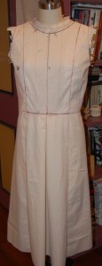
Way back in January of this year – which seems like a lifetime ago now – making plans for my 2020 sewing was an exciting exercise. I was eagerly looking forward to some upcoming events, including one in early May which was going to require at least two new dresses. One of these dresses would be worn to a “fancy” evening. In this casual world, what dressmaker does not relish the idea of making a dressy frock? It was definitely going to be a fun trip and a varied multi-day event.

C A N C E L L E D
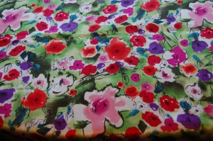
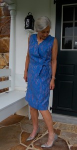
Needless to say, that trip and all its events were cancelled. Other special occasions were also cancelled, along with many that were not so special. I looked anew at my sewing plans. I shifted some things around, eliminated others. But I kept going back to the thought of that dressy dress. The fabric was so cheerful, the colors so bright I could not abandon the idea of making it, even without an occasion for its wearing. So in early May I decided to go ahead with my original plans, albeit without a deadline.
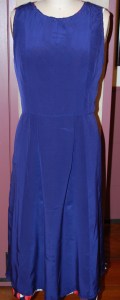
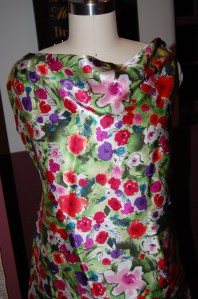
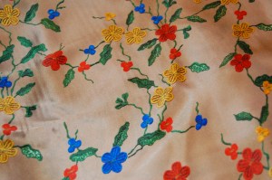
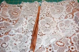
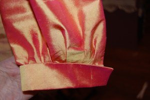
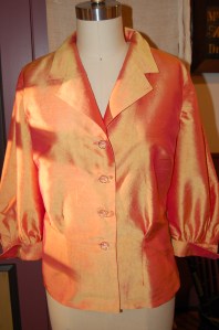
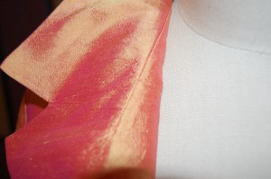
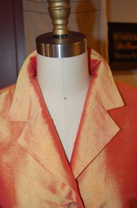
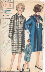
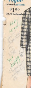
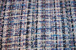
I had purchased this silk charmeuse from Mendel Goldberg Fabrics in New York City several years ago. It reminded me of fabric which one might see in a design by Christian Dior, due to its “Impressionistic” appearance.
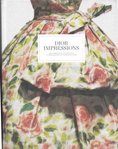
The subtitle for this informative book is The Inspiration and Influence of Impressionism at the House of Dior.
When I unfolded the fabric to give it a press, I saw it was actually a Pierre Cardin design. It struck me as somewhat unusual for Cardin, so of course I wanted to know if there had ever been any connection between the two couturiers or their fashion houses. I went to my St. James Fashion Encyclopedia. Well, yes, as a matter of fact there was: “From his earliest work for the House of Dior up to the 1950s [my italics],Cardin displays an interest in the sculptural qualities of cut and construction that are still his trademarks in the 1990s.” (p. 87, The St. James Fashion Encyclopedia, Visible Ink Press, Detroit, Michigan, c1997.)
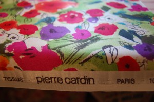
It may be a bit of a stretch to suppose this fabric does indeed have a Dior connection, but still, I wonder. Could Cardin – now at his advanced age of 97 – and his fashion house still be influenced by those early days with Dior? Of Dior’s style direction in the early 1950s, Christian Dior himself wrote ”…Colors were inspired by the pictures of the Impressionists and evoked the fields of flowers dear to Renoir and Van Gogh.” (p. 5, Dior Impressions, Rizzoli International Publications, Inc., New York, New York, c2013.) It is fascinating to ponder.
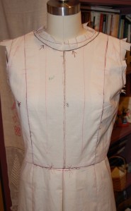
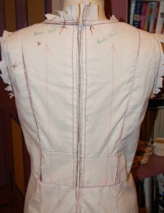
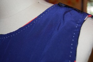
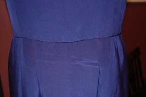
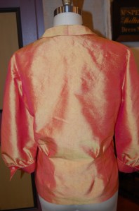
Now back to topic: I started my dress. I got the silk organza underlining marked and cut, I cut out the fashion fabric, I basted the two layers together, ready to start the actual construction. Then I had a bad day. It had nothing to do with my progress or the process, which was going along fine. I just had this dismal feeling this was all for naught. Why would I need such a lovely silk dress? Where would I wear it? Were all these hours I was spending in my sewing room just a waste of time? What purpose do all these pretty clothes serve without any social gatherings and occasions to which to wear them? I think it is fair to say I was having a serious existential sewing crisis. It was dispiriting and discouraging to say the least. It made me question my otherwise passionate commitment to couture sewing.
That night I had a dream – in vivid color. I saw myself in a fancy restaurant which was bustling with people – and I was wearing the very dress I had started – now completed and quite notable in its floral print of bright greens, and pinks and reds and purple. I was seated at a table with three friends and we were lunching. (Not sure this dress is quite the thing I would wear to a midday lunch, but that’s dreams for you.) The four of us were having the best time. We were laughing and totally engaged in our conversation and in our friendship. It was lovely and it was memorable.
And there was not a facemask in sight.


Do You Do Pink?
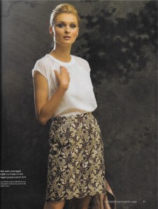
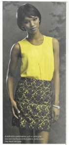
Apparently, pink is a controversial color. Or maybe “was a controversial color” is a better statement. A recent article by Nancy MacDonnell in the Off Duty section of The Wall Street Journal (“Making Peace with Pink” February 11-12, 2017) makes a case for the appropriateness – and timeliness – of pink even for those who think they don’t like it. While I am one who thinks pink is always in fashion, it turns out that this Spring, it really is in fashion! According to Ms. MacDonnell, “On this season’s runways, pink predominated.” The different fashion houses showed varying interpretations of pink: Michael Kors was “brisk, All-American, [and] cheery.” J. Crew was “equally upbeat,” while Valentino showed pink that was “lush and romantic, with intricate appliqués and historical references…” The list goes on and on. The unifying thread (pardon the pun), as claimed by the designers, was the lack of traditional “sweetness” associated with pink, with emphasis on the feminine power inherent in the color.
Looming large on page 58 from the November 2016 WSJ Magazine is a Valentino coat, quite traditional in design, but made very special by its stunning appliquéd pink wool.
According to Dr. Valerie Steele, the Museum Director at the Fashion Institute of Technology in New York, who was quoted frequently in Ms. MacDonnell’s article, the idea of pink as a feminine color did not take hold until the 1950s. Back in 1954 when Christian Dior wrote The Little Dictionary of Fashion, his entry on “pink” stated: “The sweetest of all the colors. Every woman should have something pink in her wardrobe. It is the color of happiness and of femininity.” He even used pink throughout his book for illustrations, chapter headings and the title page. He recommended pink “for blouses and scarves; … for a young girl’s frock; it can be charming for suits and coats; and it is wonderful for evening frocks.” Who can argue with that, be it 1954 or 2017?
The title page of Dior’s smart little dictionary. (Harry N. Abrams, Inc., NY, NY, copyright 2007)
This page from the June/July 2013 issue of Town and Country Magazine gives an interesting timeline of the color pink, “how the color of little girls and baby dolls came of age”:
Click on the image to read it.
I particularly like this statement from Laura Vinroot Poole, the founder of boutique Capitol in Charlotte, N. C., quoted in The Wall Street Journal article: “To wear pink, you have to be an interesting and smart person… You have to have things to say. In pink, you can’t hide.” Nor would you want to.
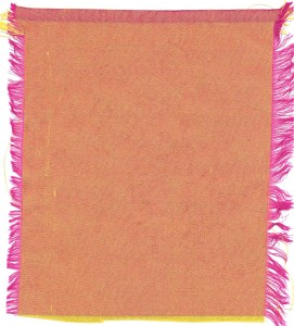
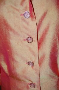
Personally, pink is my favorite color. I am always drawn to it, regardless of its hue. And its hue covers a huge range from palest pink to deepest fuchsia, from bubblegum pink to raspberry red. In thinking about pink for this post, I gathered this stack of pink fabrics from my collection. Just looking at it makes me happy!
From top to bottom:
1) vintage Moygashel linen, purchased on eBay
2) silk charmeuse, purchased from Britex Fabrics
3) vintage Moygashel linen, purchased by me in the 1970s
4) linen, possibly Moygashel, purchased on etsy
5) silk jacquard purchased from Britex Fabrics
6) silk charmeuse, purchased from Mendel Goldberg Fabrics
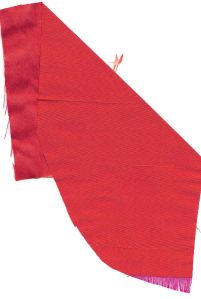
7 & 8) coordinating silks, purchased from Mendel Goldberg Fabrics
The only controversy I have with pink is deciding which hue of it I like best.
19 Comments
Filed under Fashion commentary, Moygashel linen, silk, Uncategorized, Vintage fabric
Tagged as Britex Fabrics, Mendel Goldberg Fabrics, Moygashel linen, silk, vintage fashion, Wall Street Journal Fashion coverage