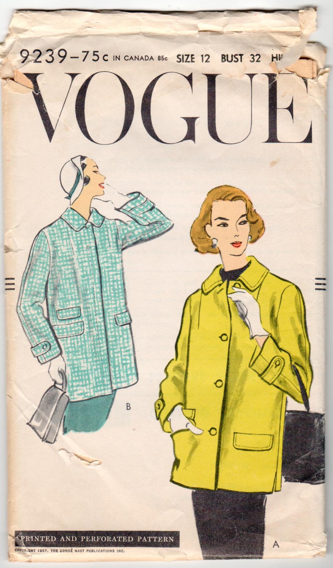
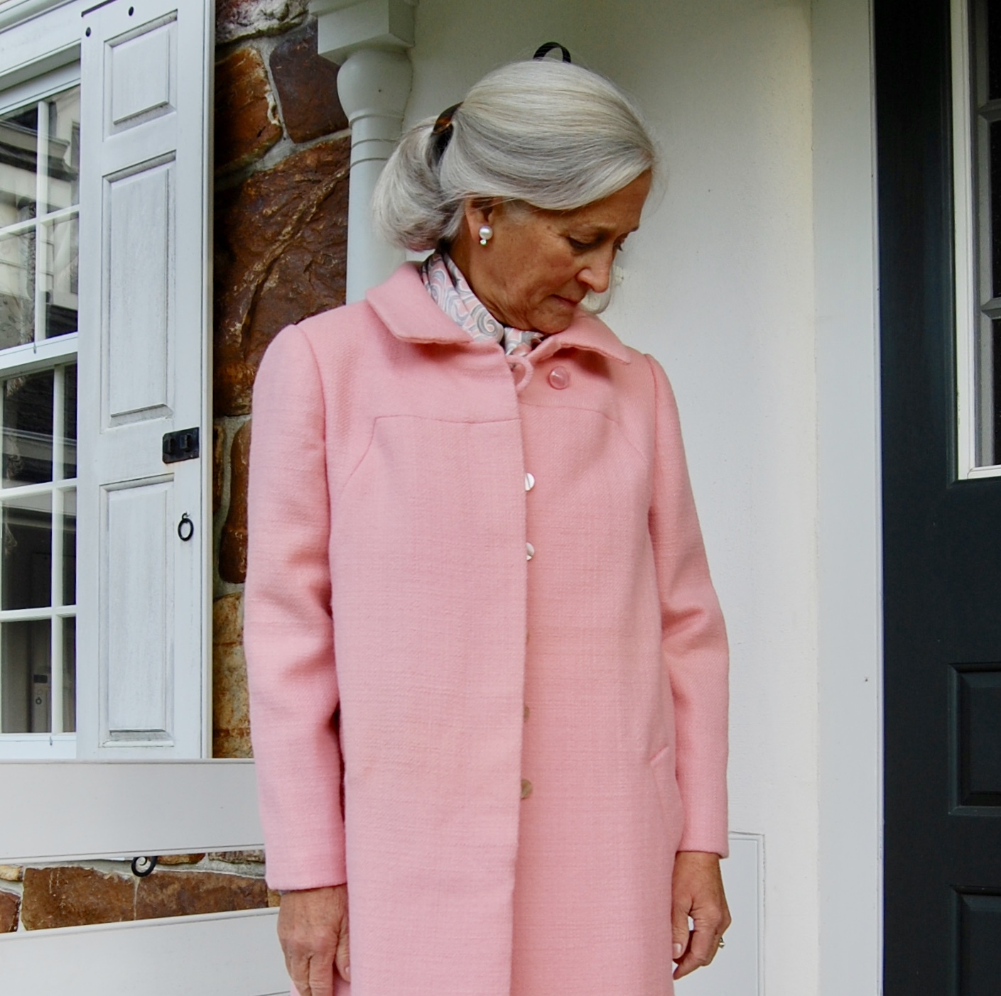
Some projects deserve more than one blog post and this pattern and coat fall into that category.
I am making View A, although with the concealed (fly front) opening.
I purchased this cashmere and wool blend from Farmhouse Fabrics. It has a “brushed” surface, giving it a nap which provides a depth to the deep pink color. I have underlined all the components of the coat with silk organza. Basting holds the two fabrics together and also gives me my stitching lines and other pertinent information.
From the magical year of 1957 (I promise some time I will devote an entire post to the notable spot that the year 1957 occupies in the modern history of fashion), this coat pattern is in a class of its own. Referred to as a “car coat” in two Vogue Pattern Book Magazine entries, it is a quintessential example of that genre. Here’s why:
It is a wonderful example of fashion following lifestyle. The copyright date of 1957 puts it firmly in the early appearance of this form. To wit, the entry for car coats in Fairchild’s Dictionary of Fashion reads: “Sport or utility coat made hip-to-three-quarter length, which is comfortable for driving a car. First became popular with the station-wagon set in suburbia in the 1950s and 1960s and has become a classic style since then.” (ibid, p. 89)
The flap pockets – three of them – are intentionally utilitarian, but also add a certain finesse to the coat. Those flaps help protect the contents of the pocket – in the case of a car coat, obviously keys, perhaps gloves, or even a change purse.
The side slits give a bit of wiggle room to the area of the hips, for sliding in and out of car seats. And the buttoned tabs at the wrists add to its aesthetic appeal. No, they are not really necessary, but that is not what this coat was all about. It was meant to be extremely functional, but smart looking.
The concealed front in View B, commonly referred to as a fly front, steps the appearance of this coat up a notch. Particularly notable is the arrowhead detail at the top of the topstitching on the front of the coat.
The busy mother and wife would have looked very “put-together” wearing this coat out and about. Later versions of the car coat style included Benchwarmer, Duffel coat, Ranch coat, Mackinaw jacket, Stadium coat, and Toggle coat (according to Fairchild’s Dictionary of Fashion) But this coat was a car coat, in its very pure early, but fashionable form.
This pattern is featured twice in the Vogue Pattern Book Magazine from August-September 1957.
Here is the longer version shown on page 22:
“The coat that goes over everything.” Here is an interesting observation which might not be readily apparent. When I was fitting my muslin (toile) for this coat, I initially thought the sleeves may be a bit too loose. You can see in this photo they are not slim on the model. But then I realized they have a bit more girth to them for a reason – to give the wearer comfort and unrestricted movement while driving. (And in 1957 there was a good chance she was driving a stick-shift car!) I kept them the way they are as I will appreciate being able to wear a heavy sweater under my coat.
And here on page 37 is a drawing (by illustrator Dilys Wall) of the coat in red with this description: “A hounds-tooth-check car coat with three flap pockets, side-slit seams, and tab-button detail on the sleeves. Designed in sizes 10 to 18.”
Interestingly, also featured in this same magazine is this example of a child’s coat, also with a fly front. This type of opening takes more skill – and time – to make. I love the affirmation this item gives to the commitment and ability of the home-sewer in the 1950s.
Because this coat has those extra details which put it a notch above ordinary, there is a lot of preparation work before seams can actually be sewn together. The sleeve tabs, with their bound buttonholes must be complete before the sleeve seams can be sewn. Additionally, the set-in pockets with their flaps present a considerable amount of prep work on the fronts of the coat. Sounds like fun to me! More to come . . .
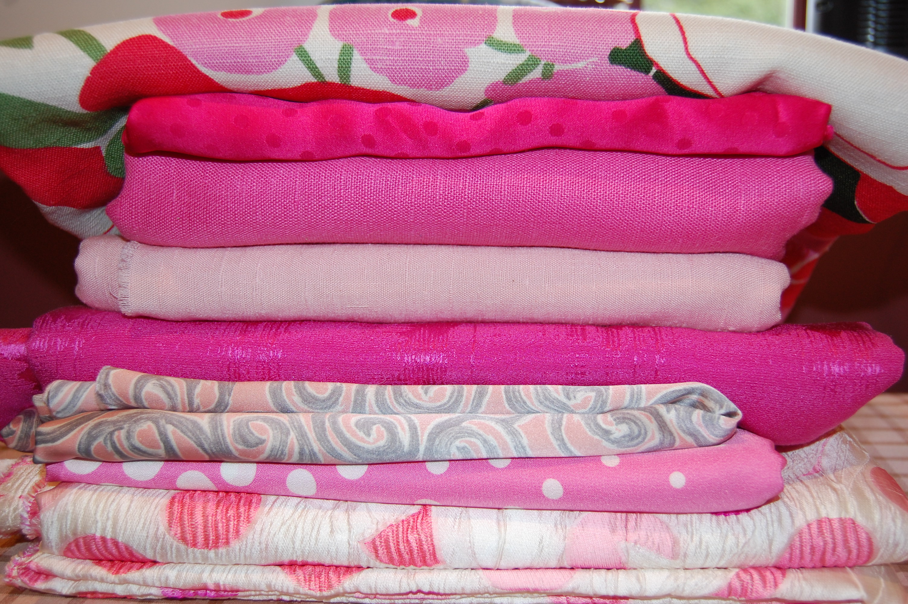
Five days into the New Year seems like a good time to look forward and put down in writing new plans and projects, both personally and in my sewing life. Occasionally in past years, I have chosen a word to guide me in my thinking, and after a sewing friend (thank you, Debra!) suggested this approach again, I happily went with the first word which popped into my mind. P I N K.
Pink is undoubtably my favorite color. I love it in all hues and shades, from the palest pink to deepest fuchia, from bubblegum pink to carnation pink. I love wearing pink and I love sewing with pink fabrics. Looking at fabrics I have collected over the past few years testifies to this fact.
A few of those selections with “assignments” for 2022 will be scattered amongst this exploration into PINK.
And first up is this length of deep pink cashmere blend (Farmhouse Fabrics), from which I plan to make this jacket:
P:
P of course stands for PINK the color.
P is also a good reminder to keep PERSPECTIVE on the year. If the last two years have taught us anything, it is to be prepared for the unexpected. Sometimes things are out of our control, thwarting our plans and timing. Rolling with the punches (another P-word!) is something I need to become better at. Which brings me to . . .
P is for PERSEVERANCE. This is an invaluable asset when it comes to sewing well – and living well.
I have plans to make a day dress out of this soft and supple dress-weight wool, purchased fromMendel Goldberg Fabrics. I am still deciding on the pattern.
I:
I is for INDULGENCE. I have decided to indulge my love of coats and dresses and fancy clothes even I don’t need them. So there!
I is also for INDECISION. I am not usually one who has trouble making decisions, but sometimes, a fabric or pattern stumps me. When that happens, I have to step back and let time make the decision for me. It always works.
I is for INSPIRATION, which is never in short supply among all the vintage patterns, fashions, buttons, and fabrics in the couture-loving-and-sewing online community.
If you follow my blog, you have seen this duo before. Silk charmeuse for a fancy blouse and silk twill for a floaty skirt, both from Britex Fabrics.
N:
N is for NEW ENDEAVORS, both in sewing and in my personal life – NEW patterns, NEW fabrics (YES! Even new fabrics), NEW commitments, determined by answering these two questions: What can I let go of? And, more importantly perhaps, What can I not let go of?
N is also for NOT feeling guilty about all the time I devote to sewing and fashion and dreaming about both.
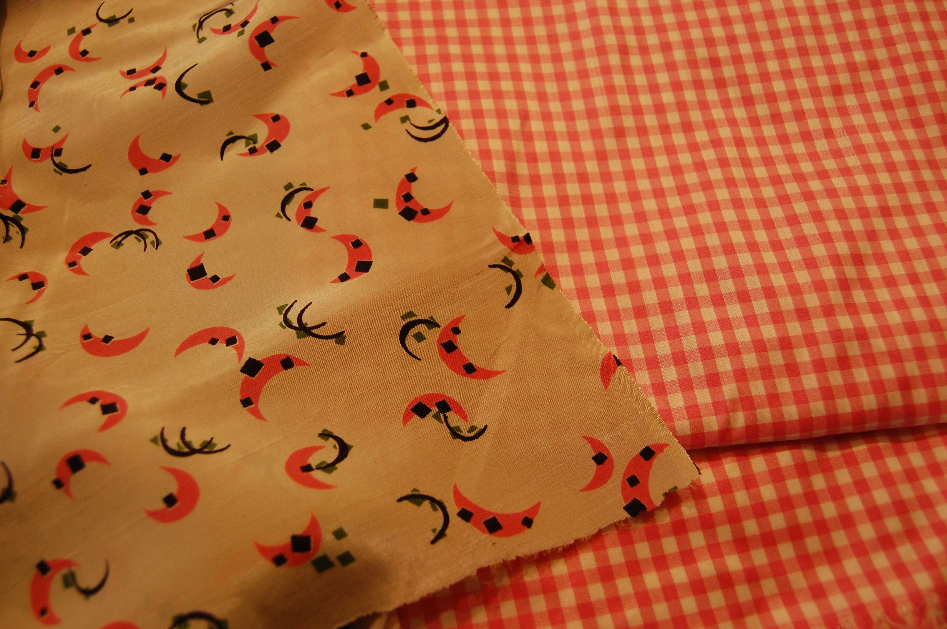
The pink gingham on the right is silk taffeta. When I purchased this fabric from Farmhouse Fabrics, I intended to make a shirt dress, but then it did not seem right to me. A couple of years later, I knew it needed to be a Spring coat instead, lined with the quirky vintage 1950s’ novelty silk. The pattern is below, first used by me in 1974 for a trench coat I sadly no longer have.
I love this pattern now as much as I did when I first made it in my early twenties.
K:
K is for Kindred Spirits – such an amazing camaraderie amongst the global sewing community. I am so grateful to be part of the network of friendships we share.
K is for Keeping Focus, and for the need to Knuckle Down in order to accomplish my sewing and personal goals this year.
K is finally for Kindness which I hope will guide me throughout this new year.
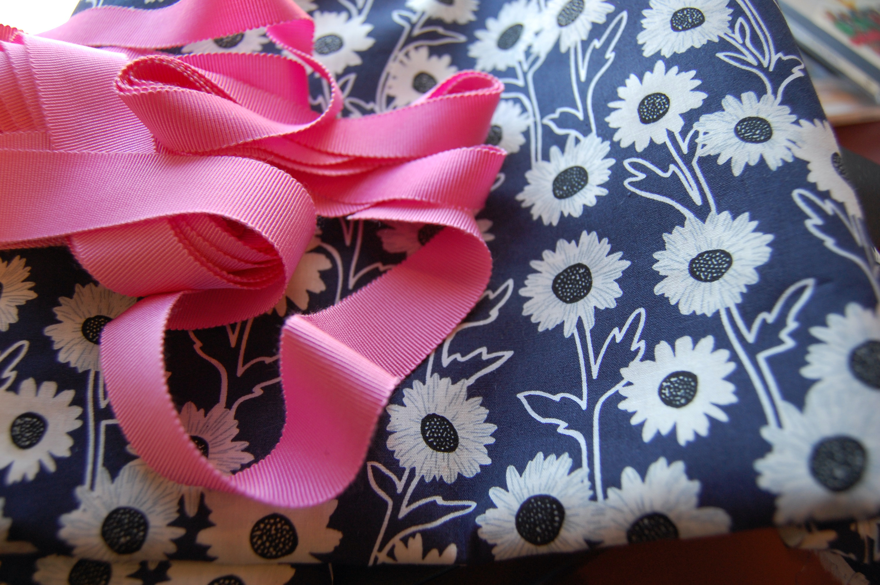
Even when I choose a color other than pink, somehow pink wiggles its way into the design. When I found this fabric at Emma One Sock Fabrics, I immediately thought of making a tunic and trimming it with pink Petersham ribbon.
A Pink-Lover’s Dream Collection: From top to bottom: 1)vintage Moygashel linen, purchased on eBay 2) silk charmeuse, purchased from Britex Fabrics 3)vintage Moygashel linen, purchased by me in the 1970s 4) linen, possibly Moygashel, purchased on Etsy 5) silk jacquard purchased from Britex 6) silk charmeuse, purchased from Mendel Goldberg Fabrics 7 & 8) coordinating silks, purchased from Mendel Goldberg.
“And now we welcome the new year, full of things that have never been.” Rainer Maria Rilke
While bogged down in the fitting of these wool slacks, my mind has been thinking about capes instead.
Almost ready for the waistband!
But first – finish inserting the lapped zipper and the silk lining.
I know myself well enough to recognize it is always prudent to work on the least favorable item first and save the ”goodies” for later, and that is what I have done with this cape and slacks ensemble introduced in my last post. There is a reason I have made few pairs of slacks in my years of sewing: I find fitting them tedious. So, while I think I am just about satisfied with how they are coming along, the thing which has kept me sane is the prospect of making that beautiful cape.
All of this has led me to do a little research into capes. I started with Fairchild’s Dictionary of Fashion, as I often do when investigating a sewing/fashion topic. Well, oh my! There happen to be no fewer than 8 pages of entries for capes, cloaks, and shawls! It turns out a cape is not just a cape, and the history of capes is long indeed. For my purposes here, the simple definition of a cape is sufficient: “Sleeveless outerwear of various lengths usually opening in center front; cut in a full circle, in a segment of a circle, or on the straight – usually with slits for arms. A classic type of outerwear worn in one form or another throughout history….” (The Fairchild Dictionary of Fashion, Third Edition, by Charlotte Mankey Calasibetta and Phyllis Tortora, Fairchild Publications, Inc., New York, New York, c2003)
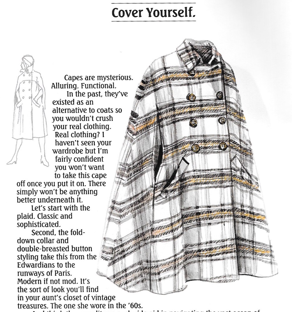
Interestingly, Christian Dior has no entry for capes in his Little Dictionary of Fashion, another one of my go-to reference books. But as luck would have it, the newest J. Peterman Company catalogue, Owners Manual No. 197, Holidays 2021, arrived in my mailbox this week. And there on page 5, he has offered for sale a Plaid Wool Cape, with the enticing caption: “Capes are mysterious. Alluring. Functional. In the past, they’ve existed as an alternative to coats so you wouldn’t crush your real clothing…” He goes on to say one will not want to take off this particular cape, as there could be nothing better under it. Well, I guess that’s an arguable point, but you get the picture. Capes demand attention, but in a good way.
I started thinking about the patterns I have gathered over the years, and I remembered at least two which feature capes. Once I got into my pattern collection, I found four besides the one I am currently using.
The earliest one is clearly this Vogue Couturier Design from the second half of the 1950s.
Its description reads: “Suit and Reversible Cape. Easy fitting jacket with concealed side pockets buttons below shaped collar. Below elbow length sleeves. Slim skirt joined to shaped waistband. Reversible, collarless cape has arm openings in side front seams.” I think this is pretty spectacular, and while the suit is lovely, it is enhanced many times over by the addition of the short cape.
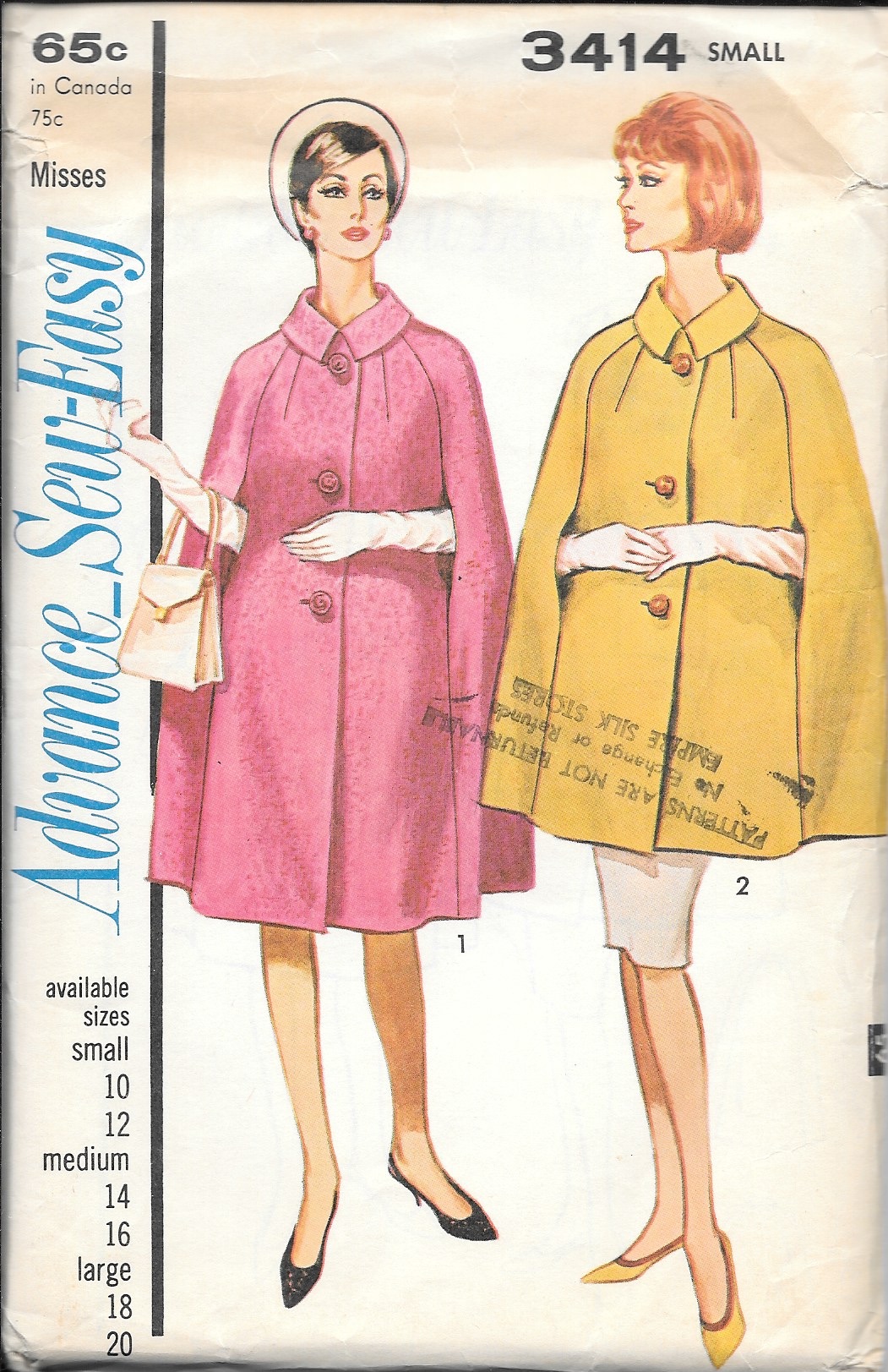
Next is this Advance pattern from the 1960s, a cape in two lengths.
The more I look at capes, the more I think I like the shorter versions.
I was attracted to this pattern because of its lengthwise darts, its rolled collar and back neckline darts.
This diagram from the back of the envelope shows the finesse of the design.
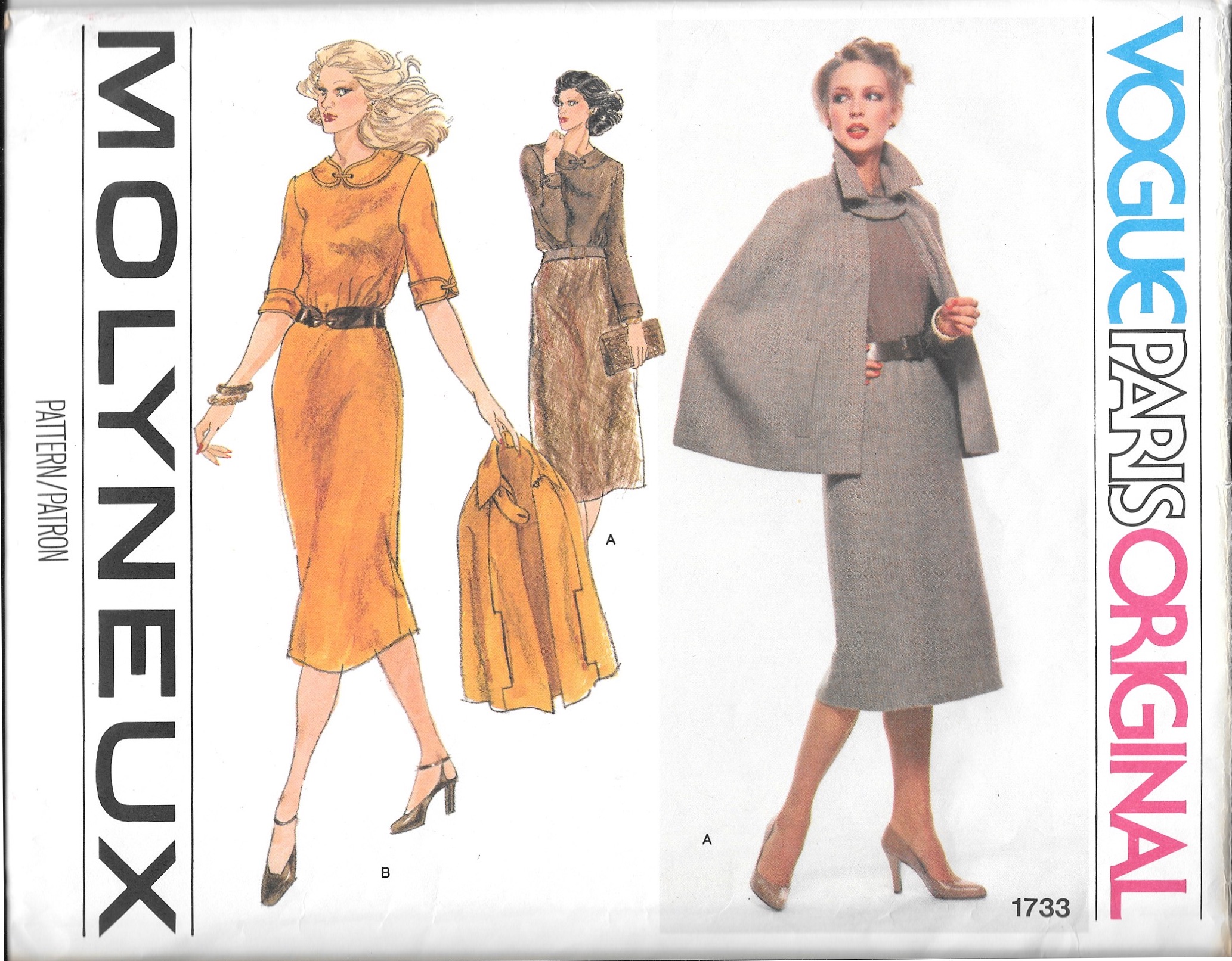
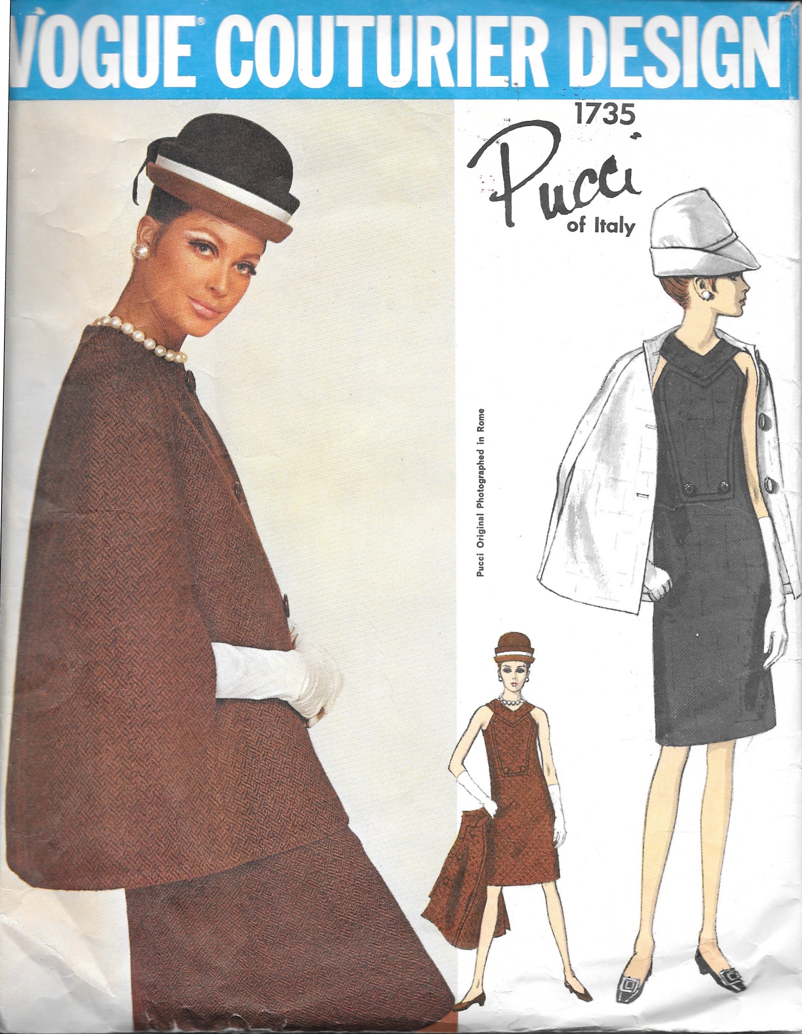
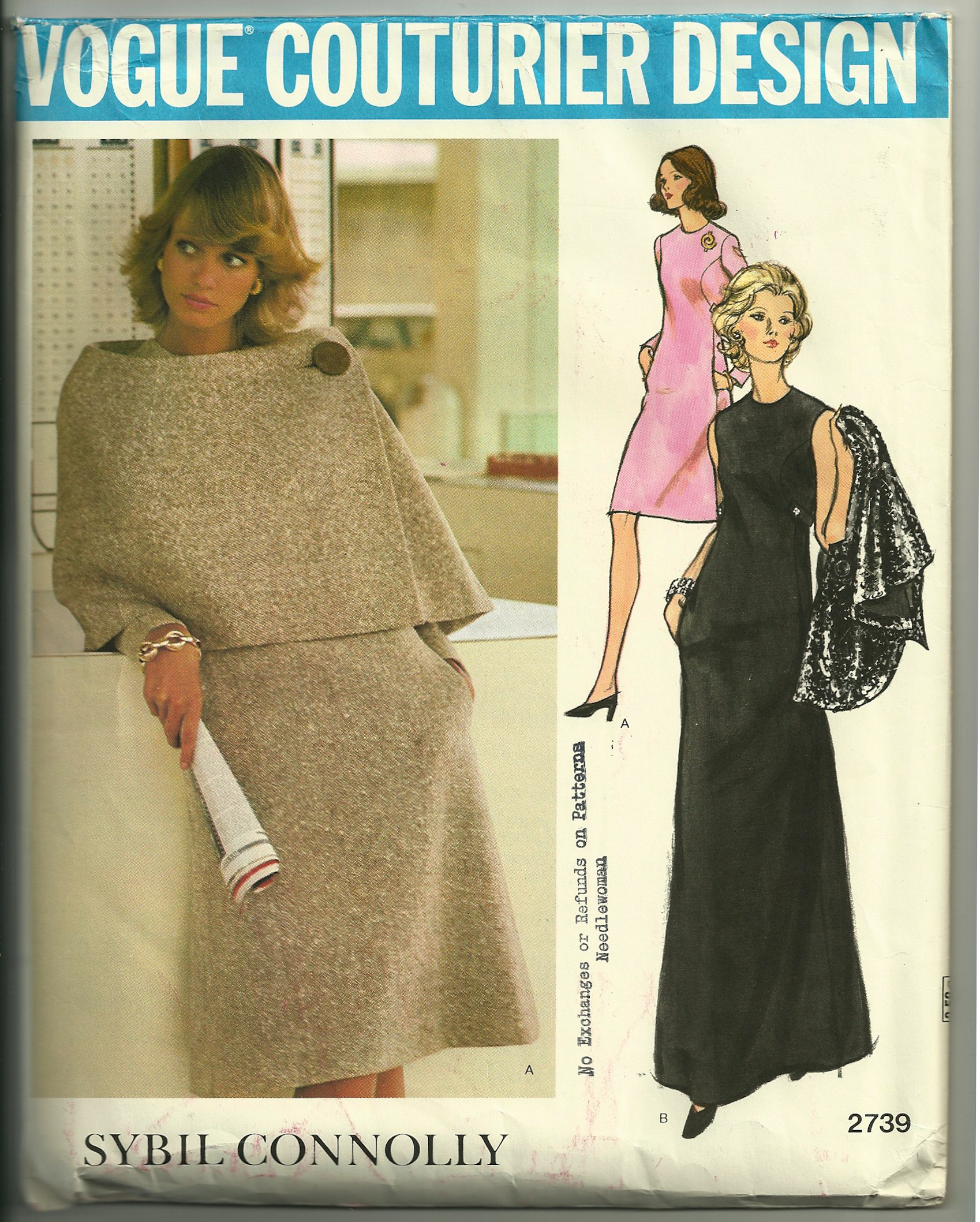
The 1970s is represented by the Molyneux pattern I am using and two more: a Pucci design and a Sybil Connolly design.
I purchased the Pucci pattern for the dress (which I now believe to be too “youthful” for me), but its cape certainly completes the outfit. The description reads: “…Cape with jewel neckline has arm openings in side front seams; back vent [which I find interesting}. Top-stitch trim.”
And the final cape pattern I own – almost a capelet – is this Sybil Connolly design. The caption states “…Short asymmetrical flared cape has side button closing.” No arm slits in this cape.
I actually made this cape a number of years ago, but I must admit I have worn it infrequently. The wide stance of the neckline makes it a little unstable. I guess there is a good reason most capes have a tighter neckline – and open in the center front.
So there is my whirlwind cape tour. What do you think? Are capes alluring and mysterious? Functional and sophisticated? I, for one, think capes have a slightly romantic charm to them. Do you?
Do you love pockets and add them to your sewn creations wherever you can? Would you be happy never to have to sew another pocket? Do you tolerate them in a garment, preferring to do without if possible? Many people have very strong opinions about pockets or the lack thereof. I think those of us who sew are among those with the strong opinions, primarily because we have it in our power to add them or delete them. My personal mantra on pockets is “Let’s see if we can do without them, unless we can’t.”
I generally divide my thoughts about pockets into three categories: those in dress pants (slacks), those in dresses and skirts, and those in dressier coats and jackets. (A little caveat is probably useful here before I get any further. Yes, jeans should have pockets, as should hiking and/or activewear pants and shorts. And absolutely, pockets are part of the functionality of active outdoor coats and jackets and vests. Those categories are not part of this discussion.)
It was over two decades ago when I first started thinking about the dilemma pockets in slacks present. I had just purchased a navy blue wool flannel, dressy pair of slim pants, which fit well and were flattering. There were two welt pockets on either side of the front which were basted closed, as is the custom in better clothes (leaving it up to the purchasing customer to remove the basting.) I left the basting in and preserved the slim silhouette of the slacks. Had I removed the basting, the front, I am sure, would have “pooched” out at those two spots and, well, not done my tummy any favors. Once I started buying vintage patterns a decade ago, I began to notice the slacks in the patterns from the 1950s generally were pocketless. (I have long thought fashion and style in the decade of the 1950s was at its zenith, both in elegance and in silhouette, which is a topic for another discussion.) Here a few examples of patterns from the 1950s:
Note the defining tuck in the front of the pant legs.
These slim pants are enhanced with 4 shaping darts each, front and back, with no waistband.
These slim pants do have a waistband.
In my mind, pockets in dress slacks are superfluous at best, detrimental at worst, and just unnecessary. Although I rarely make pants and slacks, I have yet to put a pocket in any of them.
Dresses and skirts are a bit more complicated. Fuller skirts often provide the perfect camouflage for in-seam pockets. I have sewn at least three such styles, the patterns for which included pockets in the side seams. Interestingly, two of them were vintage Diane von Furstenberg patterns from the 1970s; the other is a more recent Vogue shirt dress.
This DvF dress pattern from the 1970s has pockets in the side seams.
Again, pockets in the side seams in this Vogue pattern. The fuller skirts in all three of these dresses conceal the pockets well, but only if they are empty! If I make any of these patterns again, I will not bother with adding pockets.
There was a charming article appearing this summer in a Weekend Edition of The Wall Street Journal by author Jasmine Guillory and her “perfect dress” which, alas, has pockets. (Check her website here to read the article under “About”.) Here is what she wrote, “The only element that mars this dress’s perfection is its pockets. This might be a controversial statement, but I don’t like dresses with pockets. They pooch at my hips, even when empty, and if you put something in them, it’s worse…. What’s this great need for dresses with pockets?” She goes on to say she regularly takes her dresses with pockets to the dry cleaner to have the pockets removed. (Alas, again! Her dry cleaner closed during the pandemic, meaning that her “perfect dress” still has its pockets, making it “almost perfect.”)
But what about slimmer silhouettes? In-seam pockets could cause the same “gapping” situation, which begs the question “Would you put anything in those pockets which would cause that pocket to gap even more? Probably not. I would place my hankie or my cell phone or lip stick in my handbag, not in my pocket – and that goes for fuller skirts as well. (Besides, like Jasmine Guillory, I am quite smitten with handbags.)
However, what about in-seam pockets which are part of the design? Here is a notable example:
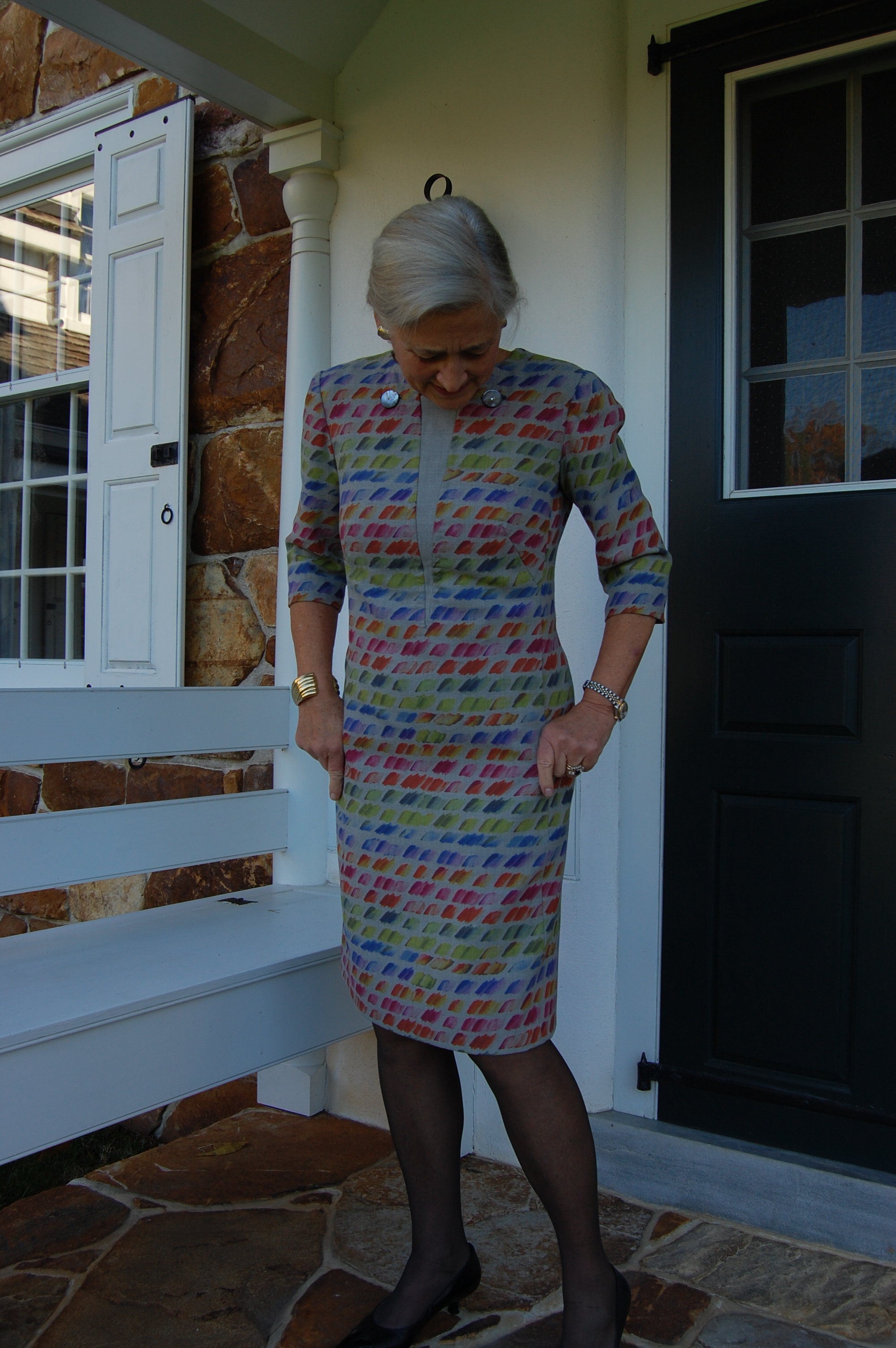
This Vogue Designer pattern has shallow pockets in its side front seams. Somehow, I can’t imagine this dress without them!
And then, of course, applied pockets are often part of the design, but not really intended for practical use. Take a look at this evening gown:
Notice that these pockets open from the side.
You might be able to tell I have decided I am not so keen on pockets in skirts and dresses either – UNLESS they are integral to the design.
Which brings us to coats and jackets. I think one’s first reaction to this category would be “Well, of course, jackets and coats need to have pockets.” And for the most part, I would agree with that. Often pockets in coats and jackets are part of the design and add stylistic interest as well as functionality. Here are a few examples of coats I have made, with such pockets:
The pockets in this coat are inserted into the shortened princess seam.
Here is a jacket pattern which is in my sewing queue for 2022. I absolutely love the pockets.
And where would a Classic French jacket be without its pockets? They are not really functional, but undeniably integral to the design.
One of the Classic French jackets I have made.
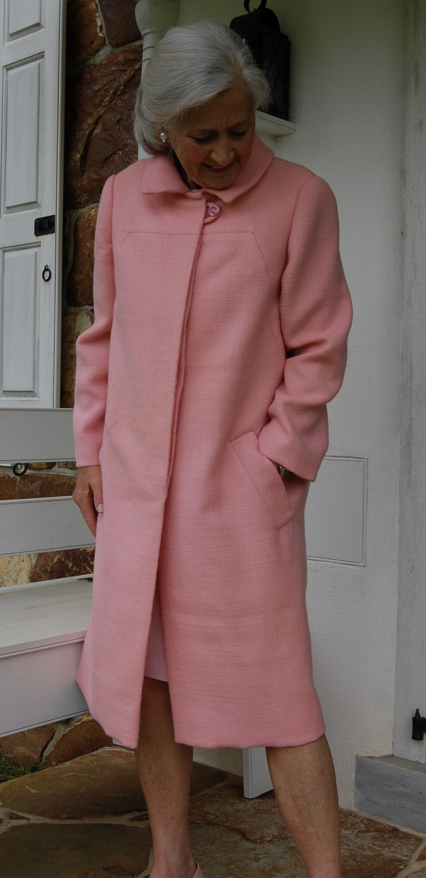
Not all coats have pockets, however. Take a look at this Madame Gres design which I made in a lavender linen. It has no pockets, nor would I want them in this Spring coat.
And here is a “summer” coat which I think is just so chic. No pockets.
I have made this coat pattern twice – once with pockets and once without.
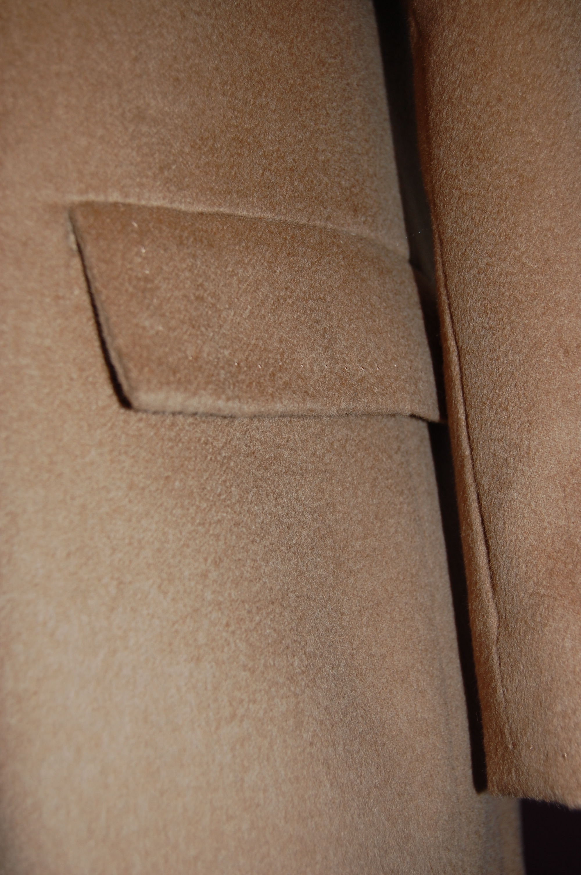
The wool version has in-seam pockets which I find useful:
A peek inside one of those in-seam pockets.
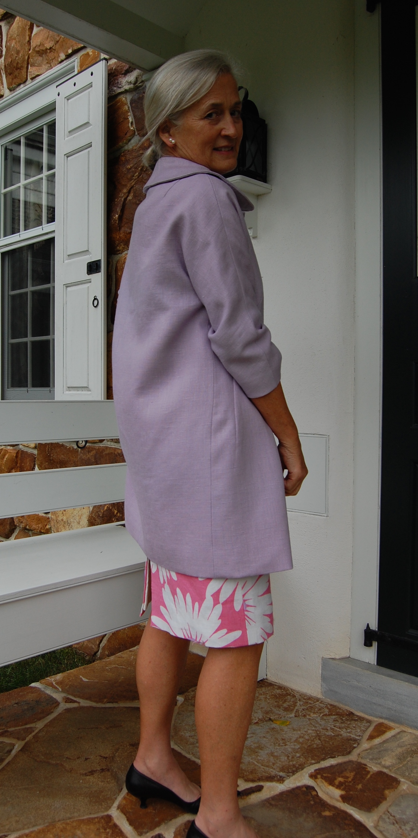
But here is the same pattern, made as a “cocktail” coat. I made it pocketless and love it.
No pockets needed when one has a lovely little clutch to carry.
Clearly there is much to consider when it comes to pockets. When we add them to a garment, or delete them, or change their placement, or baste them shut to eliminate that dreadful “pooch” problem, we are admitting that not all pockets are equal. Some are perfect in every way, some not so much, and some – are never missed.
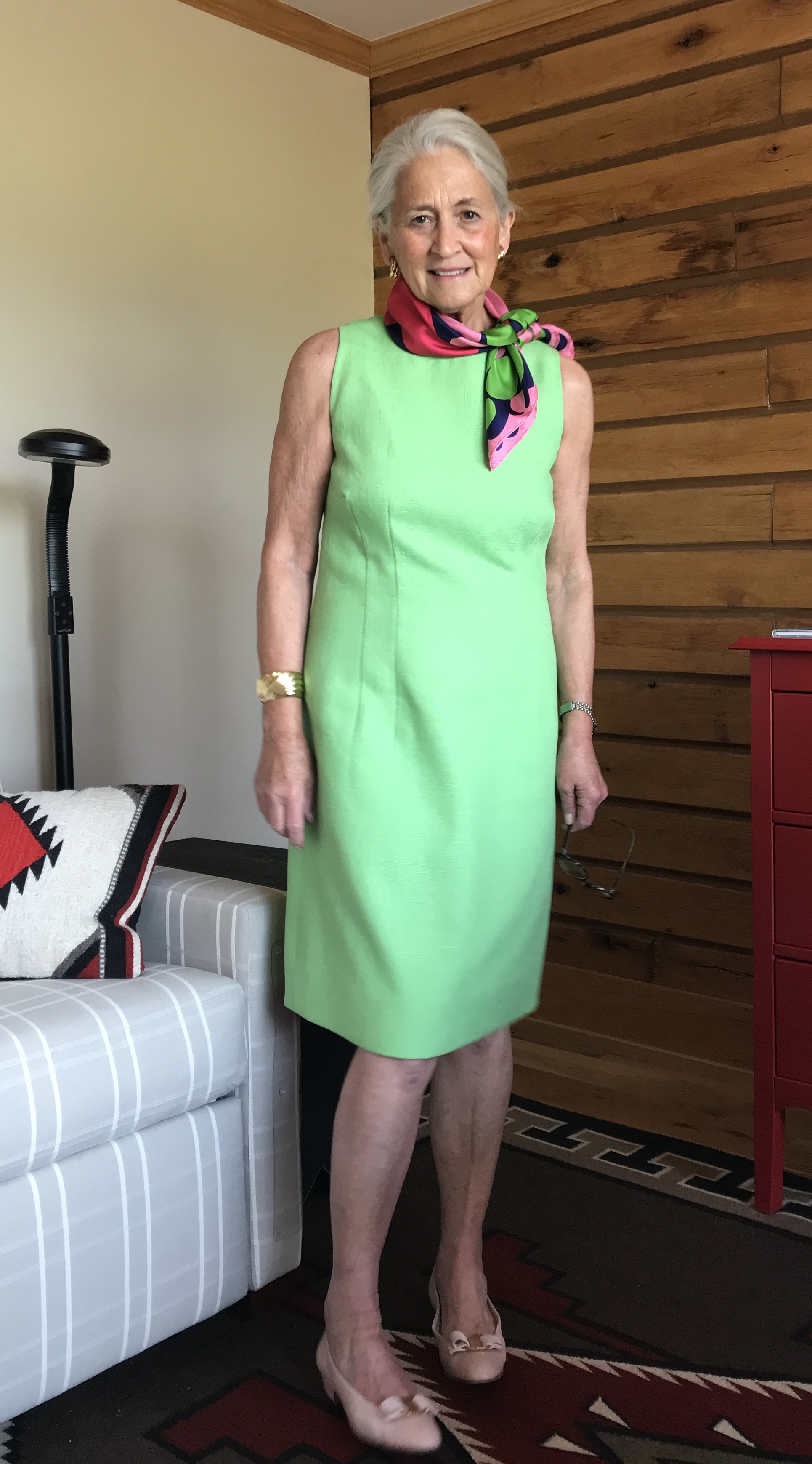
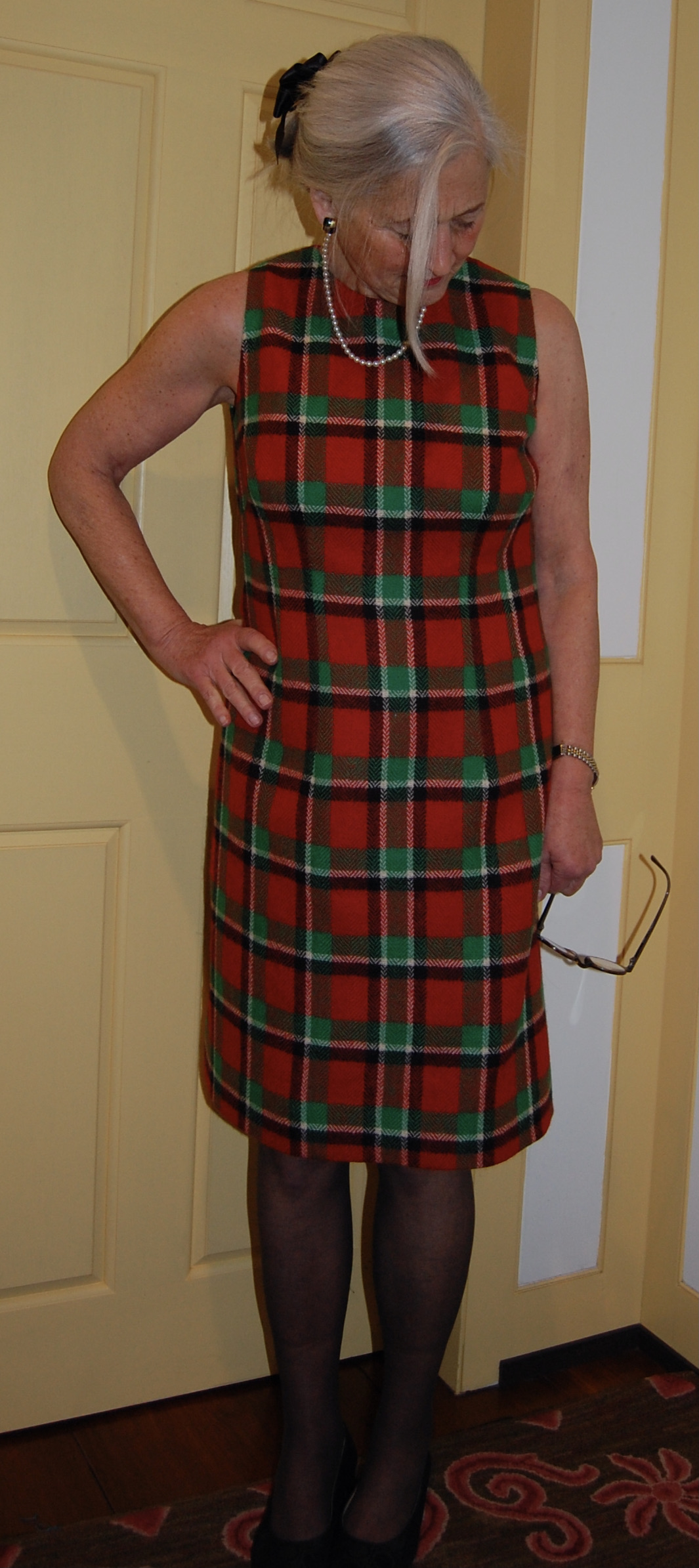
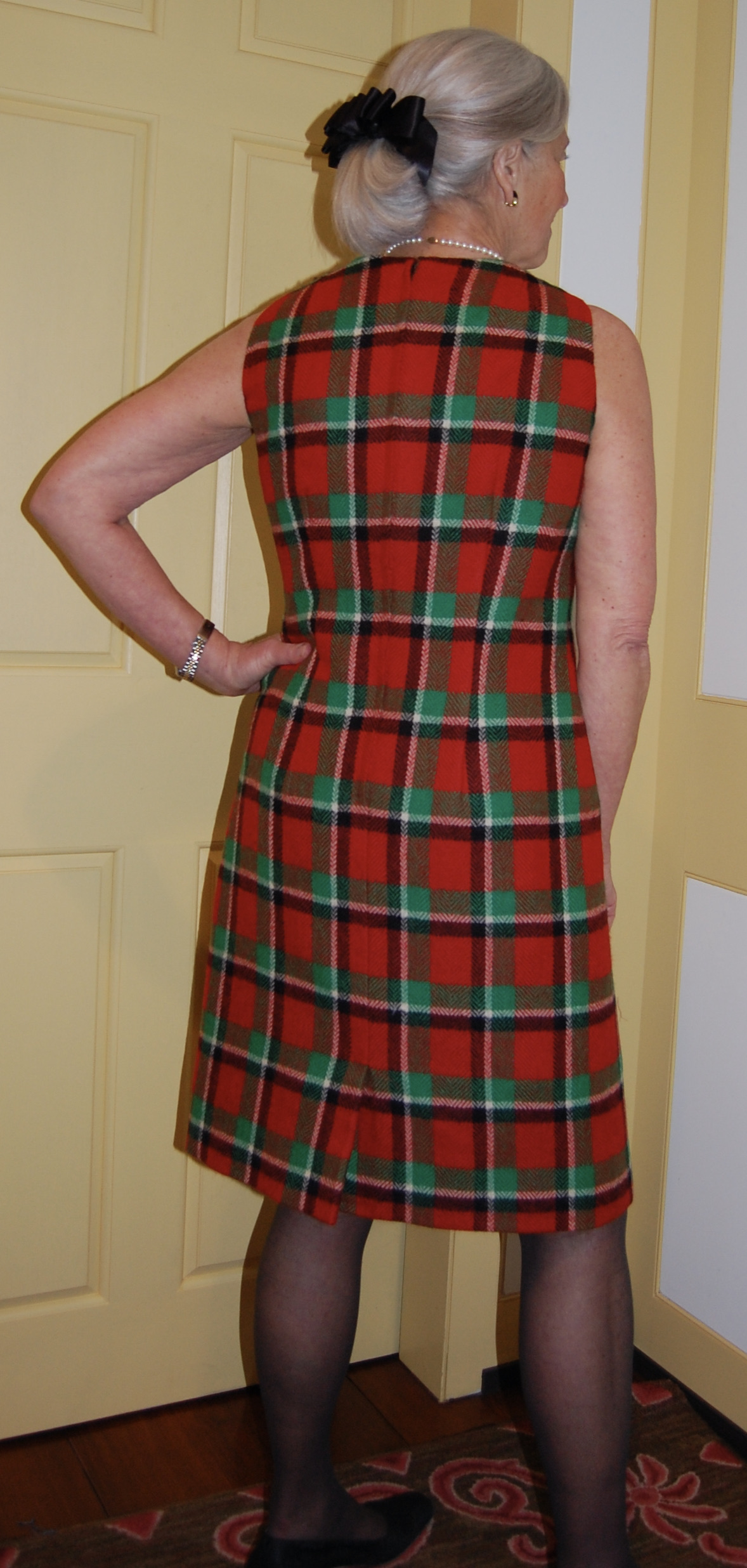
Summer is quickly slipping away, but before it does, I will share one quintessentially summer dress which I made back in July. It ticks off a number of features which make it “Summer Seasonal”: it is sleeveless, it is a bright color, and it is linen.
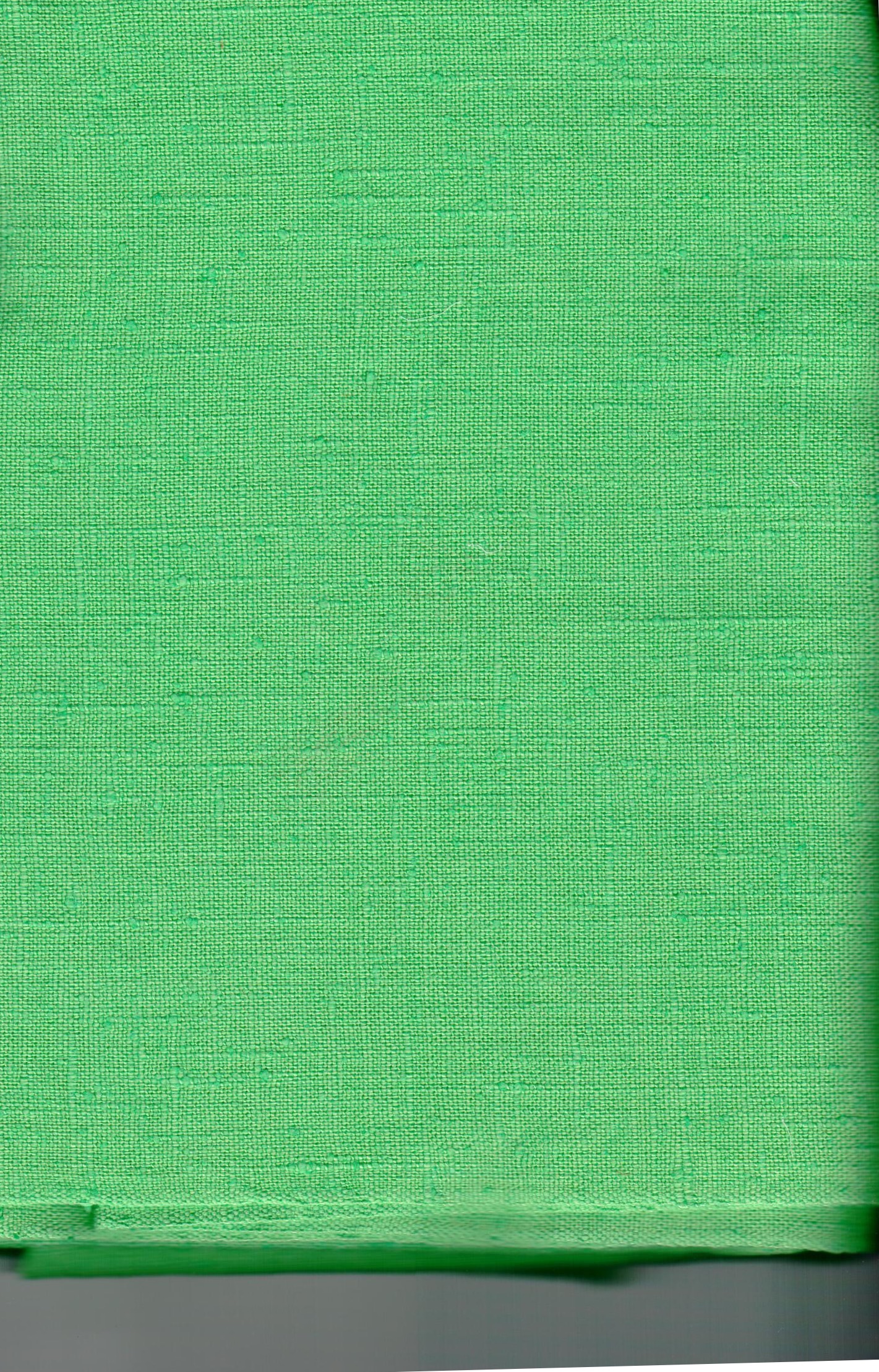
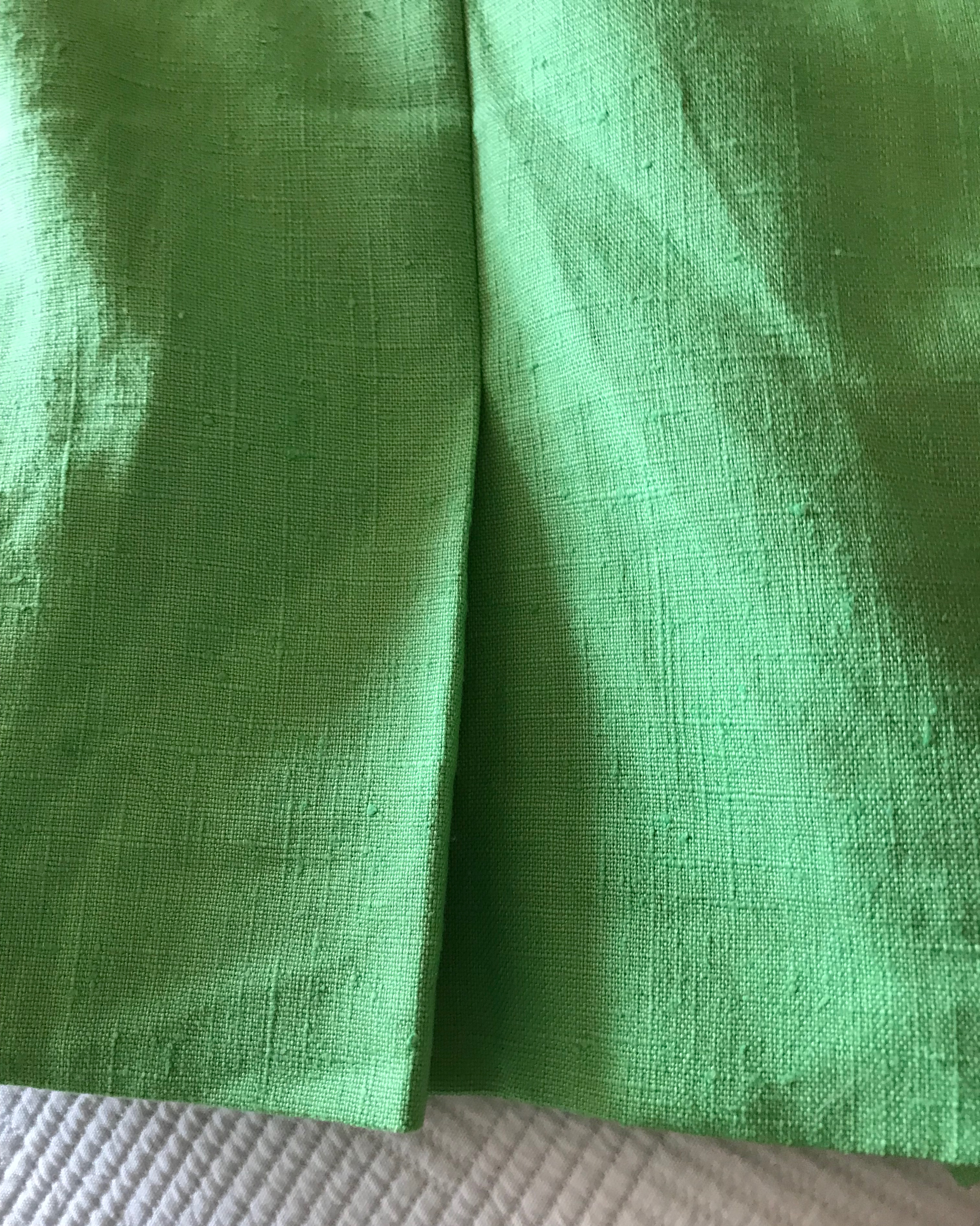
I found this vintage piece of Moygashel linen a few years ago on eBay. Always a pushover for vintage Moygashel, I purchased it, not quite knowing what shade of green it would be. I was expecting a lime green, but when it arrived it was “lime green meets mint,” a color reminiscent of the early 1960s. Actually, not just reminiscent – an actual survivor from that period of time. The width of the fabric was only 35” which was a dead giveaway that this fabric is from the early part of that decade. Shortly thereafter, Moygashel began to be woven in 45” widths. Fortunately I had three yards, which compensated for the dearth of width.
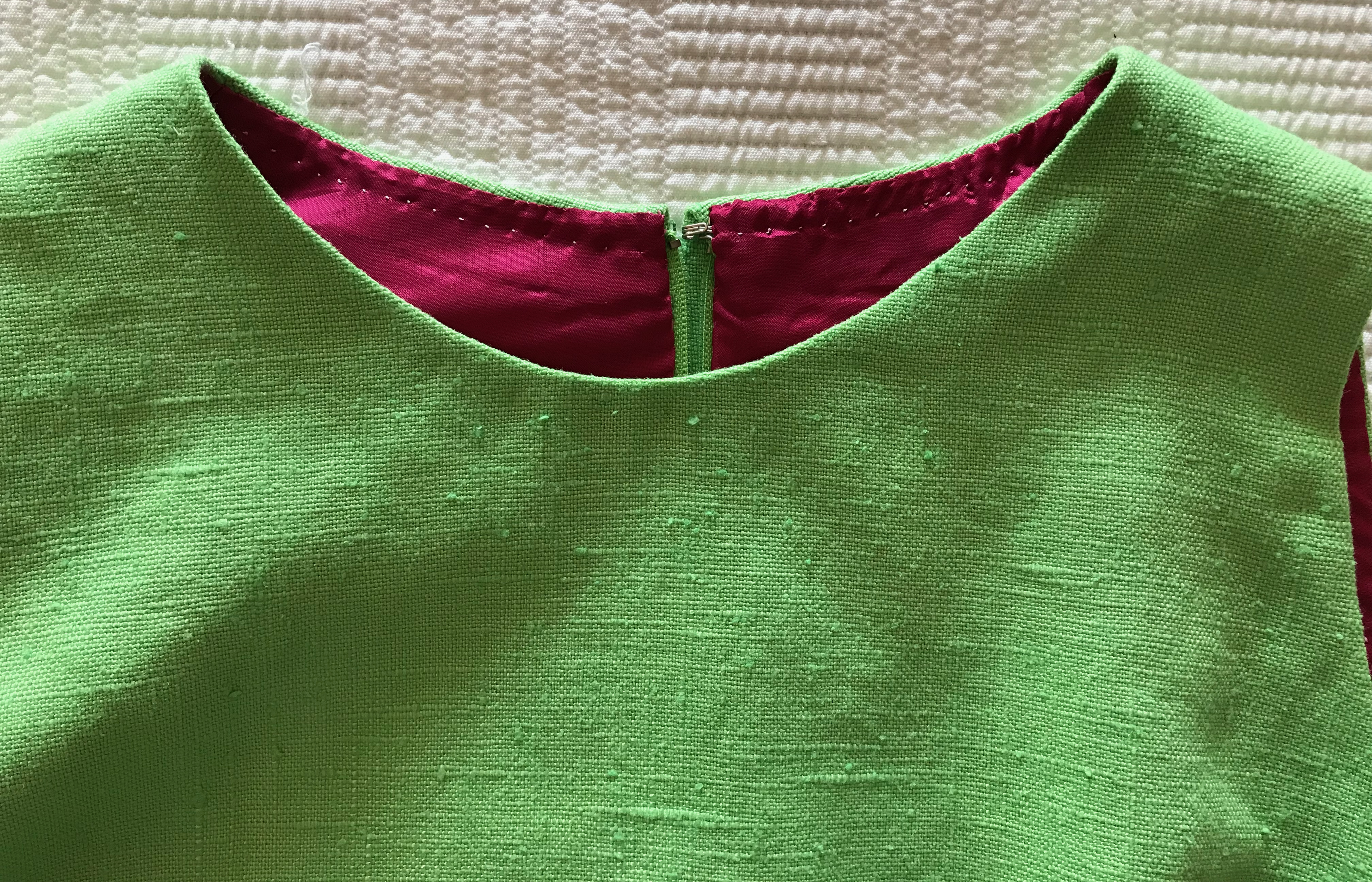
To keep with the early ‘60’s vibe, I decided to line it in pink. Although I usually line linen with a cotton batiste or cotton/linen lightweight blend, I decided to treat this dress a little bit differently. I do not often use Bemberg for lining, usually preferring silk, but this lovely, time-tested 100% rayon lining just seemed to be the right choice. (Why? I knew the seam allowances of the bright green linen would not show through the tightly woven Bemberg lining, AND it would be a comfortable, lightweight and slinky fabric with which to line a summer dress.) I ordered what I thought would be a medium pink, but when it arrived, it was more of a very deep rose. What to do? I hemmed and hawed, I thought about ordering a different hue of pink, I even thought about abandoning the pink idea and just using a white crepe de chine I had on hand. Why I was agonizing so much over the color of the lining had to do with my thought if the dress turned out well, I would enter it in the County Fair. I knew not everyone would “understand” such a deeply contrasted lining. But not wanting to waste money and fabric – and time! – I finally decided just to go with the dark pink, shown a few pictures below.
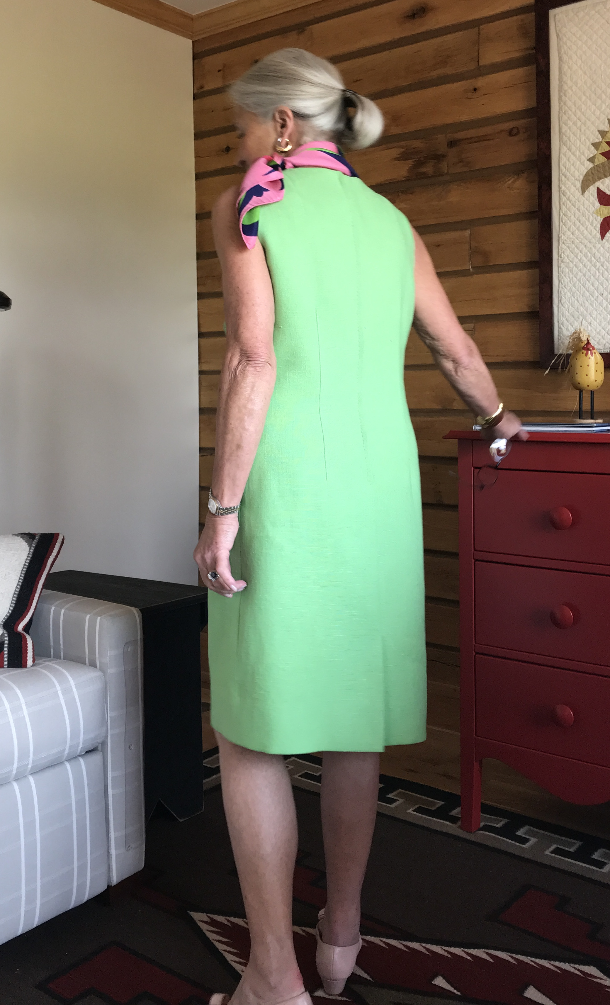
I used this sheath dress pattern again, as I am so fond of the double shaping darts in the bodice front and the real kick-pleat.
The sheath dress pattern I like is the one on the right, underneath its matching plaid coat.
Not just a slit, but a real kick-pleat!
Here is the kick-pleat on the inside of the dress.
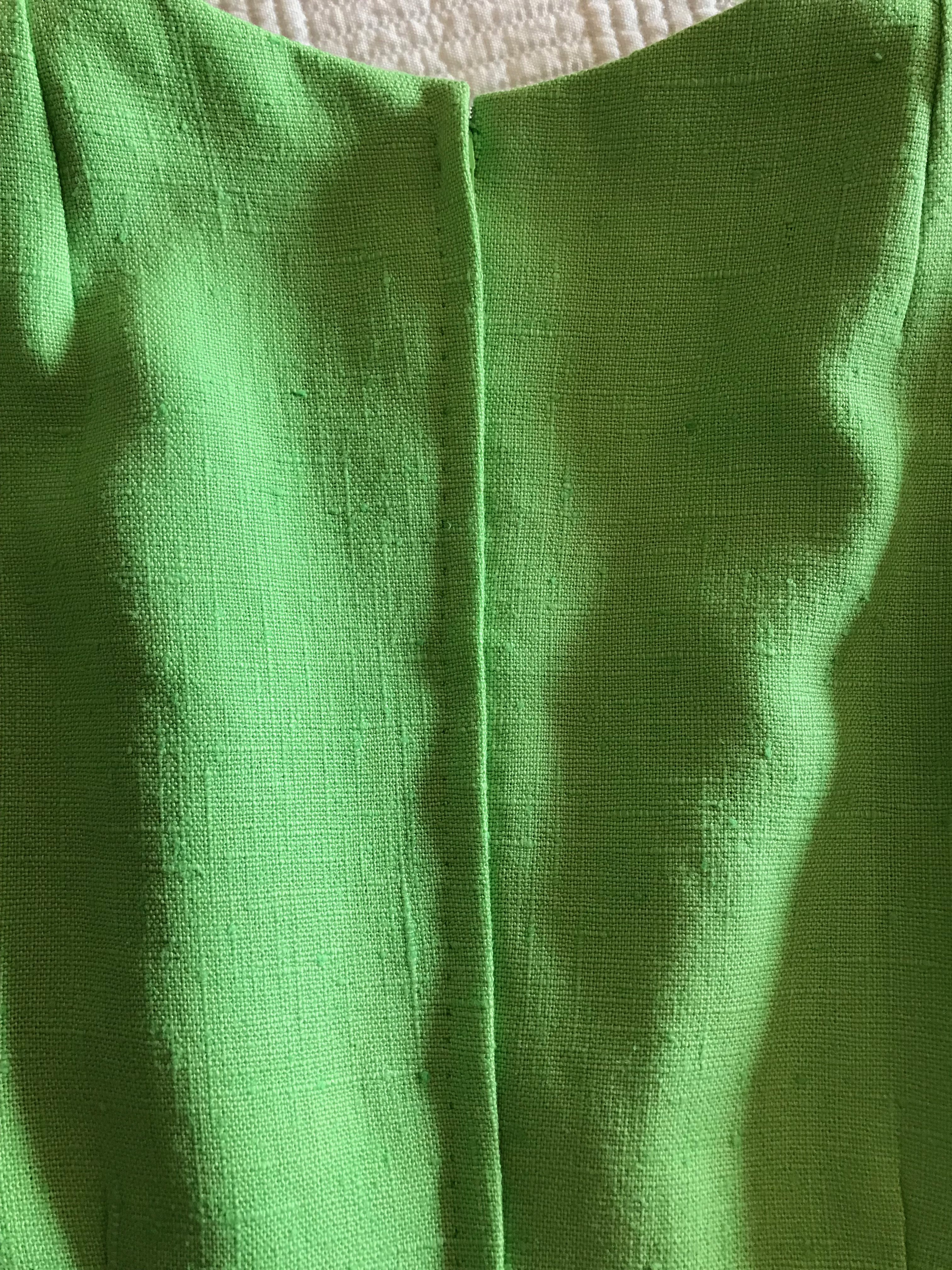
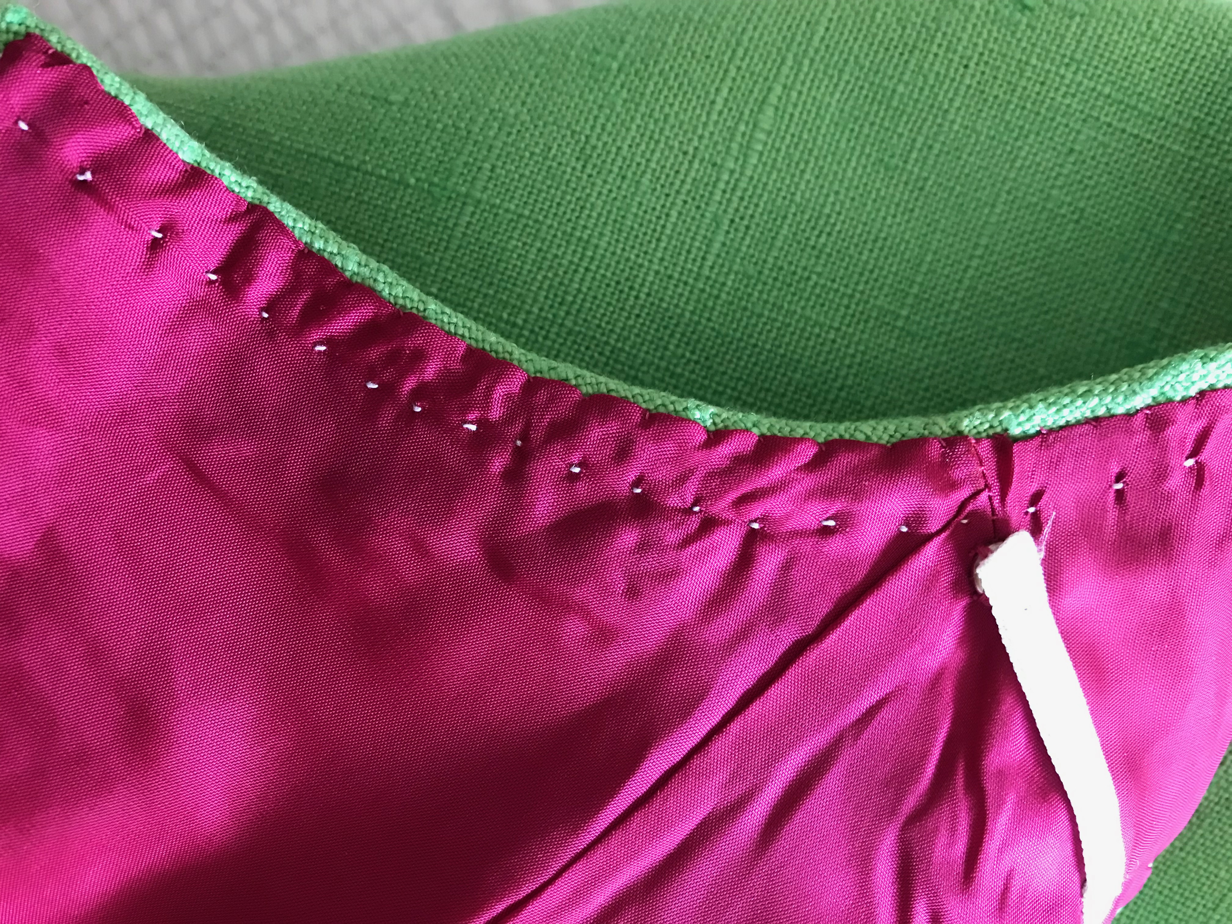
I underlined the dress in silk organza so that I could eliminate facings and have an invisible application of the lining. (The silk organza underlining gives one a base upon which to tack and secure stitches which do not show on the fashion fabric.)
The neck and armhole edges are stay stitched by machine close to the seam line, then clipped and tacked in place by hand to the silk organza underlining.
Here is one of the side seams, clipped and then also tacked in place by catch-stitches.
A beautiful lining hides all those interior stitches and seams.
I surprisingly found a zipper which was almost a perfect match to the green linen, and I did a hand-picked lapped application.
Once I had the lining fell-stitched in place around the neckline and the armholes, I under-stitched those areas in waxed and ironed white thread. (I used white to quiet down the deep pink!) Using this technique keeps the lining in place. The under-stitching is attached to the silk organza underlining only, not the fashion fabric, as explained above.
I used Hug Snug rayon tape to construct the strap holders.
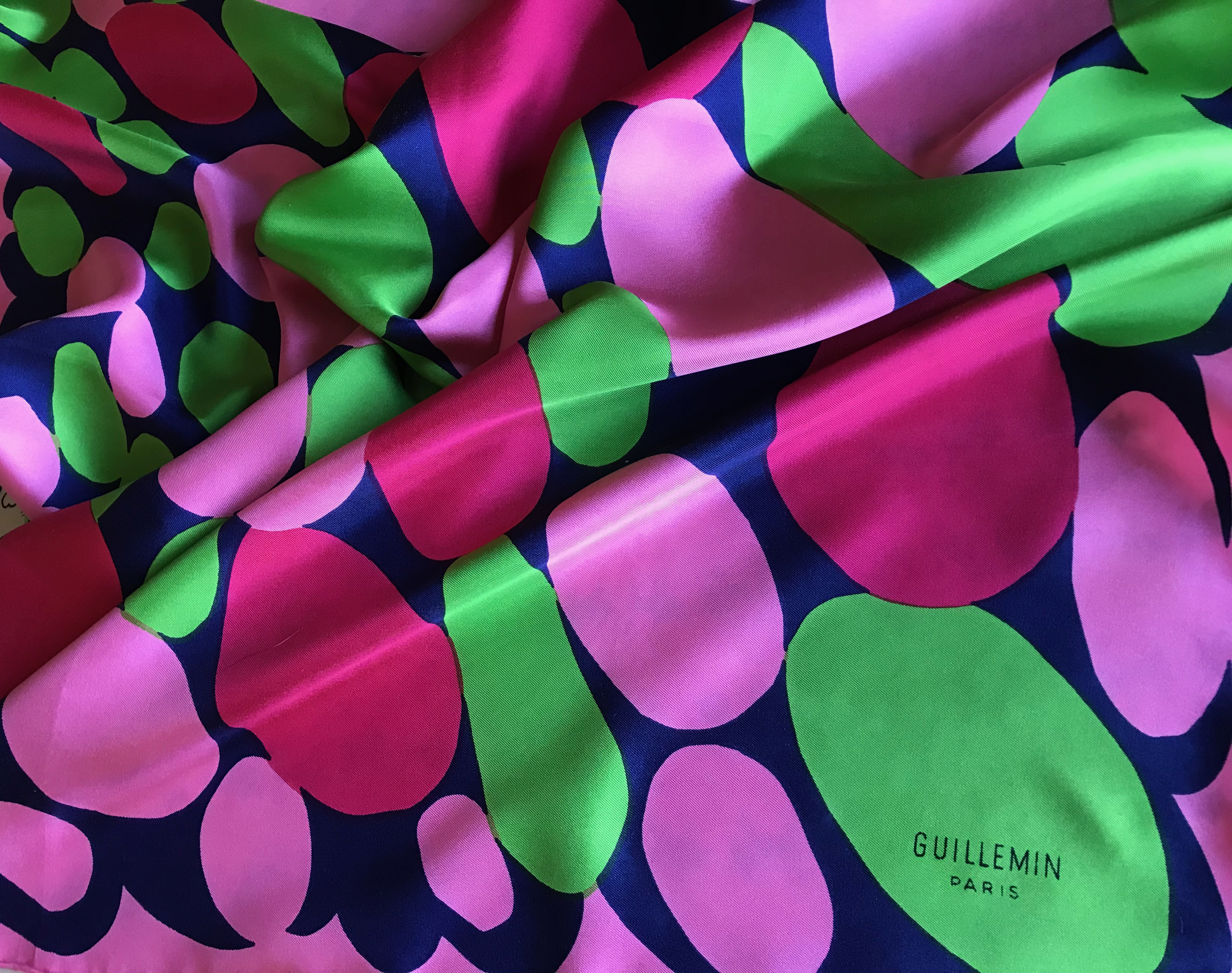
To complete the early 1960s’ essence of this dress, I can pair it with a vintage ‘60s’ Guillemin scarf, also found on eBay. The pink in the scarf doesn’t match the pink lining, but since the lining does not show, it only matters to me (and now all of you also know this little fact!)
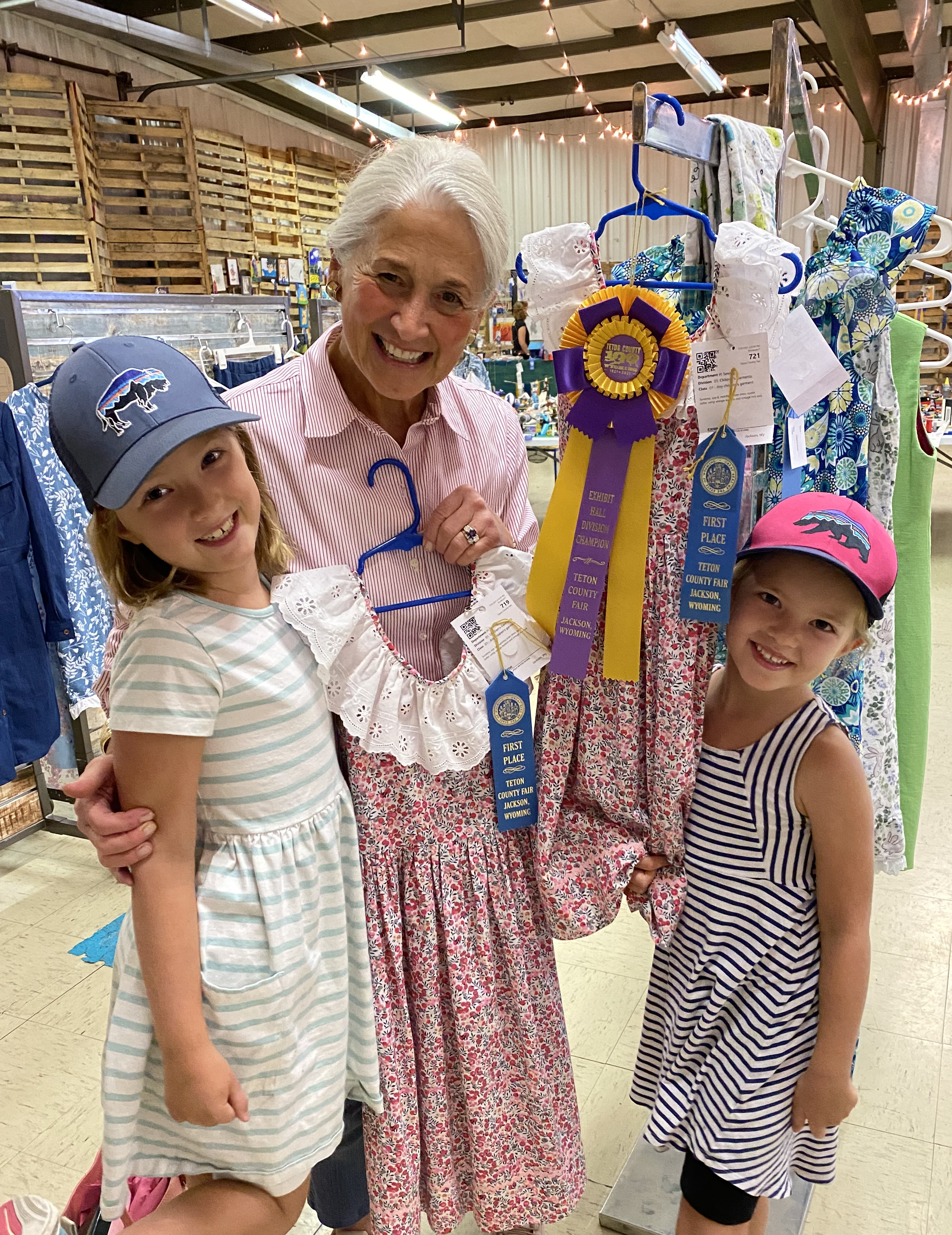
So how did I do with this dress as an entry in the County Fair? It was awarded a Red Ribbon in the Adult Division, which was lovely. The day was “saved” however, when dresses I made for my granddaughters each won Blue Ribbons (and one of them won Best of Division).
(Those of you who follow me on Instagram @fiftydresses have seen this picture already…)
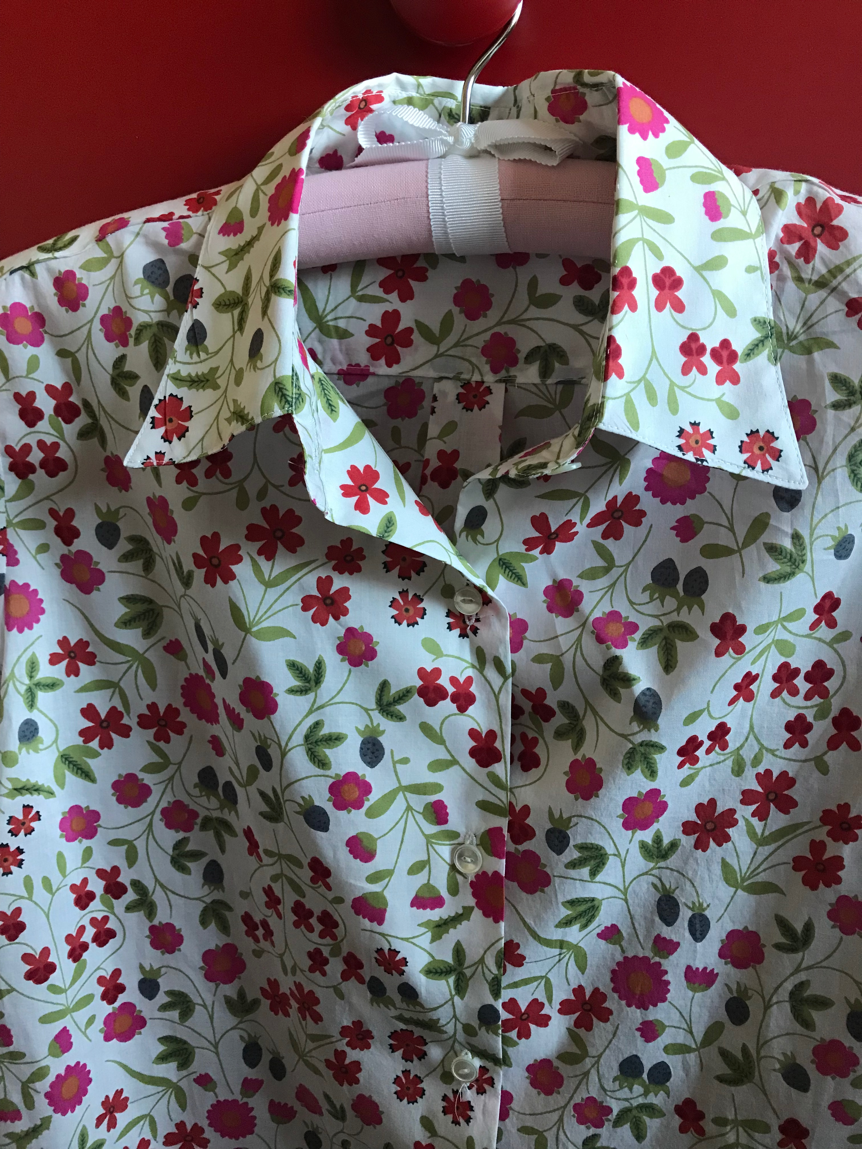
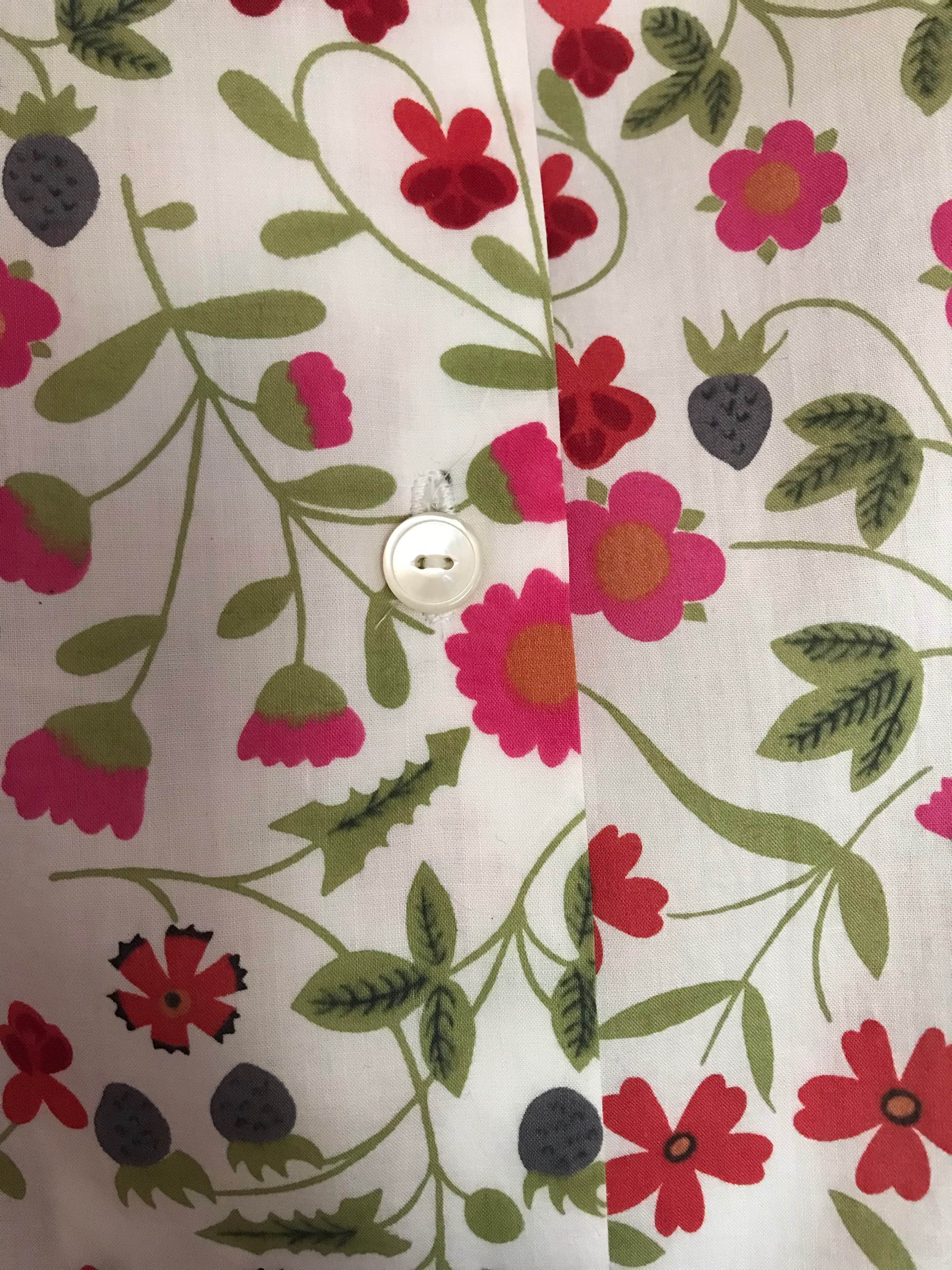
One might get the idea I love to iron should they take stock of how many cotton blouses I have made over the past few years. Now I do love a crisp cotton blouse, and I find them to be imminently wearable, neat and tidy, and versatile. So I keep making them. But do I love to iron? Not really, although it is not my most dreaded household chore. (I think that might be grocery shopping – or more precisely, lugging everything home and putting it all away. I don’t like that.)
Even wearing a pretty blouse, like this – my most recent make, to the grocery store doesn’t make that chore more bearable!
One advantage to having lots and lots of cotton blouses is that the ironing can pile up, yet I will still have blouses to go to in my closet, so there’s that. I think – no, I know – another reason I keep making casual cotton blouses is that I love to sew with beautiful quality cotton (of course Liberty comes to mind!) The selection of quality cotton prints, checks, plaids, stripes, and solids available online is astoundingly diverse, making the temptation great to make “just one more blouse.”
And then there are the buttons. If you follow my sewing life through this blog, you know my fascination with and pursuit of vintage buttons to use on my blouses and other projects. Yes, a white plastic button can perform the same function, but a beautiful pearl button adds a touch of class to a simple blouse like no other detail can.
A simple pearl button, circa 1960, BGE Originals, “First in Fashions”
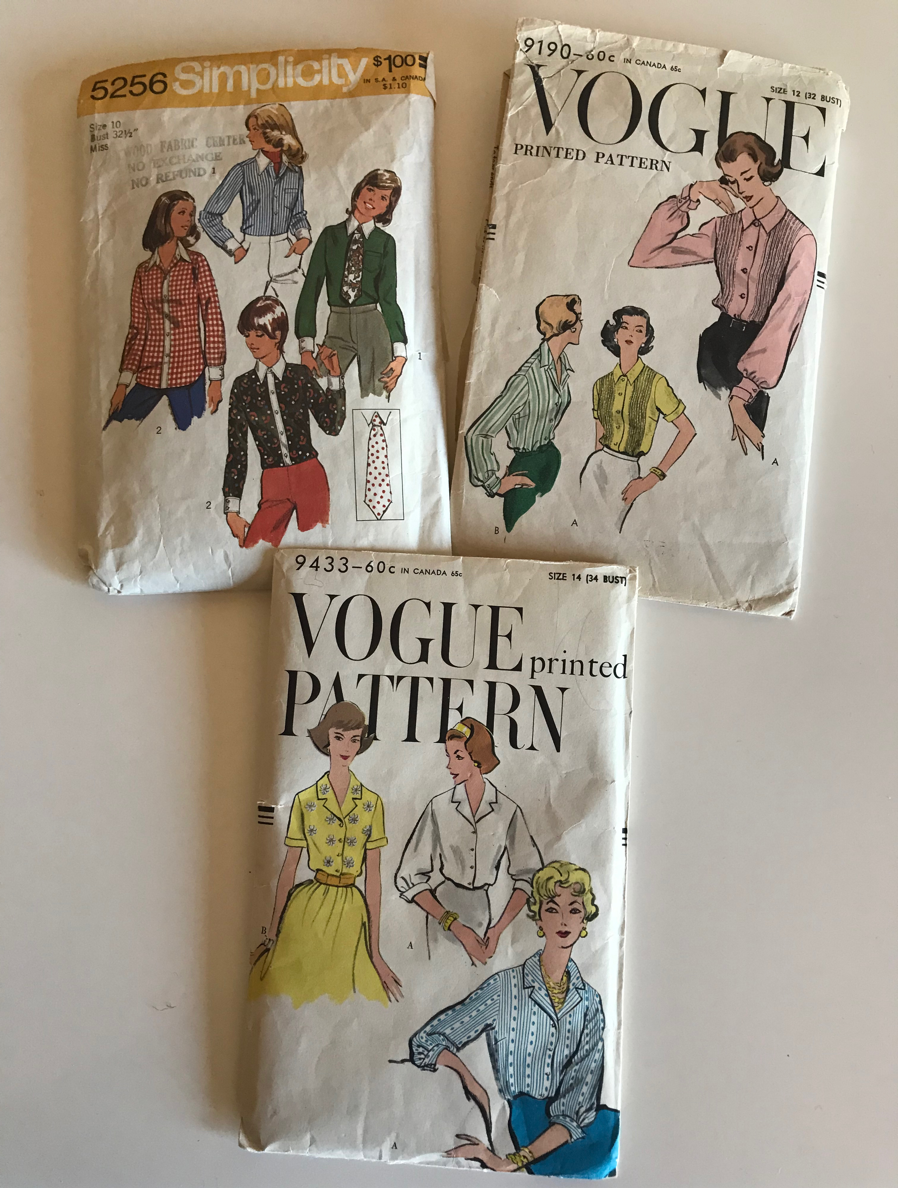
It also helps that I have a set of blouse patterns which fit well due to many alterations and tweaking over several years’ use. It is a lovely feeling to start a new project, knowing I don’t have to fit the pattern and make a muslin before I can get started on the fashion fabric.
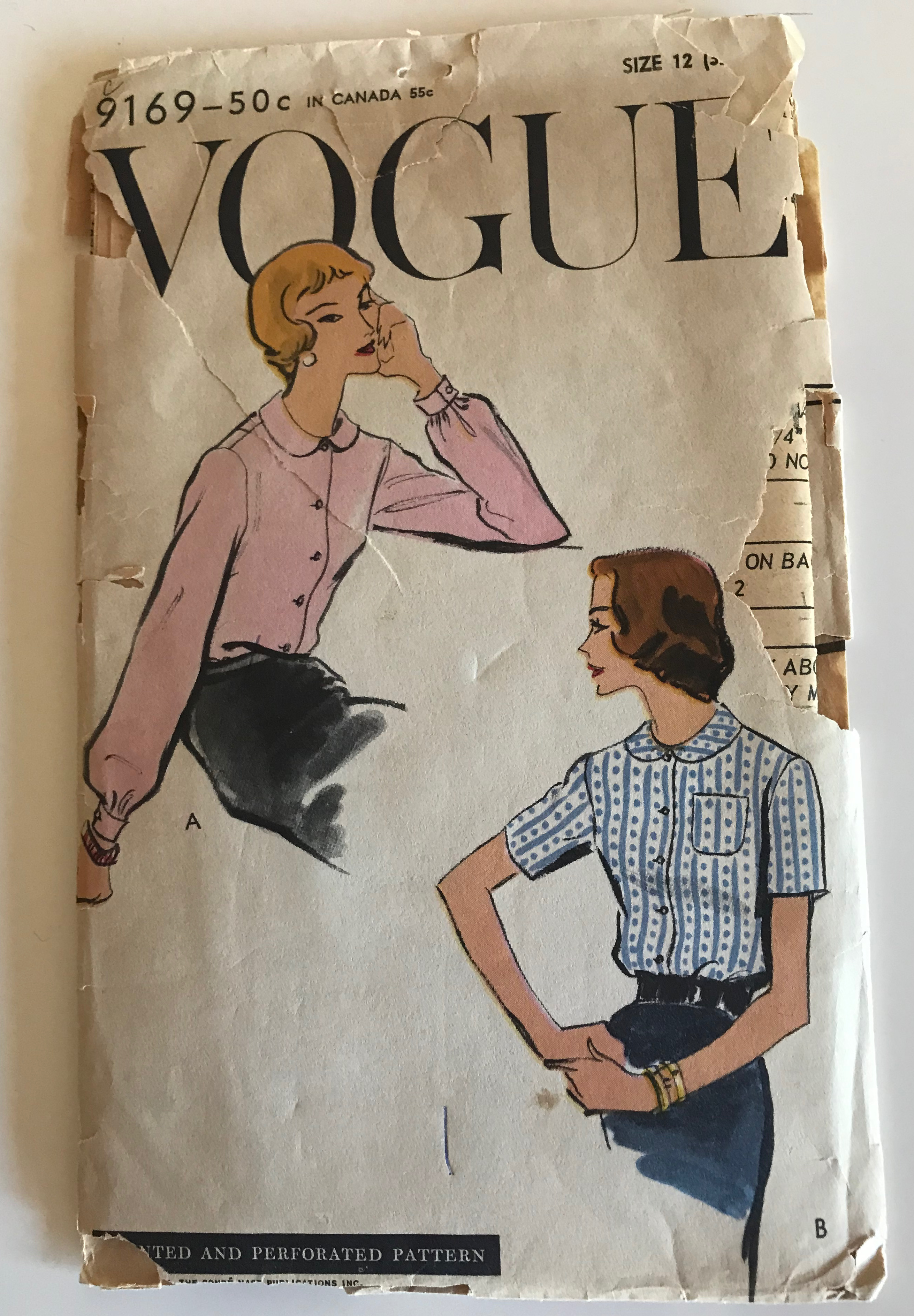
Three of my favorite blouse patterns, for which I have fitted muslins.
And one which I feel sure will become a favorite once I make and fit a muslin for it! View A is a classic look and the sleeves are so elegant.
I had been eyeing this Liberty cotton lawn on the Farmhouse Fabrics website for quite a while when I decided last Spring to go ahead and indulge. Having a floral among my blouse selections is something just a bit different for me, as I already have numerous ginghams, plaids, and stripes.
Liberty Lawn is lovely to sew and lovely to wear.
These colors make me happy.
So – is Tuesday really for ironing? There used to be a proscribed schedule for all those household chores – and it went like this:
Monday: Wash Day
Tuesday: Ironing Day
Wednesday: Sewing Day
Thursday: Market Day
Friday: Cleaning Day
Saturday: Baking Day
Sunday: Day of Rest
Well, times have changed. Now, every day is Sewing Day.
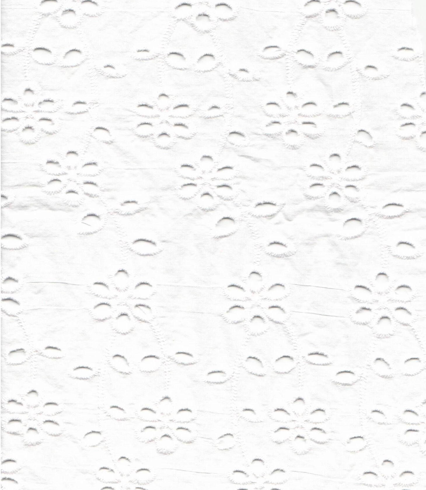
Eyelet is one of those fabrics which can conjure up memories from one’s life. So often associated with pinafores, eyelet is lovely for little girls’ dresses – and petticoats. It is often used for lingerie or sleepwear for all ages, as well as dresses and blouses. It is a summer fabric, with its “built-in” air conditioning – ie. all those little holes surrounded by embroidery. Often eyelet trim – and sometimes eyelet yard goods – have one or two finished borders. Such was the case with the eyelet I found earlier this year for the ruffled collars for sundresses for my granddaughters.
This lace was a 14″ wide double scallop-edged panel, which I cut down the middle to use for the two collars.
It was working on those collars which convinced me I needed to make an eyelet bouse for myself. I went back to Farmhouse Fabrics, from which I had purchased the double-sided eyelet panel for those collars, to find a suitable eyelet for a blouse. Farmhouse Fabrics has quite an inventory of lovely eyelets, so it was difficult to decide. But decide I did, and purchased this all-cotton eyelet made in Spain.
I liked the meandering motif in this design.
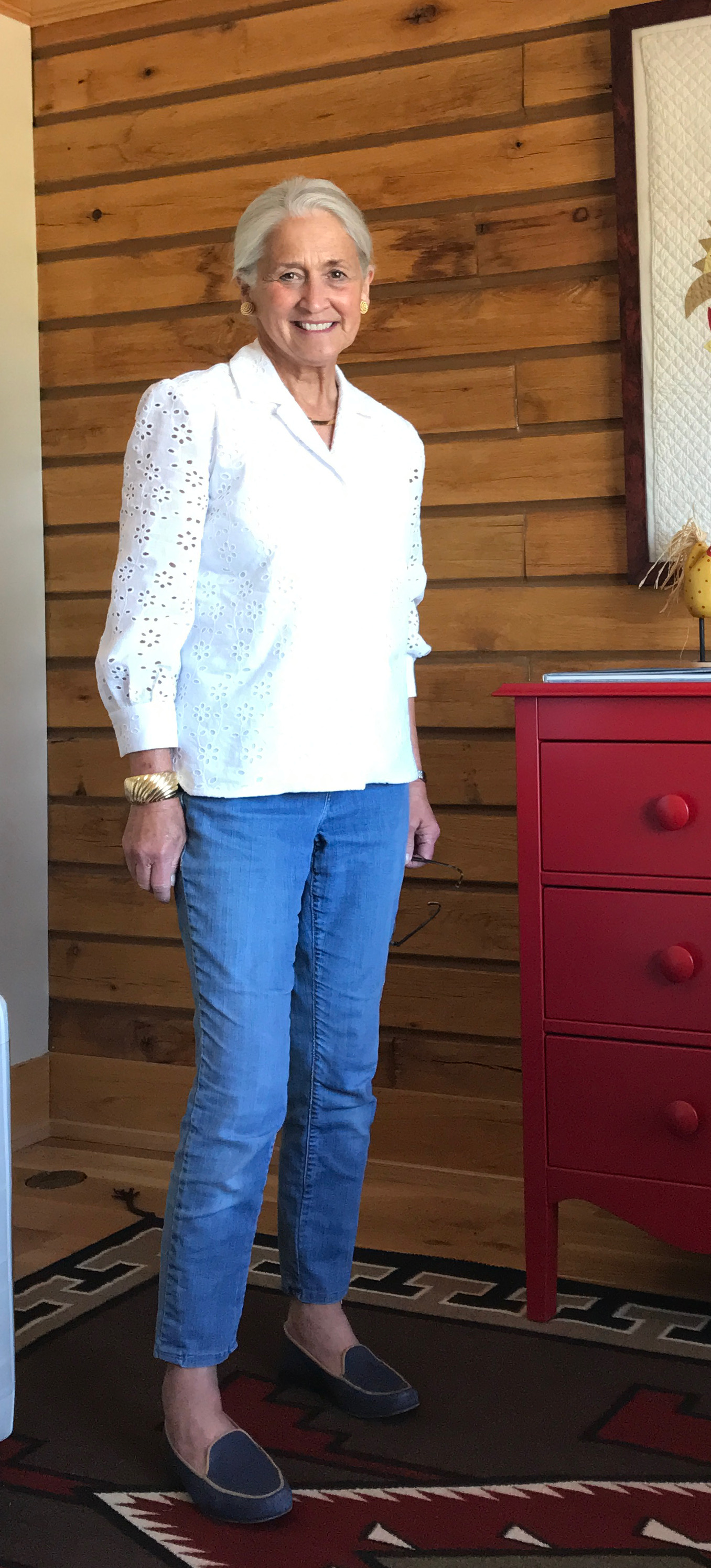
For a pattern I used this vintage Vogue pattern from 1957.
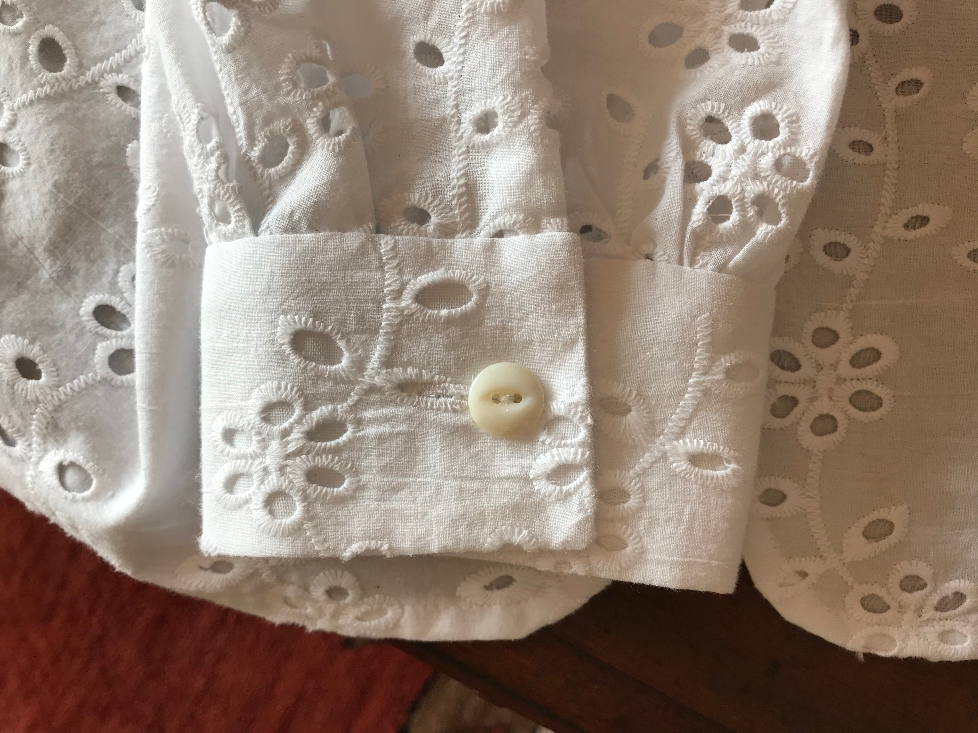
I liked the convertible collar of this pattern, as shown in View B. A convertible collar is one which can be worn open or closed. The collar is sewn directly to the neckline. I did, however, shorten the sleeves to below elbow-length. I also chose to make plain, buttoned cuffs without the extra turn-back detail.
Although the blouse is described on the pattern envelope as “tuck-in,” I liked the gently curved and split hem which would also allow me to wear the blouse as an over-blouse. The thumbnail detail from the pattern envelope shows the curved hem.
I lined the main body of the blouse with white cotton batiste, leaving the sleeves unlined. To reduce bulk, I made the undercollar and the cuff facings from the white batiste.
Buttons are always a favorite component of a blouse for me. I had a card of vintage Lady Washington Pearls which seemed a lovely complement to the scale of the fabric embroidery.
One button remaining!
I first wore this blouse on a very warm evening to attend an outdoor concert. I was amazed at how cool the blouse was. The little breeze there was, did indeed feel like air-conditioning as it wafted through all those embroidered holes!
In my case, this collar is not “convertible” as I did not put a button and buttonhole at the neckline!
I made the cuffs with a bit more width than needed so I can push the sleeves up further if I want.
After I finished the blouse I went back and added two narrow fisheye darts to the back to make the fit a bit more streamlined.
I think this blouse might be a good pairing for the Liberty cotton skirt featured in my last post.
Finding beautiful eyelet fabric is now on my sewing radar. I would like to make more with this timeless, feminine and versatile type of lace.
March was not home to much sewing at Fifty Dresses this year. The reasons were manifold, but suffice it to say, my loved ones and I weathered through the storm. Now sweet April is here, adorned in grace and gentleness and goodness, like a balm to our collective souls. April is filled with promise.
And I have given April much to make promises about! I may have not been able to sew throughout most of March, but that did not prevent me from looking at fabric, patterns, buttons, books, and fashionable inspirations. Despite my best intentions of not succumbing to new fabric purchases, my discipline failed me and I found two silk fabrics at Britex which I decided were too special to pass by. They are so different from each other, but each one appeals to certain design penchants I have finally admitted are my weakness. One is for geometric and linear prints:
This is a silk crepe de chine, blouse weight.
The second penchant is for whimsical, scattered florals, in multi-color. This one is especially appealing to me as it also has polka dots in its motif. Polka dots are especially difficult for me to resist.
This is a silk twill, dress or blouse weight. I’m not sure what I will make with this yet. If I thought I would have occasion to wear a hostess skirt, that would be it, but …. it is all still to be determined.
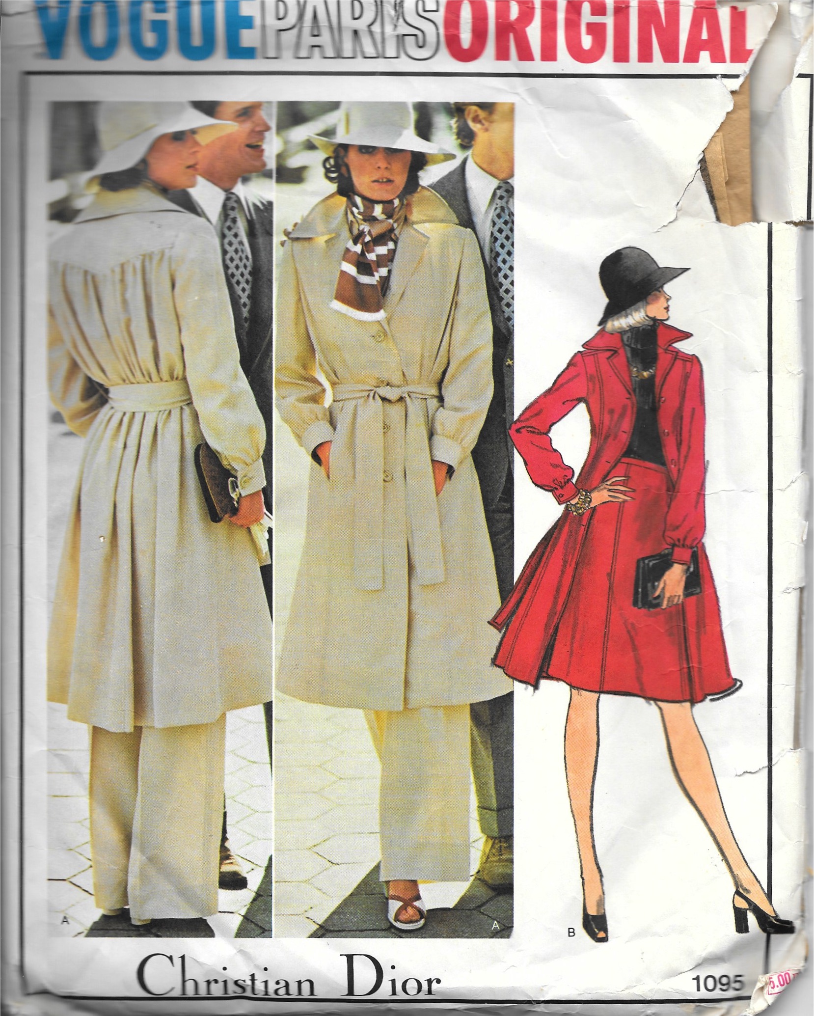
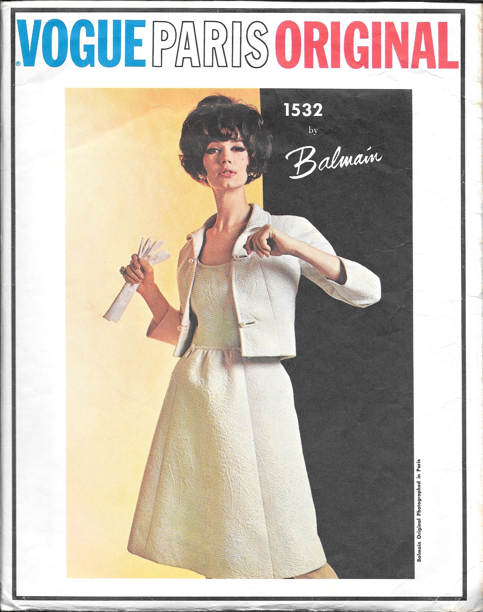
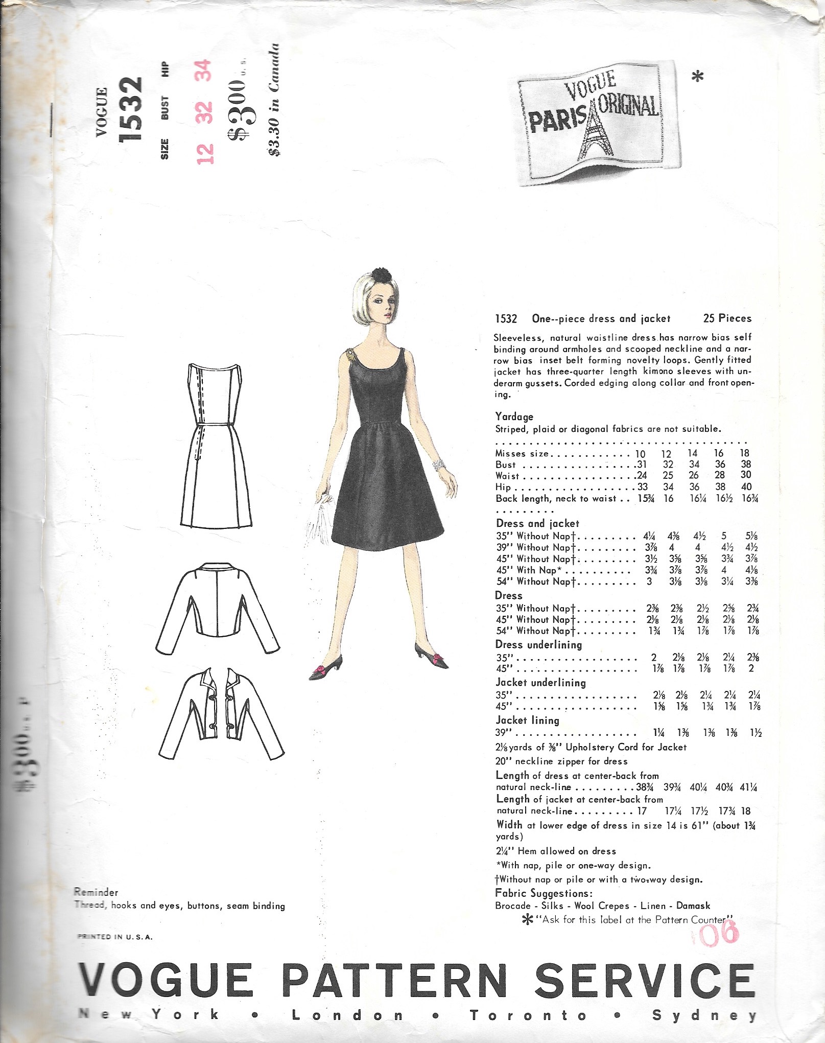
By this point I have an extensive collection of vintage patterns, so it is rare when I find one which fills a gap for me. But such was the case with this purchase of a Vogue Paris Original by Pierre Balmain. I had not come across this pattern before, and I believe it was rightly advertised as “rare.”
I wanted this pattern for the jacket. The neckline is lovely with its small, rolled collar, and the lines in the jacket appear to be very flattering. The corded front edges are an interesting design feature which will require the right weight fabric to be finished correctly, I think. And the four buttons certainly have a prominent position for a jacket not meant to be buttoned! I will relish finding buttons for this project.
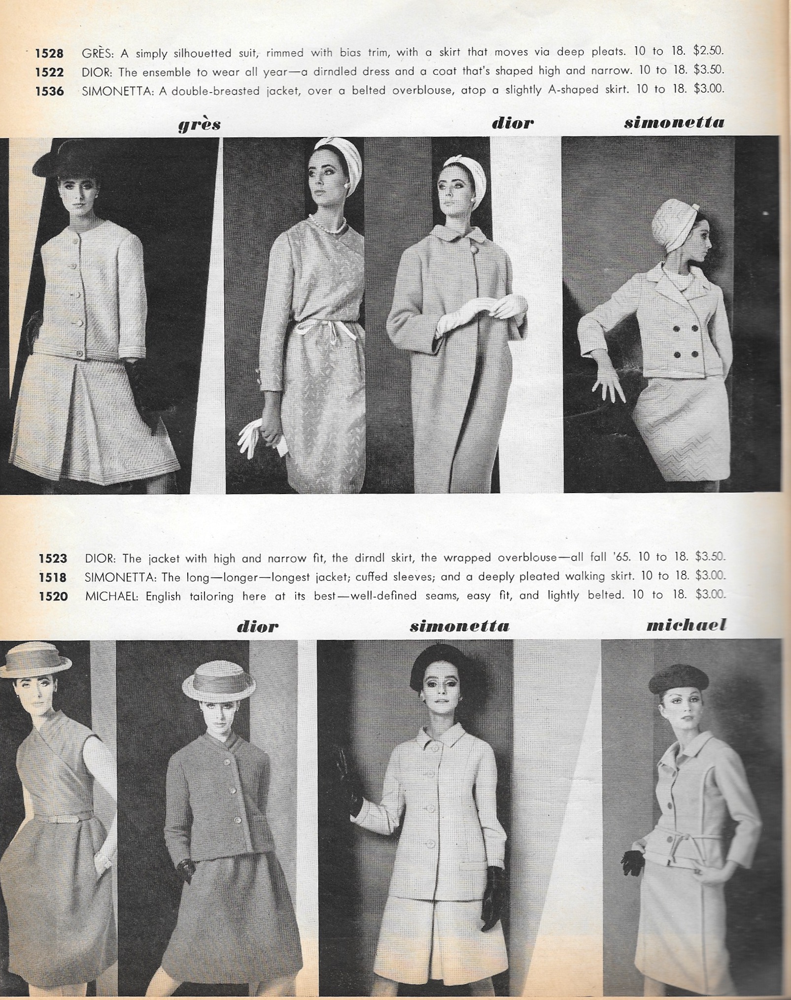
As with most of my vintage patterns, where I am never quite satisfied until I am able to assign a copyright/production date to them, such was the case with this pattern. Being a Designer pattern made it easier to narrow my search through my Vogue Pattern Book Magazines. Also, at this point I have developed a “decade” sense for styles, so I instinctively started with the mid-1960s. Bingo – the second issue from the mid ‘60s through which I looked featured this pattern. It was included in an article “Just Arrived – 33 Great Imports” in the October/November 1965 Vogue Pattern Book Magazine.
I like this image of the pattern (on the far right) as I believe it shows the lines of the jacket in a more flattering way than on the pattern envelope.
What made it especially rewarding for me was that my pink Dior coat pattern is included in the same feature. It must have been a good year.
The caption for my pink coat pattern, top and center in the same feature of “33 Great Imports”, reads: “DIOR: The ensemble to wear all year – a dirndled dress and a coat that’s shaped high and narrow.”
Pink was on my mind (well, truth be told, pink is always on my mind) during the waning days of March as I zeroed in on making “birthday” dresses for my granddaughters. (Time and looming dates have a wonderful way of getting me back on the sewing track.) And yes, they are pink. However, they are also under wraps – and wrapping paper – to be opened by the birthday girls next week.
Hopefully April will not hurry away, as these months are wont to do. There are promises to keep and there is more sewing to happen at Fifty Dresses.
Works of fiction which feature some aspect of sewing or fashion are often some of my favorite reading experiences. While I do not necessarily seek them out, if I hear of such a novel, and it’s reviews are positive, then I will add it to my reading queue (similar to my sewing queue!) And sometimes, there is a surprise sewing element in a novel – those are the bonuses.
The last three novels I have read, in quick succession, were all very different, but each one used sewing and/or fashion as foundational premises either for the plot or for character development. So, here are short reviews of each one, in the order in which I read them.
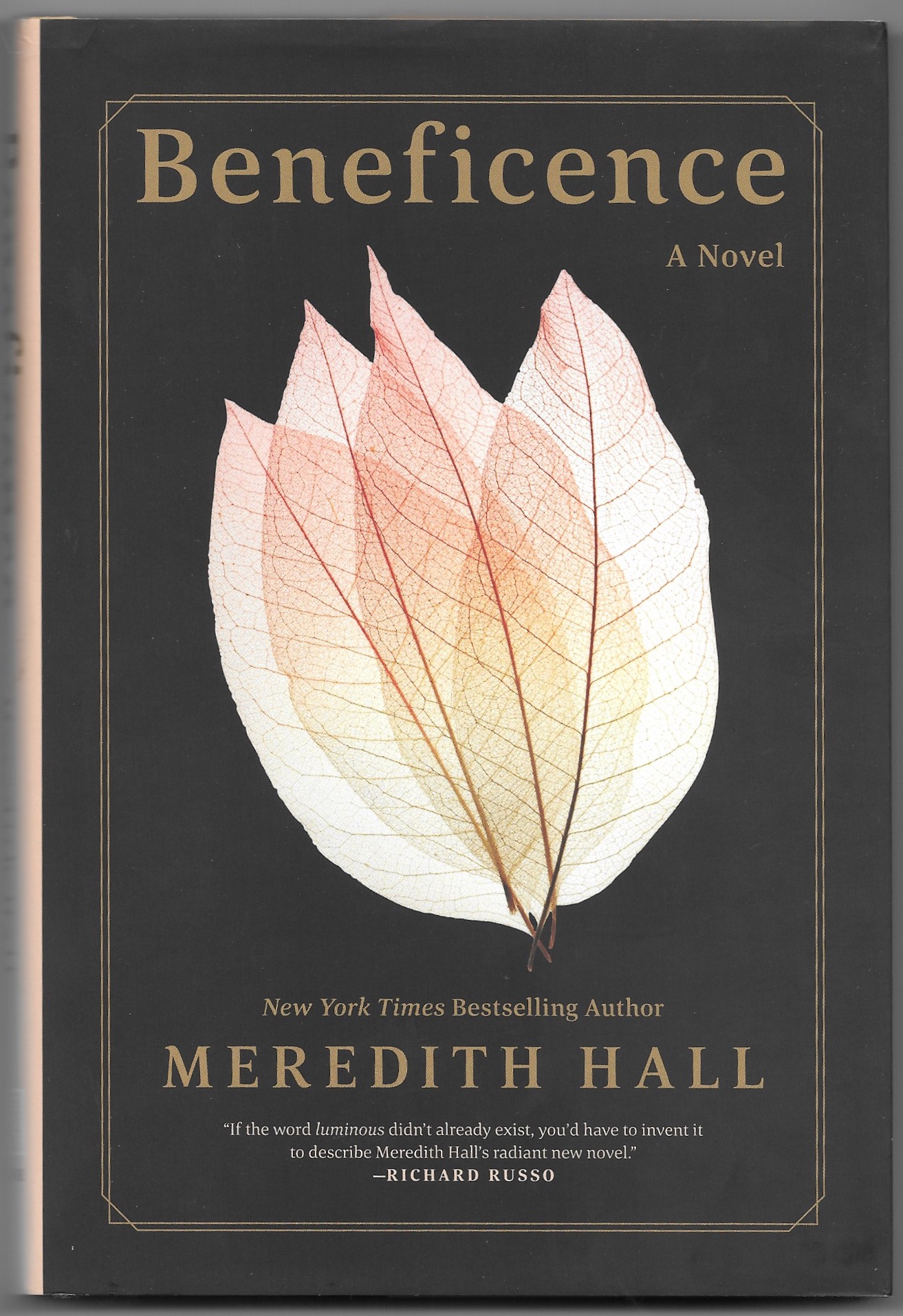
The first novel, Beneficence, by Meredith Hall, came to my attention by a review in The Wall Street Journal Weekend Edition back in the Fall. The subtle role sewing plays in this novel makes it one of those bonus books. Some of the words used to describe this novel, and rightly so, have been “haunting,” luminous,” and “exquisite.” It takes place in Maine (USA) and spans the years from the late 1940s to the early ‘60s. The story is about the Senter family, who owns a dairy farm, and the devastating tragedy which befalls the family of five. Early in the book, one gets the sense of impending doom. At this point, in no way did I have any inkling of the role sewing would have in the development of one of the main characters, Dodie, the daughter. The masterful writing – eerily beautiful, and very affecting – is of such quality that it was only after I had finished the book did I realize how her sewing helped to define Dodie. The sewing references even hint at the blessings ahead for her in the reader’s mind at book’s end. She is a mender, a creator, and a giver of things she has sewn. She is wise beyond her years. She is a character I will long remember. The book is a masterpiece.
One word of warning, however, is necessary for this book. Parts of it are very difficult emotionally to read. I cried a lot reading it, perhaps crying the most at the book’s end when grace and wisdom finally replace anguish for each of the Senters. If you are feeling in any way fragile right now, then plan to read this book at another, more secure time.
Feeling emotionally drained (but fulfilled) after reading Beneficence, I wanted something light-hearted and fun. And like a blessing, this book came to me as a Christmas gift from my daughter, Susanna.
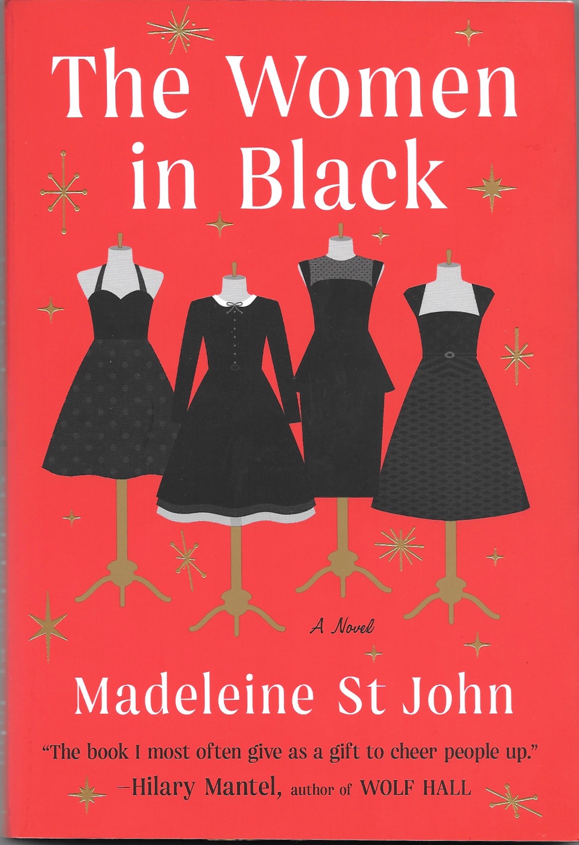
This novel first appeared in 1993, and it has been recently re-released.
The Women in Black, by Madeline St. John, is set in the early 1950s in Sydney, Australia. It follows four women (actually 3 women and one 16-year-old girl) who work at Goode’s Department Store in Fine Dresses and Model Dresses (Model Dresses being the most expensive.) The time of year is December, when cocktail and party dress buying is at a frenzy! Patty and Fay are in the fine dresses, Magda manages the Model Gowns, and Lisa is a temporary hire who helps out wherever she is needed. In many ways, however, it is Lisa’s story. Magda takes a loving interest in her, and when Lisa is exposed to the confectionary frocks in Model Gowns, she comes alive. She particularly has her eye on one dress, which is called “Lisette.” And when she finally has the opportunity to try the dress on, this is what transpires:
“Lisette was, of course, everything which could have been dreamed; like all the great works of the French couture, it was designed to look beautiful not simply as a thing in itself, but as the clothing of a female form. It took on then the property of vitality and movement, that is, of rhythm: it became finally incarnate. Lisa stood, overwhelmed, staring into the great cheval glass. . . . The frock changed her absolutely; the revelation which had come upon her when she had first been shown the Model gowns was now complete.”
What a fun book, written by someone (sadly now deceased) who understood the transformative power of dress and dresses. Treat yourself and read this book!
Just the title of the third book I am sharing is intriquing enough to catch your attention.
Based loosely on a true story, but definitely a work of fiction, The French Model, by Alexandra Joel, is the story of a stunningly beautiful young Australian woman who makes her way to Paris and becomes a model in Christian Dior’s House in post-war France. In leaving Australia, she is escaping not only from an unhappy marriage, but also from revelations about her past which make her question her identity and all those she has ever loved. This book has it all: mystery, espionage, love, fashion, friendship, sacrifice, sex, “very important person” sightings, political intrigue, history, and courage – all in a complex story line which will keep you on the edge of your seat. The writing is lovely and descriptive, the main characters endearing. Some of the story is a bit contrived – or unbelievable – but I was generally able to overlook those parts to enjoy the larger storyline. And I loved the emphasis on the workings of the House of Christian Dior. Anyone who loves vintage fashion – or historical fiction set at the end of World War II – should find escaping into this story a happy place to be.
One final observation about these three books. The dust jackets are works of art. Not unlike a perfectly fitted and flattering dress, each one is so perfectly evocative of what lies within, capturing the very essence of the books they adorn. As I look again and again at each one, it takes me back to those stories, those places and those indelible characters which gave me so much reading pleasure.
Sometimes the sewing stars align to ensure success (and sometimes they don’t.) But this story is a success story, although it played out differently than I originally planned.
I wrote about this vintage Forstmann wool fabric in a previous post.
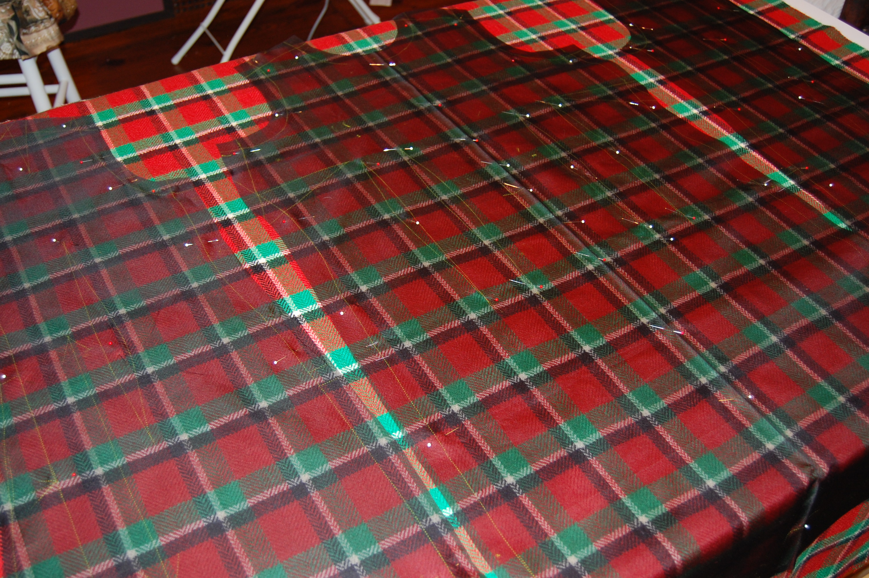
Having only 1.25 yards of this vintage wool restricted my options to either a simple sheath dress or a skirt. I opted for the sheath, with all good intentions of using the princess-lined pattern I had recently used for a pink dress in vintage Linton wool. In fact, one of the reasons I made the pink dress was to see if I would be able to successfully match plaids when I started on the red/green wool. (The weave of the pink Linton has a plaid woven into it, which I knew would be helpful to me in determining the pattern’s useability for a multi-color plaid.) Only one problem – when I laid out the pattern pieces on the Forstmann wool, I didn’t have enough fabric. I should have realized that the 7-panel princess dress would take more fabric than I had – and this time there was no making it work.
SO – I had to find another pattern. I have, over the years, made several sheath dresses using a newer Butterick pattern, but I really wanted to use a vintage pattern for this wool. Now, I have a lot of vintage patterns in my collection – and I went through every single one looking for the right sheath dress. At first I didn’t realize this pattern had the look I wanted.
I had originally purchased this pattern for that gorgeous shawl collared coat. But – BINGO – when I took another look, there was the perfect sheath looking right at me.
Although the pattern was not dated, I knew it was from the early 1960s. But of course, I thought it would be wonderful to know the year it first appeared. A lengthy search through old Vogue Pattern Magazines proved to be successful – not only successful, but timely. This pattern was included in the December 1962/January 1963 issue, and was the featured pattern for a Special Capsule Catalog included in the issue. Not only that, the caption read: “110 IDEAS TO START THE NEW YEAR IN VOGUE.” Yes, I thought, that’s what I want to do!
What a glamorous look!
And here is the entry for this pattern in the capsule catalog.
Of course, starting with a pattern I had not before used meant I had to make a muslin (toile) and fit it. That little effort took two days. But then I got started in earnest, cutting out the silk organza underlining and positioning it right where it needed to be on the fabric.
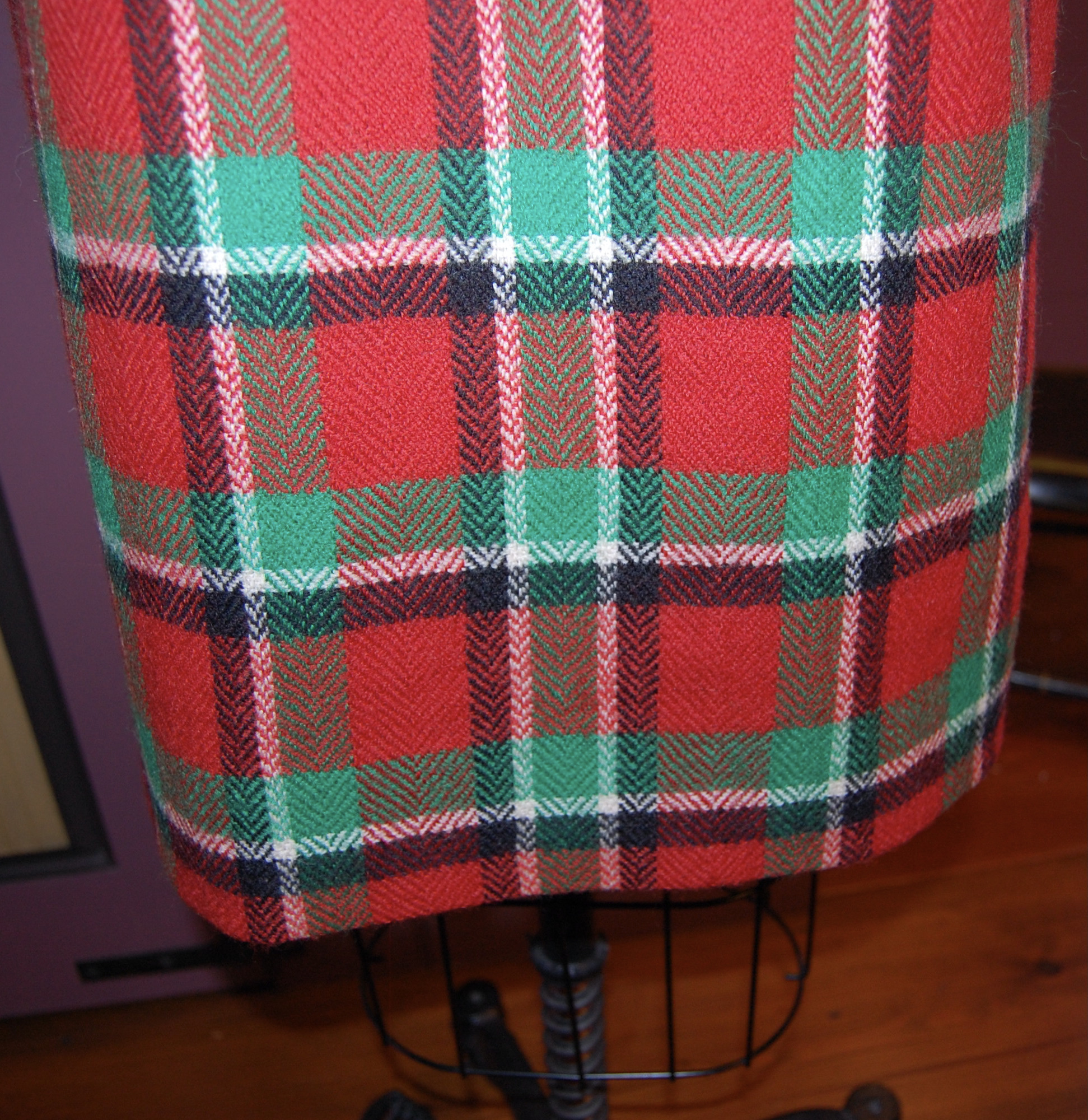
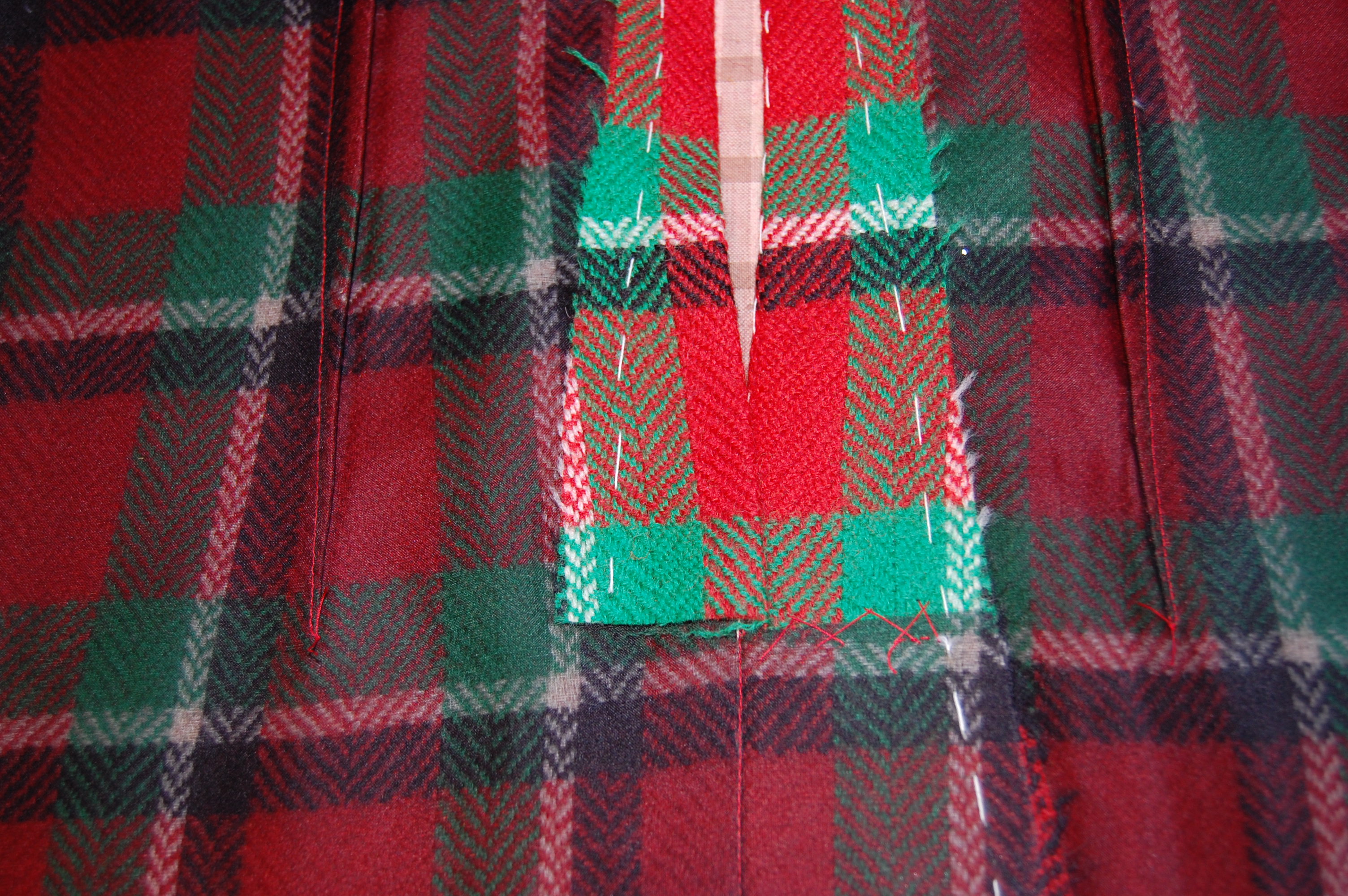
You will notice that this fabric has a center front, woven to provide a mirror image of the plaid on each side. Really a brilliant way to handle an uneven plaid.
There were two important considerations for placing my silk organza underlining “templates” on the plaid: 1) the orientation of the plaid vertically and 2) the correct placement of the hemline on the grid of theplaid and making this placement work with the position of the waistline and neckline.
I thought the wider, darker part of each woven “block” on the plaid should be oriented to the bottom of the dress, which I believe is apparent above.
I find, when working with plaid, it is very important to have the hemline determined before you cut out your fabric. Visually it is more appealing if the hem does not cut a block of the plaid directly in half or, especially with smaller plaids, end right at the edge of a block. I think it looks better if there is a bit of a “float” around the bottom of the dress to anchor the bottommost blocks. (Larger plaids have their own considerations. Look at the art on the pattern envelope above to observe this.)
The red “band” at the hemline serves as this “float.”
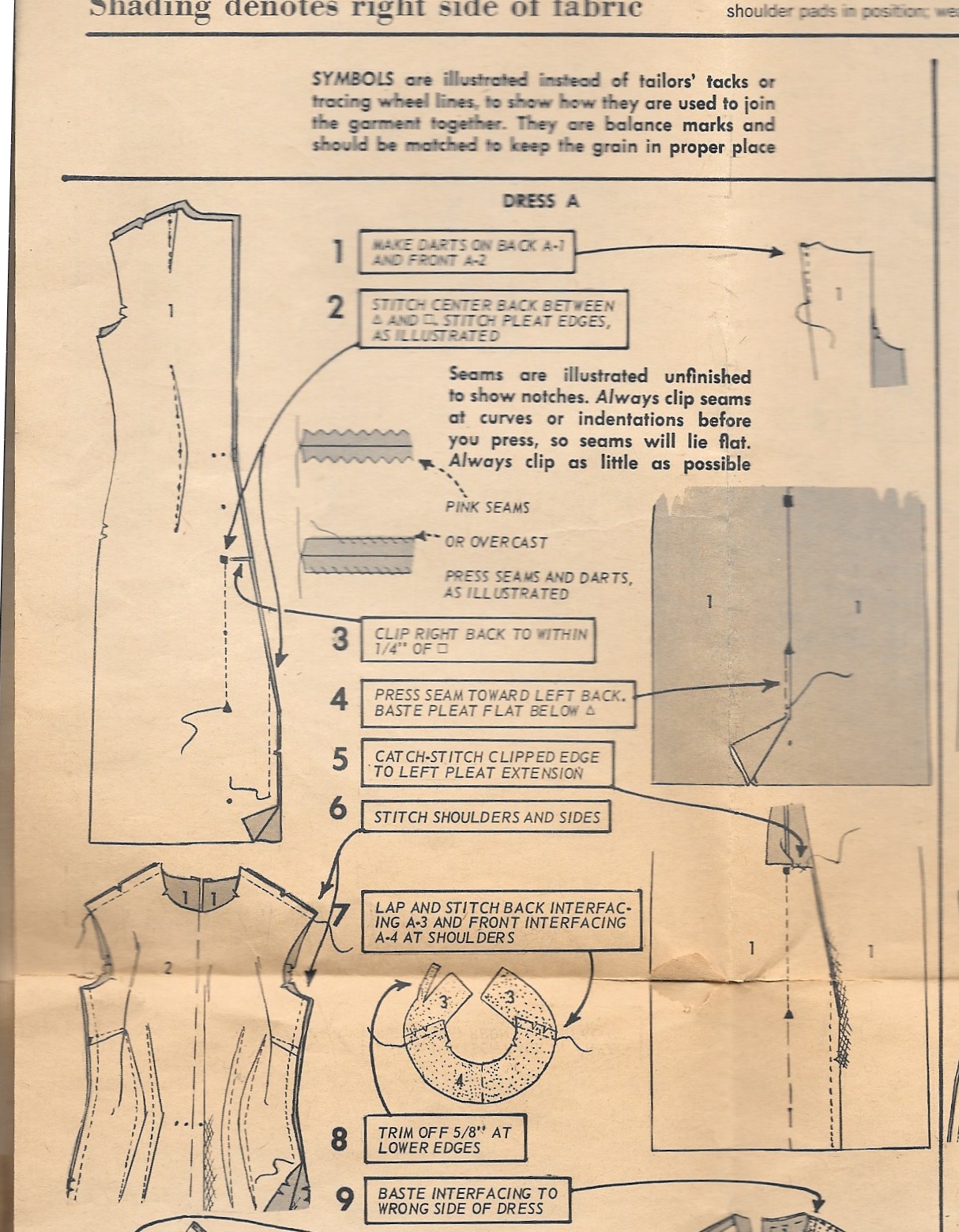
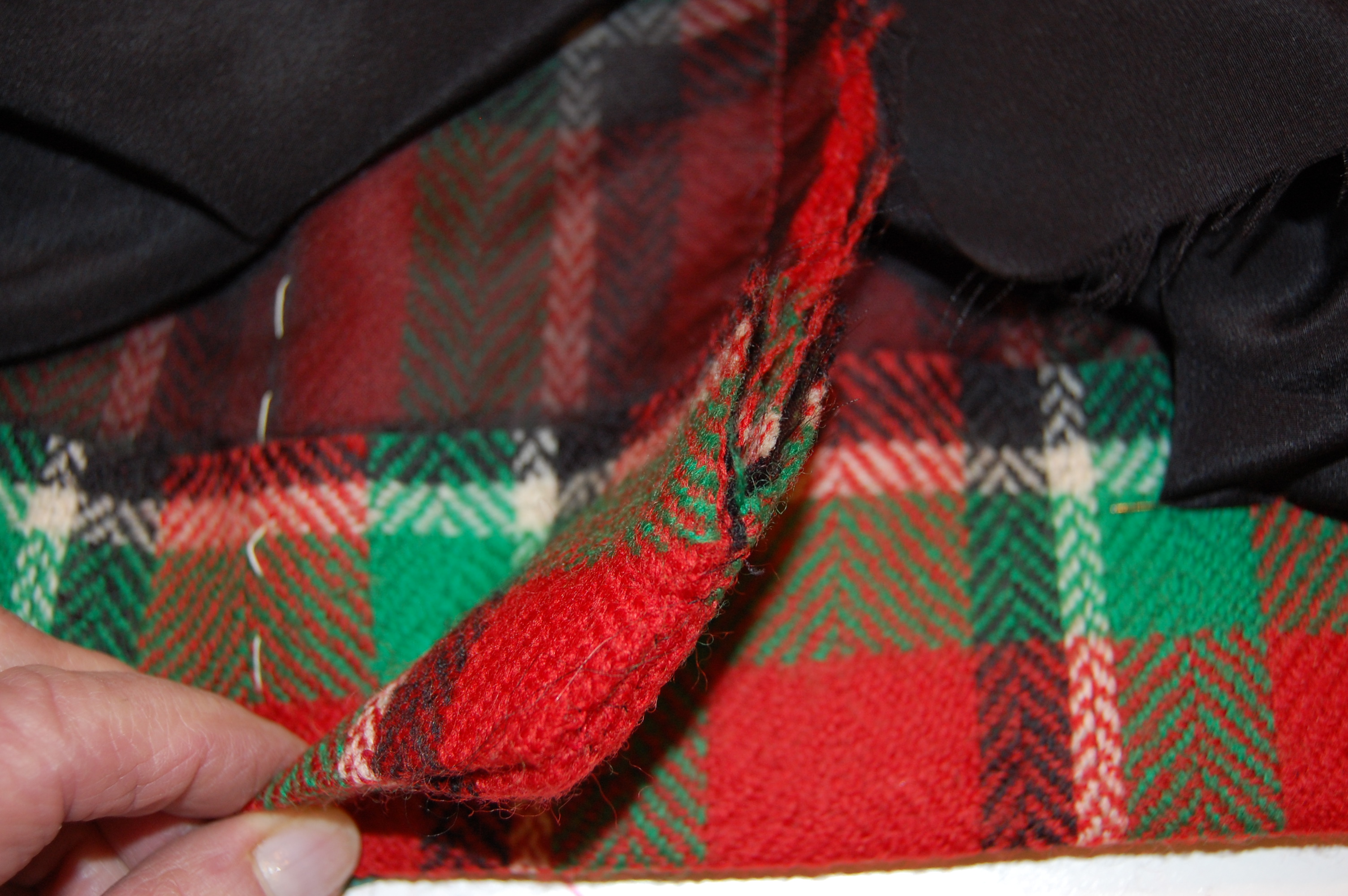
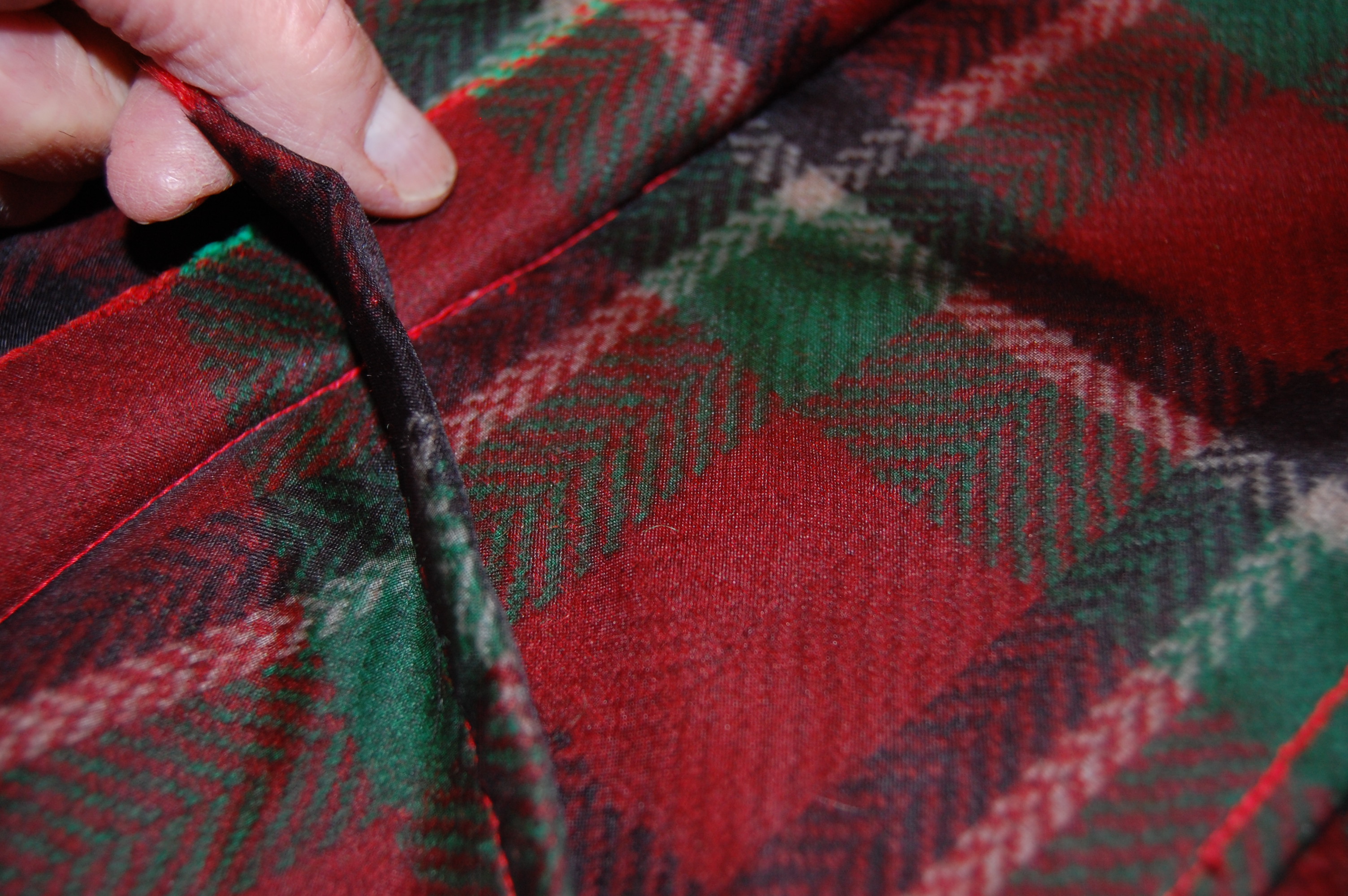
One of the design features of this dress is the kick pleat, which has its origin in the back seam starting at the bottom of the zipper. I wasn’t sure how I was going to work the lining around this, but I also thought I could probably figure it out.
The instruction diagram shows the kick pleat quite well.I angled the raw edges to finish the bottom edge of the seam.Here is the finished kick pleat.
I loved that fact that this type of kick pleat made the perfect setting for a lapped zipper, shown below.
The left side is pressed slightly to the middle to accommodate a lapped zipper.
You will notice this dress has two shaping darts on either side of the front panel, in addition to the bust darts. The back has one shoulder dart and one shaping dart on either side.
All these darts make for such a lovely fit. In addition, I used a trick I have learned from Susan Khalje. Instead of sewing the bust dart into the side seam, I allowed it to float free, stitching the seam above and below the dart. I did this for both the fashion fabric and the lining. Using this method provides more ease to the bust.
This photo shows what I did with the side seam at the bust dart.
I did lower the neckline by about ½ inch, and I cut the shoulders in by about an inch on either side. These changes just seemed to look better on me, as determined by my muslin (toile).
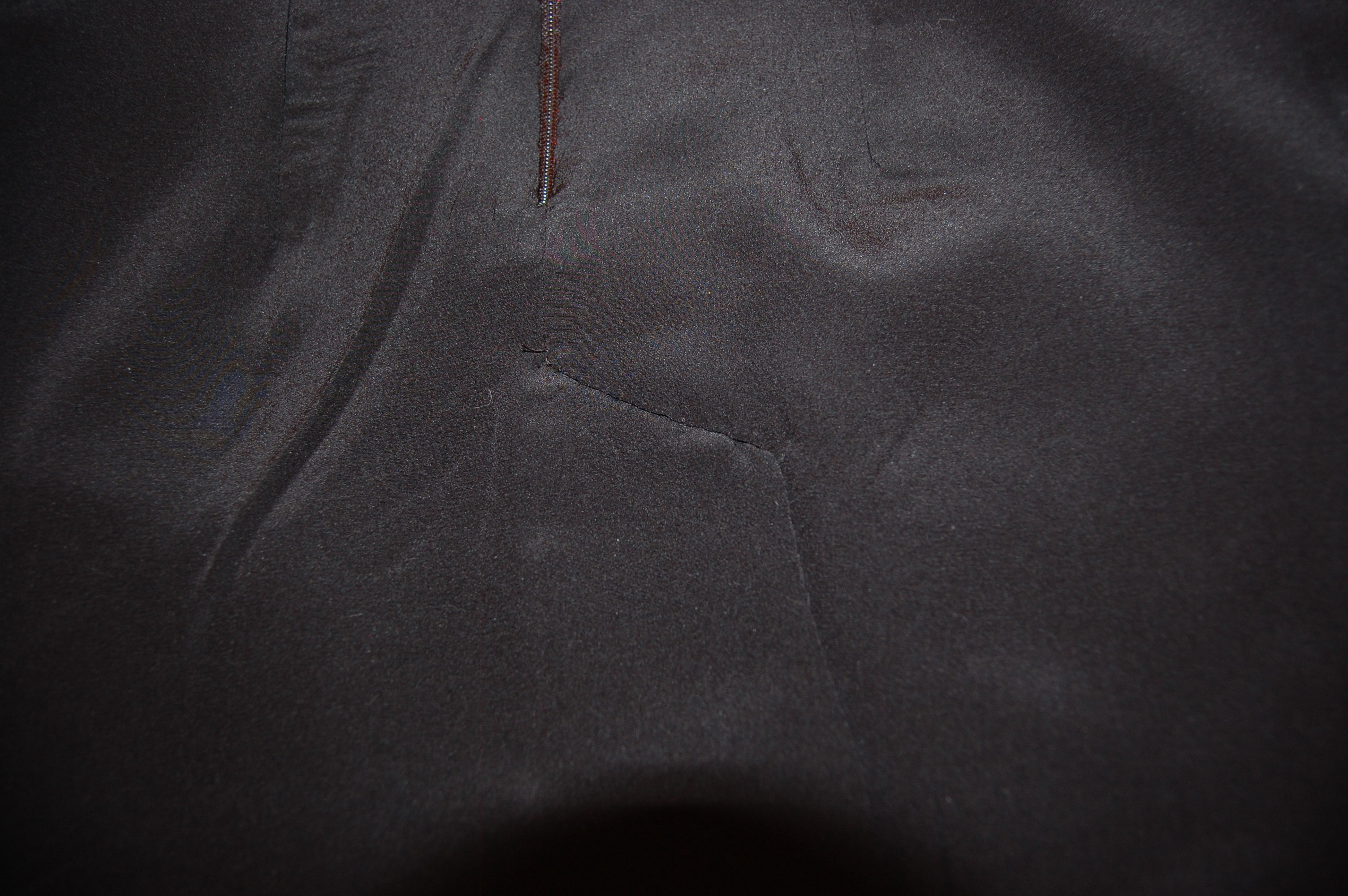
I lined the dress in black silk crepe de chine. (I find almost all my lining silk at Emma One Sock.) When it came to the kick pleat, I found that a slanted seam below the end of the zipper was necessary to divide the lining between the two sides of the kick pleat.
Black is so difficult to photograph, but hopefully the angle is apparent.
I have no idea how to explain what I did to finish the lining in this area. Just know that whatever I did – worked! I ended up with no lumps and no restriction on the functionality of the pleat.
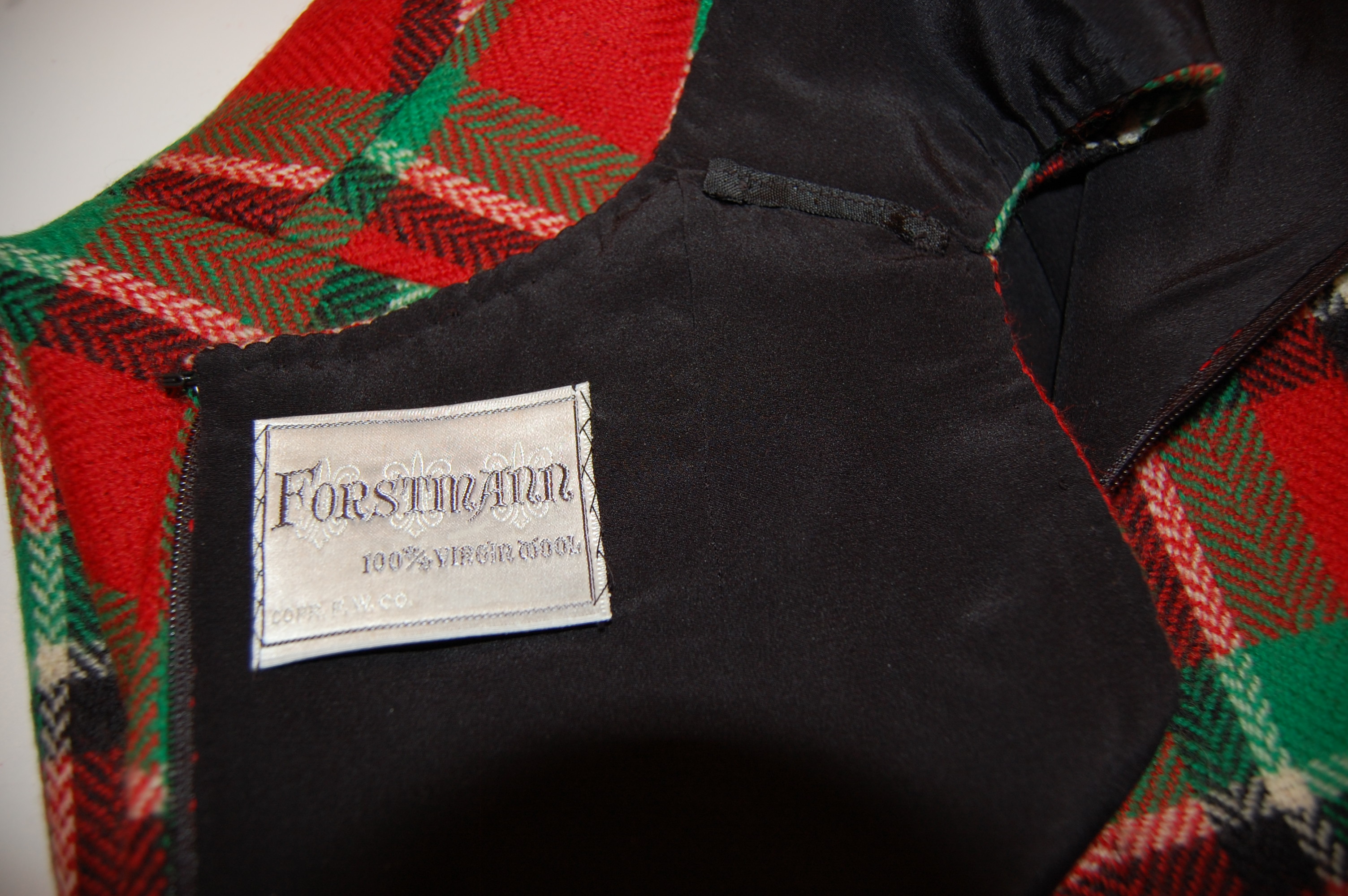
How lovely to have a label for this vintage wool.
This dress was such a fun project. I loved working with such a beautiful wool and such a beautiful pattern. There will be more such sheath dresses in my future.
I now would like to make a black jacket to wear with this dress; I do have a small amount of fabric remaining to use as trim in some way…
So now, how about you? Have you started the new year in Vogue? I hope so!


A Very Pink Coat, Part 1
Some projects deserve more than one blog post and this pattern and coat fall into that category.
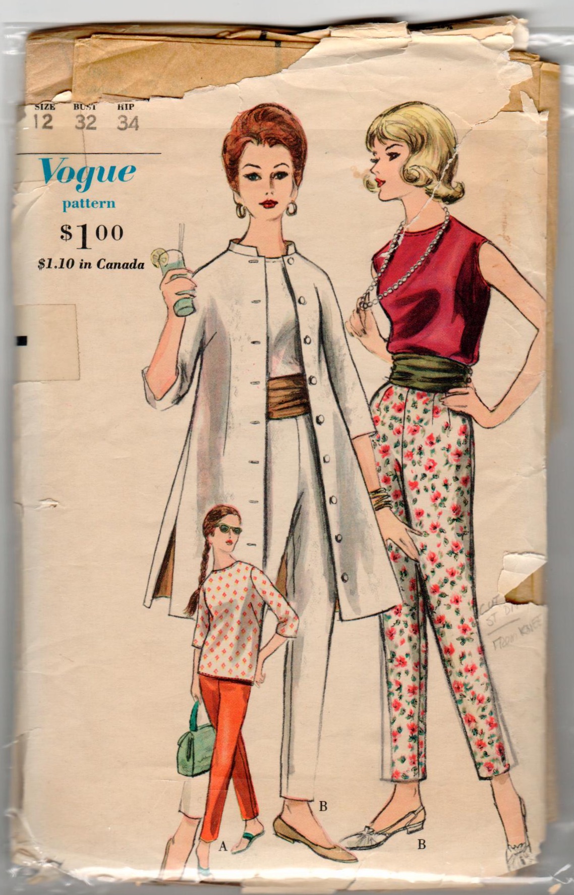
From the magical year of 1957 (I promise some time I will devote an entire post to the notable spot that the year 1957 occupies in the modern history of fashion), this coat pattern is in a class of its own. Referred to as a “car coat” in two Vogue Pattern Book Magazine entries, it is a quintessential example of that genre. Here’s why:
This pattern is featured twice in the Vogue Pattern Book Magazine from August-September 1957.
Here is the longer version shown on page 22:
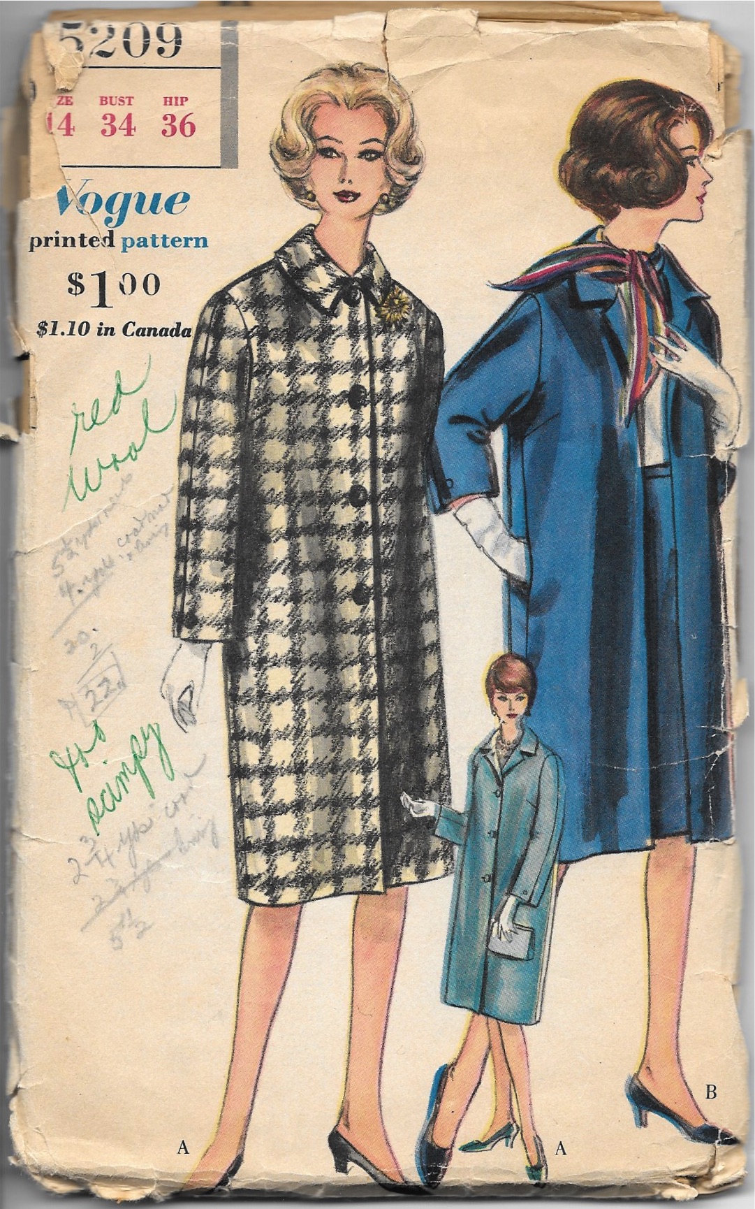
And here on page 37 is a drawing (by illustrator Dilys Wall) of the coat in red with this description: “A hounds-tooth-check car coat with three flap pockets, side-slit seams, and tab-button detail on the sleeves. Designed in sizes 10 to 18.”
Interestingly, also featured in this same magazine is this example of a child’s coat, also with a fly front. This type of opening takes more skill – and time – to make. I love the affirmation this item gives to the commitment and ability of the home-sewer in the 1950s.
Because this coat has those extra details which put it a notch above ordinary, there is a lot of preparation work before seams can actually be sewn together. The sleeve tabs, with their bound buttonholes must be complete before the sleeve seams can be sewn. Additionally, the set-in pockets with their flaps present a considerable amount of prep work on the fronts of the coat. Sounds like fun to me! More to come . . .
16 Comments
Filed under car coats, Coats, Fashion commentary, Fashion history, Mid-Century style, Pattern Art, pockets, Uncategorized, vintage Vogue patterns from the 1950s, woolens
Tagged as 1950's Vogue patterns, coats, fashion sewing, sewing, vintage fashion, vintage Vogue patterns