String is a wonderful thing. I am particularly fond of kitchen string. Usually twisted cotton or a twisted cotton blend, it is useful for many things (such as tying together the newspapers for recycling, playing with the cats, securing open bags of flour and sugar, etc., etc.) It also occasionally makes its way upstairs to my sewing room.
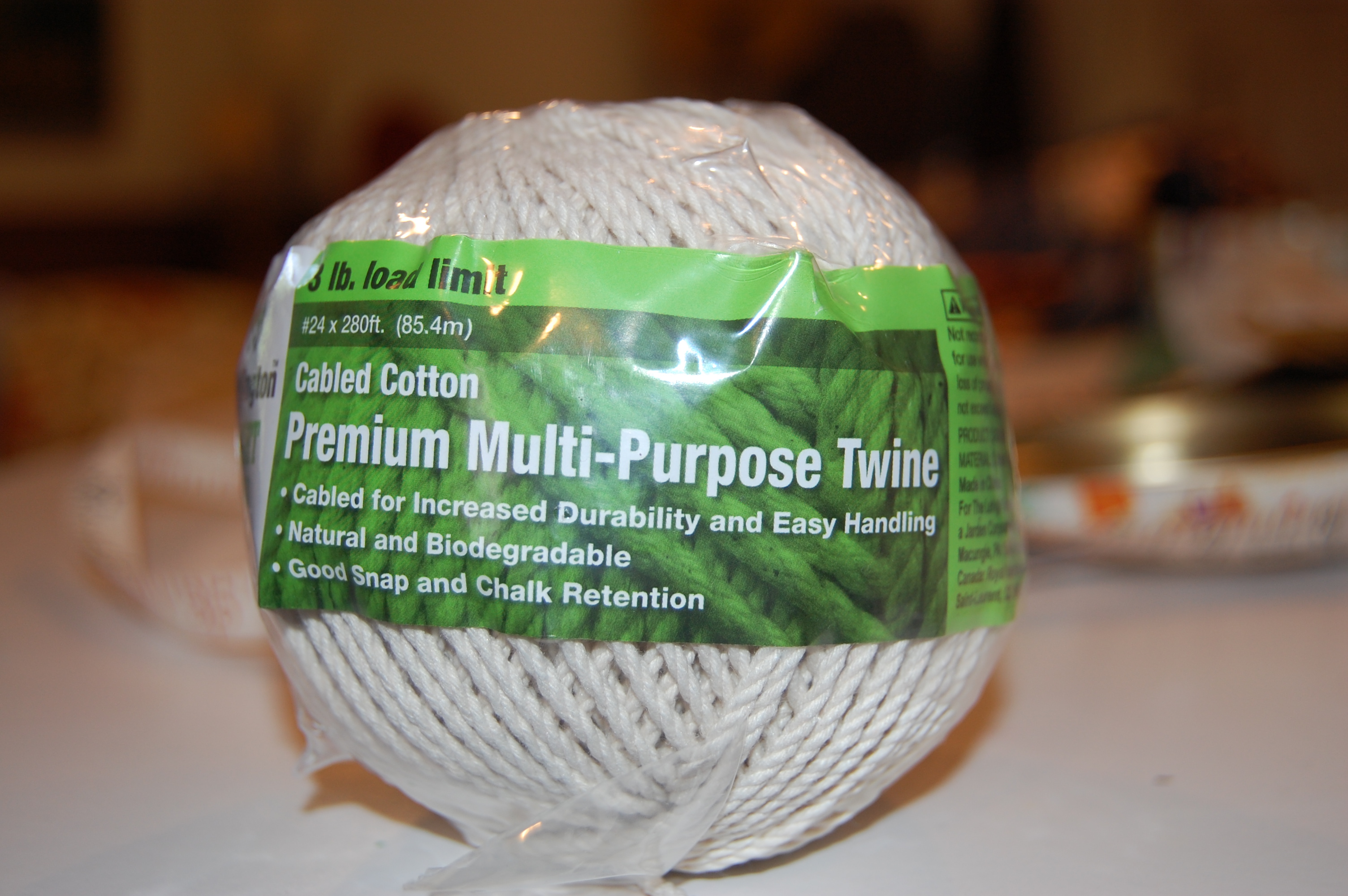
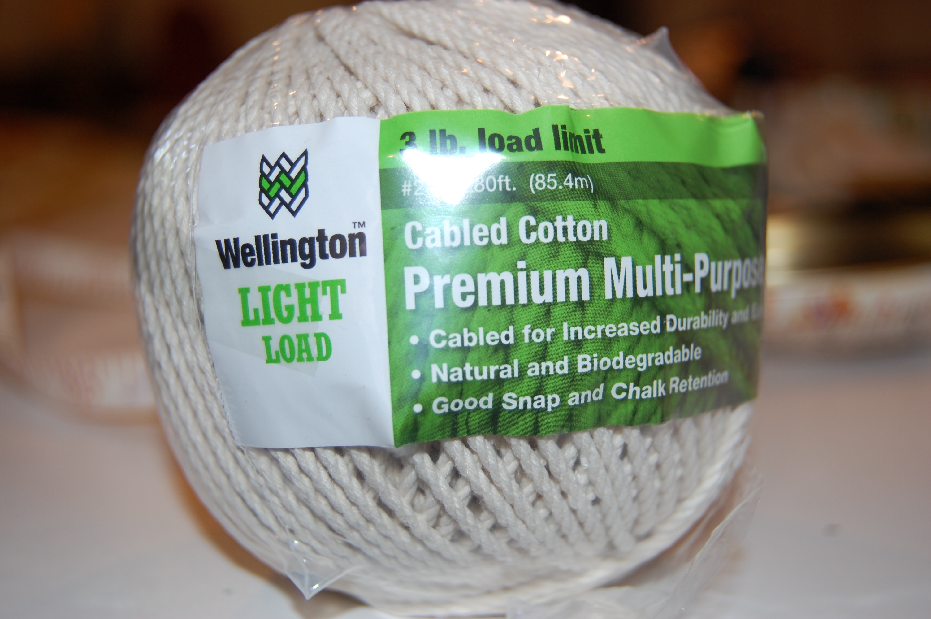
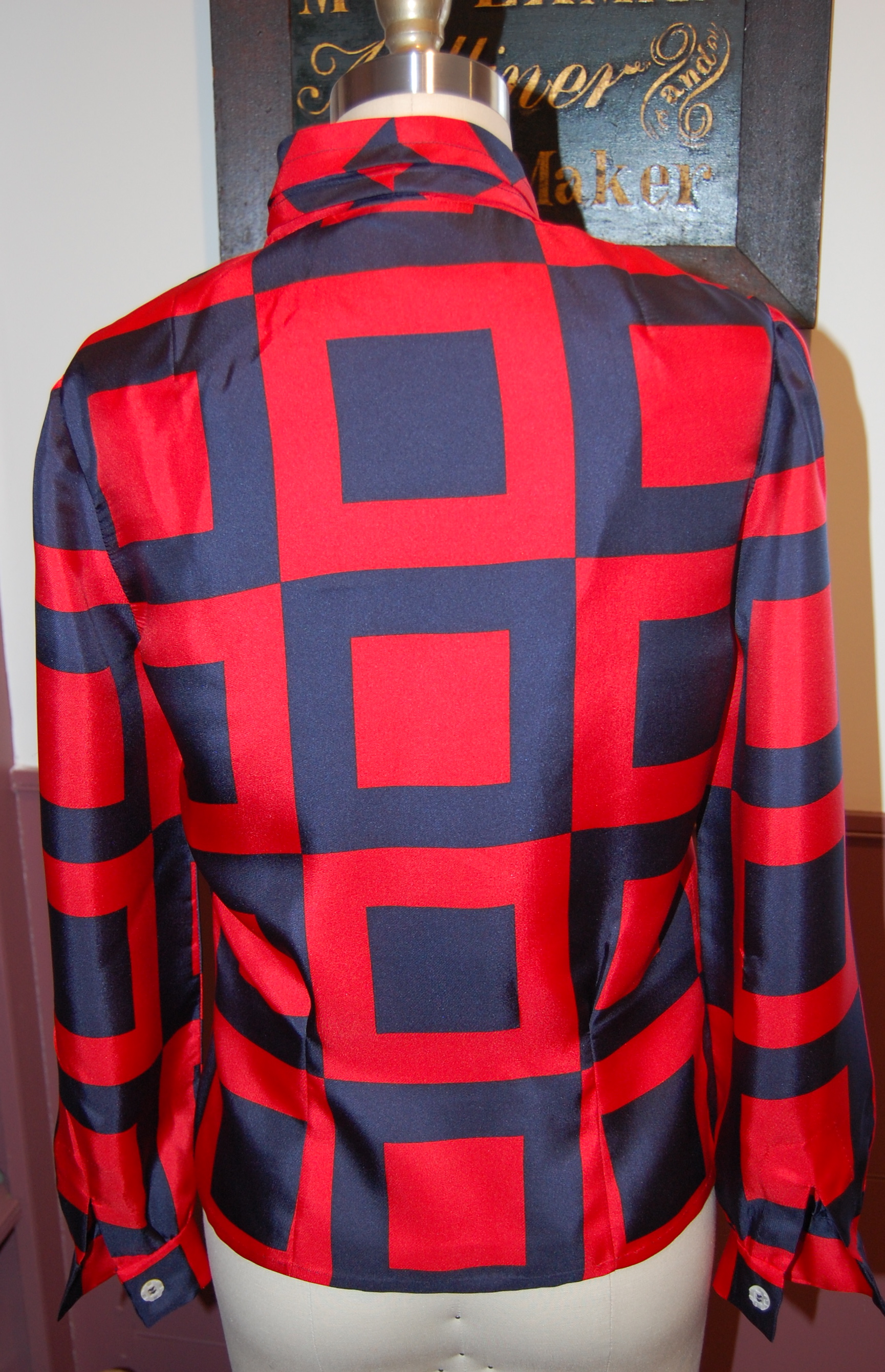
“Light load” kitchen string happens to be the perfect weight and diameter for making piping to be used in apparel. And – my current project for Fall features piping as one of the main design details.
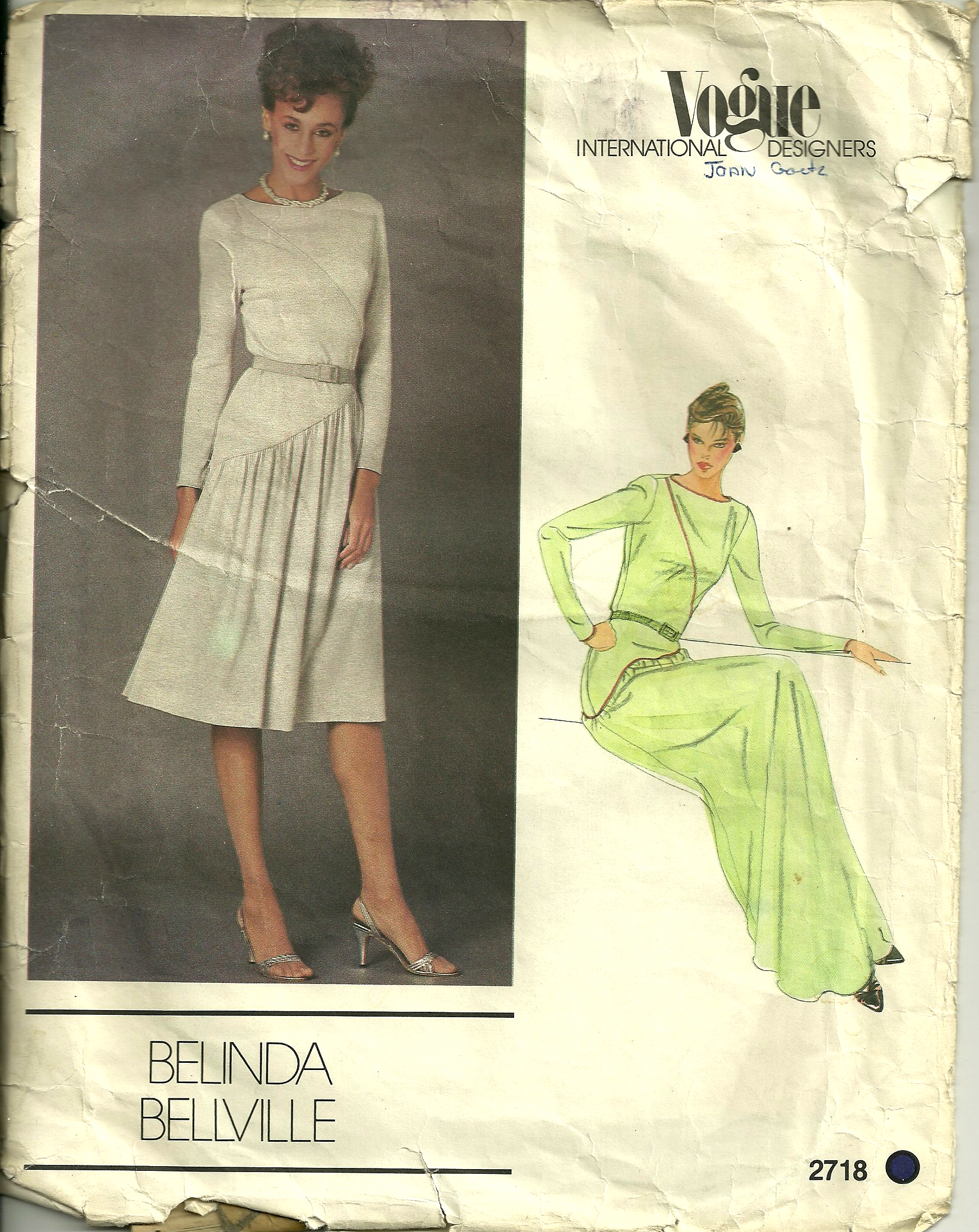
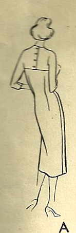
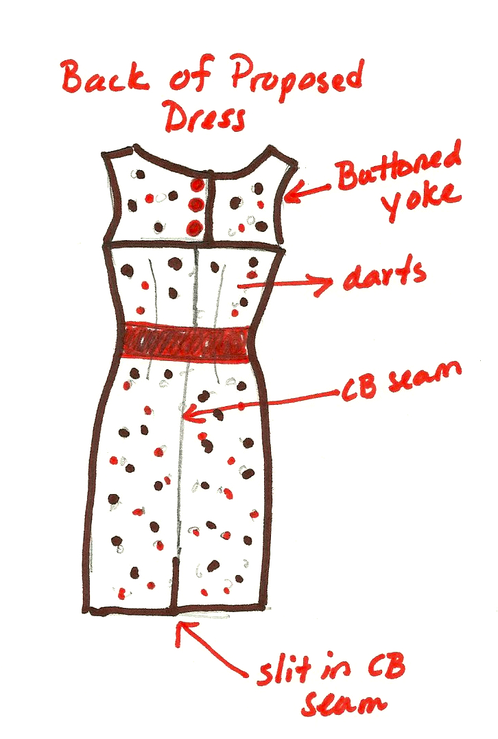
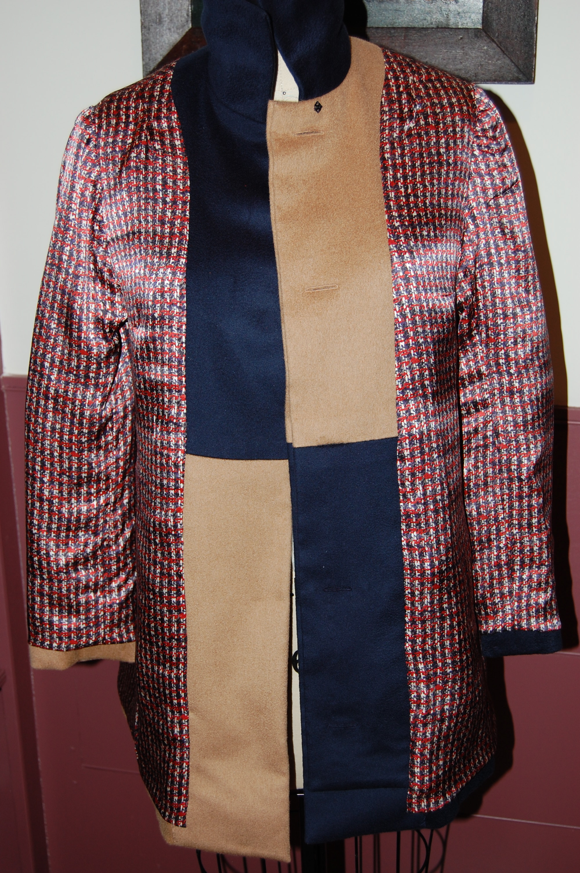
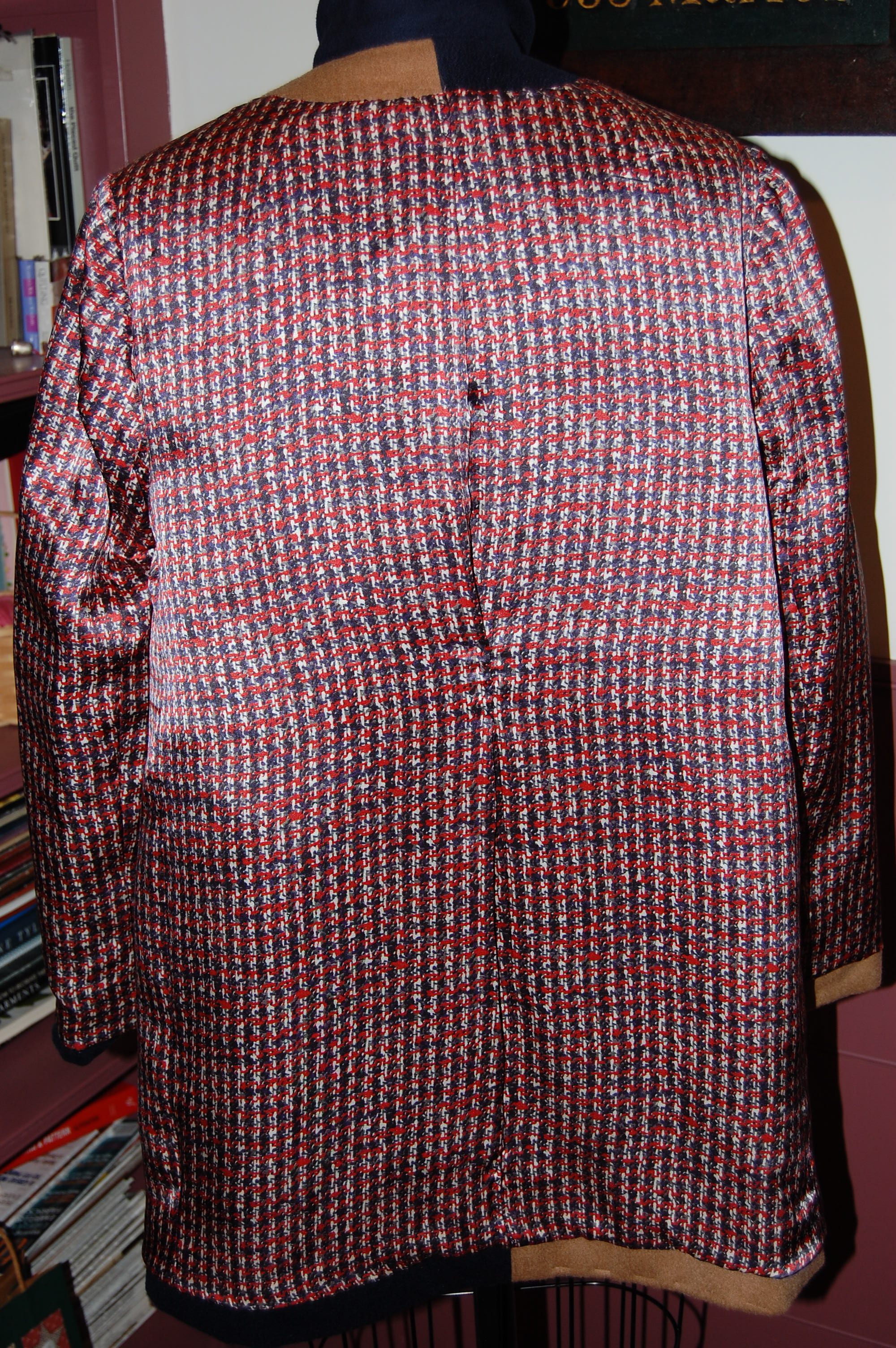
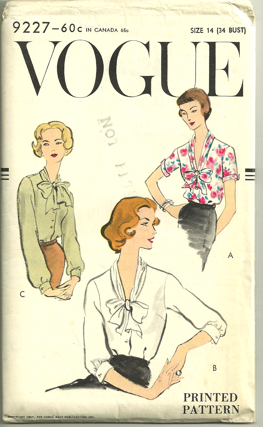
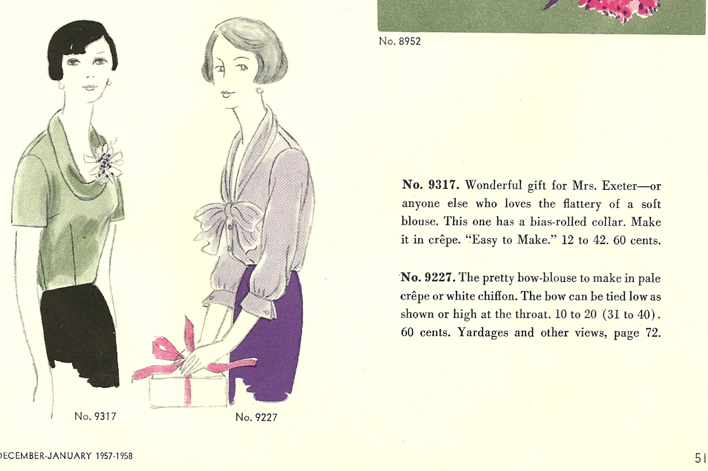
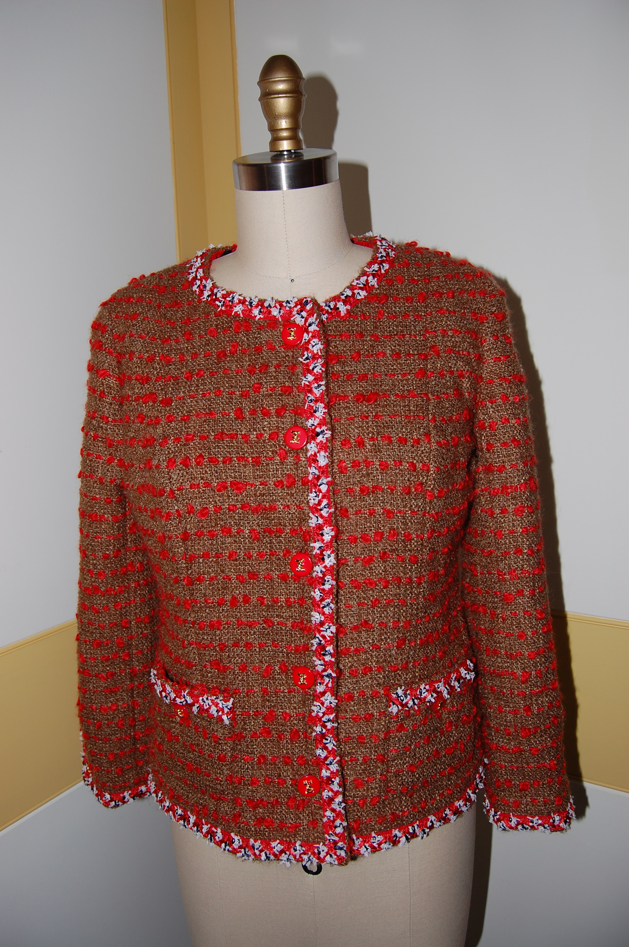
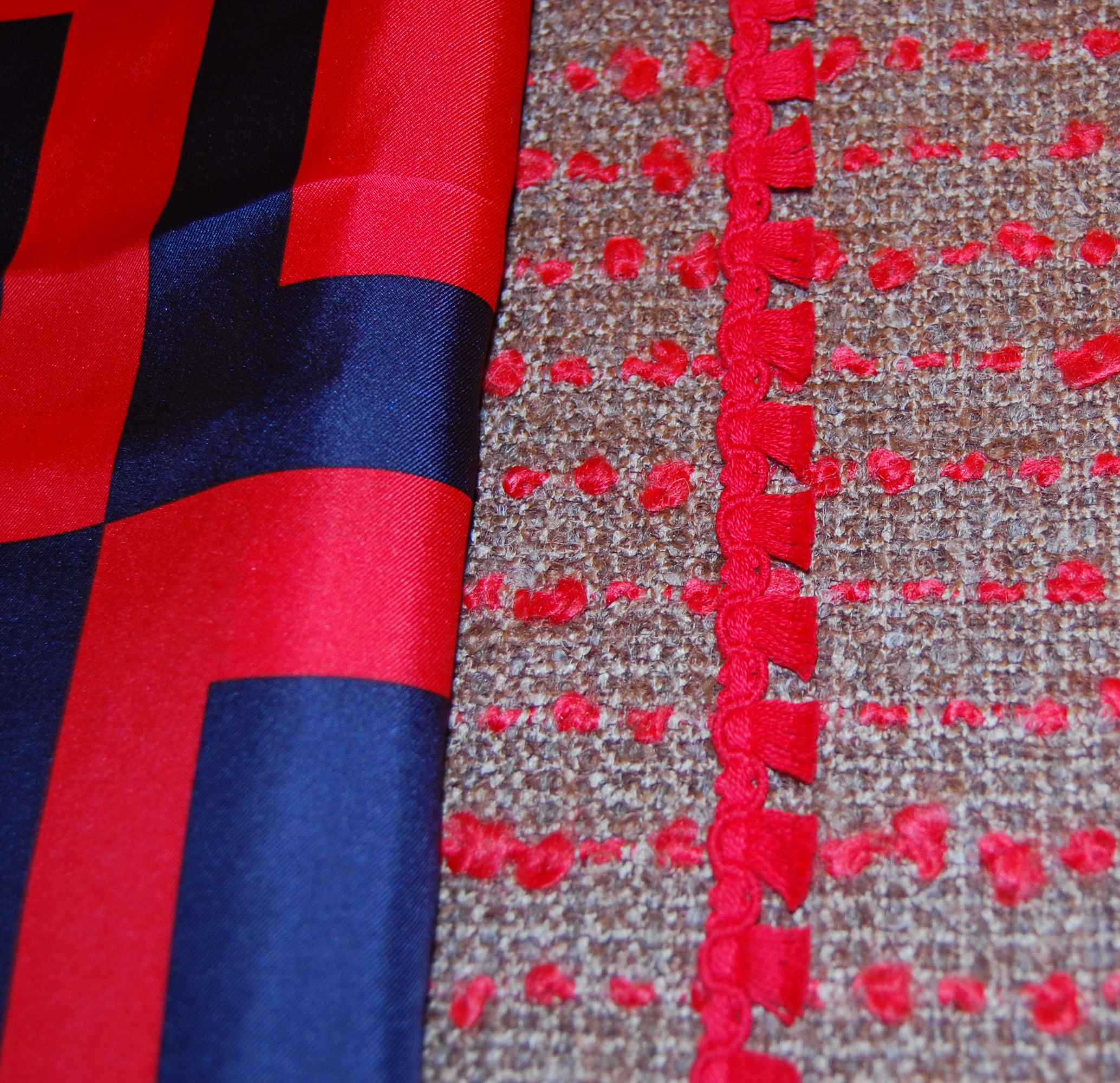
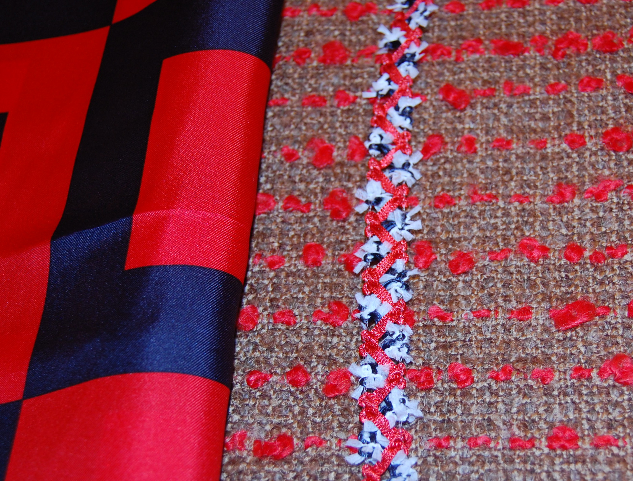
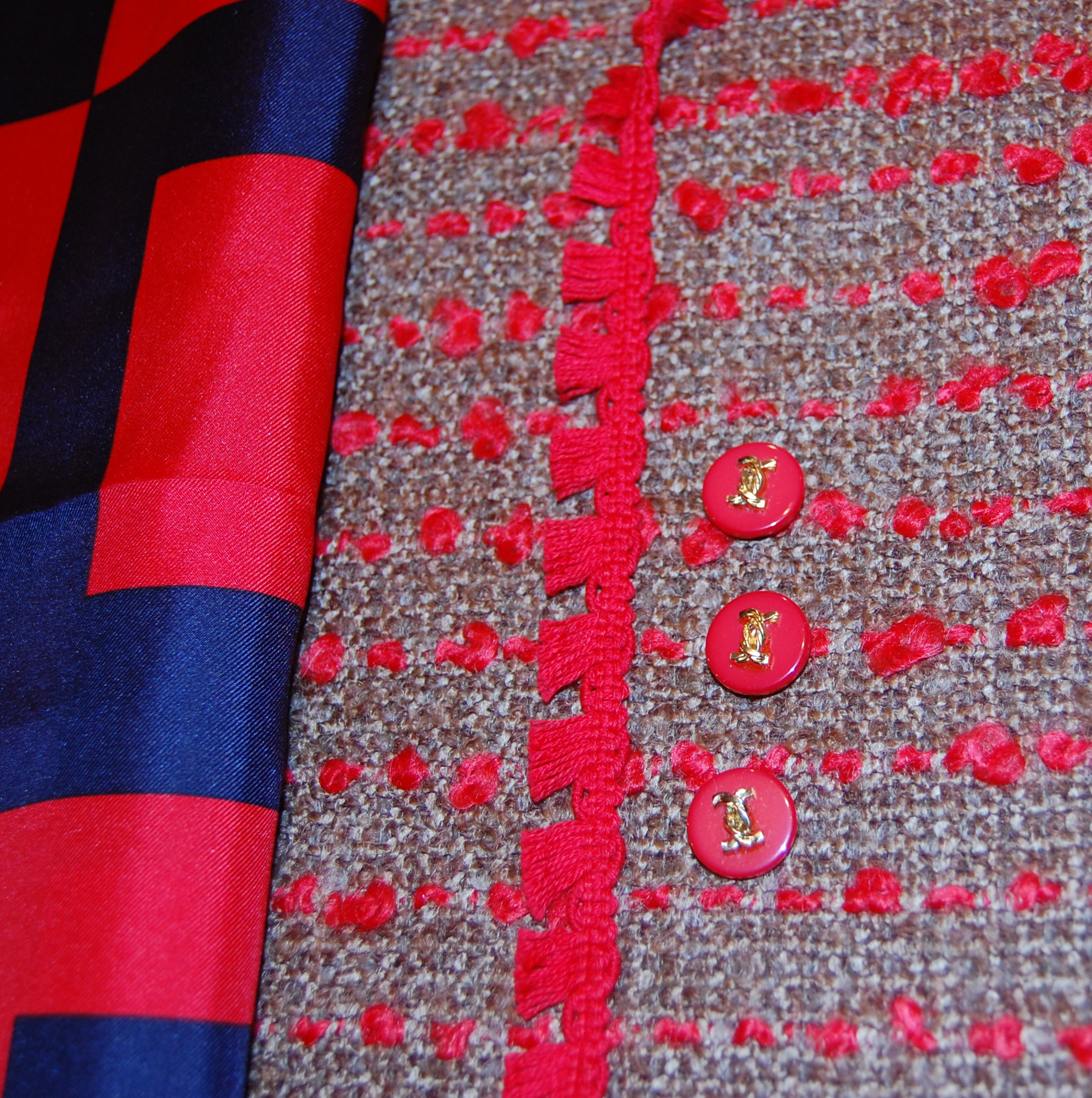
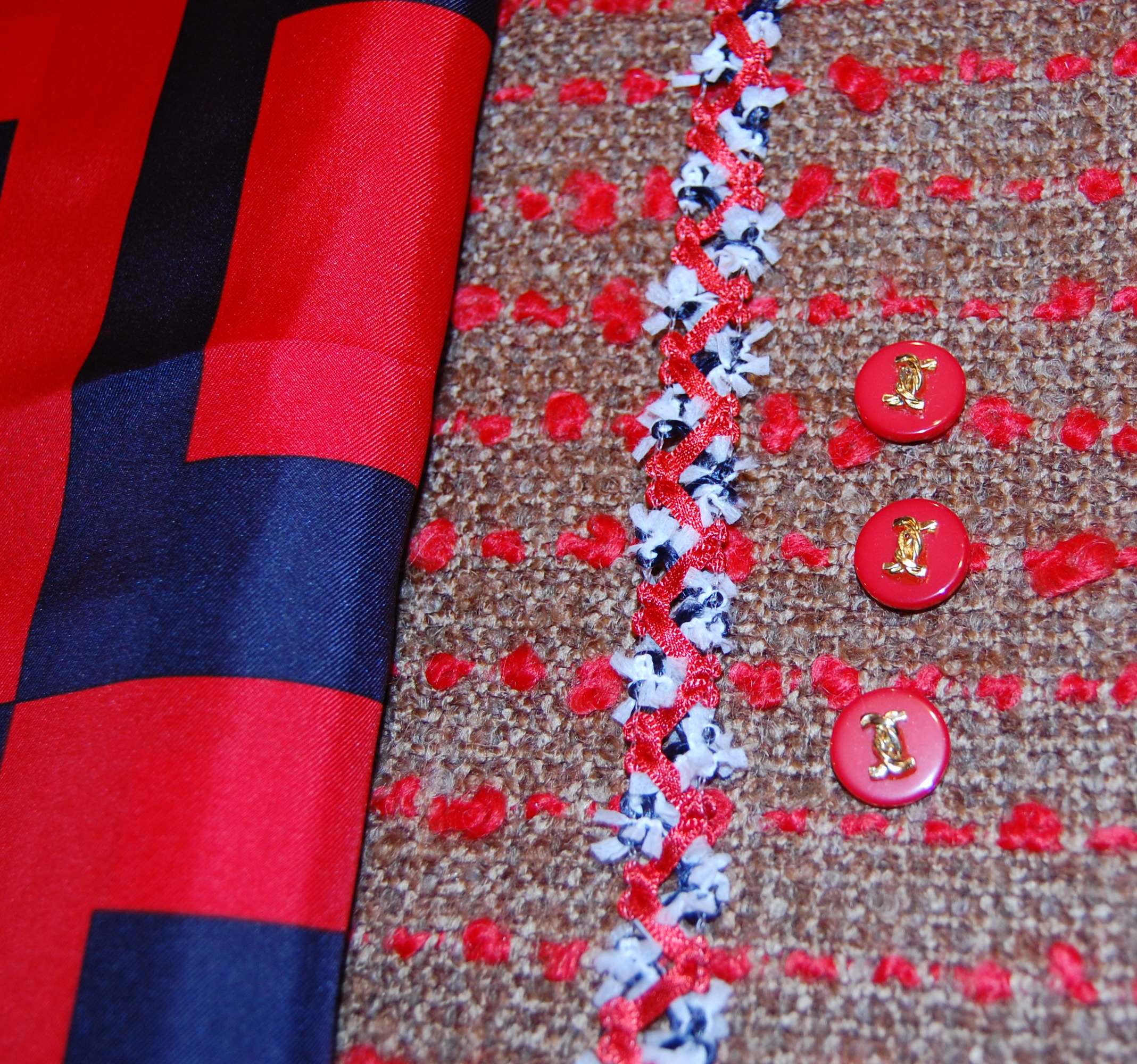
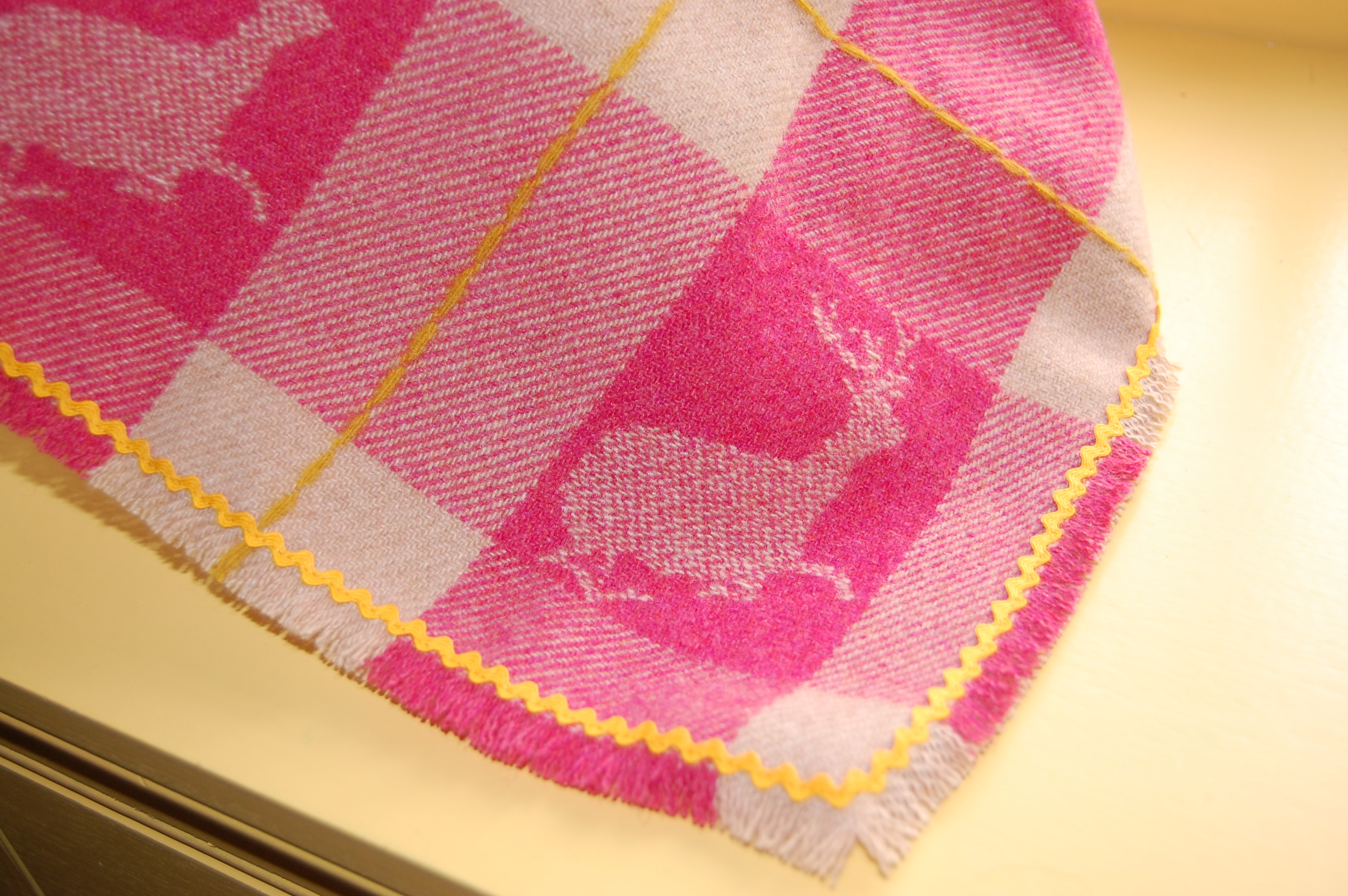
The piping is more clearly visible on the green view of this dress.
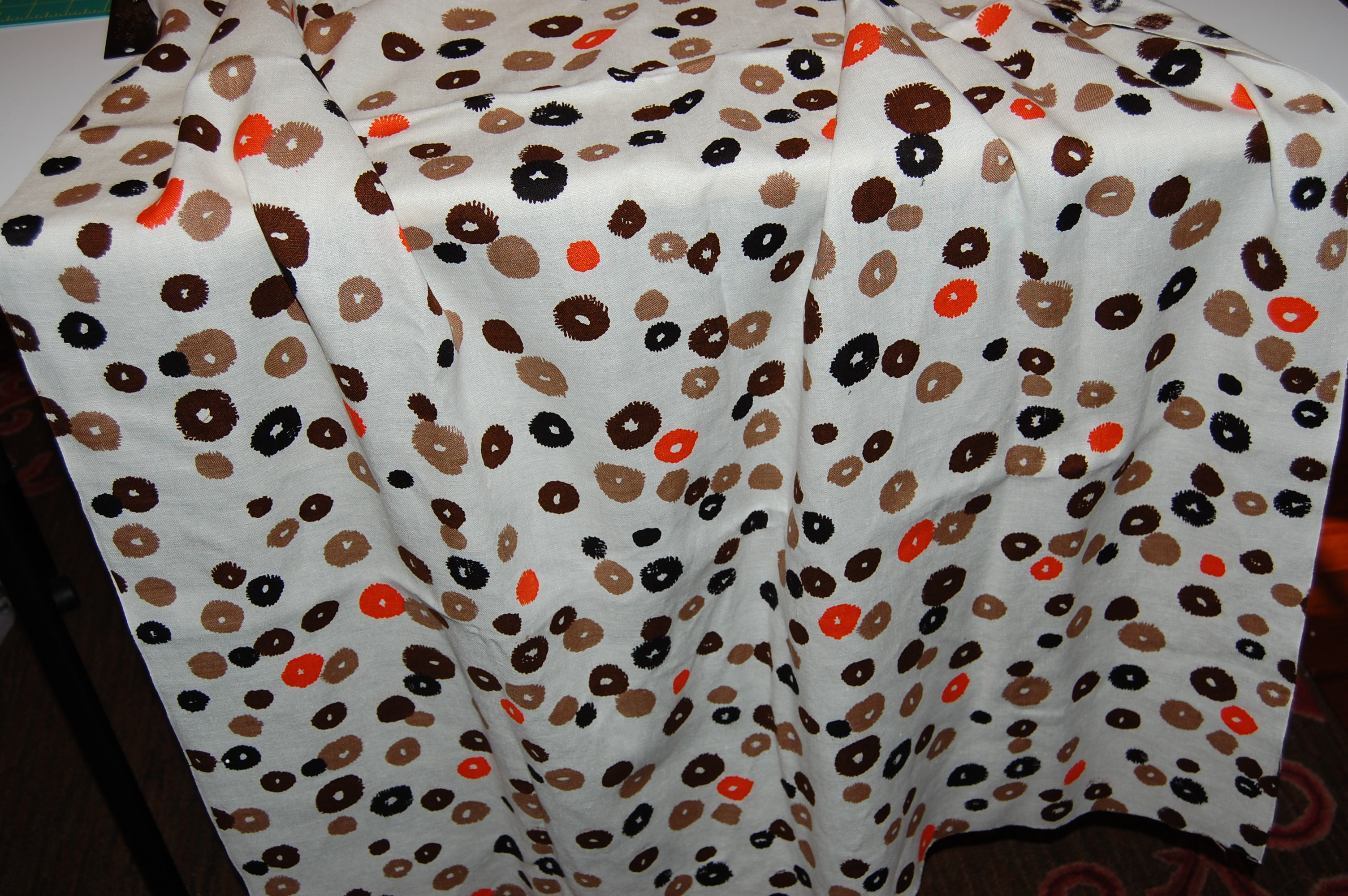
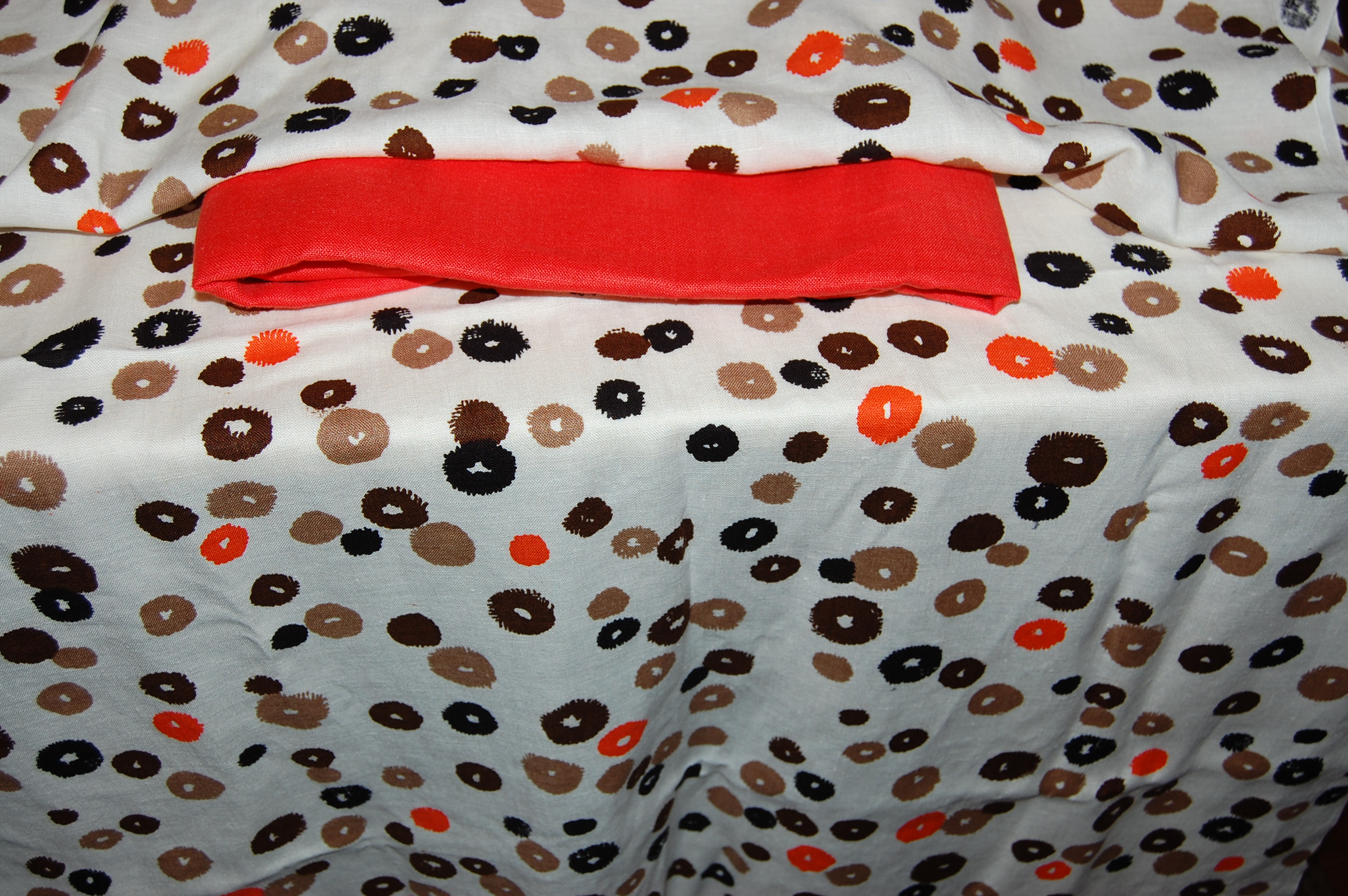
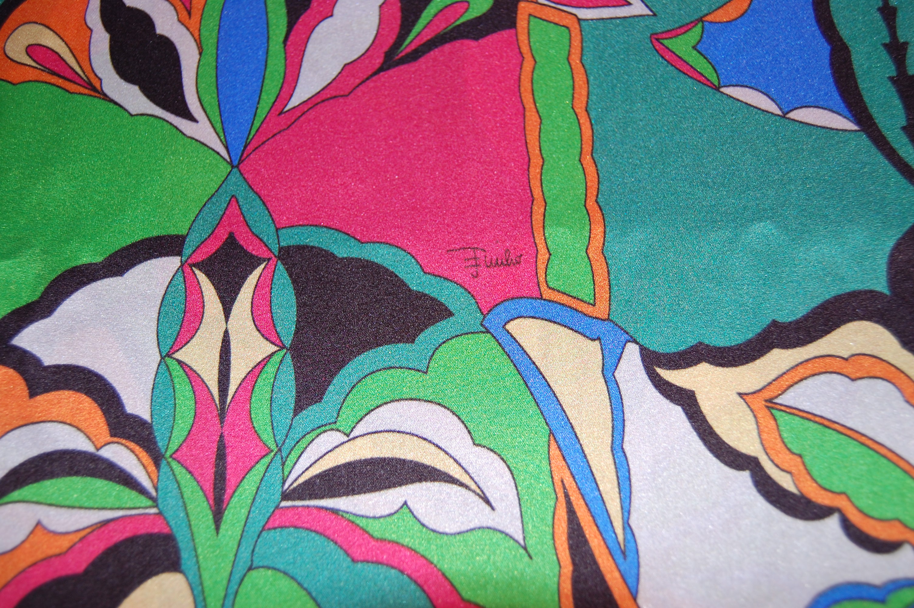
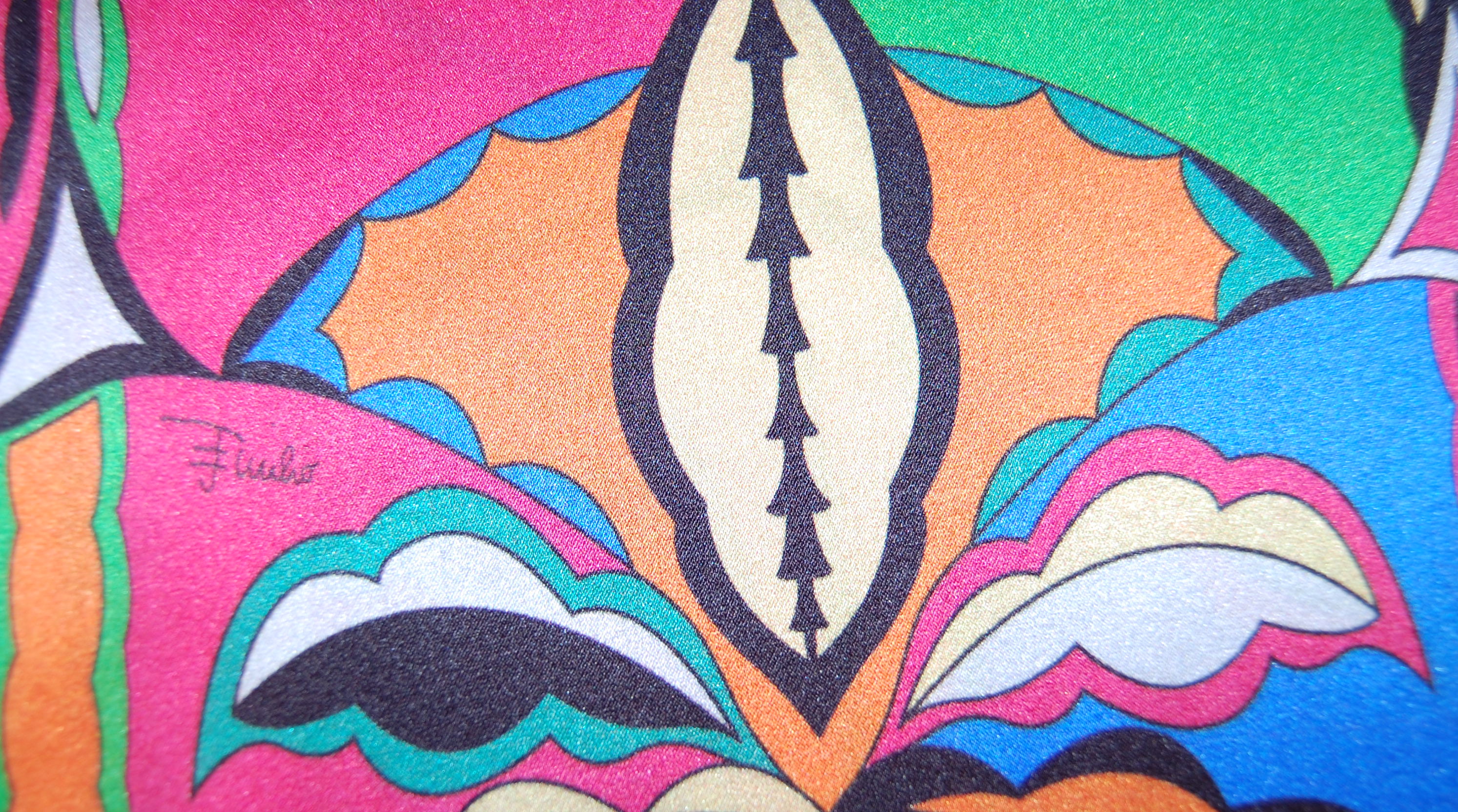
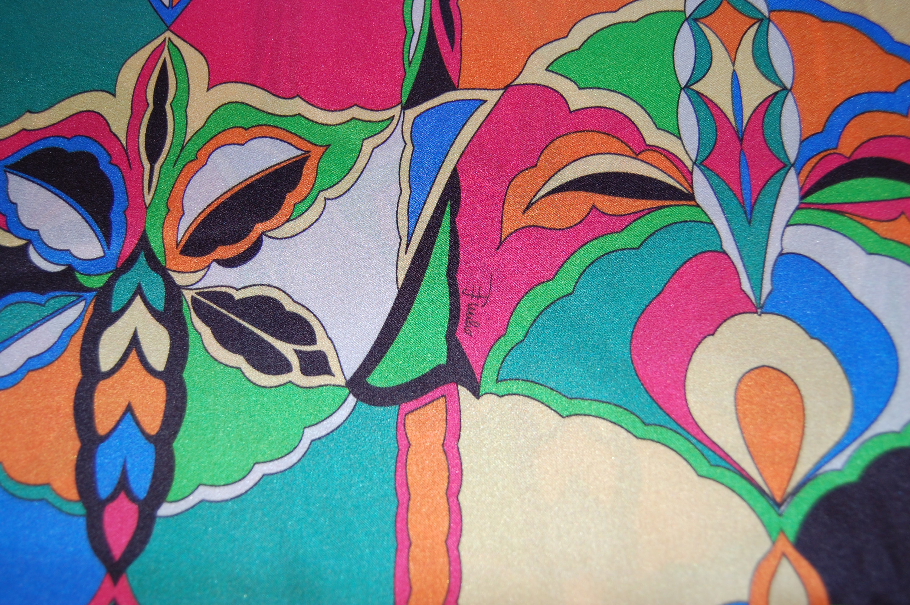
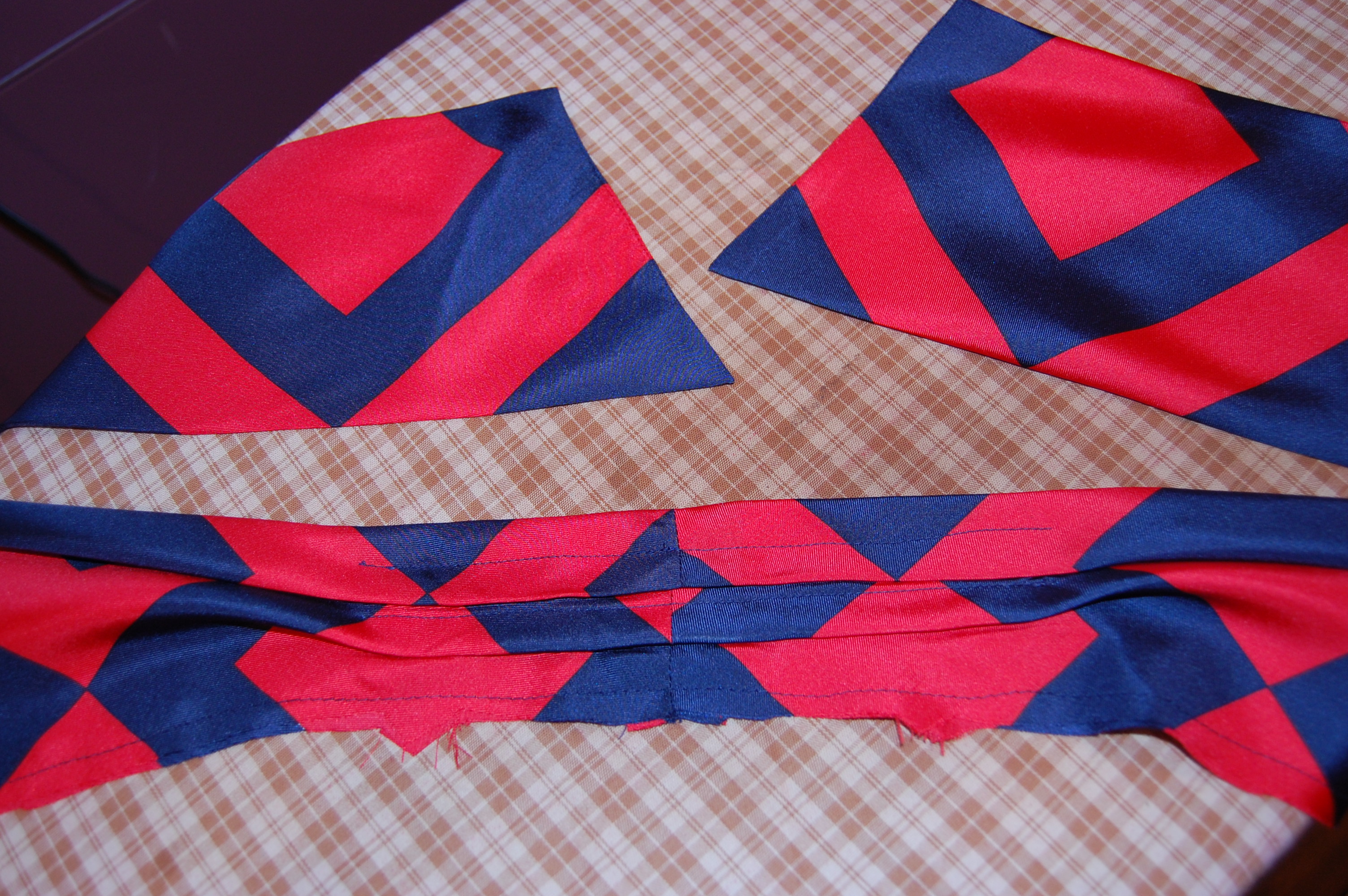
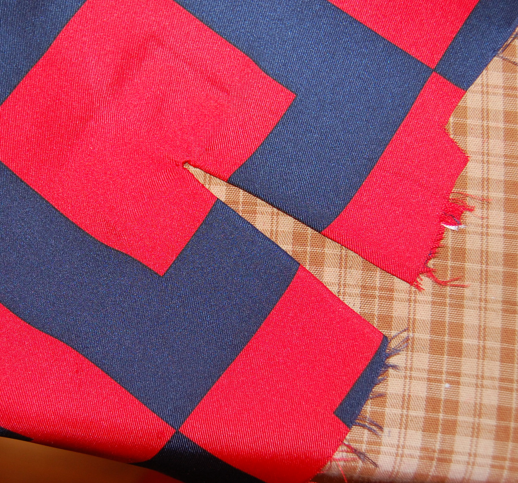
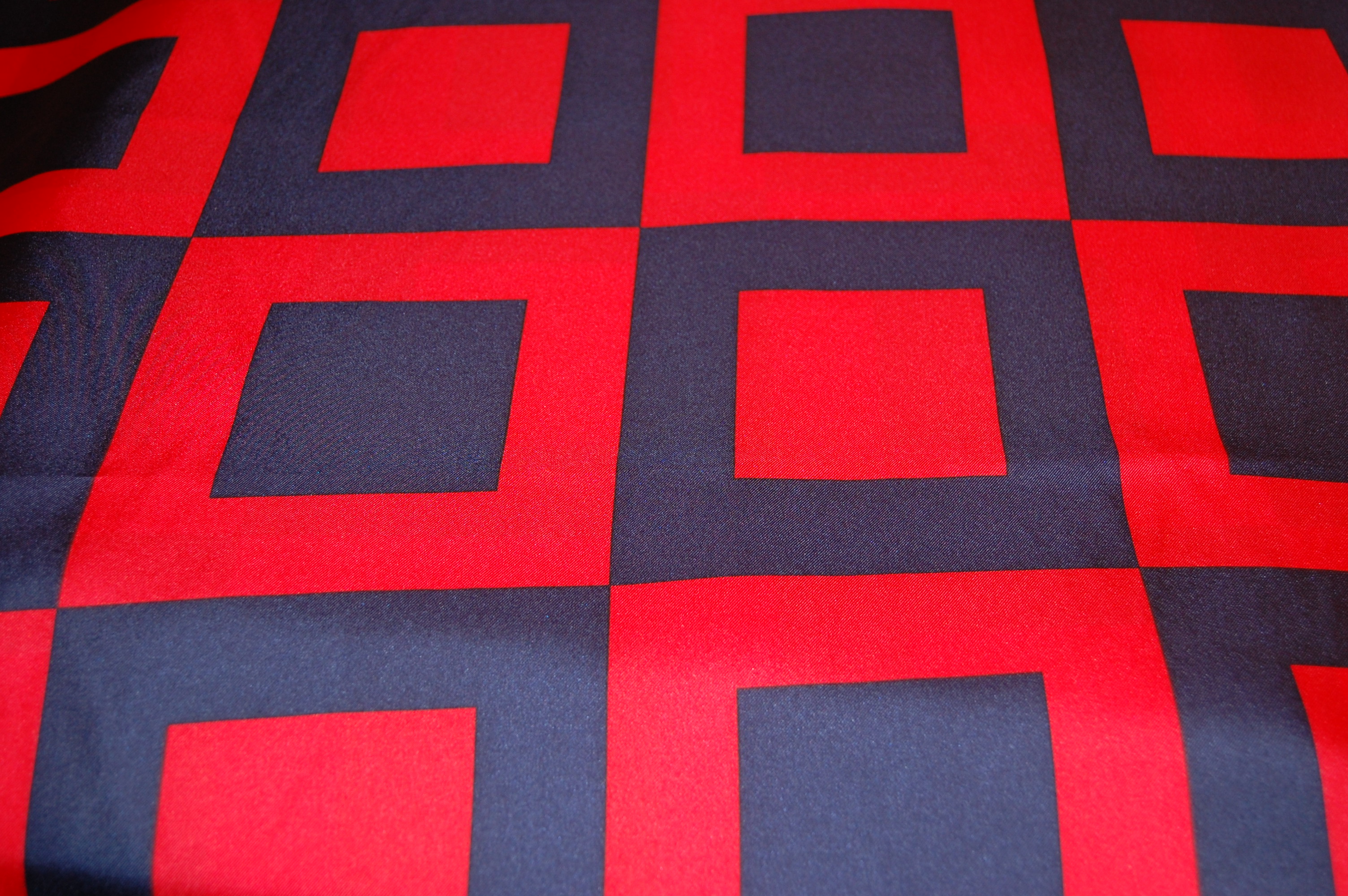
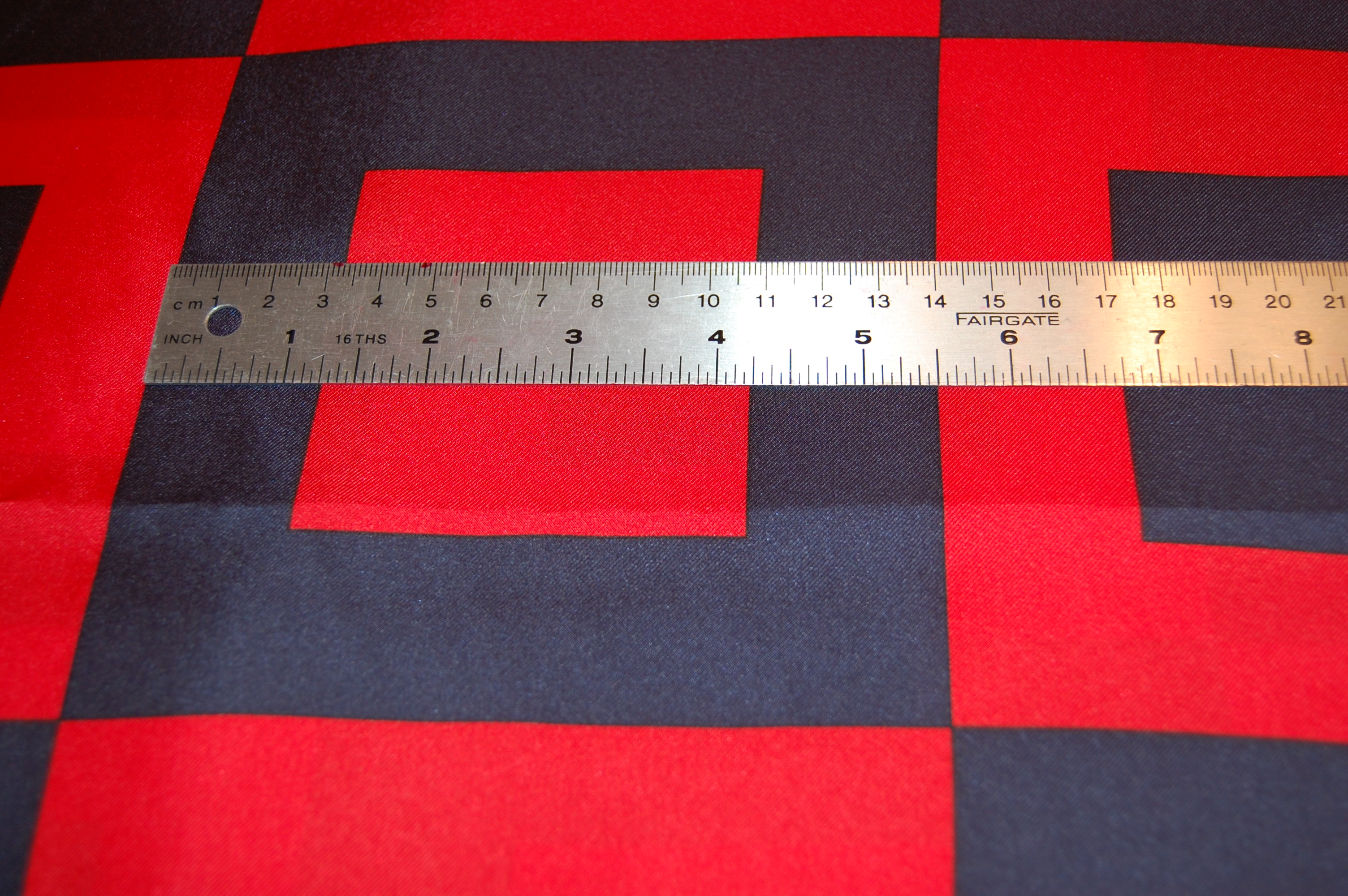
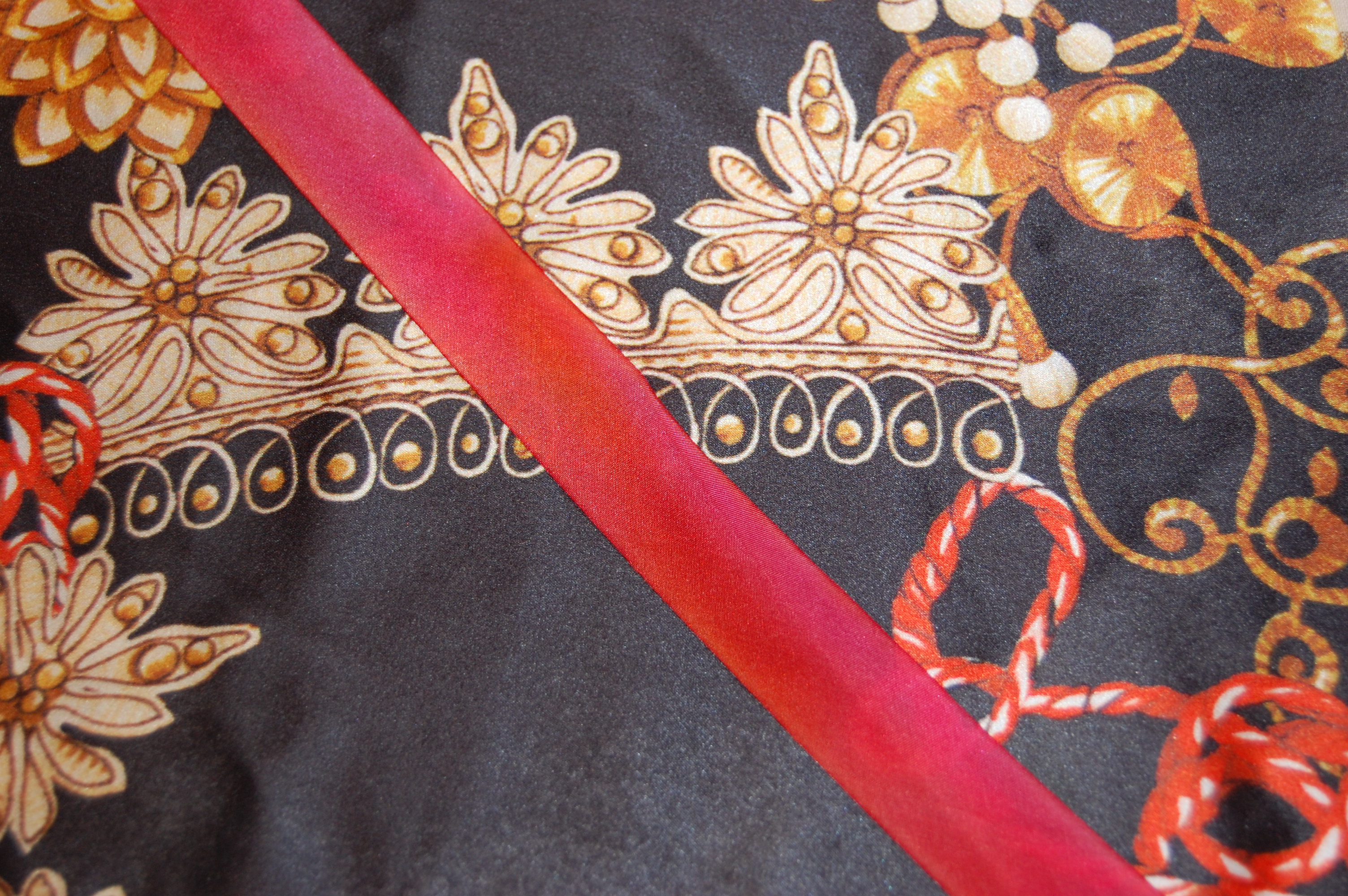
As luck would have it, I had purchased some hand-dyed silk bias ribbon from Britex Fabrics a couple of years ago. One of the colors I had ordered turned out to be a perfect complement to this silk from Mendel Goldberg, which is slowly making its transformation into a dress.
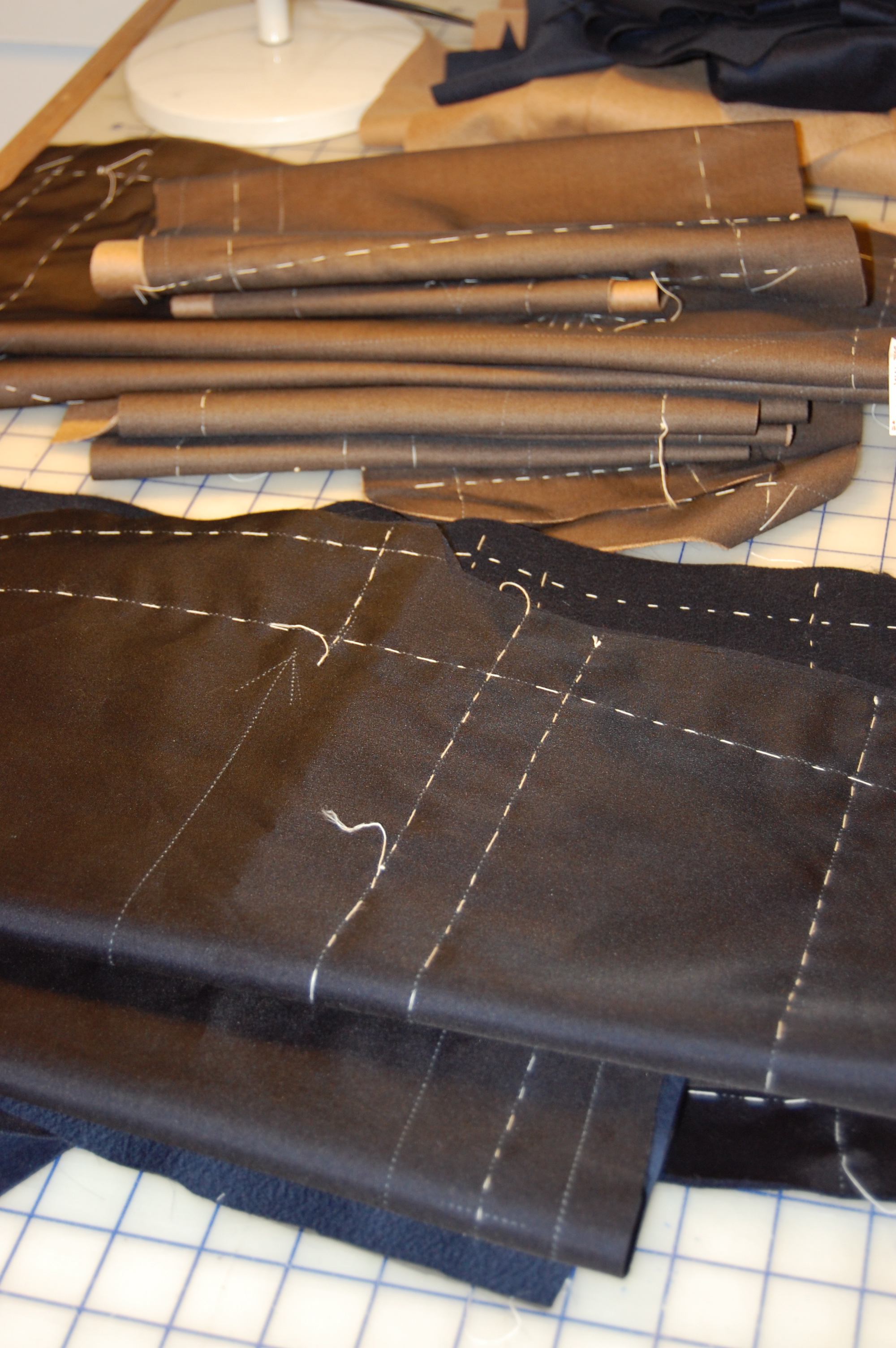
After hours and hours of working on the muslin (toile), cutting out the underlining (on the bias to accommodate the stretch of the silk fabric), checking and re-checking (multiple times) to make sure my pattern pieces were laid out properly, and then meticulously basting the gossamer silk gauze underlining and the slippery fashion fabric together, I was ready to do something fun. “What could be easier?” I thought. “The ribbon is already cut on the bias so I’ll just sew up three yards of piping and I’ll be in business.” Except that I kept getting ridges and lumps in my piping as I encased that kitchen string in the silk ribbon. I thought maybe if I stretched it a bit, it might look better, but it really didn’t. I must admit I was discouraged – actually very discouraged. I could not figure out what I was doing wrong, but I knew I needed to take a break from this mess and come back the next day.
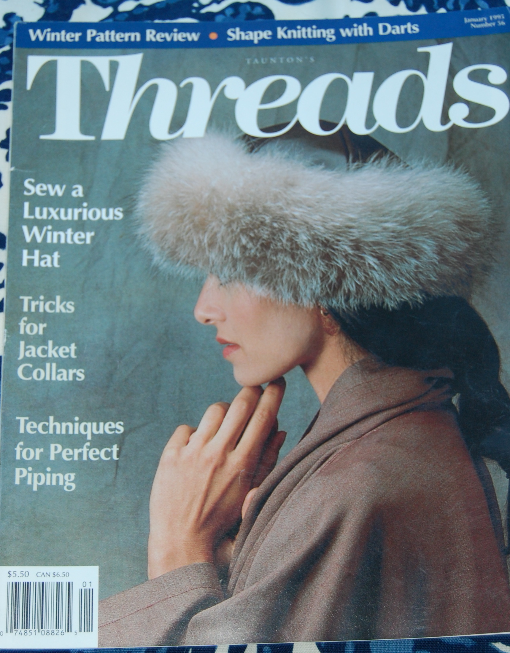
Before I left my sewing room, I went to my stack of Threads Magazines to look for a particular issue recently recommended to me for another reason, and in my search found, by chance, the December 1994/January 1995 issue. There on the cover “Techniques for Perfect Piping” was a featured article.
I have many odd issues of Threads Magazine, but earlier in the year I bought the Threads Magazine Archive 1985-2013, available for purchase on their website. I can’t recommend it highly enough – decades of sewing advice and expertise is readily available at the click of your computer mouse!
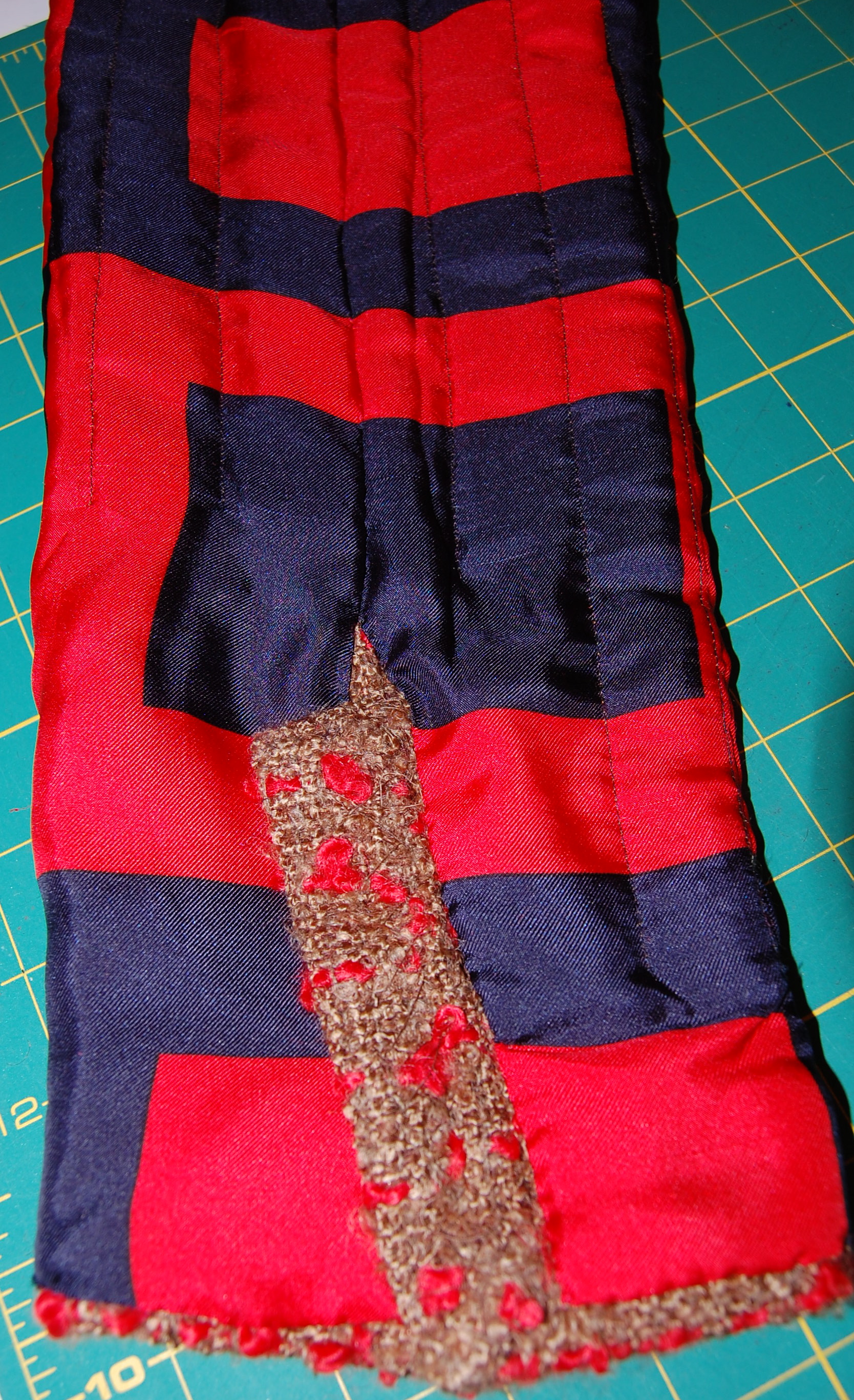
Needless to say, that became my evening reading. One line in this article by Linda Wakefield led me to the solution to my problem: “I also recommend reducing presser foot pressure, if possible, so that the fabric doesn’t twist or ripple as you stitch.” Even though I am unable to change the presser foot tension on my machine, that advice made me think that I needed to stabilize and reinforce the silk bias ribbon somehow to make it feed more evenly through the needle. The next day, back in my sewing room, I got some tissue paper – the kind one uses for wrapping presents – and cut it into strips. I placed a single layer of tissue under the silk ribbon as I stitched – and voila! Perfect piping emerged from my machine.
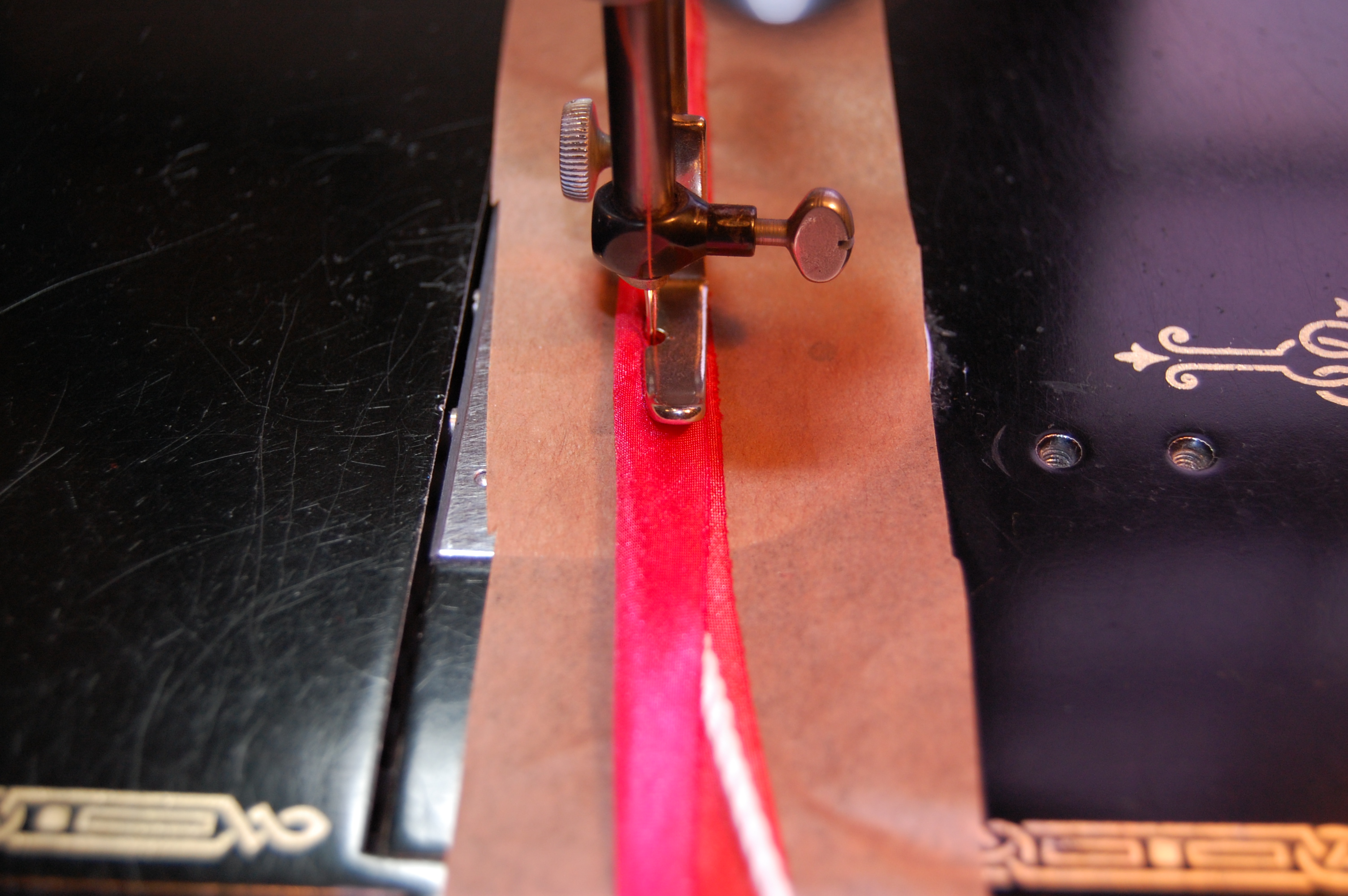
The tissue is brown (which is just some I happened to have with my gift wrapping supplies.)
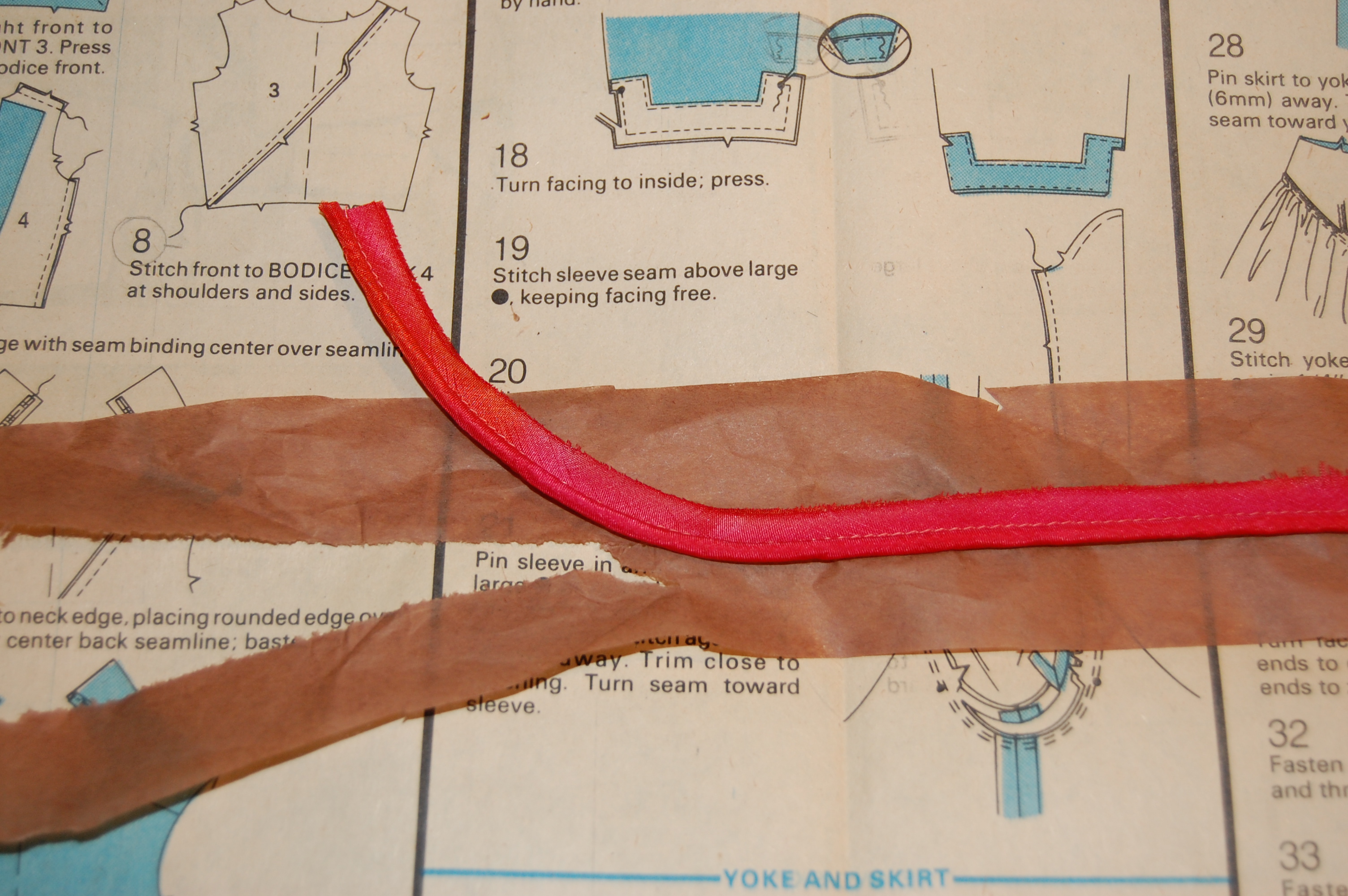
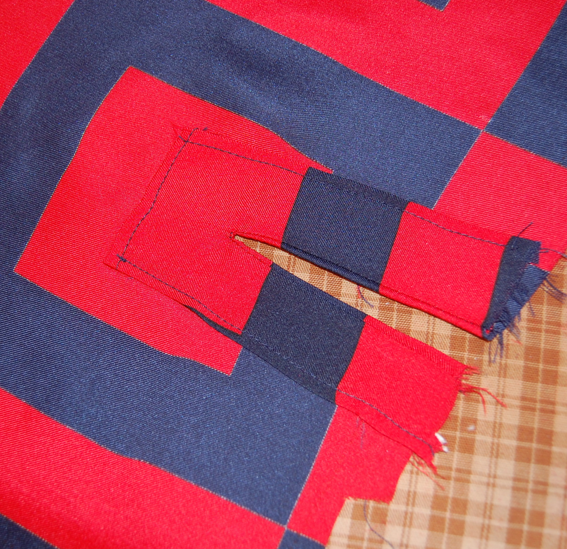
The tissue paper tears off easily and cleanly from the silk piping.
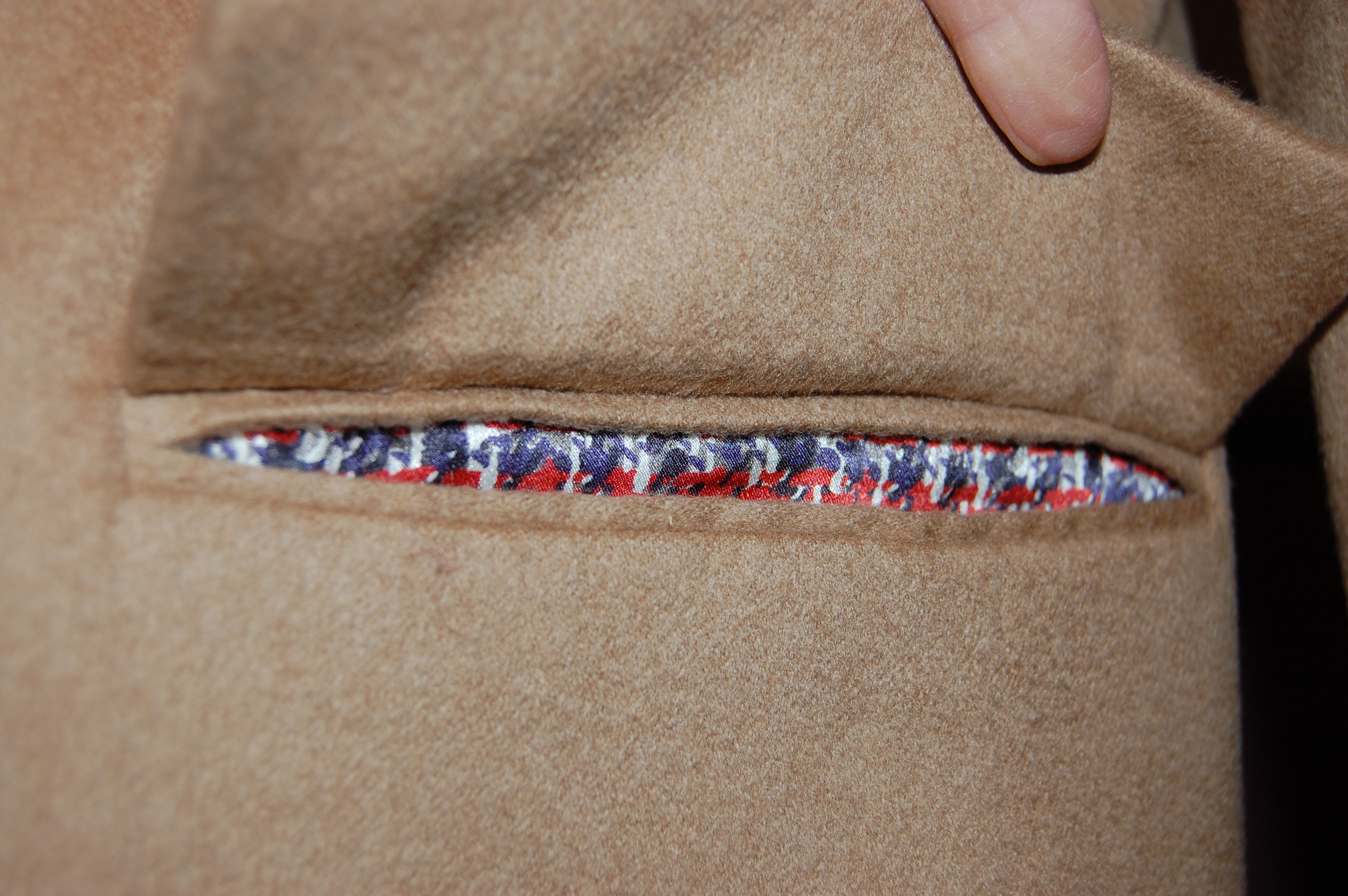
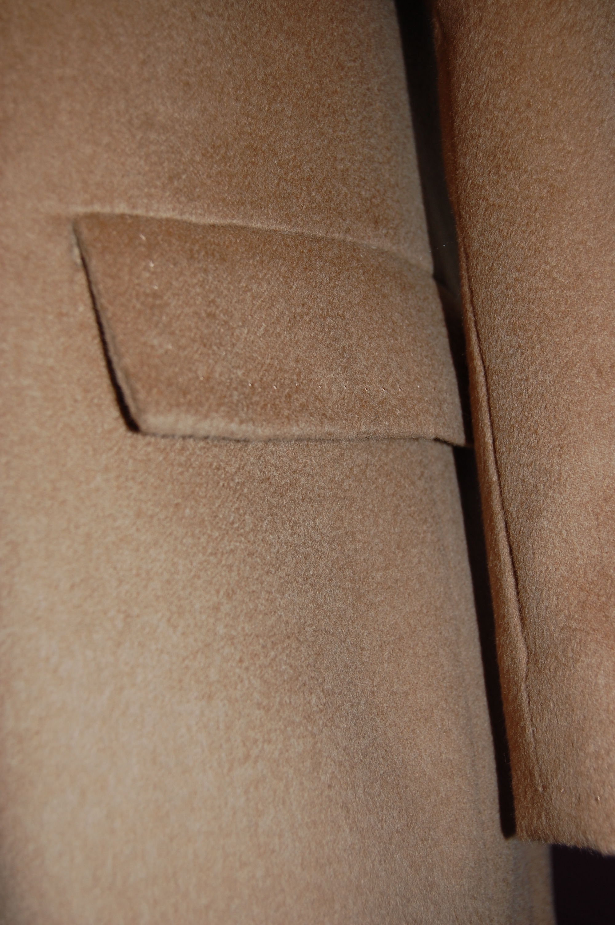
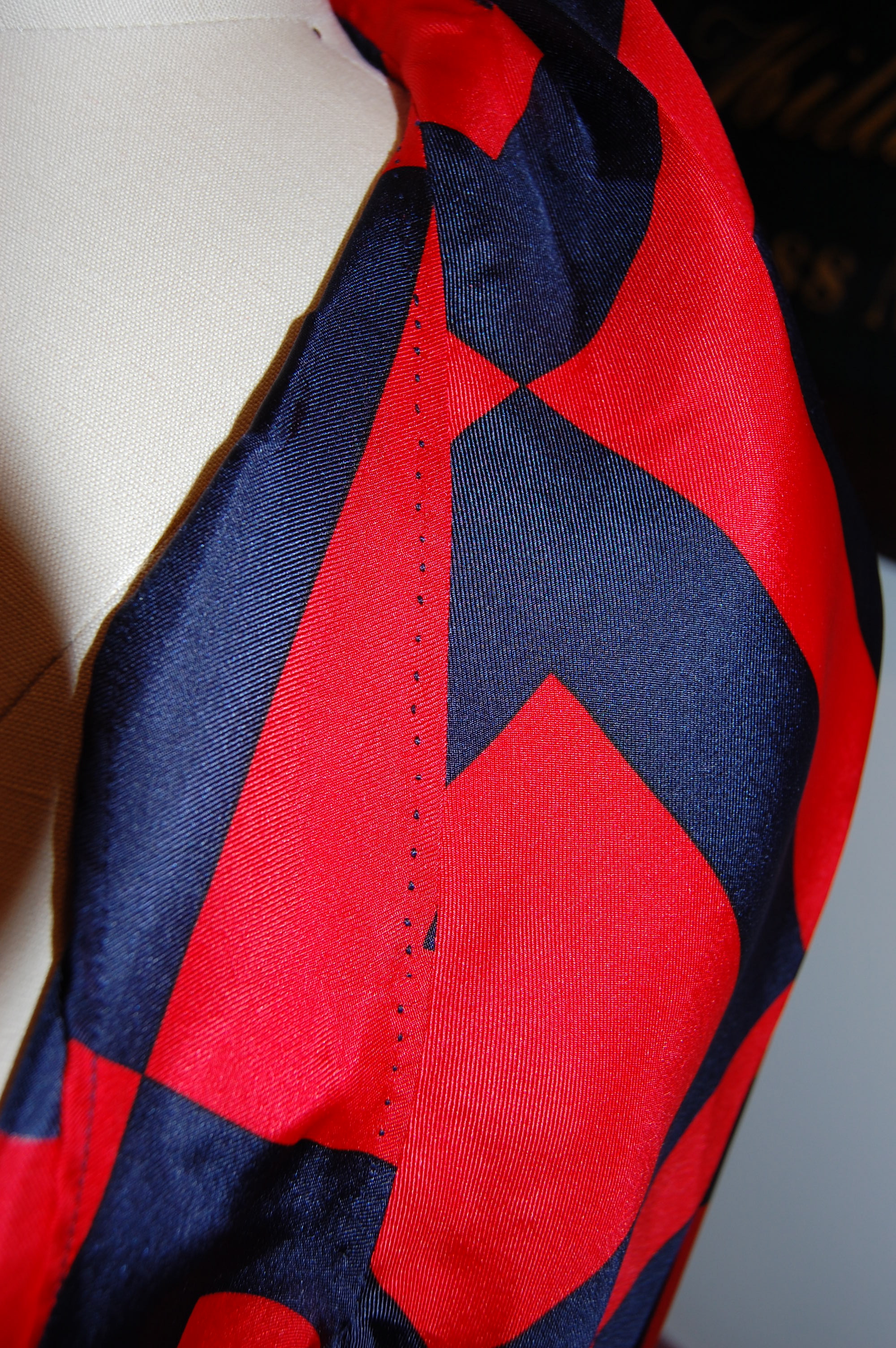
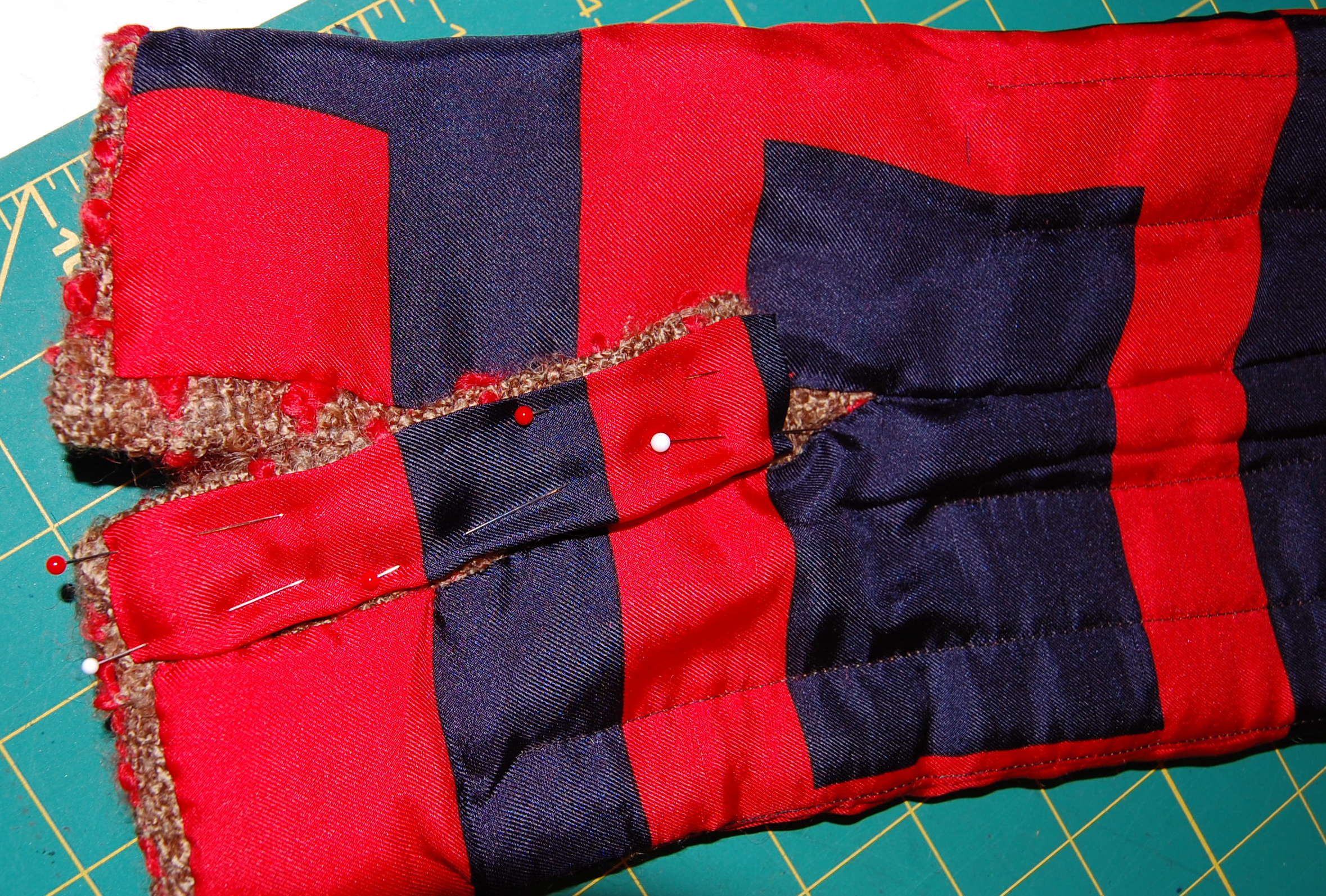
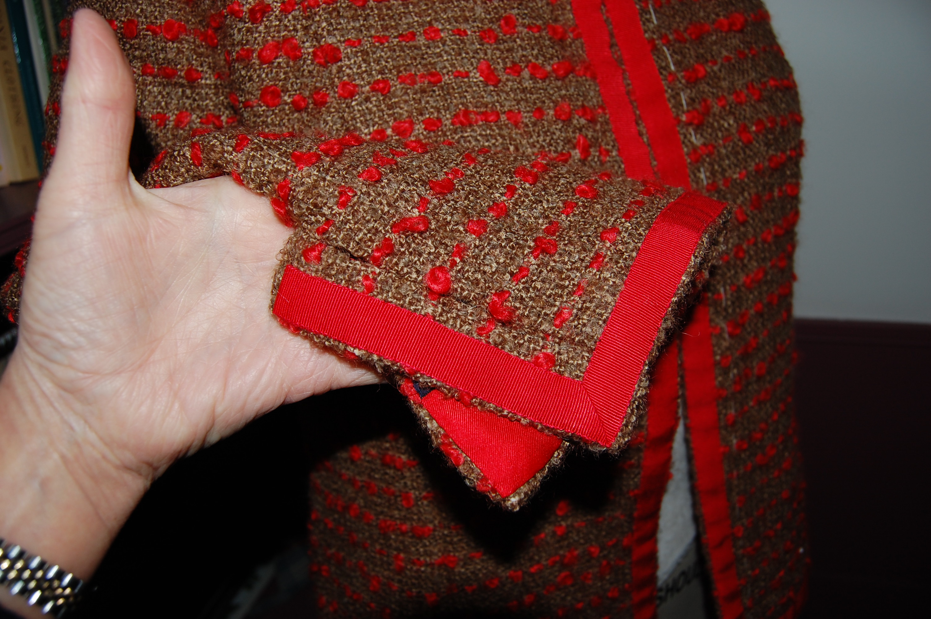
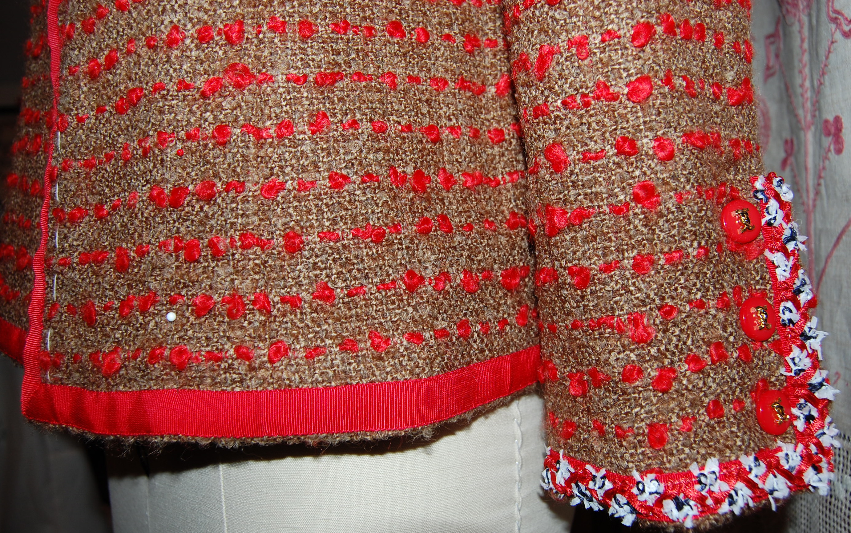
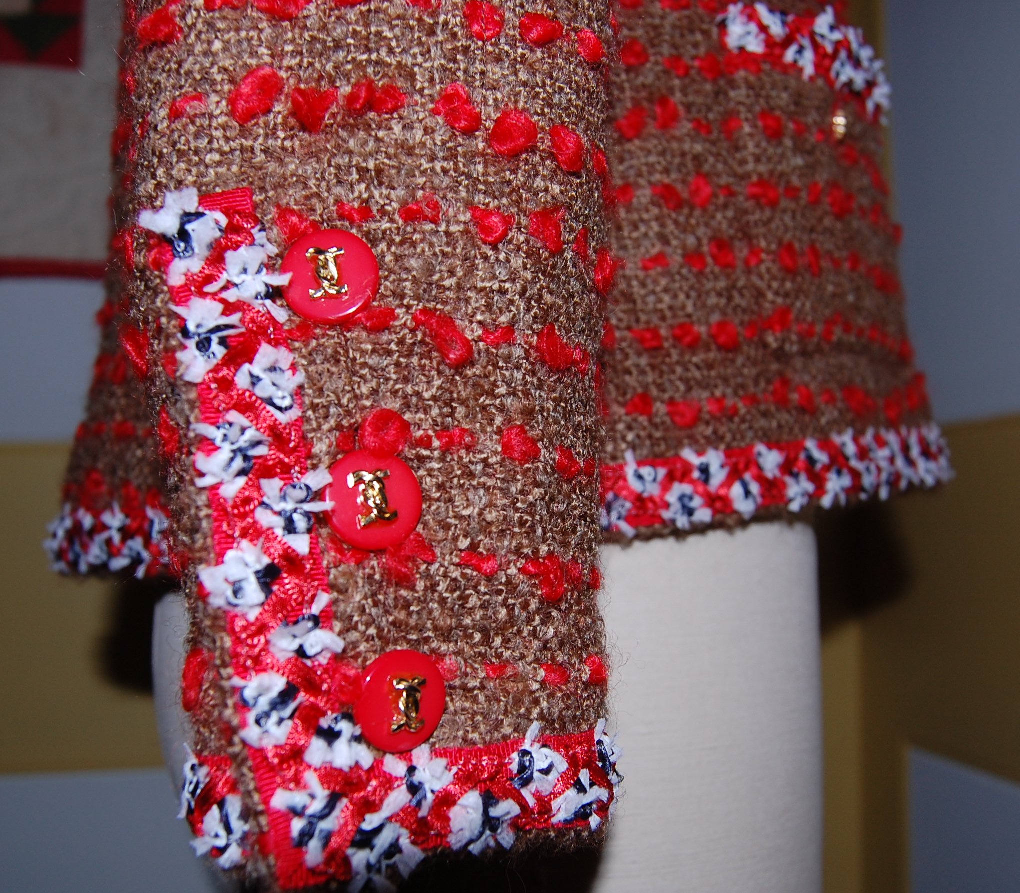
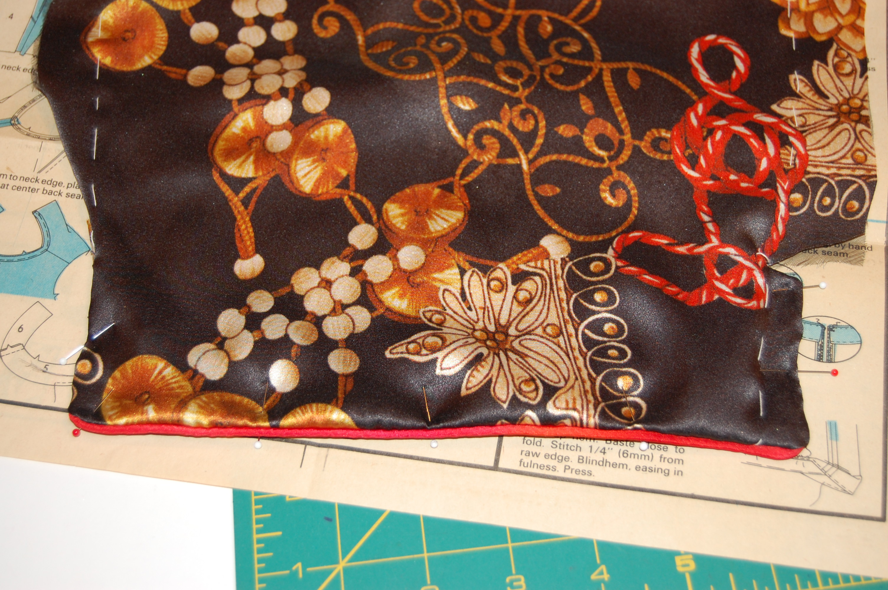
Further advice in the article gave tips on applying the piping. I decided to try my hand with this added guidance, choosing to start with the sleeves. The pattern calls for piping around the lower edge – a nice short distance and easy to fix if I wasn’t happy with the finished look. What do you think?
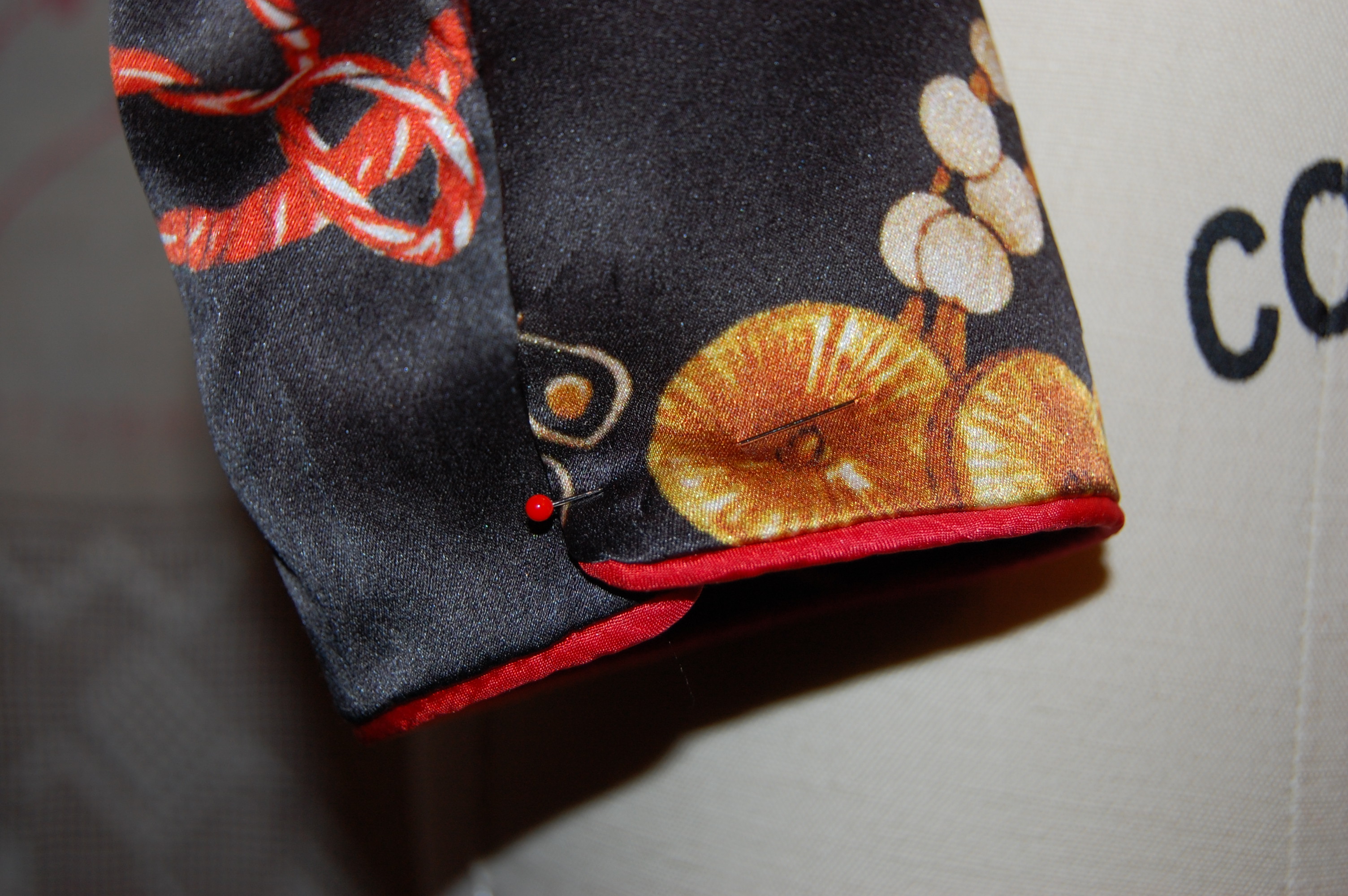
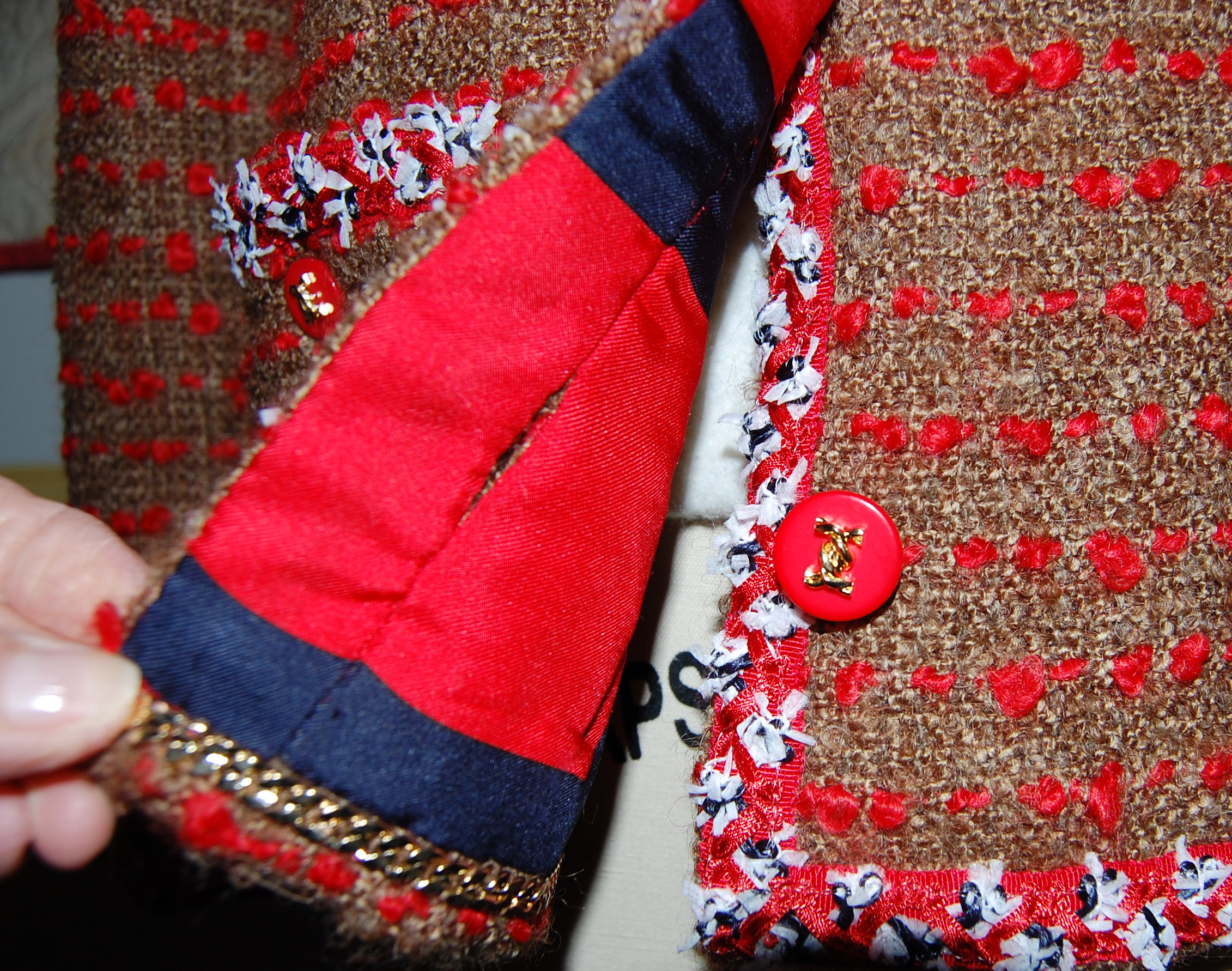
The sleeve has a side opening – to be secured by snaps. Here it is just pinned.
There will still, I am sure, be some tedious moments as I continue work on this dress, but my load was definitely made lighter by something as simple as —- tissue paper!