After completing my “Classic French Jacket” and its coordinating sheath dress, I wanted something easy – and relatively quick – for my next project. I didn’t think it was going to be another bathrobe, but that’s what it has turned out to be, to my great surprise.
Because we had such a chilly Spring, I was wearing my newly constructed Winter bathrobe into June. But, suddenly, Summer arrived in the middle of that month, with its humidity and often beastly temperatures. It was then I pulled out my old, lightweight Summer robe – you know, the one with the missing button – and the small tear – and the tea stain which somehow became a permanent fixture. Not such a pretty sight. Having become used to my new Winter robe which makes me happy whenever I put it on, I decided maybe it was time to replace my Summer robe, too.
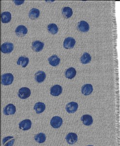
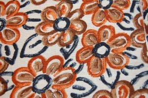
I already had a three-yard length of “water-color-designed cotton lawn” from Britex Fabrics.
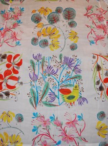
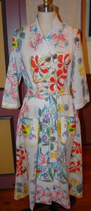
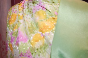
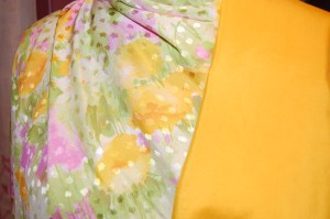
I forgot to get a photo of the fabric before I cut into it. This is a partial view of the back of the robe. I purchased this Italian-produced, fine cotton during one of the online sales at Britex Fabrics in San Francisco.
At 56” wide, I thought it would be enough to make a robe, using the same wonderful pattern I had used for my Winter robe.
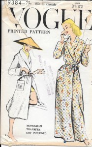
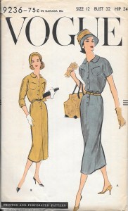
This pattern from 1959 is so well engineered, with subtle details which give it a polished appearance.
My only reservation was that the fabric makes quite a statement. I wondered if perhaps it was going to be too, too much in an ankle length robe. Truthfully, though, how many people see me in my bathrobe? I figured I’d go for it.
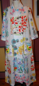
Once again, laying out the pattern was quite the task, done entirely on the floor. Although the pattern matching didn’t have to be quite as precise as working with an orderly plaid, I did have to pay attention to the large squares and where they would end up in relation to each other and in relation to the dimensions of the front and back of the robe.
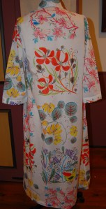
And a back view. Without lining up the “watercolor blocks” in some relation to each other, the effect would really have been chaos!
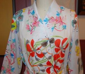
The fineness of the fabric is apparent if you look closely at the collar, where there is some fade-through of the design. (The interfacing is attached to the under section of the collar.)
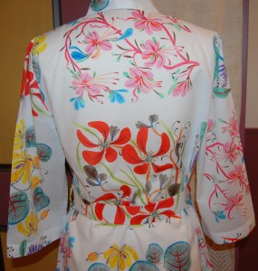
I did not have enough fabric to “match” the designs on the sleeves, but I rather like them not exactly alike. Also, I shortened the sleeves to below elbow length, more appropriate for a Summer robe, but also necessary to save fabric!
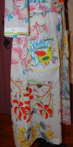
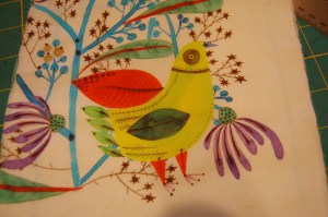
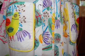
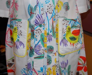
After just barely managing to get the two fronts, one back, the sleeves and collar and front facings placed on the fabric, I knew I was not going to have enough fabric left to match the pockets to their underlaying design. I did, however, have two fabric blocks featuring those quirky little birds, enough to make two pockets. The birds could even face each other.
But I knew they would look a little “lost in space” unless I set them off somehow. That’s when I went to my tried and true solution for all kinds of sewing fixes – piping! Yellow seemed to delineate the pockets the best – beating out green, red, pink and purple, all of which I “auditioned.”
I quite like those little birds, looking cheery and chirpy on the front of my robe.
The fabric is so lovely, almost diaphanous in its effect. And that bold, colorful pattern which had given me pause? It has an exotic flair to it, quite acceptable for a summer robe. I just hope it doesn’t panic the cat.

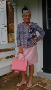
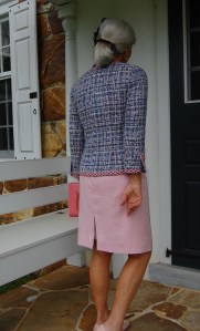
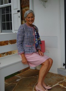
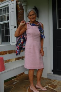












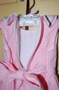
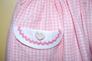
Do You Do Pink?
Apparently, pink is a controversial color. Or maybe “was a controversial color” is a better statement. A recent article by Nancy MacDonnell in the Off Duty section of The Wall Street Journal (“Making Peace with Pink” February 11-12, 2017) makes a case for the appropriateness – and timeliness – of pink even for those who think they don’t like it. While I am one who thinks pink is always in fashion, it turns out that this Spring, it really is in fashion! According to Ms. MacDonnell, “On this season’s runways, pink predominated.” The different fashion houses showed varying interpretations of pink: Michael Kors was “brisk, All-American, [and] cheery.” J. Crew was “equally upbeat,” while Valentino showed pink that was “lush and romantic, with intricate appliqués and historical references…” The list goes on and on. The unifying thread (pardon the pun), as claimed by the designers, was the lack of traditional “sweetness” associated with pink, with emphasis on the feminine power inherent in the color.
Looming large on page 58 from the November 2016 WSJ Magazine is a Valentino coat, quite traditional in design, but made very special by its stunning appliquéd pink wool.
According to Dr. Valerie Steele, the Museum Director at the Fashion Institute of Technology in New York, who was quoted frequently in Ms. MacDonnell’s article, the idea of pink as a feminine color did not take hold until the 1950s. Back in 1954 when Christian Dior wrote The Little Dictionary of Fashion, his entry on “pink” stated: “The sweetest of all the colors. Every woman should have something pink in her wardrobe. It is the color of happiness and of femininity.” He even used pink throughout his book for illustrations, chapter headings and the title page. He recommended pink “for blouses and scarves; … for a young girl’s frock; it can be charming for suits and coats; and it is wonderful for evening frocks.” Who can argue with that, be it 1954 or 2017?
The title page of Dior’s smart little dictionary. (Harry N. Abrams, Inc., NY, NY, copyright 2007)
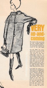
This page from the June/July 2013 issue of Town and Country Magazine gives an interesting timeline of the color pink, “how the color of little girls and baby dolls came of age”:
Click on the image to read it.
I particularly like this statement from Laura Vinroot Poole, the founder of boutique Capitol in Charlotte, N. C., quoted in The Wall Street Journal article: “To wear pink, you have to be an interesting and smart person… You have to have things to say. In pink, you can’t hide.” Nor would you want to.
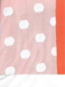
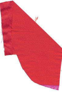
Personally, pink is my favorite color. I am always drawn to it, regardless of its hue. And its hue covers a huge range from palest pink to deepest fuchsia, from bubblegum pink to raspberry red. In thinking about pink for this post, I gathered this stack of pink fabrics from my collection. Just looking at it makes me happy!
From top to bottom:
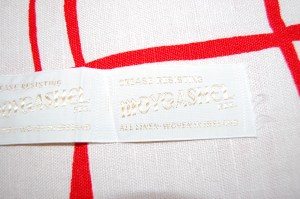
1) vintage Moygashel linen, purchased on eBay
2) silk charmeuse, purchased from Britex Fabrics
3) vintage Moygashel linen, purchased by me in the 1970s
4) linen, possibly Moygashel, purchased on etsy
5) silk jacquard purchased from Britex Fabrics
6) silk charmeuse, purchased from Mendel Goldberg Fabrics
7 & 8) coordinating silks, purchased from Mendel Goldberg Fabrics
The only controversy I have with pink is deciding which hue of it I like best.
19 Comments
Filed under Fashion commentary, Moygashel linen, silk, Uncategorized, Vintage fabric
Tagged as Britex Fabrics, Mendel Goldberg Fabrics, Moygashel linen, silk, vintage fashion, Wall Street Journal Fashion coverage